


一、坐标轴范围
import plotly.graph_objects as go
import numpy as np
np.random.seed(1)

N = 70

fig = go.Figure(data=[go.Mesh3d(x=(70*np.random.randn(N)),
                   y=(55*np.random.randn(N)),
                   z=(40*np.random.randn(N)),
                   opacity=0.5, # 设置透明度
                   color='rgba(244,22,100,0.6)'
                  )])
# 坐标轴设置
fig.update_layout(
    scene = dict(
        xaxis = dict(nticks=4, range=[-100,100],),
                     yaxis = dict(nticks=4, range=[-50,100],), # 标记4个标签值
                     zaxis = dict(nticks=4, range=[-100,100],),),
    width=700,
    margin=dict(r=20, l=10, b=10, t=10))

fig.show()
二、3D椭球体
看起来像球体
import plotly.graph_objects as go
import numpy as np
np.random.seed(1)

u = np.linspace(0, 2 * np.pi, 100)
v = np.linspace(0, np.pi, 100)

fig = go.Figure(data=[go.Scatter3d(
    x=list(1 * np.outer(np.cos(u), np.sin(v)).flatten()),
    y=list(1 * np.outer(np.sin(u), np.sin(v)).flatten()),
    z=list(1 * np.outer(np.ones(np.size(u)), np.cos(v)).flatten()),
    mode='markers'
)])
# 添加注释
fig.update_layout(annotations=[
    dict(x=0.8,
         xref='paper',  #使用相对坐标
         y=0.98,
         yref='paper',
         text='星暖冷月',
         showarrow=False,  # 不显示箭头
        ),
])
fig.show()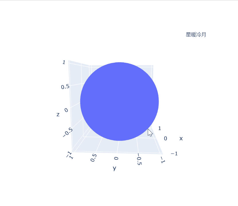
import plotly.graph_objects as go
import numpy as np
np.random.seed(1)

u = np.linspace(0, 2 * np.pi, 100)
v = np.linspace(0, np.pi, 100)
fig = go.Figure(data=[go.Mesh3d(x=list(1 * np.outer(np.cos(u), np.sin(v)).flatten()),
                   y=list(1 * np.outer(np.sin(u), np.sin(v)).flatten()),
                   z=list(1 * np.outer(np.ones(np.size(u)), np.cos(v)).flatten()),
                   opacity=0.5, # 设置透明度
                   color='rgba(244,22,100,0.6)'
                  )])
# 坐标轴设置
fig.update_layout(width=700,
                  margin=dict(r=20, l=10, b=10, t=10),)
fig.update_layout(annotations=[
    dict(x=0.8,
         xref='paper',  #使用相对坐标
         y=0.98,
         yref='paper',
         text='星暖冷月',
         showarrow=False,  # 不显示箭头
        ),
])
fig.show()
三、 多子图的3D图
import plotly.graph_objects as go
from plotly.subplots import make_subplots
import numpy as np

N = 50

fig = make_subplots(rows=2, cols=2,
                    specs=[[{'is_3d': True}, {'is_3d': True}],
                           [{'is_3d': True}, {'is_3d': True}]],
                    print_grid=False)
for i in [1,2]:
    for j in [1,2]:
        fig.append_trace(
            go.Mesh3d(
                x=(60*np.random.randn(N)),
                y=(25*np.random.randn(N)),
                z=(40*np.random.randn(N)),
                opacity=0.5,
              ),
            row=i, col=j)

fig.update_layout(width=700, margin=dict(r=10, l=10, b=10, t=10))
# fix the ratio in the top left subplot to be a cube
fig.update_layout(scene_aspectmode='cube')
# manually force the z-axis to appear twice as big as the other two
fig.update_layout(scene2_aspectmode='manual',
                  scene2_aspectratio=dict(x=1, y=1, z=2))
# draw axes in proportion to the proportion of their ranges
fig.update_layout(scene3_aspectmode='data')
# automatically produce something that is well proportioned using 'data' as the default
fig.update_layout(scene4_aspectmode='auto')
fig.show()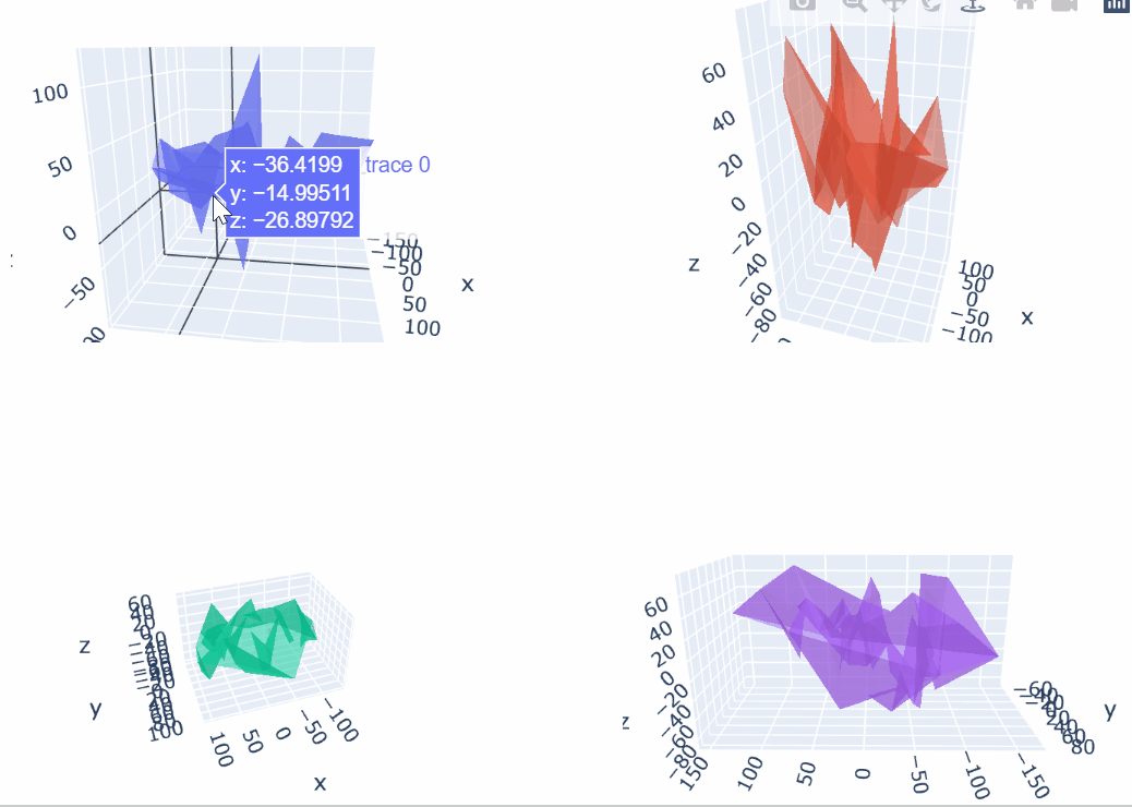
四、给坐标轴命名
import plotly.graph_objects as go
import numpy as np

# Define random surface
N = 50
fig = go.Figure()
fig.add_trace(go.Mesh3d(x=(60*np.random.randn(N)),
                   y=(25*np.random.randn(N)),
                   z=(40*np.random.randn(N)),
                   opacity=0.5,
                   color='yellow'
                  ))
fig.add_trace(go.Mesh3d(x=(70*np.random.randn(N)),
                   y=(55*np.random.randn(N)),
                   z=(30*np.random.randn(N)),
                   opacity=0.5,
                   color='pink'
                  ))

fig.update_layout(scene = dict(
                    xaxis_title='X AXIS TITLE',
                    yaxis_title='Y AXIS TITLE',
                    zaxis_title='Z AXIS TITLE'),
                    width=700,
                    margin=dict(r=20, b=10, l=10, t=10))

fig.show()
五、坐标轴刻度设置
import plotly.graph_objects as go
import numpy as np

# Define random surface
N = 50
fig = go.Figure(data=[go.Mesh3d(x=(60*np.random.randn(N)),
                   y=(25*np.random.randn(N)),
                   z=(40*np.random.randn(N)),
                   opacity=0.5,
                   color='rgba(100,22,200,0.5)'
                  )])

# Different types of customized ticks
fig.update_layout(scene = dict(
                    xaxis = dict(
                        ticktext= ['TICKS','MESH','PLOTLY','PYTHON'],
                        tickvals= [0,50,75,-50]),
                    yaxis = dict(
                        nticks=5, tickfont=dict(
                            color='green',
                            size=12,
                            family='Old Standard TT, serif',),
                        ticksuffix='#'),
                    zaxis = dict(
                        nticks=4, ticks='outside',
                        tick0=0, tickwidth=4),),
                    width=700,
                    margin=dict(r=10, l=10, b=10, t=10)
                  )

fig.show()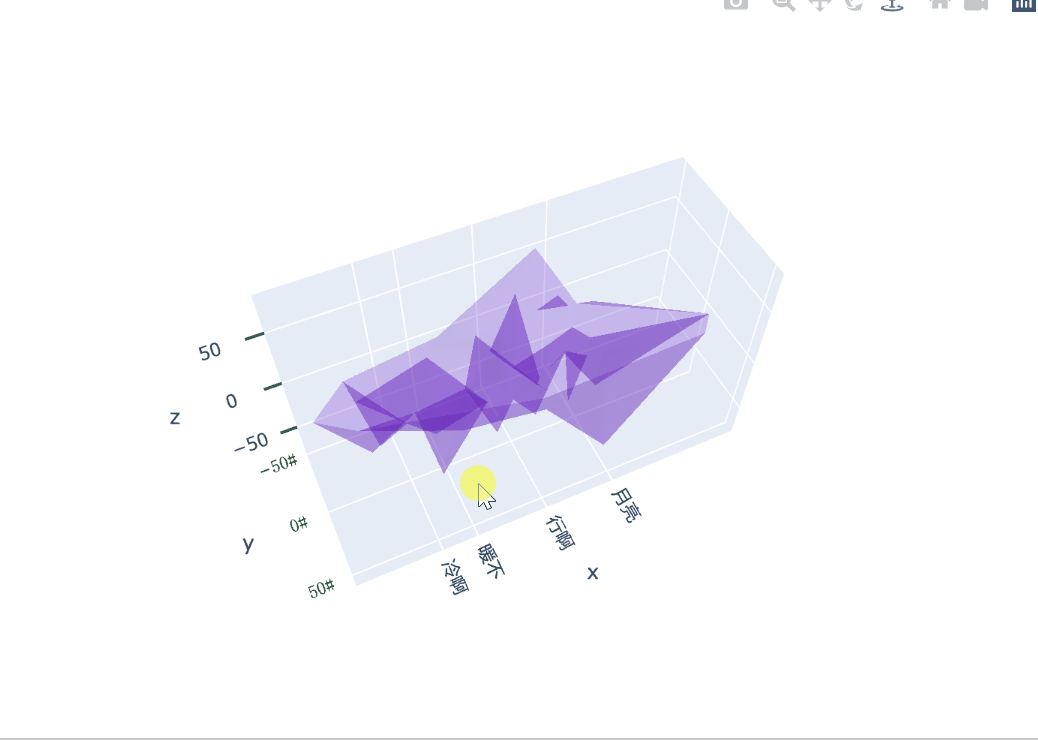
六、 背景和网格颜色
import plotly.graph_objects as go
import numpy as np

N = 50
fig = go.Figure(data=[go.Mesh3d(x=(30*np.random.randn(N)),
                   y=(25*np.random.randn(N)),
                   z=(30*np.random.randn(N)),
                   opacity=0.5,)])


# xaxis.backgroundcolor is used to set background color
fig.update_layout(scene = dict(
                    xaxis = dict(
                         backgroundcolor="rgb(200, 200, 230)",
                         gridcolor="white",
                         showbackground=True,
                         zerolinecolor="white",),
                    yaxis = dict(
                        backgroundcolor="rgb(230, 200,230)",
                        gridcolor="white",
                        showbackground=True,
                        zerolinecolor="white"),
                    zaxis = dict(
                        backgroundcolor="rgb(230, 230,200)",
                        gridcolor="white",
                        showbackground=True,
                        zerolinecolor="white",),),
                    width=700,
                    margin=dict(
                    r=10, l=10,
                    b=10, t=10)
                  )
fig.show()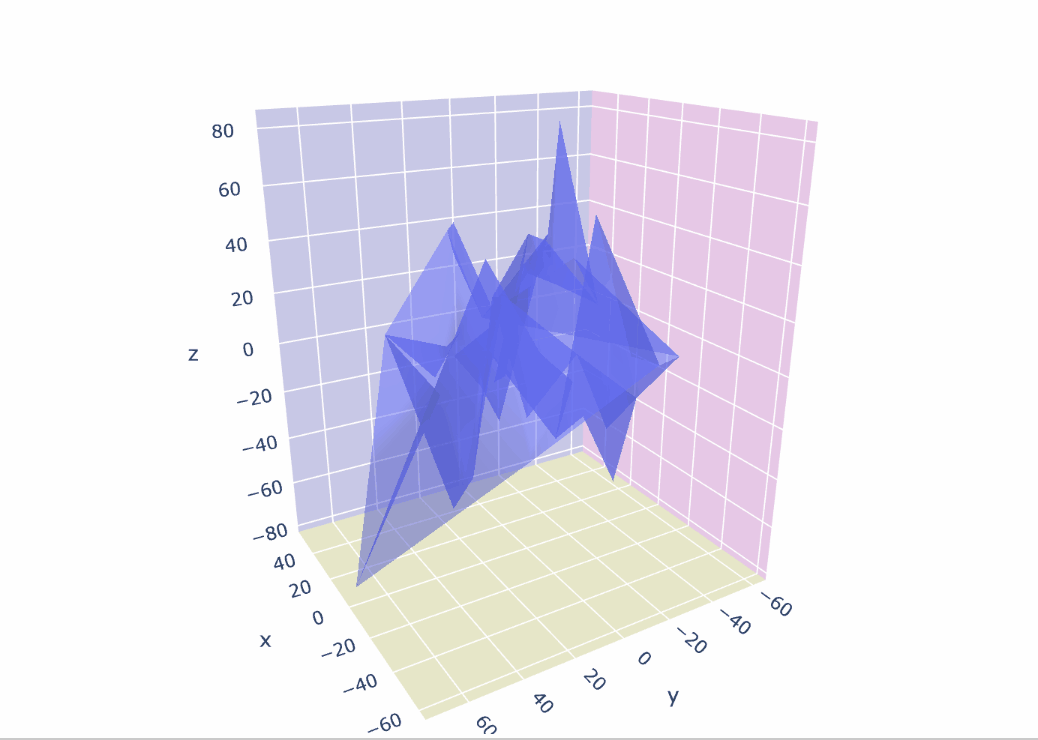
七、禁用工具提示峰值
import plotly.graph_objects as go
import numpy as np

N = 50
fig = go.Figure(data=[go.Mesh3d(x=(30*np.random.randn(N)),
                   y=(25*np.random.randn(N)),
                   z=(30*np.random.randn(N)),
                   opacity=0.5,)])
fig.update_layout(scene=dict(xaxis_showspikes=False,
                             yaxis_showspikes=False))
fig.show()
八、总结
在某个备战考研的下午,搞这些花里胡哨但喜欢的东西,心里却不曾有些愧疚感,还是一样,留着以后用。


 2272
2272


 被折叠的 条评论
为什么被折叠?
被折叠的 条评论
为什么被折叠?
 到【灌水乐园】发言


