


常用布局:layout
线性布局 LinearLayout
sp:相当于像素的概念但区别于px。
android:orientation=”vertical” 垂直分布 orientation (方向)
android:orientation=”horizontal” 水平分布
组件的默认对齐方式:左对齐
android:layout_gravity=”right” //设置这个组件本身是靠右边的
android:gravity=”right” //设置的是组件中的内容是右对齐。
 <LinearLayout xmlns:android="http://schemas.android.com/apk/res/android"
    android:layout_width="match_parent"
    android:layout_height="match_parent"
    android:orientation="vertical"  //  竖直方向     水平方向 是 horizontal
    />
<TextView
        android:layout_width="wrap_content"  //  组件的宽度是包裹内容。
        android:layout_height="wrap_content"
        android:text="第一个"
        android:textSize="18sp"  //设置字体的大小
       android:layout_gravity="right"     //设置这个组件本身是靠右的
        />
       </LinearLayout>
注意线性布局的特性:
LinearLayout中竖直方向(orentation方向 v 竖直)
android:layout_gravity=”center_vertical” 组件本身的方向不支持 竖直居中。
组件本身需注意在竖直布局下, 左对齐、右对齐,水平居中生效
在水平布局下,支持上对齐,底部对齐,和竖直居中生效。
2、
需要注意的是组件的宽度是与父类的匹配。组件的父节点就是线性布局其父类就是屏幕。 需要注意的是不要把其他组件顶出去了。
 <TextView
        android:layout_width="match_parent"
        android:layout_height="wrap_content"
        android:text="第一个"
        android:textSize="18sp" />
3、权重:
权重:按比例分配屏幕的剩余宽度或者高度。(需要注意的是剩余屏幕的)
RGB颜色
android:background=”#ff0000” 红色
android:background=”#ffffff” 白色
android:background=”#000000” 黑色
android:background=”#00ff00” 绿色
android:background=”#ffff00” 黄色(红绿组合)
android:background=”#ff00ff” 粉色(红蓝)
android:background=”#0000ff” 背景颜色是蓝色
方向是水平的权重分配的是宽度 组件的初始化宽度确认好后剩余的就是剩余屏幕宽度。 权重分配的就是这部分宽度,通常配合 android:layout_width=”0dp”使用达到预期的效果。
android:layout_weight=”1” 权重
android:layout_width=”0dp”
下面就是线性布局中的利用 layout_weight 权重做出的效果图。
<?xml version="1.0" encoding="utf-8"?>
<LinearLayout xmlns:android="http://schemas.android.com/apk/res/android"
    android:layout_width="match_parent"
    android:layout_height="match_parent"
    android:orientation="vertical" >

    <LinearLayout
        android:layout_width="match_parent"
        android:layout_height="0dp"
        android:layout_weight="1"
        android:orientation="horizontal" >

        <TextView
            android:layout_width="0dp"
            android:layout_height="match_parent"
            android:layout_weight="1"
            android:background="#FF0000" />

        <TextView
            android:layout_width="0dp"
            android:layout_height="match_parent"
            android:layout_weight="1"
            android:background="#ffffff" />

        <TextView
            android:layout_width="0dp"
            android:layout_height="match_parent"
            android:layout_weight="1"
            android:background="#000000" />

        <TextView
            android:layout_width="0dp"
            android:layout_height="match_parent"
            android:layout_weight="1"
            android:background="@android:color/darker_gray" />
    </LinearLayout>

    <LinearLayout
        android:layout_width="match_parent"
        android:layout_height="0dp"
        android:layout_weight="1"
        android:orientation="vertical" >

        <TextView
            android:layout_width="match_parent"
            android:layout_height="0dp"
            android:layout_weight="1"
            android:background="#00ff00" />

        <TextView
            android:layout_width="match_parent"
            android:layout_height="0dp"
            android:layout_weight="1"
            android:background="@android:color/darker_gray" />

        <TextView
            android:layout_width="match_parent"
            android:layout_height="0dp"
            android:layout_weight="1"
            android:background="#000000" />

        <TextView
            android:layout_width="match_parent"
            android:layout_height="0dp"
            android:layout_weight="1"
            android:background="#ff0000" />
    </LinearLayout>

</LinearLayout>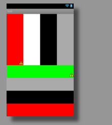
LinearLayout:
指定各个节点的排列方向
android:orientation="horizontal"
* 设置右对齐
android:layout_gravity="right"
* 当竖直布局时,只能左右对齐和水平居中,顶部底部对齐竖直居中无效
* 当水平布局时,只能顶部底部对齐和竖直居中
* 使用match_parent时注意不要把其他组件顶出去
* 线性布局非常重要的一个属性:权重
android:layout_weight="1"
* 权重设置的是按比例分配剩余的空间
相对布局:
RelativeLayout
相对布局没有方向只有线性布局才有方向。
组件默认位置都是左上角,组件之间可以重叠
可以相对于父元素上下左右对齐,相对于父元素,水平居中、竖直居中、水平竖直同时居中
android:layout_centerInParent=”true” 处于中间位置
* 可以相对于其他组件上下左右对齐
*可以布局于其他组件的上方、下方、左边、右边
需要注意的是android:gravity 改变的是组件内部的。 相对布局中没有Layout_gravity.
组件默认左对齐、顶部对齐
* 设置组件在指定组件的右边
android:layout_toRightOf="@id/tv1"
* 设置在指定组件的下边
android:layout_below="@id/tv1"
* 设置右对齐父元素
android:layout_alignParentRight="true"
* 设置与指定组件右对齐
android:layout_alignRight="@id/tv1"
简单的相对父元素的对齐方式:
align:
android:layout_alignParentTop=”true”//相对父元素的上面 align对齐方式
android:layout_alignParentBottom=”true”
android:layout_alignParentRight=”true”
android:layout_alignParentLeft=”true”
 <TextView
        android:id="@+id/tv4"
        android:layout_width="wrap_content"
        android:layout_height="wrap_content"
        android:layout_above="@id/tv2"    //在应用idtv2的上面。
        android:layout_alignParentRight="true"     //对齐父元素的右边
        android:text="第四个"
        android:textSize="18dp" />
注意相对布局是不存在方面的所以向右对齐和向下对齐可以同时生效:
<TextView
        android:layout_width="wrap_content"
        android:layout_height="wrap_content"
        android:text="第二个"
        android:layout_alignParentBottom="true"
        android:layout_alignParentRight="true"  //值有两种true,和false. 对齐父元素
        android:textSize="18dp" />
对齐组件的属性:
toLeftOf 后面是应用ID。
android:layout_toRightOf=”@id/tv3” //在tv3组件的右边 相对于组件 引用id.
android:layout_toLeftOf=”@id/tv1” //在tv1组件的左边
android:layout_above=”@id/tv2” 在组件的上方。
 android:layout_toLeftOf="@id/tv1"
 android:layout_above="@id/tv2"      //两者可以同时生效 在组件tv1的左边,在组件tv2的上边。
2、android:layout_alignLeft=”” Makes the left edge of this view match the left edge of the
given anchor view ID. 就是该组件的左边框要与引用资源ID的左边框对齐。
注意常用组件的性质:
文本视图组件:
textview 显示的就是文本框
按钮组件:
button 显示的效果就是按钮
 <Button
        android:id="@+id/center"
        android:layout_width="wrap_content"
        android:layout_height="wrap_content"
        android:layout_centerInParent="true"
        android:text="center" />

    <Button
        android:id="@+id/above"
        android:layout_width="wrap_content"
        android:layout_height="wrap_content"
        android:layout_above="@id/center"
        android:layout_alignLeft="@id/center"
        android:layout_alignRight="@id/center"
        android:text="above" />
FrameLayout 帧布局
layout_gravity
线性布局:组件不会重叠在一起
相对布局: 组件可以重叠在一起
帧布局:组件可以重叠在一起
帧布局 :默认组件是在左对齐和顶部对齐。 和相对布局一样。
帧布局中layout_gravity 的组件属性与线性布局很像。
android:layout_gravity="right|bottom" //组件在右下方表格布局:
tableLayout 一个很重要的节点是tablerow
tablelayout中节点的宽度和高度都无需再定义,这个是android中唯一一个不用定义宽高属性的布局。
原因是写了也没用。
每一个tablerow表示一行。
每有一个TableRow子节点表示一行,该子节点的每一个子节点都表示一列
TableLayout的一级子节点默认宽都是匹配父元素
* TableRow的子节点默认宽高都是包裹内容
注意:
在tablelayout中 有一个属性需要定义在tablelayout中拉伸列。
android:stretchColumns=”1” 1表示第一列,从第零列开始。 //意思拉伸整个列充满剩余屏幕的宽度。
android:gravity=”right” 组件的的内容靠右注意 layout_gravity
在安卓开发中定义一条分割线的方法:
用textview实现:
在两个tablerow之间加一个textview
“`
tablelayout表格布局中有的组件为空时拉伸列的优化:
这两个属性eclipse感应不到需谨记:
1、在tablelayout定义的拉伸列的前面出现空列 (在要拉伸列的组件上定义与tablelayout设定拉伸列数相同)
android:layout_column="1"  要在需要拉伸列的组件上定义它属于的列
2、在tablelayout定义的拉伸列的后面出现空列优化方法’:
 android:layout_span="2"  (这个表示该组件需要占用两列,将空列删除并能保证后续列的正常显示)
 另外还有一个布局:
 **Absolutelayout 绝对布局**  手机软件开发用不到。  他设计时可以直接拖动组件上面显示的是x,y的坐标值。
 智能电视软件的开发中屏幕适配基本不要适配,两种可以使用绝对布局。
 ----------
总结

  布局:
  线性布局  Linearlayout(layou_gravity 组件自身相对方向    方向    权重   layout_weight)
  相对布局: relativelayout    (相对组件的父元素,和相对组件之间 需要id textview  align 相对     toLeftOf 相对于组件的左边    android:layout_alignLeft 组件左边框对齐  )
  帧布局: framelayout  ( 组件之间可以重叠      layout_gravity )
  表格布局:tablelayout (  tablerow 组件 代表 行    tablerow内部的组件代表多少列如 textview    sterchcolumns(拉伸列)    layout_span      layout_column)
  绝对布局:AbsoluteLayout  xy坐标形式


----------
Logcat
等级
* verbose:冗余,最低等级
* debug:调试
* info:正常等级的信息
* warn:警告
* error:错误
Log.e(tag,mssg);

----------

android:hint="请输入用户名"  hint 暗示
android:inputType="textPassword"   输入类型是密文显示。
EditText et=  (EditText) findViewById(R.id.et_user); 通过id得到组件的文本数据。


 <EditText
        android:id="@+id/et_user"
        android:layout_width="match_parent"
        android:layout_height="wrap_content"
        android:hint="请输入用户名" />
Toast.makeText(context, text, duration) .show() 吐司对话框
context:上下文 this
text : 文本内容 ”登陆成功“
duration:持续时间 Toast.LENGTH_SHORT 0 3秒
Toast.LENGTH_LONG 1 持续五秒自动消失
往内存内部写入数据:
内部存储空间
* RAM内存:运行内存,相当于电脑的内存
* ROM内存:存储内存,相当于电脑的硬盘
文件写入需要注意的几个点:
1、文件布局时layout线性布局Linearlayout 默认特性是横着排列
要达到文本框竖直的需设置方向 android:orentation=”vertical” 竖直
2、为了能到可以输入数据的效果:需要采用EditText组件 设置id
隐性提示: android:hint=“”加入需要提示的内容
密码类型的输入密文 android:inputtype=”textpassword”
3、几种布局可以混着使用 线性布局中套用相对布局
CheckBox 选择框
<CheckBox
            android:id="@+id/check"
            android:layout_width="wrap_content"
            android:layout_height="wrap_content"
            android:layout_centerVertical="true"
            android:text="请记住用户名和密码" />
button 按钮: 文本、点击事件
 <Button
            android:layout_width="wrap_content"
            android:layout_height="wrap_content"
            android:layout_alignParentRight="true"
            android:text="登陆"
            android:onClick="login">
4、布局完后 达到理想效果开始进行文件写入内部内存
定义点击事件的函数
public  void  login (View v)
{
    EditText et _name= (EditText)findViewById(R.id.et_name)  //通过id  得到文件布局中的EditText对象
    EditText et _pass= (EditText)findViewById(R.id.et_pass);
       String  name= et_name.getText().toString();     //得到name的值
          String  pass= et_pass.getText().toString();       //得到密码
          //接下来判断是否需要写入  得到CheckBox对象判断是否有被选中
          CheckBox  cb =  (CheckBox) findViewById(R.id.cb)
        if (cb.isChecked())    //判断 选框是否被选中  boolean类型的值
        {
            File file = new File("data/data/com.zh.rwin/info.txt");   //选中创建文件输出流 需要先明确文件写到的路径  创建文件对象定义path值
            FileOutputStream fos;
            try {
                fos = new FileOutputStream(file);     //创建文件输出流对象  传入文件对象 明确输出流要到达的path
                fos.write((user + "##" + password).getBytes());   //将字节数组写入写入文件中      (需要写入的字符串需要先得到)
                fos.close();          //关流

            } catch (Exception e) {
                // TODO Auto-generated catch block
                e.printStackTrace();

            }

        }
        //System.out.println("登陆了啊");  //如果没选中就不处理 直接打印
        Toast.makeText(this, "登陆成功", Toast.LENGTH_SHORT).show();  //这个是吐司对话框无消退按钮  显示一定时间Duration会自动消失  第一个参数是 context  第二个是要显示的text 第三个参数是显示的时间自动隐退 short = 0  三秒   long =1  5秒

    }


}
最后是查看FileExplore 找到data内部目录,导出已经导入的文件查看是否正确。 pull


 扫一扫
扫一扫
 1105
1105

 被折叠的 条评论
为什么被折叠?
被折叠的 条评论
为什么被折叠?
 到【灌水乐园】发言


