


文章目录
1 说明
本章介绍 Odin Inspector 插件中有关 Button 特性的使用方法。
2 Button 特性
2.1 Button
依据方法,在 Inspector 窗口上生成可点击的按钮。点击一次,方法执行一次。
-
无参方法
-
string name按钮名称,默认为方法名。
-
ButtonSizes buttonSize按钮大小(枚举)。
-
ButtonStyle parameterBtnStyle按钮样式。
-
int buttonSize按钮自定义大小。
-
SdfIconType icon按钮图标。
-
IconAlignment iconAlignment按钮图标对齐方式。
-
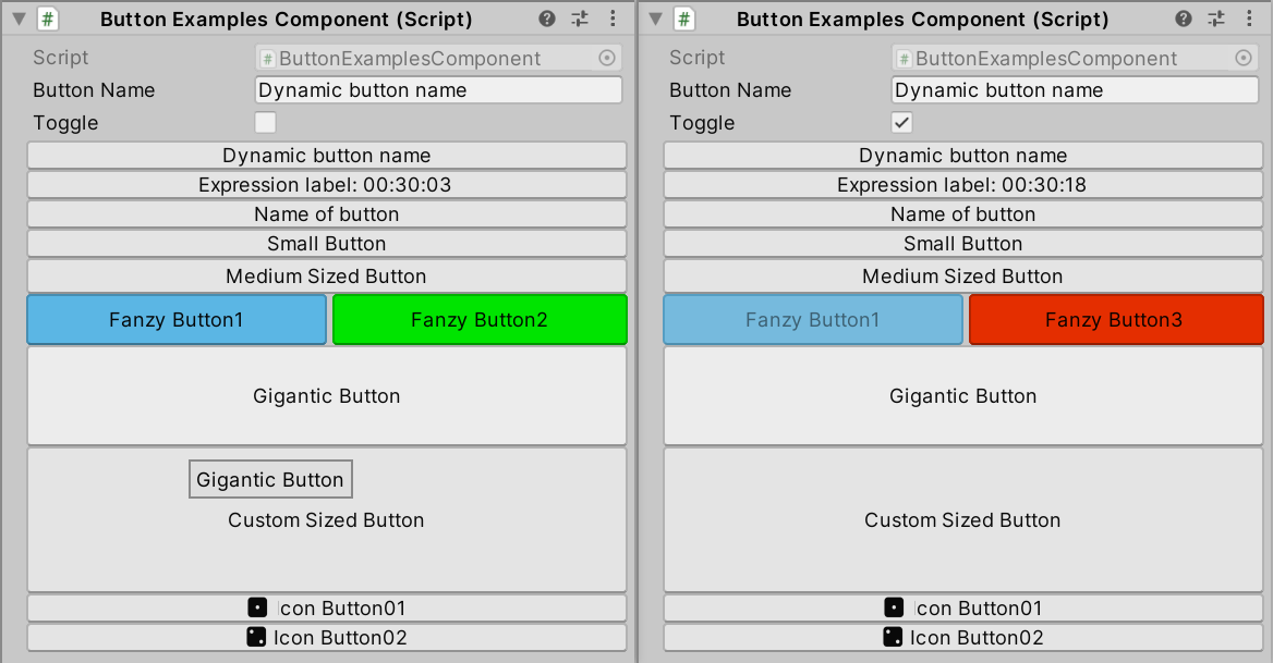
// ButtonExamplesComponent.cs

using Sirenix.OdinInspector;
using UnityEngine;

public class ButtonExamplesComponent : MonoBehaviour
{
    public string ButtonName = "Dynamic button name";

    public bool Toggle;

    [Button("$ButtonName")]
    private void DefaultSizedButton() {
        this.Toggle = !this.Toggle;
    }

    [Button("@\"Expression label: \" + DateTime.Now.ToString(\"HH:mm:ss\")")]
    public void ExpressionLabel() {
        this.Toggle = !this.Toggle;
    }

    [Button("Name of button")]
    private void NamedButton() {
        this.Toggle = !this.Toggle;
    }

    [Button(ButtonSizes.Small)]
    private void SmallButton() {
        this.Toggle = !this.Toggle;
    }

    [Button(ButtonSizes.Medium)]
    private void MediumSizedButton() {
        this.Toggle = !this.Toggle;
    }

    [DisableIf("Toggle")]
    [HorizontalGroup("Split", 0.5f)]
    [Button(ButtonSizes.Large), GUIColor(0.4f, 0.8f, 1)]
    private void FanzyButton1() {
        this.Toggle = !this.Toggle;
    }

    [HideIf("Toggle")]
    [VerticalGroup("Split/right")]
    [Button(ButtonSizes.Large), GUIColor(0, 1, 0)]
    private void FanzyButton2() {
        this.Toggle = !this.Toggle;
    }

    [ShowIf("Toggle")]
    [VerticalGroup("Split/right")]
    [Button(ButtonSizes.Large), GUIColor(1, 0.2f, 0)]
    private void FanzyButton3() {
        this.Toggle = !this.Toggle;
    }

    [Button(ButtonSizes.Gigantic)]
    private void GiganticButton() {
        this.Toggle = !this.Toggle;
    }

    [Button(90)]
    private void CustomSizedButton() {
        this.Toggle = !this.Toggle;
    }

    [Button(Icon = SdfIconType.Dice1Fill, IconAlignment = IconAlignment.LeftOfText)]
    private void IconButton01() {
        this.Toggle = !this.Toggle;
    }

    [Button(Icon = SdfIconType.Dice2Fill, IconAlignment = IconAlignment.LeftOfText)]
    private void IconButton02() {
        this.Toggle = !this.Toggle;
    }
}
-
有参方法
-
bool Expanded = false如果按钮包含参数,可通过将其设置为 true 来禁用折叠显示。
-
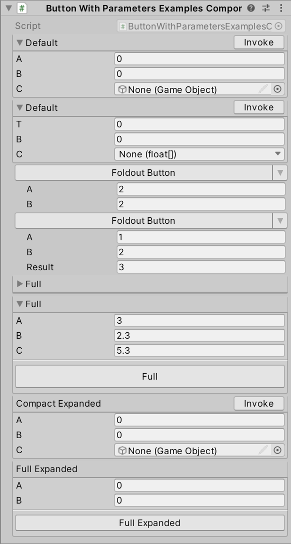
// ButtonWithParametersExamplesComponent.cs

using Sirenix.OdinInspector;
using UnityEngine;

public class ButtonWithParametersExamplesComponent : MonoBehaviour
{
    [Button]
    private void Default(float a, float b, GameObject c) { }

    [Button]
    private void Default(float t, float b, float[] c) { }

    [Button(ButtonSizes.Medium, ButtonStyle.FoldoutButton)]
    private int FoldoutButton(int a = 2, int b = 2) {
        return a + b;
    }

    [Button(ButtonSizes.Medium, ButtonStyle.FoldoutButton)]
    private void FoldoutButton(int a, int b, ref int result) {
        result = a + b;
    }

    [Button(ButtonStyle.Box)]
    private void Full(float a, float b, out float c) {
        c = a + b;
    }

    [Button(ButtonSizes.Large, ButtonStyle.Box)]
    private void Full(int a, float b, out float c) {
        c = a + b;
    }

    [Button(ButtonStyle.CompactBox, Expanded = true)]
    private void CompactExpanded(float a, float b, GameObject c) { }

    [Button(ButtonSizes.Medium, ButtonStyle.Box, Expanded = true)]
    private void FullExpanded(float a, float b) { }
}
2.2 ButtonGroup
将 Button 分组显示。
string group = "_DefaultGroup"组名。
float order = 0.0f顺序。
int ButtonHeight按钮组中所有按钮的高度。
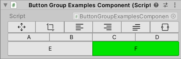
// ButtonGroupExamplesComponent.cs

using System;
using Sirenix.OdinInspector;
using UnityEngine;

public class ButtonGroupExamplesComponent : MonoBehaviour
{
    public IconButtonGroupExamples iconButtonGroupExamples;

    [ButtonGroup]
    private void A() { }

    [ButtonGroup]
    private void B() { }

    [ButtonGroup]
    private void C() { }

    [ButtonGroup]
    private void D() { }

    [Button(ButtonSizes.Large)]
    [ButtonGroup("My Button Group")]
    private void E() { }

    [GUIColor(0, 1, 0)]
    [ButtonGroup("My Button Group")]
    private void F() { }

    [Serializable, HideLabel]
    public struct IconButtonGroupExamples
    {
        [ButtonGroup(ButtonHeight = 25), Button(SdfIconType.ArrowsMove, "")]
        void ArrowsMove() { }

        [ButtonGroup, Button(SdfIconType.Crop, "")]
        void Crop() { }

        [ButtonGroup, Button(SdfIconType.TextLeft, "")]
        void TextLeft() { }

        [ButtonGroup, Button(SdfIconType.TextRight, "")]
        void TextRight() { }

        [ButtonGroup, Button(SdfIconType.TextParagraph, "")]
        void TextParagraph() { }

        [ButtonGroup, Button(SdfIconType.Textarea, "")]
        void Textarea() { }
    }
}
可以与 TitleGroup 组合使用。
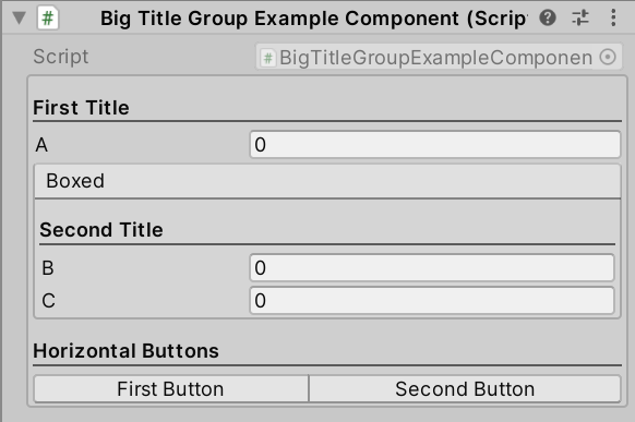
// BigTitleGroupExampleComponent.cs
using Sirenix.OdinInspector;
using UnityEngine;

public class BigTitleGroupExampleComponent : MonoBehaviour
{
    [BoxGroup("Titles", ShowLabel = false)]
    [TitleGroup("Titles/First Title")]
    public int A;

    [BoxGroup("Titles/Boxed")]
    [TitleGroup("Titles/Boxed/Second Title")]
    public int B;

    [TitleGroup("Titles/Boxed/Second Title")]
    public int C;

    [TitleGroup("Titles/Horizontal Buttons")]
    [ButtonGroup("Titles/Horizontal Buttons/Buttons")]
    public void FirstButton() { }

    [ButtonGroup("Titles/Horizontal Buttons/Buttons")]
    public void SecondButton() { }
}
2.3 EnumPaging
为枚举添加“下一步”和“上一步”按钮选择器,循环查看枚举属性的可用值。
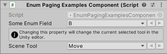
// EnumPagingExamplesComponent.cs

using Sirenix.OdinInspector;
using UnityEngine;

public class EnumPagingExamplesComponent : MonoBehaviour
{
    [EnumPaging]
    public SomeEnum SomeEnumField;

    public enum SomeEnum
    {
        A, B, C
    }

#if UNITY_EDITOR // UnityEditor.Tool is an editor-only type, so this example will not work in a build
    [EnumPaging, OnValueChanged("SetCurrentTool")]
    [InfoBox("Changing this property will change the current selected tool in the Unity editor.")]
    public UnityEditor.Tool sceneTool;

    private void SetCurrentTool() {
        UnityEditor.Tools.current = this.sceneTool;
    }
#endif
}
2.4 EnumToggleButtons
在水平按钮组中绘制枚举,而不是下拉列表。
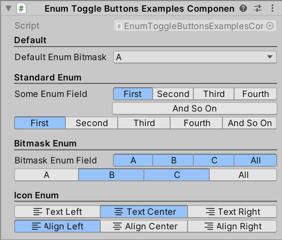
// EnumToggleButtonsExamplesComponent.cs

using Sirenix.OdinInspector;
using UnityEngine;

public class EnumToggleButtonsExamplesComponent : MonoBehaviour
{
    [Title("Default")]
    public SomeBitmaskEnum DefaultEnumBitmask;

    [Title("Standard Enum")]
    [EnumToggleButtons]
    public SomeEnum SomeEnumField; // 单选枚举

    [EnumToggleButtons, HideLabel]
    public SomeEnum WideEnumField; // 单选枚举

    [Title("Bitmask Enum")]
    [EnumToggleButtons]
    public SomeBitmaskEnum BitmaskEnumField; // 多选枚举

    [EnumToggleButtons, HideLabel]
    public SomeBitmaskEnum EnumFieldWide; // 多选枚举

    [Title("Icon Enum")]
    [EnumToggleButtons, HideLabel]
    public SomeEnumWithIcons EnumWithIcons;

    [EnumToggleButtons, HideLabel]
    public SomeEnumWithIconsAndNames EnumWithIconsAndNames;

    public enum SomeEnum
    {
        First, Second, Third, Fourth, AndSoOn
    }

    public enum SomeEnumWithIcons
    {
        [LabelText(SdfIconType.TextLeft)]   TextLeft,
        [LabelText(SdfIconType.TextCenter)] TextCenter,
        [LabelText(SdfIconType.TextRight)]  TextRight,
    }

    public enum SomeEnumWithIconsAndNames
    {
        [LabelText("Align Left", SdfIconType.TextLeft)]
        TextLeft,

        [LabelText("Align Center", SdfIconType.TextCenter)]
        TextCenter,

        [LabelText("Align Right", SdfIconType.TextRight)]
        TextRight,
    }

    [System.Flags]
    public enum SomeBitmaskEnum
    {
        A   = 1 << 1,
        B   = 1 << 2,
        C   = 1 << 3,
        All = A | B | C
    }
}
2.5 InlineButton
在属性右侧绘制按钮。
string action点击按钮时执行的方法。
SdfIconType icon按钮图标。
string label = null按钮显示名称。
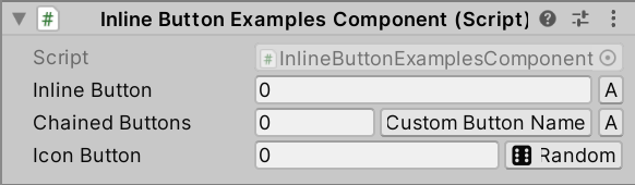
// InlineButtonExamplesComponent.cs

using Sirenix.OdinInspector;
using UnityEngine;

public class InlineButtonExamplesComponent : MonoBehaviour
{
    // Inline Buttons:
    [InlineButton("A")]
    public int InlineButton;

    [InlineButton("A")]
    [InlineButton("B", "Custom Button Name")]
    public int ChainedButtons;

    [InlineButton("C", SdfIconType.Dice6Fill, "Random")]
    public int IconButton;

    private void A() {
        Debug.Log("A");
    }

    private void B() {
        Debug.Log("B");
    }

    private void C() {
        Debug.Log("C");
    }
}
2.6 ResponsiveButtonGroup
将按钮绘制在组内,该组将响应其可用的水平空间。
string group = "_DefaultResponsiveButtonGroup"组名。
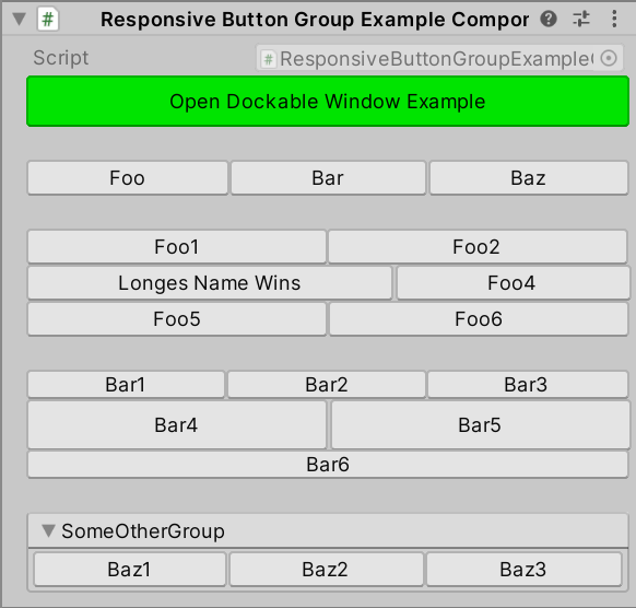
// ResponsiveButtonGroupExampleComponent.cs
using Sirenix.OdinInspector;
using UnityEngine;

#if UNITY_EDITOR // Editor namespaces can only be used in the editor.
using Sirenix.OdinInspector.Editor.Examples;
#endif

public class ResponsiveButtonGroupExampleComponent : MonoBehaviour
{
#if UNITY_EDITOR // Editor-related code must be excluded from builds
    [Button(ButtonSizes.Large), GUIColor(0, 1, 0)]
    private void OpenDockableWindowExample()
    {
        var window = UnityEditor.EditorWindow.GetWindow<MyDockableGameDashboard>();
        window.WindowPadding = new Vector4();
    }
#endif

    [OnInspectorGUI] private void Space1() { GUILayout.Space(20); }

    [ResponsiveButtonGroup] public void Foo() { }
    [ResponsiveButtonGroup] public void Bar() { }
    [ResponsiveButtonGroup] public void Baz() { }

    [OnInspectorGUI] private void Space2() { GUILayout.Space(20); }

    [ResponsiveButtonGroup("UniformGroup", UniformLayout = true)] public void Foo1() { }
    [ResponsiveButtonGroup("UniformGroup")] public void Foo2() { }
    [ResponsiveButtonGroup("UniformGroup")] public void LongesNameWins() { }
    [ResponsiveButtonGroup("UniformGroup")] public void Foo4() { }
    [ResponsiveButtonGroup("UniformGroup")] public void Foo5() { }
    [ResponsiveButtonGroup("UniformGroup")] public void Foo6() { }

    [OnInspectorGUI] private void Space3() { GUILayout.Space(20); }

    [ResponsiveButtonGroup("DefaultButtonSize", DefaultButtonSize = ButtonSizes.Small)] public void Bar1() { }
    [ResponsiveButtonGroup("DefaultButtonSize")] public void Bar2() { }
    [ResponsiveButtonGroup("DefaultButtonSize")] public void Bar3() { }
    [Button(ButtonSizes.Large), ResponsiveButtonGroup("DefaultButtonSize")] public void Bar4() { }
    [Button(ButtonSizes.Large), ResponsiveButtonGroup("DefaultButtonSize")] public void Bar5() { }
    [ResponsiveButtonGroup("DefaultButtonSize")] public void Bar6() { }

    [OnInspectorGUI] private void Space4() { GUILayout.Space(20); }

    [FoldoutGroup("SomeOtherGroup")]
    [ResponsiveButtonGroup("SomeOtherGroup/SomeBtnGroup")] public void Baz1() { }
    [ResponsiveButtonGroup("SomeOtherGroup/SomeBtnGroup")] public void Baz2() { }
    [ResponsiveButtonGroup("SomeOtherGroup/SomeBtnGroup")] public void Baz3() { }
}
与 TabGroup 结合使用:
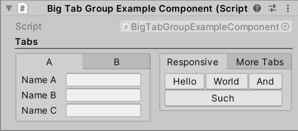
// BigTabGroupExampleComponent.cs

using Sirenix.OdinInspector;
using UnityEngine;

public class BigTabGroupExampleComponent : MonoBehaviour
{
    [TitleGroup("Tabs")]
    [HorizontalGroup("Tabs/Split", Width = 0.5f)]
    [TabGroup("Tabs/Split/Parameters", "A")]
    public string NameA, NameB, NameC;

    [TabGroup("Tabs/Split/Parameters", "B")]
    public int ValueA, ValueB, ValueC;

    [TabGroup("Tabs/Split/Buttons", "Responsive")]
    [ResponsiveButtonGroup("Tabs/Split/Buttons/Responsive/ResponsiveButtons")]
    public void Hello() { }

    [ResponsiveButtonGroup("Tabs/Split/Buttons/Responsive/ResponsiveButtons")]
    public void World() { }

    [ResponsiveButtonGroup("Tabs/Split/Buttons/Responsive/ResponsiveButtons")]
    public void And() { }

    [ResponsiveButtonGroup("Tabs/Split/Buttons/Responsive/ResponsiveButtons")]
    public void Such() { }

    [Button]
    [TabGroup("Tabs/Split/Buttons", "More Tabs")]
    [TabGroup("Tabs/Split/Buttons/More Tabs/SubTabGroup", "A")]
    public void SubButtonA() { }

    [Button]
    [TabGroup("Tabs/Split/Buttons/More Tabs/SubTabGroup", "A")]
    public void SubButtonB() { }

    [Button(ButtonSizes.Gigantic)]
    [TabGroup("Tabs/Split/Buttons/More Tabs/SubTabGroup", "B")]
    public void SubButtonC() { }
}


 5万+
5万+


 被折叠的 条评论
为什么被折叠?
被折叠的 条评论
为什么被折叠?
 到【灌水乐园】发言


