


css3新增了不少比较有意思的属性,今天笔者根据css3中的动画属性,简单创作了一个轮回写轮眼,供喜爱动漫的青少年欣赏学习。请先看效果图: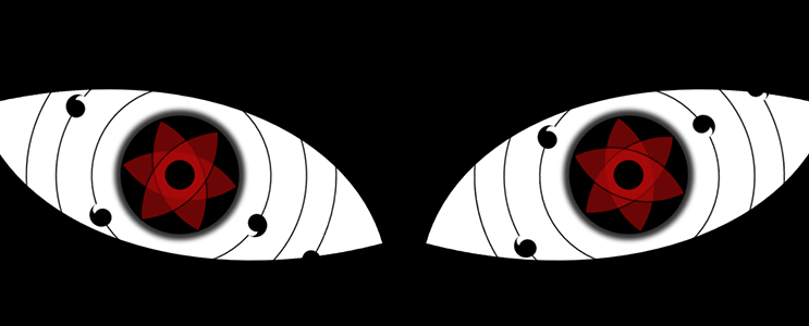
这里只用到了html和css没有用到JavaScript,jQuery等知识点。笔者下面贴出全部代码,然后对代码中部分知识点进行讲解。请看代码:
<!DOCTYPE html>
<html>
    <head>
        <meta charset="UTF-8">
        <title></title>
        <style type="text/css">
            *{
    padding: 0;margin: 0;}
            html body{
                background: black;
            }
            .box1{
                width: 600px;
                height: 400px;
                background: white;
                border: 5px solid black;
                margin-left: 0px;
                margin-top: 100px;
                border-radius: 0px 100%;
                position: relative;
                transform: rotate(-15deg);
                overflow: hidden;
                float: left;
            }
            .box2{
                width: 600px;
                height: 400px;
                background: white;
                border: 5px solid black;
                margin-left: 0px;
                margin-top: 100px;
                border-radius: 100% 0px;
                position: relative;
                transform: rotate(15deg);
                overflow: hidden;
                float: right;
            }
            .xielunyan{
                width: 200px;
                height: 200px;
                background: black;
                border-radius: 50%;
                position: absolute;
                left: 50%;
                top: 50%;
                margin-left: -100px;
                margin-top: -100px;
                box-shadow: 0px 0px 10px 10px #333;
            }
            .box1 .xielunyan{
                animation: run1 3s infinite linear;
            }
            .box2 .xielunyan{
                animation: run 3s infinite linear;
            }
            .tongkong{
                width: 50px;
                height: 50px;
                border-radius: 50%;
                background: black;
                position: absolute;
                left: 50%;
                top: 50%;
                margin-top: -25px;
                margin-left: -25px;
            }
            .xing1,.xing2,.xing3{
                width: 138px;
                height: 138px;
                border-radius: 100% 0px;
 最低0.47元/天 解锁文章


 扫一扫
扫一扫


 625
625

 被折叠的 条评论
为什么被折叠?
被折叠的 条评论
为什么被折叠?
 到【灌水乐园】发言


