


版本
7.4.0 classic
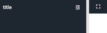
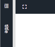
效果
- 展开
- 折叠
源码
- 覆盖panel组件updateCollapseTool方法修改折叠按钮图标
updateCollapseTool: function () {
    this.callParent();
    var me = this, collapseTool = me.collapseTool;
    if (collapseTool) {
        if (me.collapsed && !me.isPlaceHolderCollapse()) {
            collapseTool.setIconCls('x-fa fa-indent')
        } else {
            collapseTool.setIconCls('x-fa fa-outdent')
        }
    }
}
- 覆盖panel组件createReExpander方法修改展开按钮图标
createReExpander: function (direction, defaults) {
    var result = this.callParent([direction, defaults]);
    result.expandTool.setIconCls('x-fa fa-indent');
    return result;
}
EXT源码
- ext-classic/src/panel/Panel.js
// 更新折叠按钮图标
updateCollapseTool: function() {
    var me = this,
        collapseTool = me.collapseTool,
        toolCfg;

    if (!collapseTool && me.collapsible) {
        me.collapseDirection = me.collapseDirection || me.getHeaderPosition() || 'top';

        toolCfg = {
            xtype: 'tool',
            handler: me.toggleCollapse,
            scope: me
        };

        // In accordion layout panels are collapsible/expandable with keyboard
        // via the panel title that is focusable. There is no need to have a separate
        // collapse/expand tool for keyboard interaction but we still have to react
        // to mouse clicks, and historically accordion panels had coolapse tools
        // so we leave the tool but make it unfocusable and keyboard inactive.
        // Note that we do the same thing for the automatically added close tool
        // but NOT for the other tools.
        if (me.isAccordionPanel) {
            toolCfg.focusable = false;
            toolCfg.ariaRole = 'presentation';
        }

        me.collapseTool = me.expandTool = collapseTool = Ext.widget(toolCfg);
    }

    if (collapseTool) {
        if (me.collapsed && !me.isPlaceHolderCollapse()) {
            collapseTool.setType('expand-' + me.getOppositeDirection(me.collapseDirection));
            collapseTool.setTooltip(me.expandToolText);
        }
        else {
            collapseTool.setType('collapse-' + me.collapseDirection);
            collapseTool.setTooltip(me.collapseToolText);
        }
    }
},
// 创建展开按钮
createReExpander: function(direction, defaults) {
    var me = this,
        isLeft = direction === 'left',
        isRight = direction === 'right',
        isVertical = isLeft || isRight,
        ownerCt = me.ownerCt,
        header = me.header,
        result = Ext.apply({
            hideMode: 'offsets',
            title: me.getTitle(),
            titleAlign: me.getTitleAlign(),
            titlePosition: me.getTitlePosition(),
            vertical: isVertical,
            textCls: me.headerTextCls,
            icon: me.getIcon(),
            iconCls: me.getIconCls(),
            iconAlign: me.getIconAlign(),
            glyph: me.getGlyph(),
            baseCls: me.self.prototype.baseCls + '-header',
            ui: me.ui,
            frame: me.frame && me.frameHeader,
            ignoreParentFrame: me.frame || me.overlapHeader,
            ignoreBorderManagement: me.frame || me.ignoreHeaderBorderManagement,
            indicateDrag: me.draggable,
            collapseImmune: true,
            ariaRole: me.ariaRole,
            preventRefocus: true,
            ownerCt: (ownerCt && me.collapseMode === 'placeholder') ? ownerCt : me,
            ownerLayout: me.componentLayout,
            forceOrientation: true,
            margin: me.margin,
            // When placeholder is focused, focus the expander tool.
            // TODO: When https://sencha.jira.com/browse/EXTJS-19718 is
            // fixed, this should not be needed.
            // placeholder is a FocusableContainer
            defaultFocus: 'tool[isDefaultExpandTool]'
        }, defaults);

    // If we're in mini mode, set the placeholder size to only 1px since
    // we don't need it to show up.
    if (me.collapseMode === 'mini') {
        if (isVertical) {
            result.width = 1;
        }
        else {
            result.height = 1;
        }
    }

    if (header) {
        Ext.apply(result, {
            focusableContainer: header.focusableContainer,
            activeChildTabIndex: header.activeChildTabIndex,
            inactiveChildTabIndex: header.inactiveChildTabIndex,
            allowFocusingDisabledChildren: header.allowFocusingDisabledChildren
        });
    }

    // Create the re expand tool
    // For UI consistency reasons, collapse:left reExpanders, and region: 'west' placeHolders
    // have the re expand tool at the *top* with a bit of space.
    if (!me.hideCollapseTool) {
        if (!me.maintainTitlePosition && (isLeft || (isRight && me.isPlaceHolderCollapse()))) {
            // adjust the title position if the collapse tool needs to be at the
            // top of a vertical header
            result.titlePosition = 1;
        }

        result.tools = [{
            xtype: 'tool',
            type: 'expand-' + me.getOppositeDirection(direction),
            isDefaultExpandTool: true,
            uiCls: ['top'],
            handler: me.toggleCollapse,
            scope: me,
            tooltip: me.expandToolText
        }];
    }

    result = new Ext.panel.Header(result);
    result.addClsWithUI(me.getHeaderCollapsedClasses(result));

    result.expandTool = result.down('tool[isDefaultExpandTool=true]');

    return result;
},


 1053
1053


 被折叠的 条评论
为什么被折叠?
被折叠的 条评论
为什么被折叠?
 到【灌水乐园】发言


