


 本文介绍了R语言中用于组合多个图形的几种方法,包括cowplot宏包的plot_grid()函数、patchwork宏包、自定义layout以及par()函数。通过实例展示了如何使用这些方法将不同图形按需排列组合,以实现美观的多图展示。同时,文章还提供了详细的代码示例和参考资料链接,帮助读者掌握这些技巧。
组合图片
(1) cowplot
可以使用 cowplot 宏包的plot_grid()函数完成多张图片的组合,使用方法很简单。
p1 <- gapdata %>%
ggplot(aes(x = gdpPercap, y = lifeExp)) +
geom_point(aes(color = lifeExp > mean(lifeExp))) +
scale_x_log10() +
theme(legend.position = "none") +
scale_color_manual(values = c("orange", "pink")) +
labs(
title = "My Plot Title",
x = "The X Variable",
y = "The Y Variable"
)
p2 <- gapdata %>%
ggplot(aes(x = gdpPercap, y = lifeExp, color = continent)) +
geom_point() +
scale_x_log10() +
scale_color_manual(
values = c("#195744", "#008148", "#C6C013", "#EF8A17", "#EF2917")
) +
theme(legend.position = "none") +
labs(
title = "My Plot Title",
x = "The X Variable",
y = "The Y Variable"
)
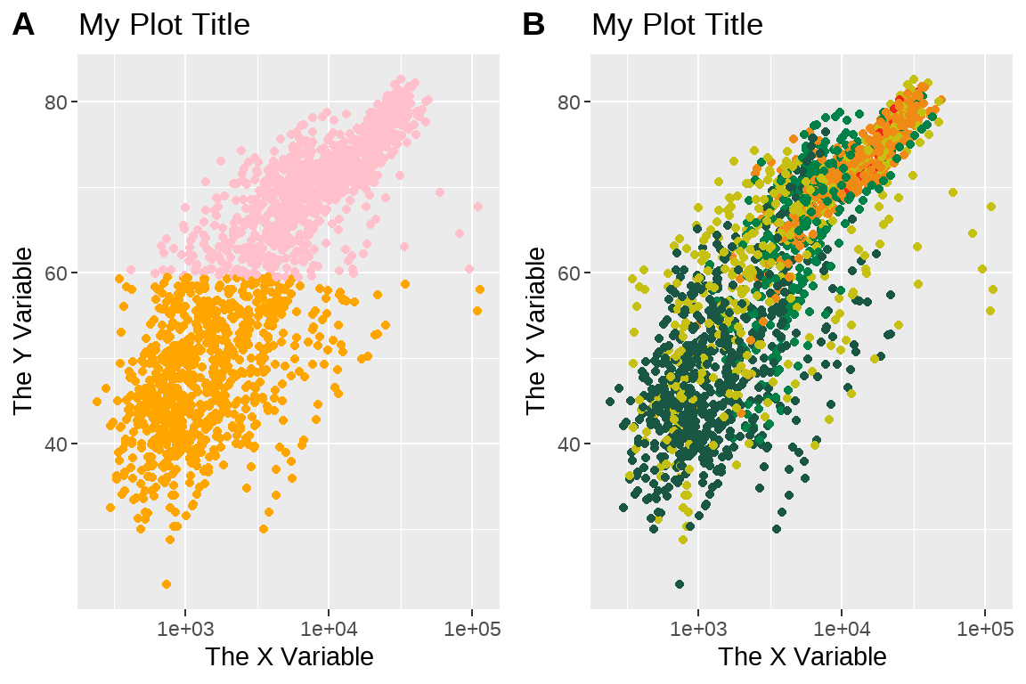
cowplot::plot_grid(
p1,
p2,
labels = c("A", "B")
)
参数及用法:http://www.idata8.com/rpackage/cowplot/plot_grid.html
示例:https://www.jianshu.com/p/6400fd3abc56
(2) patchwork宏包
也可以使用patchwork宏包,更简单的方法
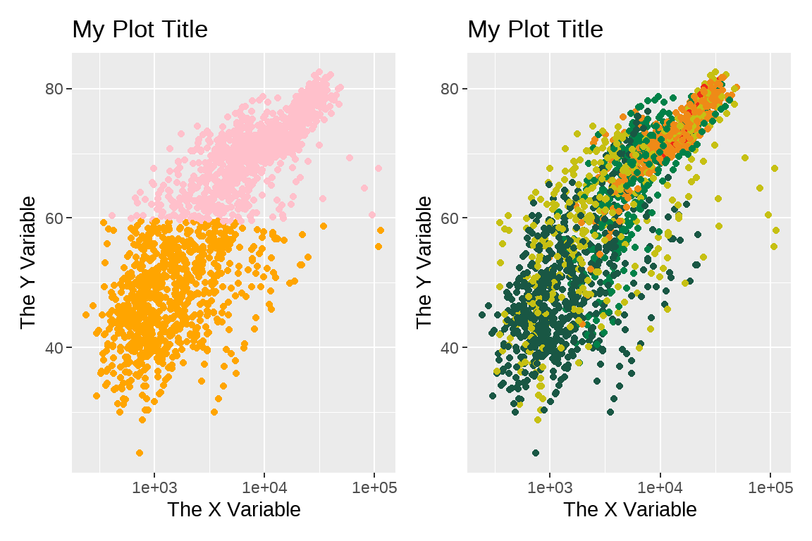
library(patchwork)
p1 + p2
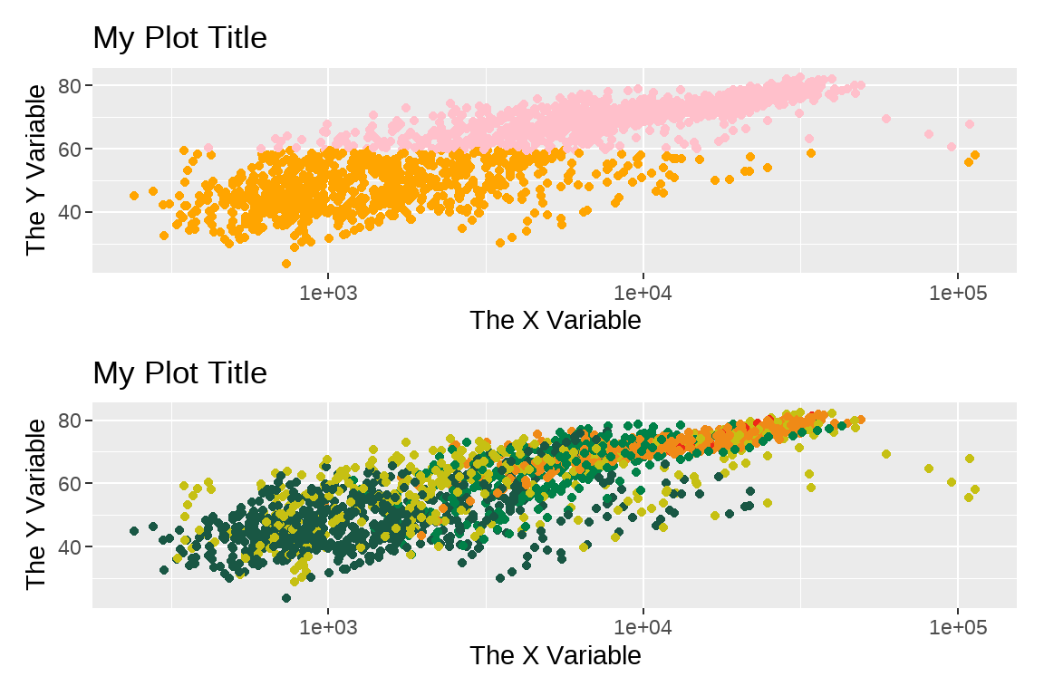
p1 / p2
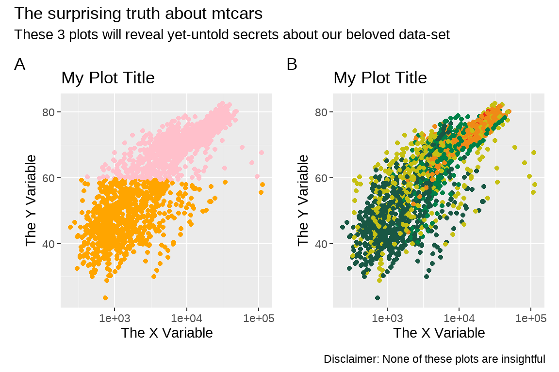
p1 + p2 +
  plot_annotation(
    tag_levels = "A",
    title = "The surprising truth about mtcars",
    subtitle = "These 3 plots will reveal yet-untold secrets about our beloved data-set",
    caption = "Disclaimer: None of these plots are insightful"
  )
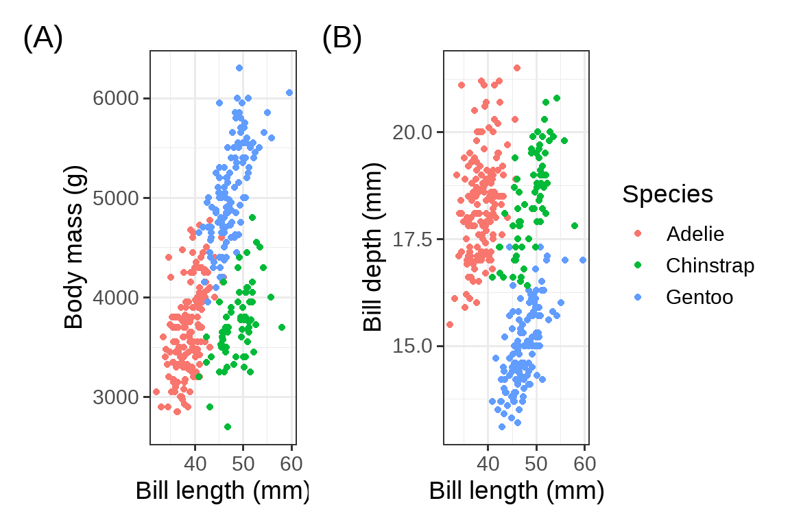
library(palmerpenguins)
g1 <- penguins %>%
  ggplot(aes(bill_length_mm, body_mass_g, color = species)) +
  geom_point() +
  theme_bw(base_size = 14) +
  labs(tag = "(A)", x = "Bill length (mm)", y = "Body mass (g)", color = "Species")
g2 <- penguins %>%
  ggplot(aes(bill_length_mm, bill_depth_mm, color = species)) +
  geom_point() +
  theme_bw(base_size = 14) +
  labs(tag = "(B)", x = "Bill length (mm)", y = "Bill depth (mm)",  color = "Species")
g1 + g2 + patchwork::plot_layout(guides = "collect")
参考:https://bookdown.org/wangminjie/R4DS/baseR-intro-ds.html
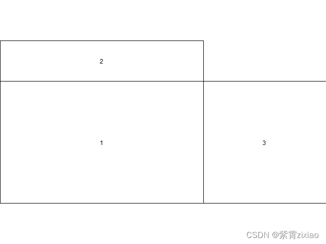
(3) 自定义布局layout
用法
layout(mat, widths = rep.int(1, ncol(mat)),
       heights = rep.int(1, nrow(mat)), respect = FALSE)
- mat 参数为一个矩阵,提供了作图的顺序以及图形版面的安排。0代表空缺,不绘制图形,大于0 的数代表绘图顺序,相同数字代表占位符。
- widths 和 heights 参数提供了各个矩形作图区域的长和宽的比例。
- respect 参数控制着各图形内的横纵轴刻度长度的比例尺是否一样。
- n 参数为欲显示的区域的序号。
matrix(c(0,2,0,0,1,3),2,3,byrow = T)
     [,1] [,2] [,3]
[1,]    0    2    0
[2,]    0    1    3
nf <- layout(matrix(c(0,2,0,0,1,3),2,3,byrow = T),c(0,5,3),c(1,3),TRUE);
layout.show(3)
参考:https://blog.csdn.net/qq_40794743/article/details/107897265
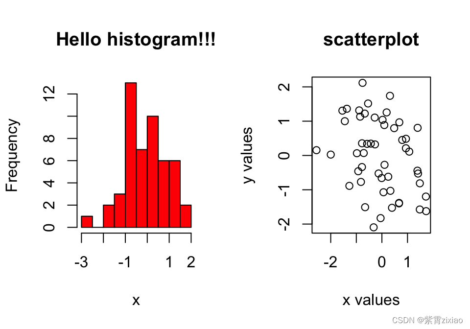
(4) par()
par(mfrow=c(1,2)) # 1行2列

# make the plots
hist(x,main="Hello histogram!!!",col="red")
plot(x,y,main="scatterplot",
        ylab="y values",xlab="x values")
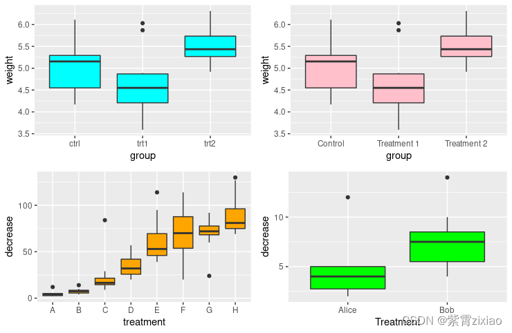
(5)gridExtra
library(ggplot2)
library(gridExtra)

p1 <- ggplot(PlantGrowth, aes(x = group, y = weight)) +
  geom_boxplot(fill = "cyan")

p2 <- ggplot(PlantGrowth, aes(x = group, y = weight)) +
  geom_boxplot(fill = "pink") +
  scale_x_discrete(
    labels = c("Control", "Treatment 1", "Treatment 2")
  )

p3 <- ggplot(OrchardSprays, aes(x = treatment, y = decrease)) +
  geom_boxplot(fill = "orange")

p4 <- ggplot(OrchardSprays, aes(x = treatment, y = decrease)) +
  geom_boxplot(fill = "green") +
  scale_x_discrete(
    limits = c("A", "B"),
    labels = c("Alice", "Bob"),
    name = "Treatment"
  )

grid.arrange(p1, p2, p3, p4, ncol = 2, nrow =2)


 1845
1845

 被折叠的 条评论
为什么被折叠?
被折叠的 条评论
为什么被折叠?
 到【灌水乐园】发言


