


整理了ARIMA的时间序列预测代码免费分享给大家,希望对大家有所帮助,记得点赞哦

#!/usr/bin/env python
# coding: 帅帅的笔者
# # 导入环境中的相关包
import itertools
import numpy as np #
import pandas as pd #
import matplotlib.pyplot as plt
from matplotlib.ticker import MultipleLocator
import warnings
from statsmodels.graphics.tsaplots import plot_acf, plot_pacf
from statsmodels.stats.diagnostic import acorr_ljungbox
from statsmodels.tsa.arima_model import ARIMA
from sklearn.metrics import r2_score # R square
from sklearn.metrics import mean_absolute_error # 平方绝对误差
from sklearn.metrics import mean_squared_error#均方根差,矩阵计算
import seaborn as sns
from statsmodels.tsa.stattools import adfuller
import math
import statsmodels.api as sm
#显示中文
#忽略警告
warnings.filterwarnings('ignore')
plt.rcParams['font.sans-serif']=['SimHei'] #用来正常显示中文标签
plt.rcParams['figure.figsize'] = (10.0, 8.0) # set default size of plots
plt.rcParams['image.interpolation'] = 'nearest'
plt.rcParams['image.cmap'] = 'gray'
df = pd.read_csv("shao - 单.csv", usecols=[1]) #读取数据
df.head()
# 显示原数据
plt.figure(figsize=(15, 3))
plt.title('')
plt.xlabel('点数(点/5min)')
plt.ylabel('DO')
plt.plot(df, 'blue', label='DO')
plt.legend()
plt.show()
#定义稳定性检验函数
def adf_val(ts, ts_title):
'''
ts: 时间序列数据,Series类型
ts_title: 时间序列图的标题名称,字符串
'''
# 稳定性(ADF)检验
adf, pvalue, usedlag, nobs, critical_values, icbest = adfuller(ts)
name = ['adf', 'pvalue', 'usedlag',
'nobs', 'critical_values', 'icbest']
values = [adf, pvalue, usedlag, nobs,
critical_values, icbest]
print(list(zip(name, values)))
return adf, pvalue, critical_values,
# 返回adf值、adf的p值、三种状态的检验值
#白噪声检验也称为纯随机性检验,当数据是纯随机数据时,再对数据进行分析就没有任何意义了,所以拿到数据后最好对数据进行一个纯随机性检验。
def acorr_val(ts):
'''
# 白噪声(随机性)检验
ts: 时间序列数据,Series类型
返回白噪声检验的P值
'''
lbvalue, pvalue = acorr_ljungbox(ts, lags=1) # 白噪声检验结果
return lbvalue, pvalue
def tsplot(y, lags=None, figsize=(14, 8)):
fig = plt.figure(figsize=figsize)
layout = (2, 2)
ts_ax = plt.subplot2grid(layout, (0, 0))
hist_ax = plt.subplot2grid(layout, (0, 1))
acf_ax = plt.subplot2grid(layout, (1, 0))
pacf_ax = plt.subplot2grid(layout, (1, 1))
y.plot(ax=ts_ax)
ts_ax.set_title('A Given Training Series')
y.plot(ax=hist_ax, kind='hist', bins=25)
hist_ax.set_title('Histogram')
#自相关(Autocorrelation): 对一个时间序列,现在值与其过去值的相关性。如果相关性为正,则说明现有趋势将继续保持。
plot_acf(y, lags=lags, ax=acf_ax)
#可以度量现在值与过去值更纯正的相关性
plot_pacf(y, lags=lags, ax=pacf_ax)
[ax.set_xlim(0) for ax in [acf_ax, pacf_ax]]
sns.despine()
fig.tight_layout()
fig.show()
return ts_ax, acf_ax, pacf_ax
ts_data = df.astype('float32')
#adf结果为-10.4, 小于三个level的统计值。pvalue也是接近于0 的,所以是平稳的
adf, pvalue1, critical_values = adf_val(ts_data, 'raw time series')
print('adf',adf)
print('pvalue1',pvalue1)
print('critical_values',critical_values)
#若p值远小于0.01,认为该时间序列是平稳的
aco=acorr_val(ts_data)
print('aco',aco)
##自相关和偏自相关
tsplot(ts_data, lags=20)
train_data, test_data = df[0:int(len(df)*0.8)], df[int(len(df)*0.8):]
#画出训练集和测试集的原数据(open 价格)
plt.figure(dpi=100, figsize=(20,4))
plt.title('', size=40)
plt.xlabel('points',size=30)
plt.ylabel('DO',size=30)
plt.plot(train_data, 'b', label='Training Data',linewidth=3)
plt.plot(test_data, 'g', label='Testing Data',linewidth=3)
font = {'serif': 'Times New Roman','size': 30}
plt.rc('font', **font)
plt.legend()
plt.show()
#取划分的数据
train_ar = train_data.values
test_ar = test_data.values
p_min = 0
p_max = 5
d_min = 0
d_max = 2
q_min = 0
q_max = 5
train_results = sm.tsa.arma_order_select_ic(train_ar, ic=['aic', 'bic'], trend='c', max_ar=p_max, max_ma=q_max)
print('AIC', train_results.aic_min_order)
print('BIC', train_results.bic_min_order)
# # 构建训练数据
history = [x for x in train_ar]
print(type(history))
predictions = list()
#训练ARIMA模型
for t in range(len(test_ar)):
model = sm.tsa.ARIMA(history, order=(3, 1, 1))
model_fit = model.fit()
output = model_fit.forecast()#模型预测
yhat = output[0]
predictions.append(yhat)
obs = test_ar[t]
history.append(obs)
print('predicted=%f, expected=%f' % (yhat, obs))
testScore = math.sqrt(mean_squared_error(test_ar, predictions))
print('RMSE %.3f ' %(testScore))
testScore = r2_score(test_ar, predictions)
print('R2 %.3f' %(testScore))
testScore = mean_absolute_error(test_ar, predictions)
print('MAE %.3f ' %(testScore))
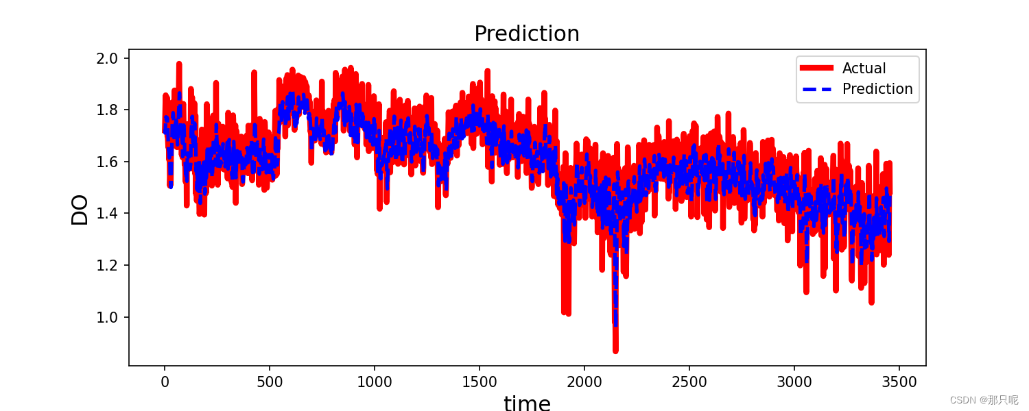
#只显示预测部分,不显示训练数据部分
plt.figure(figsize=(12,3))
plt.plot(test_data.index, predictions, color='b', marker='o', linestyle='dashed',label='Predicted Price')
plt.plot(test_data, color='red', label='Actual Price')
plt.title('')
plt.xlabel('points')
plt.ylabel('DO')
plt.legend()
plt.show()
更多ARIMA的组合模型获取链接:时间序列预测算法全集合--深度学习


 573
573


 被折叠的 条评论
为什么被折叠?
被折叠的 条评论
为什么被折叠?
 到【灌水乐园】发言


