


1. 自适应的椭圆
border-radius可以单独指定水平和垂直半径,用一个斜杠(/)分隔这两个值即可。
border-radius: 水平半径 / 垂直半径;
border-radius: 50% / 50%;即可实现一个自适应的椭圆;
- 半椭圆
border-radius: 50% / 100% 100% 0 0;
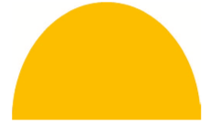
其中垂直半径分别为:左上角100% 右上角100% 左下角0 右下角0;
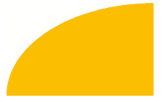
- 四分之一椭圆
border-radius: 100% 0 0 0;
2. 平行四边形
- 嵌套元素方案
<a href="#yolo" class="button">
	<div>Click me</div>
</a>
.button { transform: skewX(-45deg); }
.button > div { transform: skewX(45deg); }
- 伪元素方案
.button {
	position: relative;
	/* 其他的文字颜色、内边距等样式...... */
}
.button::before {
	content: ''; /* 用伪元素来生成一个矩形 */
	position: absolute;
	top: 0; right: 0; bottom: 0; left: 0;
	z-index: -1;
	background: #58a;
	transform: skew(45deg);
}
最终效果:

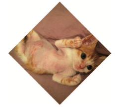
3. 菱形图片
- 基于变形的方案
<div class="picture">
	<img src="adam-catlace.jpg" alt="..." />
</div>
.picture {
	width: 400px;
	transform: rotate(45deg);
	overflow: hidden;
}
.picture > img {
	max-width: 100%;
	transform: rotate(-45deg) scale(1.42);
}
- 裁剪路径的方案
clip-path: polygon(50% 0, 100% 50%, 50% 100%, 0 50%);
最终效果:
4. 切角效果
采用CSS渐变实现:
background: #58a;
background: linear-gradient(-45deg, transparent 15px, #58a 0) right,
    		linear-gradient(45deg, transparent 15px, #655 0) left;
background-size: 50% 100%;
background-repeat: no-repeat;
最终效果:
弧形切角的实现:
background: #58a;
background:
    radial-gradient(circle at top left,
             transparent 15px, #58a 0) top left,
    radial-gradient(circle at top right,
             transparent 15px, #58a 0) top right,
    radial-gradient(circle at bottom right,
             transparent 15px, #58a 0) bottom right,
    radial-gradient(circle at bottom left,
             transparent 15px, #58a 0) bottom left;
background-size: 50% 50%;
background-repeat: no-repeat;
5. 梯形标签页
采用3D变形实现如下:
.tab {
	position: relative;
	display: inline-block;
	padding: .5em 1em .35em;
	color: white;
}
.tab::before {
	content: ''; /* 用伪元素来生成一个矩形 */
	position: absolute;
	top: 0; right: 0; bottom: 0; left: 0;
	z-index: -1;
	background: #58a;
	transform: scaleY(1.3) perspective(.5em) rotateX(5deg);
	transform-origin: bottom;
}
最终实现效果如下:

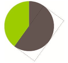
6. 简单的饼图
<div class="pie"></div>

.pie {
	position: relative;
	width: 100px;
	line-height: 100px;
	border-radius: 50%;
	background: yellowgreen;
	background-image: linear-gradient(to right, transparent 50%, #655 0);
	color: transparent;
	text-align: center;
}
@keyframes spin {
	to { transform: rotate(.5turn); }
}
@keyframes bg {
	50% { background: #655; }
}
.pie::before {
	content: '';
	position: absolute;
	top: 0;
	left: 50%;
	width: 50%;
	height: 100%;
	border-radius: 0 100% 100% 0 / 50%;
	background-color: inherit;
	transform-origin: left;
	animation: spin 50s linear infinite, bg 100s step-end infinite;
	animation-play-state: paused;
	animation-delay: inherit;
}
最终实现效果为:


 593
593


 被折叠的 条评论
为什么被折叠?
被折叠的 条评论
为什么被折叠?
 到【灌水乐园】发言


