


taoyan:伪码农,R语言爱好者,爱开源。
个人博客: https://ytlogos.github.io/
公众号:生信大课堂
往期回顾


绘制带有误差棒的条形图
library(ggplot2)
#创建数据集
df <- data.frame(treatment = factor(c(1, 1, 1, 2, 2, 2, 3, 3, 3)),
response = c(2, 5, 4, 6, 9, 7, 3, 5, 8),
group = factor(c(1, 2, 3, 1, 2, 3, 1, 2, 3)),
se = c(0.4, 0.2, 0.4, 0.5, 0.3, 0.2, 0.4, 0.6, 0.7))
head(df) #查看数据集
## treatment response group se
## 1 1 2 1 0.4
## 2 1 5 2 0.2
## 3 1 4 3 0.4
## 4 2 6 1 0.5
## 5 2 9 2 0.3
## 6 2 7 3 0.2
# 使用geom_errorbar()绘制带有误差棒的条形图
# 这里一定要注意position要与`geom_bar()`保持一致,由于系统默认dodge是0.9,
# 因此geom_errorbar()里面position需要设置0.9,width设置误差棒的大小
ggplot(data = df, aes(x = treatment, y = response, fill = group)) +
geom_bar(stat = "identity", position = "dodge") +
geom_errorbar(aes(ymax = response + se, ymin = response - se),
position = position_dodge(0.9), width = 0.15) +
scale_fill_brewer(palette = "Set1")

绘制带有显著性标记的条形图
label <- c("", "*", "**", "", "**", "*", "", "", "*") #这里随便设置的显著性,还有abcdef等显著性标记符号,原理一样,这里不再重复。
# 添加显著性标记跟上次讲的添加数据标签是一样的,这里我们假设1是对照
ggplot(data = df, aes(x = treatment, y = response, fill = group)) +
geom_bar(stat = "identity", position = "dodge") +
geom_errorbar(aes(ymax = response + se, ymin = response - se),
position = position_dodge(0.9), width = 0.15) +
geom_text(aes(y = response + 1.5 * se, label = label, group = group),
position = position_dodge(0.9), size = 5, fontface = "bold") +
scale_fill_brewer(palette = "Set1") #这里的label就是刚才设置的,group是数据集中的,fontface设置字体。

绘制两条形图中间带有星号的统计图
#创建一个简单的数据集
Control <- c(2.0,2.5,2.2,2.4,2.1)
Treatment <- c(3.0,3.3,3.1,3.2,3.2)
mean <- c(mean(Control), mean(Treatment))
sd <- c(sd(Control), sd(Treatment))
df1 <- data.frame(V=c("Control", "Treatment"), mean=mean, sd=sd)
df1$V <- factor(df1$V, levels=c("Control", "Treatment"))
#利用geom_segment()绘制图形
ggplot(data=df1, aes(x=V, y=mean, fill=V))+
geom_bar(stat = "identity",position = position_dodge(0.9),color="black")+
geom_errorbar(aes(ymax=mean+sd, ymin=mean-sd), width=0.05)+
geom_segment(aes(x=1, y=2.5, xend=1, yend=3.8))+#绘制control端的竖线
geom_segment(aes(x=2, y=3.3, xend=2, yend=3.8))+#绘制treatment端竖线
geom_segment(aes(x=1, y=3.8, xend=1.45, yend=3.8))+
geom_segment(aes(x=1.55, y=3.8, xend=2, yend=3.8))+#绘制两段横线
annotate("text", x=1.5, y=3.8, label="〇", size=5)#annotate函数也可以添加标签

为图形添加标题
图形标题有图标题、坐标轴标题、图例标题等
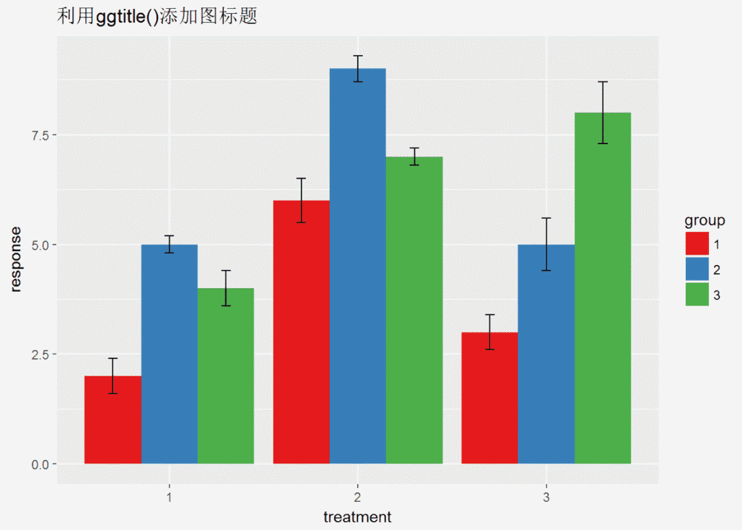
p <- ggplot(data = df, aes(x = treatment, y = response, fill = group)) +
geom_bar(stat = "identity", position = "dodge") +
geom_errorbar(aes(ymax = response + se, ymin = response - se),
position = position_dodge(0.9), width = 0.15) +
scale_fill_brewer(palette = "Set1")# 利用ggtitle()添加图标题,还有labs()也可以添加标题,最后会提一下。(有一个问题就是ggtitle()添加的标题总是左对齐)
p + ggtitle("利用ggtitle()添加图标题")
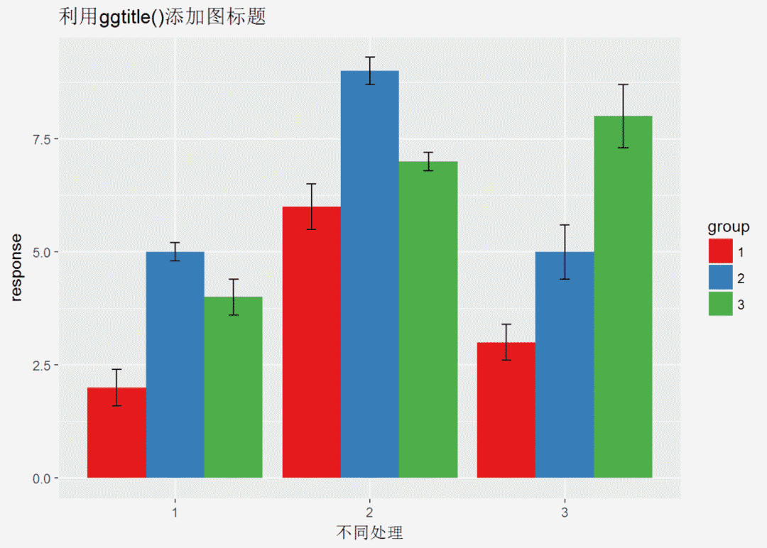
# 利用xlab()\ylab()添加/修改坐标轴标题
p + ggtitle("利用ggtitle()添加图标题") +
xlab("不同处理") +
ylab("response") #标题的参数修改在theme里,theme是一个很大的函数,几乎可以定义一切,下次有时间会讲解
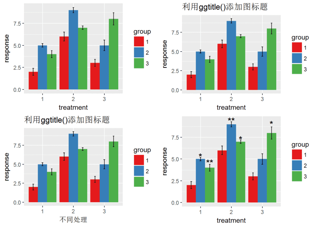
最后再讲解一下如何将多副图至于一个页面 利用包gridExtra中grid.arrange()函数实现
# 将四幅图放置于一个页面中
p <- ggplot(data = df, aes(x = treatment, y = response, fill = group)) +
geom_bar(stat = "identity", position = "dodge") +
geom_errorbar(aes(ymax = response + se, ymin = response - se),
position = position_dodge(0.9), width = 0.15) +
scale_fill_brewer(palette = "Set1")
p1 <- p + ggtitle("利用ggtitle()添加图标题")
p2 <- p + ggtitle("利用ggtitle()添加图标题") + xlab("不同处理") + ylab("response")
p3 <- ggplot(data = df, aes(x = treatment, y = response, fill = group)) +
geom_bar(stat = "identity", position = "dodge") +
geom_errorbar(aes(ymax = response + se, ymin = response - se),
position = position_dodge(0.9), width = 0.15) +
geom_text(aes(y = response + 1.5 * se, label = label, group = group),
position = position_dodge(0.9), size = 5, fontface = "bold") +
scale_fill_brewer(palette = "Set1")
library(gridExtra) #没有安装此包先用install.packages('gridExtra')安装
grid.arrange(p, p1, p2, p3)
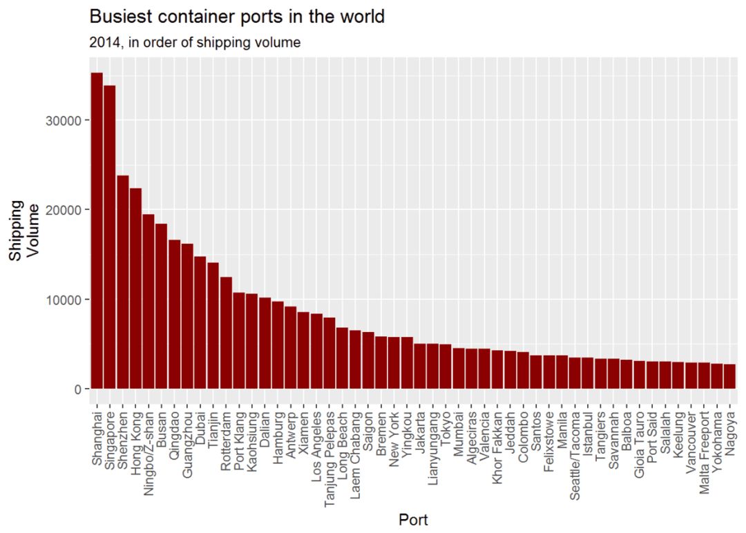
上次有人问坐标轴旋转的实现,坐标轴旋转有时是很有用的,下面是我看过的一个例子,用来介绍一下。
#先加载他的数据
url.world_ports <- url("http://sharpsightlabs.com/wpcontent/datasets/world_ports.RData")
load(url.world_ports)
knitr::kable(df.world_ports[1:5,])#该数据是关于世界上各个港口的数据汇总

library(dplyr) #用于数据操作,与ggplot2一样是R语言必学包#现在绘制条形图(%>%上次说过是管道操作,用于连接各个代码,十分有用)
df.world_ports%>%filter(year==2014)%>% #筛选2014年的数据
ggplot(aes(x=reorder(port_label, desc(volume)), y=volume))+
geom_bar(stat = "identity", fill="darkred")+
labs(title="Busiest container ports in the world")+
labs(subtitle = '2014, in order of shipping volume')+ #添加副标题
labs(x = "Port", y = "Shipping\nVolume")+
theme(axis.text.x = element_text(angle = 90, hjust = 1, vjust = .4))#调整x轴标签,angle=90表示标签旋转90度,从图中可以看出
#现在旋转坐标轴,并筛选排名小于25的港口,并且添加数据标签
df.world_ports %>% filter(year==2014, rank<=25) %>% #筛选2014年并且rank小于等于25的数据
ggplot(aes(x=reorder(port, volume), y=volume))+
geom_bar(stat = "identity", fill="darkred")+
labs(title="Busiest container ports in the world")+
labs(subtitle = '2014, in order of shipping volume')+
labs(x = "Port", y = "Shipping\nVolume")+
geom_text(aes(label=volume), hjust=1.2, color="white")+
coord_flip()#旋转坐标轴
两图相比,明显第二幅图好,一是可以添加数据标签,二是不用歪着脖子看。
本来打算讲讲图例的但是发现内容太多了,就不讲了,下次吧!

公众号后台回复关键字即可学习
回复 R R语言快速入门及数据挖掘
回复 Kaggle案例 Kaggle十大案例精讲(连载中)
回复 文本挖掘 手把手教你做文本挖掘
回复 可视化 R语言可视化在商务场景中的应用
回复 大数据 大数据系列免费视频教程
回复 量化投资 张丹教你如何用R语言量化投资
回复 用户画像 京东大数据,揭秘用户画像
回复 数据挖掘 常用数据挖掘算法原理解释与应用
回复 机器学习 人工智能系列之机器学习与实践
回复 爬虫 R语言爬虫实战案例分享


 324
324

 被折叠的 条评论
为什么被折叠?
被折叠的 条评论
为什么被折叠?
 到【灌水乐园】发言


