


往期知识点整理
- 【鸿蒙UI实战开发】基于List和Scroller由简单到复杂列表布局开发实践
- 【鸿蒙UI实战开发】基于原生能力的键盘控制
- 【鸿蒙UI实战开发】基于ArkUI现有能力实现自定义弹窗封装方案
- 【鸿蒙ArkUI实战】基于ImageKit对图片进行处理
- 【鸿蒙ArkUI开发】基于ArkUI的验证码实现
- 【鸿蒙ArkUI实战开发】基于原生能力的深色模式适配
- 【鸿蒙ArkUI实战开发】基于ArkUI的动效能力
- 【鸿蒙ArkUI实战开发】基于ArkUI的透明页面效果
- 【鸿蒙ArkUI实战开发】基于Search组件实现搜索栏
- 【鸿蒙ArkUI实战开发】基于Swiper的页面布局
- 持续更新中……
场景一:Swiper页面支持自定义动画
方案:
- 给Swiper组件设置.nextMargin(50).prevMargin(50)属性。
- 给Swiper组件添加onChange事件,设置当前this.currentIndex=index,当currentIndex为首页或者尾页时,设置上一张以及下一张图片的缩放值。
核心代码:
.onChange((index) => {

console.info('changeIndex' + index)

this.currentIndex = index

// 设置当前index缩放值为最大值

this.scaleArray[this.currentIndex] = MAX_SCALE;

if (this.currentIndex == 0) {

// 当前index=0时,设置上一张图片的缩放值

this.scaleArray[this.scaleArray.length - 1] = MIN_SCALE

} else

// 当前index不为0时,设置上一张图片的缩放值

{

this.scaleArray[this.currentIndex -1] = MIN_SCALE

}


if (this.currentIndex == this.scaleArray.length - 1) {

// 当index为最后一张图片时,设置下一张图片的缩放值

this.scaleArray[0] = MIN_SCALE

} else

// 当index不为最后一张时,设置上一张图片的缩放值

{

this.scaleArray[this.currentIndex + 1] = MIN_SCALE

}

})
3.设置Swiper组件的.displayMode(SwiperDisplayMode.STRETCH)使其Swiper滑动一页的宽度为Swiper组件自身的宽度,如果displayMode属性为SwiperDisplayMode.AUTO_LINEAR时,customContentTransition接口不生效。
4.给Swiper添加customContentTransition(transition: SwiperContentAnimatedTransition)事件,设置页面移除视窗时超时1000ms下渲染树,然后对视窗内所有页面逐帧回调transition。想要实现显示在视窗内正中间的Index为正常状态,两边的index图片为缩小状态。通过事件回调的proxy获取下面数据,通过滑动的距离来计算滑动过程中图片的缩放值。
.customContentTransition({

// 页面移除视窗时超时1000ms下渲染树

timeout: 1000,

// 对视窗内所有页面逐帧回调transition,在回调中修改opacity、scale、translate、zIndex等属性值,实现自定义动画

transition: (proxy: SwiperContentTransitionProxy) => {

if (this.startSwiperOffset == 0) {

this.startSwiperOffset = proxy.position * proxy.mainAxisLength;

console.info('startSwiperOffset:' + this.startSwiperOffset)

}

console.info('proxy-selectedIndex:' + proxy.selectedIndex + '--index:' + proxy.index +

'--position:' + proxy.position + '--mainAxisLength:' + proxy.mainAxisLength)

let offset: number = proxy.position * proxy.mainAxisLength // 移动距离

let currentScale: number = this.scaleArray[proxy.index] //当前index缩放值


let nextIndex = (proxy.index == this.scaleArray.length - 2 ? 0 : proxy.index + 1) //计算下一个index

let preIndex = (proxy.index == 0 ? this.scaleArray.length - 2 : proxy.index - 1) //计算上一个index


let nextScale: number = this.scaleArray[nextIndex] //下一个index缩放值

let preScale: number = this.scaleArray[preIndex] //上一个index缩放值

// 通过滑动的距离来计算滑动过程中图片的缩放值

let distance = Math.abs(offset)

currentScale = MAX_SCALE - Math.min(distance / DRAGGING_MAX_DISTANCE, MAX_SCALE - MIN_SCALE) //当前缩放值

if (this.startSwiperOffset > offset) {

nextScale = MIN_SCALE + Math.min(distance / DRAGGING_MAX_DISTANCE, MAX_SCALE - MIN_SCALE)

preScale = MIN_SCALE

} else {

preScale = MIN_SCALE + Math.min(distance / DRAGGING_MAX_DISTANCE, MAX_SCALE - MIN_SCALE)

nextScale = MIN_SCALE

}

this.scaleArray[this.currentIndex] = currentScale //当前index缩放值

this.scaleArray[nextIndex] = nextScale //下一个index缩放值

this.scaleArray[preIndex] = preScale //上一个index缩放值

}

})
场景二:Swiper指示器距离底部位置
方案:
此方案只适用于指示点距离底部的位置
将Swiper分成两个部分上部分为Swiper内容区,下部分为一块空白区域, 空白区域专门放置指示器点。可以通过indicator 属性去设置指示器点的部分样式。
@Entry

@Component

struct SwiperPageTwo {

@State message: string = 'Hello World';

private bannerInfo: number[] = [1, 2, 3, 4]

dataList:Color[] = [Color.Gray, Color.Yellow, Color.Blue,Color.Pink,Color.Orange]


build() {

if (this.bannerInfo && this.bannerInfo.length > 0) {

Swiper() {

ForEach(this.bannerInfo, (item: number, index: number) => {

Column() {

// 第一部分 Swiper内容区域

Column()

.width("100%")

.height(200)

.borderRadius("8vp")

.backgroundColor(this.dataList[index])

// 第二部分 指示点区域

Column() {


}.width('100%')

.height(35)

}


})

}

.cachedCount(2)

.autoPlay(true)

.interval(3000)

.vertical(false)

.loop(true)

.margin({ left: "16vp", right: "16vp" })

.indicator(

new DotIndicator()

.bottom(5)

.itemWidth("8vp")

.itemHeight("8vp")

.selectedItemWidth("10vp")

.selectedItemHeight("10vp")

.color(Color.Green)

.selectedColor(Color.Orange)

)

}

}

}
场景三:Swiper自定义指示器
目前Swiper自带的指示器位置限定比较固定,不能完全靠底部、左边或者右边以及不能调整指示器中间间距,因此可以考虑自定义指示器,将指示器位置定位到我们所需的地方。
方案:
给Swiper自带指示器设置.indicator(false),然后在Swiper组件下面写一个自定义的指示器。
// 自定义指示器,可以通过定位

Row() {

ForEach(this.data, (item: string, index: number) => {

Column()

.width(this.currentIndex === index ? 10 : 5)

.height(5)// 设置指示点中间间距

.margin(5)

.borderRadius(5)

.backgroundColor(Color.Green)

.backgroundColor(this.currentIndex === index ? Color.Red : Color.Gray)

}, (item: string) => item)

}

//设置指示点距离Swiper上下的距离

.margin({ top: 5 })


// 设置指示点在Swiper的左边或者右边或者其他地方

// .position({x:0,y:300})
总是有很多小伙伴反馈说:鸿蒙开发不知道学习哪些技术?不知道需要重点掌握哪些鸿蒙开发知识点? 为了解决大家这些学习烦恼。在这准备了一份很实用的鸿蒙全栈开发学习路线与学习文档给大家用来跟着学习。
针对一些列因素,整理了一套纯血版鸿蒙(HarmonyOS Next)全栈开发技术的学习路线,包含了鸿蒙开发必掌握的核心知识要点,内容有(OpenHarmony多媒体技术、Napi组件、OpenHarmony内核、OpenHarmony驱动开发、系统定制移植……等)技术知识点。

《鸿蒙 (Harmony OS)开发学习手册》(共计892页):https://gitcode.com/HarmonyOS_MN/733GH/overview
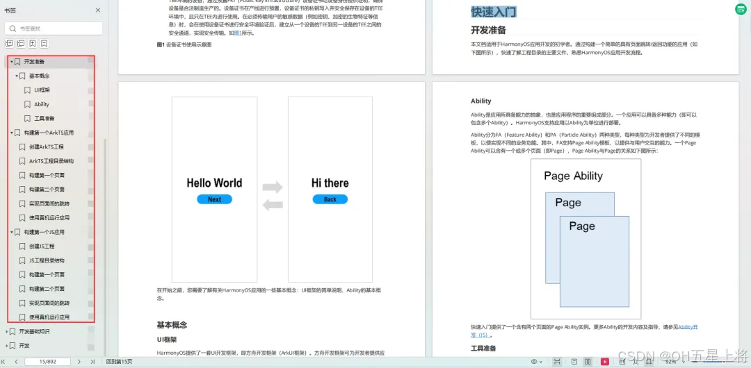
如何快速入门?
1.基本概念
2.构建第一个ArkTS应用
3.……
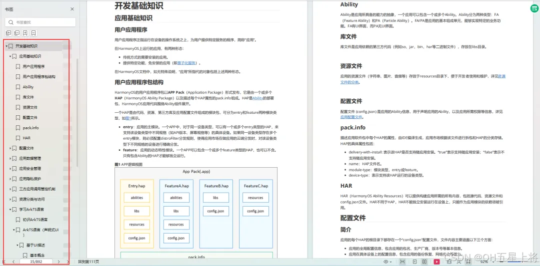
开发基础知识:
1.应用基础知识
2.配置文件
3.应用数据管理
4.应用安全管理
5.应用隐私保护
6.三方应用调用管控机制
7.资源分类与访问
8.学习ArkTS语言
9.……
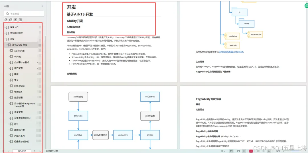
基于ArkTS 开发
1.Ability开发
2.UI开发
3.公共事件与通知
4.窗口管理
5.媒体
6.安全
7.网络与链接
8.电话服务
9.数据管理
10.后台任务(Background Task)管理
11.设备管理
12.设备使用信息统计
13.DFX
14.国际化开发
15.折叠屏系列
16.……
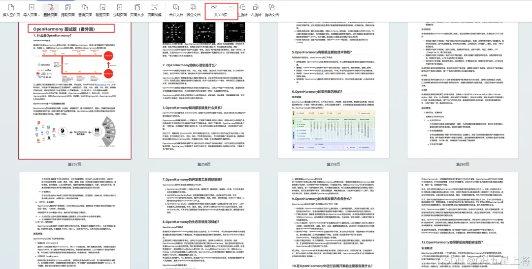
鸿蒙开发面试真题(含参考答案):https://gitcode.com/HarmonyOS_MN/733GH/overview
OpenHarmony 开发环境搭建
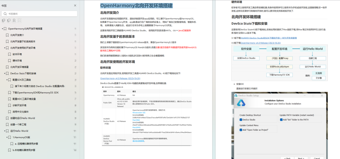
《OpenHarmony源码解析》:https://gitcode.com/HarmonyOS_MN/733GH/overview
- 搭建开发环境
- Windows 开发环境的搭建
- Ubuntu 开发环境搭建
- Linux 与 Windows 之间的文件共享
- ……
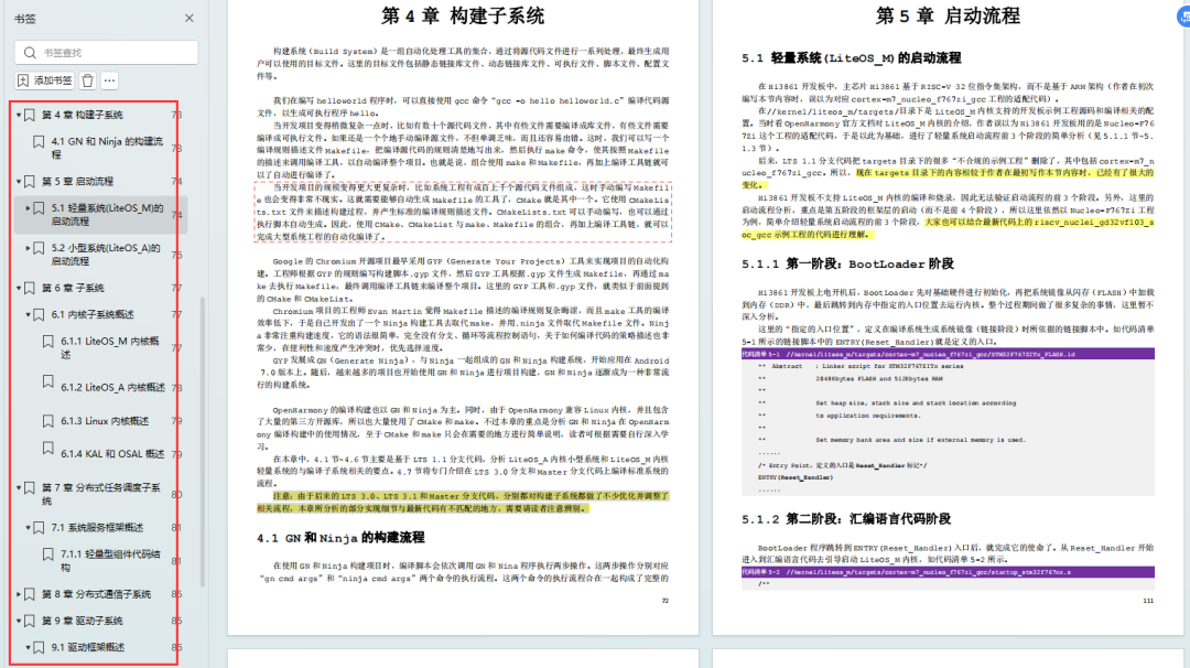
- 系统架构分析
- 构建子系统
- 启动流程
- 子系统
- 分布式任务调度子系统
- 分布式通信子系统
- 驱动子系统
- ……
OpenHarmony 设备开发学习手册:https://gitcode.com/HarmonyOS_MN/733GH/overview


 扫一扫
扫一扫
 4539
4539

 被折叠的 条评论
为什么被折叠?
被折叠的 条评论
为什么被折叠?
 到【灌水乐园】发言


