


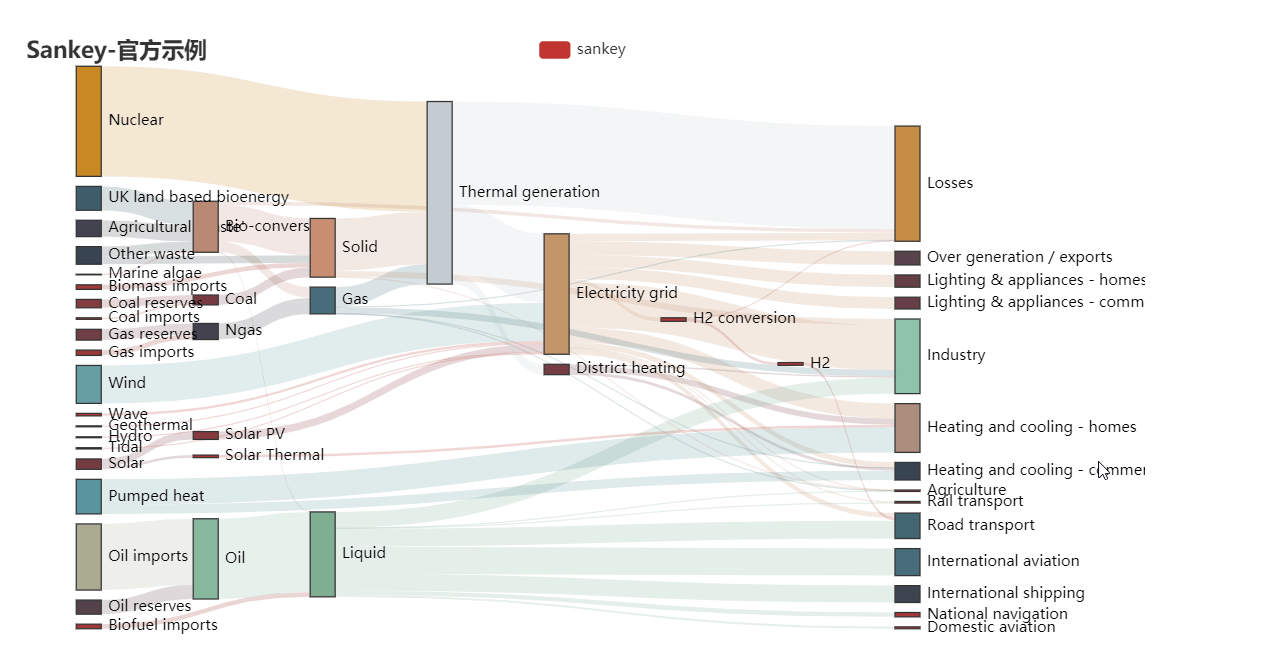
 桑基图是一种展示数据流转的流程图,常用于能源、材料成分等数据分析。本文通过多个经典例子介绍桑基图的历史及应用,并详细讲解如何使用Python的pyecharts库绘制桑基图,包括节点、链接的配置,线条样式、标签、对齐方式及方向的设置,以实现美观的可视化效果。
什么是桑基图
桑基图(Sankey diagram),即桑基能量分流图,也叫桑基能量平衡图。它是一种特定类型的流程图,核心在于展示数据的流转,图中延伸的分支的宽度对应数据流量的大小,通常应用于能源、材料成分、金融等数据的可视化分析。因1898年Matthew Henry Phineas Riall Sankey绘制的"蒸汽机的能源效率图"而闻名,此后便以其名字命名为"桑基图"。(来源:百度)
“桑基图”的数据特点是由源数据,目标数据,流量值三个量组成,源数据与目标数据之间是流量带,流量值越大流量带越宽。流量带由源数据流向目标数据,因为能量守恒,所以源数据宽度和目标数据宽度相等。
经典的桑基图
1869年的minard图
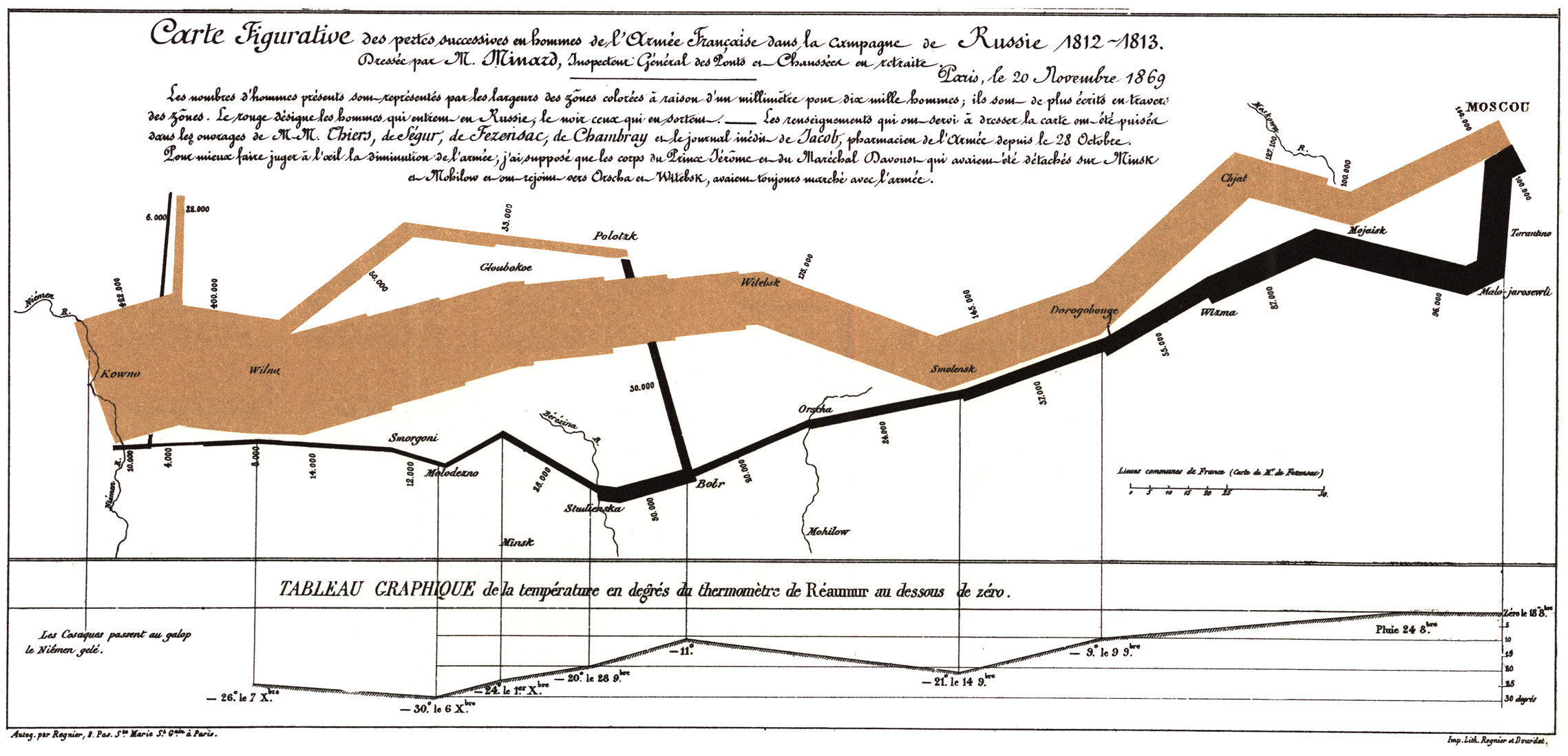
Charles Minard是信息图表之父,他是信息图领域的创始者。这张图描绘的是拿破仑在1812到1813年进攻俄国的情况。它的背景是一个真实的地图,西边是波兰的边境,东边是莫斯科。图上那条主线的宽度代表拿破仑军队的人数,黄色表示进攻路线,黑色表示撤退的路线:他开始于42万人,在向莫斯科进军的过程中丧失了很多人,到达莫斯科时只剩下10万人,而最后从莫斯科活着返回的只剩下1万人。
当时,这种图还不叫桑基图,因为桑基图的命名三十年之后才出现,但这张图很清晰的展现了“法国士兵人数” 这个值的流量变化过程,一路打,一路死,42万人最后剩下1万人回家,看这图就知道那场战争是多么的惨烈了。
1898年的蒸汽的能源效率图
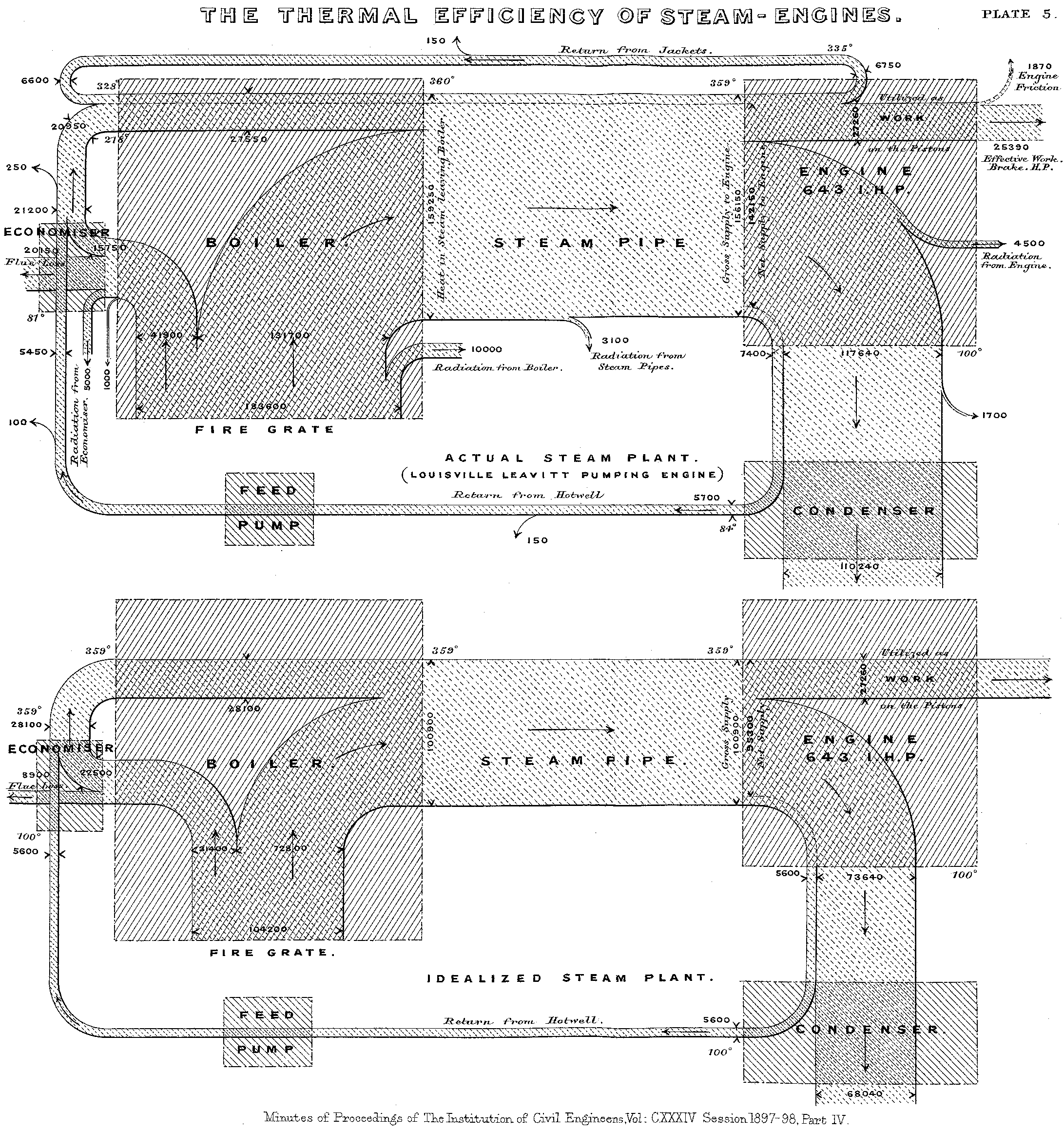
1898年,爱尔兰船长马修·亨利·菲尼亚斯·里亚尔·桑基(Matthew Henry Phineas Riall Sankey)使用了这种类型的图表展示了蒸汽的能源效率。与此同时,这个图也以船长的名字命名为“桑基图”。
法国公共管理部门的资金来源
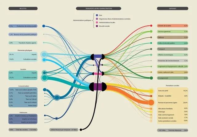
这张桑基图(Sankey Diagram)厘清了法国公共管理部门的资金来源,以及他们是如何分配这些资金的。
最左边的支点代表了不同的资金来源,包括社会、个人税收等。这些资金在汇总到法国的四大公共管理部门后,被再分配到交通、环境保护、住房、教育、文化等各个领域。 在描述收支情况时,桑基图能帮你捋清每一笔金钱的走向。钱都来自哪里,花在哪里,在一张桑基图上都能一目了然。
2017,年度行程表
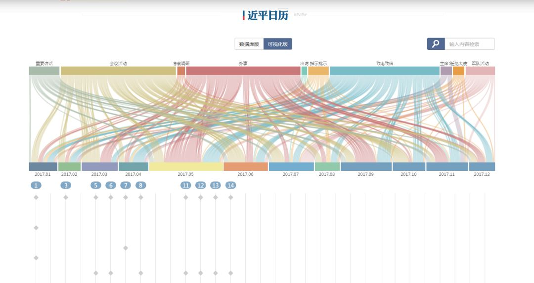
这张图是桑基图的一个变种,展示了2017年度的一个日常事务的分类与时间行程对应关系,桑基图清晰的展现了日常事务的那种密集、交叉与繁忙。
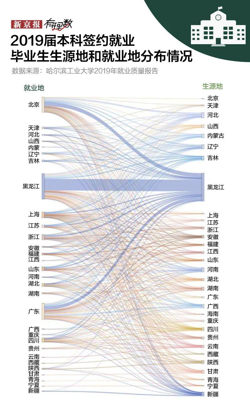
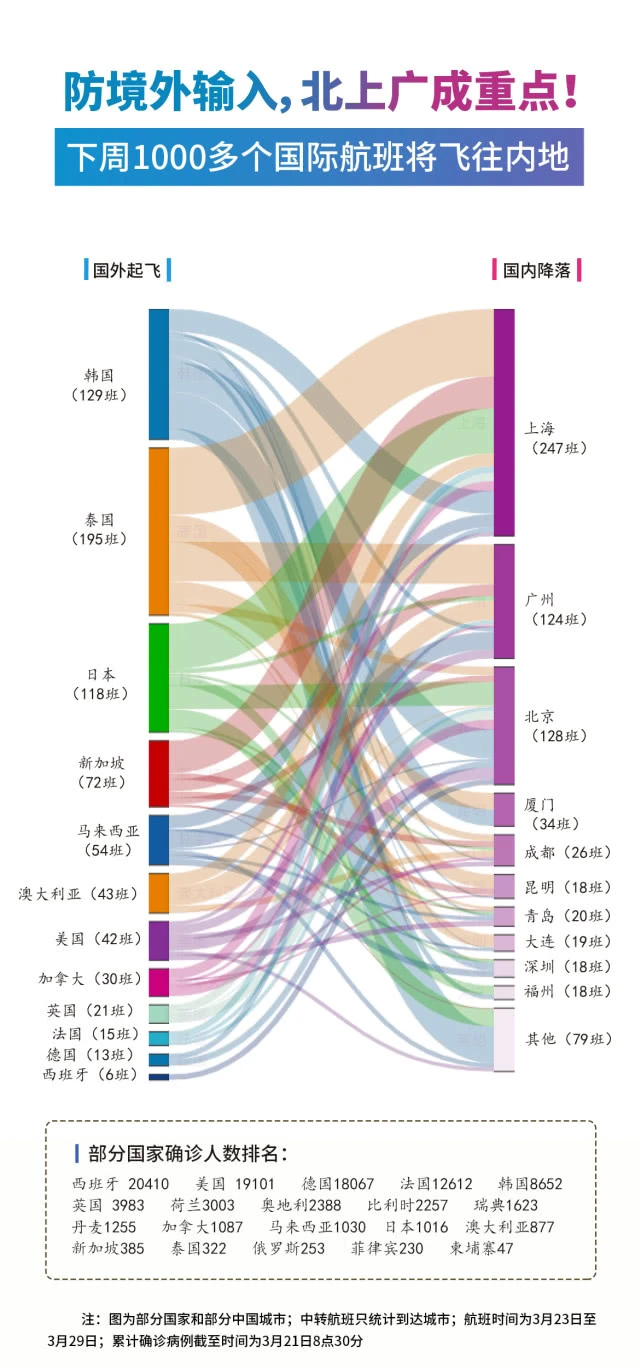
其他的各种典型桑基图
如何绘制一个桑基图?
绘制“桑基图”需要用到pyecharts库。
安装:
pip install pyecharts
官方地址:
https://github.com/pyecharts/pyecharts/
开源教程:
https://pyecharts.org/#/zh-cn/intro
代码基础框架如下:
from pyecharts.charts import Sankey
from pyecharts import options as opts

sankey = Sankey()
sankey.add(series_name=''  # 桑基图的名字
           , nodes=[]  # 配置有多少个结点
           , links=[]  # 配置结点之间的信息流关系
           , linestyle_opt=opts.LineStyleOpts()  # 线样式配置项
           , label_opts=opts.LabelOpts()  # 标签配置项
           , levels=[opts.SankeyLevelsOpts(), ...]  # 每一层节点配置
           , node_align=''  # 对齐方式的配置
           , orient=''  # 方向的配置
           )
sankey.render('sankey.html')  # 输出html文件
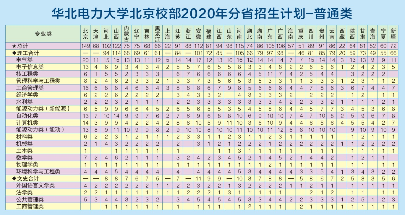
下面从华北电力大学的2020年分省招生计划中选择一些专业和省份来说明桑基图的绘制方法。
【例子】全部默认配置的桑基图
from pyecharts.charts import Sankey
from pyecharts import options as opts

nodes = [
    {'name': '电气类'}
    , {'name': '电子信息类'}
    , {'name': '核工程类'}
    , {'name': '管理科学与工程类'}
    , {'name': '工商管理类'}
    , {'name': '经济学类'}
    , {'name': '水利类'}
    , {'name': '北京'}
    , {'name': '天津'}
    , {'name': '河北'}
    , {'name': '山西'}
    , {'name': '内蒙古'}
]
links = [
    {'source': '北京', 'target': '电气类', 'value': 20}
    , {'source': '北京', 'target': '电子信息类', 'value': 13}
    , {'source': '北京', 'target': '核工程类', 'value': 6}
    , {'source': '北京', 'target': '管理科学与工程类', 'value': 8}
    , {'source': '北京', 'target': '工商管理类', 'value': 16}
    , {'source': '北京', 'target': '经济学类', 'value': 6}
    , {'source': '北京', 'target': '水利类', 'value': 2}

    , {'source': '天津', 'target': '电气类', 'value': 11}
    , {'source': '天津', 'target': '电子信息类', 'value': 4}
    , {'source': '天津', 'target': '核工程类', 'value': 1}
    , {'source': '天津', 'target': '管理科学与工程类', 'value': 2}
    , {'source': '天津', 'target': '工商管理类', 'value': 6}
    , {'source': '天津', 'target': '经济学类', 'value': 2}
    , {'source': '天津', 'target': '水利类', 'value': 2}

    , {'source': '河北', 'target': '电气类', 'value': 15}
    , {'source': '河北', 'target': '电子信息类', 'value': 6}
    , {'source': '河北', 'target': '核工程类', 'value': 5}
    , {'source': '河北', 'target': '管理科学与工程类', 'value': 4}
    , {'source': '河北', 'target': '工商管理类', 'value': 8}
    , {'source': '河北', 'target': '经济学类', 'value': 2}
    , {'source': '河北', 'target': '水利类', 'value': 2}

    , {'source': '山西', 'target': '电气类', 'value': 15}
    , {'source': '山西', 'target': '电子信息类', 'value': 9}
    , {'source': '山西', 'target': '核工程类', 'value': 5}
    , {'source': '山西', 'target': '管理科学与工程类', 'value': 6}
    , {'source': '山西', 'target': '工商管理类', 'value': 8}
    , {'source': '山西', 'target': '经济学类', 'value': 6}
    , {'source': '山西', 'target': '水利类', 'value': 3}

    , {'source': '内蒙古', 'target': '电气类', 'value': 13}
    , {'source': '内蒙古', 'target': '电子信息类', 'value': 3}
    , {'source': '内蒙古', 'target': '核工程类', 'value': 2}
    , {'source': '内蒙古', 'target': '管理科学与工程类', 'value': 2}
    , {'source': '内蒙古', 'target': '工商管理类', 'value': 4}
    , {'source': '内蒙古', 'target': '经济学类', 'value': 2}
    , {'source': '内蒙古', 'target': '水利类', 'value': 2}
]
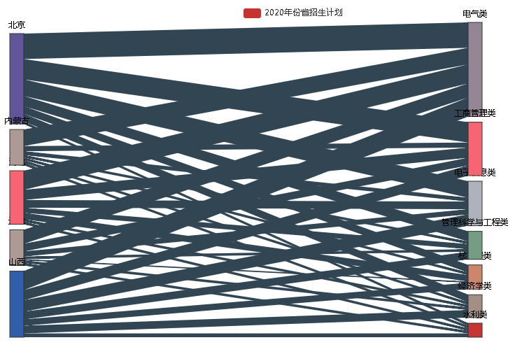
全部默认设置
sankey = Sankey()
sankey.add(
    series_name='2020年份省招生计划'
    , nodes=nodes
    , links=links
)
sankey.render('sankey.html')
得到的结果如下,可以看到格式相当不美观,接下来,我们看看怎么设置参数,使得图片更加好看。
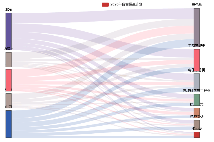
【例子】信息流的格式配置(颜色、透明度、曲线程度)
https://pyecharts.org/#/zh-cn/series_options?id=linestyleopts%ef%bc%9a%e7%ba%bf%e6%a0%b7%e5%bc%8f%e9%85%8d%e7%bd%ae%e9%a1%b9
sankey = Sankey()
sankey.add(
    series_name='2020年份省招生计划'
    , nodes=nodes
    , links=links
    , linestyle_opt=opts.LineStyleOpts(
        opacity=0.2  ###透明度设置
        , curve=0.5  ###信息流的曲线弯曲度设置
        , color="source"  ##颜色设置,source表示使用节点的颜色
    )  ##线条格式 ,设置所有线条的格式
)
sankey.render('sankey.html')
输出结果为如下,好看了许多,但是生源地和专业的字看不清楚,接下来继续配置标签。
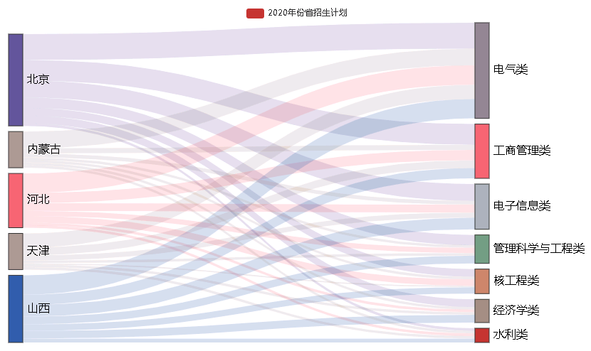
【例子】标签的格式配置(大小、颜色、位置)
https://pyecharts.org/#/zh-cn/series_options?id=labelopts%ef%bc%9a%e6%a0%87%e7%ad%be%e9%85%8d%e7%bd%ae%e9%a1%b9
sankey = Sankey()
sankey.add(
    series_name='2020年份省招生计划'
    , nodes=nodes
    , links=links
    , linestyle_opt=opts.LineStyleOpts(
        opacity=0.2  ###透明度设置
        , curve=0.5  ###信息流的曲线弯曲度设置
        , color="source"  ##颜色设置,source表示使用节点的颜色
    )  ##线条格式 ,设置所有线条的格式
    , label_opts=opts.LabelOpts(
        font_size=16
        , position='right'
    )  ##标签配置,具体参数详见opts.LabelOpts()
)
sankey.render('sankey.html')
输出结果如下,美观了不少。
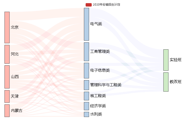
【例子】配置每一层节点的颜色
有时候需要将同一层节点的颜色配置为一致的,我们可以通过level参数逐层配置节点和信息流的格式。
nodes.extend(
    [{'name': '实验班'}
        , {'name': '教改班'}
     ]
)

links.extend(
    [{'source': '电气类', 'target': '实验班', 'value': 20}
        , {'source': '电气类', 'target': '教改班', 'value': 14}
        , {'source': '电子信息类', 'target': '实验班', 'value': 7}
        , {'source': '电子信息类', 'target': '教改班', 'value': 8}
        , {'source': '核工程类', 'target': '实验班', 'value': 5}
        , {'source': '核工程类', 'target': '教改班', 'value': 5}
        , {'source': '管理科学与工程类', 'target': '实验班', 'value': 6}
        , {'source': '管理科学与工程类', 'target': '教改班', 'value': 6}
        , {'source': '工商管理类', 'target': '实验班', 'value': 10}
        , {'source': '工商管理类', 'target': '教改班', 'value': 10}
     ]
)

sankey = Sankey()
sankey.add(
    series_name='2020年份省招生计划'
    , nodes=nodes
    , links=links
    , linestyle_opt=opts.LineStyleOpts(
        opacity=0.2  ###透明度设置
        , curve=0.5  ###信息流的曲线弯曲度设置
        , color="source"  ##颜色设置,source表示使用节点的颜色
    )  ##线条格式 ,设置所有线条的格式
    , label_opts=opts.LabelOpts(
        font_size=16
        , position='right'
    )  ##标签配置,具体参数详见opts.LabelOpts()
    , levels=[
        opts.SankeyLevelsOpts(
            depth=0,  ##第一层的配置
            itemstyle_opts=opts.ItemStyleOpts(color="#fbb4ae"),  ##节点格式的配置
            linestyle_opts=opts.LineStyleOpts(color="source", opacity=0.2, curve=0.5))
        , opts.SankeyLevelsOpts(
            depth=1,  ##第二层的配置
            itemstyle_opts=opts.ItemStyleOpts(color="#b3cde3"),  ##节点格式的配置
            linestyle_opts=opts.LineStyleOpts(color="source", opacity=0.2, curve=0.5))  ##信息的配置
        , opts.SankeyLevelsOpts(
            depth=2,  ##第三层的配置
            itemstyle_opts=opts.ItemStyleOpts(color="#ccebc5"),  ##节点格式的配置
            linestyle_opts=opts.LineStyleOpts(color="source", opacity=0.2, curve=0.5))  ##信息的配置
    ]  # 桑基图每一层的设置。可以逐层设置
)
sankey.render('sankey.html')
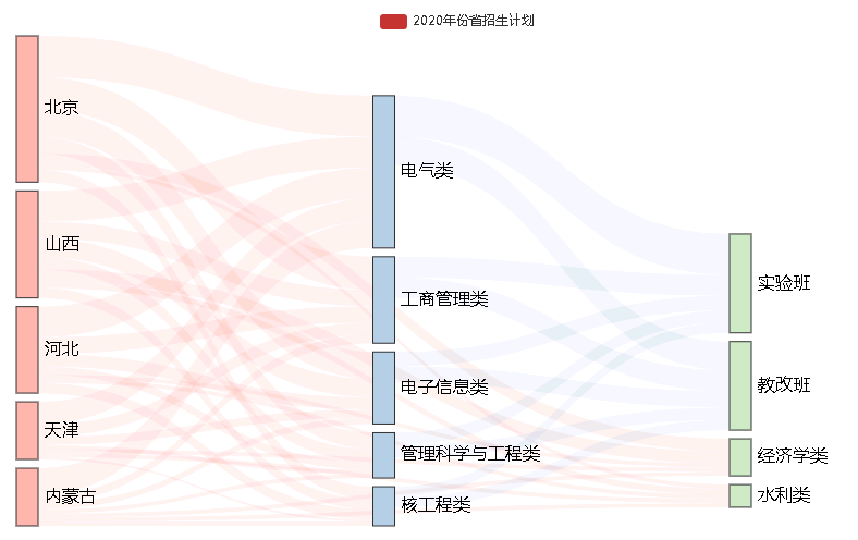
经济学类、水利类没有实验班和教改班,感官上不符合逻辑归类,于是我们进行“对齐方式”的设置。
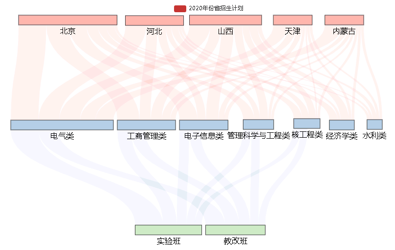
【例子】对齐方式的配置
如果个别节点没有下级节点,其他的节点有下级节点,为了美观一些,可以选择节点对齐的方式。通过node_align参数进行配置。
桑基图中节点的对齐方式,默认是双端对齐,可以设置为左对齐或右对齐,对应的值分别是:
justify:节点双端对齐。left:节点左对齐。right:节点右对齐
sankey = Sankey()
sankey.add(
    series_name='2020年份省招生计划'
    , nodes=nodes
    , links=links
    , node_align='left'
    , linestyle_opt=opts.LineStyleOpts(
        opacity=0.2  ###透明度设置
        , curve=0.5  ###信息流的曲线弯曲度设置
        , color="source"  ##颜色设置,source表示使用节点的颜色
    )  ##线条格式 ,设置所有线条的格式
    , label_opts=opts.LabelOpts(
        font_size=16
        , position='right'
    )  ##标签配置,具体参数详见opts.LabelOpts()
    , levels=[
        opts.SankeyLevelsOpts(
            depth=0,  ##第一层的配置
            itemstyle_opts=opts.ItemStyleOpts(color="#fbb4ae"),  ##节点格式的配置
            linestyle_opts=opts.LineStyleOpts(color="source", opacity=0.2, curve=0.5))
        , opts.SankeyLevelsOpts(
            depth=1,  ##第二层的配置
            itemstyle_opts=opts.ItemStyleOpts(color="#b3cde3"),  ##节点格式的配置
            linestyle_opts=opts.LineStyleOpts(color="source", opacity=0.2, curve=0.5))  ##信息的配置
        , opts.SankeyLevelsOpts(
            depth=2,  ##第三层的配置
            itemstyle_opts=opts.ItemStyleOpts(color="#ccebc5"),  ##节点格式的配置
            linestyle_opts=opts.LineStyleOpts(color="source", opacity=0.2, curve=0.5))  ##信息的配置
    ]  # 桑基图每一层的设置。可以逐层设置
)
sankey.render('sankey.html')
【例子】方向的配置
有时候,流程比较长,横向展示不美观,竖向的桑基图会美观一些。
桑基图中节点的布局方向,可以是水平的从左往右,也可以是垂直的从上往下。
对应的参数值分别是horizontal,vertical。
通过orient参数来配置。
orient='horizontal':表示水平横向orient='vertical':表示垂直竖向
sankey = Sankey()
sankey.add(
    series_name='2020年份省招生计划'
    , nodes=nodes
    , links=links
    , node_align='left'
    , orient='vertical'
    , linestyle_opt=opts.LineStyleOpts(
        opacity=0.2  ###透明度设置
        , curve=0.5  ###信息流的曲线弯曲度设置
        , color="source"  ##颜色设置,source表示使用节点的颜色
    )  ##线条格式 ,设置所有线条的格式
    , label_opts=opts.LabelOpts(
        font_size=16
        , position='bottom'
    )  ##标签配置,具体参数详见opts.LabelOpts()
    , levels=[
        opts.SankeyLevelsOpts(
            depth=0,  ##第一层的配置
            itemstyle_opts=opts.ItemStyleOpts(color="#fbb4ae"),  ##节点格式的配置
            linestyle_opts=opts.LineStyleOpts(color="source", opacity=0.2, curve=0.5))
        , opts.SankeyLevelsOpts(
            depth=1,  ##第二层的配置
            itemstyle_opts=opts.ItemStyleOpts(color="#b3cde3"),  ##节点格式的配置
            linestyle_opts=opts.LineStyleOpts(color="source", opacity=0.2, curve=0.5))  ##信息的配置
        , opts.SankeyLevelsOpts(
            depth=2,  ##第三层的配置
            itemstyle_opts=opts.ItemStyleOpts(color="#ccebc5"),  ##节点格式的配置
            linestyle_opts=opts.LineStyleOpts(color="source", opacity=0.2, curve=0.5))  ##信息的配置
    ]  # 桑基图每一层的设置。可以逐层设置
)
sankey.render('sankey.html')
【例子】其他参数配置
is_selected=True:图例是否选中pos_left='20%':图距离容器左边的距离pos_top='20%':图距离容器上端的距离pos_right='20%':图距离容器右侧的距离pos_bottom='20%':图距离容器下端的距离node_width=15:桑基图中每个矩形节点的宽度node_gap=20:每一列两个桑基图之间的距离is_draggable=True:是否能够拖动节点,默认拖动,可以不配置
sankey = Sankey()
sankey.add(
    series_name='2020年份省招生计划'
    , nodes=nodes
    , links=links
    , node_align='left'
    , orient='vertical'
    , is_selected=True  # 图例是否选中
    , pos_left='20%'  ##图距离容器左边的距离
    , pos_top='20%'  ##图距离容器上端的距离
    , pos_right='20%'  # 图距离容器右侧的距离
    , pos_bottom='20%'  ###图距离容器下端的距离
    , node_width=15  # 桑基图中每个矩形节点的宽度
    , node_gap=20  # 每一列两个桑基图之间的距离
    , is_draggable=True  ##是否能够拖动节点,默认拖动,可以不配置
    , linestyle_opt=opts.LineStyleOpts(
        opacity=0.2  ###透明度设置
        , curve=0.5  ###信息流的曲线弯曲度设置
        , color="source"  ##颜色设置,source表示使用节点的颜色
    )  ##线条格式 ,设置所有线条的格式
    , label_opts=opts.LabelOpts(
        font_size=16
        , position='bottom'
    )  ##标签配置,具体参数详见opts.LabelOpts()
    , levels=[
        opts.SankeyLevelsOpts(
            depth=0,  ##第一层的配置
            itemstyle_opts=opts.ItemStyleOpts(color="#fbb4ae"),  ##节点格式的配置
            linestyle_opts=opts.LineStyleOpts(color="source", opacity=0.2, curve=0.5))
        , opts.SankeyLevelsOpts(
            depth=1,  ##第二层的配置
            itemstyle_opts=opts.ItemStyleOpts(color="#b3cde3"),  ##节点格式的配置
            linestyle_opts=opts.LineStyleOpts(color="source", opacity=0.2, curve=0.5))  ##信息的配置
        , opts.SankeyLevelsOpts(
            depth=2,  ##第三层的配置
            itemstyle_opts=opts.ItemStyleOpts(color="#ccebc5"),  ##节点格式的配置
            linestyle_opts=opts.LineStyleOpts(color="source", opacity=0.2, curve=0.5))  ##信息的配置
    ]  # 桑基图每一层的设置。可以逐层设置
)
sankey.render('sankey.html')
参考文献:
- https://zhuanlan.zhihu.com/p/131373203


 1799
1799

 被折叠的 条评论
为什么被折叠?
被折叠的 条评论
为什么被折叠?
 到【灌水乐园】发言


