


You are now ready to set out on your adventure of designing advanced visualizations! Advanced does not necessarily mean difficult, since Tableau makes many visualizations easy to create. Advanced also does not necessarily mean complex. The goal is to communicate the data, not obscure it in needless complexity.
Instead, these visualizations are advanced in the sense that you will need to understand when they should be used, why they are useful, and how to leverage the capabilities of Tableau to create them. Additionally, many of the examples we will look at will introduce some advanced techniques, such as calculations, to extend the usefulness of foundational visualizations. Many of these techniques will be developed fully in future chapters, so don't worry about trying to absorb every detail right now.
Most of the examples in this chapter are designed so that you can follow along. However, don't simply memorize a set of instructions. Instead, take the time to understand how the combinations of different field types you place on different shelves change the way headers, axes, and marks are rendered. Experiment and even deviate from the instructions from time to time, just to see what else is possible. You can always use Tableau's back button to follow the example again!
In this chapter, visualizations will fall under the following major categories:
- Comparison
- Dates and times
- Parts of the whole
- Distributions
- Multiple axes
You may have noticed the lack of a spatial location or geographic category in the preceding list. Mapping was introduced in Chapter 1, Taking Off with Tableauhttps://blog.csdn.net/Linli522362242/article/details/122932763, and we'll get to some advanced geographic capabilities in Chapter 11 , Advanced Visualizations, Techniques, Tips, and Tricks.
You may recreate the examples that are found in this chapter by using the Chapter 03 Starter.twbx workbook, or even start from scratch by using a blank workbook and connecting to the Hospital Visits.csv file that's located in the Learning Tableau/Chapter 03 folder. The completed examples may be found in the Chapter 03 Complete.twbx workbook.
Comparing values
Often, you will want to compare the differences between measured values across different categories. You might find yourself asking the following questions:
- How many customers did each store serve?
- How much energy did each wind farm风电场 produce?
- How many patients did each doctor see?
In each case, you are looking to make a comparison (among stores, wind farms, or doctors) in terms of some quantitative measurement (number of customers, megawatts of electricity兆瓦电力, and patient).
Bar charts
You can sort a view in multiple ways, as follows:
- Click one of the sort icons on the toolbar
 : This results in an automatic sort of the dimension based on the measure that defined the axis. Changes in data or filtering that result in a new order will be reflected in the view.
 - Click the sort icon on the axis
 : The option icon will become visible when you hover over the axis and then remain in place when you enable the sort. This will also result in automatic sorting
 - Use the dropdown on the active dimension field and select Sort to view
 and edit the sorting options
 . You can also select Clear Sort to remove any sorting
 - Drag
 and drop
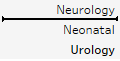 row headers to manually rearrange them. This results in a manual sort that does not get updated with data refreshes.
Any of these sorting methods are specific to the view and will override any default sort you defined in the metadata.

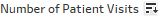
This bar chart makes it easy to compare the number of patient visits between various departments in the hospital. As a dimension, Department slices the data according to each distinct value such as ER急诊室, ICU, or Cardiology心脏病学. It creates a header for these values because it is discrete (blue). As a measure, Number of Patient Visits gives the sum of patient visits for each department. Because it is a continuous (green) field, it defines an axis, and bars are rendered to visualize the value.
Notice that the bar chart is sorted by the department having
- the highest sum of patient visits at the top
- and the lowest at the bottom.
Sorting a bar chart often adds a lot of value to the analysis because it makes it easier to make comparisons and see rank order. For example, it is easy to see that the Microbiology微生物科 department has had more patient visits than the Nutrition department. If the chart wasn't sorted, this may not have been as obvious.
Bar chart variations
A basic bar chart can be extended in many ways to accomplish various objectives. Consider the following variations:
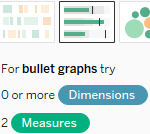
- Bullet chart to show progress toward a goal, target, or threshold
- Bar-in-bar chart to show progress toward a target or compare two specific values within a category
- Highlighting categories of interest
Bullet chart – comparing to a goal, target, or threshold
A bullet graph (sometimes also called a bullet chart) is a great way to visually compare a measure with a goal, target, or threshold.
- The bar indicates the measure value,
- while the line indicates the target.
- Tableau also defaults to shading to indicate 60% and 80% of the distance to the goal or threshold.
- The line and the shading are reference lines that can be adjusted (we'll explore how in detail in future chapters):
Let's say that hospital administration has set some goals regarding the time to service, that is, the number of minutes between the time a patient arrives at the hospital and the time they start receiving care. Administration knows that each department has unique capabilities and requirements, so they have defined different goals for each department, as follows: the Department field will be used in the data blend to link the two data sources
You maintain these goals in a spreadsheet (here, this is Hospital Goals.xlsx in the Chapter 03 folder). Your goal is to create a visualization that shows the actual averages per department in comparison to the goals that have been set by administration.
We'll build a bullet graph using the Chapter 3 workbook, which contains the Hospital Visits and the Hospital Goals spreadsheet data sources. We'll use these two data sources to visualize the relationship between actual and target minutes to service as you follow these steps:
- 1. Navigate to the Average Minutes to Service (Bullet Chart) sheet.

- 2. Using the Hospital Visits data source
 , create a basic bar chart of the average Minutes to Service per Department. (hint: use the drop-down arrow on the Minutes to Service field on Rows to select Measure | Average
 . This will set the appropriate aggregation).
 - 3. Sort Department from highest to lowest. At this point, your view should look like this:

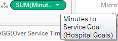
- 4. In the left-hand data pane, select the Hospital Goals data source(Edit Data Source...==>
 ) and then click to select the Minutes to Service Goal
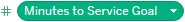 field in the data pane under Measures.
 - 5. Open Show Me and select the bullet graph
 . At this point, Tableau will have created a bullet graph using the fields in the view and the Minutes to Service Goal field you selected. You'll observe that the Department field has been used in the data blend to link the two data sources
 and that it is already enabled because the Department field was used in the view:
* The bar indicates the measure value(Average Minutes to Service)
* while the line indicates the target(goal:the number of minutes between the time a patient arrives at the hospital and the time they start receiving care).
* Tableau also defaults to shading to indicate 60% and 80% of the distance to the goal or threshold.
Tip:
When you use Show Me to create a bullet chart, you may sometimes find that Tableau uses the fields in reverse order from what you intend (with the wrong measure defining the axis and bars, and the other defining the reference line). If this happens, simply right-click the axis and select Swap reference line fields.
With bullet charts, it can be helpful to visually call out the bars that exceed the threshold直观地标出超出阈值的条形图. We'll look at creating calculations in depth in the next chapter, but for now, you can complete this example with the following steps:
- 1. Click the Hospital Visits data source to select it.
- 2. Right-click an empty spot in the data pane under Dimensions or Measures and select Create Calculated Field.
- 3. Name the calculated field Over Service Time Goal? with the following code:
Minutes to Service Goal : the number of minutes between the time a patient arrives at the hospital and the time they start receiving care
For each department :
:
wrong : AVG([Minutes to Service])>([Hospital Goals].[Minutes to Service Goal])
aggregate > non-aggregate(should use sum or avg for each department)
AVG([Minutes to Service])>SUM([Hospital Goals].[Minutes to Service Goal])
- 4. Click OK and drag the new Over Service Time Goal? field from the data pane and drop it on Color
 .
.  ==>
==>

The calculation
- returns true when the Average Minutes to Service values is greater than the goal value,
- and false otherwise.
With the calculated field on Color, it becomes very easy to see which departments are over the threshold. The bullet chart makes it easy to see which departments have gone over the threshold that's been set by administration.
Bar-in-bar chart
Another possibility for showing relationships between two values for each category is a bar-in-bar chart. Like the bullet chart, the bar-in-bar chart can show progress toward a goal, but it can also be used to compare any two values. For example, you might compare revenue to a target, or you might compare the revenue for the current year to the previous year:
To create this view, continue in the same workbook and follow these steps:
- 1. Navigate to the Year over Year Revenue (Bar-in-Bar) sheet.

- 2. Drag and drop Revenue from the Hospital Visits data source onto the horizontal axis in the view (which gives the same results as dropping it onto the Columns shelf).
- 3. Drag and drop Department Type onto Rows.
- 4. Drag and drop Date of Admit onto Color
 . We'll discuss dates in more detail in the next section, but you'll notice that Tableau uses the year of the date to give you a stacked bar chart that looks like this:
- 5. For a bar-in-bar chart, we do not want the marks to be stacked. To turn off stacking, use the top menu to select
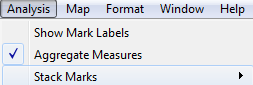 Analysis | Stack Marks | Off.
 - 6. All of the bar segments now begin at 0, but some may be completely overlapped
 . To see each bar, we'll need to adjust another visual element. In this case, hold down the Ctrl key while dragging the YEAR(Date of Admit)
 field that is currently on Color in the Marks card to Size
 .
.
Holding the Ctrl key while moving a field from one shelf to another creates a copy of the field instead.
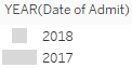
After completing the previous step, a size legend should appear. The bars will be sized based on the year and we will be able to see all of the segments that are available, even if they overlap. - 7. We want 2018 to be in front and 2017 to be in the background, so drag and drop 2018 within the Size legend to reorder the values so that 2017 comes after 2018:

- 8. Double-click the Color legend to edit the colors so that 2018 is emphasized. An orange or blue for 2018 with a light gray for 2017 would serve this purpose well (though you may find other color combinations you prefer!).

- Adding a border to the bars. Accomplish this by clicking the Color shelf and using the Border option.

- Adjusting the sizing of the view. Accomplish this by hovering over the canvas, just over the bottom border, until the mouse cursor changes to a sizing cursor
 , and then click and drag to resize the view.
- Adjusting the size range(bar width) to reduce the difference between the large and small extremes. Accomplish this by double-clicking the Size legend
 (or using the caret dropdown and selecting Edit from the menu).
- Hiding the size legend. You may decide that the size legend does not add anything to this particular view as size was only used to allow overlapping bars to be seen. To hide any legend, use the drop-down arrow on the legend and select Hide Card:


Highlighting categories of interest
Let's say one of your primary responsibilities at the hospital is to monitor the number of patient visits for the ICU and Neonatal[ˌniːoʊˈneɪtl]新生的 departments. You don't necessarily care about the details of other departments, but you do want to keep track of how your two departments compare with others. You might design something like this:
Now, as the data is refreshed over time, you will be able to immediately see how the two departments of interest to you compared to other departments. To create this view, follow these steps:
- 1. Navigate to the ICU and Neonatal sheet.

- 2. Place Department on Rows and Number of Patient Visits on Columns. Sort the bar chart in descending order.
- 3. Click on the bar in the view for ICU and, while holding down the Ctrl key, click the bar for Neonatal.
- 4. Hover the cursor over one of the selected bars for a few seconds and, from the menu that appears, click the Create Group button (which looks like a paperclip):

- 5. This will create a group, which results in a new dimension, named Department (group)
 , in the left-hand data pane. Tableau automatically assigns this field to Color.
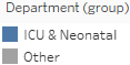
Ad hoc groups are powerful in Tableau. You can create groups in the view (as you did previously) or by using the menu for a dimension in the data pane and selecting Create | Group. You can use them as you would any other dimension. - 6. To add a label only to the bars for those two departments, right-click each bar and
 select Mark label | Always show. The label for the mark will always be shown, even if other labels are turned off for the view or the label overlaps marks or other labels.
Visualizing dates and times
In your analysis, you will often want to understand when something happened. You'll ask questions like the following:
- When did we gain the most new customers?
- What times of day have the highest call volume?
- What kinds of seasonal trends do we see in sales and profit?
Fortunately, Tableau makes this kind of visual discovery and analysis easy.
Date parts, date values, and exact dates
When you are connected to a flat file, relational, or extracted data source, Tableau provides a robust built-in date hierarchy for any date field.
Cubes/OLAP (multi-dimensional/Online analytical processing) connections do not allow for Tableau hierarchies. You will want to ensure that all date hierarchies and date values you need are defined in the cube.
To see this in action, continue with the Chapter 3 workbook, navigate to the Built-in Date Hierarchy sheet, and create a view similar to the one that was shown by dragging and dropping Number of Patient Visits to Rows and Date of Admit to Columns. The YEAR(Date of Admit) field on Columns will have a plus sign indicator, like this:![]() ==>click
==>click![]()
When you click it, the hierarchy expands by adding QUARTER(Date of Admit, Discrete quater Q2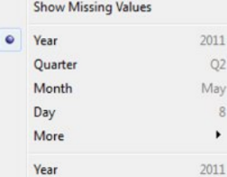 ) to the right of the YEAR(Date of Admit) on Columns, and the view is expanded to the new level of the hierarchy:
The YEAR(Date of Admit) field now has a minus sign indicator that allows you to collapse the hierarchy back to the year level. The QUARTER field also has a plus sign, indicating that you can expand the hierarchy further. Starting with Year, the hierarchy flows as follows: Year | Quarter | Month | Day. When the field is a date and time, you can further drill down into Hour | Minute | Second. Any of the parts of the hierarchy can be moved within the view or removed from the view completely.
The hierarchy is made up of Date Parts, which is one of the three ways a date field can be used. When you right-click the date field in the view or by using the drop-down menu, you'll see multiple date options, as follows:
The three major date types are evident, though not explicitly labeled, in the menu:
- Date part: This field will represent a specific part of the date, such as the quarter or month. The part of the date is used by itself and without reference to any other part of the date. This means that a date of November 8, 1980, when used as a month date part, is simply November. The November that's selected in the view here represents all of the Novembers in the dataset,
while the number of patient visits is the total for both 2017 and 2018:
discrete(can sort it )
)
continuous
- Date value: This field will represent a date value, but rolled up or truncated to the level you select. For example, if you select a date value of month, then November 8, 2018 gets truncated to the month and year, and is November 2018. You'll notice that November 2017 and November 2018 each have a separate value in the header and a distinct bar:
discrete(can sort it)
continuous
- Exact date: This field represents the exact date value (including time, if applicable) in the data. This means that November 8, 1980, 2:01 am is treated as distinct from November 8, 1980, 3:08 pm.
discrete(can sort it)
continuous
It is important to note that nearly any of these options can be used as discrete or continuous fields. Date parts are discrete by default. Date values and exact dates are continuous by default. However, you can switch between discrete and continuous as required to allow for flexibility in the visualization.
For example, you must have an axis (requiring a continuous field) to create a reference line. Also, Tableau will only connect lines at the lowest level of row or column headers. Using a continuous date value instead of multiple discrete date parts will allow you to connect lines across multiple years, quarters, and months.
当你的数据是以连续的日期索引时,在tableau中可以进行此最小日期索引单位的discrete和continuous交换操作。比如,你的连续的日期索引的最小单位是每日,那么就不能对小时,分钟,秒等进行discrete和continuous交换操作,但可以across multiple years, quarters, months, day等进行discrete和continuous交换操作
across multiple years~~discrete(can sort it ![]() )
)
across multiple years~~continuous
As a shortcut, you can right-click and then drag and drop a date field into the view(Columns or Rows shelf) to get a menu of options for how the date field should be used prior to the view being drawn. 
==>  ==>
==>
Variations of date and time visualizations
The ability to use various parts and values of dates and even mix and match them gives you a lot of flexibility in creating unique and useful visualizations.
For example, using the month date part for columns and the year date part for color![]() gives a time series that makes year-over-year analysis quite easy. The year date part has been copied to the label so that the lines can be labeled
gives a time series that makes year-over-year analysis quite easy. The year date part has been copied to the label so that the lines can be labeled![]() :
:
Font: right click![]() ==>Format...==>
==>Format...==>
Clicking on any of the shelves on the Marks card will give you a menu of options. Here, Label has been clicked, and the label![]() was adjusted to show only at the end of each line.
was adjusted to show only at the end of each line.
if you want to rotate x-axis tick label and font, just
- 1. right click the axis(such as Juanuary
 ) then
 - 2. click to select rotate label then repeat step 1, then click format

- OR just click format
 then set font format and alighment
if you want to set y-axis tick label format and y-axis title format just
- right click
 ==> click format
 ==>
==>
The following heat map is another example of using date parts on different shelves to achieve useful analysis. This kind of visualization can be quite useful when looking at patterns across different parts of time, such as hours in a day, or weeks in a month. Here, we are looking at how many patients were admitted by month and day:
black border and
and 

The year has not been included in the view, so this is an analysis of all years in the data and allows us to see whether there are any seasonal patterns or hotspots. We might notice patterns related to epidemics, doctors' schedules, or the timing of insurance benefits. Perhaps the increased intensity of patient admissions in February corresponds to the flu season.
Observe that placing a Continuous field on the Color shelf resulted in Tableau completely filling each intersection of Row and Column with the shade of color that encoded the sum of patient visits![]() . Clicking on the Color shelf gives us some fine-tuning options, including the option to add borders to marks. Here, a black border has been added to help distinguish each cell.
. Clicking on the Color shelf gives us some fine-tuning options, including the option to add borders to marks. Here, a black border has been added to help distinguish each cell.
Gantt Charts
Gantt Charts can be incredibly useful for understanding any series of events with a duration[djuˈreɪʃn]持续时间, especially if those events have some kind of relationship. Visually, they are very useful for determining whether certain events overlap, have dependency, or take longer or shorter than other events.
The following Gantt Chart shows a series of processes that run when an application is started. Some of these processes run in parallel, and some are clearly dependent on others. The Gantt Chart makes these dependencies clear: ==>
==>

To create a Gantt Chart in Tableau, you can select the Gantt mark type![]() on the marks card dropdown. This places a Gantt bar mark starting at the value that was defined by the field
on the marks card dropdown. This places a Gantt bar mark starting at the value that was defined by the field![]() (Exact Date) defining the axis. The length of the Gantt bar is then defined by the field on the Size card
(Exact Date) defining the axis. The length of the Gantt bar is then defined by the field on the Size card![]() , with positive values stretching to the right and negative values to the left.
, with positive values stretching to the right and negative values to the left.
At the hospital, you might want to see each patient visit to the ER(ER急诊室,就诊) in 2018 and understand
- how long each visit lasted, duration = Date of Discharge - Date of Admit
- whether any patients returned to the hospital, Date of Admit or Date of Discharge for each patient
- and how much time there was between visits. Date of Admit new patient- Date of Admit last patient : answer with
The following steps give an example of how you might create a Gantt Chart to observe these patterns:
- 1. Place Department on Filters and keep only ER.
- 2. Place Date of Admit on Filters, select Years as the option for filtering, and keep only 2018.
- 3. Place Date of Admit on Columns as a continuous Exact Date or as a Day value (not day part). Notice that Tableau's automatic default for the mark type is Gantt bars:

- 4. Place Patient Name on Rows. The result is a row for each patient. The Gantt bar shows the date of the order. In most cases, we'd also want to add a unique identifier to the view, such as Patient ID, to ensure that patients who happen to share the same name are distinguished in the visualization. This is not necessary with this dataset, as all names happen to be unique, but it may be vitally important when you work with your data.
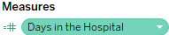
- 5. The length of the Gantt bar is set by placing a field with a value of duration on the Size shelf. There is no such field in this dataset. However, we have the Date of Discharge, and we can create a calculated field for the duration. We'll cover calculations in more detail in the next chapter. For now, select Analysis from the menu and click Create Calculated Field.... Name the field Days in the Hospital and enter the following code:
duration = Date of Discharge - Date of AdmitDATEDIFF('day', [Date of Admit], [Date of Discharge])
-
6. The new calculated field
 will appear under Measures in the data pane. Drag and drop the field onto the Size shelf. You now have a Gantt Chart showing when patients were admitted and how long each visit lasted.
 - 7. Sort the Patient Name field by selecting Sort from the drop-down menu on the field on Rows in the view. Select the following options:
- Sort By: Field
- Sort Order: Ascending
- Field Name: Date of Admit
patients who were admitted earlier toward the top and patients who were admitted later toward the bottom - Aggregation: Minimum:
based on the earliest (minimum) date of admission for the patient When you have specified these options, close the Sort [Patient Name] dialog.
Sorting enables you to see patients who were admitted earlier toward the top and patients who were admitted later toward the bottom. It is based on the earliest (minimum) date of admission for the patient, even if they were admitted multiple times. Sorting can be a very useful technique for seeing patterns in the Gantt Chart. Your final view should look something like this:

Relating parts of the data to the whole
As you explore and analyze data, you'll often want to understand how various parts add up to a whole如何叠加成一个整体. For example, you'll ask questions such as the following:
- How much does each electric generation method (wind, solar, coal, and nuclear) contribute to the total amount of energy produced?
- What percentage of total profit is made in each state?
- How much space does each file, subdirectory, and directory occupy on my hard disk?
These types of questions are asking about the relationship between the part (production method, state, file/directory) and the whole (total energy, national sales, and hard disk). There are several types of visualizations and variations that can aid you in your analysis.
Stacked bars
We took a look at stacked bars in Chapter 1https://blog.csdn.net/Linli522362242/article/details/122932763, Taking Off with Tableau, where we noted one significant drawback: it is difficult to compare values across most categories. Except for the leftmost (or bottom-most) bars, the other bar segments have different starting points, so lengths are much more difficult to compare. It doesn't mean stacked bars should never be used, but caution should be exercised to ensure clarity of communication.
Here, we are using stacked bars to visualize the makeup of the whole. We are less concerned with visually comparing across categories and more concerned with seeing the parts that make up a category.
For example, at the hospital, we might want to know what the patient population looks like within each type of department. Perhaps each patient was assigned a risk profile on admission也许每位患者在入院时都被分配了风险概况. We can visualize the number of visits broken down by risk profile as a stacked bar, like this:![]()

Adjusting the sizing of the view. Accomplish this by hovering over the canvas, just over the bottom border, until the mouse cursor changes to a sizing cursor![]() , and then click and drag to resize the view
, and then click and drag to resize the view
This gives a decent view of the visits for each department type. We can tell that
- more people visit one of the general departments and that the number of high-risk patients for both general and specialty are about the same各自的高危患者数量比例大致相同.
- Labs and intensive care see fewer high-risk patients and fewer patients overall. But this is only part of the story.

Consider a stacked bar that doesn't give the absolute value, but gives percentages for each type of department(click the drop down menu![]() |Quick Table Calculation|Percent of total):
|Quick Table Calculation|Percent of total):
Then use the same drop-down menu, select Compute Using | Patient Risk Profile. This tells Tableau to calculate the percent for each Patient Risk Profile within a given department. This means that the values will add up to 100% for each department.![]()

Compare the previous two stacked bar charts. The fact that nearly 50% of patients in Intensive Care are considered High Risk is evident from both charts. However, the second chart makes this immediately obvious.
None of the data has changed between the two charts, but
- the bars in the second chart represent the percent of the total for each type of department.
- You can no longer compare the absolute values, but the percent for each Patient Risk Profile within a given department(the percent for each Patient Risk Profile within a given department).
- Although there are fewer patients in Intensive Care, a much higher percentage of them are in a high-risk category.
Let's consider how the preceding charts can be created and even combined into a single visualization in Tableau. We'll use a quick table calculation, which will be covered in depth in Chapter 5, Diving Deep with Table Calculations. Here, it will only take a few clicks to implement.
Continuing with the Chapter 03 workbook, ![]() follow these steps:
follow these steps:
- 1. Create a stacked bar chart by
- placing Department Type on Rows,
- Number of Patient Visits on Columns, and
- Patient Risk Profile on Color. You'll now have a single stacked bar chart.
- 2. Sort the bar chart in descending order.
- 3. Duplicate the Number of Patient Visits field on Columns by holding down Ctrl while dragging the Number of Patient Visits field in the view to a spot on Columns, immediately to the right of its current location. Alternatively, you can drag and drop the field from the data pane to Columns. At this point, you have two Number of Patient Visits axes which, in effect, duplicate the stacked bar chart:

- 4. Using the drop-down menu of the second Number of Patient Visits field, select Quick Table Calculation | Percent of Total. This table calculation runs a secondary calculation on the values that were returned from the data source to compute a percent of the total. Here, you will need to further specify how that total should be computed.
- 5. Using the same drop-down menu, select Compute Using | Patient Risk Profile. This tells Tableau to calculate the percent for each Patient Risk Profile within a given department. This means that the values will add up to 100% for each department.
- 6. Turn on labels by clicking the T button on the top toolbar. This turns on default labels for each mark:

After following the preceding steps, your completed stacked bar charts should appear as follows:
Using both the absolute values and percentages in a single view can reveal significant aspects and details that might be obscured with only one of the charts.
Treemaps
Treemaps use a series of nested rectangles to display parts of the whole, especially within hierarchical relationships. Treemaps are particularly useful when you have hierarchies and dimensions with high cardinality高基数 (a high number of distinct values).
Here is an example of a treemap that shows the number of days spent in the hospital by patients. The largest rectangle sections show Department Type . Within those are departments and patients:
- The order of the dimensions on the marks card defines the way the treemap groups the rectangles.
- assign two or more colors by holding down the Shift key while dropping the second field on color.


To create a treemap, you simply need to place a measure on the Size shelf and a dimension on the Detail shelf. You can add additional dimensions to the level of detail to increase the detail of the view. Tableau will add borders of varying thickness to separate the levels of detail that are created by multiple dimensions. Note that in the preceding view, you can easily see the division of
- department types,
- then departments,
- then doctors,
- and finally individual patients.
You can adjust the border of the lowest level by clicking the Color shelf.
The order of the dimensions on the marks card defines the way the treemap groups the rectangles. Additionally, you can add dimensions to rows or columns to slice the treemap into multiple treemaps. The end result is effectively a bar chart of treemaps:

The preceding treemap not only demonstrates the ability to have multiple rows (or columns) of treemaps—it also demonstrates the technique of placing multiple fields on the Color shelf. This can only be done with discrete fields. You can assign two or more colors by holding down the Shift key while dropping the second field on color. Alternatively, the icon or space to the left of each field on the Marks card can be clicked to change which shelf is used for the field:

Treemaps, along with packed bubbles, word clouds, and a few other chart types, are called non-Cartesian chart types. This means that they are drawn without an x or y axis, and do not even require row or column headers. To create any of these chart types, do the following:
- Make sure that no continuous fields are used on Rows or Columns
- Use any field as a measure on Size
- Change the mark type based on the desired chart type: square for treemap, circle for packed bubbles, or text for word cloud (with the desired field on Label)
Area charts
Take a line chart and then fill in the area beneath[bɪˈniːθ]在……下方 the line. If there are multiple lines, then stack the filled areas on top of each other. That's how you might think of an area chart.
In fact, in Tableau, you may find it easy to create a line chart, like you've done previously, and then change the mark type on the Marks card to Area. Any dimensions on the Color, Label, or Detail shelves will create slices of area that will be stacked on top of each other. The Size shelf is not applicable to an area chart.
As an example, consider a visualization of patient visits over time, segmented by hospital branch:
- Show Me:
 and
and 
-
Click the
 , select Continous and Month in date value(Truncated)
 - Click format in the drop-down menu of
 ==>
==>

a visualization of patient visits over time, segmented by hospital branch
 Each band represents a different hospital branch location. In many ways, the view is aesthetically[esˈθetɪkli]审美地 pleasing and it does highlight some patterns in the data. However, it suffers from some of the same weaknesses as the stacked bar chart. Only the bottom band (South) can be read in terms of the values on the axis.
The other bands are stacked on top and it becomes very difficult to compare. For example, it is obvious that there is a spike in February of each year. But is it at each branch? Or is one of the lower bands pushing the higher bands up? Which band has the most significant spike?
a quick table calculation
Table(down) : Computes down the length of the table and restarts after every partition(here is each Hospital Branch).
This view uses a quick table calculation, similar to the stacked bars example. It is no longer possible to see the spikes, as in the first chart. However, it is much easier to see that there was a dramatic increase in the percentage of patients seen by the East branch (the middle band) around February 2018, and that the branch continued to see a significant amount of patients through the end of the year. 
It is important to understand what facets of the data story are emphasized (or hidden) by selecting a different chart type. You might even experiment in the Chapter 3 workbook by changing the first area chart to a line chart. You may notice that you can see the spikes as well as the absolute increase and decrease in patient visits per branch. Each chart type contributes to a certain aspect of the data story.
Tip
You can define the order in which the areas are stacked by changing the sort order of the dimensions on the shelves of the Marks card . Additionally, you can rearrange them by dragging and dropping them within the Color Legend to further adjust the order
 .
.
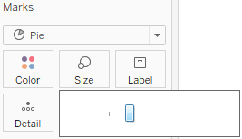
Pie charts
Pie charts can also be used to show part-to-whole relationships. To create a pie chart in Tableau, change the mark type to Pie. This will give you an Angle shelf, which you can use to encode a measure. Whatever dimension(s) you place on the marks card (typically on the Color shelf) will define the slices of the pie:


Observe that the preceding pie chart uses the sum of revenue to define the angle of each slice; the higher the sum, the wider the slice. The Hospital Branch dimension is slicing the measure and defining slices of the pie. This view also demonstrates the ability to place multiple fields on the Label shelf. The second SUM(Revenue) field is the percent of total table calculation you saw previously. This allows you to see the absolute values of revenue, as well as the percent of the whole.
Tip
Pie charts can work well with a few slices. In most cases, more than two or three become very difficult to see and understand. Also, as a good practice, sort the slices by sorting the dimension that defines the slices. In the preceding example, the Hospital Branch dimension was sorted by
the SUM of revenue descending. This was done by using the drop-down menu option. This causes slices to be ordered from largest to smallest and allows anyone reading the chart the ability to easily see which slices are larger, even when the size and angles are nearly identical.
Visualizing distributions
Often, simply understanding totals, sums, and even the breakdown of part-to-whole only gives a piece of the overall picture. Most of the time, you'll want to understand where individual items fall within a distribution of all similar items.
You might find yourself asking questions such as the following:
- How much does each customer spend at our stores and how does that compare to all other customers?
- How long do most of our patients stay in the hospital? Which patients fall outside the normal range?
- What's the average life expectancy for components in a machine and which components fall above or below that average? Are there any components with extremely long or extremely short lives?
- How far above or below passing were students' test scores?
These questions all have similarities. In each case, you seek an understanding of how individuals (patients, components, students) relate to the group. In each case, you most likely have a relatively high number of individuals. In data terms, you have a dimension (customer, patient, component, and student) representing a relatively large population of individuals and some measure (amount spent, length of stay, life expectancy, test score) you'd like to compare. Using one or more of the following visualizations might be a good way to do this.
Circle charts
Circle charts are one way to visualize a distribution. Consider the following view, which shows how each doctor compares to other doctors within the same type of department in terms of the average number of minutes it takes to start treating a patient:
Here, you can easily see that
- certain doctors do better or worse on average than others in terms of the time it takes to start treating a patient.
- It is also interesting to note that certain types of departments take more or less time on average. This makes sense as each type of department has different constraints and operating procedures. There are also certain departments where time is more critical than others.
- Being able to evaluate doctors within their type of department makes comparisons far more meaningful.
To create the preceding circle chart, you need to
- place the fields on the shelves that are shown and Show Me

- then simply change the mark type from Automatic (which was a bar mark) to Circle.
marks overlap : click the Color shelf and add some transparency and a border to each circle
- Department Type defines the rows,
- and each circle is drawn at the level of Doctor, which is in the level of Detail on the Marks card.
- Finally, to add the average lines, simply switch to the Analytics tab of the left sidebar and drag the Average Line to the view, specifically dropping it on the Cell option:

- You may also click one of the resulting average lines and select Edit to find fine-tuning options, such as labeling.

Jittering(抖动图)
When using views like circle plots or other similar visualization types, you'll often see that marks overlap, which can lead to obscuring[əbˈskjʊring]v. 使……模糊 part of the true story. Do you know for certain, just by looking, that there are only doctors in Intensive Care who are above average and only two below? Or could there be two or more circles exactly overlapping? One way of minimizing this is to click the Color shelf and add some transparency and a border to each circle. Another approach is a technique called jittering[ˈdʒɪtərɪŋ]抖动.
Tip:
Jittering is a common technique in data visualization that involves adding a bit of intentional noise to a visualization to avoid overlap without harming the integrity of what is communicated. Alan Eldridge and Steve Wexler are among those who pioneered techniques for jittering in Tableau.
Various jittering techniques, such as using Index() or Random() functions, can be found by searching for jittering on the Tableau forums or Tableau jittering using a search engine.
Here is one approach that uses the Index() function, computed along Doctor, as a continuous field on Rows. Since Index is continuous (green), it defines an axis and causes the circles to spread out vertically. Now, you can more clearly see each individual mark and have higher confidence that the overlap is not obscuring the true picture of the data. You can use jittering techniques on many kinds of visualizations:
- right click an empty spot on Row shelf, then select New calculation
 ==>
==> Doctor
the vertical axis that was created by the Index field- You can hide an axis or header by using the drop-down menu of the field defining the axis or header and unchecking Show Header.
Alternatively, you can right-click any axis or header in the view and select the same option. 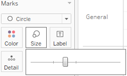 AND
AND

Box and whisker plots
Box and whisker plots (sometimes just called box plots) add additional statistical context to distributions. To understand a box and whisker plot, consider the following diagram:

Here, the box plot has been added to a circle graph. The box is divided by the median, meaning that half of the values are above and half are below. The box also indicates the lower(IQ1) and upper(IQ2) quartiles, which each contain a quarter of the values. The span of the box makes up what is known as the Interquartile Range (IQR). The whiskers extend to 1.5 times the IQR value (or the maximum extent of the data). Any marks beyond the whiskers are outliers.
To add box and whisker plots(after following the steps on the previous Circle charts), use the Analytics tab on the left sidebar and drag Box Plot to the view. Doing this to the circle chart we considered previously yields the following chart:
The box plots help us to see and compare the medians, ranges of data, concentration of values, and any outliers. You may edit box plots by clicking or right-clicking the box or whisker and selecting Edit. This will reveal multiple options, including how whiskers should be drawn, whether only outliers should be displayed, and other formatting possibilities.
Histograms
Another possibility for showing distributions is to use a histogram. A histogram looks similar to a bar chart, but the bars show a count of occurrences of a value. For example, standardized test auditors looking for evidence of grade tampering[ˈtæmpərɪŋ]干预,贿赂 might construct a histogram of student test scores. Typically, a distribution might look like this:
The test scores are shown on the x axis and the height of each bar shows the number of students that made that particular score. A typical distribution should have a fairly recognizable bell curve, with some students doing poorly, some doing extremely well, and most falling toward somewhere in the middle.
What if auditors saw something like this?
Something is clearly wrong. Perhaps graders have bumped up提高 students who were just shy of passing差点及格 to barely passing. It's also possible this may indicate bias in subjective grading主观评分 instead of blatant[ˈbleɪt(ə)nt]公然的 tampering. We shouldn't jump to conclusions不应该草率下结论, but the pattern is not normal and requires investigation. Histograms are very useful in catching anomalies like this.
Let's say you'd like to see a histogram of the time it takes to begin patient treatment. You might start with a blank view and observe steps such as the following:

- 1. Click to select the Minutes to Service field under Measures in the data pane.
- 2. Expand Show Me if necessary and select the histogram.
Upon selecting the histogram, Tableau builds the chart by creating a new dimension, Minutes to Service (bin)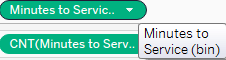 , which is used in the view, along with a COUNT of Minutes to Service
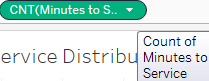 to render the view:
You can see the curve, which peaks at just over 40 minutes and then tapers[ˈteɪpər](使)一端逐渐变细 off with a few patients having to wait as long as 110 minutes. The key to the histogram is the bin.
Bins are ranges of measure values that can be used as dimensions to slice the data. You can think of bins as buckets. For example, you might look at test scores by 0-5%, 5-10%, and so on, or people's ages by 0-10, 10-20, and so on. You can set the size, or range, of the bin when it is created and edit it at any point. Tableau will also suggest a size for the bin based on an algorithm that looks at the values that are present in the data. Tableau will use uniform bin sizes for all bins.
You can create new bins on your own by right-clicking a numeric field  and selecting Create | Bins.
  You may also edit an existing bin field by right-clicking the bin field itself and selecting Edit. When you first create a bin (or when Tableau creates one based on Show Me), Tableau uses an algorithm to determine a best size for the bin.
In the case of the histogram you created earlier, the size was set at 6.5 minutes. This may not be the most helpful for understanding the data in this case, so you might wish to edit the bin size by right-clicking the Minutes to Service (bin) field under Dimensions in the data pane, selecting Edit, and then adjusting the size to something more intuitive, such as 5 :
You'll also want to decide what you want to count for each bin and place that on Rows. When you used Show Me, Tableau placed the COUNT of Minutes to Service on Rows, which is just a count of every record where the value was not null. In this case, that's equivalent to a count of patient visits. However, if you wanted to count the number of unique patients, you might consider replacing the field in the view with COUNTD([Patient ID]) COUNT (Distinct).
Edit in shelf==>

Just like dates, when the bin field in the view is discrete, the drop-down menu includes an option for Show Missing Values. If you use a discrete bin field, you may wish to use this option to avoid distorting the visualization and to identify what values don't occur in the data.
Visualizing multiple axes to compare different measures
Often, you'll need to use more than one axis to compare different measures, understand correlation, or analyze the same measure at different levels of detail. In these cases, you'll use visualizations with more than one axis.
Scatterplot
A scatterplot is an essential visualization type for understanding the relationship between two measures. Consider a scatterplot when you find yourself asking questions like the following:
- Does how much I spend on marketing really make a difference on sales?
- How much does power consumption go up with each degree of heating/cooling?
- Is there any correlation between hours of study and test performance?
Each of these questions seeks to understand the correlation (if any) between two measures. Scatterplots are great for seeing these relationships and also in locating outliers.
Consider the following scatterplot, which looks for a relationship between the average minutes to service and the average number of days spent in the hospital, broken down by department type(![]() ) and doctor(
) and doctor(![]() ):
):
The dimensions of Department Type and Doctor on the Marks card define the view level of detail. Color has been used to make it easy to see the department type where each doctor practices. Each mark in the view represents the average minutes to service and average days in the hospital for patients seen by a doctor in a department type. The Size of each circle indicates the total number of patients seen by that doctor.
There does not appear to be much correlation between minutes to service and days in the hospital per doctor. However, the scatterplot is useful for seeing some grouping patterns for doctors within certain departments and also illustrates that Intensive Care (the marks in the upper right) are potentially outliers.
Dual axis and combination charts
One very important feature in Tableau is the ability to use a dual axis. Scatterplots use two axes, but they are X and Y. You also observed in the stacked bar example that placing multiple continuous (green) fields next to each other on Rows or Columns results in multiple side-by-side axes. Dual axis, on the other hand, means that a view is using two axes that are opposite each other with a common pane.
Here is a sample view using a dual axis for Sales and Profit:
There are several key features of the view, which are as follows:
- The Sales and Profit fields on Rows indicate that they have a dual axis by sharing a flattened side.
- The axes defined by Sales and Profit are on opposing sides of the view. Also, note that they are not synchronized, which, in many cases, can give a distorted view of the data. It would be great if profit was that close to total sales! But it's not. To synchronize the axes, right-click the right axis and select Synchronize Axis
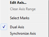 .
.
If that option is grayed out, it is likely that one of the values is a whole number type and the other is a decimal type. You can change the data type of one of the fields by right-clicking it in the data pane and selecting Change Data Type | Number (Whole) or Number (Decimal). - The Marks card is now an [əˈkɔːrdiən]accordion-like control类似于手风琴的控件 with an All section and a section for Sales and Profit. You can use this to customize marks for all measures or specifically customize marks for either Sales or Profit.
To create a dual axis, drag and drop two continuous (green) fields next to each other on Rows or Columns, then use the drop-down menu on the second, and select Dual Axis. Alternatively, you can drop the second field onto the canvas, opposite the existing axis.
Tip
Dual axes can be used with any continuous field that defines an axis. This includes numeric fields, date fields, and latitude or longitude fields that define a geographic visualization. In the case of latitude or longitude, simply copy one of the fields and place it immediately next to itself on the Rows or Columns shelf. Then, select Dual Axis by using the drop-down menu.
A combination chart extends the use of dual axes to overlay different mark types. This is possible because the Marks card will give options for editing all marks or customizing marks for each individual axis.
Multiple mark types are available any time two or more continuous fields are located beside each other on Rows or Columns.
As an example of a combination dual axis chart, consider the following visualization: There are several things to note about this view:
- The field on the Color shelf is listed as Multiple Fields and is gray on the Marks card. This indicates that different fields have been used for Color for each axis on Marks.

- The view demonstrates the ability to mix levels of detail in the same view.
- The bars are drawn at the highest level (patient visits for each month),


- while the lines have been drawn at a lower level (patient visits for each branch for each month).
 ==>
==> ==>To synchronize the axes, right-click the right axis and select Synchronize Axis
- The bars are drawn at the highest level (patient visits for each month),
- The view demonstrates the ability to use the same field (Patient Visits, in this case) multiple times on the same shelf (Rows, in this case).
- The second axis (the Patient Visits field on the right) has the header hidden to remove redundancy from the view. You can do this by unchecking Show Header from the drop-down menu on the field in the view or right-clicking the axis or header you wish to hide.
This chart uses a combination of bars and lines to show the total number of patient visits over time (using bars) and the breakdown of patient visits by hospital branch over time (using lines). This kind of visualization can be quite effective at giving additional context to detail.

Dual axis and combination charts open up a wide range of possibilities for mixing mark types and levels of detail, and are very useful for generating unique insights. We'll see a few more examples of these throughout the rest of this book, but definitely experiment with this feature and let your imagination run wild with all that can be done.
Summary
We've covered quite a bit of ground in this chapter! You should now have a good grasp of when to use certain types of visualizations. The types of questions you ask about the data will often lead you to a certain type of view. You've explored how to create these various types and how to extend basic visualizations using a variety of advanced techniques, such as calculated fields, jittering, multiple mark types, and dual axis. Along the way, we've also covered some details on how dates work in Tableau.
Hopefully, the examples of using calculations in this chapter have whet your appetite for learning more about creating calculated fields. The ability to create calculations in Tableau opens up endless possibilities for extending analysis on the data, calculating results, customizing visualizations, and creating rich user interactivity. We'll dive deep into calculations in the next two chapters to see how they work and what amazing things they can do.


 1268
1268


 被折叠的 条评论
为什么被折叠?
被折叠的 条评论
为什么被折叠?
 到【灌水乐园】发言


