


In [69]: import numpy as np
import matplotlib.pyplot as plt
In [70]: data =np.random.rand(1024,2)#[0,1]interval, (row,column)=(1024,2)
In [71]: plt.scatter(data[:,0], data[:,1])
plt.show()

In [73]: data.shape
Out[73]: (1024, 2)
2 Using custom colors for scatter plots
In [1]: import numpy as np
import matplotlib.pyplot as plt
In [15]: A = np.random.standard_normal((100, 2))
A += np.array((-1,-1)) # Center the distrib.at <-1, -1> or all elements plus -1
In [16]: B = np.random.standard_normal((100,2))
B += np.array((1,1)) #Center the distrib.at <1,1> or all elements plus 1
In [17]: plt.scatter(A[:,0], A[:,1], color='.25')
plt.scatter(B[:,0], B[:,1], color='.75')
plt.show()

##########################################
iris.data.txt
5.3,3.7,1.5,0.2,Iris-setosa
5.0,3.3,1.4,0.2,Iris-setosa
7.0,3.2,4.7,1.4,Iris-versicolor
6.4,3.2,4.5,1.5,Iris-versicolor
......................
##########################################
In [2]: import numpy as np
import matplotlib.pyplot as plt
In [3]: label_set = (
b'Iris-setosa',
b'Iris-versicolor',
b'Iris-virginica',
)#tuple
In [21]: def read_label2(label):
return label_set.index(label)
In [22]: #The last (4th)column that gives the label of each point is a string that can take three possible
# values—Iris-virginica, Iris-versicolor, and Iris-Vertosa.
data = np.loadtxt('iris.data.txt', delimiter = ',' , converters ={4:read_label2})
color_set = ('.00', '.50', '.75')
color_list = [color_set[int(label)] for label in data[:,4]
]
plt.scatter(data[:,0], data[:,1], color=color_list)
plt.show()

In [23]: label_set.index('Iris-setosa')
Out[23]: 0
In [24]: type(label_set)
Out[24]: tuple
In [26]: data[:4]
Out[26]: array([[5.1, 3.5, 1.4, 0.2, 0. ],
[4.9, 3. , 1.4, 0.2, 0. ],
[4.7, 3.2, 1.3, 0.2, 0. ],
[4.6, 3.1, 1.5, 0.2, 0. ]])
In [1]: import numpy as np
import matplotlib.pyplot as plt
In [2]: data = np.random.standard_normal((100,2))
In [12]: plt.scatter(data[:,0], data[:,1], color='1.0',edgecolor='b')
#edgecolor=blue, color='1'=white
plt.show()

In [9]: data[:,0].shape
Out[9]: (100,)
6 p52 Using colormaps for scatter plots
In [1]: import numpy as np
import matplotlib.cm as cm
import matplotlib.pyplot as plt
In [8]: N=256
angle = np.linspace(0,8* 2*np.pi, N) # 0~2pi * 8 /256
radius = np.linspace(0.5, 1., N)
In [9]: Xarr = radius*np.cos(angle)
Yarr = radius*np.sin(angle)
In [10]: plt.scatter(Xarr, Yarr, c = angle, cmap=cm.hsv) #8pi or 8 圈 256/=32
plt.show()

Controlling a marker's style
Predefined markers: They can be predefined shapes, represented as a number in the [0, 8] range, or some strings
Vertices list: This is a list of value pairs, used as coordinates for the path of a shape
Regular polygon: It represents a triplet (N, 0, angle) for an N sided regular polygon, with a rotation of angle degrees
Start polygon: It represent
# In[78]:
import numpy as np
import matplotlib.pyplot as plt
# In[86]:
A = np.random.standard_normal((100,2))
B = np.random.standard_normal((100,2))
#the marker parameter does not accept a list of marker specifications as inputs
plt.scatter(A[:,0], A[:,1], color='k', marker='x')
plt.scatter(B[:,0], B[:,1], color='k', marker='^')
plt.show()

vs
A = np.random.standard_normal((100,2))
B = np.random.standard_normal((100,2))
A += np.array((-1,-1))# # Center the distrib.at <-1, -1> or all elements plus -1
B += np.array((1,1))
#the marker parameter does not accept a list of marker specifications as inputs
plt.scatter(A[:,0], A[:,1], color='k', marker='x')
plt.scatter(B[:,0], B[:,1], color='k', marker='^')
plt.show()
# ################################
#
# iris.data.txt:
#
# 5.3,3.7,1.5,0.2,Iris-setosa
#
# 5.0,3.3,1.4,0.2,Iris-setosa
#
# 7.0,3.2,4.7,1.4,Iris-versicolor
#
# 6.4,3.2,4.5,1.5,Iris-versicolor
# ################################
# In[88]:
import numpy as np
import matplotlib.pyplot as plt
# In[89]:
label_list=(
b'Iris-setosa',
b'Iris-versicolor',
b'Iris-virginica'
)
# In[91]:
def read_label(label):
return label_list.index(label) #return index value in label_list
# In[92]:
data = np.loadtxt('iris.data.txt', delimiter=',', converters={4:read_label})
segregate points per label(分离数据点用不同的marker)
# In[95]:
marker_set=('^','x','.')
#however, we segregate points per label. Then, we iterate through
#each entry of the map and call pyplot.scatter() for each subset of points.
for i, marker in enumerate(marker_set):
data_subset = np.asarray([x for x in data if x[4] ==i]) #if x[4] ==i then save the data to data_subset
plt.scatter(data_subset[:,0], data_subset[:,1], color='k', marker=marker)
plt.show()


Controlling a marker's size
Because the sizes are the actual surface areas and not the radii, they follow a quadratic progression—the markers that are four times larger will have radii that are two times larger.
import numpy as np
import matplotlib.pyplot as plt
# In[106]:
A = np.random.standard_normal((100,2))
A += np.array((-1,-1))
B = np.random.standard_normal((100,2))
B += np.array((1,1))
# In[108]:
plt.scatter(B[:,0], B[:,1], c='k', s=100.)
plt.scatter(A[:,0], A[:,1], c='k', s=25.)
plt.show()

# In[109]:
import numpy as np
import matplotlib.pyplot as plt
# In[110]:
M = np.random.standard_normal((1000,2))
R = np.sum(M ** 2, axis=1)
# In[112]:
plt.scatter(M[:,0], M[:,1], c='w', marker='s', s=32*R, edgecolor='k')
#The pyplot.plot() function also allows to change the size of the markers with the
#help of the markersize (or its shortcut ms) parameter. This parameter does not accept
#a list of values as an input.
plt.show()


###############################################################################
Macrodata.csv file

###############################################################################

Scatter or Point Plots
import seaborn as sns
import matplotlib.pyplot as plt
import numpy as np
import pandas as pd
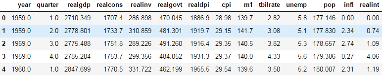
macro =pd.read_csv('../examples/macrodata.csv')
macro.head()
data=macro[
['cpi', 'm1', 'tbilrate', 'unemp']
]
data.head()

#log differences
trans_data = np.log(data).diff().dropna()
trans_data[-5:]

# We can then use seaborn’s regplot method, which makes a scatter plot and fits a linear regression line
sns.regplot(data=trans_data,x='m1',y='unemp')
plt.title('Changes in log %s versus log %s' % ('m1', 'unemp'))
plt.show()

In exploratory data analysis it’s helpful to be able to look at all the scatter plots among a group of variables; this is known as a pairs plot or scatter plot matrix. Making such a plot from scratch is a bit of work, so seaborn has a convenient pairplot function, which supports placing histograms or density estimates of each variable along the diagonal
sns.pairplot(trans_data, diag_kind='kde', plot_kws={'alpha': 0.2})
plt.title('Pair plot matrix of statsmodels macro data')
plt.show()


 539
539


 被折叠的 条评论
为什么被折叠?
被折叠的 条评论
为什么被折叠?
 到【灌水乐园】发言


