


欢迎关注微信公众号(医学生物信息学),医学生的生信笔记,记录学习过程。
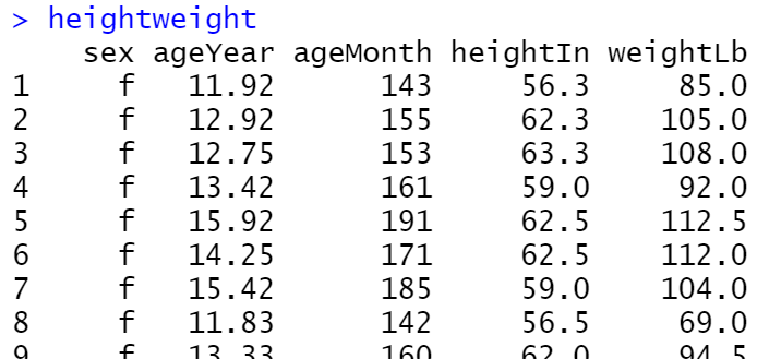
带误差线的柱形图
# 使用每个类别的均值作为柱形的高度,再根据每个类别的标准差绘制误差线
library(ggplot2)
library(RColorBrewer)
library(gcookbook)
ggplot(heightweight, aes(x = sex, y = heightIn))+
  stat_summary(mapping=aes(fill = sex),fun=mean, fun.args = list(mult=1),geom='bar',colour="black",width=.7) +
  stat_summary(fun.data = mean_sdl, fun.args = list(mult=1),geom='errorbar', color='black',width=.2)
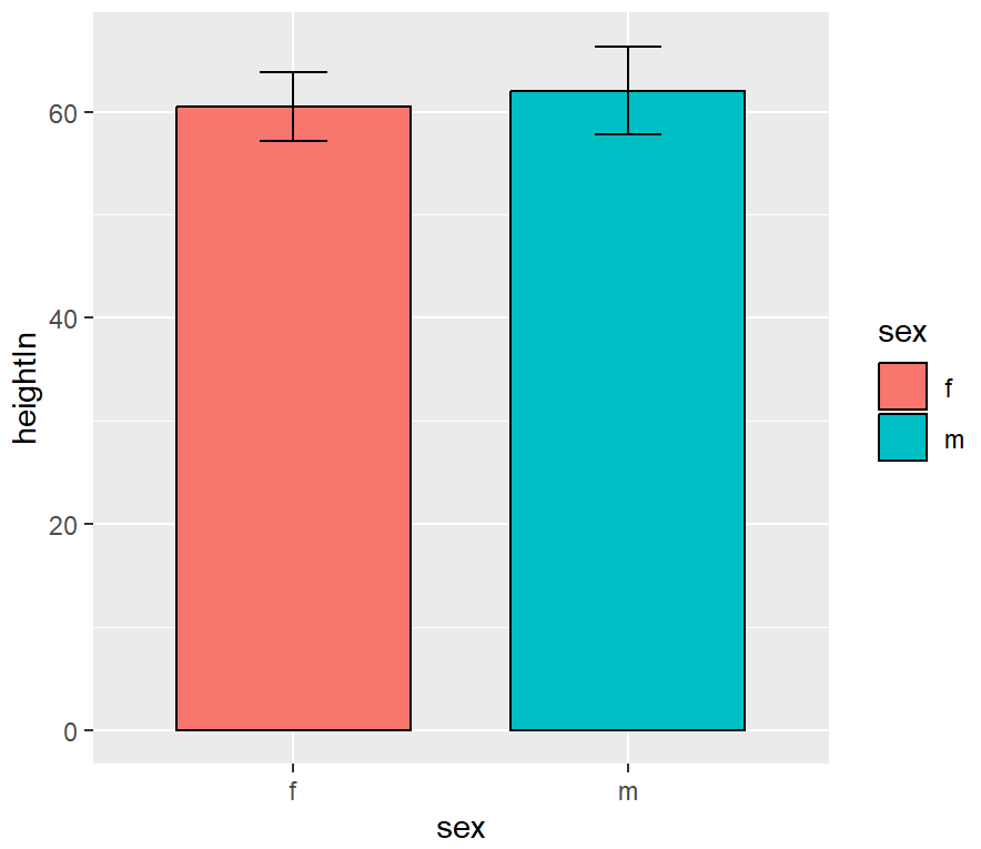
ggplot(heightweight, aes(x = sex, y = heightIn))+
  stat_summary(mapping=aes(fill = sex),fun=mean, fun.args = list(mult=1),geom='bar',colour="black",width=.7) +
  stat_summary(fun.data = mean_sdl, fun.args = list(mult=1),geom='errorbar', color='black',width=.2) +
  #scale_fill_manual(values=c(brewer.pal(7,"Set2")[c(1,2)]))+
  ylim(0,80)+
  theme_classic()
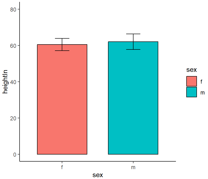
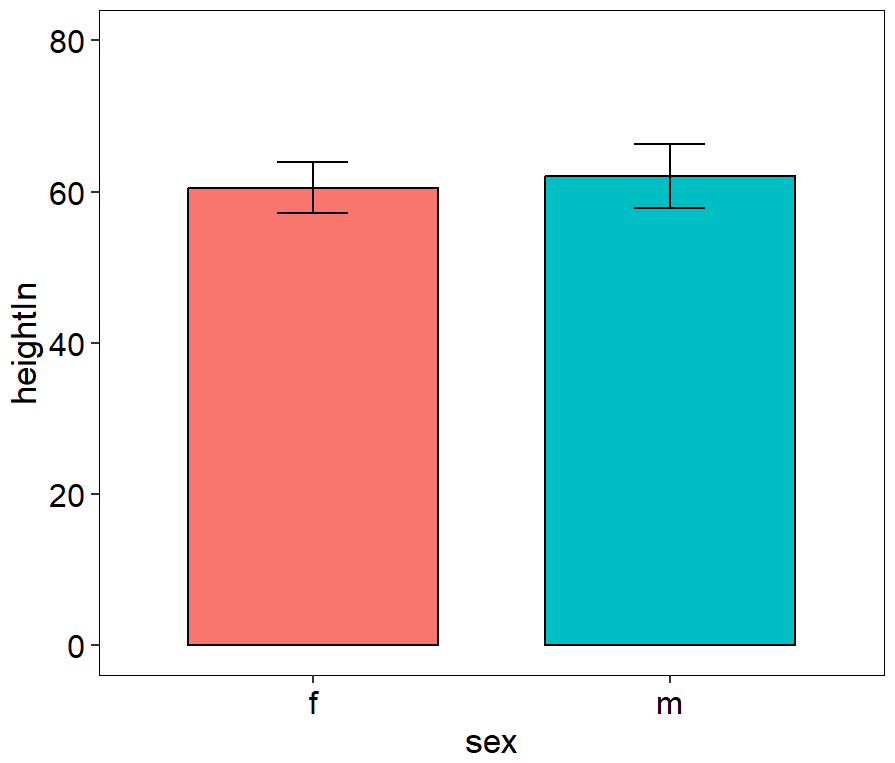
ggplot(heightweight, aes(x = sex, y = heightIn))+
  stat_summary(mapping=aes(fill = sex),fun=mean, fun.args = list(mult=1),geom='bar',colour="black",width=.7) +
  stat_summary(fun.data = mean_sdl, fun.args = list(mult=1),geom='errorbar', color='black',width=.2) +
  #scale_fill_manual(values=c(brewer.pal(7,"Set2")[c(1,2)]))+
  ylim(0,80)+
  theme_classic()+
  theme(panel.background=element_rect(fill="white",colour="black",linewidth=0.25),
        axis.line=element_line(colour="black",linewidth=0.25),
        axis.title=element_text(size=13,face="plain",color="black"),
        axis.text = element_text(size=12,face="plain",color="black"),
        legend.position="none"
  )
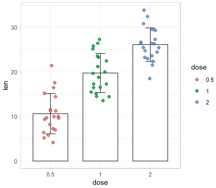
带误差线合并点抖动柱形图
library(ggplot2)
library(RColorBrewer)

data("ToothGrowth")
ToothGrowth$dose<-factor(ToothGrowth$dose)

ggplot(ToothGrowth, aes(x = dose, y = len))+
  #添加柱形图
  stat_summary(fun.y=mean, geom='bar', fun.args = list(mult=1),colour="black",fill="white",width=.7) +
  #添加误差线
  stat_summary(fun.data = mean_sdl, fun.args = list(mult=1),geom='errorbar', color='black',width=.2) +
  #添加抖动散点图
  geom_jitter(aes(fill = dose),position = position_jitter(0.2),shape=21, size = 2,alpha=0.9)+
  #scale_fill_manual(values=c(brewer.pal(7,"Set2")[c(1,2)]))+
  theme_light()
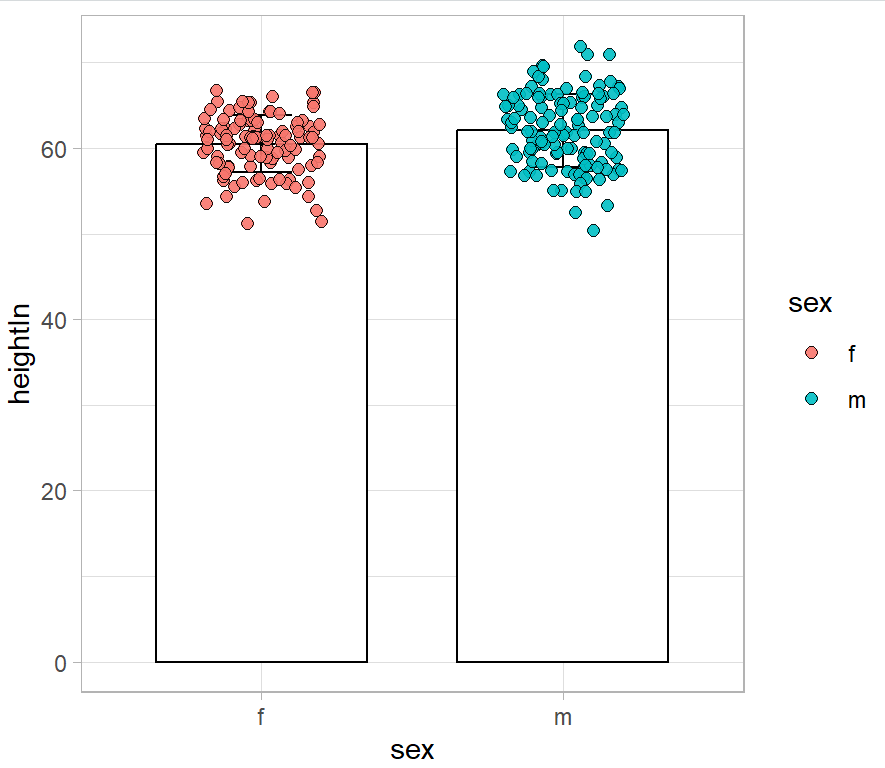
library(ggplot2)
library(RColorBrewer)
library(gcookbook)

ggplot(heightweight, aes(x = sex, y = heightIn))+
  #添加柱形图
  stat_summary(fun.y=mean, geom='bar', fun.args = list(mult=1),colour="black",fill="white",width=.7) +
  #添加误差线
  stat_summary(fun.data = mean_sdl, fun.args = list(mult=1),geom='errorbar', color='black',width=.2) +
  #添加抖动散点图
  geom_jitter(aes(fill = sex),position = position_jitter(0.2),shape=21, size = 2,alpha=0.9)+
  #scale_fill_manual(values=c(brewer.pal(7,"Set2")[c(1,2)]))+
  theme_light()
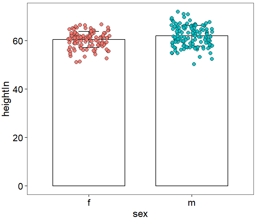
ggplot(heightweight, aes(x = sex, y = heightIn))+
  stat_summary(fun.y=mean, fun.args = list(mult=1),geom='bar',colour="black",fill="white",width=.7) +
  stat_summary(fun.data = mean_sdl,fun.args = list(mult=1), geom='errorbar', color='black',width=.2) +
  geom_jitter(aes(fill = sex),position = position_jitter(0.2),shape=21, size = 2,alpha=0.9)+
  #scale_fill_manual(values=c(brewer.pal(7,"Set2")[c(1,2)]))+
  theme_classic()+
  theme(panel.background=element_rect(fill="white",colour="black",size=0.25),
        axis.line=element_line(colour="black",size=0.25),
        axis.title=element_text(size=13,face="plain",color="black"),
        axis.text = element_text(size=12,face="plain",color="black"),
        legend.position="none"
  )
参考资料
[1] https://github.com/EasyChart/Beautiful-Visualization-with-R
[2] R语言数据可视化之美:专业图表绘制指南(增强版) (张杰)


 3415
3415


 被折叠的 条评论
为什么被折叠?
被折叠的 条评论
为什么被折叠?
 到【灌水乐园】发言


