


欢迎关注微信公众号(医学生物信息学),医学生的生信笔记,记录学习过程。
ggplot2包提供了geom_histogram()函数和geom_density()函数,可以分别绘制统计直方图和核密度估计图。geom_histogram()函数主要由两个参数控制统计分析结果:binwidth(箱形宽度)和bins(箱形总数)。geom_density()函数的主要参数是bw(带宽)和kernel(核函数),kernel(核函数)默认为高斯核函数gaussian,还有其他核函数包括epanechnikov,rectangular,triangular,biweight,cosine,optcosine。
直方图
单分组
library(ggplot2)
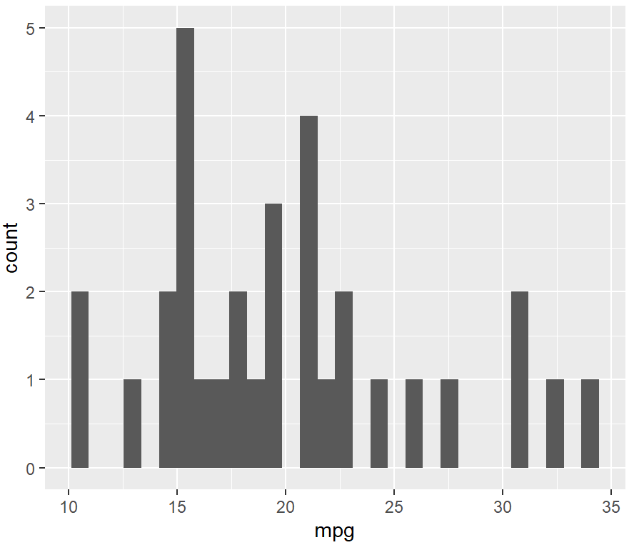
ggplot(mtcars, aes(x = mpg)) + #默认30个组,组距自动选择
geom_histogram()
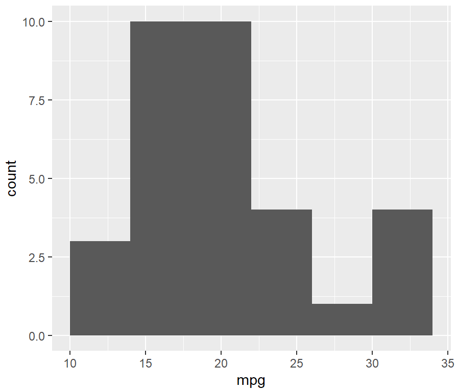
ggplot(mtcars, aes(x = mpg)) +
  geom_histogram(binwidth = 4)
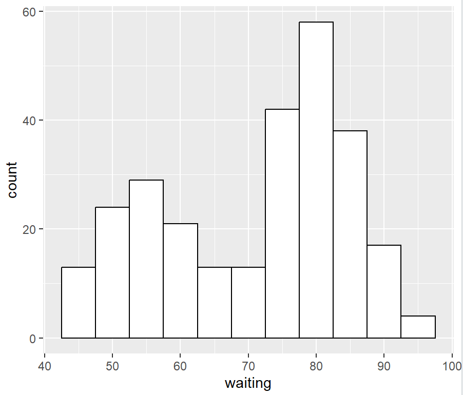
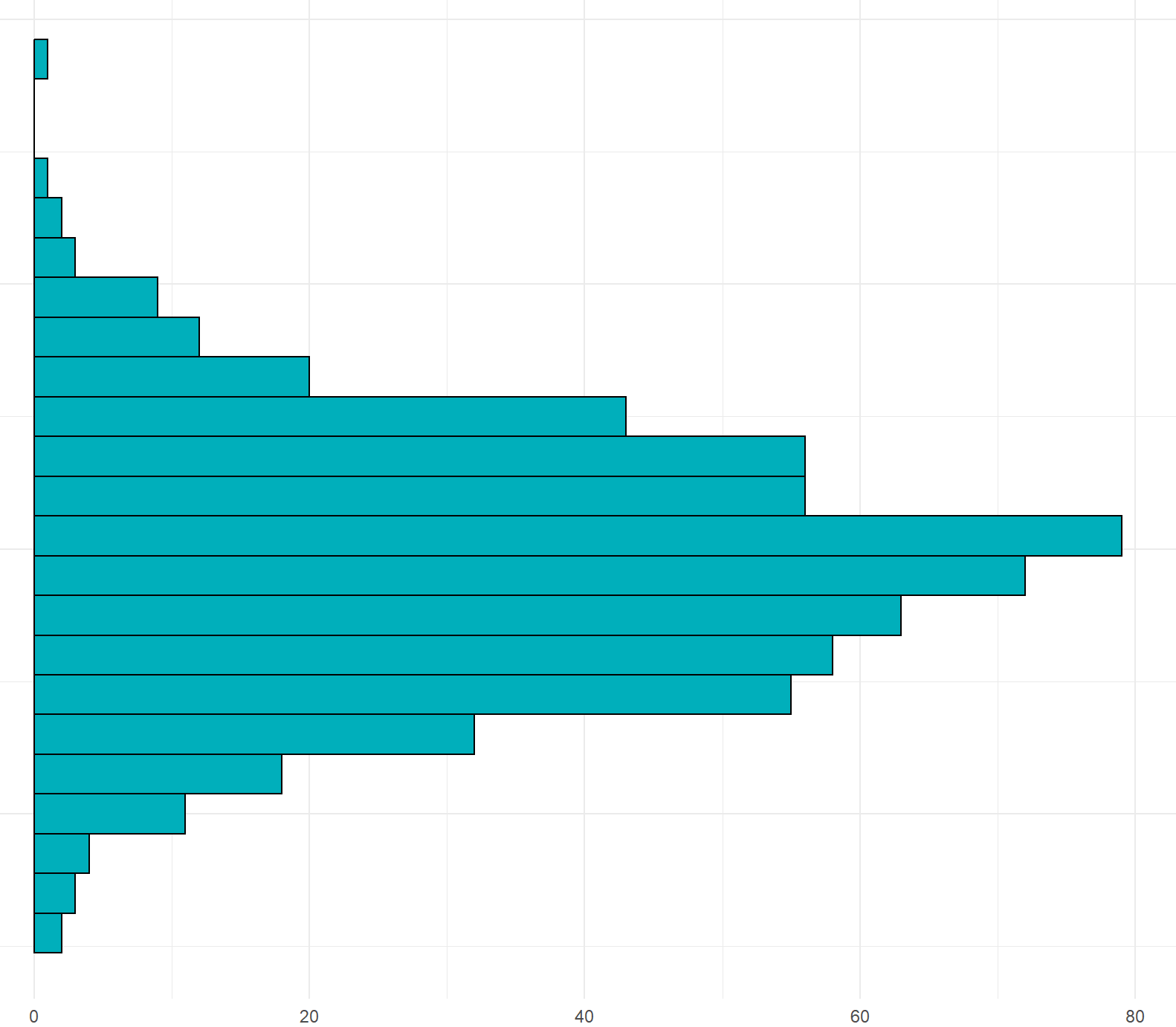
ggplot(faithful, aes(x = waiting)) +
  geom_histogram(binwidth = 5, fill = "white", colour = "black")
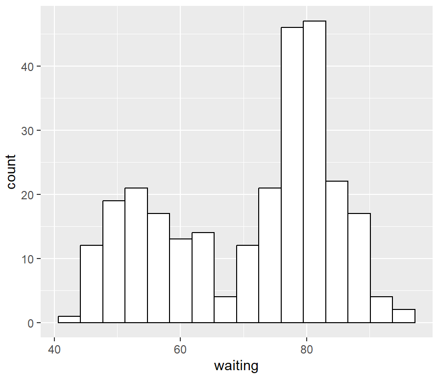
# 极差除以15个组得到组距
binsize <- diff(range(faithful$waiting))/15

ggplot(faithful, aes(x = waiting)) +
  geom_histogram(binwidth = binsize, fill = "white", colour = "black")
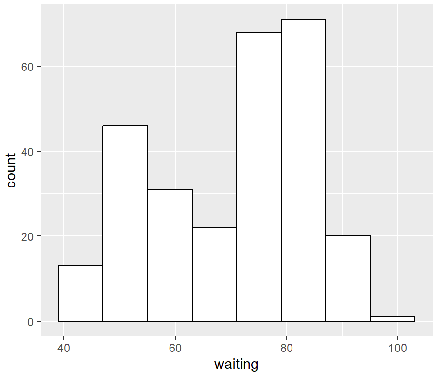
faithful_p <- ggplot(faithful, aes(x = waiting))

faithful_p +
  geom_histogram(binwidth = 8, fill = "white", colour = "black", boundary = 31)
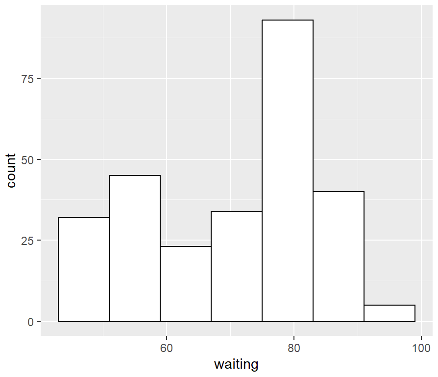
faithful_p +
  geom_histogram(binwidth = 8, fill = "white", colour = "black", boundary = 35)
多分组
library(MASS)
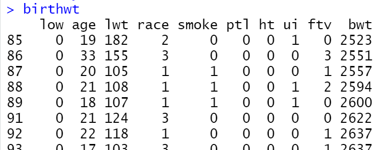
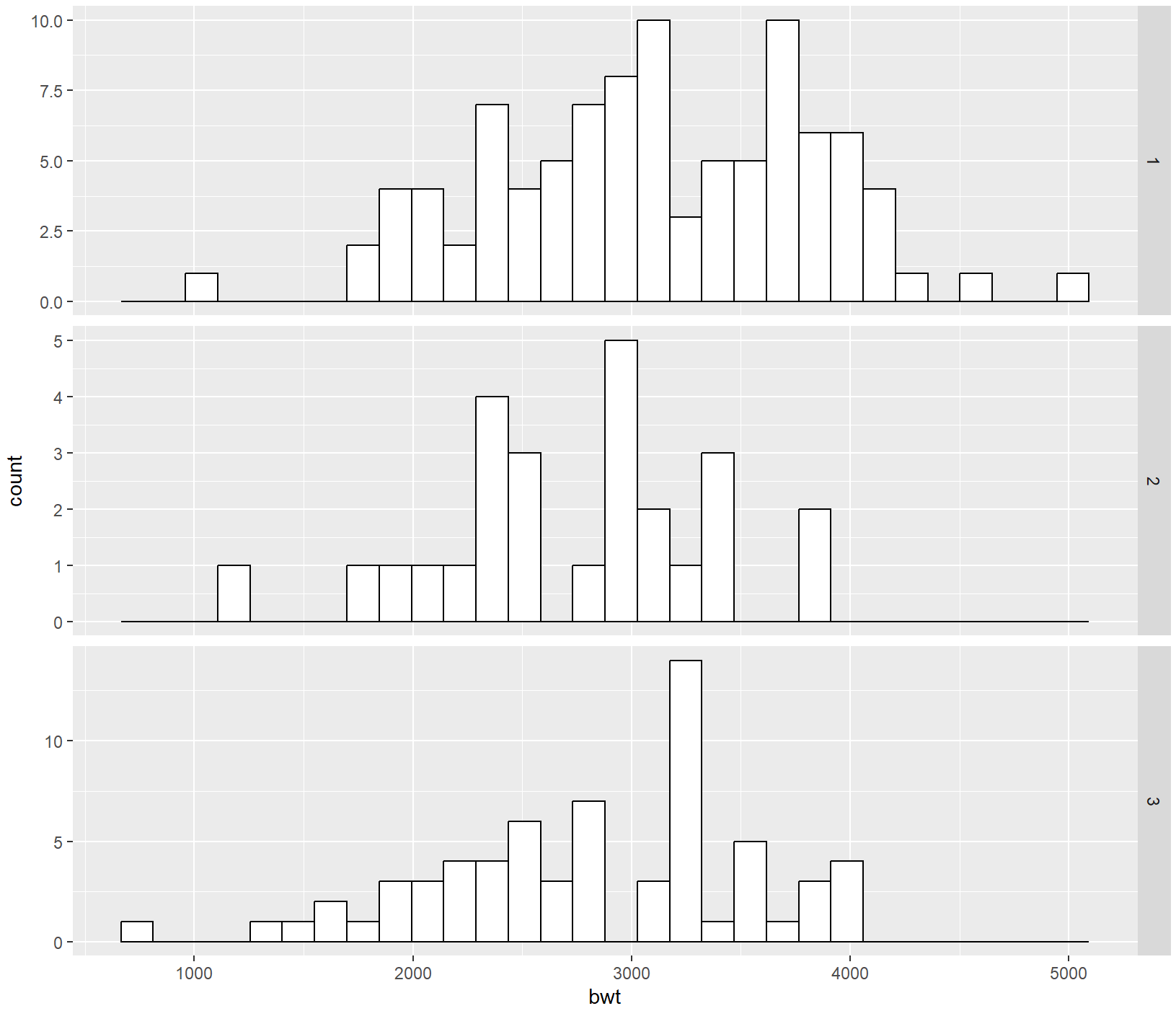
ggplot(birthwt, aes(x = bwt)) +
geom_histogram(fill = "white", colour = "black") +
facet_grid(smoke ~ .)
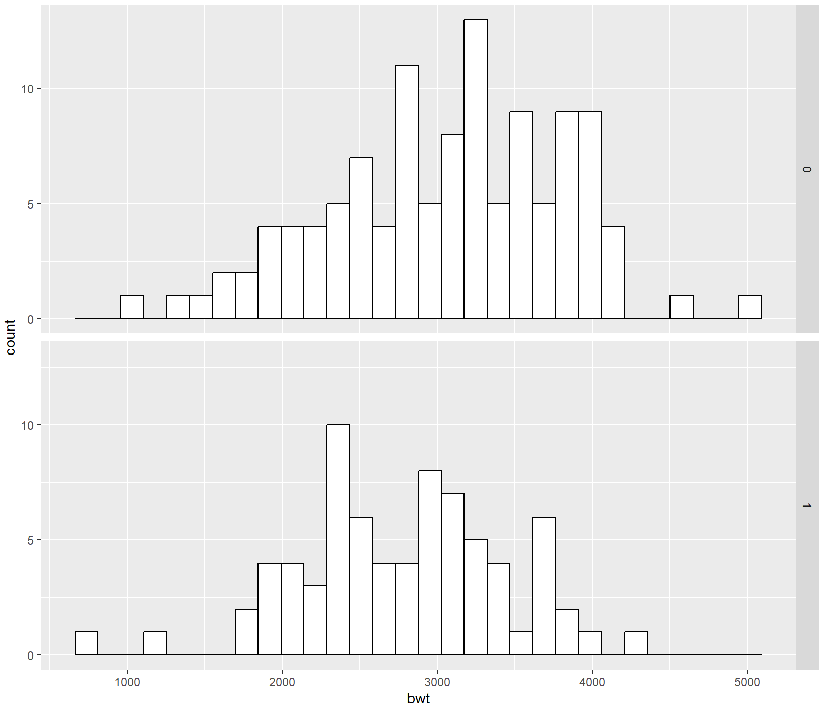
birthwt_mod <- birthwt
library(tidyverse)
birthwt_mod$smoke <- recode_factor(birthwt_mod$smoke, '0' = 'No Smoke', '1' = 'Smoke')

ggplot(birthwt_mod, aes(x = bwt)) +
  geom_histogram(fill = "white", colour = "black") +
  facet_grid(smoke ~ .)
ggplot(birthwt, aes(x = bwt)) +
  geom_histogram(fill = "white", colour = "black") +
  facet_grid(race ~ .)
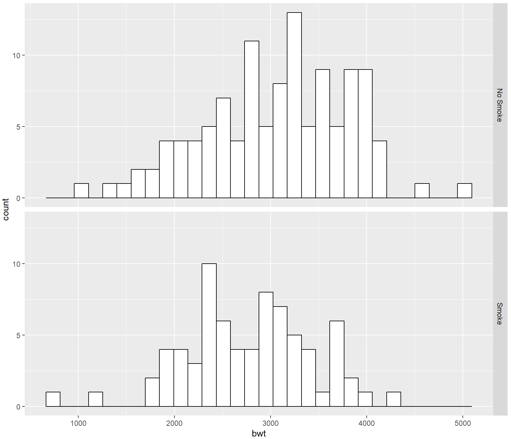
ggplot(birthwt, aes(x = bwt)) +
  geom_histogram(fill = "white", colour = "black") +
  facet_grid(race ~ ., scales = "free")
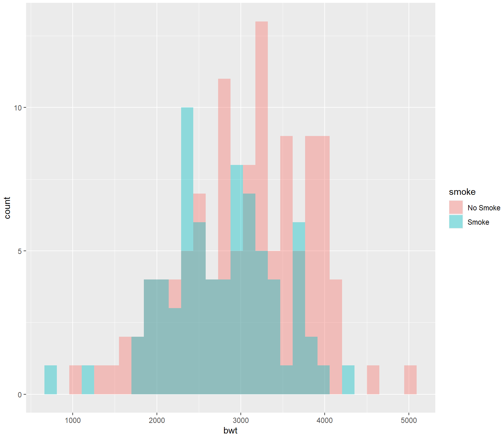
ggplot(birthwt_mod, aes(x = bwt, fill = smoke)) +
  geom_histogram(position = "identity", alpha = 0.4)
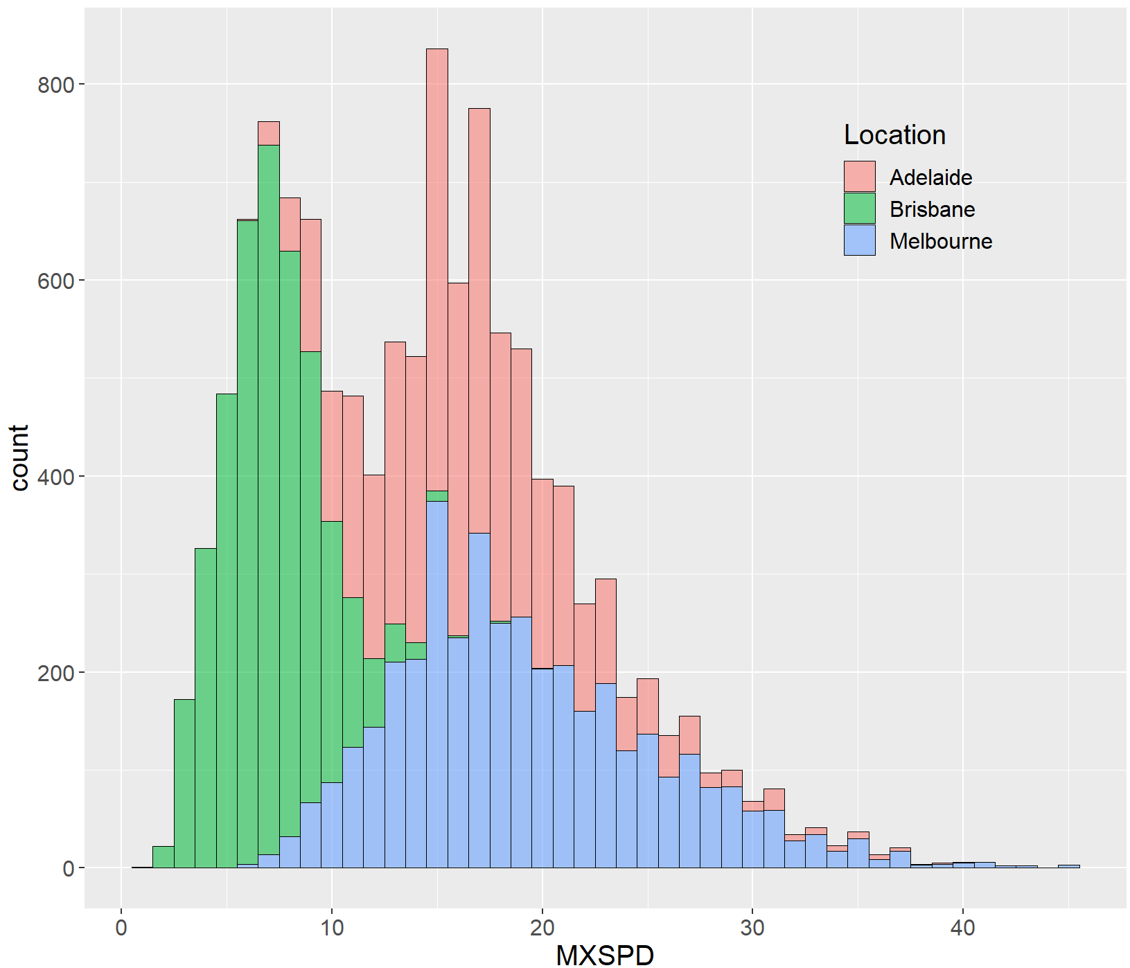
library(ggplot2)
df<-read.csv("Hist_Density_Data.csv",stringsAsFactors=FALSE)
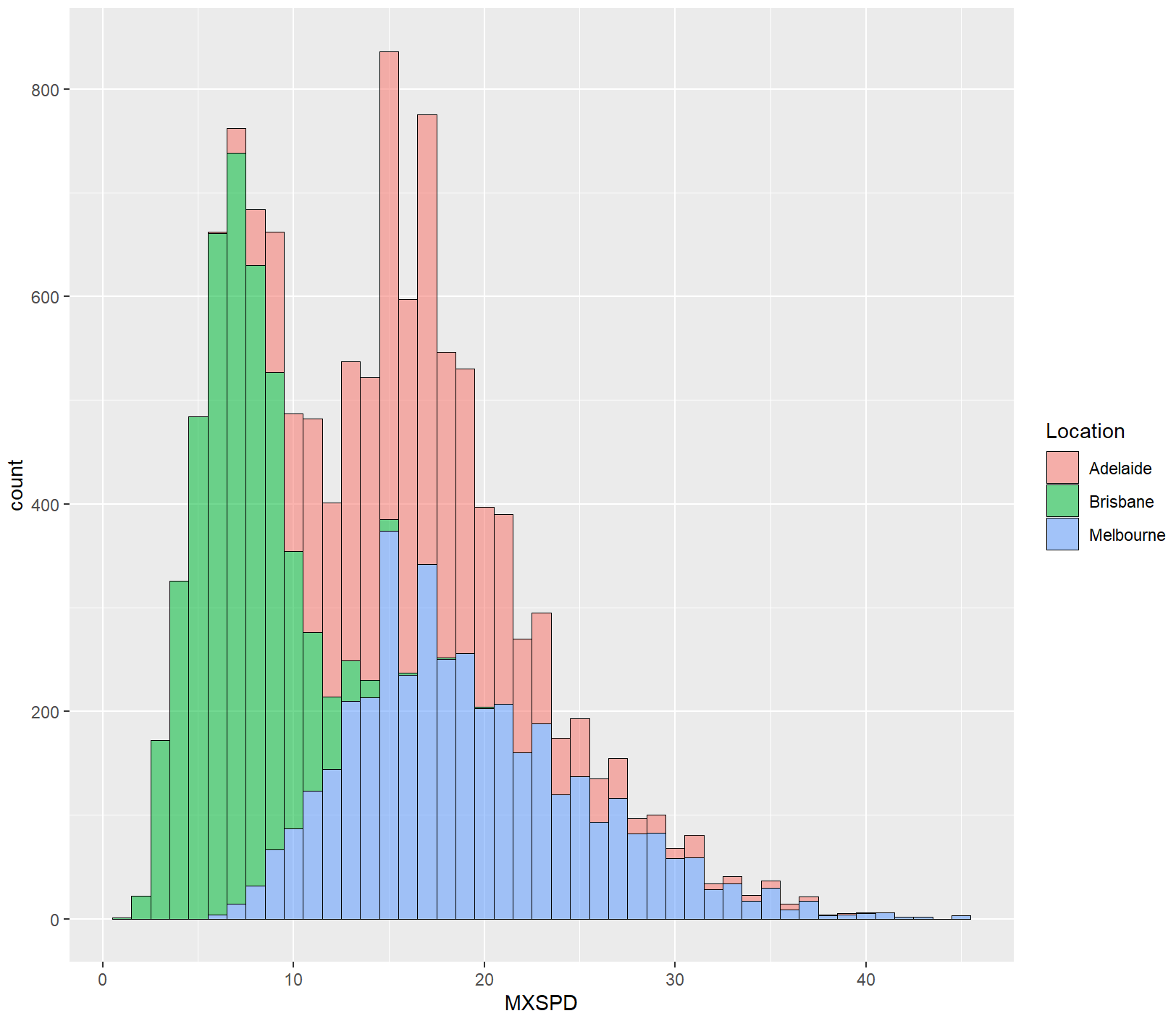
ggplot(df, aes(x=MXSPD, fill=Location))+
  geom_histogram(binwidth = 1,alpha=0.55,colour="black",size=0.25)
ggplot(df, aes(x=MXSPD, fill=Location))+
  geom_histogram(binwidth = 1,alpha=0.55,colour="black",size=0.25)+#, aes(fill = ..count..) )
  theme(
    text=element_text(size=15,color="black"),
    plot.title=element_text(size=15,family="myfont",face="bold.italic",hjust=.5,color="black"),#,
    legend.position=c(0.8,0.8),
    legend.background = element_blank()
  )
核密度估计图
单分组
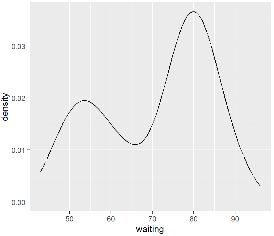
library(ggplot2)
ggplot(faithful, aes(x = waiting)) +
  geom_density()
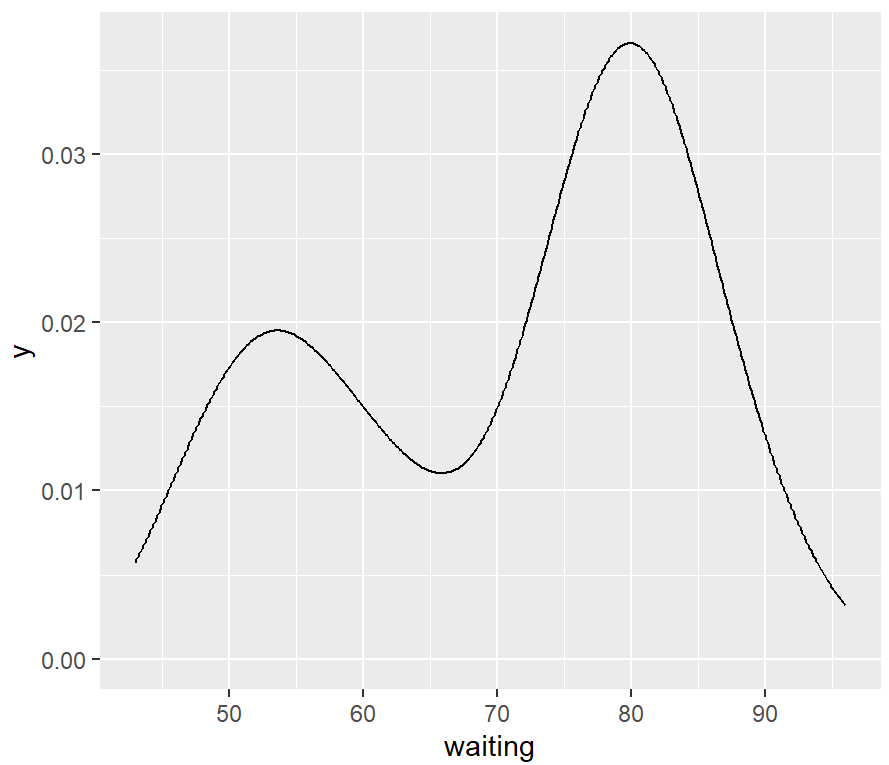
ggplot(faithful, aes(x = waiting)) +
  geom_line(stat = "density") +
  expand_limits(y = 0)
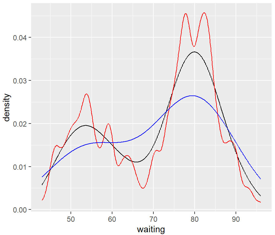
The amount of smoothing depends on the kernel bandwidth: the larger the bandwidth, the more smoothing there is. The bandwidth can be set with the adjust parameter, which has a default value of 1.
ggplot(faithful, aes(x = waiting)) +
  geom_line(stat = "density") +
  geom_line(stat = "density", adjust = .25, colour = "red") +
  geom_line(stat = "density", adjust = 2, colour = "blue")
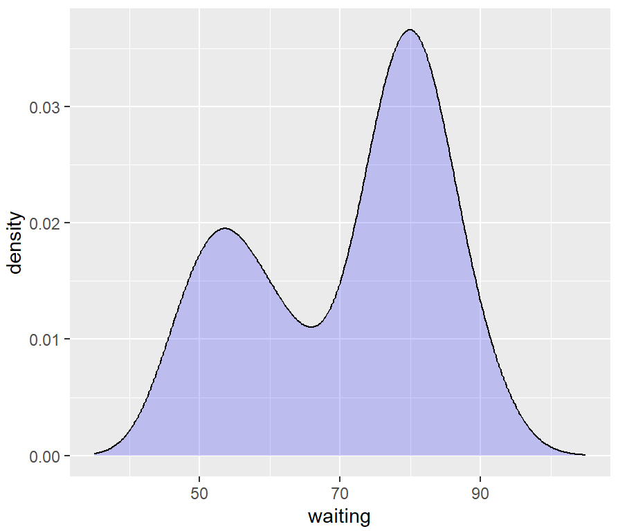
# 改变x轴范围
ggplot(faithful, aes(x = waiting)) +
  geom_density(fill = "blue", alpha = .2) +
  xlim(35, 105)
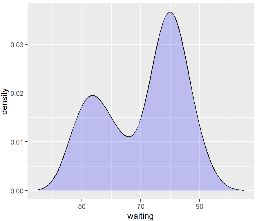
ggplot(faithful, aes(x = waiting)) +
  geom_density(fill = "blue", alpha = .2, colour = NA) +
  xlim(35, 105) +
  geom_line(stat = "density")
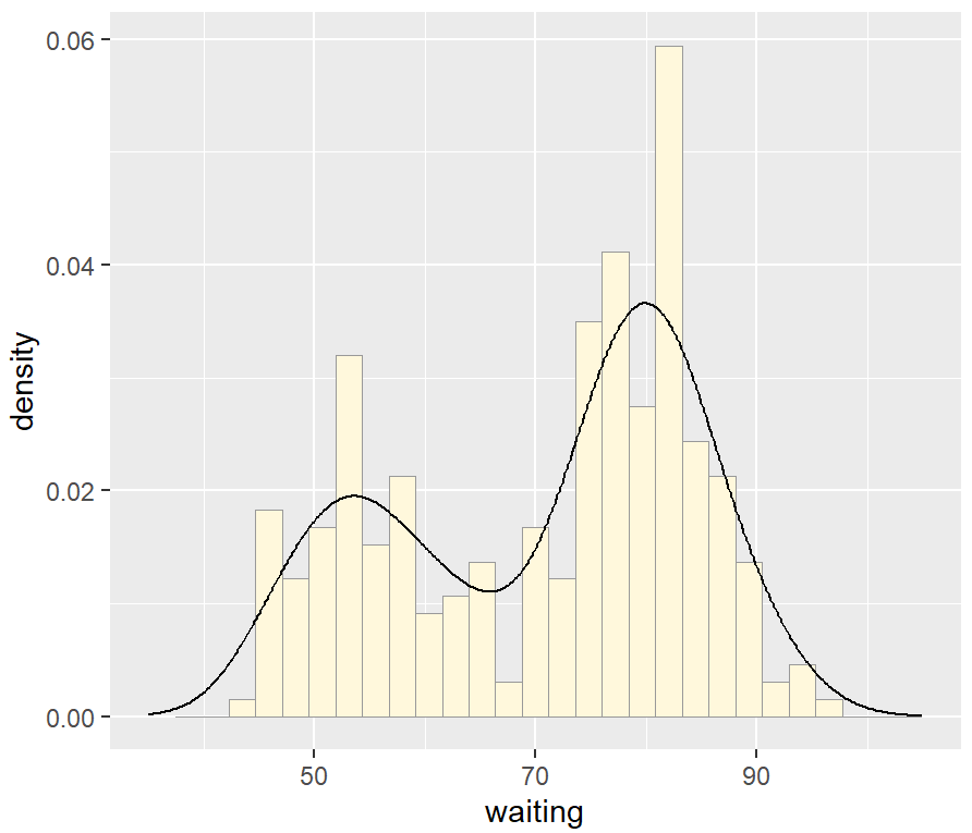
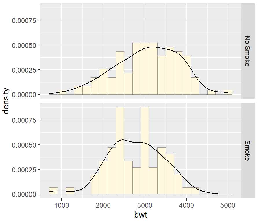
我们可以将核密度曲线与直方图叠加。由于核密度曲线的y值很小(曲线下的面积总和总是为1),如果将其覆盖在直方图上而不进行任何变换,则几乎看不到。为了解决这个问题,可以通过after_stat(density)来缩小直方图以匹配核密度曲线。
ggplot(faithful, aes(x = waiting, y = after_stat(density))) +
  geom_histogram(fill = "cornsilk", colour = "grey60", linewidth = .2) +
  geom_density() +
  xlim(35, 105)
多分组
library(MASS)
library(tidyverse)
birthwt_mod <- birthwt %>%
  mutate(smoke = as.factor(smoke))
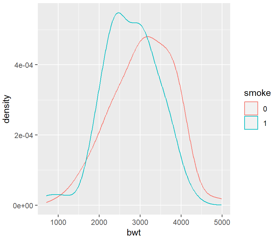
ggplot(birthwt_mod, aes(x = bwt, colour = smoke)) +
  geom_density()
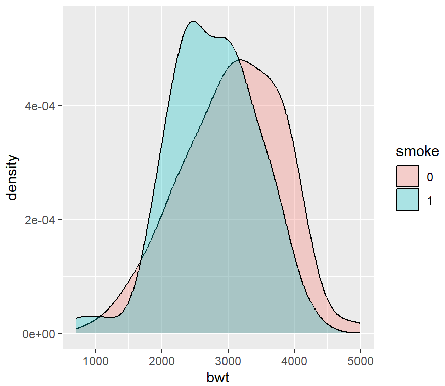
ggplot(birthwt_mod, aes(x = bwt, fill = smoke)) +
  geom_density(alpha = .3)
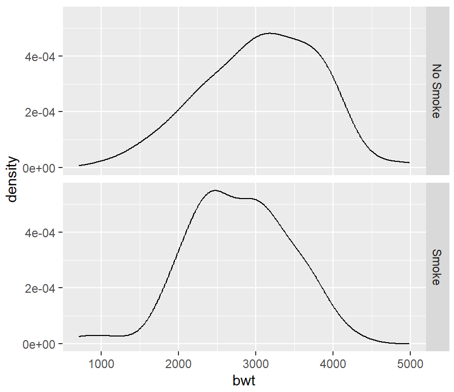
ggplot(birthwt_mod, aes(x = bwt)) +
  geom_density() +
  facet_grid(smoke ~ .)

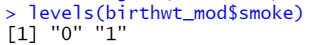
levels(birthwt_mod$smoke)
birthwt_mod$smoke <- recode(birthwt_mod$smoke, '0' = 'No Smoke', '1' = 'Smoke')

ggplot(birthwt_mod, aes(x = bwt)) +
  geom_density() +
  facet_grid(smoke ~ .)
ggplot(birthwt_mod, aes(x = bwt, y = ..density..)) +
  geom_histogram(binwidth = 200, fill = "cornsilk", colour = "grey60", size = .2) +
  geom_density() +
  facet_grid(smoke ~ .)
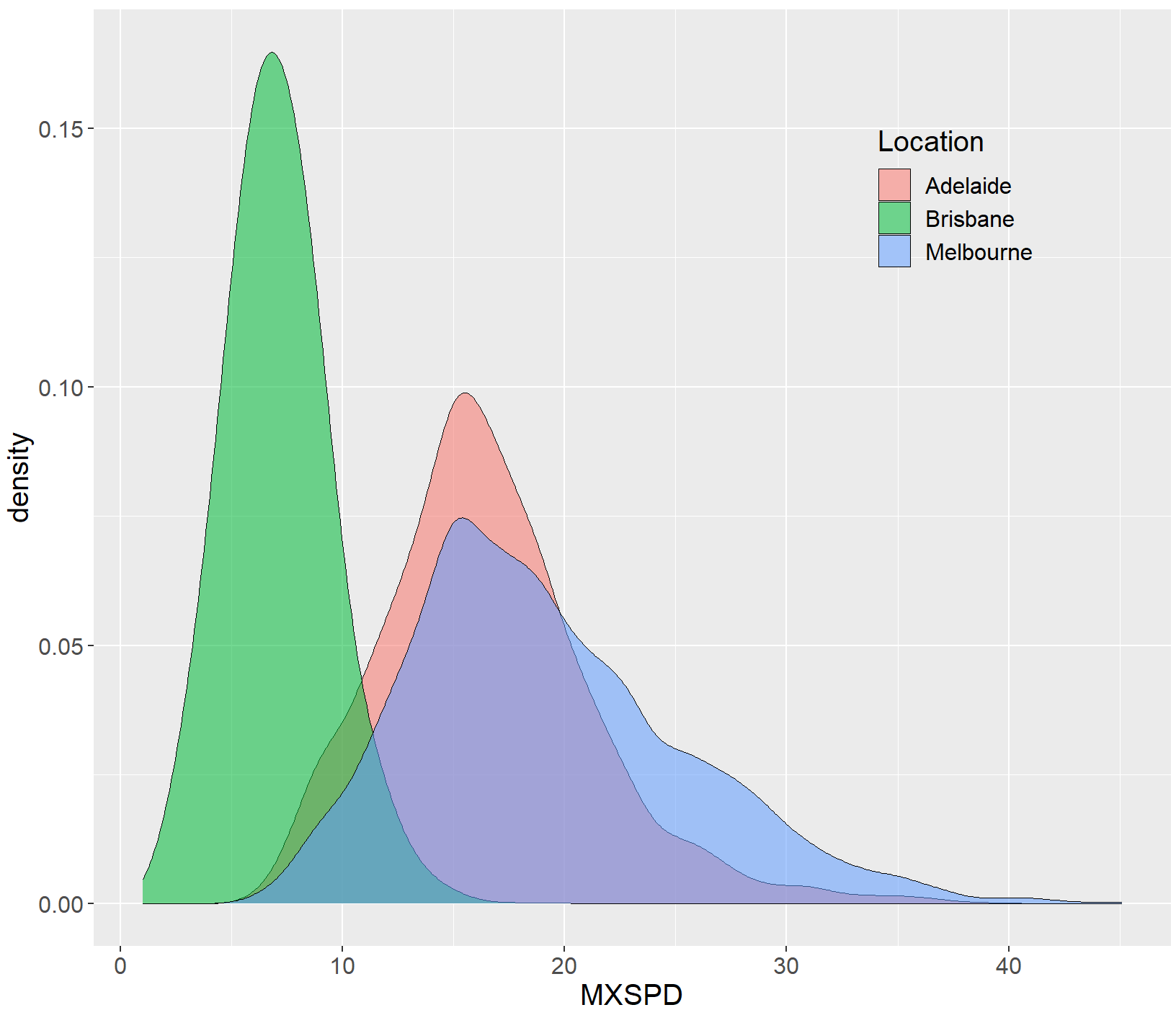
library(ggplot2)
df<-read.csv("Hist_Density_Data.csv",stringsAsFactors=FALSE)
ggplot(df, aes(x=MXSPD, fill=Location))+
 geom_density(alpha=0.55,bw=1,colour="black",size=0.25)
ggplot(df, aes(x=MXSPD,  fill=Location))+
  geom_density(alpha=0.55,bw=1,colour="black",size=0.25)+
  theme(
    text=element_text(size=15,color="black"),
    plot.title=element_text(size=15,family="myfont",face="bold.italic",hjust=.5,color="black"),#,
    legend.position=c(0.8,0.8),
    legend.background = element_blank()
  )
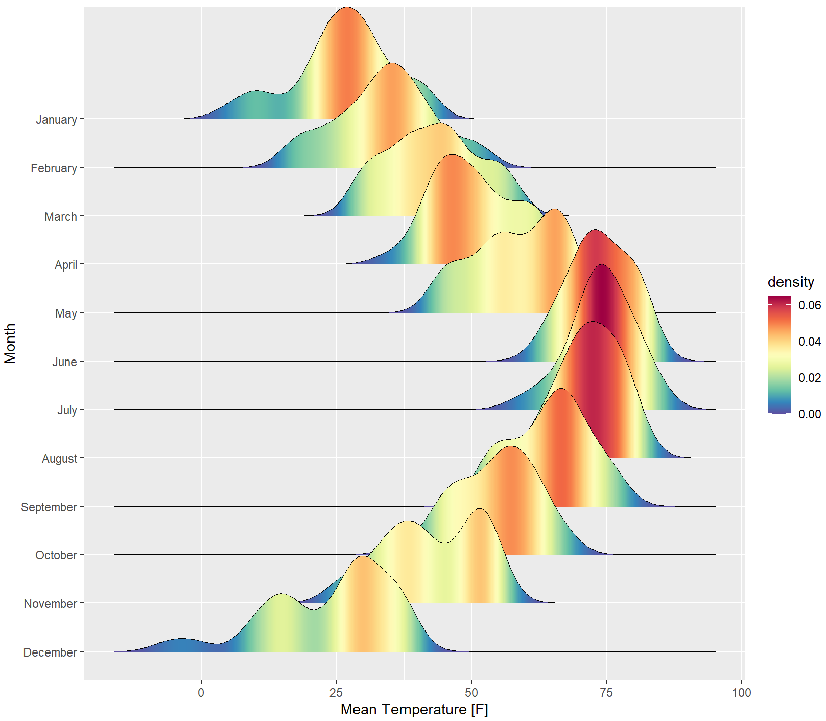
核密度估计峰峦图
ggridges包提供了geom_density_ridges_gradient()函数,可以结合 ggplot2包的ggplot()函数绘制核密度估计峰峦图。可将核密度估计峰峦图的数值映射到颜色条。
library(ggplot2)
library(ggridges)
library(RColorBrewer)
ggplot(lincoln_weather, aes(x = `Mean Temperature [F]`, y = `Month`, fill = after_stat(density))) +
  geom_density_ridges_gradient(scale = 3, rel_min_height = 0.00,size = 0.3) +
  scale_fill_gradientn(colours = colorRampPalette(rev(brewer.pal(11,'Spectral')))(32))
R 自带的rnorm()函数可以构造符合高斯分布的单峰或者多峰数据,使用SuppDists包的rJohnson()函数可以构造符合Johnson分布的数据。
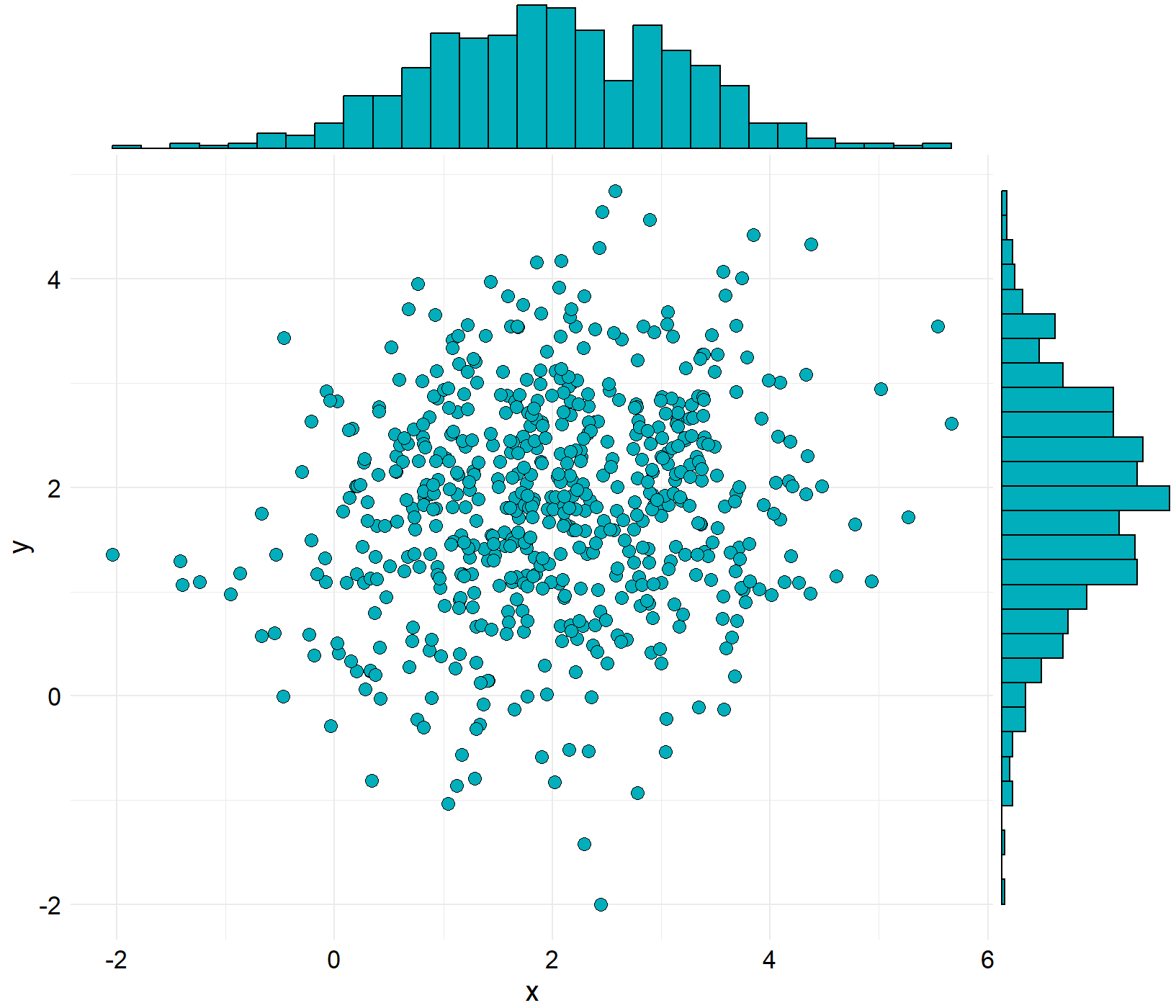
二维散点图与统计分布图组合
ggpubr包的ggscatterhist()函数(选择density参数绘制核密度估计图,选择histogram参数绘制统计直方图,选择boxplot参数绘制箱形图,共三种类型),ggExtra包的ggMarginal()函数(选择density参数绘制核密度估计图, 选择histogram参数绘制统计直方图, 选择boxplot参数绘制箱形图,选择violin参数绘制小提琴图,共 4 种类型),gridExtra包的grid.arrange()函数实现ggplot2包绘制的散点图和统计直方图的组合,这三种方法都可以实现二维散点图与统计直方图组合,其中以ggscatterhist()函数最为简单,grid.arrange()函数的可控性最好,也最为复杂。
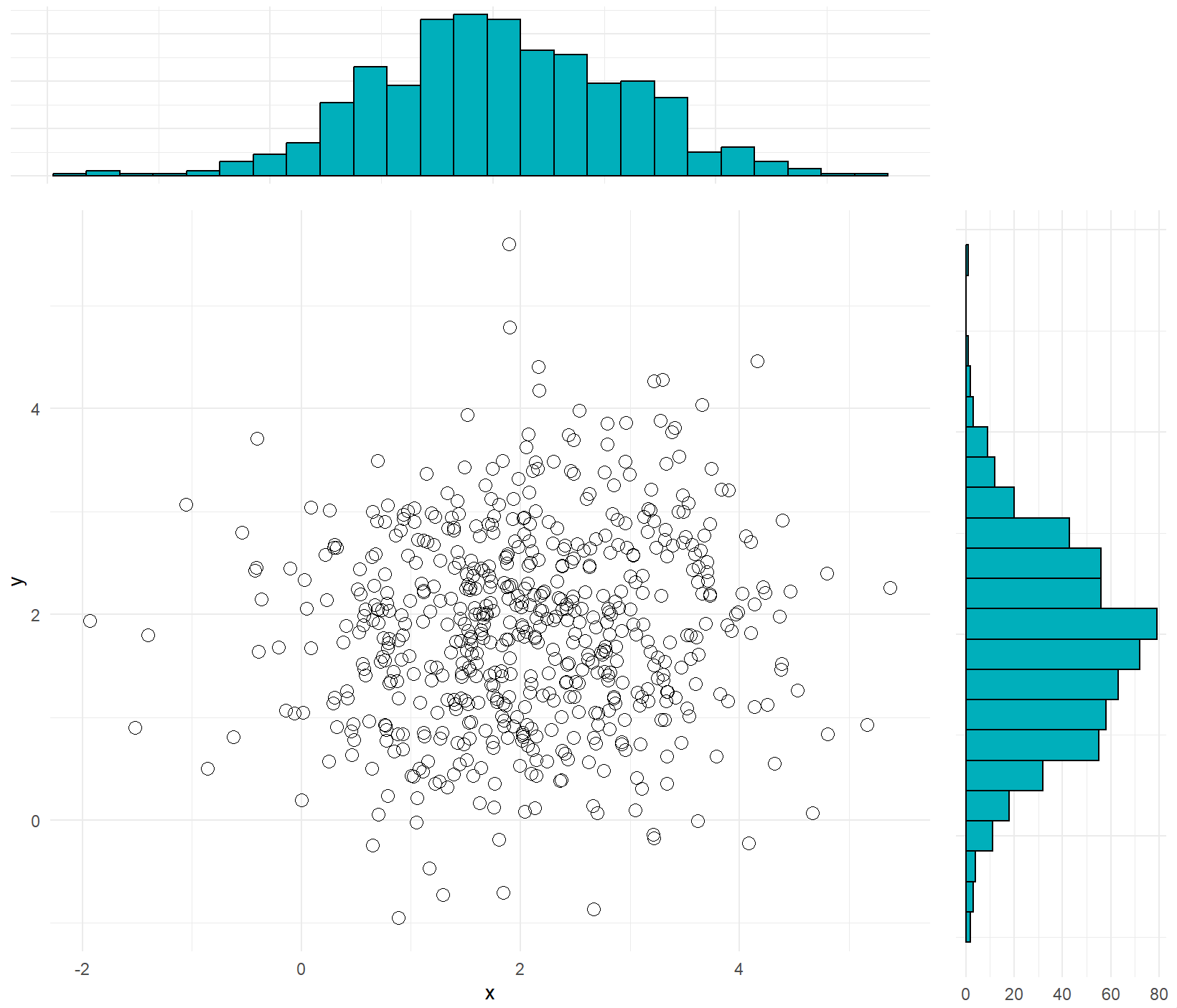
二维散点图与统计直方图组合
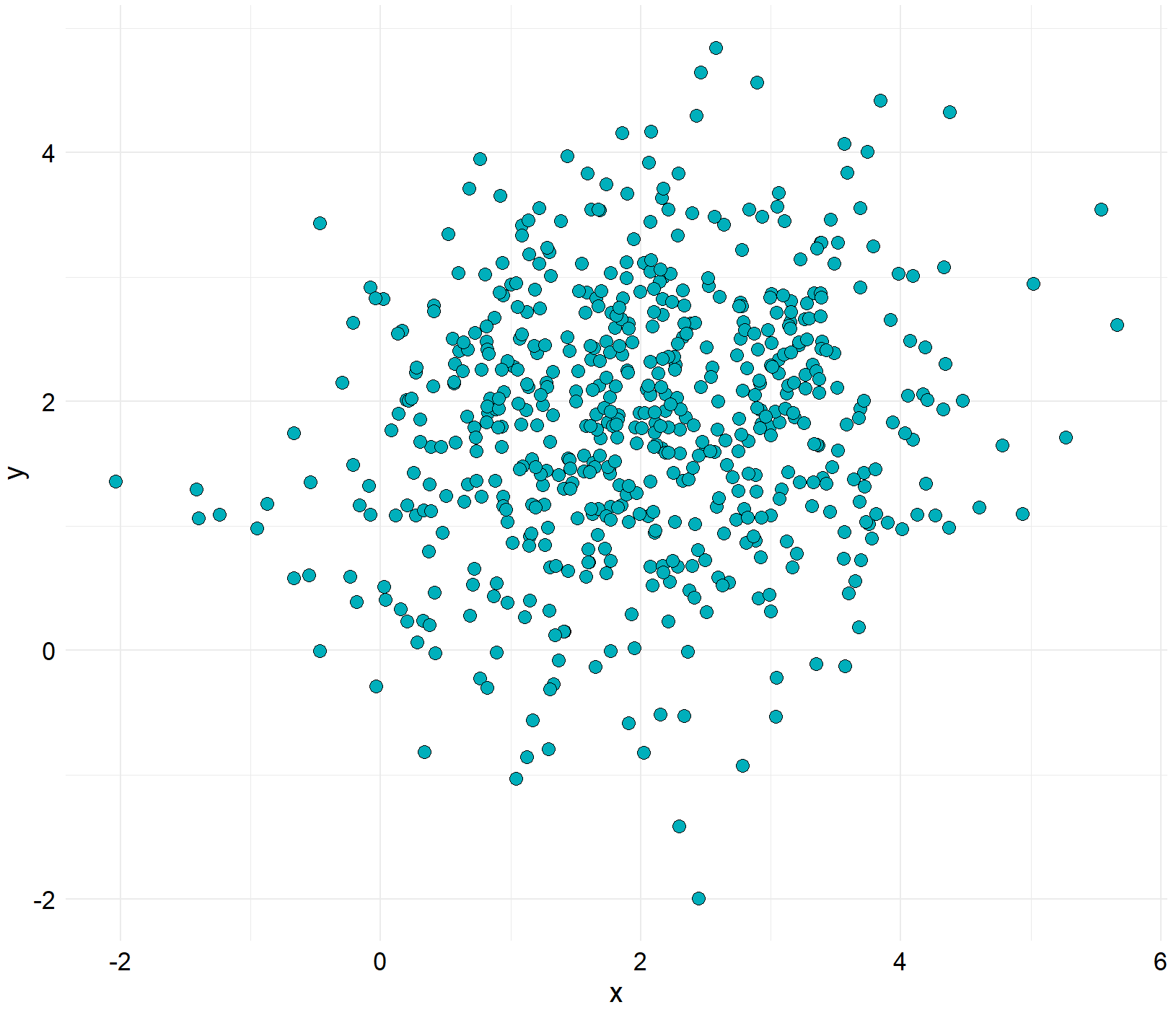
N<-300
x1 <- rnorm(mean=1.5, N)
y1 <- rnorm(mean=1.6, N)
x2 <- rnorm(mean=2.5, N)
y2 <- rnorm(mean=2.2, N)

data1 <- data.frame(x=c(x1,x2),y=c(y1,y2))
① 方法一
ggscatterhist(
  data1, x ='x', y = 'y', shape=21,fill="#00AFBB",color = "black",size = 3, alpha = 1,
  #palette = c("#00AFBB", "#E7B800", "#FC4E07"),
  margin.params = list( fill="#00AFBB",color = "black", size = 0.2,alpha=1),
  margin.plot =  "histogram",
  legend = c(0.8,0.8),
  ggtheme = theme_minimal())
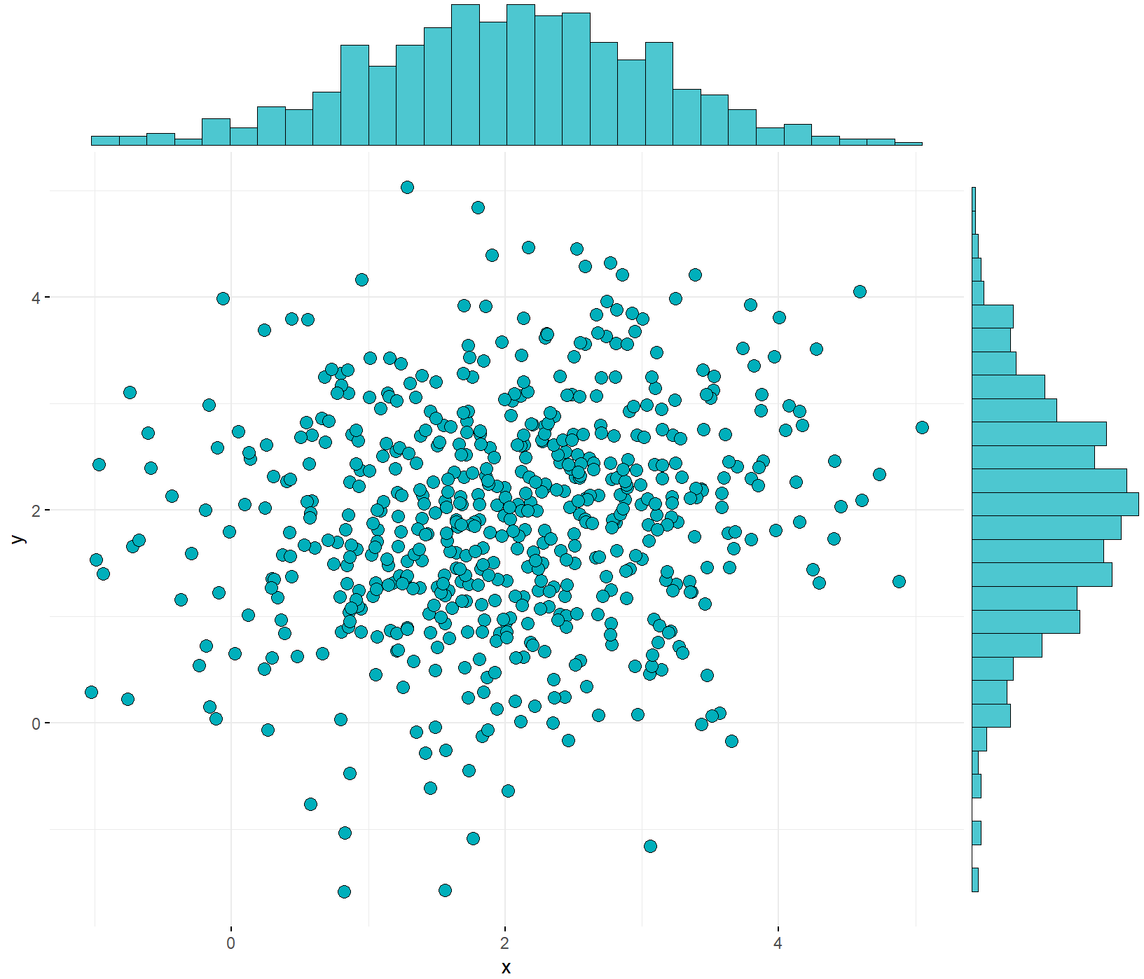
② 方法二
scatter <- ggplot(data=data1,aes(x=x,y=y)) +
  geom_point(shape=21,fill="#00AFBB",color="black",size=3)+
  theme_minimal()+
  theme(
    #text=element_text(size=15,face="plain",color="black"),
    axis.title=element_text(size=15,face="plain",color="black"),
    axis.text = element_text(size=13,face="plain",color="black"),
    legend.text= element_text(size=13,face="plain",color="black"),
    legend.title=element_text(size=12,face="plain",color="black"),
    legend.background=element_blank()
    #legend.position = c(0.12,0.88)
  )
library(ggExtra)
ggMarginal(scatter,type="histogram",color="black",fill="#00AFBB")
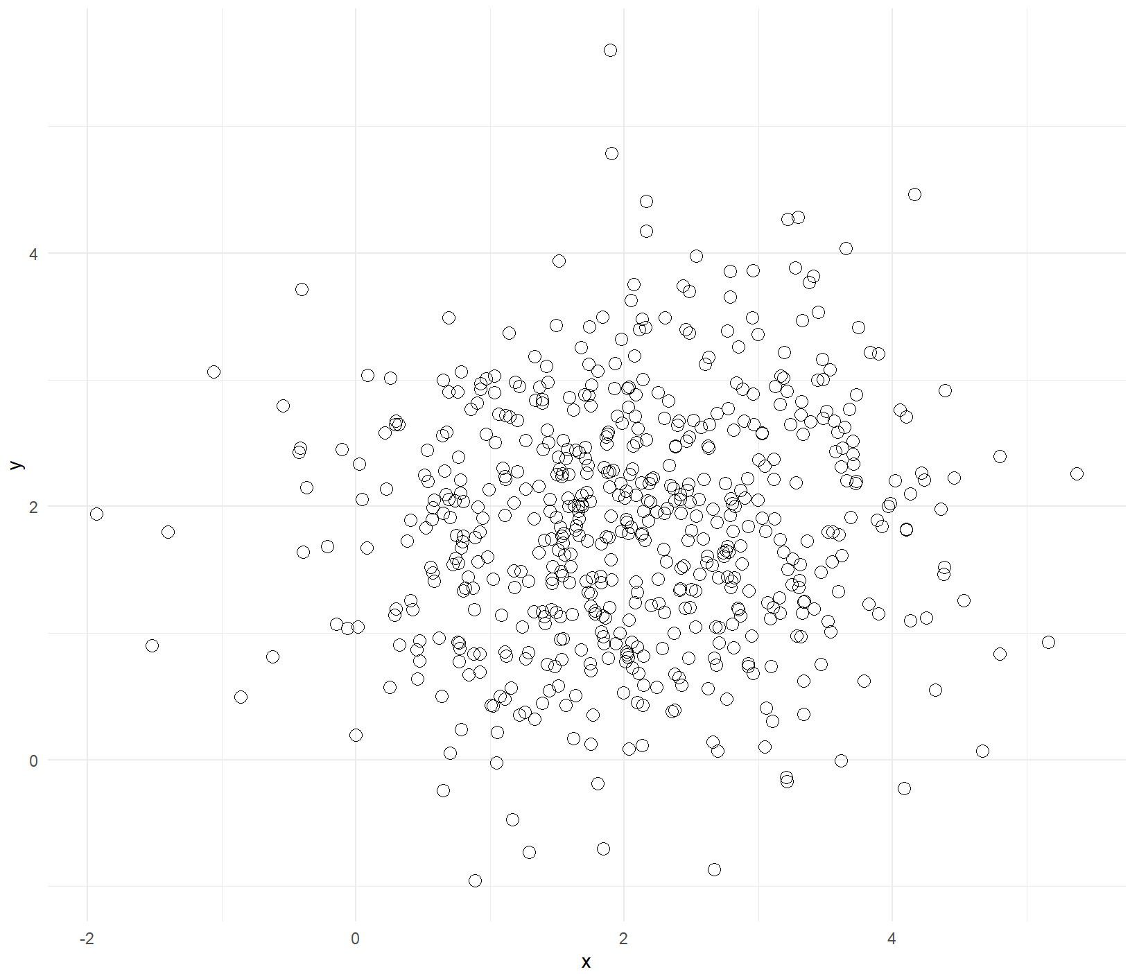
③ 方法三
library(gridExtra)
# 绘制主图散点图,并将图例去除,这里point层和path层使用了不同的数据集
scatter <- ggplot() +
  geom_point(data=data1,aes(x=x,y=y),shape=21,color="black",size=3)+
  theme_minimal()
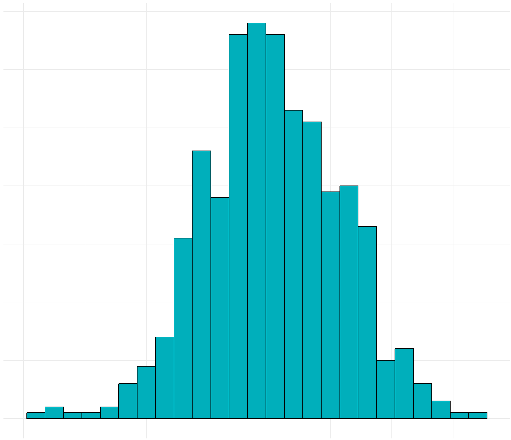
# 绘制上边的直方图,并将各种标注去除
hist_top <- ggplot()+
  geom_histogram(aes(data1$x),colour='black',fill='#00AFBB',binwidth = 0.3)+
  theme_minimal()+
  theme(panel.background=element_blank(),
        axis.title.x=element_blank(),
        axis.title.y=element_blank(),
        axis.text.x=element_blank(),
        axis.text.y=element_blank(),
        axis.ticks=element_blank())
# 同样绘制右边的直方图
hist_right <- ggplot()+
  geom_histogram(aes(data1$y),colour='black',fill='#00AFBB',binwidth = 0.3)+
  theme_minimal()+
  theme(panel.background=element_blank(),
        axis.title.x=element_blank(),
        axis.title.y=element_blank(),
        #axis.text.x=element_blank(),
        axis.text.y=element_blank(),
        axis.ticks=element_blank())+
  coord_flip()
empty <- ggplot() +
  theme(panel.background=element_blank(),
        axis.title.x=element_blank(),
        axis.title.y=element_blank(),
        axis.text.x=element_blank(),
        axis.text.y=element_blank(),
        axis.ticks=element_blank())

grid.arrange(hist_top, empty, scatter, hist_right, ncol=2, nrow=2, widths=c(4,1), heights=c(1,4))
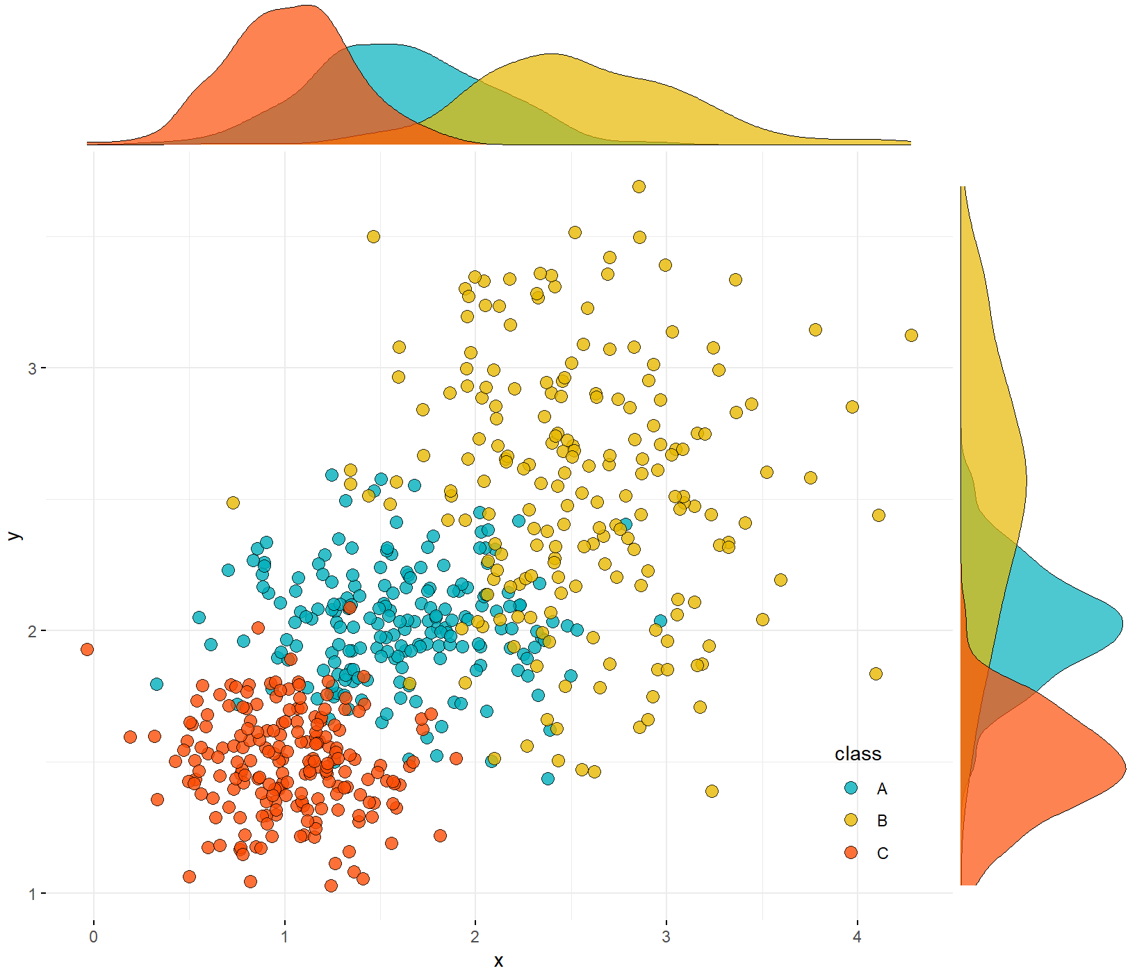
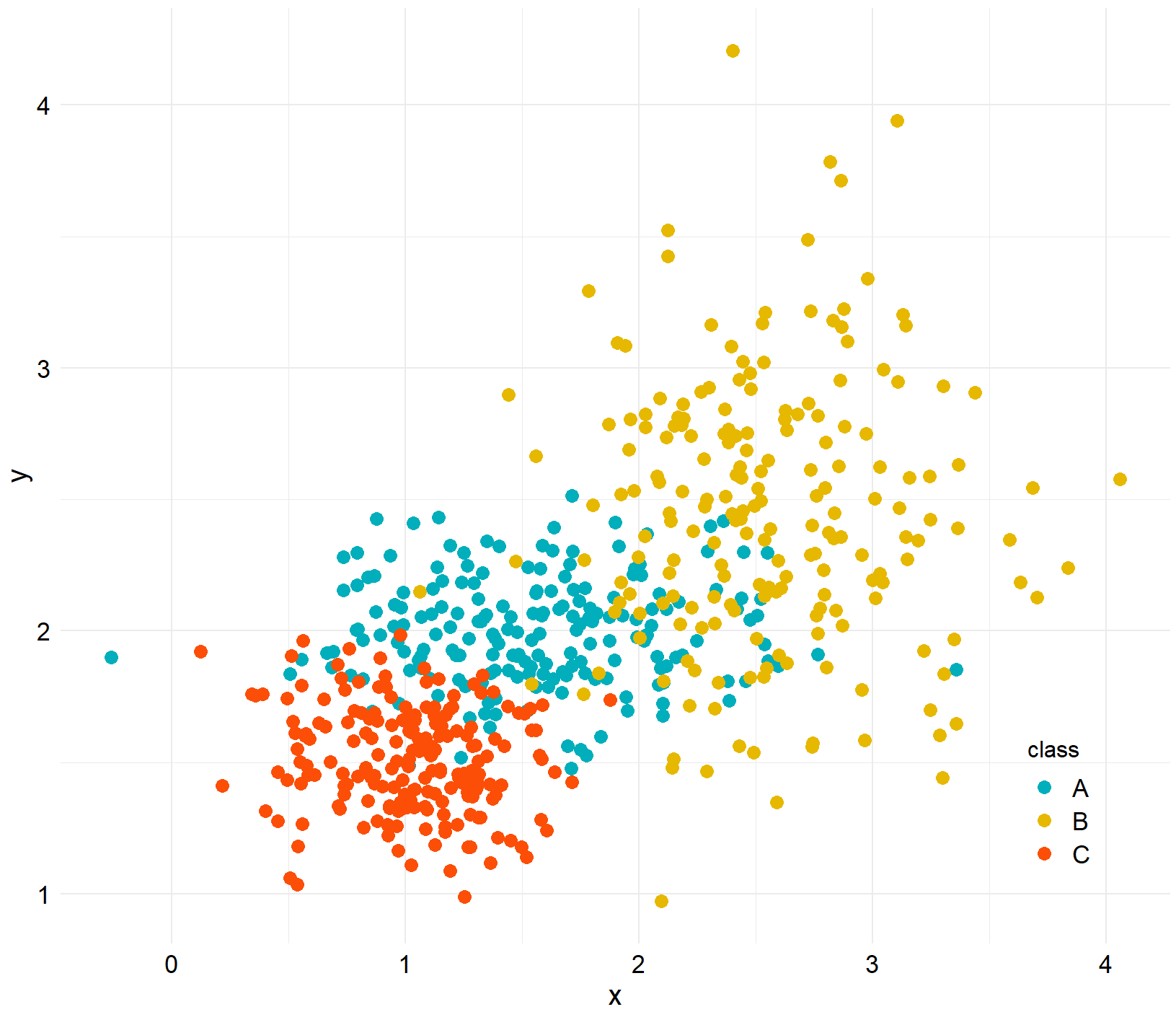
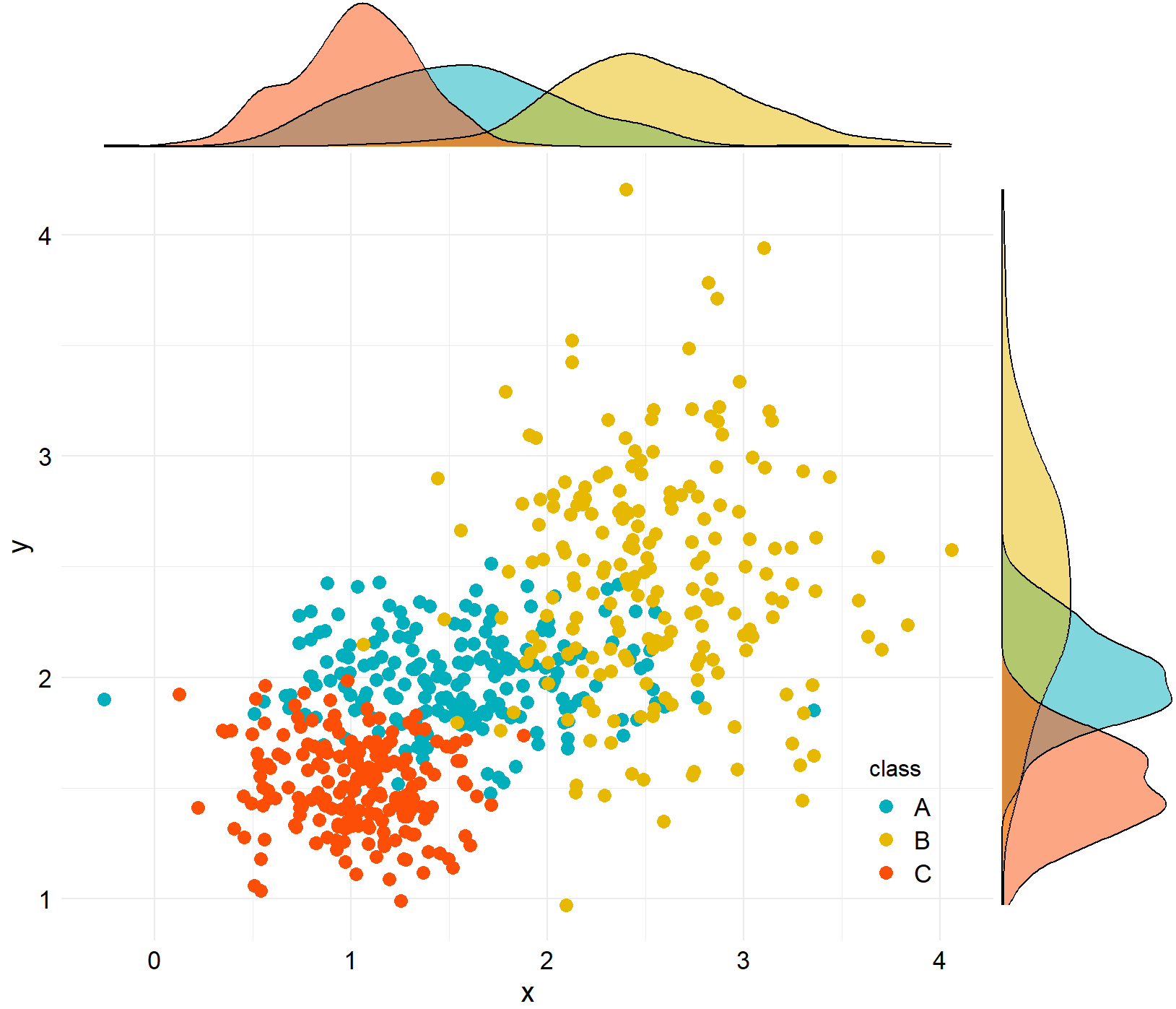
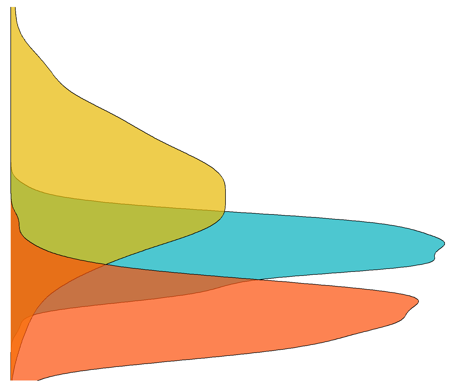
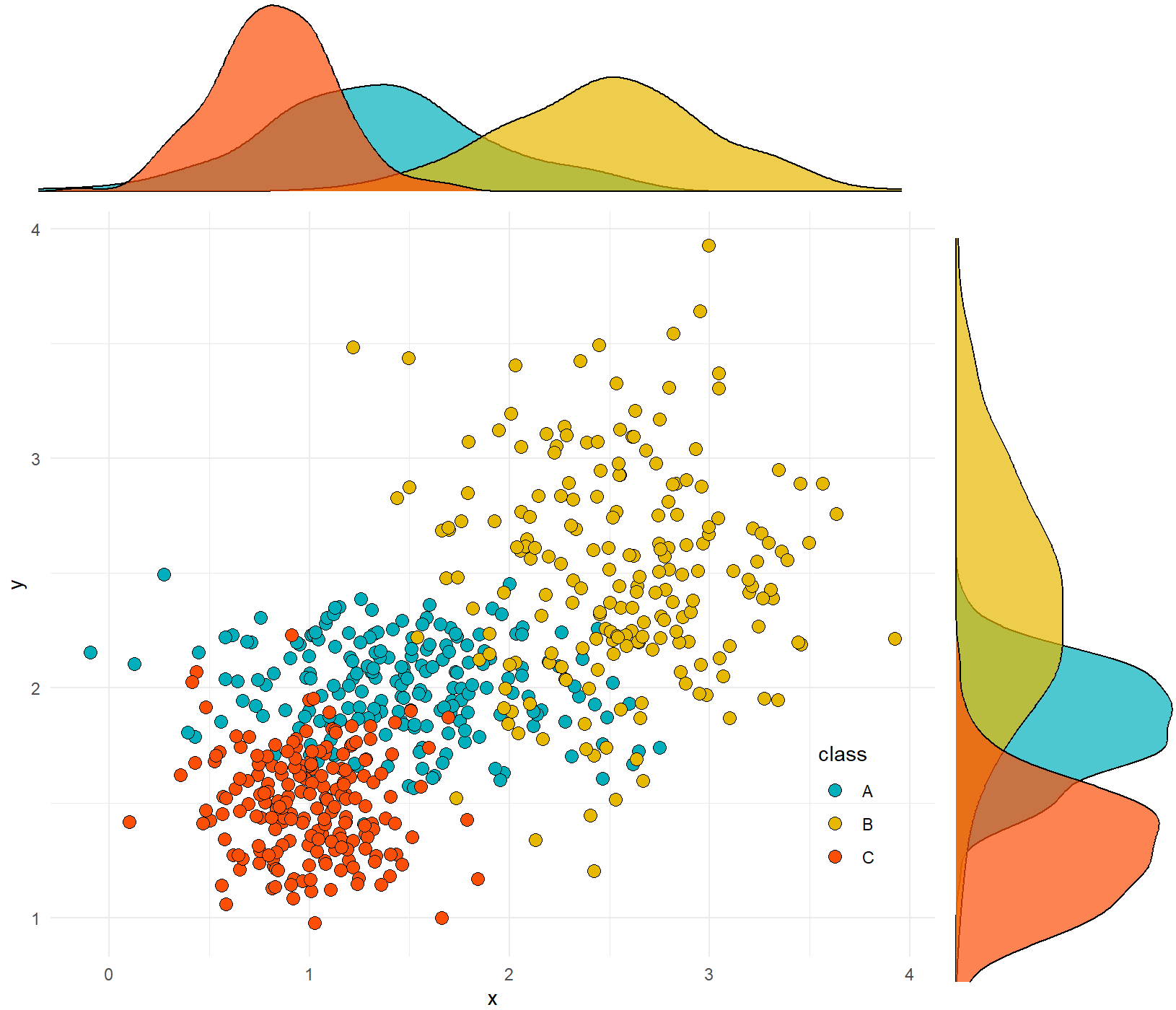
二维散点与核密度估计图
library(ggpubr)
N<-200
x1 <- rnorm(mean=1.5, sd=0.5,N)
y1 <- rnorm(mean=2,sd=0.2, N)
x2 <- rnorm(mean=2.5,sd=0.5, N)
y2 <- rnorm(mean=2.5,sd=0.5, N)
x3 <- rnorm(mean=1, sd=0.3,N)
y3 <- rnorm(mean=1.5,sd=0.2, N)
data2 <- data.frame(x=c(x1,x2,x3),y=c(y1,y2,y3),class=rep(c("A","B","C"),each=200))
① 方法一
ggscatterhist(
  data2, x ='x', y = 'y',
  shape=21,color ="black",fill= "class", size =3, alpha = 0.8,
  palette = c("#00AFBB", "#E7B800", "#FC4E07"),
  margin.plot = "density",
  margin.params = list(fill = "class", color = "black", size = 0.2),
  legend = c(0.9,0.15),
  ggtheme = theme_minimal())
② 方法二
scatter <- ggplot(data=data2,aes(x=x,y=y,colour=class,fill=class)) +
  geom_point(aes(fill=class),shape=21,size=3)+#,colour="black")+
  scale_fill_manual(values= c("#00AFBB", "#E7B800", "#FC4E07"))+
  scale_colour_manual(values=c("#00AFBB", "#E7B800", "#FC4E07"))+
  theme_minimal()+
  theme(
    #text=element_text(size=15,face="plain",color="black"),
    axis.title=element_text(size=15,face="plain",color="black"),
    axis.text = element_text(size=13,face="plain",color="black"),
    legend.text= element_text(size=13,face="plain",color="black"),
    legend.title=element_text(size=12,face="plain",color="black"),
    legend.background=element_blank(),
    legend.position = c(0.9,0.15)
  )
library(ggExtra)
ggMarginal(scatter,type="density",color="black",groupColour = FALSE,groupFill = TRUE)
③ 方法三
library(gridExtra)
# 绘制主图散点图,并将图例去除,这里point层和path层使用了不同的数据集
scatter <- ggplot() +
  geom_point(data=data2,aes(x=x,y=y,fill=class),shape=21,color="black",size=3)+
  scale_fill_manual(values= c("#00AFBB", "#E7B800", "#FC4E07"))+
  theme_minimal()+
  theme(legend.position=c(0.9,0.2))
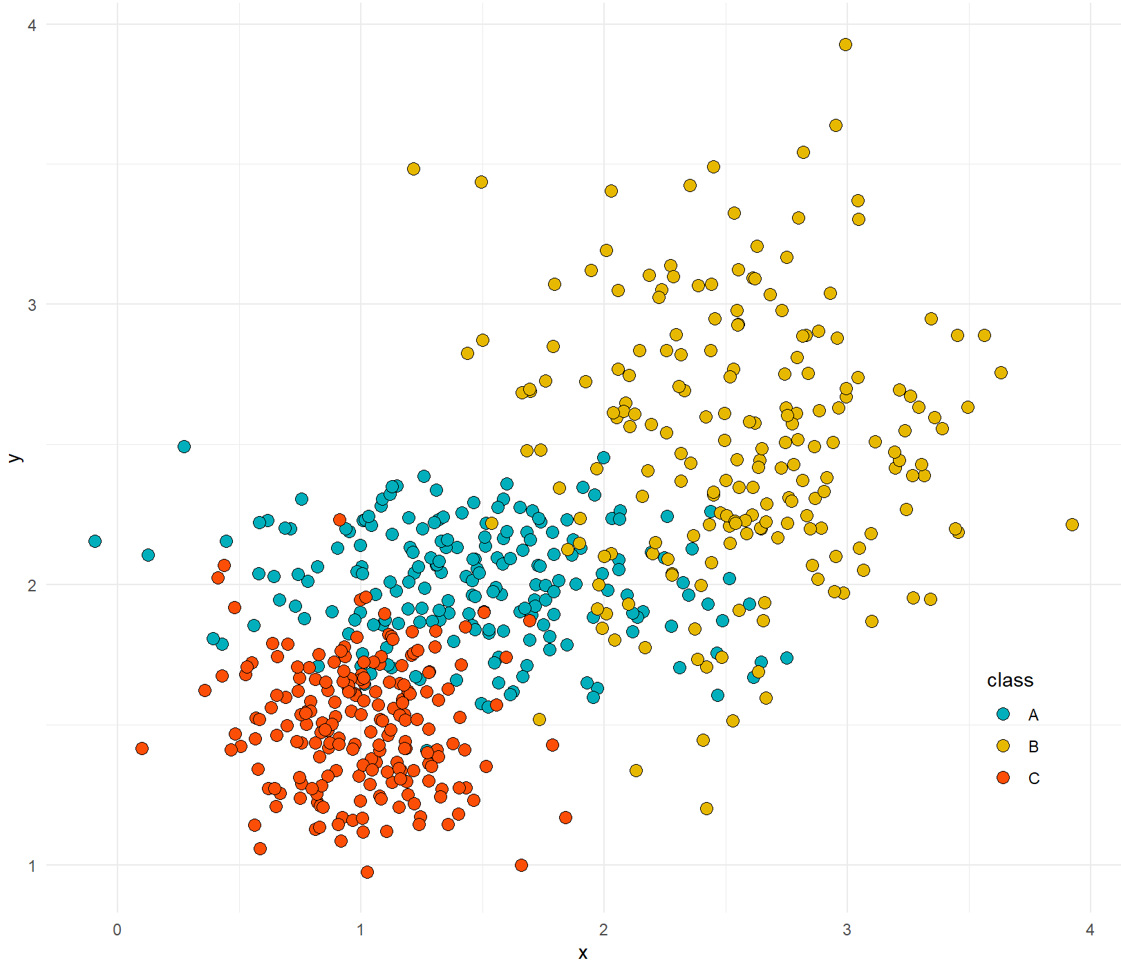
# 绘制上边的直方图,并将各种标注去除
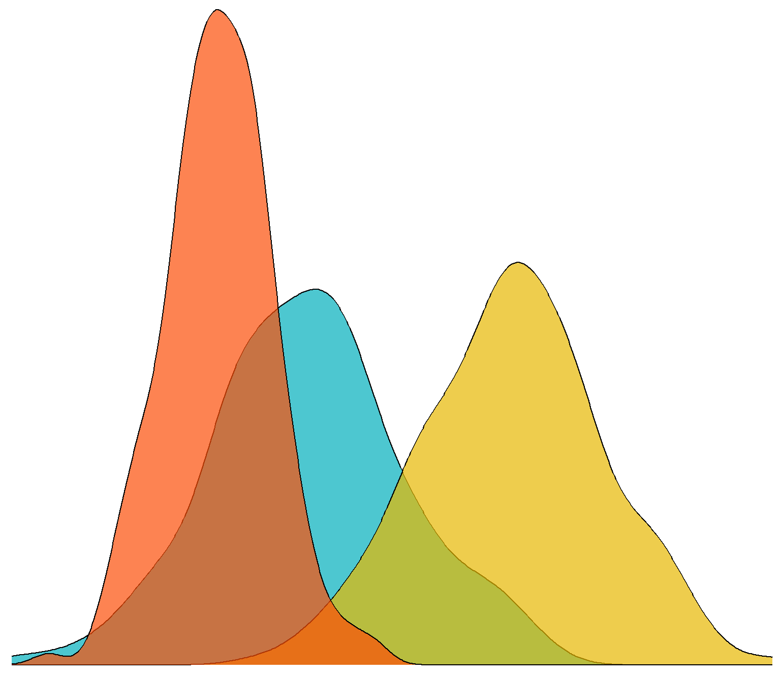
hist_top <- ggplot()+
geom_density(data=data2,aes(x,fill=class),colour='black',alpha=0.7)+
scale_fill_manual(values= c("#00AFBB", "#E7B800", "#FC4E07"))+
theme_void()+
theme(legend.position="none")
# 同样绘制右边的直方图
hist_right <- ggplot()+
  geom_density(data=data2,aes(y,fill=class),colour='black',alpha=0.7)+
  scale_fill_manual(values= c("#00AFBB", "#E7B800", "#FC4E07"))+
  theme_void()+
  coord_flip()+
  theme(legend.position="none")
empty <- ggplot() +
  theme(panel.background=element_blank(),
        axis.title.x=element_blank(),
        axis.title.y=element_blank(),
        axis.text.x=element_blank(),
        axis.text.y=element_blank(),
        axis.ticks=element_blank())

grid.arrange(hist_top, empty, scatter, hist_right, ncol=2, nrow=2, widths=c(4,1), heights=c(1,4))
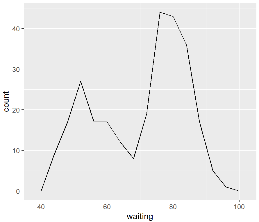
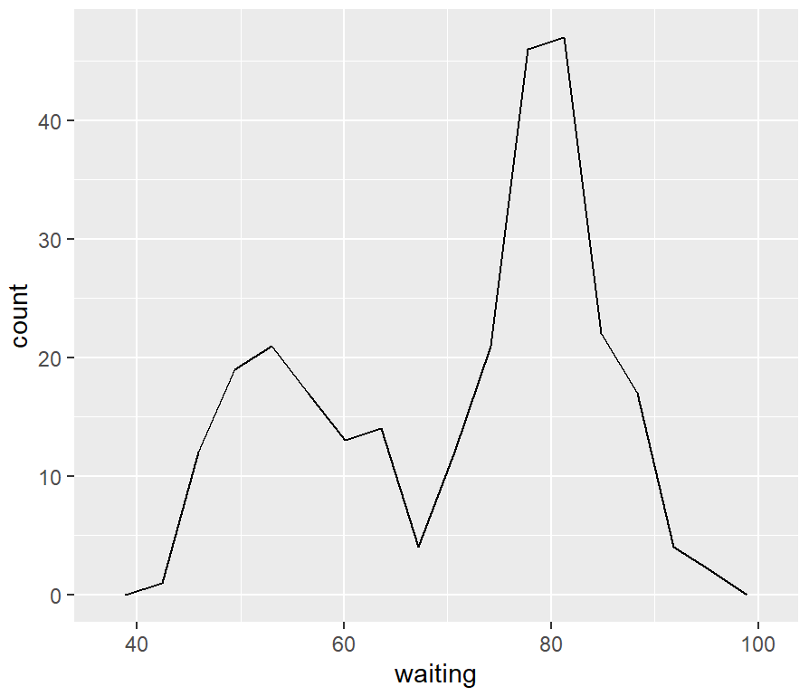
频率多边形
频率多边形与核密度估计曲线相似,但它所显示的信息与直方图相同。它像直方图一样,显示了数据中的内容。
ggplot(faithful, aes(x=waiting)) +
  geom_freqpoly()
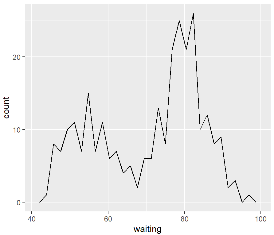
ggplot(faithful, aes(x = waiting)) +
  geom_freqpoly(binwidth = 4)
# 极差除以分组数来得到组距
binsize <- diff(range(faithful$waiting))/15

ggplot(faithful, aes(x = waiting)) +
  geom_freqpoly(binwidth = binsize)
参考资料
[1] https://r-graphics.org/recipe-bar-graph-labels
[2] https://github.com/EasyChart/Beautiful-Visualization-with-R
[3] R语言数据可视化之美:专业图表绘制指南(增强版) (张杰)


 2万+
2万+


 被折叠的 条评论
为什么被折叠?
被折叠的 条评论
为什么被折叠?
 到【灌水乐园】发言


