


欢迎关注微信公众号(医学生物信息学),医学生的生信笔记,记录学习过程。
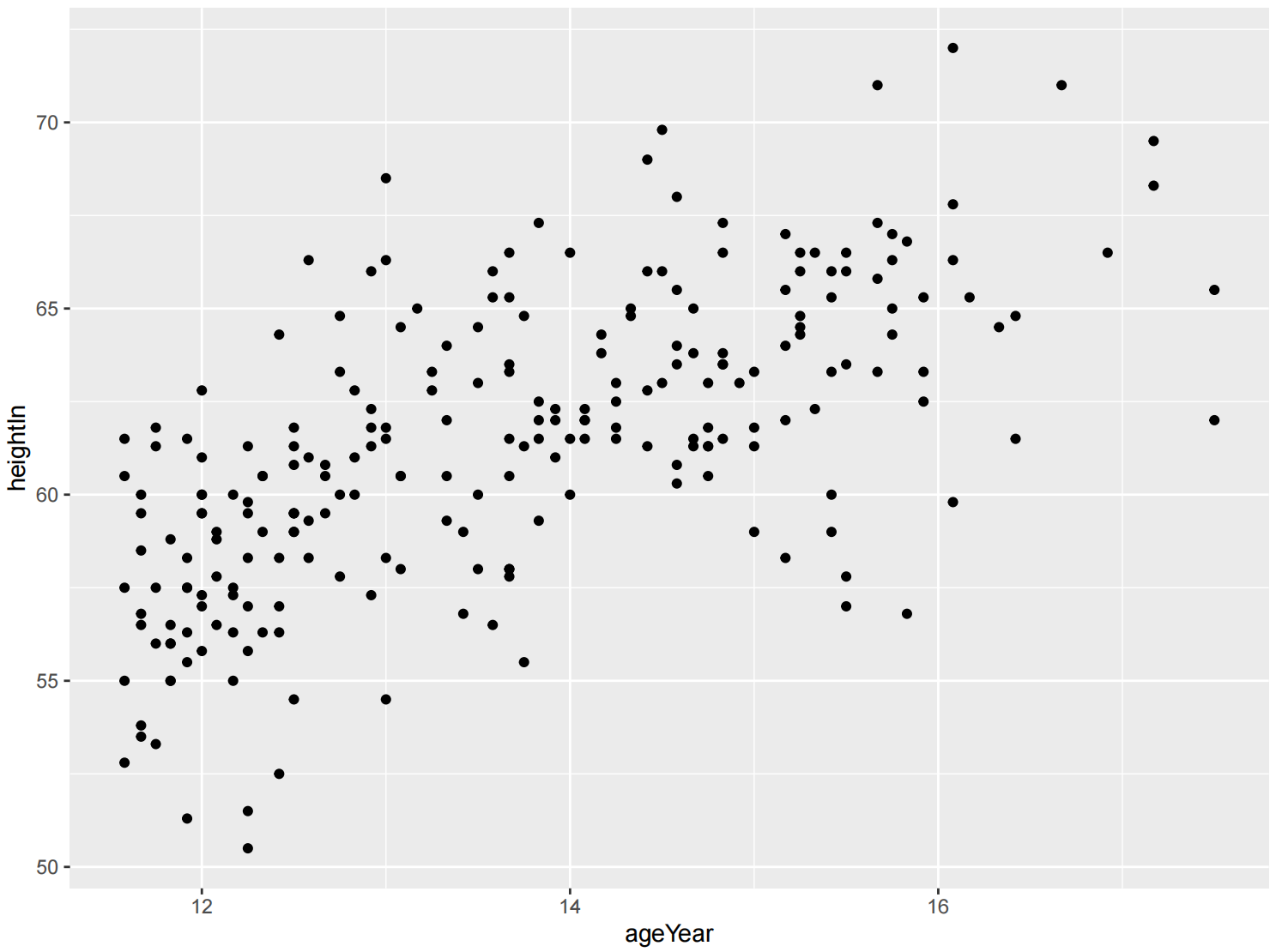
简单散点图
library(gcookbook)
library(dplyr)

heightweight %>%
  select(ageYear, heightIn)
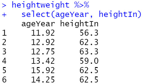
ggplot(heightweight, aes(x = ageYear, y = heightIn)) +
  geom_point()
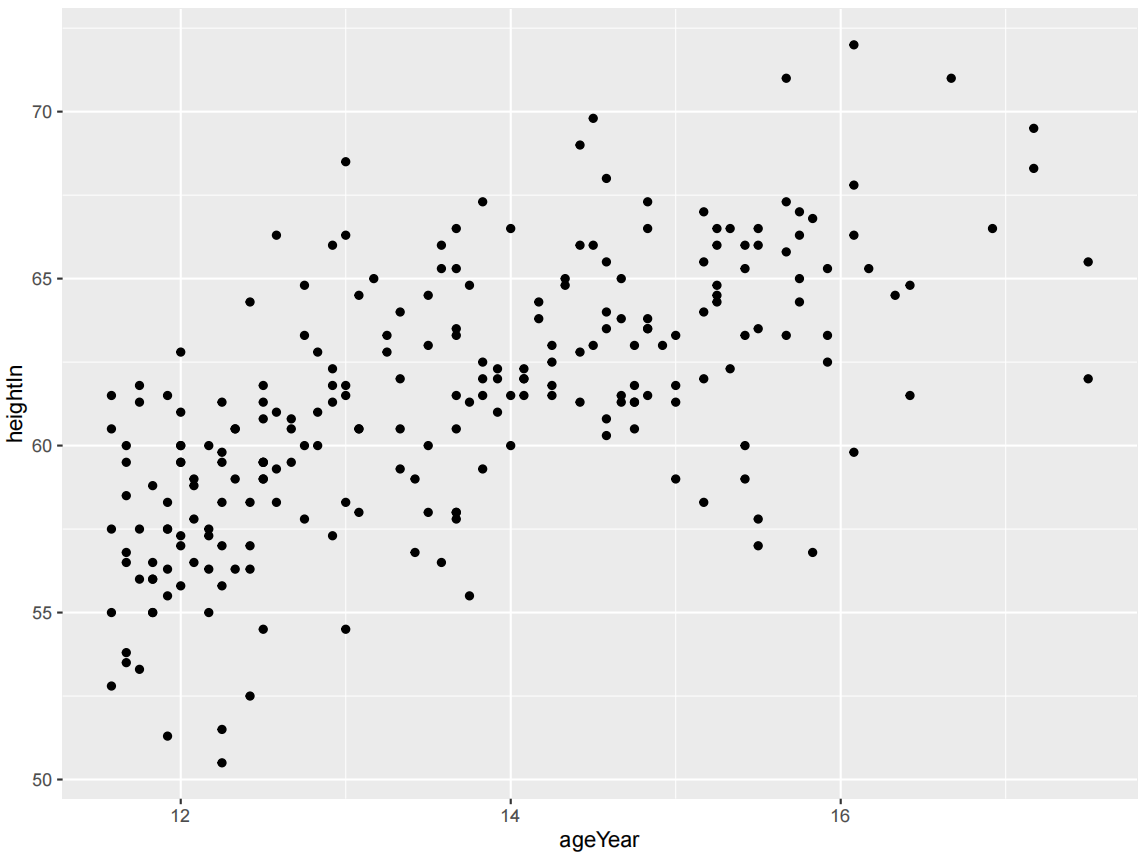
ggplot(heightweight, aes(x = ageYear, y = heightIn)) +
  geom_point(shape = 21)
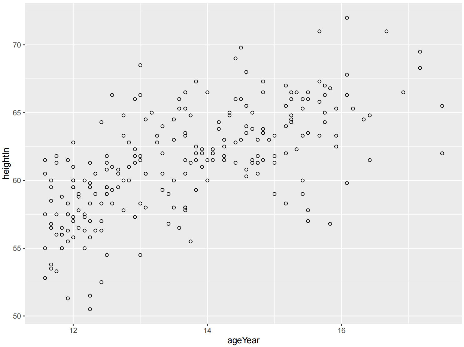
ggplot(heightweight, aes(x = ageYear, y = heightIn)) +
  geom_point(shape = 3)
ggplot(heightweight, aes(x = ageYear, y = heightIn)) +
  geom_point(size = 1.5) #size默认值为2
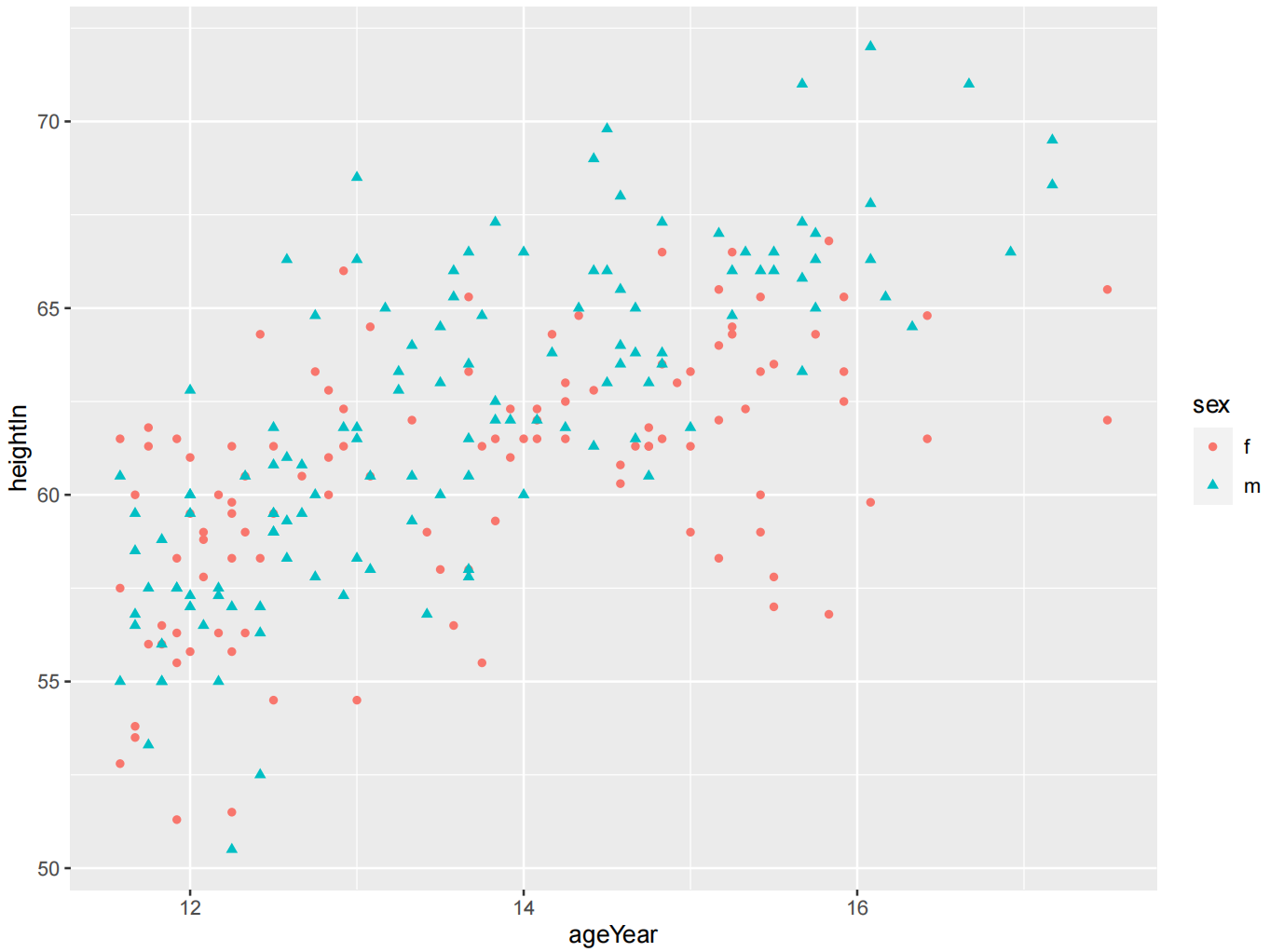
多分组散点图
选择的分组变量必须是分类的,是一个因子或字符向量。如果分组变量是一个数字向量,则应首先将其转换为因子。
library(gcookbook)

heightweight %>%
  select(sex, ageYear, heightIn)
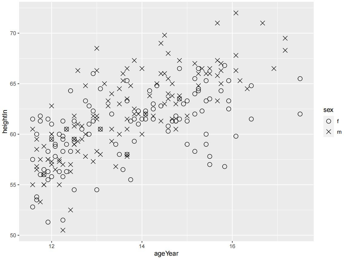
ggplot(heightweight, aes(x = ageYear, y = heightIn, shape = sex, colour = sex)) +
  geom_point()
可以使用scale_shape_manual()为分组变量选择其他形状,并使用scale_color_brewer()或scale_color_manual()选择其他颜色。
ggplot(heightweight, aes(x = ageYear, y = heightIn, shape = sex)) +
  geom_point(size = 3) +
  scale_shape_manual(values = c(1, 4))
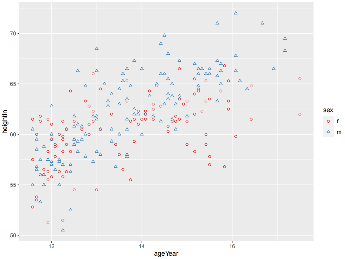
ggplot(heightweight, aes(x = ageYear, y = heightIn, shape = sex, colour = sex)) +
  geom_point() +
  scale_shape_manual(values = c(1,2)) +
  scale_colour_brewer(palette = "Set1")
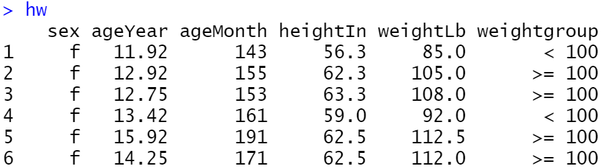
hw <- heightweight %>%
  mutate(weightgroup = ifelse(weightLb < 100, "< 100", ">= 100"))
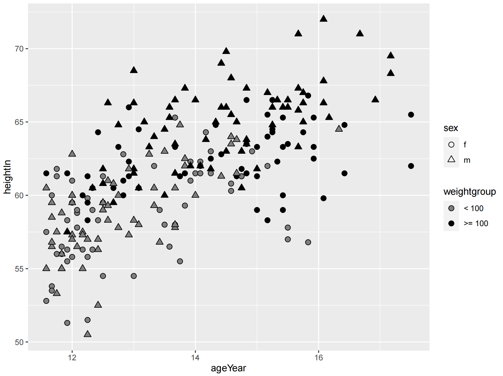
ggplot(hw, aes(x = ageYear, y = heightIn, shape = sex, fill = weightgroup)) +
  geom_point(size = 2.5) +
  scale_shape_manual(values = c(21, 24)) +
  scale_fill_manual(
    values = c(NA, "black"),
    guide = guide_legend(override.aes = list(shape = 21))
  )
将连续变量映射到颜色或大小
library(gcookbook)
library(tidyverse)
heightweight %>%
  select(sex, ageYear, heightIn, weightLb)
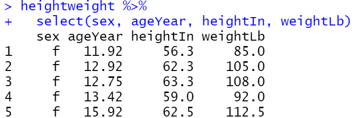
ggplot(heightweight, aes(x = ageYear, y = heightIn, colour = weightLb)) +
  geom_point()
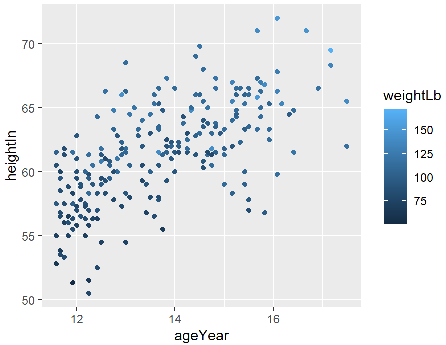
ggplot(heightweight, aes(x = ageYear, y = heightIn, size = weightLb)) +
  geom_point()
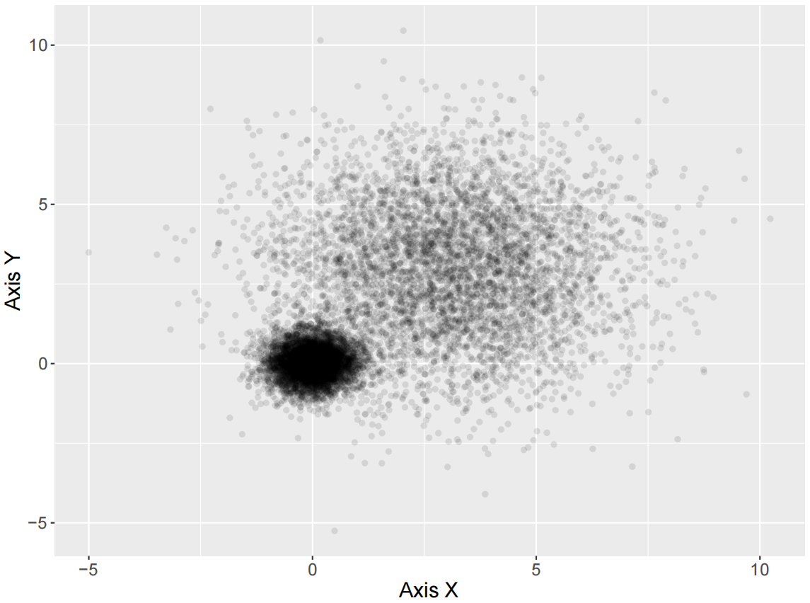
高密度散点图
对于大型数据集,散点图中的点可能相互重叠和模糊,从而妨碍观察者准确地评估数据的分布。
library(ggplot2)
library(RColorBrewer)

mydata<-read.csv("HighDensity_Scatter_Data.csv",stringsAsFactors=FALSE)
设置透明度的散点图
ggplot(data = mydata, aes(x,y)) +
  geom_point( colour="black",alpha=0.1)+
  labs(x = "Axis X",y="Axis Y")+
  theme(
    text=element_text(size=15,color="black"),
    plot.title=element_text(size=15,family="myfont",face="bold.italic",hjust=.5,color="black"),
    legend.position="none"
  )
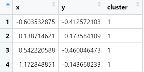
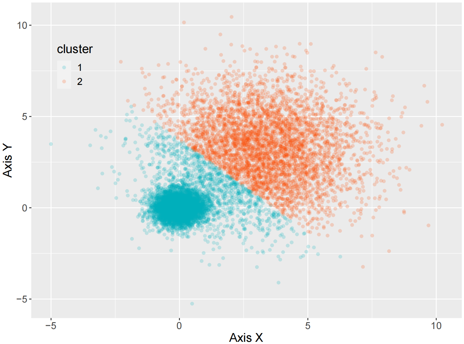
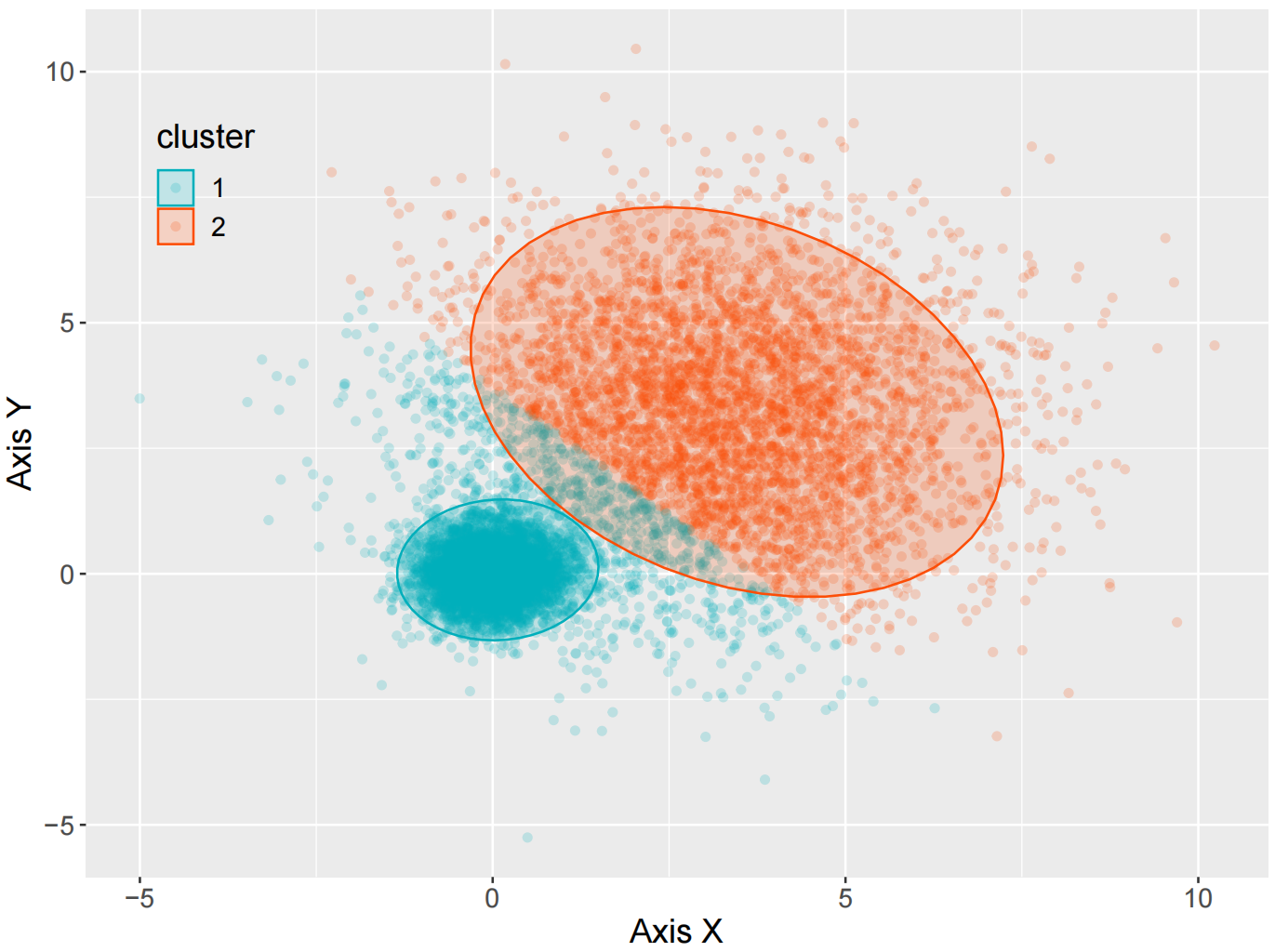
k-means聚类的散点图
k-means 算法接受输入参数 k,然后将 n 个数据对象划分为 k 个聚类以便使所获得的聚类满足:同一聚类中的对象相似度较高,而不同聚类中的对象相似度较小。
kmeansResult<- kmeans(mydata, 2, nstart =20)
# mydata 为 x 和 y 两列数据组成,k-means 算法
mydata$cluster <- as.factor(kmeansResult$cluster)
ggplot(data = mydata, aes(x,y,color=cluster)) +
  geom_point( alpha=0.2)+
  scale_color_manual(values=c("#00AFBB",  "#FC4E07"))+
  labs(x = "Axis X",y="Axis Y")+
  theme(
    text=element_text(size=15,color="black"),
    plot.title=element_text(size=15,family="myfont",face="bold.italic",color="black"),
    legend.background=element_blank(),
    legend.position=c(0.1,0.8)
  )
ggplot(data = mydata, aes(x,y,color=cluster)) +
  geom_point (alpha=0.2)+
  # 绘制透明度为 0.2 的散点图
  stat_ellipse(aes(x=x,y=y,fill= cluster), geom="polygon", level=0.95, alpha=0.2) +
  scale_color_manual(values=c("#00AFBB","#FC4E07")) +#使用不同颜色标定不同数据类别
  scale_fill_manual(values=c("#00AFBB","#FC4E07")) #使用不同颜色标定不同的类别
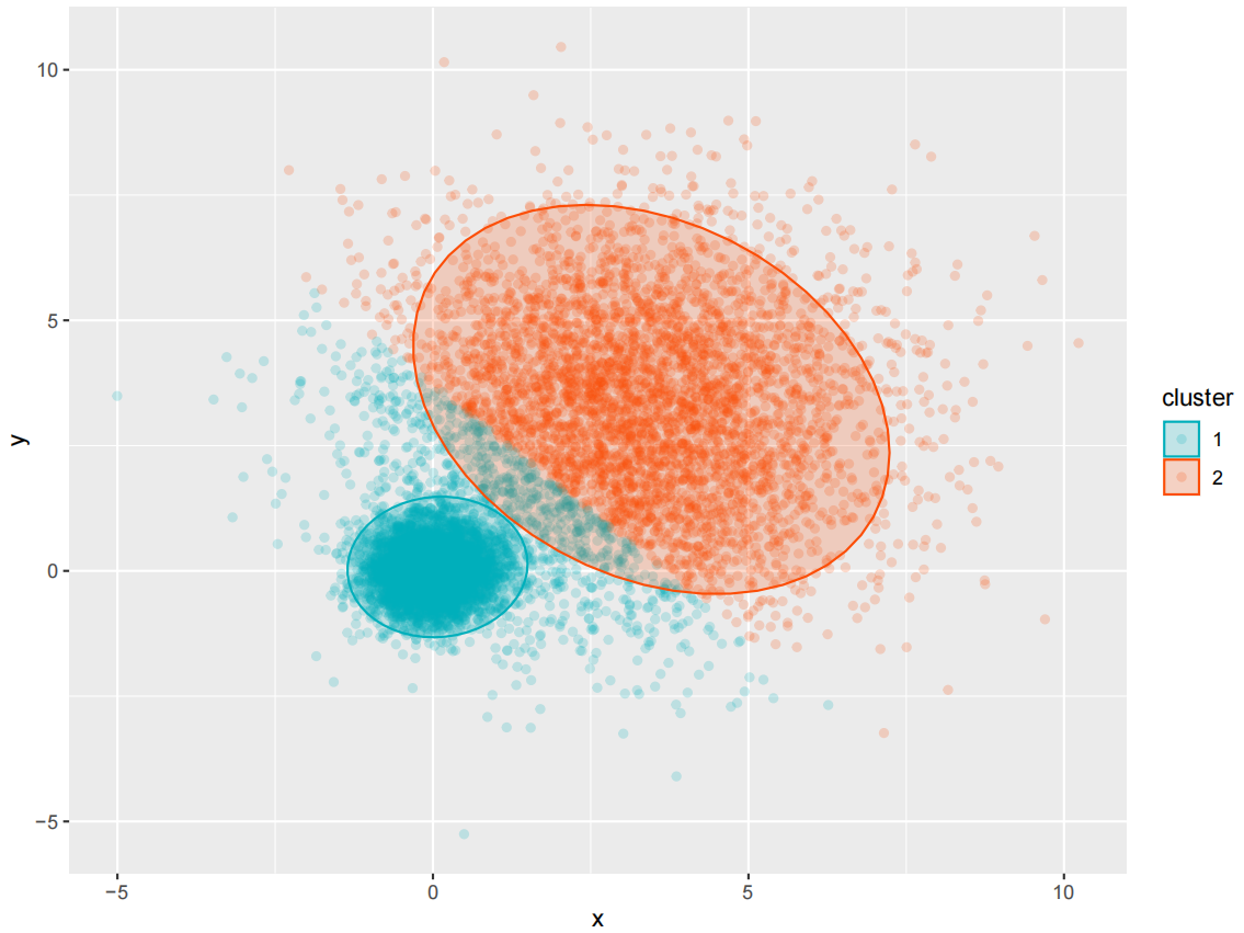
ggplot(data = mydata, aes(x,y,color=cluster)) +
  geom_point (alpha=0.2)+
  # 绘制透明度为0.2 的散点图
  stat_ellipse(aes(x=x,y=y,fill= cluster), geom="polygon", level=0.95, alpha=0.2) +
  scale_color_manual(values=c("#00AFBB","#FC4E07")) +#使用不同颜色标定不同数据类别
  scale_fill_manual(values=c("#00AFBB","#FC4E07"))+  #使用不同颜色标定不同椭类别
  labs(x = "Axis X",y="Axis Y")+
  theme(
    text=element_text(size=15,color="black"),
    plot.title=element_text(size=15,family="myfont",face="bold.italic",color="black"),
    legend.background=element_blank(),
    legend.position=c(0.1,0.8)
  )
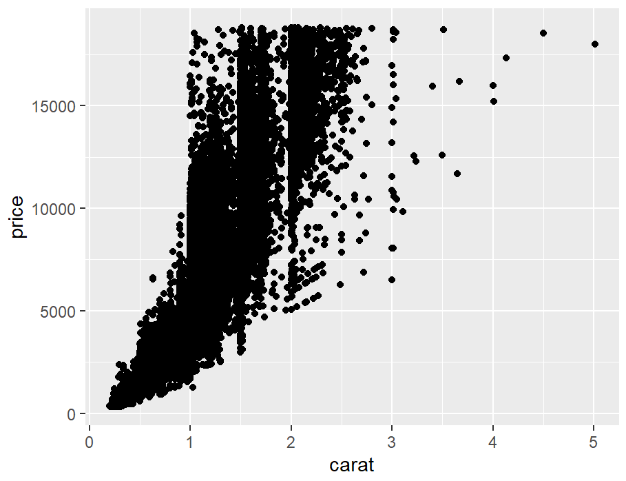
stat_bin_2d()
diamonds_sp <- ggplot(diamonds, aes(x = carat, y = price))

diamonds_sp +
  geom_point()
diamonds_sp +
  stat_bin2d()
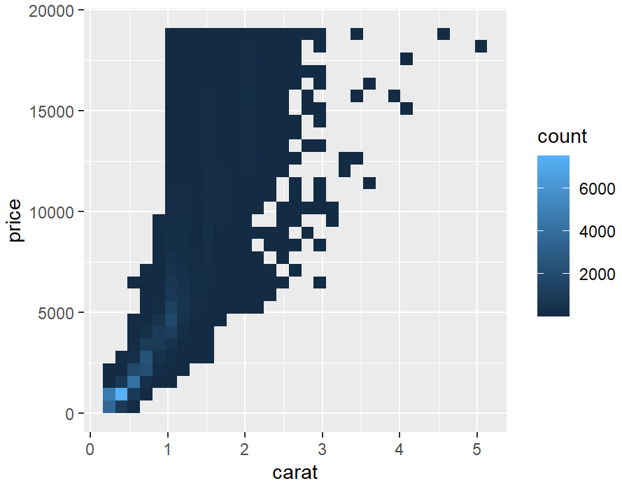
# 默认情况下,stat_bin_2d()将空间在x和y方向上划分为30组,总共900个容器。我们可以增加bin的数量,bin=50。
diamonds_sp +
  stat_bin2d(bins = 50) +
  scale_fill_gradient(low = "lightblue", high = "red", limits = c(0, 6000))
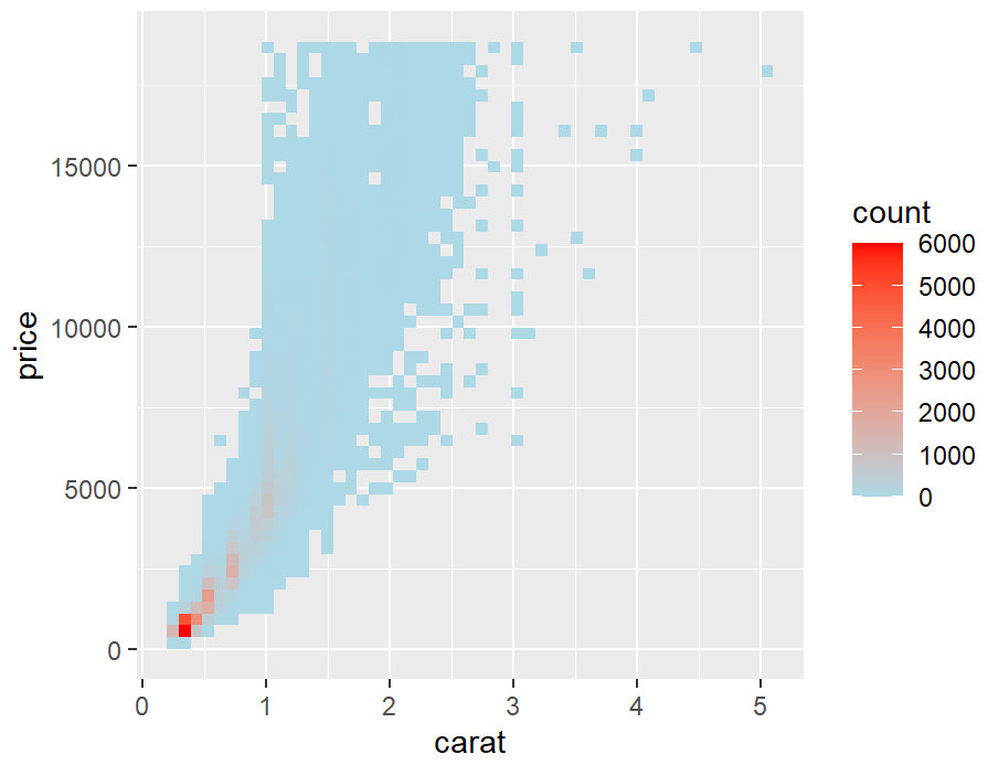
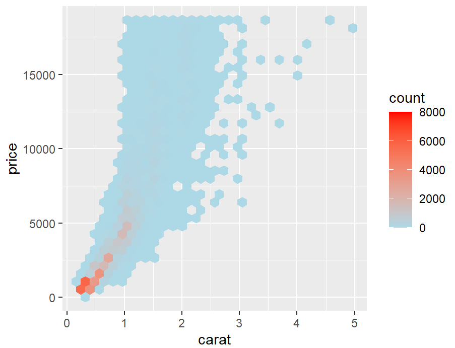
stat_binhex()
library(hexbin)
diamonds_sp <- ggplot(diamonds, aes(x = carat, y = price))
diamonds_sp +
  stat_binhex() +
  scale_fill_gradient(low = "lightblue", high = "red", limits = c(0, 8000))
diamonds_sp +
  stat_binhex() +
  scale_fill_gradient(low = "lightblue", high = "red", limits = c(0, 5000))
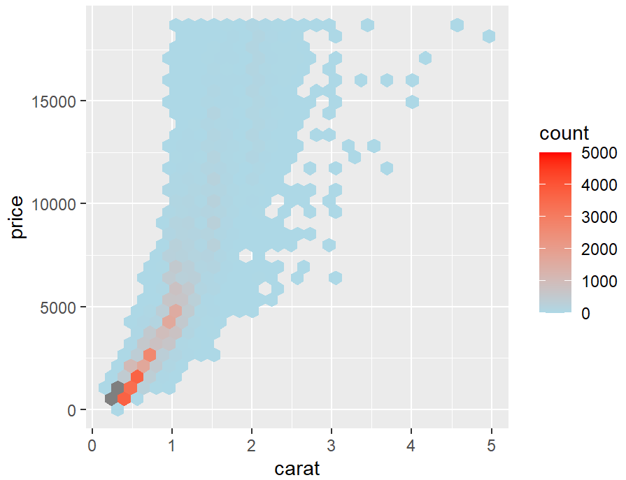
对于stat_bin_2d()和stat_binhex()这两种方法,如果手动指定范围,并且有一个bin由于点太多或太少而超出该范围,则该bin将显示为灰色,而不是范围高端或低端的颜色。
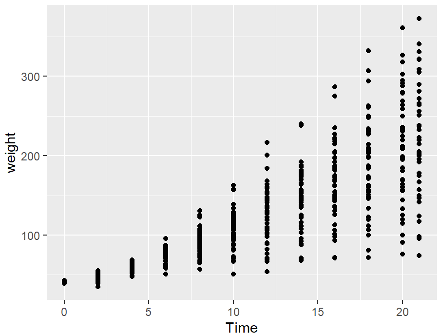
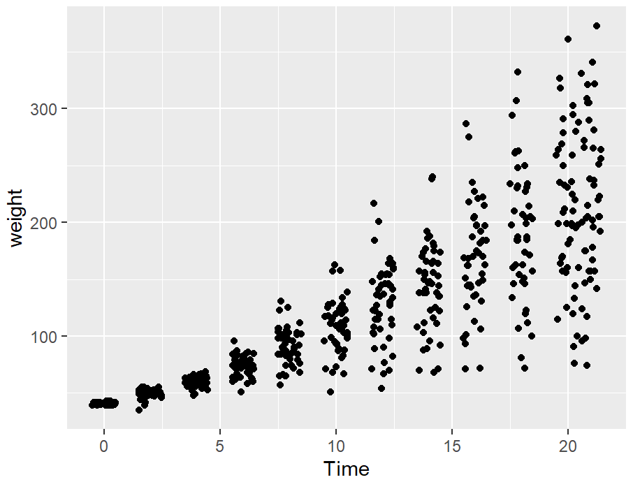
position_jitter()
cw_sp <- ggplot(ChickWeight, aes(x = Time, y = weight))

cw_sp +
  geom_point()
cw_sp +
  geom_point(position = "jitter")
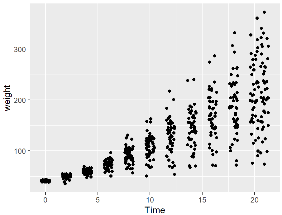
cw_sp +
  geom_point(position = position_jitter(width = .5, height = 0))
给点添加标签
library(gcookbook)
library(dplyr)
library(ggplot2)
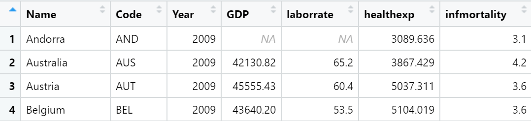
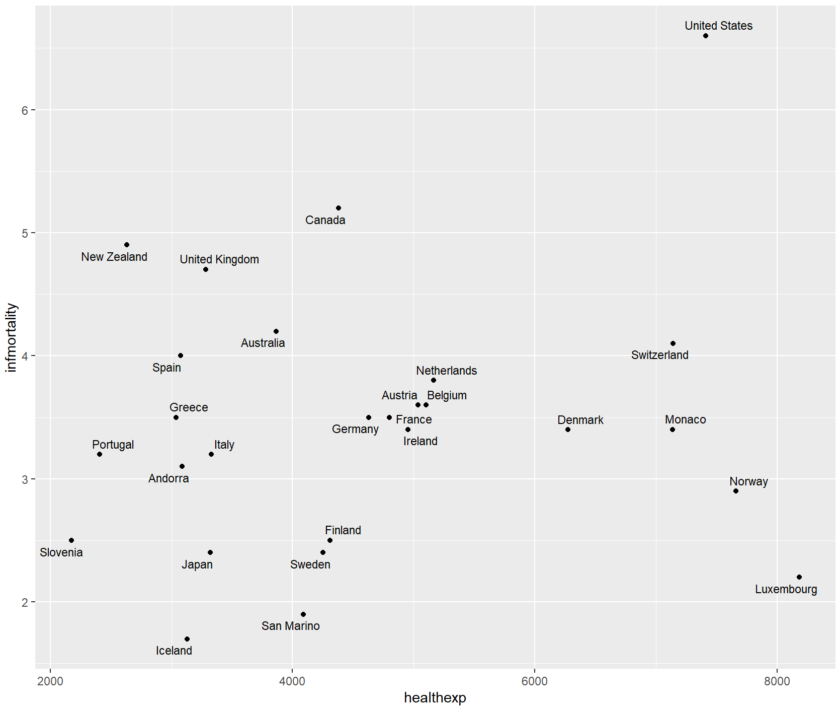
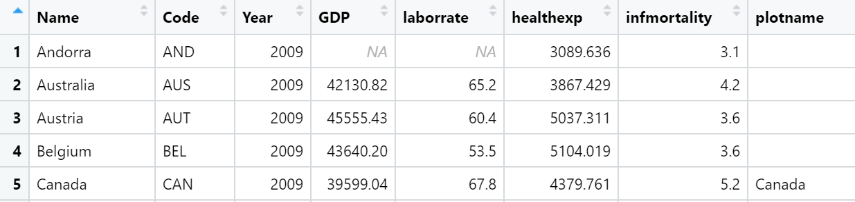
countries_sub <- countries %>%
filter(Year == 2009 & healthexp > 2000)
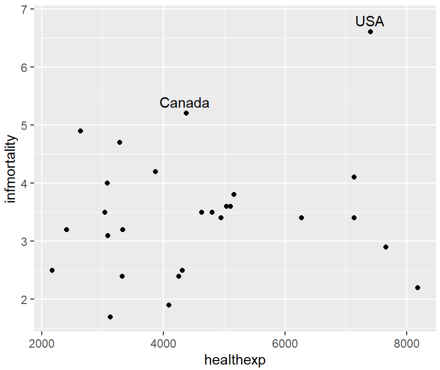
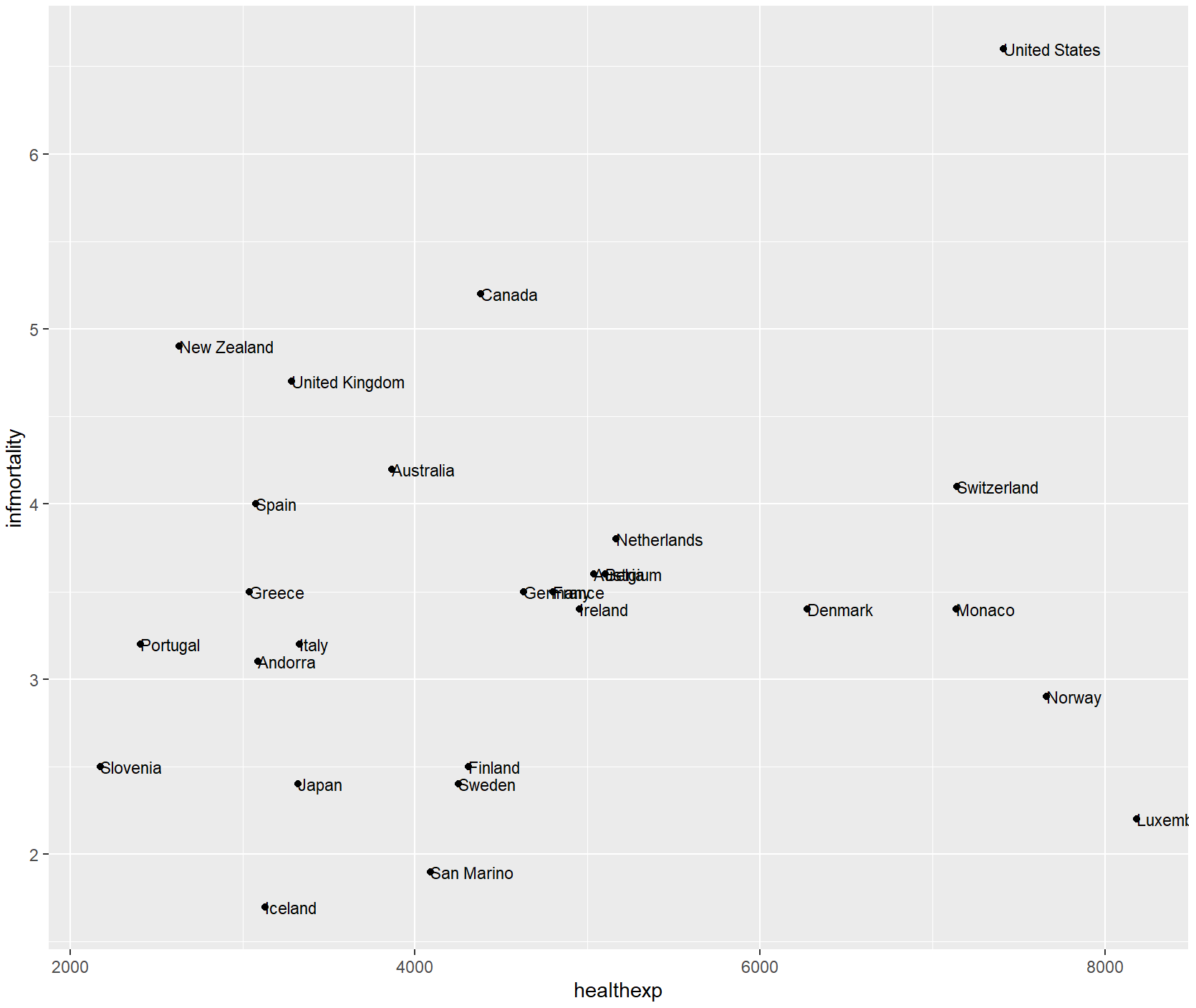
countries_sp <- ggplot(countries_sub, aes(x = healthexp, y = infmortality)) +
  geom_point()

countries_sp +
  annotate("text", x = 4350, y = 5.4, label = "Canada") +
  annotate("text", x = 7400, y = 6.8, label = "USA")
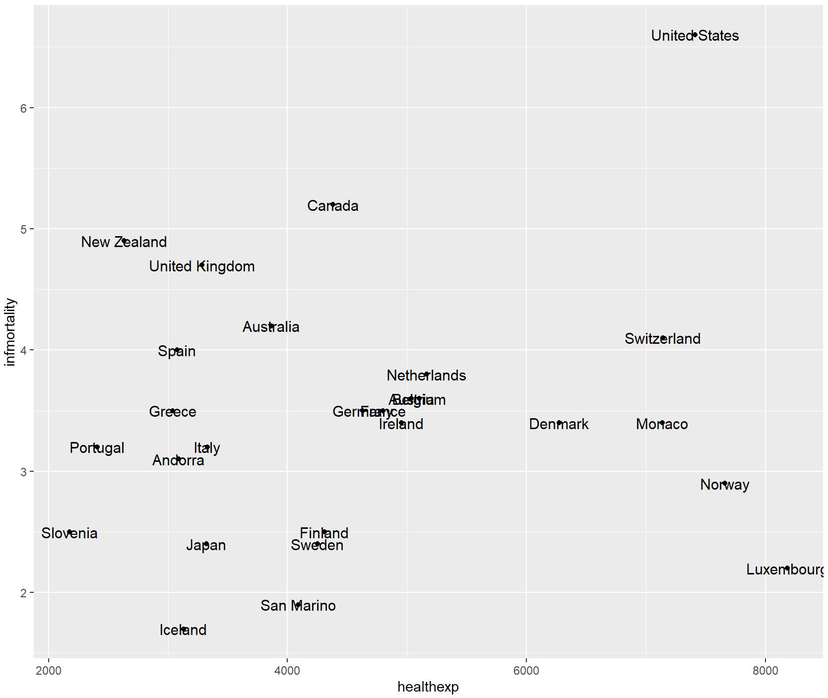
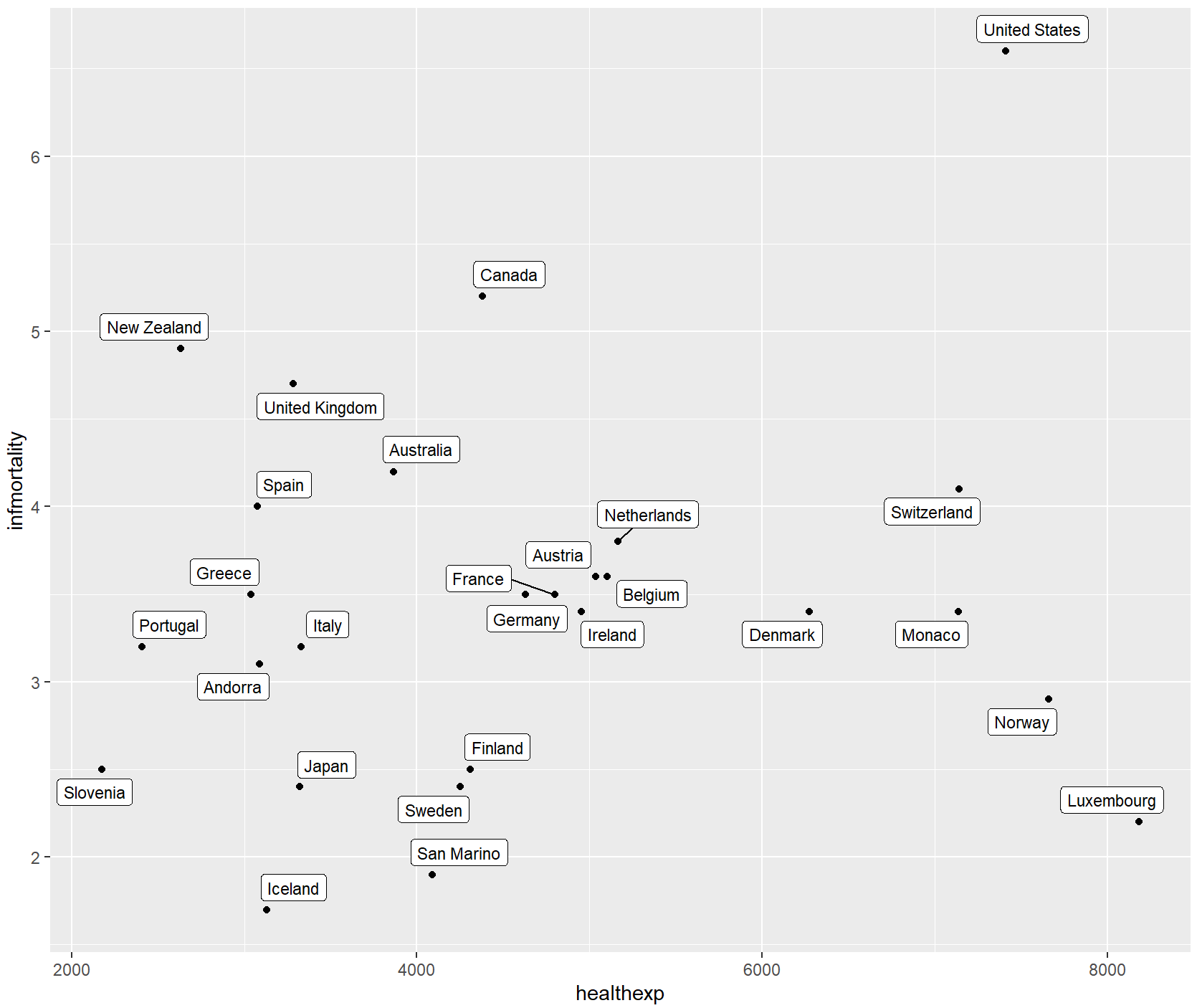
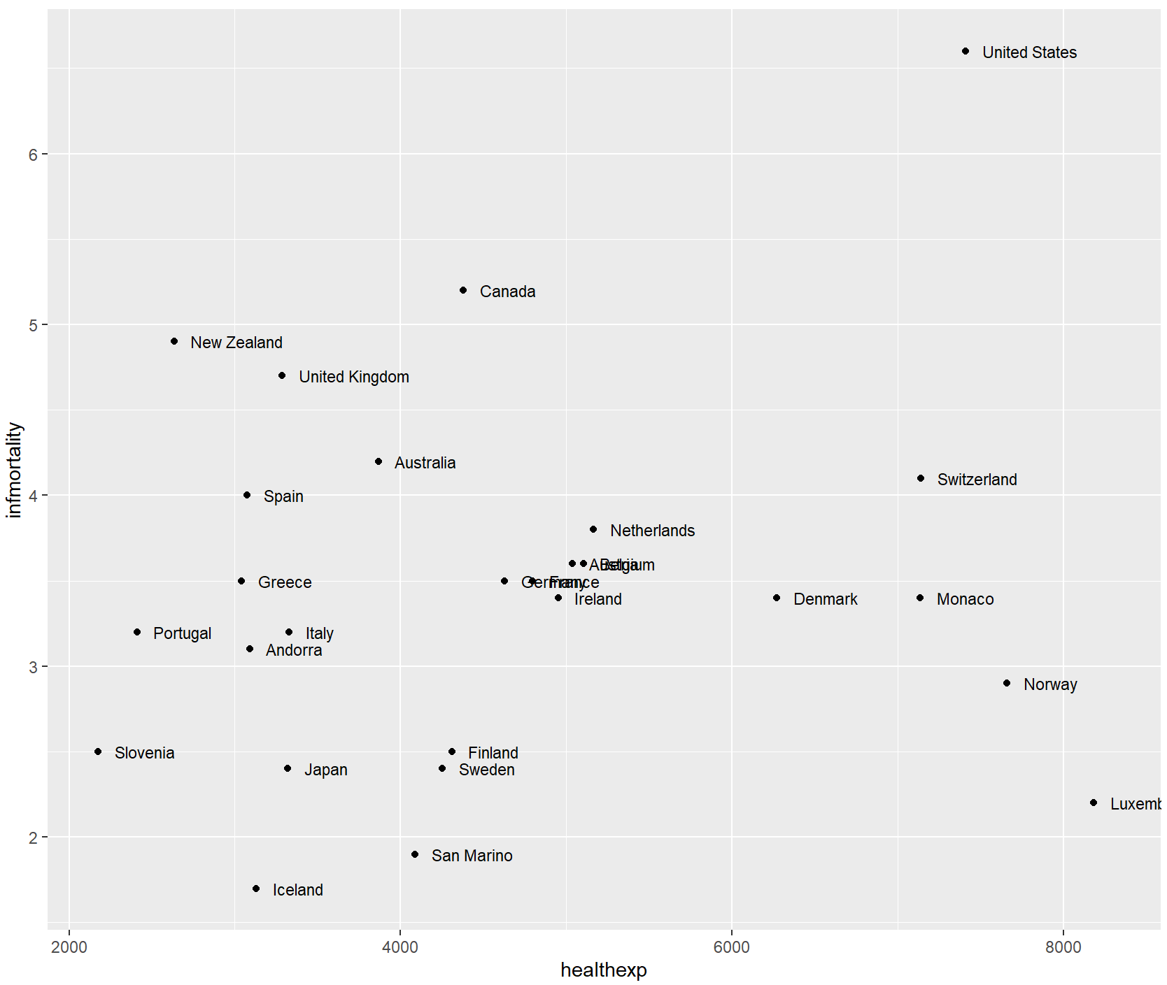
可以使用geom_text()函数从数据中自动添加标签,size大小的默认值为5,可改变标签字体大小而不改变点的大小。
countries_sp +
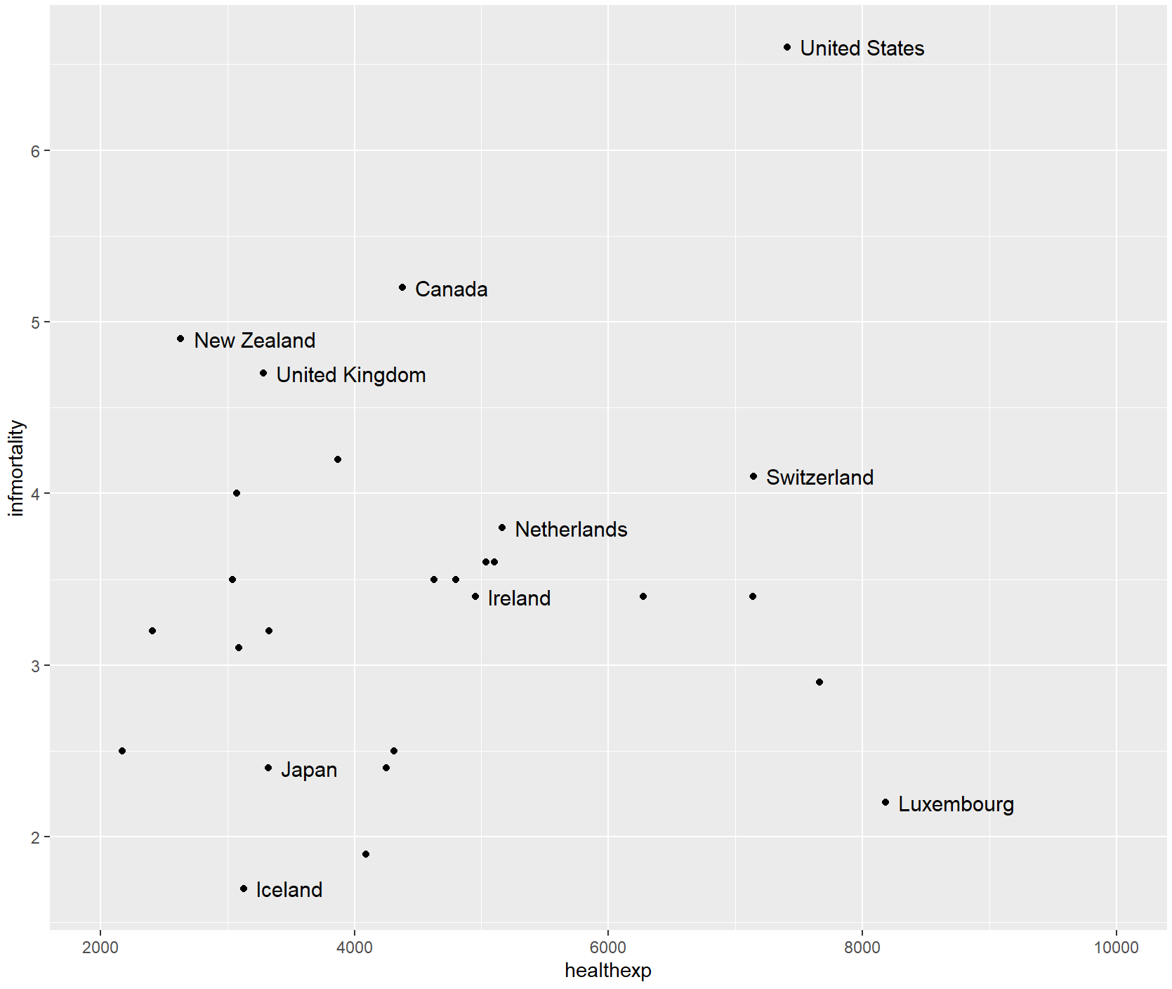
geom_text(aes(label = Name), size = 4)
想要自动调整点标签,使其不重叠,我们可以使用ggrepel包中的geom_text_repel或geom_label_excelle,其功能与geom_text类似。
library(ggrepel)
countries_sp +
  geom_text_repel(aes(label = Name), size = 3)
countries_sp +
  geom_label_repel(aes(label = Name), size = 3)
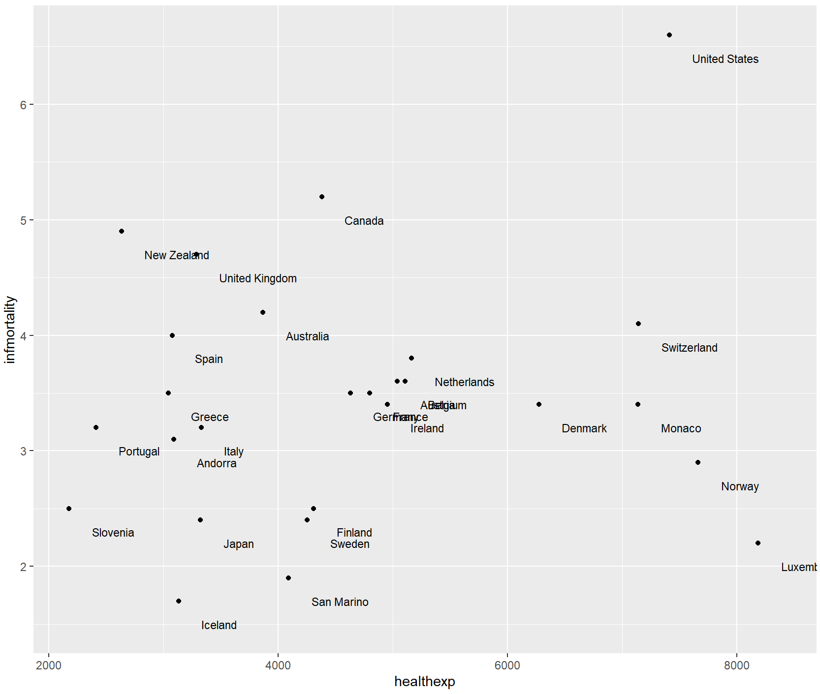
如果可以精确控制每个标签的放置位置,则应该使用annotate()或geom_text()。通过vjust或hjust参数来改变标签的位置。
countries_sp +
  geom_text(aes(label = Name), size = 3, vjust = 0)
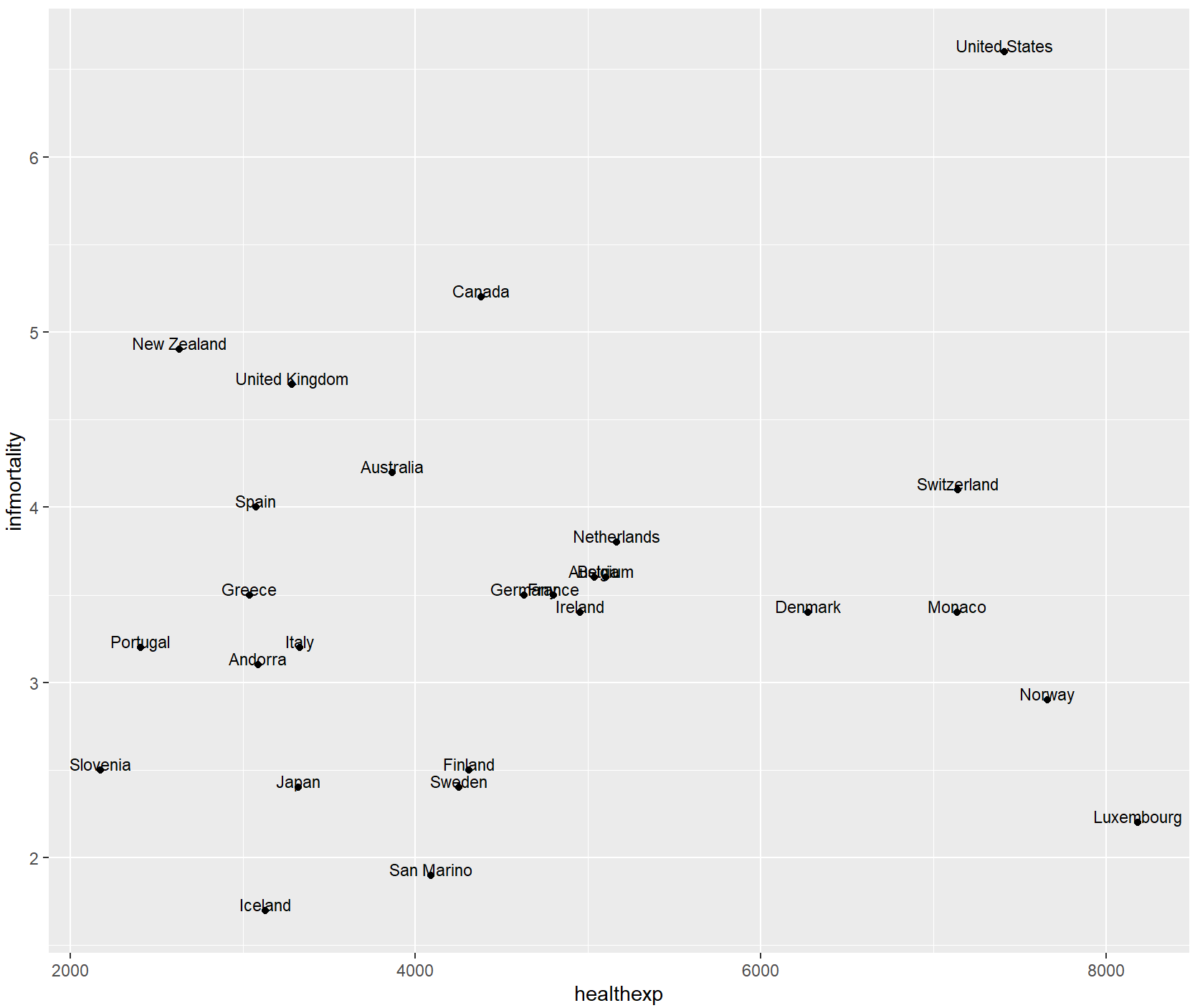
you can increase or decrease vjust to shift the labels higher or lower, or you can add or subtract a bit to or from the y mapping to get the same effect.
# Add a little extra to y
countries_sp +
  geom_text(aes(y = infmortality + .1, label = Name), size = 3)
vjust调整上下,hjust调整左右。
countries_sp +
  geom_text(
    aes(label = Name),
    size = 3,
    hjust = 0
  )
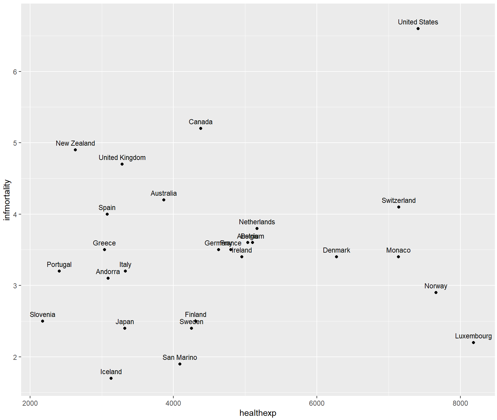
countries_sp +
  geom_text(
    aes(x = healthexp + 100, label = Name),
    size = 3,
    hjust = 0
  )
如果使用对数轴,而不是与x或y相加,则需要将x或y值乘以一个数字,以使标签偏移一致的量。
还可以使用position=position_nudge()同时调整所有标签的位置。当标签较少或可能导致与标签重叠的点较少时,此方法效果最佳。请注意,用x=…和y=…指定的单位对应于x和y轴的单位。
countries_sp +
  geom_text(
    aes(x = healthexp + 100, label = Name),
    size = 3,
    hjust = 0,
    position = position_nudge(x = 100, y = -0.2)
  )
如果只想标记某些点,但希望自动处理位置,可以向数据框添加一个新列,其中只包含所需的标签。有一种方法可以做到这一点: 首先,我们将复制正在使用的数据,然后将Name列复制到plotname中,将factor转换为字符向量。
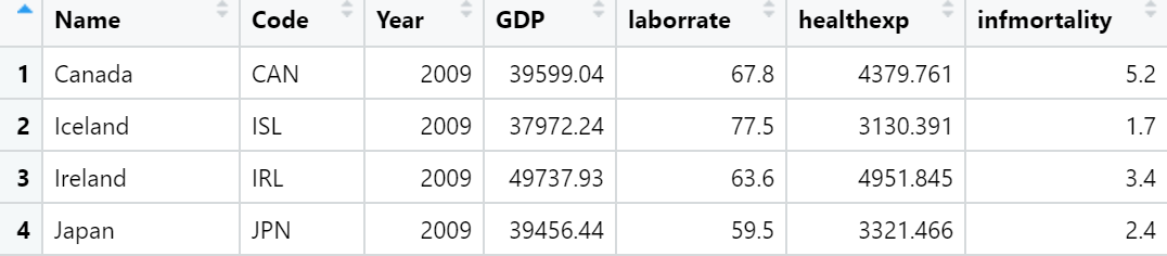
cdat <- countries %>%
  filter(Year == 2009, healthexp > 2000) %>%
  mutate(plotname = as.character(Name))
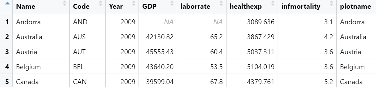
countrylist <- c("Canada", "Ireland", "United Kingdom", "United States",
  "New Zealand", "Iceland", "Japan", "Luxembourg", "Netherlands", "Switzerland")

cdat <- cdat %>%
  mutate(plotname = ifelse(plotname %in% countrylist, plotname, ""))
ggplot(cdat, aes(x = healthexp, y = infmortality)) +
  geom_point() +
  geom_text(aes(x = healthexp + 100, label = plotname), size = 4, hjust = 0) +
  xlim(2000, 10000)
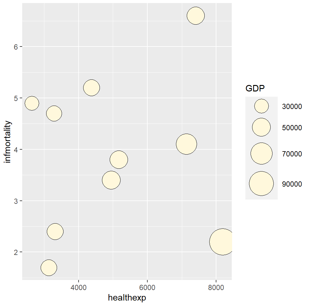
气泡图
圆圈状气泡的大小是映射到面积而不是半径或者直径绘制的。因为如果是基于半径或者直径,那么圆的大小不仅会呈指数级变化,而且还会导致视觉误差。
气泡图最好只表达三个维度的数据:X 轴和 Y 轴分别代表不同的两个维度的数据;同时使用气泡的面积和颜色,或者只使用气泡面积,代表第三个维度的数据。
连续型变量气泡图
library(gcookbook)

countrylist <- c("Canada", "Ireland", "United Kingdom", "United States",
                 "New Zealand", "Iceland", "Japan", "Luxembourg", "Netherlands", "Switzerland")
cdat <- countries %>%
  filter(Year == 2009, Name %in% countrylist)
# GDP mapped to radius (default with scale_size_continuous)
cdat_sp <- ggplot(cdat, aes(x = healthexp, y = infmortality, size = GDP)) +
    geom_point(shape = 21, colour = "black", fill = "cornsilk")

# GDP mapped to area instead, and larger circles
cdat_sp +
  scale_size_area(max_size = 15)
library(ggrepel)
library(ggplot2)
library(RColorBrewer)
attach(mtcars)
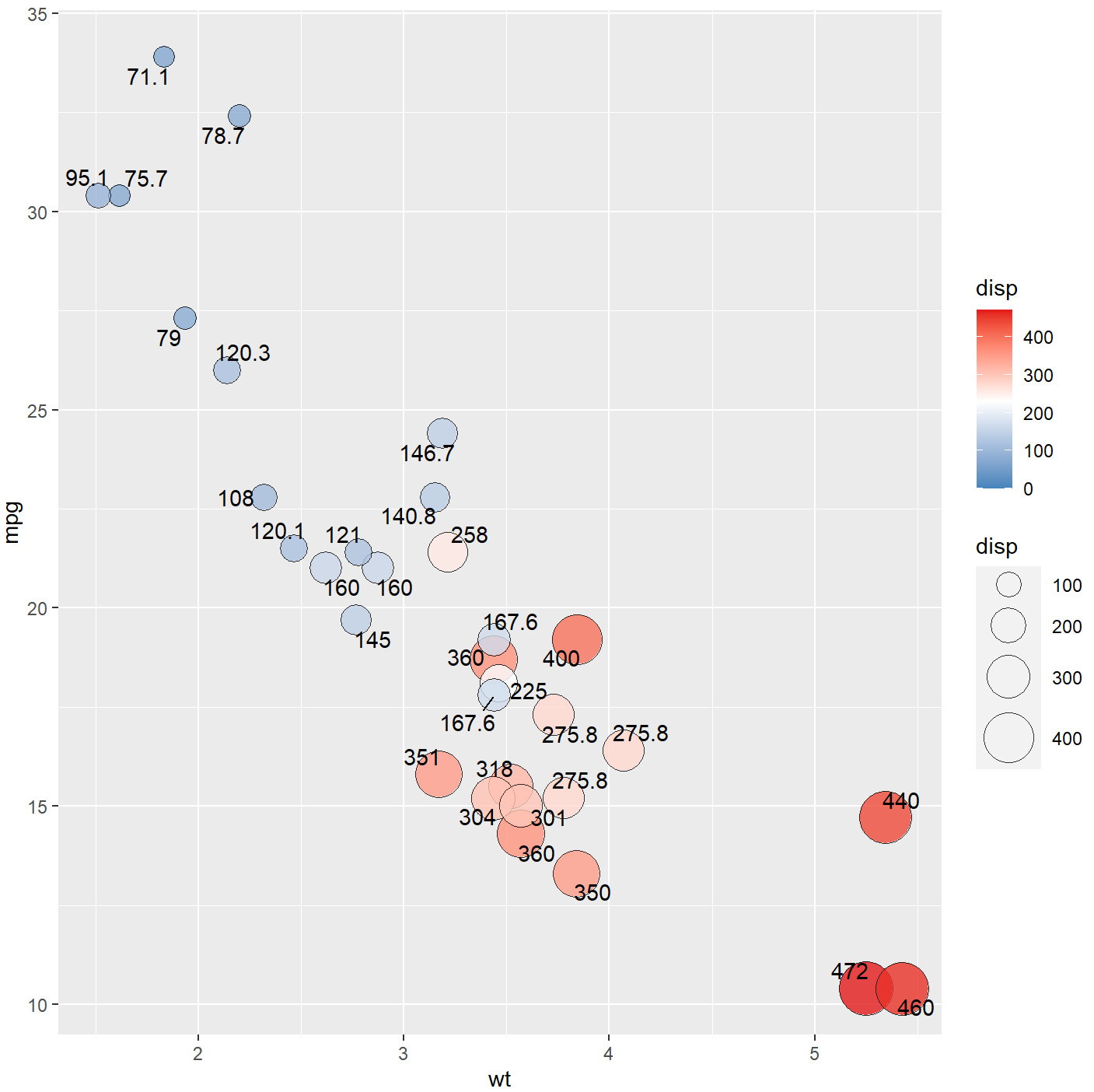
ggplot(data=mtcars, aes(x=wt,y=mpg))+
geom_point(aes(size=disp,fill=disp),shape=21,colour="black",alpha=0.8)+
# 绘制气泡图,填充颜色和面积大小都映射到“disp”
scale_fill_gradient2(low="#377EB8",high="#E41A1C",limits = c(0,max(mtcars$ disp)),
midpoint = mean(mtcars$disp))+ #设置填充颜色映射主题(colormap)
scale_size_area(max_size=12)+ # 设置显示的气泡图气泡最大面积
geom_text_repel(label = disp ) # 添加数据标签“disp”
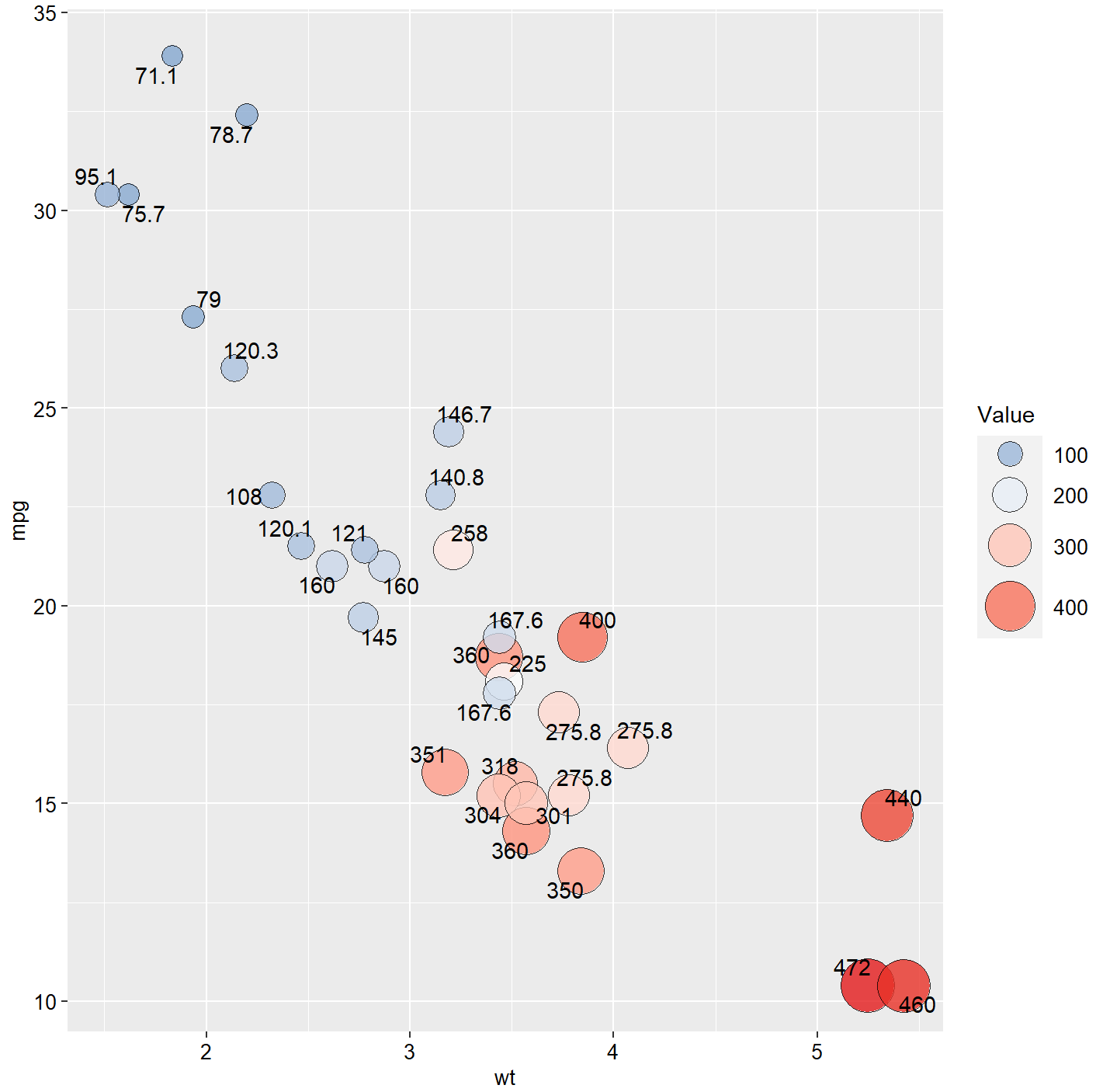
ggplot(data=mtcars, aes(x=wt,y=mpg))+
  geom_point(aes(size=disp,fill=disp),shape=21,colour="black",alpha=0.8)+
  scale_fill_gradient2(low="#377EB8",high="#E41A1C",midpoint = mean(mtcars$disp))+
  geom_text_repel(label = disp )+
  scale_size_area(max_size=12)+
  guides(size = guide_legend((title="Value")),
         fill = guide_legend((title="Value")))+
  theme(
    legend.text=element_text(size=10,face="plain",color="black"),
    axis.title=element_text(size=10,face="plain",color="black"),
    axis.text = element_text(size=10,face="plain",color="black"),
    legend.position = "right"
  )
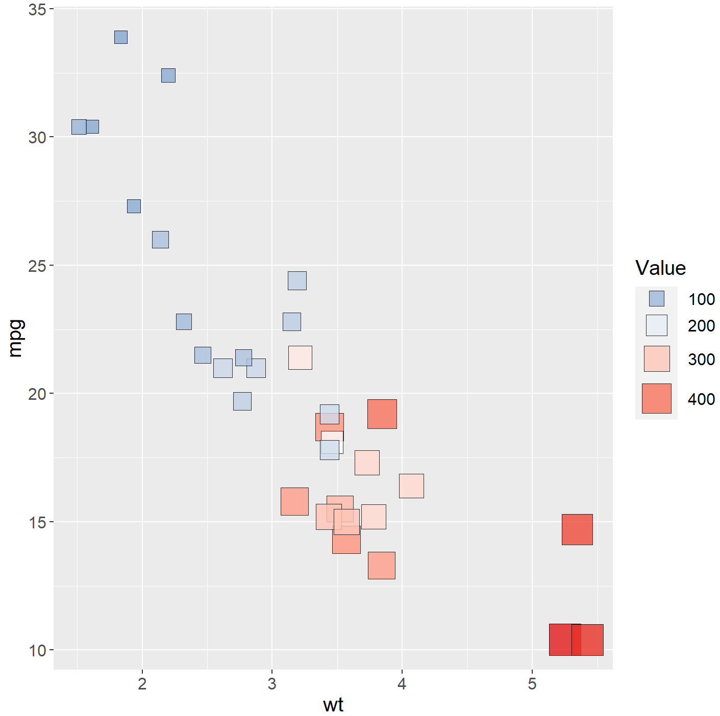
ggplot(mtcars, aes(wt,mpg))+
  geom_point(aes(size=disp,fill=disp),shape=22,colour="black",alpha=0.8)+
  scale_fill_gradient2(low=brewer.pal(7,"Set1")[2],high=brewer.pal(7,"Set1")[1],
                       midpoint = mean(mtcars$disp))+
  scale_size_area(max_size=12)+
  guides(fill = guide_legend((title="Value")),
         size =  guide_legend((title="Value")))+
  theme(
    text=element_text(size=15,color="black"),
    plot.title=element_text(size=15,family="myfont",face="bold.italic",color="black")#,
    #legend.position=c(0.9,0.05)
  )
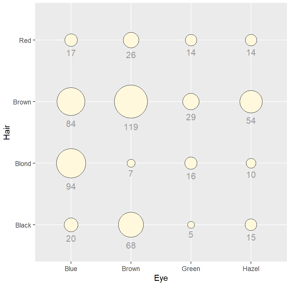
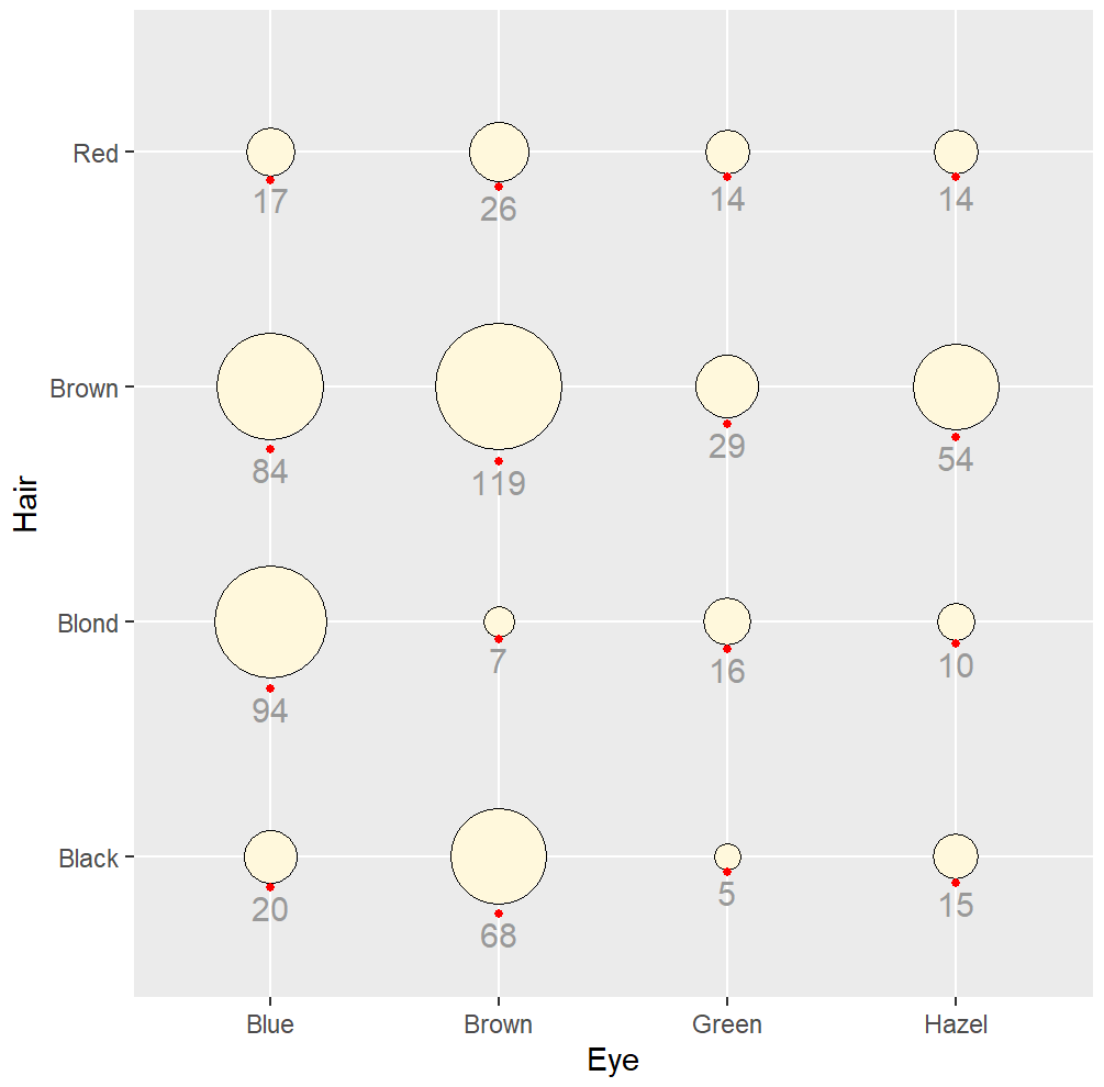
分类变量气泡图
library(gcookbook)
hec <- HairEyeColor %>%
  as_tibble() %>%
  group_by(Hair, Eye) %>%
  summarize(count = sum(n))
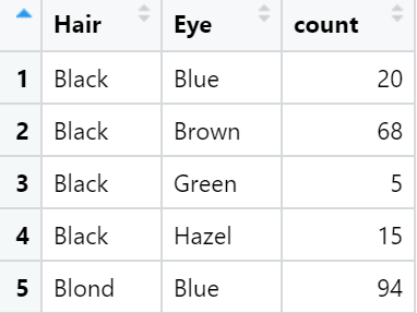
hec_sp <- ggplot(hec, aes(x = Eye, y = Hair)) +
  geom_point(aes(size = count), shape = 21, colour = "black", fill = "cornsilk") +
  scale_size_area(max_size = 20, guide = "none") +
  geom_text(aes(
    y = as.numeric(as.factor(Hair)) - sqrt(count)/34, label = count),
    vjust = 1.3,
    colour = "grey60",
    size = 4
  )
hec_sp +
  geom_point(aes(y = as.numeric(as.factor(Hair)) - sqrt(count)/34), colour = "red", size = 1)
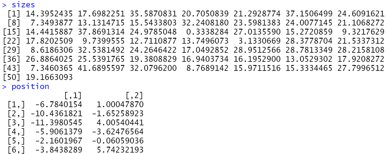
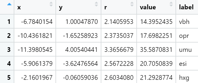
圆堆积气泡图
使用ggraph包的pack_circles()函数可以根据气泡数值构造气泡的位置数据,然后使用ggforce包的geom_circle()函数就可以绘制气泡。
library(ggraph)
library(ggforce)
set.seed(123)
sizes <-rnorm(50, mean = 20, sd = 10)
position <- pack_circles(sizes)
data <- data.frame(x = position[,1], y = position[,2], r = sqrt(sizes/pi),value=sizes,
                   label=paste(sample(letters[1:24], 50, TRUE), sample(letters[1:24], 50, TRUE), sample(letters[1:24], 50, TRUE),sep = ""))
ggplot(data) +
  geom_circle(aes(x0 = 0, y0 = 0, r = attr(position, 'enclosing_radius')*0.88),size=1) +
  geom_circle(aes(x0 = x, y0 = y, r = r,fill=r), data = data) +
  geom_text(aes(x=x,y=y,label=label,size=r))+
  scale_fill_distiller(palette='Spectral',name='value')+
  guides(size="none")+
  coord_fixed()+
  theme_void()
相关性散点图
线性回归
library(gcookbook)
library(ggplot2)
library(tidyverse)
heightweight %>% select("ageYear","heightIn")
hw_sp <- ggplot(heightweight, aes(x = ageYear, y = heightIn))
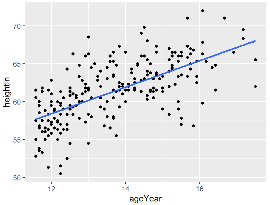
hw_sp +
geom_point() +
stat_smooth(method = lm)
# 默认情况下,stat_smooth()会为回归拟合添加95%的置信区间。置信区间可以通过修改level值来更改,也可以通过se=FALSE来禁用。

# 99% confidence region
hw_sp +
  geom_point() +
  stat_smooth(method = lm, level = 0.99)
# No confidence region
hw_sp +
  geom_point() +
  stat_smooth(method = lm, se = FALSE)
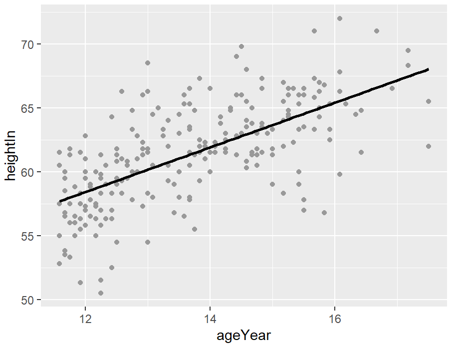
hw_sp +
  geom_point(colour = "grey60") +
  stat_smooth(method = lm, se = FALSE, colour = "black")
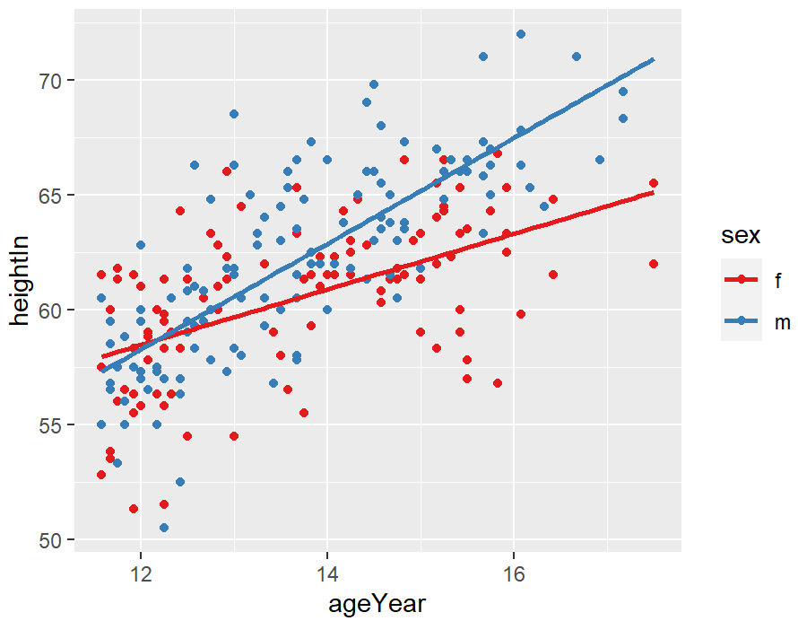
hw_sp <- ggplot(heightweight, aes(x = ageYear, y = heightIn, colour = sex)) +
  geom_point() +
  scale_colour_brewer(palette = "Set1")
hw_sp +
  geom_smooth(method = lm, se = FALSE, fullrange = TRUE)
loess回归
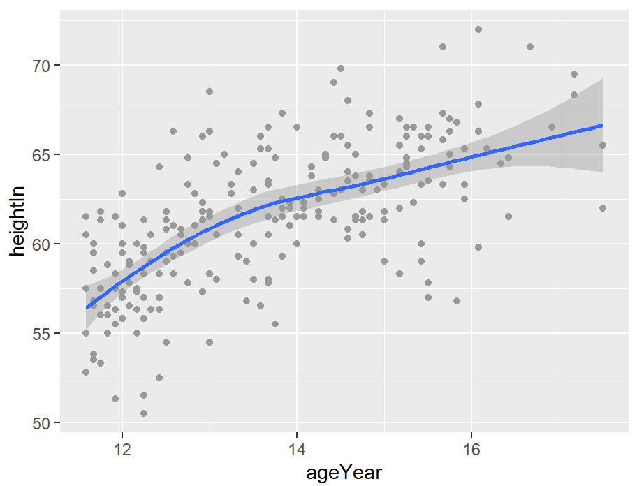
stat_smooth默认情况下会使用LOESS(局部加权多项式)曲线:
hw_sp +
  geom_point(colour = "grey60") +
  stat_smooth()

# Equivalent to:
hw_sp +
  geom_point(colour = "grey60") +
  stat_smooth(method = loess)
hw_sp <- ggplot(heightweight, aes(x = ageYear, y = heightIn, colour = sex)) +
    geom_point() +
    scale_colour_brewer(palette = "Set1")

hw_sp +
  geom_smooth()

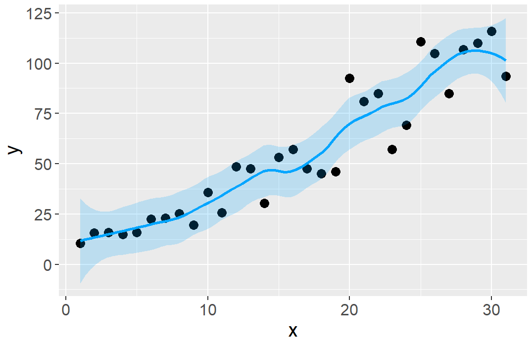
library(ggplot2)
mydata<-read.csv("Scatter_Data.csv",stringsAsFactors=FALSE)
ggplot(data = mydata, aes(x,y)) +
  geom_point(fill="black",colour="black",size=3,shape=21) +
  #geom_smooth(method="lm",se=TRUE,formula=y ~ splines::bs(x, 5),colour="red")+ #(h)
  #geom_smooth(method = 'gam',formula=y ~s(x))+   #(g)
  geom_smooth(method = 'loess',span=0.4,se=TRUE,colour="#00A5FF",fill="#00A5FF",alpha=0.2)+ #(f)
  scale_y_continuous(breaks = seq(0, 125, 25))+
  theme(
    text=element_text(size=15,color="black"),
    plot.title=element_text(size=15,family="myfont",hjust=.5,color="black"),
    legend.position="none"
  )
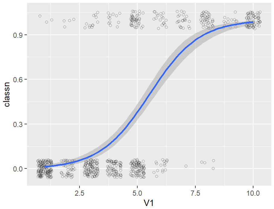
逻辑回归
If, for example, you wanted to use loess(degree = 1), you would call stat_smooth(method = loess, method.args = list(degree = 1)). The same could be done for other modeling functions like lm() or glm().
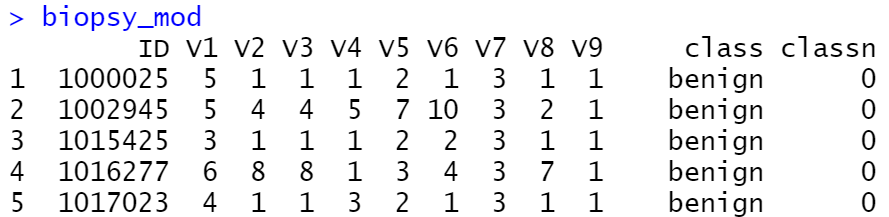
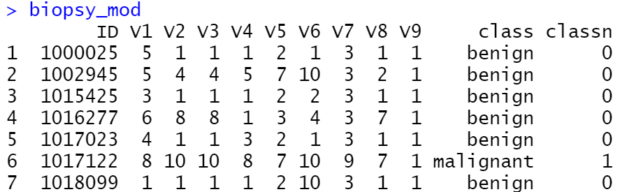
library(MASS)
biopsy_mod <- biopsy %>%
 mutate(classn = recode(class, benign = 0, malignant = 1))
ggplot(biopsy_mod, aes(x = V1, y = classn)) +
  geom_point(
    position = position_jitter(width = 0.3, height = 0.06),
    alpha = 0.4,
    shape = 21,
    size = 1.5
  ) +
  stat_smooth(method = glm, method.args = list(family = binomial))
现有模型添加拟合线
你已经为数据集创建了拟合回归模型对象,并且希望绘制该模型的直线。
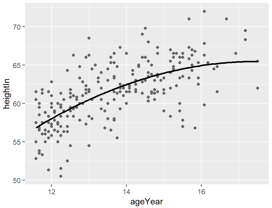
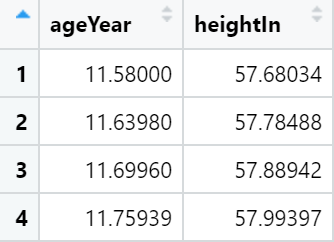
我们将使用lm()建立一个二次模型,其中ageYear作为heightIn的预测因子。然后,我们将使用predict()函数,根据ageYear值范围预测heightIn的值:
library(gcookbook)
model <- lm(heightIn ~ ageYear + I(ageYear^2), heightweight)
model
xmin <- min(heightweight$ageYear)
xmax <- max(heightweight$ageYear)
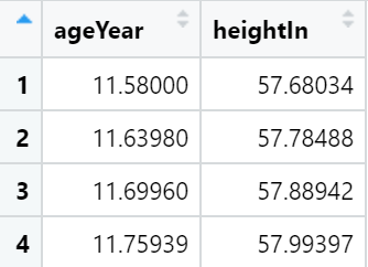
predicted <- data.frame(ageYear = seq(xmin, xmax, length.out = 100))
# 计算heightIn的预测值
predicted$heightIn <- predict(model, predicted)
predicted
hw_sp <- ggplot(heightweight, aes(x = ageYear, y = heightIn)) +
  geom_point(colour = "grey40")
hw_sp +
  geom_line(data = predicted, linewidth = 1)
构建函数来简化上述过程:
# Given a model, predict values of yvar from xvar
# This function supports one predictor and one predicted variable
# xrange: If NULL, determine the x range from the model object. If a vector with
# two numbers, use those as the min and max of the prediction range.
# samples: Number of samples across the x range.
# ...: Further arguments to be passed to predict()
predictvals <- function(model, xvar, yvar, xrange = NULL, samples = 100, ...) {
# If xrange isn't passed in, determine xrange from the models.
# Different ways of extracting the x range, depending on model type
if (is.null(xrange)) {
if (any(class(model) %in% c("lm", "glm")))
xrange <- range(model$model[[xvar]])
else if (any(class(model) %in% "loess"))
xrange <- range(model$x)
}
newdata <- data.frame(x = seq(xrange[1], xrange[2], length.out = samples))
names(newdata) <- xvar
newdata[[yvar]] <- predict(model, newdata = newdata, ...)
newdata
}
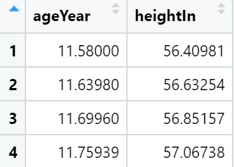
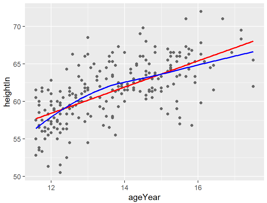
# 构建模型
modlinear <- lm(heightIn ~ ageYear, heightweight)
modloess <- loess(heightIn ~ ageYear, heightweight)
lm_predicted <- predictvals(modlinear, "ageYear", "heightIn")
loess_predicted <- predictvals(modloess, "ageYear", "heightIn")
hw_sp <- ggplot(heightweight, aes(x = ageYear, y = heightIn)) +
  geom_point(colour = "grey40")
hw_sp +
  geom_line(data = lm_predicted, colour = "red", size = .8) +
  geom_line(data = loess_predicted, colour = "blue", size = .8)
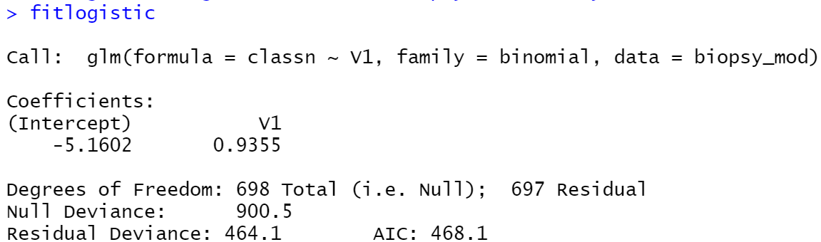
对于使用非线性链接函数的glm模型,您需要为predictvals()函数指定type=“response”。这是因为glm的默认行为是返回线性预测因子的预测值,而不是响应(y)变量的预测值。
library(MASS)
biopsy_mod <- biopsy %>%
  mutate(classn = recode(class, benign = 0, malignant = 1))
fitlogistic <- glm(classn ~ V1, biopsy_mod, family = binomial)
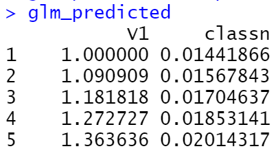
glm_predicted <- predictvals(fitlogistic, "V1", "classn", type = "response")
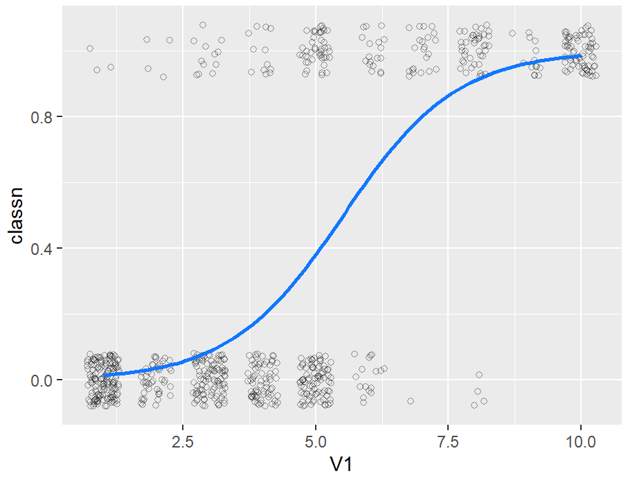
ggplot(biopsy_mod, aes(x = V1, y = classn)) +
  geom_point(
    position = position_jitter(width = .3, height = .08),
    alpha = 0.4,
    shape = 21,
    size = 1.5
  ) +
  geom_line(data = glm_predicted, colour = "#1177FF", size = 1)
library(gcookbook)
library(dplyr)
# Create an lm model object for each value of sex; this returns a data frame
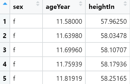
models <- heightweight %>%
group_by(sex) %>%
do(model = lm(heightIn ~ ageYear, .)) %>%
ungroup()
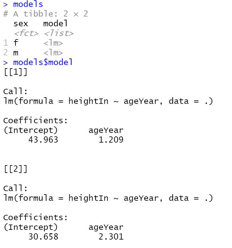
现在我们有了模型对象的列表,我们可以运行自定义的predictvals()函数来获得每个模型的预测值。
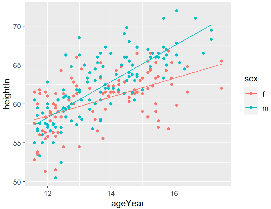
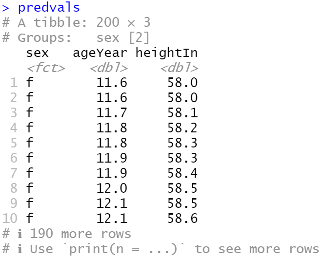
predvals <- models %>%
  group_by(sex) %>%
  do(predictvals(.$model[[1]], xvar = "ageYear", yvar = "heightIn"))
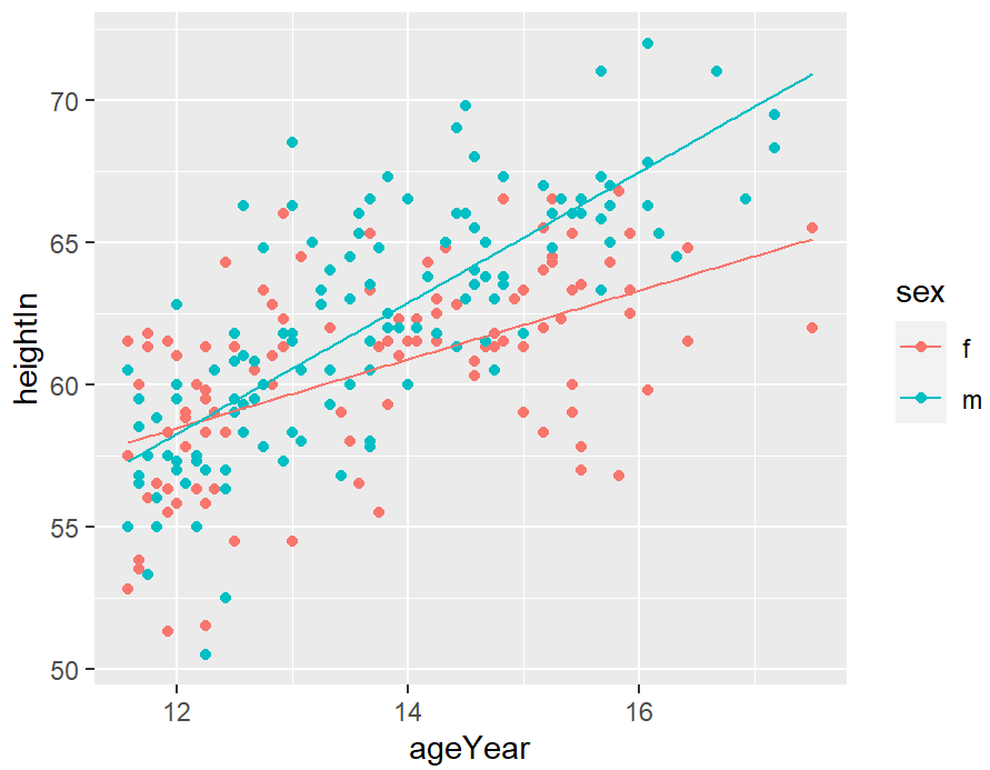
ggplot(heightweight, aes(x = ageYear, y = heightIn, colour = sex)) +
  geom_point() +
  geom_line(data = predvals)
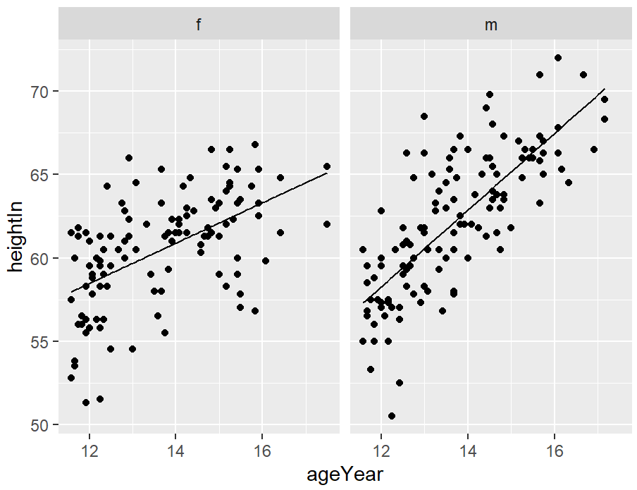
ggplot(heightweight, aes(x = ageYear, y = heightIn)) +
  geom_point() +
  geom_line(data = predvals) +
  facet_grid(. ~ sex)
group_by()和do()调用用于将数据拆分为多个部分,在这些部分上运行函数,然后重新组合输出。
要在所有组中形成具有相同x范围的预测线,我们可以简单地传入xrange,如下所示:
predvals <- models %>%
  group_by(sex) %>%
  do(predictvals(
    .$model[[1]],
    xvar = "ageYear",
    yvar = "heightIn",
    xrange = range(heightweight$ageYear))
  )
ggplot(heightweight, aes(x = ageYear, y = heightIn, colour = sex)) +
  geom_point() +
  geom_line(data = predvals)
添加公式和R^2
library(gcookbook)

model <- lm(heightIn ~ ageYear, heightweight)
summary(model)
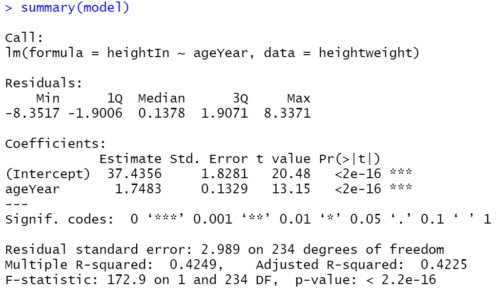
这表明r^2值为0.4249。我们将创建一个图形,并使用annotate()手动添加文本。
predictvals <- function(model, xvar, yvar, xrange = NULL, samples = 100, ...) {

  # If xrange isn't passed in, determine xrange from the models.
  # Different ways of extracting the x range, depending on model type
  if (is.null(xrange)) {
    if (any(class(model) %in% c("lm", "glm")))
      xrange <- range(model$model[[xvar]])
    else if (any(class(model) %in% "loess"))
      xrange <- range(model$x)
  }

  newdata <- data.frame(x = seq(xrange[1], xrange[2], length.out = samples))
  names(newdata) <- xvar
  newdata[[yvar]] <- predict(model, newdata = newdata, ...)
  newdata
}
pred <- predictvals(model, "ageYear", "heightIn")
hw_sp <- ggplot(heightweight, aes(x = ageYear, y = heightIn)) +
geom_point() +
geom_line(data = pred)
hw_sp +
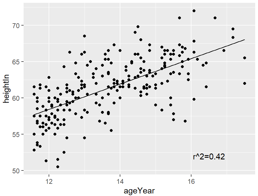
annotate("text", x = 16.5, y = 52, label = "r^2=0.42")
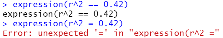
不使用纯文本字符串,也可以使用R的数学表达式语法输入公式,方法是使用parse=TRUE:
hw_sp +
  annotate("text", x = 16.5, y = 52, label = "r^2 == 0.42", parse = TRUE)

ggplot中的文本geoms不直接接受表达式对象;相反,它们采用可以通过R的parse()函数转换为表达式的字符串。
如果使用数学表达式,则语法必须正确,表达式才能成为有效的R表达式对象。您可以通过将对象包装在expression()函数中并查看它是否抛出错误来测试有效性(确保不要在表达式周围使用引号)。在这里的示例中,==是表达式中表示相等的有效构造,但=不是:
expression(r^2 == 0.42)
expression(r^2 = 0.42)
eqn <- sprintf(
    "italic(y) == %.3g + %.3g * italic(x) * ',' ~~ italic(r)^2 ~ '=' ~ %.2g",
    coef(model)[1],
    coef(model)[2],
    summary(model)$r.squared
  )
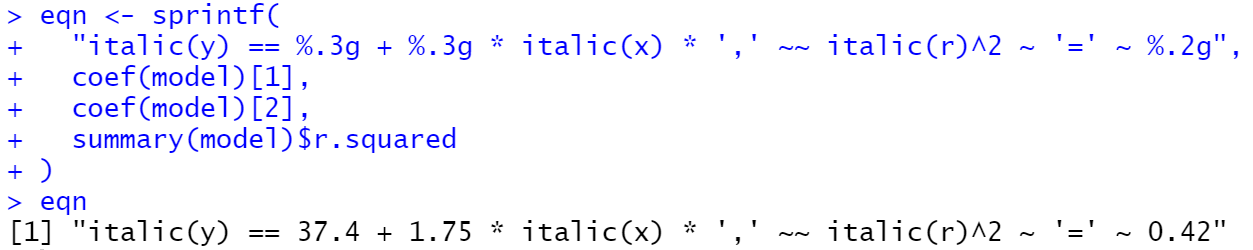
parse(text = eqn)

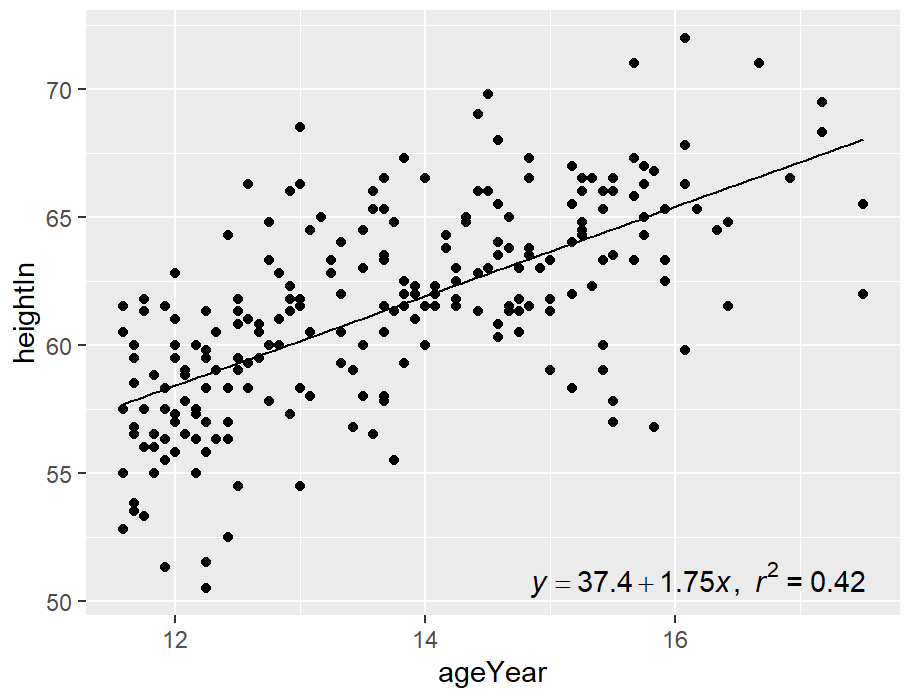
hw_sp +
  annotate(
    "text",
    x = Inf, y = -Inf,
    label = eqn, parse = TRUE,
    hjust = 1.1, vjust = -.5
  )
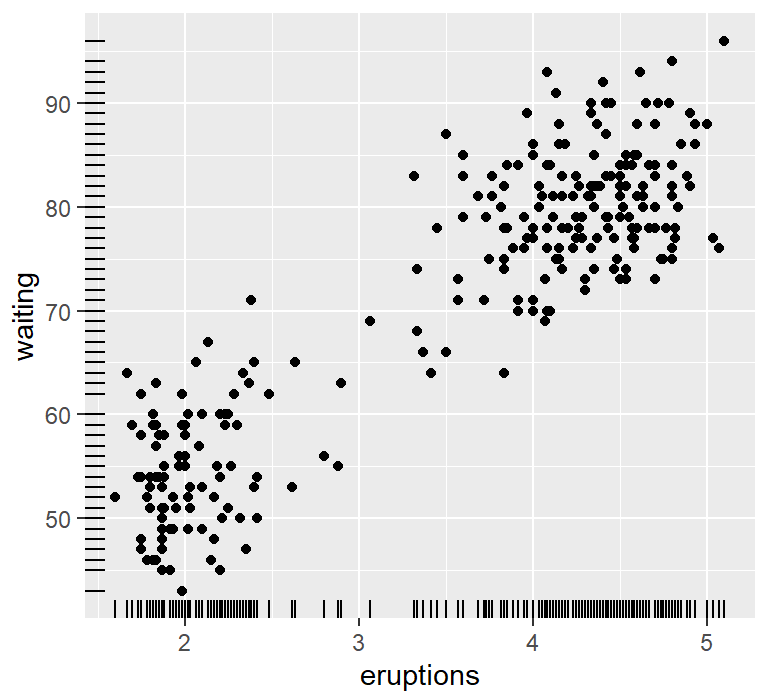
标尺展示散点分布
ggplot(faithful, aes(x = eruptions, y = waiting)) +
  geom_point() +
  geom_rug()
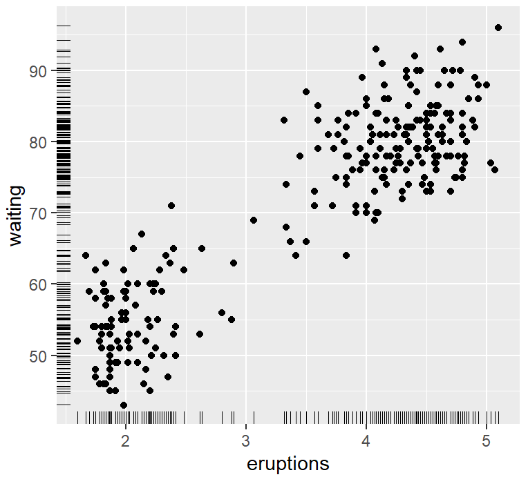
ggplot(faithful, aes(x = eruptions, y = waiting)) +
  geom_point() +
  geom_rug(position = "jitter", size = 0.2)
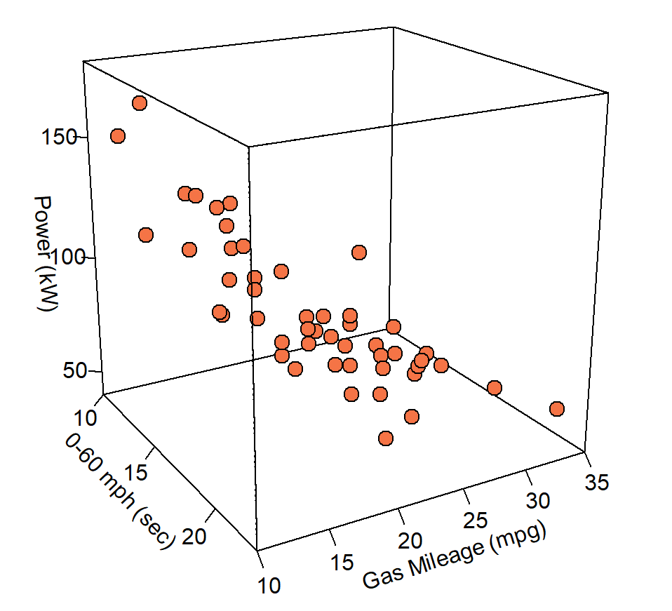
三维散点图
scatterplot3d包的scatterplot3d()函数、rgl包的plot3d()函数、plot3D包的scatter3D()函数等都可以绘制三维散点图。
library(plot3D)
df<-read.csv("ThreeD_Scatter_Data.csv",header=T)
pmar <- par(mar = c(5.1, 4.1, 4.1, 6.1))
with(df, scatter3D(x = mph, y = Gas_Mileage, z = Power, #bgvar = mag,
                   pch = 21, cex = 1.5,col="black",bg="#F57446",
                   xlab = "0-60 mph (sec)",
                   ylab = "Gas Mileage (mpg)",
                   zlab = "Power (kW)",
                   zlim=c(40,180),
                   ticktype = "detailed",bty = "f",box = TRUE,
                   #panel.first = panelfirst,
                   theta = 60, phi = 20, d=3,
                   colkey = FALSE)#list(length = 0.5, width = 0.5, cex.clab = 0.75))
)
library(RColorBrewer)
library(fields)
#构造颜色映射
colormap <- colorRampPalette(rev(brewer.pal(11,'RdYlGn')))(100)
index <- ceiling(((prc <- 0.7 * df$Power/ diff(range(df$Power))) - min(prc) + 0.3)*100)
for (i in seq(1,length(index)) ){
  prc[i]=colormap[index[i]]
}
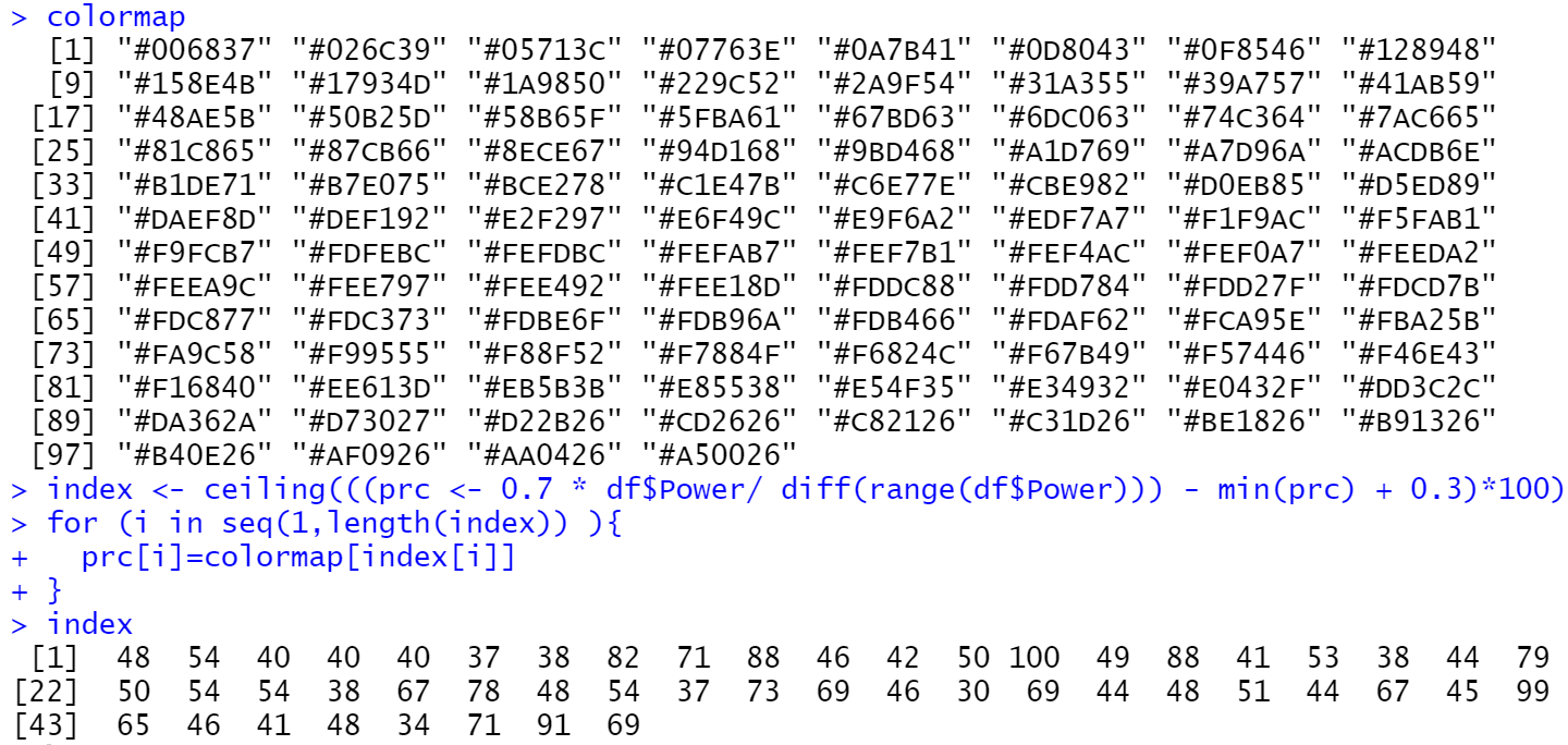
pmar <- par(mar = c(5.1, 4.1, 4.1, 6.1))
with(df, scatter3D(x = mph, y = Gas_Mileage, z = Power, #bgvar = mag,
                   pch = 21, cex = 1.5,col="black",bg=prc,
                   xlab = "0-60 mph (sec)",
                   ylab = "Gas Mileage (mpg)",
                   zlab = "Power (kW)",
                   zlim=c(40,180),
                   ticktype = "detailed",bty = "f",box = TRUE,
                   #panel.first = panelfirst,
                   theta = 60, phi = 20, d=3,
                   colkey = FALSE)#list(length = 0.5, width = 0.5, cex.clab = 0.75))
)
colkey (col=colormap,clim=range(df$Power),clab = "Power", add=TRUE, length=0.5,side = 4)
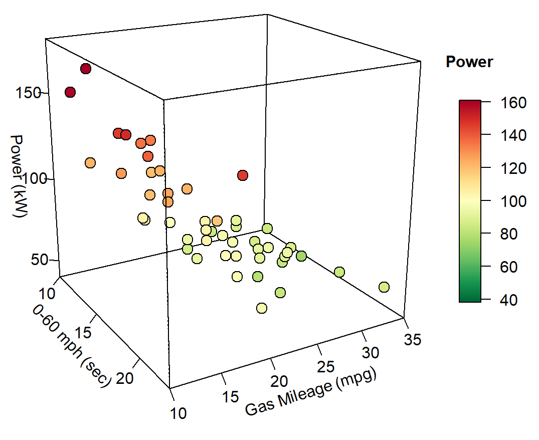
index <- ceiling(((prc <- 0.7 * df$Weight/ diff(range(df$Weight))) - min(prc) + 0.3)*100)
for (i in seq(1,length(index)) ){
  prc[i]=colormap[index[i]]
}
pmar <- par(mar = c(5.1, 4.1, 4.1, 6.1))
with(df, scatter3D(x = mph, y = Gas_Mileage, z = Power, #bgvar = mag,
                   pch = 21, cex = 1.5,col="black",bg=prc,
                   xlab = "0-60 mph (sec)",
                   ylab = "Gas Mileage (mpg)",
                   zlab = "Power (kW)",
                   zlim=c(40,180),
                   ticktype = "detailed",bty = "f",box = TRUE,
                   #panel.first = panelfirst,
                   theta = 60, phi = 20, d=3,
                   colkey = FALSE)#list(length = 0.5, width = 0.5, cex.clab = 0.75))
)
colkey (col=colormap,clim=range(df$Weight),clab = "Weight", add=TRUE, length=0.5,side = 4)
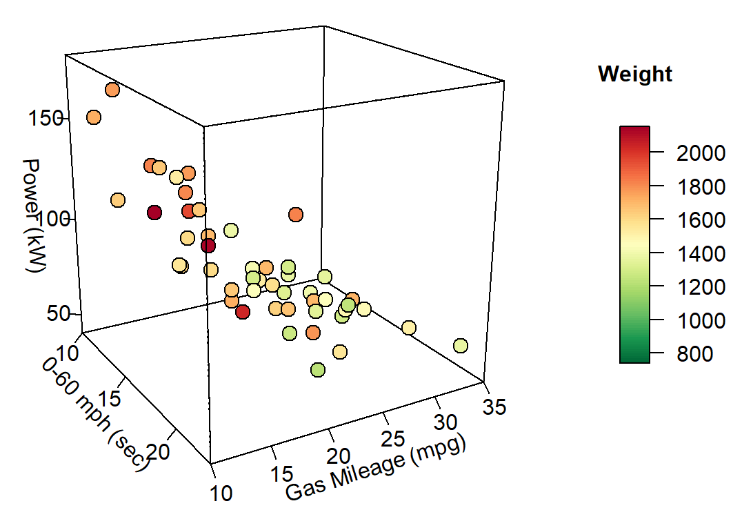
library(plot3D)
library(RColorBrewer)
library(fields)
library(scales)
colormap <- colorRampPalette(rev(brewer.pal(11,'RdYlGn')))(100)
index <- ceiling(((prc <- 0.7 * df$Weight/ diff(range(df$Weight))) - min(prc) + 0.3)*100)
for (i in seq(1,length(index)) ){
  prc[i]=colormap[index[i]]
}
pmar <- par(mar = c(5.1, 4.1, 4.1, 6.1))
with(df, scatter3D(x = mph, y = Gas_Mileage, z = Power,
                   pch = 21, cex = rescale(df$Weight, c(.5, 5)),col="black",bg=prc,
                   xlab = "0-60 mph (sec)",
                   ylab = "Gas Mileage (mpg)",
                   zlab = "Power (kW)",
                   zlim=c(40,180),
                   ticktype = "detailed",bty = "f",box = TRUE,
                   theta = 60, phi = 20, d=3,
                   colkey = FALSE)
)
breaks<-round(seq(500,2000,length.out=4),3) # df$Weight 的范围为 739~2152
legend_index <- ceiling(((legend_prc <- 0.7 *breaks/ diff(range(breaks))) - min(legend_prc) + 0.3)*100)
for (i in seq(1,length(legend_index)) ){
  legend_prc[i]=colormap[legend_index[i]]
}
legend("right",title = "Weight",legend=breaks,pch=21,
       pt.cex=rescale(breaks, c(.5, 5)),y.intersp=1.6, pt.bg = legend_prc,bg="white",bty="n")
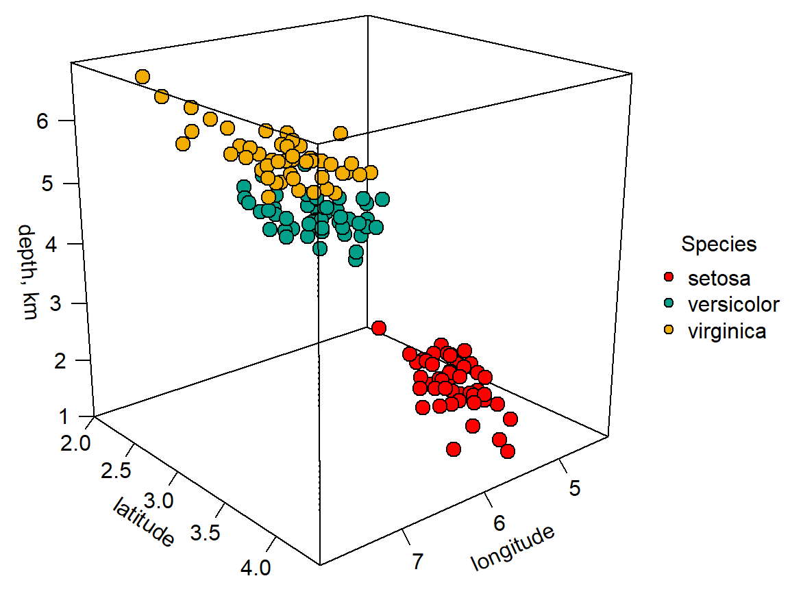
library(plot3D)
library(wesanderson)
pmar <- par(mar = c(5.1, 4.1, 4.1, 7.1))
colors0 <-wes_palette(n=3, name="Darjeeling1")
colors <- colors0[as.numeric(iris$Species)]
with(iris, scatter3D(x = Sepal.Length, y = Sepal.Width, z = Petal.Length,
                     pch = 21, cex = 1.5,col="black",bg=colors,
                     xlab = "longitude", ylab = "latitude",
                     zlab = "depth, km",
                     ticktype = "detailed",bty = "f",box = TRUE,
                     theta = 140, phi = 20, d=3,
                     colkey = FALSE))
legend("right",title = "Species",legend=c("setosa", "versicolor", "virginica"),pch=21,
       cex=1,y.intersp=1,pt.bg = colors0,bg="white",bty="n")
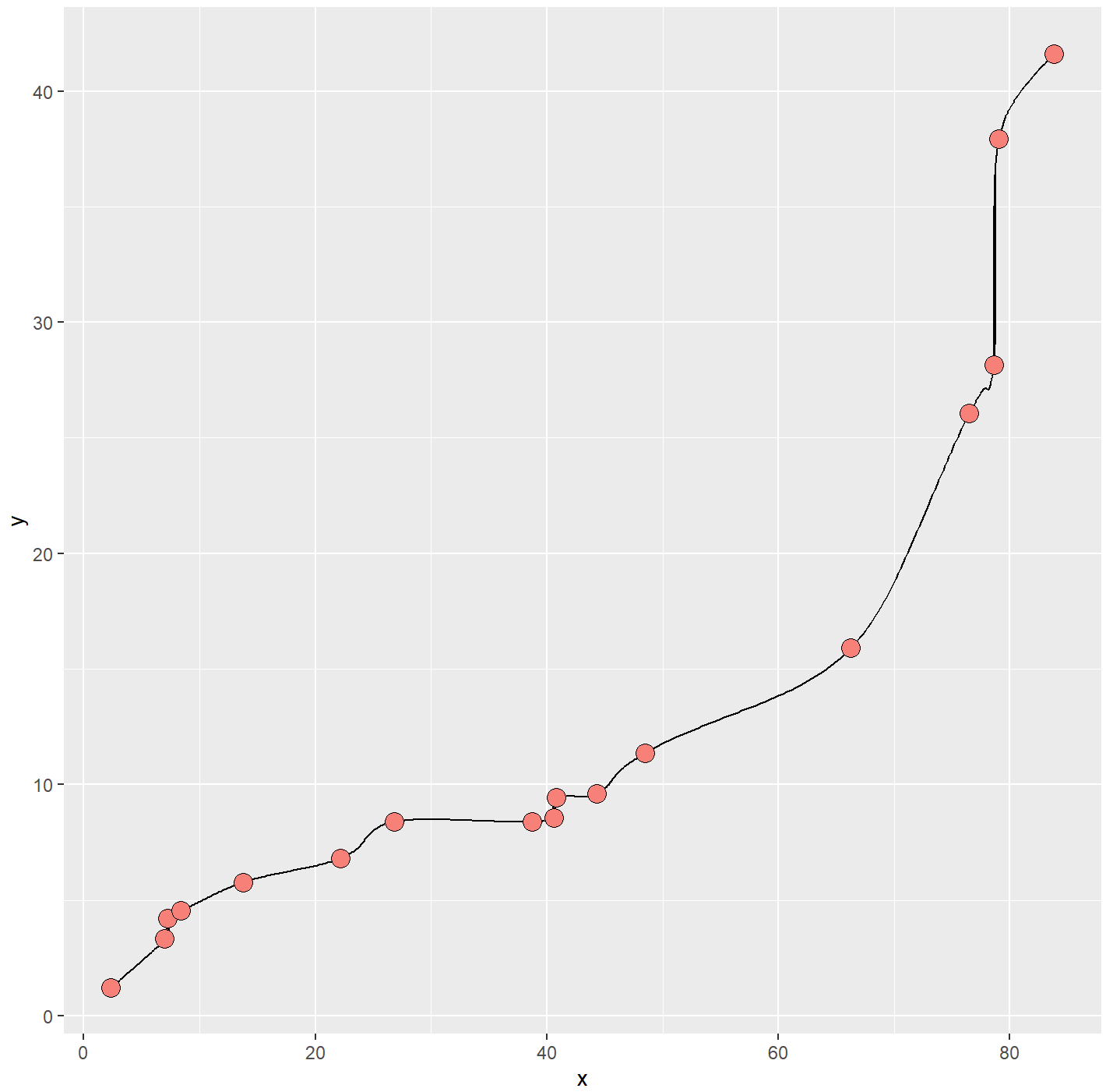
散点曲线图
ggplot2包的geom_line()函数只能绘制折线图,但是R中ggalt包提供的geom_xspline()函数可以绘制带光滑曲线的散点图。
geom_line()函数是先对数据根据 X 轴变量的数值排序,然后使用直线依次连接,常用于直角坐标系中。geom_path()函数是直接根据给定的数据点顺序,使用直线将各点连接,常用于地理空间坐标系中。
library(ggplot2)
library(ggalt)
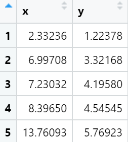
mydata<-read.csv("Line_Data.csv",header=T)
ggplot(mydata, aes(x, y) )+
  geom_xspline(spline_shape=-0.5, size=0.25)+
  geom_point(shape=21,size=4,color="black",fill="#F78179") +
  theme_gray()

ggplot(mydata, aes(x, y) )+
  geom_xspline(spline_shape=-0.5, size=0.25)+
  geom_point(shape=21,size=4,color="black",fill="#F78179") +
  xlab("X-Axis")+
  ylab("Y-Axis")+
  ylim(0, 50)+
  theme_gray()+
  theme(
    text=element_text(size=15,face="plain",color="black"),
    axis.title=element_text(size=10,face="plain",color="black"),
    axis.text = element_text(size=10,face="plain",color="black")
  )
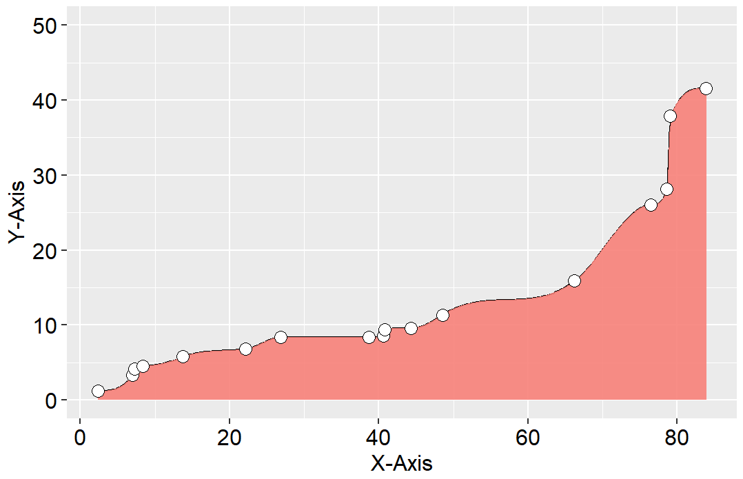
可以使用数据预处理的方法先用算法平滑曲线,然后根据平滑数据绘制面积图,再添加散点曲线。R 中splines包的spline()函数可以使用样条函数实现曲线的光滑与插值。spline()函数的method参数有fmm、natural、periodic、monoH.FC和hyman。hyman只适应于单调递增或递减的数据插值,natural使用自然样条插值方法,periodic使用周期样条插值方法。
library(ggplot2)
library(splines)
mydata<-read.csv("Line_Data.csv",header=T)
newdata <- data.frame(spline(mydata$x,mydata$y,n=300,method="hyman" ))
ggplot(newdata, aes(x, y) )+
  geom_line(linewidth=0.25)+
  geom_area(fill="#F78179",alpha=0.7)+
  geom_point(data=mydata,aes(x,y),shape=21,size=4,color="black",fill="white")

ggplot(newdata, aes(x, y) )+
  geom_line(size=0.5,color="black")+
  geom_area(fill="#F78179",alpha=0.9)+
  geom_point(data=mydata,aes(x,y),shape=21,size=3,color="black",fill="white") +
  xlab("X-Axis")+
  ylab("Y-Axis")+
  ylim(0, 50)+
  theme_gray()+
  theme(
    text=element_text(size=15,face="plain",color="black"),
    axis.title=element_text(size=12,face="plain",color="black"),
    axis.text = element_text(size=12,face="plain",color="black")
  )
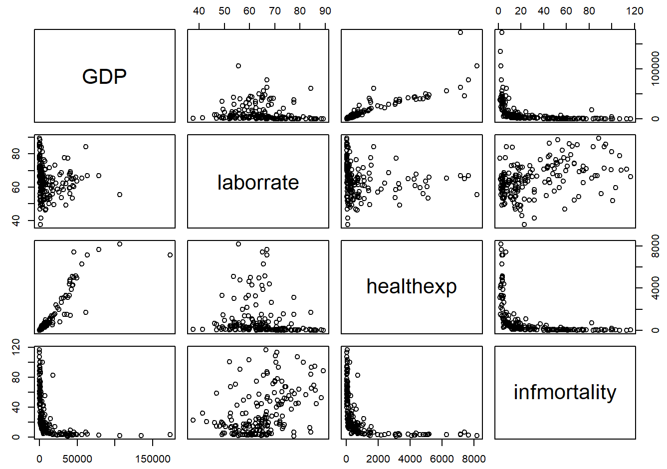
散点图矩阵
library(gcookbook)
library(tidyverse)
c2009 <- countries %>%
  filter(Year == 2009) %>%
  select(Name, GDP, laborrate, healthexp, infmortality)
c2009_num <- select(c2009, -Name)
pairs(c2009_num)
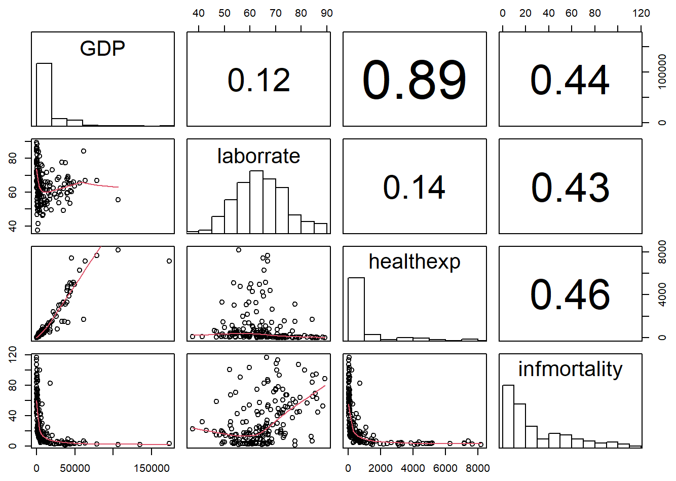
panel.cor <- function(x, y, digits = 2, prefix = "", cex.cor, ...) {
  usr <- par("usr")
  on.exit(par(usr))
  par(usr = c(0, 1, 0, 1))
  r <- abs(cor(x, y, use = "complete.obs"))
  txt <- format(c(r, 0.123456789), digits = digits)[1]
  txt <- paste(prefix, txt, sep = "")
  if (missing(cex.cor)) cex.cor <- 0.8/strwidth(txt)
  text(0.5, 0.5, txt, cex =  cex.cor * (1 + r) / 2)
}

panel.hist <- function(x, ...) {
  usr <- par("usr")
  on.exit(par(usr))
  par(usr = c(usr[1:2], 0, 1.5) )
  h <- hist(x, plot = FALSE)
  breaks <- h$breaks
  nB <- length(breaks)
  y <- h$counts
  y <- y/max(y)
  rect(breaks[-nB], 0, breaks[-1], y, col = "white", ...)
}

pairs(
  c2009_num,
  upper.panel = panel.cor,
  diag.panel  = panel.hist,
  lower.panel = panel.smooth
)
# 线性回归
panel.lm <- function (x, y, col = par("col"), bg = NA, pch = par("pch"),
                      cex = 1, col.smooth = "black", ...) {
  points(x, y, pch = pch, col = col, bg = bg, cex = cex)
  abline(stats::lm(y ~ x),  col = col.smooth, ...)
}

pairs(
  c2009_num,
  upper.panel = panel.cor,
  diag.panel  = panel.hist,
  lower.panel = panel.smooth,
  pch = "."
)
This time the default line color is black instead of red, though you can change it here (and with panel.smooth) by setting col.smooth when you call pairs().We’ll also use small points in the visualization, so that we can distinguish them a bit better. This is done by setting pch = ".".
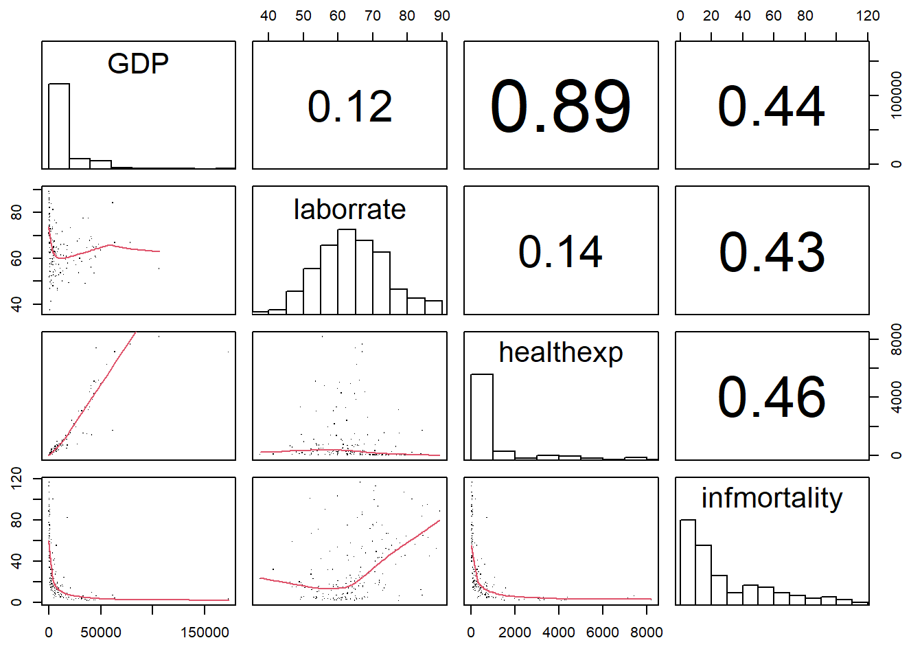
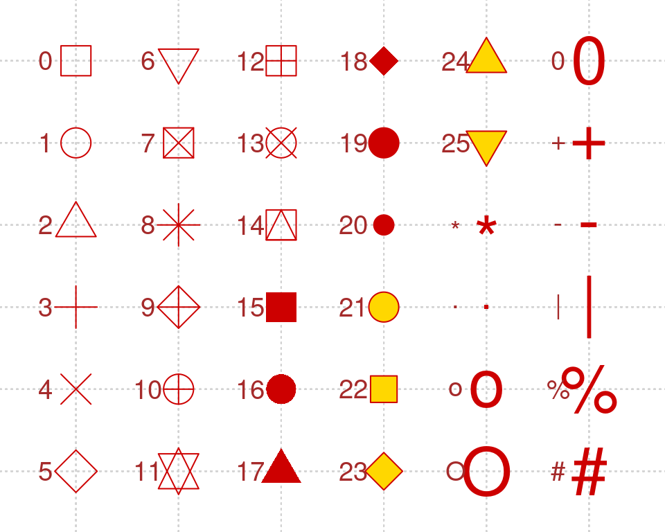
点的大小也可以使用cex参数进行控制。cex的默认值为1,若图片存为pdf格式,cex的值最好不低于0.5。
参考资料
[1] https://r-graphics.org/recipe-bar-graph-labels
[2] https://github.com/EasyChart/Beautiful-Visualization-with-R
[3] R语言数据可视化之美:专业图表绘制指南(增强版) (张杰)


 3万+
3万+


 被折叠的 条评论
为什么被折叠?
被折叠的 条评论
为什么被折叠?
 到【灌水乐园】发言


