Introduction
“Money makes the world go round” is something which you cannot ignore whether to choose to agree or disagree with it. A more apt saying in today’s digital revolutionary age would be “Data makes the world go round”. Indeed data has become a first class asset for businesses, corporations and organizations irrespective of their size and scale. Any intelligent system regardless of their complexity needs to be powered by data. At the heart of any intelligent system, we have one or more algorithms based on machine learning, deep learning or statistical methods which consume this data to gather knowledge and provide intelligent insights over a period of time. Algorithms are pretty naive by themselves and cannot work out of the box on raw data. Hence the need for engineering meaningful features from raw data is of utmost importance which can be understood and consumed by these algorithms.
A gentle refresher of the machine learning pipeline
Any intelligent system basically consists of an end-to-end pipeline starting from ingesting raw data, leveraging data processing techniques to wrangle, process and engineer meaningful features and attributes from this data. Then we usually leverage techniques like statistical models or machine learning models to model on these features and then deploy this model if necessary for future usage based on the problem to be solved at hand. A typical standard machine learning pipeline based on the CRISP-DM industry standard process model is depicted below.
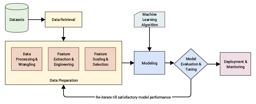
A standard machine learning pipeline (source: Practical Machine Learning with Python, Apress/Springer)
Ingesting raw data and building models on top of this data directly would be foolhardy since we wouldn’t get desired results or performance and also algorithms are not intelligent enough to automatically extract meaningful features from raw data (there are automated feature extraction techniques which are enabled nowadays with deep learning methodologies to some extent, but more on that later!).
Our main area of focus falls under the data preparation aspect as pointed out in the figure above, where we deal with various methodologies to extract meaningful attributes or features from the raw data after it has gone through necessary wrangling and pre-processing.
Motivation
Feature engineering is an essential part of building any intelligent system. Even though you have a lot of newer methodologies coming in like deep learning and meta-heuristics which aid in automated machine learning, each problem is domain specific and better features (suited to the problem) is often the deciding factor of the performance of your system. Feature Engineering is an art as well as a science and this is the reason Data Scientists often spend 70% of their time in the data preparation phase before modeling. Let’s look at a few quotes relevant to feature engineering from several renowned people in the world of Data Science.
“Coming up with features is difficult, time-consuming, requires expert knowledge. ‘Applied machine learning’ is basically feature engineering.”
— Prof. Andrew Ng.
This basically reinforces what we mentioned earlier about data scientists spending close to 80% of their time in engineering features which is a difficult and time-consuming process, requiring both domain knowledge and mathematical computations.
“Feature engineering is the process of transforming raw data into features that better represent the underlying problem to the predictive models, resulting in improved model accuracy on unseen data.”
— Dr. Jason Brownlee
This gives us an idea about feature engineering being the process of transforming data into features to act as inputs for machine learning models such that good quality features help in improving the overall model performance. Features are also very much dependent on the underlying problem. Thus, even though the machine learning task might be same in different scenarios, like classification of emails into spam and non-spam or classifying handwritten digits, the features extracted in each scenario will be very different from the other.
Prof. Pedro Domingos from the University of Washington, in his paper titled, “A Few Useful Things to Know about Machine Learning” tells us the following.
“At the end of the day, some machine learning projects succeed and some fail. What makes the difference? Easily the most important factor is the features used.”
— Prof. Pedro Domingos
The final quote which should motivate you about feature engineering is from renowned Kaggler, Xavier Conort. Most of you already know that tough real-world machine learning problems are often posted on Kaggle regularly which is usually open to everyone.
“The algorithms we used are very standard for Kagglers. …We spent most of our efforts in feature engineering. … We were also very careful to discard features likely to expose us to the risk of over-fitting our model.”
— Xavier Conort
Understanding Features
A feature is typically a specific representation on top of raw data, which is an individual, measurable attribute, typically depicted by a column in a dataset. Considering a generic two-dimensional dataset, each observation is depicted by a row and each feature by a column, which will have a specific value for an observation.
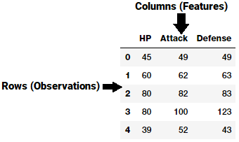
A generic dataset snapshot
Thus like in the example in the figure above, each row typically indicates a feature vector and the entire set of features across all the observations forms a two-dimensional feature matrix also known as a feature-set. This is akin to data frames or spreadsheets representing two-dimensional data. Typically machine learning algorithms work with these numeric matrices or tensors and hence most feature engineering techniques deal with converting raw data into some numeric representations which can be easily understood by these algorithms.
Features can be of two major types based on the dataset. Inherent raw features are obtained directly from the dataset with no extra data manipulation or engineering. Derived features are usually obtained from feature engineering, where we extract features from existing data attributes. A simple example would be creating a new feature “Age” from an employee dataset containing “Birthdate” by just subtracting their birth date from the current date.
There are diverse types and formats of data including structured and unstructured data. In this article, we will discuss various feature engineering strategies for dealing with structured continuous numeric data. All these examples are a part of one of my recent books ‘Practical Machine Learning with Python’ and you can access relevant datasets and code used in this article on GitHub. A big shout out also goes to Gabriel Moreira who helped me by providing some excellent pointers on feature engineering techniques.
Feature Engineering on Numeric Data
Numeric data typically represents data in the form of scalar values depicting observations, recordings or measurements. Here, by numeric data, we mean continuous data and not discrete data which is typically represented as categorical data. Numeric data can also be represented as a vector of values where each value or entity in the vector can represent a specific feature. Integers and floats are the most common and widely used numeric data types for continuous numeric data. Even though numeric data can be directly fed into machine learning models, you would still need to engineer features which are relevant to the scenario, problem and domain before building a model. Hence the need for feature engineering still remains. Let’s leverage python and look at some strategies for feature engineering on numeric data. We load up the following necessary dependencies first (typically in a Jupyternotebook).
import pandas as pd
import matplotlib.pyplot as plt
import numpy as np
import scipy.stats as spstats
%matplotlib inline
Raw Measures
Like we mentioned earlier, raw numeric data can often be fed directly to machine learning models based on the context and data format. Raw measures are typically indicated using numeric variables directly as features without any form of transformation or engineering. Typically these features can indicate values or counts. Let’s load up one of our datasets, the Pokémon dataset also available on Kaggle.
poke_df = pd.read_csv('datasets/Pokemon.csv', encoding='utf-8') poke_df.head()

Snapshot of our Pokemon dataset
Pokémon is a huge media franchise surrounding fictional characters called Pokémon which stands for pocket monsters. In short, you can think of them as fictional animals with superpowers! This dataset consists of these characters with various statistics for each character.
Values
If you closely observe the data frame snapshot in the above figure, you can see that several attributes represent numeric raw values which can be used directly. The following snippet depicts some of these features with more emphasis.
poke_df[['HP', 'Attack', 'Defense']].head()
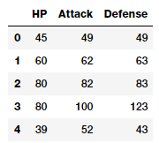
Features with (continuous) numeric data
Thus, you can directly use these attributes as features which are depicted in the above data frame. These include each Pokémon’s HP (Hit Points), Attack and Defense stats. In fact, we can also compute some basic statistical measures on these fields.
poke_df[['HP', 'Attack', 'Defense']].describe()
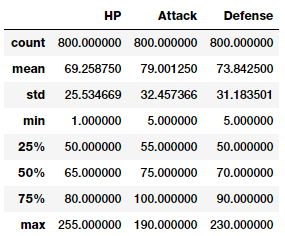
Basic descriptive statistics on numeric features
With this you can get a good idea about statistical measures in these features like count, average, standard deviation and quartiles.
Counts
Another form of raw measures include features which represent frequencies, counts or occurrences of specific attributes. Let’s look at a sample of data from the millionsong dataset which depicts counts or frequencies of songs which have been heard by various users.
popsong_df = pd.read_csv('datasets/song_views.csv',
                          encoding='utf-8')
popsong_df.head(10)
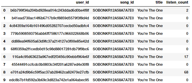
Song listen counts as a numeric feature
It is quite evident from the above snapshot that the listen_count field can be used directly as a frequency\count based numeric feature.
Binarization
Often raw frequencies or counts may not be relevant for building a model based on the problem which is being solved. For instance if I’m building a recommendation system for song recommendations, I would just want to know if a person is interested or has listened to a particular song. This doesn’t require the number of times a song has been listened to since I am more concerned about the various songs he\she has listened to. In this case, a binary feature is preferred as opposed to a count based feature. We can binarize our listen_count field as follows.
watched = np.array(popsong_df['listen_count'])
watched[watched >= 1] = 1
popsong_df['watched'] = watched
You can also use scikit-learn's Binarizer class here from its preprocessing module to perform the same task instead of numpy arrays.
from sklearn.preprocessing import Binarizer
bn = Binarizer(threshold=0.9)
pd_watched = bn.transform([popsong_df['listen_count']])[0]
popsong_df['pd_watched'] = pd_watched
popsong_df.head(11)
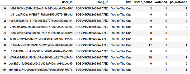
Binarizing song counts
You can clearly see from the above snapshot that both the methods have produced the same result. Thus we get a binarized feature indicating if the song was listened to or not by each user which can be then further used in a relevant model.
Rounding
Often when dealing with continuous numeric attributes like proportions or percentages, we may not need the raw values having a high amount of precision. Hence it often makes sense to round off these high precision percentages into numeric integers. These integers can then be directly used as raw values or even as categorical (discrete-class based) features. Let’s try applying this concept in a dummy dataset depicting store items and their popularity percentages.
items_popularity = pd.read_csv('datasets/item_popularity.csv',
                               encoding='utf-8')
items_popularity['popularity_scale_10'] = np.array(
                   np.round((items_popularity['pop_percent'] * 10)),
                   dtype='int')
items_popularity['popularity_scale_100'] = np.array(
                  np.round((items_popularity['pop_percent'] * 100)),
                  dtype='int')
items_popularity
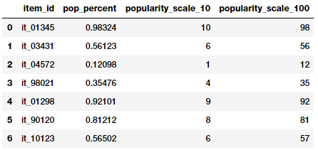
Rounding popularity to different scales
Based on the above ouputs, you can guess that we tried two forms of rounding. The features depict the item popularities now both on a scale of 1–10 and on a scale of 1–100. You can use these values both as numerical or categorical features based on the scenario and problem.
Interactions
Supervised machine learning models usually try to model the output responses (discrete classes or continuous values) as a function of the input feature variables. For example, a simple linear regression equation can be depicted as

where the input features are depicted by variables

having weights or coefficients denoted by

respectively and the goal is to predict the response y.
In this case, this simple linear model depicts the relationship between the output and inputs, purely based on the individual, separate input features.
However, often in several real-world scenarios, it makes sense to also try and capture the interactions between these feature variables as a part of the input feature set. A simple depiction of the extension of the above linear regression formulation with interaction features would be

where the features represented by

denote the interaction features. Let’s try engineering some interaction features on our Pokémon dataset now.
atk_def = poke_df[['Attack', 'Defense']]
atk_def.head()
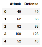
From the output data frame, we can see that we have two numeric (continuous) features, Attack and Defence. We will now build features up to the 2nd degree by leveraging scikit-learn.
from sklearn.preprocessing import PolynomialFeatures
pf = PolynomialFeatures(degree=2, interaction_only=False,
                        include_bias=False)
res = pf.fit_transform(atk_def)
res
Output
------
array([[    49.,     49.,   2401.,   2401.,   2401.],
       [    62.,     63.,   3844.,   3906.,   3969.],
       [    82.,     83.,   6724.,   6806.,   6889.],
       ...,
       [   110.,     60.,  12100.,   6600.,   3600.],
       [   160.,     60.,  25600.,   9600.,   3600.],
       [   110.,    120.,  12100.,  13200.,  14400.]])
The above feature matrix depicts a total of five features including the new interaction features. We can see the degree of each feature in the above matrix as follows.
pd.DataFrame(pf.powers_, columns=['Attack_degree',
                                  'Defense_degree'])
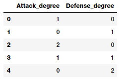
Looking at this output, we now know what each feature actually represents from the degrees depicted here. Armed with this knowledge, we can assign a name to each feature now as follows. This is just for ease of understanding and you should name your features with better, easy to access and simple names.
intr_features = pd.DataFrame(res, columns=['Attack', 'Defense',
                                           'Attack^2',
                                           'Attack x Defense',
                                           'Defense^2'])
intr_features.head(5)
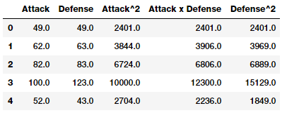
Numeric features with their interactions
Thus the above data frame represents our original features along with their interaction features.
Binning
The problem of working with raw, continuous numeric features is that often the distribution of values in these features will be skewed. This signifies that some values will occur quite frequently while some will be quite rare. Besides this, there is also another problem of the varying range of values in any of these features. For instance view counts of specific music videos could be abnormally large (Despacito we’re looking at you!) and some could be really small. Directly using these features can cause a lot of issues and adversely affect the model. Hence there are strategies to deal with this, which include binning and transformations.
Binning, also known as quantization is used for transforming continuous numeric features into discrete ones (categories). These discrete values or numbers can be thought of as categories or bins into which the raw, continuous numeric values are binned or grouped into. Each bin represents a specific degree of intensity and hence a specific range of continuous numeric values fall into it. Specific strategies of binning data include fixed-width and adaptive binning. Let’s use a subset of data from a dataset extracted from the 2016 FreeCodeCamp Developer\Coder survey which talks about various attributes pertaining to coders and software developers.
fcc_survey_df = pd.read_csv('datasets/fcc_2016_coder_survey_subset.csv',
encoding='utf-8')
fcc_survey_df[['ID.x', 'EmploymentField', 'Age', 'Income']].head()

Sample attributes from the FCC coder survey dataset
The ID.x variable is basically a unique identifier for each coder\developer who took the survey and the other fields are pretty self-explanatory.
Fixed-Width Binning
Just like the name indicates, in fixed-width binning, we have specific fixed widths for each of the bins which are usually pre-defined by the user analyzing the data. Each bin has a pre-fixed range of values which should be assigned to that bin on the basis of some domain knowledge, rules or constraints. Binning based on rounding is one of the ways, where you can use the rounding operation which we discussed earlier to bin raw values.
Let’s now consider the Age feature from the coder survey dataset and look at its distribution.
fig, ax = plt.subplots()
fcc_survey_df['Age'].hist(color='#A9C5D3', edgecolor='black',
                          grid=False)
ax.set_title('Developer Age Histogram', fontsize=12)
ax.set_xlabel('Age', fontsize=12)
ax.set_ylabel('Frequency', fontsize=12)
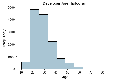
Histogram depicting developer age distribution
The above histogram depicting developer ages is slightly right skewed as expected (lesser aged developers). We will now assign these raw age values into specific bins based on the following scheme
Age Range: Bin
---------------
 0 -  9  : 0
10 - 19  : 1
20 - 29  : 2
30 - 39  : 3
40 - 49  : 4
50 - 59  : 5
60 - 69  : 6
  ... and so on
We can easily do this using what we learnt in the Rounding section earlier where we round off these raw age values by taking the floor value after dividing it by 10.
fcc_survey_df['Age_bin_round'] = np.array(np.floor(
                              np.array(fcc_survey_df['Age']) / 10.))
fcc_survey_df[['ID.x', 'Age', 'Age_bin_round']].iloc[1071:1076]
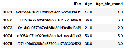
Binning by rounding
You can see the corresponding bins for each age have been assigned based on rounding. But what if we need more flexibility? What if we want to decide and fix the bin widths based on our own rules\logic? Binning based on custom ranges will help us achieve this. Let’s define some custom age ranges for binning developer ages using the following scheme.
Age Range : Bin
---------------
 0 -  15  : 1
16 -  30  : 2
31 -  45  : 3
46 -  60  : 4
61 -  75  : 5
75 - 100  : 6
Based on this custom binning scheme, we will now label the bins for each developer age value and we will store both the bin range as well as the corresponding label.
bin_ranges = [0, 15, 30, 45, 60, 75, 100]
bin_names = [1, 2, 3, 4, 5, 6]
fcc_survey_df['Age_bin_custom_range'] = pd.cut(
                                           np.array(
                                              fcc_survey_df['Age']),
                                              bins=bin_ranges)
fcc_survey_df['Age_bin_custom_label'] = pd.cut(
                                           np.array(
                                              fcc_survey_df['Age']),
                                              bins=bin_ranges,
                                              labels=bin_names)
# view the binned features
fcc_survey_df[['ID.x', 'Age', 'Age_bin_round',
               'Age_bin_custom_range',
               'Age_bin_custom_label']].iloc[10a71:1076]

Custom binning scheme for developer ages
Adaptive Binning
The drawback in using fixed-width binning is that due to us manually deciding the bin ranges, we can end up with irregular bins which are not uniform based on the number of data points or values which fall in each bin. Some of the bins might be densely populated and some of them might be sparsely populated or even empty! Adaptive binning is a safer strategy in these scenarios where we let the data speak for itself! That’s right, we use the data distribution itself to decide our bin ranges.
Quantile based binning is a good strategy to use for adaptive binning. Quantiles are specific values or cut-points which help in partitioning the continuous valued distribution of a specific numeric field into discrete contiguous bins or intervals. Thus, q-Quantiles help in partitioning a numeric attribute into q equal partitions. Popular examples of quantiles include the 2-Quantile known as the median which divides the data distribution into two equal bins, 4-Quantiles known as the quartiles which divide the data into 4 equal bins and 10-Quantiles also known as the deciles which create 10 equal width bins. Let’s now look at the data distribution for the developer Incomefield.
fig, ax = plt.subplots()
fcc_survey_df['Income'].hist(bins=30, color='#A9C5D3',
                             edgecolor='black', grid=False)
ax.set_title('Developer Income Histogram', fontsize=12)
ax.set_xlabel('Developer Income', fontsize=12)
ax.set_ylabel('Frequency', fontsize=12)
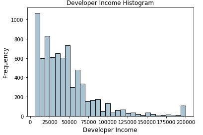
Histogram depicting developer income distribution
The above distribution depicts a right skew in the income with lesser developers earning more money and vice versa. Let’s take a 4-Quantile or a quartile based adaptive binning scheme. We can obtain the quartiles easily as follows.
quantile_list = [0, .25, .5, .75, 1.]
quantiles = fcc_survey_df['Income'].quantile(quantile_list)
quantiles
Output
------
0.00      6000.0
0.25     20000.0
0.50     37000.0
0.75     60000.0
1.00    200000.0
Name: Income, dtype: float64
Let’s now visualize these quantiles in the original distribution histogram!
fig, ax = plt.subplots()
fcc_survey_df['Income'].hist(bins=30, color='#A9C5D3',
                             edgecolor='black', grid=False)
for quantile in quantiles:
    qvl = plt.axvline(quantile, color='r')
ax.legend([qvl], ['Quantiles'], fontsize=10)
ax.set_title('Developer Income Histogram with Quantiles',
             fontsize=12)
ax.set_xlabel('Developer Income', fontsize=12)
ax.set_ylabel('Frequency', fontsize=12)
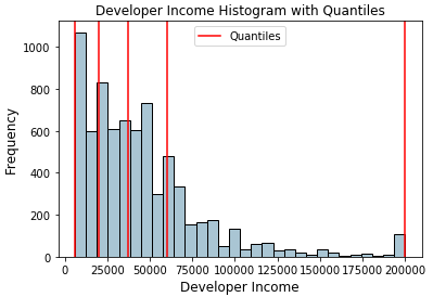
Histogram depicting developer income distribution with quartile values
The red lines in the distribution above depict the quartile values and our potential bins. Let’s now leverage this knowledge to build our quartile based binning scheme.
quantile_labels = ['0-25Q', '25-50Q', '50-75Q', '75-100Q']
fcc_survey_df['Income_quantile_range'] = pd.qcut(
                                            fcc_survey_df['Income'],
                                            q=quantile_list)
fcc_survey_df['Income_quantile_label'] = pd.qcut(
                                            fcc_survey_df['Income'],
                                            q=quantile_list,
                                            labels=quantile_labels)

fcc_survey_df[['ID.x', 'Age', 'Income', 'Income_quantile_range',
               'Income_quantile_label']].iloc[4:9]

Quantile based bin ranges and labels for developer incomes
This should give you a good idea of how quantile based adaptive binning works. An important point to remember here is that the resultant outcome of binning leads to discrete valued categorical features and you might need an additional step of feature engineering on the categorical data before using it in any model. We will cover feature engineering strategies for categorical data shortly in the next part!
Statistical Transformations
We talked about the adverse effects of skewed data distributions briefly earlier. Let’s look at a different strategy of feature engineering now by making use of statistical or mathematical transformations.We will look at the Log transform as well as the Box-Cox transform. Both of these transform functions belong to the Power Transform family of functions, typically used to create monotonic data transformations. Their main significance is that they help in stabilizing variance, adhering closely to the normal distribution and making the data independent of the mean based on its distribution
Log Transform
The log transform belongs to the power transform family of functions. This function can be mathematically represented as

which reads as log of x to the base b is equal to y. This can then be translated into

which indicates as to what power must the base b be raised to in order to get x. The natural logarithm uses b=e where e = 2.71828 popularly known as Euler’s number. You can also use base b=10 used popularly in the decimal system.
Log transforms are useful when applied to skewed distributions as they tend to expand the values which fall in the range of lower magnitudes and tend to compress or reduce the values which fall in the range of higher magnitudes.This tends to make the skewed distribution as normal-like as possible. Let’s use log transform on our developer Income feature which we used earlier.
fcc_survey_df['Income_log'] = np.log((1+ fcc_survey_df['Income']))
fcc_survey_df[['ID.x', 'Age', 'Income', 'Income_log']].iloc[4:9]
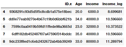
Log transform on developer income
The Income_log field depicts the transformed feature after log transformation. Let’s look at the data distribution on this transformed field now.
income_log_mean = np.round(np.mean(fcc_survey_df['Income_log']), 2)
fig, ax = plt.subplots()
fcc_survey_df['Income_log'].hist(bins=30, color='#A9C5D3',
                                 edgecolor='black', grid=False)
plt.axvline(income_log_mean, color='r')
ax.set_title('Developer Income Histogram after Log Transform',
             fontsize=12)
ax.set_xlabel('Developer Income (log scale)', fontsize=12)
ax.set_ylabel('Frequency', fontsize=12)
ax.text(11.5, 450, r'$\mu$='+str(income_log_mean), fontsize=10)
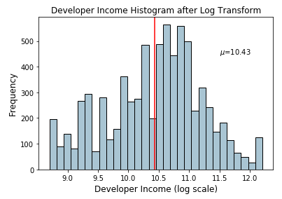
Histogram depicting developer income distribution after log transform
Based on the above plot, we can clearly see that the distribution is more normal-like or gaussian as compared to the skewed distribution on the original data.
Box-Cox Transform
The Box-Cox transform is another popular function belonging to the power transform family of functions. This function has a pre-requisite that the numeric values to be transformed must be positive (similar to what logtransform expects). In case they are negative, shifting using a constant value helps. Mathematically, the Box-Cox transform function can be denoted as follows.

Such that the resulted transformed output y is a function of input x and the transformation parameter λ such that when λ = 0, the resultant transform is the natural log transform which we discussed earlier. The optimal value of λ is usually determined using a maximum likelihood or log-likelihood estimation. Let’s now apply the Box-Cox transform on our developer income feature. First we get the optimal lambda value from the data distribution by removing the non-null values as follows.
income = np.array(fcc_survey_df['Income'])
income_clean = income[~np.isnan(income)]
l, opt_lambda = spstats.boxcox(income_clean)
print('Optimal lambda value:', opt_lambda)
Output
------
Optimal lambda value: 0.117991239456
Now that we have obtained the optimal λ value, let us use the Box-Cox transform for two values of λ such that λ = 0 and λ = λ(optimal) and transform the developer Income feature.
fcc_survey_df['Income_boxcox_lambda_0'] = spstats.boxcox(
                                        (1+fcc_survey_df['Income']),
                                          lmbda=0)
fcc_survey_df['Income_boxcox_lambda_opt'] = spstats.boxcox(
                                            fcc_survey_df['Income'],
                                              lmbda=opt_lambda)

fcc_survey_df[['ID.x', 'Age', 'Income', 'Income_log',
               'Income_boxcox_lambda_0',
               'Income_boxcox_lambda_opt']].iloc[4:9]

Developer income distribution after Box-Cox transform
The transformed features are depicted in the above data frame. Just like we expected, Income_log and Income_boxcox_lamba_0 have the same values. Let’s look at the distribution of the transformed Income feature after transforming with the optimal λ.
income_boxcox_mean = np.round(
                      np.mean(
                       fcc_survey_df['Income_boxcox_lambda_opt']),2)
fig, ax = plt.subplots()
fcc_survey_df['Income_boxcox_lambda_opt'].hist(bins=30,
                     color='#A9C5D3', edgecolor='black', grid=False)
plt.axvline(income_boxcox_mean, color='r')
ax.set_title('Developer Income Histogram after Box–Cox Transform',
             fontsize=12)
ax.set_xlabel('Developer Income (Box–Cox transform)', fontsize=12)
ax.set_ylabel('Frequency', fontsize=12)
ax.text(24, 450, r'$\mu$='+str(income_boxcox_mean), fontsize=10)
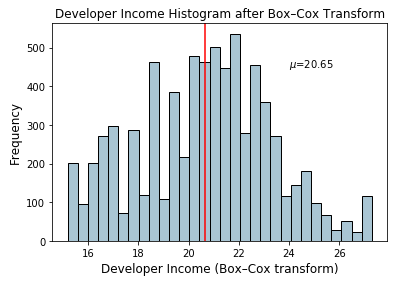
Histogram depicting developer income distribution after Box-Cox transform
The distribution looks more normal-like similar to what we obtained after the log transform.
Conclusion
Feature engineering is a very important aspect of machine learning and data science and should never be ignored. While we have automated feature engineering methodologies like deep learning as well as automated machine learning frameworks like AutoML (which still stresses that it requires good features to work well!). Feature engineering is here to stay and even some of these automated methodologies often require specific engineered features based on the data type, domain and the problem to be solved.
We looked at popular strategies for feature engineering on continuous numeric data in this article. In the next part, we will look at popular strategies for dealing with discrete, categorical data and then move on to unstructured data types in future articles. Stay tuned!
All the code and datasets used in this article can be accessed from my GitHub
The code is also available as a Jupyter notebook


 4092
4092

 被折叠的 条评论
为什么被折叠?


