


本文来源公众号“小白玩转Python”,仅用于学术分享,侵权删,干货满满。
原文链接:Top 5 Python 数据可视化技术
数据可视化技术是学习和工作必不可少的技能之一。掌握这五种高级可视化图表将使数据可视化变得容易。这些库互为补充,以最大化数据表达。
和弦图 (Chord Diagram)
和弦图创造性地展示了数据点之间复杂的关系。节点围绕一个圆圈排列,通过弧线连接。弧线的长度反映了连接值,其粗细表示关系的重要性。颜色对数据进行分类,使比较变得容易。广泛应用于各个领域,特别是在可视化遗传数据方面。

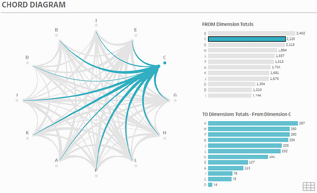
以下是一个使用 Holoviews & Bokeh 创建显示五个国家之间贸易关系的和弦图的示例。
import holoviews as hv
from holoviews import opts
import pandas as pd
import numpy as np
hv.extension('bokeh')

# Sample matrix representing the export volumes between 5 countries
export_data = np.array([[0, 50, 30, 20, 10],
                        [10, 0, 40, 30, 20],
                        [20, 10, 0, 35, 25],
                        [30, 20, 10, 0, 40],
                        [25, 15, 30, 20, 0]])

labels = ['USA', 'China', 'Germany', 'Japan', 'India']

# Creating a pandas DataFrame
df = pd.DataFrame(export_data, index=labels, columns=labels)
df = df.stack().reset_index()
df.columns = ['source', 'target', 'value']

# Creating a Chord object
chord = hv.Chord(df)

# Styling the Chord diagram
chord.opts(
    opts.Chord(
        cmap='Category20',
        edge_cmap='Category20',
        labels='source',
        label_text_font_size='10pt',
        edge_color='source',
        node_color='index',
        width=700,
        height=700
    ).select(value=(5, None))
)

# Display the plot
chord
这段代码首先导入了必要的库,然后创建了一个表示5个国家之间出口量的矩阵。接着,使用Pandas创建了一个DataFrame,并将其转换为适合创建和弦图的格式。最后,使用Holoviews创建了一个和弦图,并对其进行了样式设置,以便显示。
参考链接:
https://holoviews.org/reference/elements/matplotlib/Chord.html
https://github.com/moshi4/pyCirclize
Sunburst Chart
Sunburst Chart 通过清晰展示层次数据,超越了传统的饼图和环图。它使用同心圆,每个圆代表层次中的一级。中心是根,扇形表示节点。每个扇形的大小反映了它的值,直观地理解数据的重要性。在可视化文件系统层次结构、用户导航路径、市场细分和遗传数据方面非常有用。以下是一个使用 Plotly 库创建Sunburst Chart 的示例。
import plotly.express as px
import numpy as np

df = px.data.gapminder().query("year == 2007")

fig = px.sunburst(df, path=['continent', 'country'],
                  values='pop',
                  color='lifeExp',
                  hover_data=['iso_alpha'],
                  color_continuous_scale='RdBu',
                  color_continuous_midpoint=np.average(df['lifeExp'], weights=df['pop']))

fig.show()
这段代码首先导入了必要的库,然后从Plotly的内置数据集中筛选出2007年的数据。接着,使用Plotly Express创建了一个Sunburst(旭日图)来展示不同国家和大陆的人口和预期寿命。最后,显示了这个图表。

参考链接:
https://plotly.com/python/sunburst-charts/
六边形分箱图 (Hexbin Plot)

六边形分箱图,或称六边形分箱,对于可视化二维数据分布非常有效,特别是当数据点密集时。它将数据空间划分为六边形箱,颜色表示每个箱中的点数,清晰地表示数据分布。
以下是一个使用 Python 和 Matplotlib 创建六边形分箱图的示例,展示了空气质量指数 (AQI) 与医院访问之间的相关性。
import numpy as np
import matplotlib.pyplot as plt
from mplhexbin import HexBin

# Simulated data
np.random.seed(0)  # Ensure reproducibility
n_points = 10000
x = np.random.rand(n_points) * 100  # Air Quality Index (AQI) range from 0 to 100
y = 5 * np.sin(x * np.pi / 50) + np.random.randn(n_points) * 15  # Simulated hospital visits, related to AQI but with noise

# Create a new figure
fig, ax = plt.subplots(figsize=(10, 8))

# Use HexBin to create a hexagonal bin plot
hb = HexBin(ax, gridsize=20, cmap='viridis', extent=[0, 100, -30, 50])  # Set grid size, colormap, and range
hb.hexbin(x, y, mincnt=1)  # Draw the hexagonal bin plot, mincnt sets the minimum count threshold

# Add title and axis labels
ax.set_title('Relationship between Air Quality Index (AQI) and Hospital Visits')
ax.set_xlabel('Air Quality Index (AQI)')
ax.set_ylabel('Hospital Visits')

# Show the figure
plt.colorbar(hb.cmap, ax=ax, label='Number of Data Points')  # Add color bar and set label
plt.show()这段代码首先导入了必要的库,然后生成了模拟数据,用于表示空气质量指数(AQI)和医院访问次数之间的关系。接着,使用mplhexbin库创建了一个六边形分箱图来可视化这些数据。最后,添加了图表的标题、轴标签和颜色条,并显示了图表。

参考链接:
https://matplotlib.org/stable/gallery/statistics/hexbin_demo.html
桑基图 (Sankey Diagram)
桑基图可视化数据流,非常适合能源、材料和财务数据。以 Matthew Henry Phineas Riall Sankey 命名,它显示了系统各阶段或部分之间的流量。节点宽度与流量数量成比例,易于理解数据规模和方向。

以下是一个使用 Python 创建桑基图的示例,展示了从生产源头到小城市消费者的能量流。
import plotly.graph_objects as go

labels = ["Coal", "Solar", "Wind", "Nuclear", "Residential", "Industrial", "Commercial"]
source = [0, 1, 2, 3, 0, 1, 2, 3]
target = [4, 4, 4, 4, 5, 5, 5, 5]
value = [25, 10, 40, 20, 30, 15, 25, 35]

# Create the Sankey diagram object
fig = go.Figure(data=[go.Sankey(
    node=dict(
        pad=15,
        thickness=20,
        line=dict(color="black", width=0.5),
        label=labels
    ),
    link=dict(
        source=source,
        target=target,
        value=value
    )
)])

fig.update_layout(title_text="Energy Flow in Model City", font_size=12)
fig.show()
这段代码首先导入了必要的库,然后定义了用于创建桑基图(Sankey diagram)的标签、源、目标和值。接着,使用Plotly创建了一个桑基图对象,并更新了布局以设置标题和字体大小。最后,显示了这个图表。

参考链接:
https://plotly.com/python/sankey-diagram/
流图 (Stream Graph, 主题河流)
流图类似于河流,描绘了随时间的变化。颜色区分类别,而“河流”的宽度表示每个类别的值。它直观地展示趋势和关系,易于理解数据动态。

以下是一个使用 Altair 库创建流图的示例。
import altair as alt
from vega_datasets import data

source = data.unemployment_across_industries.url

alt.Chart(source).mark_area().encode(
    alt.X('yearmonth(date):T',
        axis=alt.Axis(format='%Y', domain=False, tickSize=0)
    ),
    alt.Y('sum(count):Q', stack='center', axis=None),
    alt.Color('series:N',
        scale=alt.Scale(scheme='category20b')
    )
).interactive()
这段代码首先导入了必要的库,然后从Vega数据集中获取了跨行业的失业数据。接着,使用Altair创建了一个区域图(area chart)来展示数据,并对其进行了编码设置,包括X轴、Y轴和颜色。最后,使图表可交互。

参考链接:
https://altair-viz.github.io/gallery/streamgraph.html
THE END !
文章结束,感谢阅读。您的点赞,收藏,评论是我继续更新的动力。大家有推荐的公众号可以评论区留言,共同学习,一起进步。


 831
831

 被折叠的 条评论
为什么被折叠?
被折叠的 条评论
为什么被折叠?
 到【灌水乐园】发言


