excel生成图表
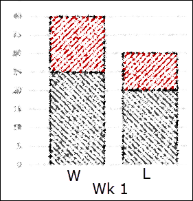
Last weekend, I helped someone who needed a chart for a fantasy football league, to show the highest and lowest win/loss scores for each week. To help explain what it should look like, they posted a picture of a hand drawn chart, similar to the picture below.
上周末,我帮助需要幻想足球联赛图表的人显示了每周最高/最低得分。 为了帮助解释它的外观,他们张贴了一张手绘图表的图片,类似于下面的图片。
By the way, I created the sketch in Excel, by using the Marker option, in the Artistic Effects. Who knew that Excel was so artistically talented?
顺便说一句,我通过使用“艺术效果”中的“标记”选项在Excel中创建了草图。 谁知道Excel具有如此出色的艺术才能?
设置数据 (Set Up the Data)
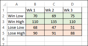
The win/loss data was set up with a separate column for each week, and rows for the win and loss highs and lows.
获利/损失数据每周设置一个单独的列,并按行分别显示获利和损失的高点和低点。
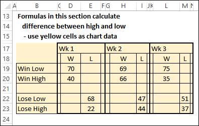
To create the type of chart that’s in the sketch, we’ll need to build a clustered stacked column chart. Blank rows and columns need to be added, and the numbers have to be staggered, with the Win and Loss numbers in separate columns.
要创建草图中的图表类型,我们需要构建一个聚集的堆积柱形图 。 需要添加空白的行和列,并且必须将数字错开,将获胜和失败的数字分别放在不同的列中。

The difference between the high and low scores needs to be calculated too, so the High amount is correctly shown. I also added a “W” or “L” heading to each column of scores, so the chart will be easier to understand.
高低分数之间的差异也需要计算,因此正确显示了高分数。 我还在分数的每一列上添加了“ W”或“ L”标题,因此该图表将更易于理解。
创建图表 (Create the Chart)
The yellow cells, in the screen shot above, are used as the source for the chart.
上面的屏幕截图中的黄色单元格用作图表的来源。
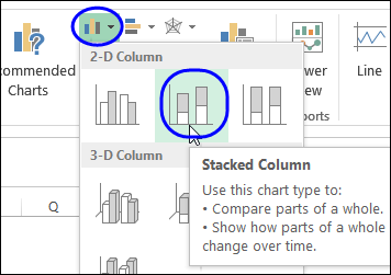
On the Ribbon’s Insert tab, click Column Chart, then click the Stacked Column option
在功能区的“插入”选项卡上,单击“柱形图”,然后单击“堆积柱形”选项
After the chart is created, change the formatting so the gap is smaller, and the High and Low series have the colours that you want.
在创建图表之后,请更改格式,以使间隙更小,并且“高”和“低”系列具有所需的颜色。
In the screen shot below, you can see the chart that I created.
在下面的屏幕快照中,您可以看到我创建的图表。
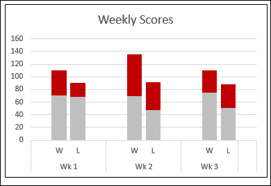
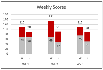
If you want the actual High scores to appear, copy the Win High label and data (row 7), and Lose High label and data (row 11), and paste them into the chart. Then, change the 2 new series to Line Charts.
如果要显示实际的高分,请复制“赢得高分”标签和数据(第7行)和“失去高分”标签和数据(第11行),然后将其粘贴到图表中。 然后,将2个新系列更改为折线图。
Then, add data labels to the Line Charts, to show the High scores, and add data labels at the Inside End for the Low scores.
然后,将数据标签添加到折线图中,以显示高分,并在内侧端添加数据标签以显示低分。
群集堆积图实用程序 (Clustered Stacked Chart Utility)
If you don't have the time or patience to arrange your data and create your own Clustered Stacked Column chart, Jon Peltier has an Excel Chart Utility. that will make the job easier for you.
如果您没有时间或耐心来安排数据并创建自己的“聚簇堆积柱形图”,那么Jon Peltier可以提供Excel Chart Utility 。 这将使您的工作更加轻松。
You can see how it works in this video, or watch on YouTube: Create a Cluster Stack Chart With Excel Chart Utility
您可以在此视频中看到其工作原理,或在YouTube上观看: 使用Excel Chart Utility创建群集堆栈图
下载样本文件 (Download the Sample File)
To see how the data is set up, and view the completed chart, you can download the sample file from my Contextures website. On the Sample Excel Files page, go to the Charts section, and look for CH0010 - Show High and Low in Clustered Stacked Chart. The zipped file is in xlsx format, and does not contain macros.
若要查看数据的设置方式并查看完整的图表,可以从我的Contextures网站下载示例文件。 在“示例Excel文件”页面上,转到“图表”部分,然后查找CH0010-在群集堆叠图表中显示高低 。 压缩文件为xlsx格式,不包含宏。
翻译自: https://contexturesblog.com/archives/2014/10/23/excel-chart-compares-high-and-low-scores/
excel生成图表


 854
854

 被折叠的 条评论
为什么被折叠?


