


视网膜屏幕
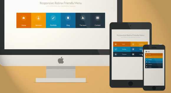
Today we will create a colorful Retina-ready and responsive menu inspired by the colors of the Maliwan manufacturer of the Borderlands game. The menu automatically changes to one of three different layouts depending on the browser window size: a “desktop” inline version, a two columns tablet-optimized version and a mobile version with a menu link to display and hide the navigation for smaller screens. To make the menu fully retina-ready, we will use an icon font so that the icons of the menu won’t get pixelized on resize.
今天,我们将创建一个色彩丰富且可响应视网膜的菜单,其灵感来自Borderlands游戏的马里万制造商的颜色。 菜单会根据浏览器窗口大小自动更改为三种不同的布局之一:“桌面”嵌入式版本,两栏平板电脑优化版本和带有菜单链接的移动版本,可显示和隐藏较小屏幕的导航。 为了使菜单完全适合视网膜,我们将使用图标字体,以便菜单图标在调整大小时不会像素化。
准备图标字体 (Preparing the icon font)
Creating a custom icon font might look a bit complicated, but with tools like IcoMoon it’s just a matter of creating the icons and importing them into the tool. Icon fonts behave like any font, so you can easily change the color, adapt the size and it won’t get pixelized. Perfect for retina devices without having to use multiple assets for different screen resolutions.
创建自定义图标字体可能看起来有些复杂,但是使用IcoMoon之类的工具只需创建图标并将其导入工具即可。 图标字体的行为与任何字体一样,因此您可以轻松更改颜色,调整大小,并且不会像素化。 非常适合视网膜设备,而不必使用多种资产来实现不同的屏幕分辨率。
The first thing we need to do is to create the icons for the menu. I use Illustrator, but any vector graphics editor like, for example Inkscape, will do. We need to create each icon and export them as a SVG file. To make sure the icon will work properly in every browser, we have to convert all lines into full objects, and merge all the objects into one big shape for each icon. Once all have been exported into nice SVG files, we can import them all into the IcoMoon App tool:
我们需要做的第一件事是为菜单创建图标。 我使用Illustrator,但是任何矢量图形编辑器(例如Inkscape)都可以。 我们需要创建每个图标并将其导出为SVG文件。 为了确保该图标在每种浏览器中都能正常工作,我们必须将所有行转换为完整的对象,然后将每个图标的所有对象合并为一个大形状。 将所有文件导出到漂亮的SVG文件后,我们可以将它们全部导入IcoMoon App工具:
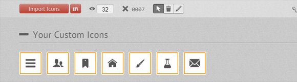
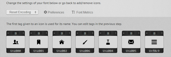
We can also enhance our font with icons from the big library that IcoMoon offers. Once we have all the icons we need, we click on the “Font” button at the bottom of the page to enter the detailed settings. On this page we can choose the encoding settings for the font, and also choose if we want to assign some letters for each icon, or prefer to use the Private Use Area of the font to make sure screen readers won’t be able to output them. I recommend using the default settings that work pretty well.
我们还可以使用IcoMoon提供的大型库中的图标来增强字体。 拥有所有需要的图标后,我们单击页面底部的“字体”按钮以输入详细设置。 在此页面上,我们可以选择字体的编码设置,还可以选择是否要为每个图标分配一些字母,或者更喜欢使用字体的“专用区域”来确保屏幕阅读器无法输出他们。 我建议使用效果很好的默认设置。
When we click on “Download” we get a ZIP file with 4 font formats (SVG, EOT, TTF and WOFF), the CSS styling and a demo page.
当我们单击“下载”时,我们得到一个ZIP文件,具有4种字体格式(SVG,EOT,TTF和WOFF),CSS样式和演示页面。
The first thing to do to be able to use the icons is to copy and paste the CSS IcoMoon provides to the top of our CSS file and make sure we also copy the font folder. There’s also a little “hack” to make the fonts look nicer on Chrome Windows you might want to check it out.
能够使用图标的第一件事是将IcoMoon提供CSS复制并粘贴到我们CSS文件的顶部,并确保我们也复制了字体文件夹。 还有一些“技巧”可以使字体在Chrome Windows上看起来更好,您可能需要检查一下。
菜单HTML (The HTML of the menu)
Here is what the HTML for our navigation looks like:
这是用于导航HTML的样子:
<nav  id="menu" class="nav">
	<ul>
		<li>
			<a  href="#" title="">
				<span  class="icon"> <i aria-hidden="true"  class="icon-home"></i></span><span>Home</span>
			</a>
		</li>
		<li>
			<a href="#" title=""><span class="icon"> <i aria-hidden="true" class="icon-services"></i></span><span>Services</span></a>
		</li>
		<li>
			<a  href="#" title=""><span  class="icon"><i  aria-hidden="true" class="icon-portfolio"></i></span><span>Portfolio</span></a>
		</li>
		<li>
			<a  href="#" title=""><span  class="icon"><i  aria-hidden="true" class="icon-blog"></i></span><span>Blog</span></a>
		</li>
		<li>
			<a  href="#" title=""><span  class="icon"><i  aria-hidden="true" class="icon-team"></i></span><span>The  team</span></a>
		</li>
		<li>
			<a  href="#" title=""><span  class="icon"><i  aria-hidden="true" class="icon-contact"></i></span><span>Contact</span></a>
		</li>
	</ul>
</nav>
To use the icon font, we simply use the class “icon-iconname” inside an i element (a span will work as well). Also note that we added a no-js class to the body that will be changed to js with Modernizr. The idea is to be able to leave the menu open if the user has JavaScript disabled. We’ll also use Modernizr to detect touch support.
要使用图标字体,我们只需在i元素内使用“ icon-iconname”类(跨度也将起作用)。 还要注意,我们在主体中添加了一个no-js类,该类将通过Modernizr更改为js 。 这个想法是如果用户禁用了JavaScript,则能够使菜单保持打开状态。 我们还将使用Modernizr来检测触摸支持。
CSS和JavaScript (The CSS & JavaScript)
Note that I won’t prefix the CSS3 properties here but you will find the prefixed version in the files.
请注意,我不会在此处为CSS3属性添加前缀,但是您会在文件中找到带前缀的版本。
The global CSS that gets applied to all screen sizes looks as follows:
应用于所有屏幕尺寸的全局CSS如下所示:
/* Global CSS that are applied for all screen sizes */

.nav ul {
	max-width: 1240px;
	margin: 0;
	padding: 0;
	list-style: none;
	font-size: 1.5em;
	font-weight: 300;
}

.nav li span {
	display: block;
}

.nav a {
	display: block;
	color: rgba(249, 249, 249, .9);
	text-decoration: none;
	transition: color .5s, background .5s, height .5s;
}

.nav i{
	/* Make the font smoother for Chrome */
	transform: translate3d(0, 0, 0);
}

/* Remove the blue Webkit background when element is tapped */

a, button {
	-webkit-tap-highlight-color: rgba(0,0,0,0);
}
We want a first little transition on the whole navigation that lowers the opacity of all the items, except the one that is being hovered. This is the code for that:
我们希望对整个导航进行第一个小过渡,以降低所有项目的不透明度,但要悬停的项目除外。 这是该代码:
/* Hover effect for the whole navigation to make the hovered item stand out */

.no-touch .nav ul:hover a {
	color: rgba(249, 249, 249, .5);
}

.no-touch .nav ul:hover a:hover {
	color: rgba(249, 249, 249, 0.99);
}
Then we want to add some nice background colors to all of the items. The code below uses a nth-child technique to select the list items. This way, you can add as many list items as you want, the color code will repeat itself.
然后,我们想为所有项目添加一些漂亮的背景色。 下面的代码使用nth-child技术选择列表项。 这样,您可以根据需要添加任意数量的列表项,颜色代码会自动重复。
.nav li:nth-child(6n+1) {
	background: rgb(208, 101, 3);
}

.nav li:nth-child(6n+2) {
	background: rgb(233, 147, 26);
}

.nav li:nth-child(6n+3) {
	background: rgb(22, 145, 190);
}

.nav li:nth-child(6n+4) {
	background: rgb(22, 107, 162);
}

.nav li:nth-child(6n+5) {
	background: rgb(27, 54, 71);
}

.nav li:nth-child(6n+6) {
	background: rgb(21, 40, 54);
}
Using a min-width media query, we can target screens that are bigger than 800px (50em, with a body font size of 15px) to transform our list into a nice horizontal navigation:
使用最小宽度的媒体查询,我们可以将大于800px(50em,正文字体大小为15px)的屏幕定位为目标,以将列表转换为漂亮的水平导航:
@media (min-width: 50em) {

	/* Transforms the list into a horizontal navigation */
	.nav li {
		float: left;
		width: 16.66666666666667%;
		text-align: center;
		transition: border .5s;
	}

	.nav a {
		display: block;
		width: auto;
	}
We continue with the nth-child selecting technique, to add a 4px border with different colors to each of our menu items. We apply it on hover, but also on focus and active to make it work on touch devices and on keyboard access.
我们继续使用第n个子项选择技术,向每个菜单项添加一个具有不同颜色的4px边框。 我们将其应用在悬停上,同时也将其应用于焦点和主动状态,以使其能够在触摸设备和键盘访问上使用。
	/* hover, focused and active effects that add a little colored border to the different items */

	.no-touch .nav li:nth-child(6n+1) a:hover,
	.no-touch .nav li:nth-child(6n+1) a:active,
	.no-touch .nav li:nth-child(6n+1) a:focus {
		border-bottom: 4px solid rgb(174, 78, 1);
	}

	.no-touch .nav li:nth-child(6n+2) a:hover,
	.no-touch .nav li:nth-child(6n+2) a:active,
	.no-touch .nav li:nth-child(6n+2) a:focus {
		border-bottom: 4px solid rgb(191, 117, 20);
	}

	.no-touch .nav li:nth-child(6n+3) a:hover,
	.no-touch .nav li:nth-child(6n+3) a:active,
	.no-touch .nav li:nth-child(6n+3) a:focus {
		border-bottom: 4px solid rgb(12, 110, 149);
	}

	.no-touch .nav li:nth-child(6n+4) a:hover,
	.no-touch .nav li:nth-child(6n+4) a:active,
	.no-touch .nav li:nth-child(6n+4) a:focus {
		border-bottom: 4px solid rgb(10, 75, 117);
	}

	.no-touch .nav li:nth-child(6n+5) a:hover,
	.no-touch .nav li:nth-child(6n+5) a:active,
	.no-touch .nav li:nth-child(6n+5) a:focus {
		border-bottom: 4px solid rgb(16, 34, 44);
	}

	.no-touch .nav li:nth-child(6n+6) a:hover,
	.no-touch .nav li:nth-child(6n+6) a:active,
	.no-touch .nav li:nth-child(6n+6) a:focus {
		border-bottom: 4px solid rgb(9, 18, 25);
	}
Then we place the icons and the text:
然后我们放置图标和文本:
	/* Placing the icon */

	.icon {
		padding-top: 1.4em;
	}

	.icon + span {
		margin-top: 2.1em;
		transition: margin .5s;
	}
We animate the height of the elements when they are hovered:
当元素悬停时,我们为它们的高度设置动画:
	/* Animating the height of the element*/
	.nav a {
		height: 9em;
	}

	.no-touch .nav a:hover ,
	.no-touch .nav a:active ,
	.no-touch .nav a:focus {
		height: 10em;
	}

	/* Making the text follow the height animation */
	.no-touch .nav a:hover .icon + span {
		margin-top: 3.2em;
		transition: margin .5s;
	}
Then we position the icons and prepare them for the CSS transition:
然后,我们放置图标并为CSS过渡做准备:
	/* Positioning the icons and preparing for the animation*/
	.nav i {
		position: relative;
		display: inline-block;
		margin: 0 auto;
		padding: 0.4em;
		border-radius: 50%;
		font-size: 1.8em;
		box-shadow: 0 0 0 0.8em transparent;
		background: rgba(255,255,255,0.1);
		transform: translate3d(0, 0, 0);
		transition: box-shadow .6s ease-in-out;
	}
To give the visuel effect we want, we transition a box shadow and change its size from 0.8em to 0, and its color from transparent to some color with a high opacity. This is also where we close our first media-query.
为了给我们想要的视觉效果,我们将盒子阴影过渡,并将其大小从0.8em更改为0,并将其颜色从透明更改为具有高不透明度的某种颜色。 这也是我们关闭第一个媒体查询的地方。
	/* Animate the box-shadow to create the effect */
	.no-touch .nav a:hover i,
	.no-touch .nav a:active i,
	.no-touch .nav a:focus i {
		box-shadow: 0 0 0px 0px rgba(255,255,255,0.2);
		transition: box-shadow .4s ease-in-out;
	}

}
We set a second media query to make some little adjustments for screens between 800 and 980px:
我们设置了第二个媒体查询,以便对800到980像素之间的屏幕进行一些小的调整:
@media (min-width: 50em) and (max-width: 61.250em) {

	/* Size and font adjustments to make it fit better */
	.nav ul {
		font-size: 1.2em;
	}

}
Now that we have finished the “desktop” version (with BIG quotation mark since more and more tablets now have 1024px and larger screens), we take care of the “global” CSS for screens that are smaller than 800px which equals to 49.938em here, using a max-width media query.
既然我们已经完成了“桌面”版本(因为越来越多的平板电脑现在具有1024像素和更大的屏幕,所以用大引号引起了),我们将为小于800像素(等于49.938em)的屏幕使用“全局” CSS ,使用最大宽度的媒体查询。
/* The "tablet" and "mobile" version */

@media (max-width: 49.938em) {

	/* Instead of adding a border, we transition the background color */
	.no-touch .nav ul li:nth-child(6n+1) a:hover,
	.no-touch .nav ul li:nth-child(6n+1) a:active,
	.no-touch .nav ul li:nth-child(6n+1) a:focus {
		background: rgb(227, 119, 20);
	}

	.no-touch .nav li:nth-child(6n+2) a:hover,
	.no-touch .nav li:nth-child(6n+2) a:active,
	.no-touch .nav li:nth-child(6n+2) a:focus {
		background: rgb(245, 160, 41);
	}

	.no-touch .nav li:nth-child(6n+3) a:hover,
	.no-touch .nav li:nth-child(6n+3) a:active,
	.no-touch .nav li:nth-child(6n+3) a:focus {
		background: rgb(44, 168, 219);
	}

	.no-touch .nav li:nth-child(6n+4) a:hover,
	.no-touch .nav li:nth-child(6n+4) a:active,
	.no-touch .nav li:nth-child(6n+4) a:focus {
		background: rgb(31, 120, 176);
	}

	.no-touch .nav li:nth-child(6n+5) a:hover,
	.no-touch .nav li:nth-child(6n+5) a:active,
	.no-touch .nav li:nth-child(6n+5) a:focus {
		background: rgb(39, 70, 90);
	}

	.no-touch .nav li:nth-child(6n+6) a:hover,
	.no-touch .nav li:nth-child(6n+6) a:active,
	.no-touch .nav li:nth-child(6n+6) a:focus {
		background: rgb(32, 54, 68);
	}

	.nav ul li {
		transition: background 0.5s;
	}

}
For screen size between 520px (32.5em) and 799px (49.938em), we want to display our menu into a 2 columns and 3 rows layout. We add some padding to make the elements easy to “tap”, and display the icons on the left and the text on the right.
对于介于520px(32.5em)和799px(49.938em)之间的屏幕,我们希望将菜单显示为2列3行的布局。 我们添加一些填充以使元素易于“点击”,并在左侧显示图标,在右侧显示文本。
/* CSS for a 2x3 columns version */

@media (min-width: 32.5em) and (max-width: 49.938em) {

	/* Creating the 2 column layout using floating elements once again */
	.nav li {
		display: block;
		float: left;
		width: 50%;
	}

	/* Adding some padding to make the elements look nicer*/
	.nav a {
		padding: 0.8em;
	}

	/* Displaying the icons on the left, and the text on the right side using inline-block */
	.nav li span,
	.nav li span.icon {
		display: inline-block;
	}

	.nav li span.icon {
		width: 50%;
	}

	.nav li .icon + span {
		font-size: 1em;
	}

	.icon + span {
		position: relative;
		top: -0.2em;
	}
The animation for big screen is too complex to fit into smaller screens, so we adapt it to make it simpler and more discreet and simply animate the border. This is where we close our media query.
大屏幕动画太复杂而无法适合较小的屏幕,因此我们对其进行了修改,使其更简单,更谨慎,并且仅对边框进行了动画处理。 这是我们关闭媒体查询的地方。
	/* Adapting the icons to animate the size and border of the rounded background in a more discreet way */
	.nav li i {
		display: inline-block;
		padding: 8% 9%;
		border: 4px solid transparent;
		border-radius: 50%;
		font-size: 1.5em;
		background: rgba(255,255,255,0.1);
		transition: border .5s;
	}

	/* Transition effect on the border color */
	.no-touch .nav li:hover i,
	.no-touch .nav li:active i,
	.no-touch .nav li:focus i {
		border: 4px solid rgba(255,255,255,0.1);
	}

}
Again, for smaller screens we adapt the font-size and width.
同样,对于较小的屏幕,我们调整字体大小和宽度。
	/* Adapting the font size and width for smaller screns*/
@media (min-width: 32.5em) and (max-width: 38.688em) {

	.nav li span.icon {
		width: 50%;
	}

	.nav li .icon + span {
		font-size: 0.9em;
	}
}
For very small screens, we hide the navigation and display a “menu” button the user can click if he wants to display the navigation. To do this, we rely on some lines of JavaScript:
对于非常小的屏幕,我们将隐藏导航并显示一个“菜单”按钮,用户可以单击该按钮以显示导航。 为此,我们依靠一些JavaScript代码:
//  The function to change the class
var changeClass = function (r,className1,className2) {
	var regex = new RegExp("(?:^|\s+)" + className1 + "(?:\s+|$)");
	if( regex.test(r.className) ) {
		r.className = r.className.replace(regex,' '+className2+' ');
    }
    else{
		r.className = r.className.replace(new RegExp("(?:^|\s+)" + className2 + "(?:\s+|$)"),' '+className1+' ');
    }
    return r.className;
};

//  Creating our button for smaller screens
var menuElements = document.getElementById('menu');
menuElements.insertAdjacentHTML('afterBegin','<button type="button" id="menutoggle" class="navtoogle" aria-hidden="true"><i aria-hidden="true" class="icon-menu"> </i> Menu</button>');

//  Toggle the class on click to show / hide the menu
document.getElementById('menutoggle').onclick = function() {
	changeClass(this, 'navtoogle active', 'navtoogle');
}

// document click to hide the menu
// http://tympanus.net/codrops/2013/05/08/responsive-retina-ready-menu/comment-page-2/#comment-438918
document.onclick = function(e) {
	var mobileButton = document.getElementById('menutoggle'),
		buttonStyle =  mobileButton.currentStyle ? mobileButton.currentStyle.display : getComputedStyle(mobileButton, null).display;

	if(buttonStyle === 'block' && e.target !== mobileButton && new RegExp(' ' + 'active' + ' ').test(' ' + mobileButton.className + ' ')) {
		changeClass(mobileButton, 'navtoogle active', 'navtoogle');
	}
}
In order to have a cleaner HTML, I chose to create the “menu” button and insert it in the DOM using JavaScript. The function changeClass helps us to toggle the class between active and no class when the users clicks on the button.
为了获得更干净HTML,我选择创建“菜单”按钮,然后使用JavaScript将其插入DOM。 当用户单击按钮时,函数changeClass可以帮助我们在活动类和无类之间切换。
Now that we have all we need for the small screen version, we can style it with CSS. The following code styles the menu button:
现在我们已经拥有了小屏幕版本所需的所有内容,我们可以使用CSS设置样式。 以下代码为菜单按钮设置样式:
/* Styling the toggle menu link and hiding it */
.nav .navtoogle{
	display: none;
	width: 100%;
	padding: 0.5em 0.5em 0.8em;
	font-family: 'Lato',Calibri,Arial,sans-serif;
	font-weight: normal;
	text-align: left;
	color: rgb(7, 16, 15);
	font-size: 1.2em;
	background: none;
	border: none;
	border-bottom: 4px solid rgb(221, 221, 221);
	cursor: pointer;
}

.navtoogle i{
	z-index:-1;
}

.icon-menu {
	position: relative;
	top: 3px;
	line-height: 0;
	font-size: 1.6em;
}
By default, the menu button is hidden. We want to display it for screens smaller than 519px (32.438em):
默认情况下,菜单按钮是隐藏的。 我们想在小于519px( 32.438em )的屏幕上显示它:
@media (max-width: 32.438em) {

	/* Unhiding the styled menu link */
	.nav .navtoogle{
		margin: 0;
		display: block;
	}
We animate the height of the navigation when the button is clicked. To close the navigation, we give it a 0em height, to open it, we give it a 30em max-height. If JavaScript is not enabled, we don’t have any button, so we use the no-js class to always display the navigation.
单击按钮时,我们会为导航的高度设置动画。 要关闭导航,我们给它一个0em的高度,要打开它,我们给它一个30em的最大高度。 如果未启用JavaScript,则没有任何按钮,因此我们使用no-js类始终显示导航。
	/* Animating the height of the navigation when the button is clicked */

	/* If JavaScript is disabled, the menu stays open */
	.no-js .nav ul {
		max-height: 30em;
		overflow: hidden;
	}
When JavaScript is enabled we hide the menu by default, and display it when the users clicks on the button which then gets the active class:
启用JavaScript后,默认情况下,我们将隐藏菜单,并在用户单击按钮后显示该菜单,以显示active类:
	/* When JavaScript is enabled, we hide the menu */
	.js .nav ul {
		max-height: 0em;
		overflow: hidden;
	}

	/* Displaying the menu when the user has clicked on the button */
	.js .nav .active + ul {
		max-height: 30em;
		overflow: hidden;
		transition: max-height .4s;
	}
We adapt the layout for smaller screens, presenting the navigation in a list of items with the icon on the left and the text on the right side:
我们将布局调整为适合较小的屏幕,在项目列表中显示导航,左侧为图标,右侧为文本:
	/* Adapting the layout of the menu for smaller screens: icon on the left and text on the right */

	.nav li span {
		display: inline-block;
		height: 100%;
	}

	.nav a {
		padding: 0.5em;
	}

	.icon + span {
		margin-left: 1em;
		font-size: 0.8em;
	}
We also add a 8px border on the left of each item with a nice color
我们还在每个项目的左侧添加了8px的边框,并带有漂亮的颜色
	/* Adding a left border of 8 px with a different color for each menu item*/
	.nav li:nth-child(6n+1) {
		border-left: 8px solid rgb(174, 78, 1);
	}

	.nav li:nth-child(6n+2) {
		border-left: 8px solid rgb(191, 117, 20);
	}

	.nav li:nth-child(6n+3) {
		border-left: 8px solid rgb(13, 111, 150);
	}

	.nav li:nth-child(6n+4) {
		border-left: 8px solid rgb(10, 75, 117);
	}

	.nav li:nth-child(6n+5) {
		border-left: 8px solid rgb(16, 34, 44);
	}

	.nav li:nth-child(6n+6) {
		border-left: 8px solid rgb(9, 18, 25);
	}
The navigation looks nice when testing its small version on desktop. But on mobile devices the items might be hard to tap. Using Modernizr we can detect the touch capability of the device. If the device has touch capabilities, a touch class is added to the body. We can use this class to enhance the experience on touch devices and make the navigation items a little bit bigger so that the user can tap them more easily. And here we close our last media query.
在台式机上测试其小型版本时,导航效果很好。 但是在移动设备上,这些物品可能很难点击。 使用Modernizr,我们可以检测设备的触摸功能。 如果设备具有触摸功能,则将touch类别添加到主体。 我们可以使用此类来增强触摸设备上的体验,并使导航项更大一些,以便用户可以更轻松地点击它们。 在这里,我们关闭上一个媒体查询。
	/* make the nav bigger on touch screens */
	.touch .nav a {
		padding: 0.8em;
	}
}
And that’s it, we’ve build a nice, touch-friendly and retina-ready navigation that works fine on desktop, tablet and mobile devices. Hope you liked it!
就是这样,我们已经构建了一个美观,触摸友好且支持视网膜的导航,可在台式机,平板电脑和移动设备上正常运行。 希望你喜欢它!
Image Credits: Featured image created with Minimal Apple Product Templates from WeGraphics.net
图片来源:使用来自WeGraphics.net的最小Apple产品模板创建的特色图片
翻译自: https://tympanus.net/codrops/2013/05/08/responsive-retina-ready-menu/
视网膜屏幕


 151
151


 被折叠的 条评论
为什么被折叠?
被折叠的 条评论
为什么被折叠?
 到【灌水乐园】发言


