


css 形状

Until the introduction of CSS Shapes, it was nearly impossible to design a magazine-esque layout with free flowing text for the web. On the contrary, web design layouts have traditionally been shaped with grids, boxes, and straight lines.
在引入CSS Shapes之前,几乎不可能设计出具有杂志风格的布局并为网络自由流动文本。 相反,Web设计布局传统上是用网格,盒子和直线来成形的。
CSS Shapes allow us to define geometric shapes that text can flow around. These shapes can be circles, ellipses, simple or complex polygons, and even images and gradients. A few practical design applications of Shapes might be displaying circular text around a circular avatar, displaying text over the simple part of a full-width background image, and displaying text flowing around drop caps in an article.
CSS Shapes允许我们定义文本可以围绕的几何形状。 这些形状可以是圆形,椭圆形,简单或复杂的多边形,甚至图像和渐变。 Shapes的一些实际设计应用可能是在圆形化身周围显示圆形文本,在全角背景图像的简单部分上显示文本,以及在文章中的首字下沉显示文本。
Now that CSS Shapes have gained widespread support across modern browsers, it’s worth taking a look into the flexibility and functionality they provide to see if they might make sense in your next design project.
既然CSS Shapes已在现代浏览器中获得了广泛的支持,就值得一看它们提供的灵活性和功能,以了解在您的下一个设计项目中是否有意义。
首先看一下CSS Shapes (First Look at CSS Shapes)
The current implementation of CSS Shapes is CSS Shapes Module Level 1, which mostly revolves around the shape-outside property. shape-outside defines a shape that text can flow around.
CSS Shapes的当前实现是CSS Shapes Module Level 1 ,它主要围绕shape-outside属性。 shape-outside定义了文本可以围绕的形状。
Considering there is a shape-outside property, you might assume there is a corresponding shape-inside property that would contain text within a shape. A shape-inside property might become a reality in the future, but it is currently a draft in CSS Shapes Module Level 2, and is not implemented by any browser.
考虑到有一个shape-outside属性,您可以假设存在一个相应的shape-inside属性,该属性将在形状内包含文本。 shape-inside属性将来可能会成为现实,但目前是CSS Shapes Module Level 2中的草稿,并且没有任何浏览器实现。
In this article, we’re going to demonstrate how to use the <basic-shape> data type and set it with shape function values, as well as setting a shape using a semi-transparent URL or gradient.
在本文中,我们将演示如何使用<basic-shape>数据类型并将其设置为形状函数值,以及如何使用半透明的URL或渐变来设置形状。
基本形状功能 (Basic Shape Functions)
We can define all sorts of Basic Shapes in CSS by applying the following function values to the shape-outside property:
通过将以下函数值应用于shape-outside属性,我们可以在CSS中定义各种基本形状:
circle()circle()ellipse()ellipse()inset()inset()polygon()polygon()
In order to apply the shape-outside property to an element, the element must be floated, and have a defined height and width. Let’s go through each of the four basic shapes and demonstrate how they can be used.
为了将shape-outside属性应用到元素,元素必须是浮动的,并且具有定义的高度和宽度。 让我们仔细研究这四个基本形状,并演示如何使用它们。
圈 (Circle)
We’ll start with the circle() function. Imagine a situation in which we have a circular avatar of an author that we want to float left, and we want the author’s description text to flow around it. Simply using a border-radius: 50% on the avatar element won’t be enough to get the text to make a circular shape; the text will still treat the avatar as a rectangular element.
我们将从circle()函数开始。 想象一下这样一种情况,我们有一个作者的圆形化身想要向左浮动,并且我们希望作者的描述文字在其周围流动。 简单地使用border-radius: 50%化身元素上的border-radius: 50%不足以使文本成为圆形; 文本仍将化身视为矩形元素。
With the circle shape, we can demonstrate how text can flow around a circle.
通过圆形,我们可以演示文本如何围绕圆形流动。
We’ll start by creating a circle class on a regular div, and making some paragraphs. (I used Bob Ross quotes as Lorem Ipsum text.)
我们将从在常规div上创建一个circle类开始,然后制作一些段落。 (我使用Bob Ross引号作为Lorem Ipsum文本。)
<div class="circle"></div>
<p>Example text...</p>
In our circle class, we float the element left, give it an equal height and width, and set the shape-outside to circle().
在我们的circle类中,我们将元素向左浮动,使其height和width相等,并将shape-outside设置为circle() 。
.circle {
float: left;
height: 200px;
width: 200px;
shape-outside: circle();
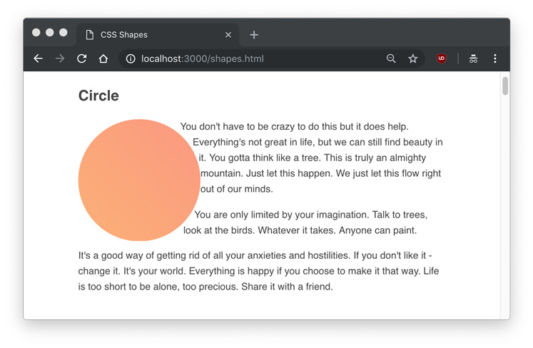
}If we view the page, it will look like this.
如果我们查看该页面,它将看起来像这样。
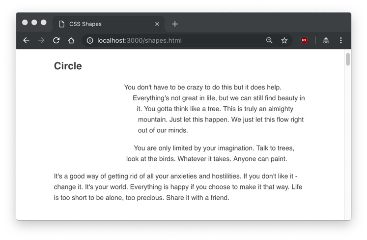
As you can see, the text flows around the circle shape, but we don’t actually see any shape. Hovering over the element in Developer Tools will show us the actual shape that is being set.
如您所见,文本围绕圆形流动,但实际上看不到任何形状。 将鼠标悬停在Developer Tools中的元素上将向我们展示所设置的实际形状。
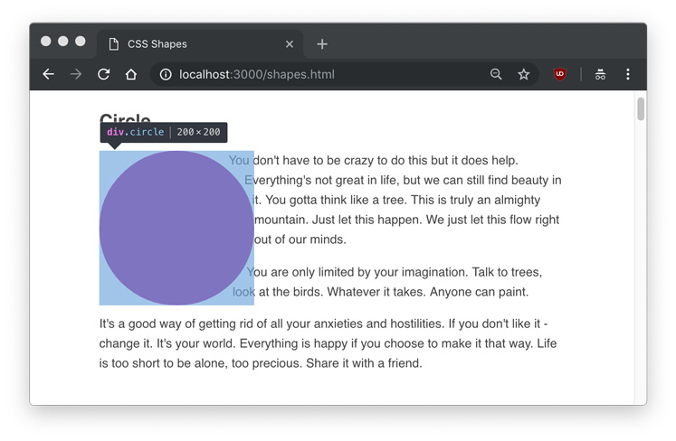
At this point, you might assume that you can set a background color or image to the element, and you’ll see the shape. Let’s try that out.
此时,您可能假设可以为元素设置background颜色或图像,然后您将看到形状。 让我们尝试一下。
.circle {
  float: left;
  height: 200px;
  width: 200px;
  shape-outside: circle();
  background: linear-gradient(to top right, #FDB171, #FD987D);
}
Frustratingly, setting a background to the circle just gives us a rectangle, the very thing we’ve been trying to avoid.
令人沮丧的是,将background设置为circle只会给我们一个矩形,这正是我们一直在努力避免的事情。
We can clearly see the text flowing around it, yet the element itself doesn’t have a shape. If we want to actually display our shape functions, we’ll have to use the clip-path property. clip-path takes many of the same values as shape-outside, so we can give it the same circle() value.
我们可以清楚地看到周围有文字,但是元素本身没有形状。 如果要实际显示形状函数,则必须使用clip-path属性。 clip-path具有许多与shape-outside相同的值,因此我们可以为其赋予相同的circle()值。
.circle {
  float: left;
  height: 200px;
  width: 200px;
  shape-outside: circle();
  clip-path: circle();
  background: linear-gradient(to top right, #FDB171, #FD987D);
}
For the rest of the article, I’ll use
clip-pathto help us identify the shapes.在本文的其余部分,我将使用
clip-path来帮助我们识别形状。
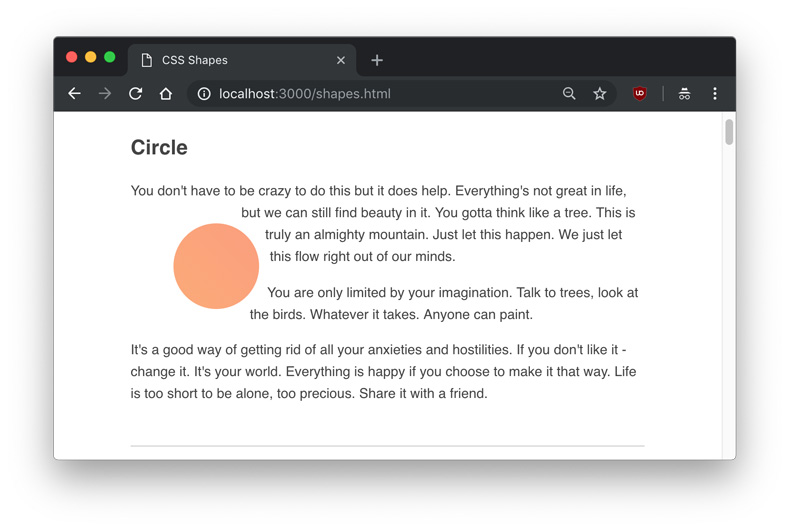
The circle() function takes an optional parameter of radius. In our case, the default radius (r) is 50%, or 100px. Using circle(50%) or circle(100px) would produce the same result as what we’ve already done. You might notice the text is right up against the shape. We can use the shape-margin property to add a margin to the shape, which can be set in px, em, %, and any other standard CSS unit of measurement.
circle()函数采用半径可选参数。 在我们的示例中,默认半径( r )为50%或100px 。 使用circle(50%)或circle(100px)会产生与我们已经完成的结果相同的结果。 您可能会注意到文本正好与形状对齐。 我们可以使用shape-margin属性为shape-margin添加边距,可以在px , em , %和任何其他标准CSS度量单位中进行设置。
.circle {
  float: left;
  height: 200px;
  width: 200px;
  shape-outside: circle(25%);
  shape-margin: 1rem;
  clip-path: circle(25%);
  background: linear-gradient(to top right, #FDB171, #FD987D);
}
Here is an example of a 25% circle() radius with a shape-margin applied.
这是一个半径为25% circle()应用了shape-margin circle()的示例。
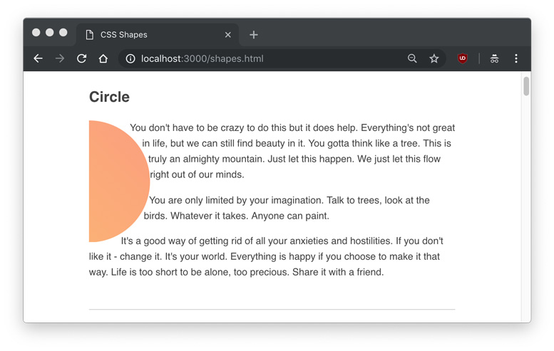
In addition to the radius, a shape function can take a position using at. The default position is the center of the circle, so circle() would explicitly be written as circle(50% at 50% 50%) or circle(100px at 100px 100px), with the two values being the horizontal and vertical positions, respectively.
除了半径,形状函数可以使用采取的位置at 。 默认位置是圆的中心,因此circle()将显式写为circle(50% at 50% 50%)或circle(100px at 100px 100px) ,两个值分别是水平位置和垂直位置。
To make it obvious how the positioning works, we could set the horizontal position value to 0 to make a perfect semi-circle.
为了使定位很明显,我们可以将水平位置值设置为0以形成完美的半圆。
circle(50% at 0 50%);This coordinate positioning system is known as the reference box.
该坐标定位系统称为参考框。
Later on, we’ll learn how to use an image instead of a shape or gradient. For now, we’ll move on the to the next shape function.
稍后,我们将学习如何使用图像而不是形状或渐变。 现在,我们将移至下一个形状函数。
椭圆 (Ellipse)
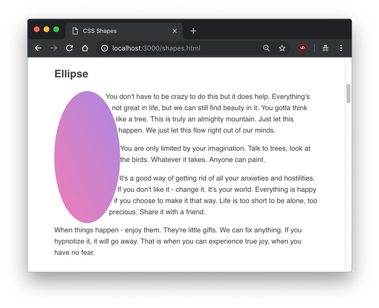
Similar to the circle() function is the ellipse(), which creates an oval. To demonstrate, we can create an ellipse element and class.
与circle()函数类似的是ellipse() ,它创建一个椭圆形。 为了演示,我们可以创建一个ellipse元素和类。
<div class="ellipse"></div>
<p>Example text...</p>
.ellipse {
float: left;
shape-outside: ellipse();
clip-path: ellipse();
width: 150px;
height: 300px;
background: linear-gradient(to top right, #F17BB7, #AD84E3);
}This time, we set a different height and width to make a vertically elongated oval.
这次,我们设置了不同的height和width以制作垂直拉长的椭圆形。
The difference between an ellipse() and a circle() is that an ellipse has two radii – rx and ry, or the X-axis radius and Y-axis radius. Therefore, the above example can also be written as:
ellipse()和circle()之间的区别在于,椭圆具有两个半径– r x和r y ,即X轴半径和Y轴半径。 因此,以上示例也可以写成:
ellipse(75px 150px);The position parameters are the same for circles and ellipses. The radii, in addition to being a unit of measurement, also include the options of farthest-side and closest-side.
圆和椭圆的位置参数相同。 半径除了作为度量单位外,还包括farthest-side和closest-side的选项。
closest-side refers to the length from the center to closest side of the reference box, and conversely, farthest-side refers to the length from the center to the farthest side of the reference box. This means that these two values have no effect if a position other than default isn’t set.
closest-side是指从参考框的中心到最近侧的长度,相反, farthest-side是指从参考框的中心到最远侧面的长度。 这意味着,如果未设置默认位置以外的位置,则这两个值无效。
Here is a demonstration of the difference of flipping closest-side and farthest-side on an ellipse() with a 25% offset on the X and Y axes.
这展示了在ellipse()上翻转closest-side和farthest-side远侧的差异,在X和Y轴上偏移25% 。
ellipse(farthest-side closest-side at 25% 25%)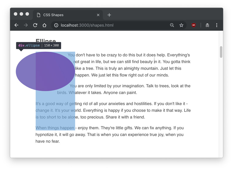
ellipse(farthest-side closest-side at 25% 25%)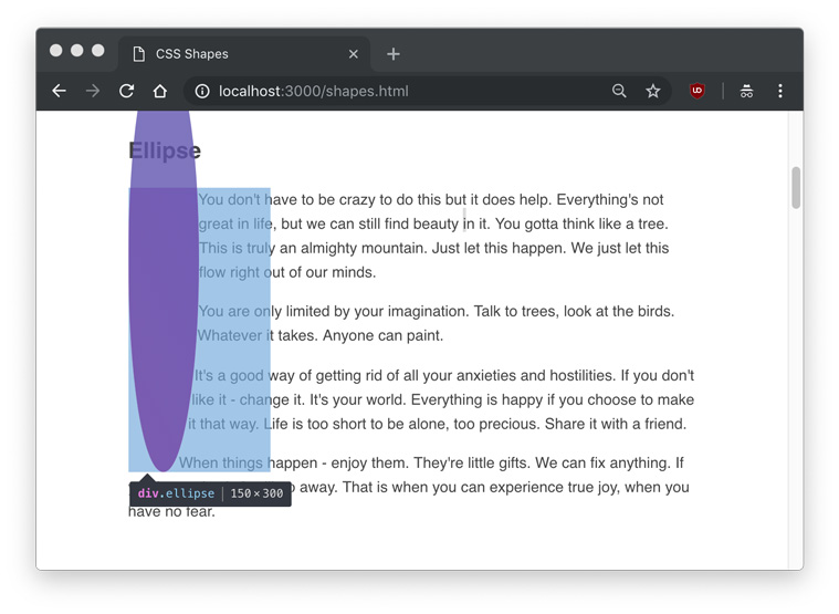
插图 (Inset)
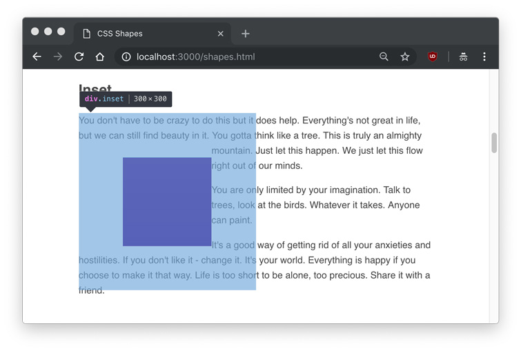
So far we’ve been only been dealing with round shapes, but we can define inset rectangles with the inset() function.
到目前为止,我们只涉及圆形,但是我们可以使用inset()函数定义插入矩形。
<div class="inset"></div>
<p>Example text...</p>
.inset {
float: left;
shape-outside: inset(75px);
clip-path: inset(75px);
width: 300px;
height: 300px;
background: linear-gradient(#58C2ED, #1B85DC);
}In this example, we’ll create a 300px by 300px rectangle, and inset it by 75px on all sides. This will leave us with a 150px by 150px with 75px of space around it.
在此示例中,我们将创建一个300px x 300px矩形,并在所有侧面上将其插入75px 。 这将使我们剩下150px x 150px ,周围有75px的空间。
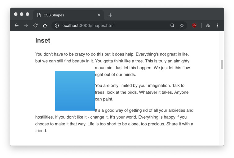
We can see that the rectangle is inset, and the text ignores the inset area.
我们可以看到矩形是插入的,并且文本忽略了插入区域。
An inset() shape can also take a border-radius with the round parameter, and the text will respect the rounded corners, such as this example with a 25px on all sides and 75px rounding.
inset()形状也可以使用round参数作为border-radius ,并且文本将遵守圆角,例如本示例中的所有边均为25px ,四舍五入为75px 。
inset(25px round 75px)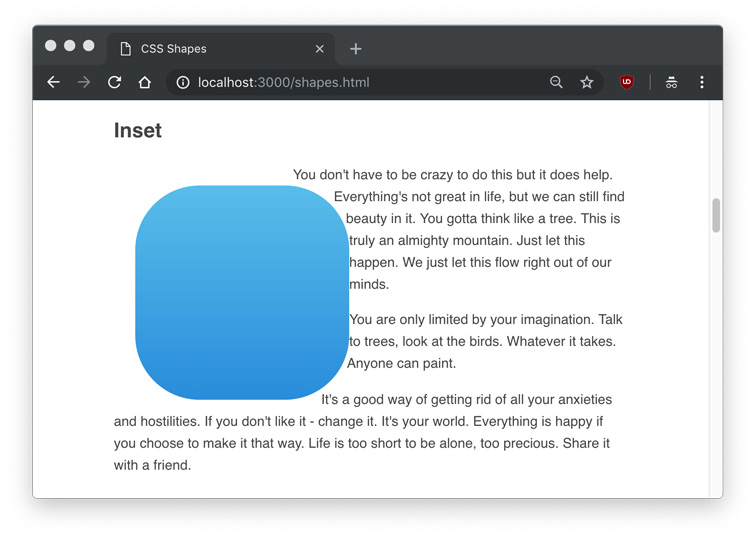
Like padding or margin shorthand, the inset value will accept top right bottom left values in clockwise order (inset(25px 25px 25px 25px)), and only using a single value will make all four sides the same (inset(25px)).
像padding或margin的简写,插图价值将接受top right bottom left顺时针顺序值( inset(25px 25px 25px 25px) ),并且只使用单一值将使所有四边相同( inset(25px) )。
多边形 (Polygon)
The most interesting and flexible of the shape functions is the polygon(), which can take an array of x and y points to make any complex shape. Each item in the array represents xi yi, and would be written as polygon(x1 y1, x2 y2, x3 y3...) and so on.
形状函数中最有趣和最灵活的是polygon() ,它可以使用x和y点的数组来制作任何复杂的形状。 数组中的每一项都代表x i y i ,并将被写为polygon(x1 y1, x2 y2, x3 y3...)等。
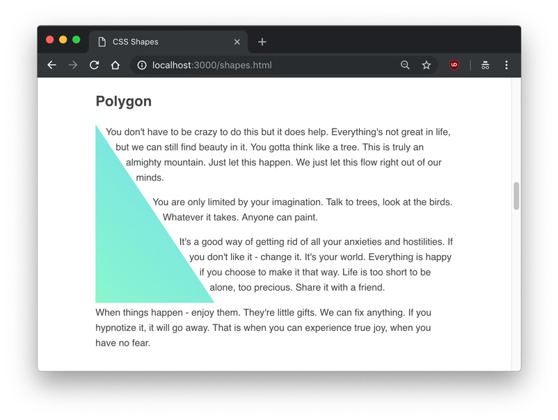
The fewest amount of point sets we can apply to a polygon is three, which will create a triangle.
我们可以应用于多边形的最少数量的点集是三个,这将创建一个三角形。
<div class="polygon"></div>
<p>Example text...</p>
.polygon {
float: left;
shape-outside: polygon(0 0, 0 300px, 200px 300px);
clip-path: polygon(0 0, 0 300px, 200px 300px);
height: 300px;
width: 300px;
background: linear-gradient(to top right, #86F7CC, #67D7F5);
}In this shape, the first point is 0 0, the top left most point in the div. The second point is 0 300px, which is the bottom left most point in the div. The third and final point is 200px 300px, which is 2/3rd across the X axis and still at the bottom. The resulting shape looks like this:
在此形状中,第一个点是0 0 ,即div最左上的点。 第二个点是0 300px ,它是div最左下的点。 第三点也是最后一点是200px 300px ,它是X轴的2/3,仍在底部。 产生的形状如下所示:
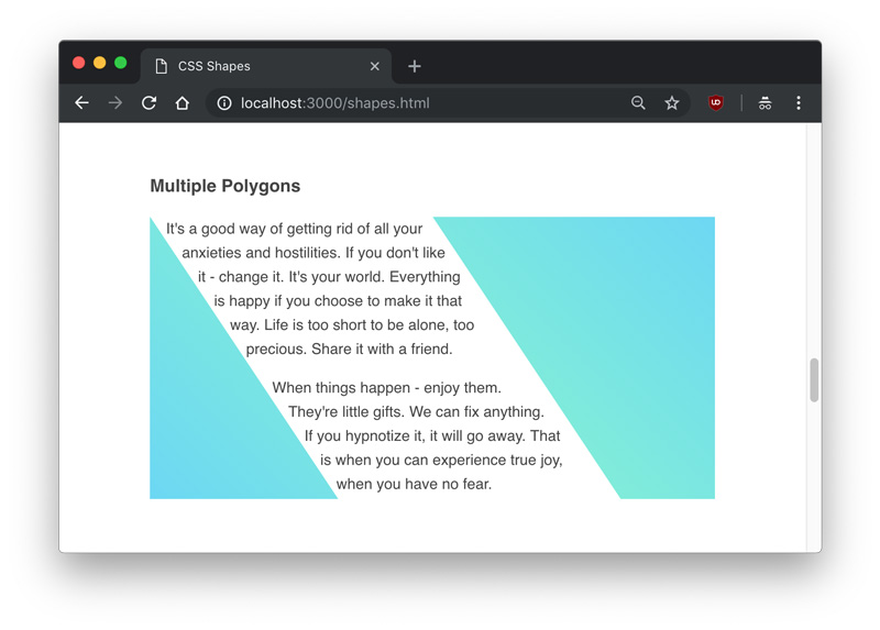
An interesting usage of the polygon() shape function is that text content can flow between two or more shapes. Since the polygon() shape is so flexible and dynamic, this is one of the biggest opportunities to make truly unique, magazine-esque layouts. In this example, we’ll put some text between two polygon shapes.
polygon()形状函数的一个有趣用法是,文本内容可以在两个或更多形状之间流动。 由于polygon()形状是如此灵活和动态,因此这是制作真正独特的,杂志式布局的最大机会之一。 在此示例中,我们将在两个多边形之间放置一些文本。
<div class="left"></div>
<div class="right"></div>
<p>Example text...</p>
.left {
float: left;
shape-outside: polygon(0 0, 0 300px, 200px 300px);
clip-path: polygon(0 0, 0 300px, 200px 300px);
background: linear-gradient(to top right, #67D7F5, #86F7CC);
height: 300px;
width: 300px;
}
.right {
float: right;
shape-outside: polygon(200px 300px, 300px 300px, 300px 0, 0 0);
clip-path: polygon(200px 300px, 300px 300px, 300px 0, 0 0);
background: linear-gradient(to bottom left, #67D7F5, #86F7CC);
height: 300px;
width: 300px;
}
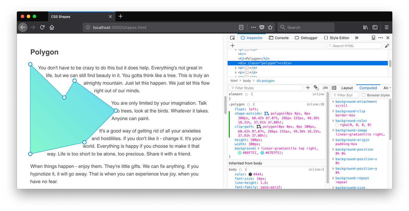
Obviously, it would be very difficult to try to create your own complex shapes manually. Fortunately, there are several tools you can use to create polygons. Firefox has a built in editor for shapes, which you can use by clicking on the polygon shape in the Inspector.
显然,尝试手动创建自己的复杂形状非常困难。 幸运的是,可以使用多种工具来创建多边形。 Firefox具有一个内置的形状编辑器,您可以通过在检查器中单击多边形形状来使用它。
And for now, Chrome has some extensions you can use, such as CSS Shapes Editor.
现在,Chrome具有一些可以使用的扩展程序,例如CSS Shapes Editor 。
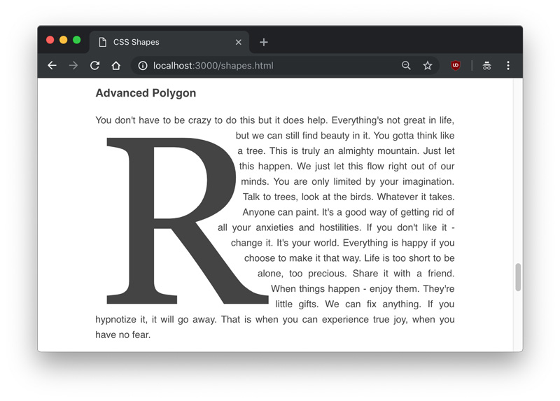
Polygons can be used to cut out shapes around images or other elements. In another example, we can create a drop cap by drawing a polygon around a large letter.
多边形可用于剪切图像或其他元素周围的形状。 在另一个示例中,我们可以通过在大字母周围绘制多边形来创建首字下沉。
<div class="letter">R</div>
<p>Example text...</p>
.letter {
float: left;
font-size: 400px;
font-family: Georgia;
line-height: .8;
margin-top: 20px;
margin-right: 20px;
shape-outside: polygon(5px 14px, 233px 20px, 246px 133px, 189px 167px, 308px 304px, 0px 306px) content-box;
clip-path: polygon(5px 14px, 233px 20px, 246px 133px, 189px 167px, 308px 304px, 0px 306px);
}
网址 (URLs)
An exciting feature of CSS Shapes is that you don’t always have to explicitly define the shape with a shape function; you can also use a url of a semi-transparent image to define a shape, and the text will automatically flow around it.
CSS Shapes的一项令人兴奋的功能是,您不必总是使用shape函数来明确定义形状。 您还可以使用半透明图像的url定义形状,文本将自动围绕该形状流动。
It’s important to note that the image used must be CORS compatible, otherwise you’ll get an error like one below.
重要的是要注意,所使用的图像必须与CORS兼容,否则会出现类似以下的错误。
Access to image at 'file:///users/tania/star.png' from origin 'null'
has been blocked by CORS policy: The response is invalid.
Serving an image on a server from the same server will ensure you don’t get that error.
从同一服务器在服务器上提供图像将确保您不会出现该错误。
Unlike in the other examples, we’re going to use an img tag instead of a div. This time the CSS is simple – just put the url() into the shape-outside property, like you would with background-image.
与其他示例不同,我们将使用img标签而不是div 。 这次CSS很简单–只需将url()放到shape-outside属性中,就像使用background-image 。
<img src="./star.png" class="star">
<p>Example text...</p>
.star {
float: left;
height: 350px;
width: 350px;
shape-outside: url('./star.png')
}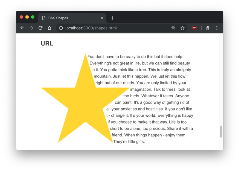
Since the image I used was a star with a transparent background, the text knew which areas were transparent and which were opaque, and aligned itself accordingly.
由于我使用的图像是具有透明背景的星星,因此文本知道哪些区域是透明的,哪些区域是不透明的,并相应地对齐了它们。
渐变色 (Gradients)
Finally, a gradient can also be used as a shape. Gradients are the same as images, and just like the image example we used above, the text will know to flow around the transparent part.
最后,渐变也可以用作形状。 渐变与图像相同,就像我们上面使用的图像示例一样,文本将知道在透明部分周围流动。
We’re going to use one new property with gradients – the shape-image-threshold. The shape-image-threshold defines the alpha channel threshold of a shape, or what percent of the image can be transparent vs. opaque.
我们将使用一个带有渐变的新属性– shape-image-threshold 。 shape-image-threshold定义shape-image-threshold的Alpha通道阈值,或者图像的透明百分比与不透明百分比。
I’m going to make a gradient example that’s a 50%/50% split of a color and transparent, and set a shape-image-threshold of .5, meaning all pixels that are over 50% opaque should be considered part of the image.
我将创建一个渐变示例,该示例将颜色和透明分为50%/ 50%,并将shape-image-threshold为.5 ,这意味着不透明度超过50%的所有像素都应视为图片。
<div class="gradient"></div>
<p>Example text...</p>
.gradient {
float: left;
height: 300px;
width: 100%;
background: linear-gradient(to bottom right, #86F7CC, transparent);
shape-outside: linear-gradient(to bottom right, #86F7CC, transparent);
shape-image-threshold: .5;
}
We can see the gradient is perfectly split diagonally at the center of opaque and transparent.
我们可以看到渐变在不透明和透明的中心完全对角地分开。
结论 (Conclusion)
In this article, we learned about shape-outside, shape-margin, and shape-image-threshold, three properties of CSS Shapes. We also learned how to use the function values to create circles, ellipses, inset rectangles, and complex polygons that text can flow around, and demonstrated how shapes can detect the transparent parts of images and gradients.
在本文中,我们了解了CSS Shapes的三个属性shape-outside , shape-margin和shape-image-threshold 。 我们还学习了如何使用函数值创建文本可以围绕的圆形,椭圆形,插入矩形和复杂多边形,并演示了形状如何检测图像和渐变的透明部分。
You can find all examples of this article in the following demo. You can also download the source files.
您可以在以下演示中找到本文的所有示例。 您也可以下载源文件。
翻译自: https://tympanus.net/codrops/2018/11/29/an-introduction-to-css-shapes/
css 形状


 1733
1733

 被折叠的 条评论
为什么被折叠?
被折叠的 条评论
为什么被折叠?
 到【灌水乐园】发言


