


 本文介绍了如何在Power BI Desktop中创建Hexbin散点图,以更有效地可视化二维数据。与传统的散点图相比,Hexbin散点图使用六边形箱展示数据密度,帮助分析复杂数据。通过调整格式选项,可以自定义颜色、半径和点的显示,以增强数据洞察。
hexbin
We have explored useful visualizations in Power BI Desktop with my previous articles that covered:
我们在以前的文章中探讨了Power BI Desktop中有用的可视化,其中涉及:
In this article, we will learn how to create ‘Hexbin Scatterplot’ charts with Power BI Desktop. We create scatter charts in Excel to represent two-dimensional data with the help of dots. This two-dimensional data is represented across both the X and Y-axis. Scatter charts display both data points in a single chart based on the data distribution.
在本文中,我们将学习如何使用Power BI Desktop创建“ Hexbin散点图”图表。 我们在Excel中创建散点图,以借助点表示二维数据。 二维数据在X轴和Y轴上均表示。 散点图基于数据分布在单个图表中显示两个数据点。
Below is the sample scatter chart in the excel sheet.
下面是excel工作表中的示例散点图。
In Power BI, the bubbles replace these points, therefore we can call a scatter chart a bubble chart as well. Let us first understand the basics of a Scatter chart and then we will see how a hexbin scatterplot in different from that chart.
在Power BI中,气泡取代了这些点,因此我们也可以将散点图称为气泡图。 让我们首先了解散点图的基础,然后我们将看到六边形散点图与该图有何不同。
将样本数据加载到Power BI Desktop (Load sample Data into Power BI Desktop)
We have imported data from a flat file (.CSV) in the previous article, therefore in this article, we will not cover importing in detail. In this article, we will use sample data Air Quality Historical Data Q4 2017 October – December. This data contains air quality historical data of various components for the period of October to December 2017.
我们已经在上一篇文章中从平面文件(.CSV)导入了数据,因此在本文中,我们将不介绍详细的导入。 在本文中,我们将使用样本数据空气质量历史数据2017年第四季度10月-12月 。 该数据包含2017年10月至2017年12月期间各个组成部分的空气质量历史数据。
Please note this is unverified data and used for demonstration purpose only.
请注意,这是未经验证的数据,仅用于演示目的。
Open the link and click on ‘Export’ and download the CSV format to import purpose.
打开链接,然后单击“导出”,然后下载CSV格式以导入目的。
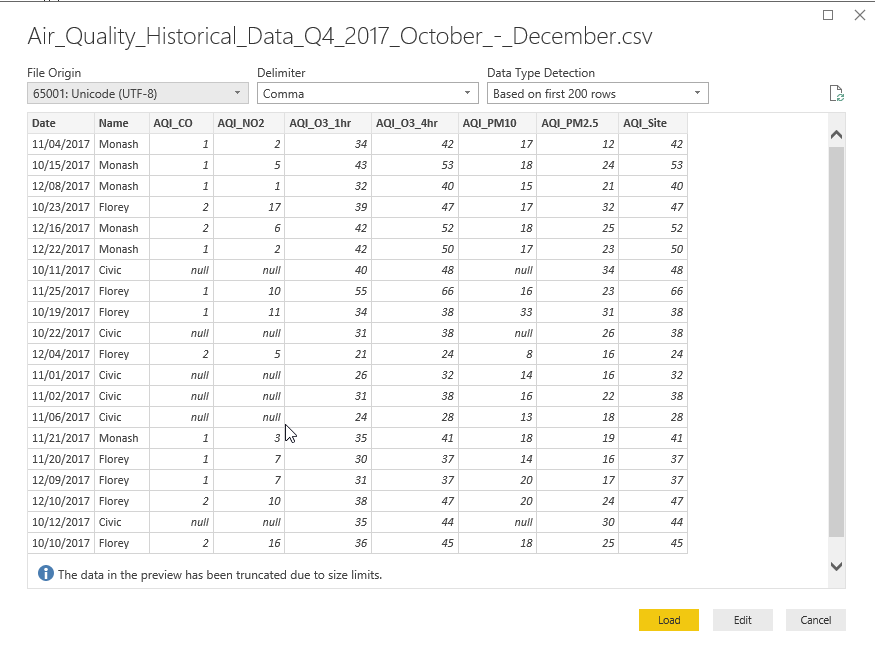
Import CSV data from the ‘Get Data->Text\CSV’ and provide the path of the.CSV file.
从“获取数据->文本\ CSV”导入CSV数据,并提供.CSV文件的路径。
Get a preview and load the data into Power BI Dataset.
获取预览并将数据加载到Power BI数据集中。
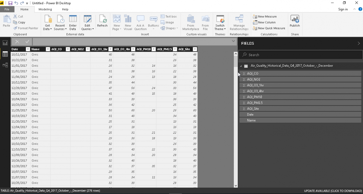
We can view the data and columns now in Power BI Desktop once data import is successful.
数据导入成功后,我们现在可以在Power BI Desktop中查看数据和列。
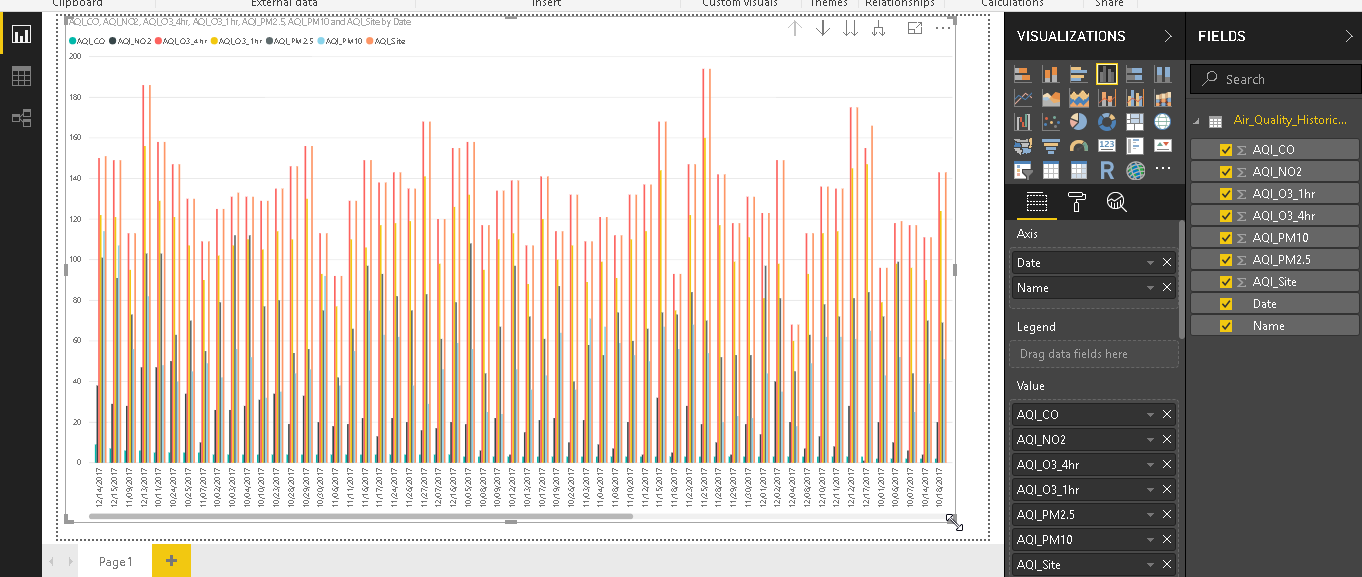
Now, just select the data columns from the data set and it generates below the bar graph. It is difficult to analyze the data due to the complexity of the data and due to multiple columns.
现在,只需从数据集中选择数据列,它就会在条形图下方生成。 由于数据的复杂性和多列,很难分析数据。
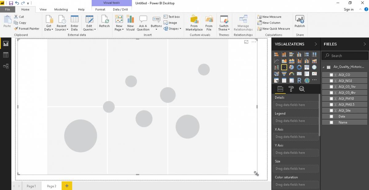
The Scatter Plot visualization is available by default as shown.
如图所示,默认情况下可以使用散点图可视化。
Click on the Scatter Plot icon and observe below that format shows scatter plot with various bubble sizes.
单击散点图图标,然后观察以下格式显示具有各种气泡大小的散点图。
 最低0.47元/天 解锁文章


 873
873

 被折叠的 条评论
为什么被折叠?
被折叠的 条评论
为什么被折叠?
 到【灌水乐园】发言


