


谷歌表格图表 横坐标 滚动
In this article, we will chart data from a publicly accessible google spreadsheet feed (via JSON) and create a dashboard using the JS Charting library. By consuming the spreadsheet in this way, updated results will show live as soon as any shared edits are made by those with permissions to edit the data.
在本文中,我们将通过可公开访问的Google电子表格Feed(通过JSON)绘制数据图表,并使用JS Charting库创建仪表板。 通过以这种方式使用电子表格,只要有权编辑数据的人员进行任何共享编辑,更新的结果就会立即显示。
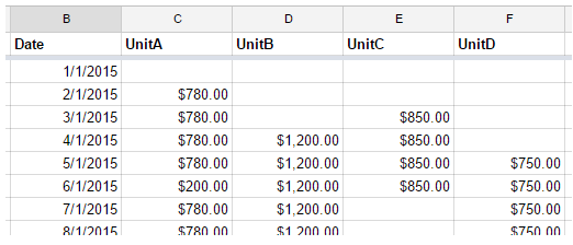
We will use this spreadsheet (Figure 1):
我们将使用此电子表格(图1):
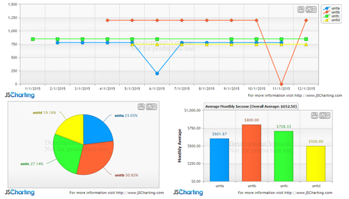
To create the following dashboard (Figure 2):
创建以下仪表板(图2):
设置电子表格 (Setting up the spreadsheet)
When parsing the spreadsheet data feed, it will be more practical to access the columns by header names. In order to setup a header row, you must freeze a row in the spreadsheet page. Click View > Freeze > 1 row to create a header row. This can also be done with columns but for our case we only freeze a single row which is styled in bold in figure 1.
解析电子表格数据供稿时,按标题名称访问列将更为实用。 为了设置标题行,您必须冻结电子表格页面中的一行。 单击视图>冻结> 1行以创建标题行。 这也可以用列来完成,但对于我们来说,我们只冻结了图1中以粗体显示的一行。
The next step is to publish the spreadsheet to the web so it can be accessible in the browser. From the menu in google docs with the spreadsheet open, select: File > Publish to the web.
下一步是将电子表格发布到Web,以便可以在浏览器中对其进行访问。 从打开电子表格的Google文档菜单中,选择:文件>发布到网络。
There will be a link generated, which in our case is
将生成一个链接,在我们的例子中是
https://docs.google.com/spreadsheets/d/1D1vL8EI0uRzeiGM-A8hZLgUCexXrocw5B_qTGnCekNE/pubhtml
https://docs.google.com/spreadsheets/d/1D1vL8EI0uRzeiGM-A8hZLgUCexXrocw5B_qTGnCekNE/pubhtml
Copy this link for reference as we will use it to fetch the data feed. Then click the Publish button.
复制此链接以供参考,因为我们将使用它来获取数据提要。 然后单击发布按钮。
提取数据Feed (Fetching the data feed)
Now that the spreadsheet is available online, we will use the jQuery getJSON function to fetch it as JSON. The following specific URL formatting is required to obtain the JSON:
现在,该电子表格可以在线使用,我们将使用jQuery getJSON函数将其作为JSON获取。 需要以下特定的URL格式来获取JSON:
https://spreadsheets.google.com/feeds/list/1D1vL8EI0uRzeiGM-A8hZLgUCexXrocw5B_qTGnCekNE/od6/public/basic?alt=json
https://spreadsheets.google.com/feeds/list/ 1D1vL8EI0uRzeiGM-A8hZLgUCexXrocw5B_qTGnCekNE / od6 / public / basic?alt = json
Notice the highlighted portion of the URL which is taken from the, “Publish to the web” URL popup in the previous step.
请注意URL的突出显示部分,该部分取自上一步“发布到Web” URL弹出窗口。
The code to get this data feed with jQuery is:
用jQuery获取此数据提要的代码是:
$.getJSON(
    "https://spreadsheets.google.com/feeds/list/1D1vL8EI0uRzeiGM-A8hZLgUCexXrocw5B_qTGnCekNE/od6/public/basic?alt=json",
    function(data){
    console.log(data);
}
This line would just access the JSON and write it in the browser's console, but we need to parse and consume the data.
该行仅访问JSON并将其写入浏览器的控制台中,但是我们需要解析和使用数据。
解析数据 (Parsing the data)
The raw JSON data structure looks like:
原始JSON数据结构如下所示:
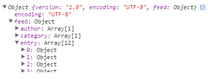
Each entry represents a row in the spreadsheet. This is an example row from the data
每个条目代表电子表格中的一行。 这是数据中的示例行

Please note that only the cells with content are included in the $t property.
请注意,$ t属性仅包含具有内容的单元格。
The following code parses spreadsheet data into a series of points and takes two parameters. The data, and the name of the column that represents the x values that are shared by all data points.
以下代码将电子表格数据解析为一系列点,并采用两个参数。 数据以及代表所有数据点共享的x值的列名称。
See the Pen by Arthur Puszynski (@jsblog) on CodePen.
看笔 由Arthur Puszynski( @jsblog )在CodePen上编写 。
It works by passing each entry with a series name, x, and y value to the addPointToSeries() function. If a series with that name doesn’t exist, a new series is created, otherwise, a point is added to the series. After all entries are processed, an array of series is returned.
它通过将具有系列名称,x和y值的每个条目传递给addPointToSeries()函数来工作。 如果不存在具有该名称的系列,则会创建一个新系列,否则,将一个点添加到该系列中。 处理完所有条目后,将返回一个系列数组。
NOTE: When parsing the $t content property, make sure to split the values to using a comma with a space after it ', ' The same goes for the column name and value ': ' This is required as numeric values can be formatted including a comma such as $1,120.00 and Datetime values can contain a colon within the time part, both of which can cause issues when parsing.
注意:解析$ t content属性时,请确保将值分割为','列名和值':相同,并在其后加一个空格。这是必需的,因为可以格式化数字值,包括逗号(例如$ 1,120.00和Datetime值)在时间部分中可能包含冒号,这两者在解析时都可能引起问题。
制作图表仪表板 (Making your chart dashboard)
Now we get to the fun part—visualizing this data. jQuery is already included, so we only need to add the chart script to get started.
现在我们进入有趣的部分-可视化此数据。 jQuery已经包含在内,因此我们只需要添加图表脚本即可上手。
<script src="JSC/JSCharting.js"></script>
Next, a div element is added for the chart itself:
接下来,为图表本身添加一个div元素:
<div id="mainChart"></div>
And the code to create a chart from the data we have so far:
以及根据到目前为止的数据创建图表的代码:
$('#mainChart').JSC({
	xAxisScaleType: 'time',
	yAxisScaleRangeMin: 0,
	series: seriesData
});
See the Pen by Arthur Puszynski (@jsblog) on CodePen.
看笔 由Arthur Puszynski( @jsblog )在CodePen上编写 。
Now that the basic chart is setup, we will add some settings to tune the chart and take advantage of the customization offered by JSCharting.
现在已经设置了基本图表,我们将添加一些设置来调整图表并利用JSCharting提供的自定义功能。
First, some y axis settings to describe the values presented in this chart.
首先,一些y轴设置来描述此图表中显示的值。
yAxis:{
    formatString:'c',
    labelText:'Received',
    scaleRangeMin: 0
},
Note: notice how this block of options is an object under the yAxis property whereas in the previous example a single property at the options root was used to set similar options. This is possible because the JSCharting options API allows joining the property hierarchical names into a single property setting for convenience.
注意:请注意,此选项块是yAxis属性下的一个对象,而在前面的示例中,选项根目录下的单个属性用于设置类似的选项。 这是可能的,因为JSCharting选项API允许为方便起见将属性层次结构名称连接到单个属性设置中。
Here we format the y data values as currency and set the y axis label. Describing the data in this way will propagate to all other parts of the chart that utilize y values. For example, whenever a y value is mentioned in a tooltip, or elsewhere, it will be automatically formatted as currency. By giving the axis a label, it will also help the automatic tooltips describe the data points.
在这里,我们将y数据值格式化为货币,并设置y轴标签。 以这种方式描述数据将传播到使用y值的图表的所有其他部分。 例如,每当在工具提示中或其他地方提到y值时,它将自动设置为货币格式。 通过给轴添加标签,它还将帮助自动工具提示描述数据点。
Next we specify a title for this chart using the following code:
接下来,我们使用以下代码为该图表指定标题:
titleLabelText: '2015 Accounts Receivable Total: %sum'
Notice the %sum token included in the title text. There are many tokens that can be used in the chart title. These tokens are all listed under the series collection section of this token reference.
请注意,标题文本中包含%sum令牌。 图表标题中可以使用许多标记。 这些令牌都在此令牌参考的系列收集部分下列出。
Also, note how the sum takes on the currency format since it related to values on the y axis.
另外,请注意,总和与y轴上的值有关,因此如何采用货币格式。
Next, let's modify the legend labels to include sums for each series:
接下来,让我们修改图例标签以包括每个系列的总和:
legendDefaultEntryText:'%name %sum',
See the Pen by Arthur Puszynski (@jsblog) on CodePen.
看笔 由Arthur Puszynski( @jsblog )在CodePen上编写 。
The next chart we create will be based on calculations retrieved from this first chart and it will have average monthly income for each unit shown as a bar chart. Another div is added to the html for the second chart of our dashboard:
我们创建的下一个图表将基于从第一个图表中检索到的计算结果,并且每个单位的平均月收入将显示为条形图。 html面板的第二个图表中又添加了一个div:
<div id="avgChart"></div>
Then, in order to interact with the first chart’s data and use those calculations, the code for the average chart will be placed inside a callback of the first charts initialization method.
然后,为了与第一张图表的数据进行交互并使用这些计算,平均图表的代码将放置在第一张图表初始化方法的回调中。
$('#mainChart').JSC({/*options*/, function(chart){ /*callback code*/});
This chart will contain only one series with a bar representing the average monthly income of each series. To do this, the main chart’s series are iterated and a new point is created for each where the y value is the series sum divided by 12 months.
此图表将仅包含一个系列,其中一个条形表示每个系列的平均月收入。 为此,对主图表的系列进行迭代,并为每个y点创建一个新点,其中y值是系列总和除以12个月。
By specifying a palette for this series, each bar will take on a different color and match the color coding of the main chart.
通过指定该系列的调色板,每个条形将具有不同的颜色,并与主图表的颜色编码匹配。
See the Pen by Arthur Puszynski (@jsblog) on CodePen.
看笔 由Arthur Puszynski( @jsblog )在CodePen上编写 。
The final chart will be a pie chart using this original data to show the percentage of income each unit contributed to the total. Our current chart can be converted to a pie chart by simply adding a type:'pie' property. You can view a list of JS charting chart types along with samples for each to experiment with other types. This setting causes the chart to show a pie where each series become a slice. If the goal was to have a pie represent each series, the setting would be defaultSeriesType:'pie' which would have each series be a pie type instead.
最终的图表将是一个饼图,使用此原始数据来显示每个单位在总收入中所占的收入百分比。 只需添加type:'pie'属性,即可将当前图表转换为饼图。 您可以查看JS图表格式列表以及每种示例的样本,以尝试其他类型。 此设置使图表显示一个饼图,其中每个系列都变成一个切片。 如果目标是让饼图代表每个系列,则设置应为defaultSeriesType:'pie',而将每个系列作为饼图类型。
See the Pen by Arthur Puszynski (@jsblog) on CodePen.
看笔 由Arthur Puszynski( @jsblog )在CodePen上编写 。
$('#pieChart').JSC({
	type:'pie',
 	yAxisFormatString: 'c',
     defaultPointLabelText:'<b>%name</b> %percentOfTotal%',
	series: seriesData
  });
Notice how the y axis format string is specified despite the fact that pies do not have axes. This is because the y axis setting describes the y values rather than an actual axis.
注意尽管py没有轴,但如何指定y轴格式字符串。 这是因为y轴设置描述的是y值,而不是实际轴。
The default point label text is also specified for this pie chart using the following code:
还使用以下代码为此饼图指定了默认点标签文本:
defaultPointLabelText:'<b>%name</b> %percentOfTotal%',
Again, we leverage tokens, but this time they are from the point token set.
同样,我们利用令牌,但这一次它们来自点令牌集。
JS图表电子表格助手 (JS Charting Spreadsheet helper)
It is worth mentioning an interesting feature of JS Charting that can be helpful in some spreadsheet cases. In the above chart, we use a time scale for the x axis, so the order and position of each data point is defined by the value itself. In some cases, such as three letter month abbreviations, x values are names or any arbitrary strings. Since some of these strings cannot be parsed into dates or any quantitative values that indicate a position along the x axis, the sort order of points may not be correct. That is, of course, if there are empty cells in a spreadsheet and the first few values of the first series are missing. Generally you would expect the first processed series to define the initial x axis values. Then any new x axis values encountered in subsequent series would be placed at the end of the x axis. JSCharting will automatically analyze the order of all the series points to determine what the intended order is even when some series have missing points. You can see an example of this here.
值得一提的是JS Charting的有趣功能,在某些电子表格案例中可能会有所帮助。 在上面的图表中,我们使用x轴的时间刻度,因此每个数据点的顺序和位置由值本身定义。 在某些情况下,例如三个字母月份的缩写,x值是名称或任何任意字符串。 由于其中一些字符串无法解析为日期或指示沿x轴位置的任何定量值,因此点的排序顺序可能不正确。 也就是说,当然,如果电子表格中有空单元格,并且第一个系列的前几个值丢失了。 通常,您希望第一个处理后的系列定义初始x轴值。 然后,在后续系列中遇到的任何新x轴值都将放置在x轴的末端。 JSCharting将自动分析所有系列点的顺序,即使某些系列缺少点,也可以确定预期顺序。 您可以在这里看到一个示例。
See the Pen by Arthur Puszynski (@jsblog) on CodePen.
看笔 由Arthur Puszynski( @jsblog )在CodePen上编写 。
Here, we assign the date values as point names and remove the x axis time scale setting. The result is that the chart looks the same as when using time scales and values.
在这里,我们将日期值指定为点名称,并删除x轴时间刻度设置。 结果是该图表看起来与使用时间刻度和值时的图表相同。
结论 (Conclusion)
Google spreadsheets offer some unique capabilities for storing data in the cloud and allows fetching it for use in any web apps. It is also possible to dynamically update these spreadsheets providing a cloud based database backend. JSCharting makes visualizing this data effortless and with its label tokens support, rich and descriptive charts can be created with very little code. There are many chart types available including mapping which is bundled with the product at no additional cost. The full suite of chart types and features is free to download and experiment with for development purposes. The JSCharting documentation describes the declarative API and is quite exhaustive.
Google电子表格提供了一些独特的功能,可将数据存储在云中,并允许将其获取以用于任何Web应用程序。 还可以动态更新这些电子表格,以提供基于云的数据库后端。 JSCharting使此数据的可视化变得毫不费力,并且借助其标签标记的支持,只需很少的代码即可创建丰富而描述性的图表。 有许多可用的图表类型 ,包括与产品捆绑在一起的映射,无需额外付费。 完整的图表类型和功能套件可免费下载并进行试验以用于开发目的。 JSCharting文档描述了声明性API,并且非常详尽。
谷歌表格图表 横坐标 滚动


 572
572

 被折叠的 条评论
为什么被折叠?
被折叠的 条评论
为什么被折叠?
 到【灌水乐园】发言


