


强化学习实验结果绘图
————————————————
版权声明:本文为CSDN博主「小帅吖」的原创文章,遵循CC 4.0 BY-SA版权协议,转载请附上原文出处链接及本声明。
原文链接:
为了帮助记忆,把几篇参考文档手动敲了一遍。
参考文献
绘图搜这个文件:
seaborn_pd.py
文章目录
前言
seaborn 可以认为是matplotlib的升级版本,使用seaborn绘制折线图时参数数据可以传递ndarray或者pandas.
一、第一个演示示例
1.1 例子
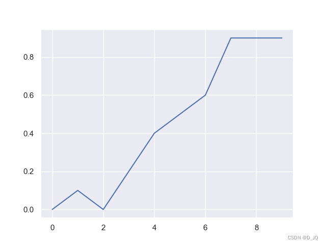
import matplotlib.pyplot as plt
import numpy as np
import seaborn as sns 	# 导入模块
sns.set() 				# 设置美化参数,一般默认就好,如果没有此行,则,白底;

rewards = np.array([0, 0.1,0,0.2,0.4,0.5,0.6,0.9,0.9,0.9])
plt.plot(rewards)
plt.show()
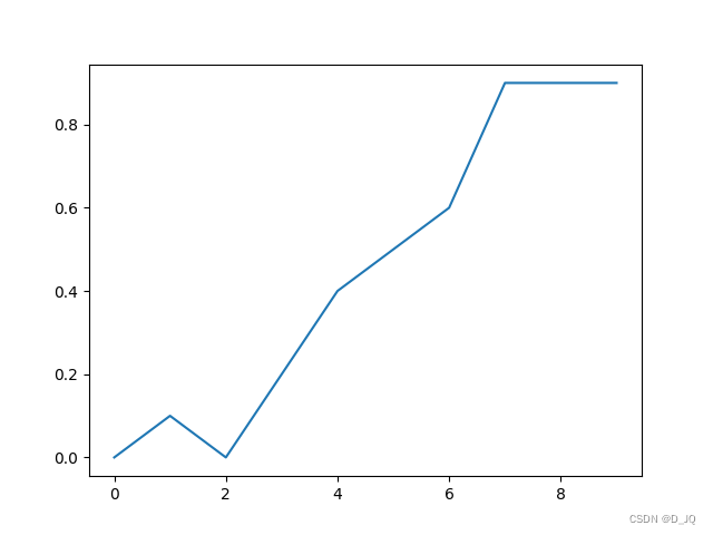
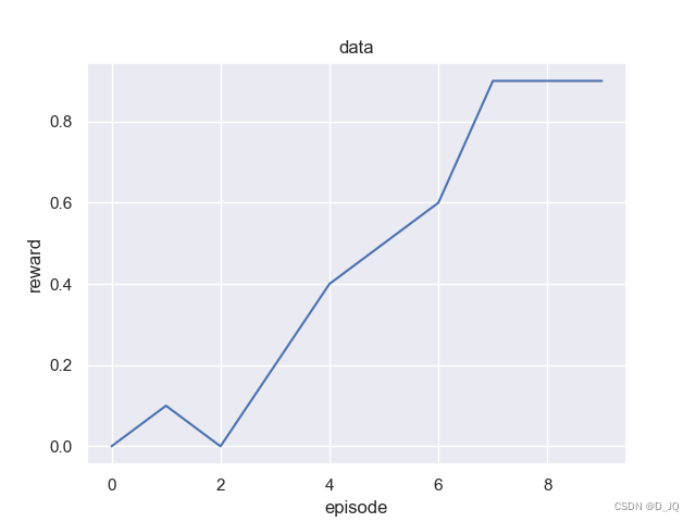
1.2 使用sns.lineplot
加上x,y的label和标题
import matplotlib.pyplot as plt
import numpy as np
import seaborn as sns

sns.set()                       # 因为sns.set()一般不用改,可以在导入模块时顺便设置好

rewards = np.array([0, 0.1, 0, 0.2, 0.4, 0.5, 0.6, 0.9, 0.9, 0.9])
sns.lineplot(x=range(len(rewards)), y=rewards)
# sns.relplot(x=range(len(rewards)),y=rewards,kind="line") # 与上面一行等价
plt.xlabel("episode")
plt.ylabel("reward")
plt.title("data")
plt.savefig('01-例子')
plt.show()
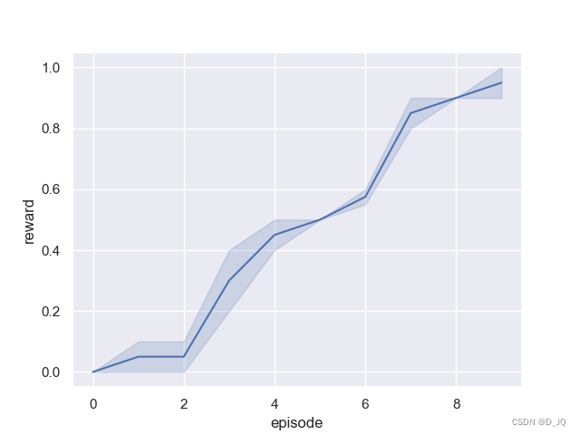
1.3 绘制rewards聚合图
同一个实验多次结果,平滑填充等操作,
import numpy as np

rewards1 = np.array([0, 0.1,0,0.2,0.4,0.5,0.6,0.9,0.9,0.9])
rewards2 = np.array([0, 0,0.1,0.4,0.5,0.5,0.55,0.8,0.9,1])
rewards3 = np.vstack((rewards1,rewards2)) # 合并成二维数组
rewards4 = np.concatenate((rewards1,rewards2)) # 合并成一维数组
print(np.shape(rewards3))
print(rewards3)
print(np.shape(rewards4))
print(rewards4)
(2, 10)
[[0.   0.1  0.   0.2  0.4  0.5  0.6  0.9  0.9  0.9 ]
 [0.   0.   0.1  0.4  0.5  0.5  0.55 0.8  0.9  1.  ]]
(20,)
[0.   0.1  0.   0.2  0.4  0.5  0.6  0.9  0.9  0.9  0.   0.   0.1  0.4
 0.5  0.5  0.55 0.8  0.9  1.  ]

Process finished with exit code 0
我们希望绘制出聚合图,但是sns.lineplot无法输入一维以上的数据,我们可以将它们全部转为一维,虽然有些难看:
为什么plot绘图最后是有平均值和阴影的呢?
import matplotlib.pyplot as plt
import numpy as np
import seaborn as sns

sns.set()               # 因为sns.set()一般不用改,可以在导入模块时顺便设置好

rewards1 = np.array([0, 0.1, 0, 0.2, 0.4, 0.5, 0.6, 0.9, 0.9, 0.9])
rewards2 = np.array([0, 0, 0.1, 0.4, 0.5, 0.5, 0.55, 0.8, 0.9, 1])
rewards = np.concatenate((rewards1, rewards2))         # 合并数组

episode1 = range(len(rewards1))
episode2=range(len(rewards2))
episode=np.concatenate((episode1,episode2))

sns.lineplot(x=episode, y=rewards)

plt.xlabel("episode")
plt.ylabel("reward")

print(rewards)
print(episode)

plt.savefig('04-多组聚合')
plt.show()

1.4 使用pandas传参
上面都是用ndarray传参,用pandas传参,就需要先把array转成DataFrame形式,如下:
import numpy as np
import pandas as pd
rewards1 = np.array([0, 0.1,0,0.2,0.4,0.5,0.6,0.9,0.9,0.9])
rewards2 = np.array([0, 0,0.1,0.4,0.5,0.5,0.55,0.8,0.9,1])
rewards=np.vstack((rewards1,rewards2)) # 合并数组
df = pd.DataFrame(rewards).melt(var_name='episode',value_name='reward') # 推荐这种转换方法
print(df)
上述转化方法,这样无论rewards多少维都不影响最终的绘图方式,其中melt方法将所有维合并成一列,var_name=‘episode’,value_name='reward’则更改对应的列名,转化结果如下:
  episode  reward
0         0    0.00
1         0    0.00
2         1    0.10
3         1    0.00
4         2    0.00
5         2    0.10
6         3    0.20
7         3    0.40
8         4    0.40
9         4    0.50
10        5    0.50
11        5    0.50
12        6    0.60
13        6    0.55
14        7    0.90
15        7    0.80
16        8    0.90
17        8    0.90
18        9    0.90
19        9    1.00
这里的x,y不再传入数组,而是传入DataFrame中对应的列名,类似于python字典中的键,结果如下:
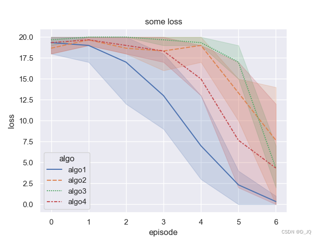
1.5 一个稍微复杂的示例
import seaborn as sns
sns.set()
import matplotlib.pyplot as plt
import numpy as np
import pandas as pd

def get_data():
    '''获取数据
    '''
    basecond = np.array([[18, 20, 19, 18, 13, 4, 1],[20, 17, 12, 9, 3, 0, 0],[20, 20, 20, 12, 5, 3, 0]])
    cond1 = np.array([[18, 19, 18, 19, 20, 15, 14],[19, 20, 18, 16, 20, 15, 9],[19, 20, 20, 20, 17, 10, 0]])
    cond2 = np.array([[20, 20, 20, 20, 19, 17, 4],[20, 20, 20, 20, 20, 19, 7],[19, 20, 20, 19, 19, 15, 2]])
    cond3 = np.array([[20, 20, 20, 20, 19, 17, 12],[18, 20, 19, 18, 13, 4, 1], [20, 19, 18, 17, 13, 2, 0]])
    return basecond, cond1, cond2, cond3

data = get_data()
label = ['algo1', 'algo2', 'algo3', 'algo4']
df=[]
for i in range(len(data)):
    df.append(pd.DataFrame(data[i]).melt(var_name='episode',value_name='loss'))
    df[i]['algo']= label[i]
df=pd.concat(df) # 合并
print(df)
sns.lineplot(x="episode", y="loss", hue="algo", style="algo",data=df)
plt.title("some loss")
plt.show()
二、读取csv文件并绘图
kaggle上一个酒店房间预定的数据,数据和本篇文章的代码都可以从这个链接获取:link。
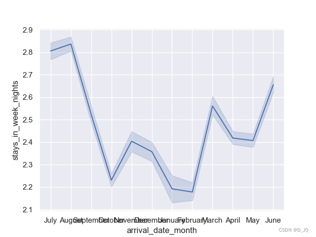
2.1 初始例子
读取数据
import pandas as pd
df=pd.read_csv('hotel_bookings.csv')
print(df.head())
          hotel  is_canceled  ...  reservation_status  reservation_status_date
0  Resort Hotel            0  ...           Check-Out               2015-07-01
1  Resort Hotel            0  ...           Check-Out               2015-07-01
2  Resort Hotel            0  ...           Check-Out               2015-07-02
3  Resort Hotel            0  ...           Check-Out               2015-07-02
4  Resort Hotel            0  ...           Check-Out               2015-07-03

[5 rows x 32 columns]
我们这里主要看两个数据,一个是arrival_date_month,一个是stays_in_week_nights,分别表示客人到来的月份和住的时间。使用seaborn的lineplot的时候,调用API的方式有点不一样,这里x和y是直接指定我们数据的索引,x这里就是df[‘arrival_date_month’]这个数据,最后通过data参数来指定我们要传入的数据。
import pandas as pd
import matplotlib.pyplot as plt
import seaborn as sns # 导入模块
sns.set() # 设置美化参数,一般默认就好
df=pd.read_csv('hotel_bookings.csv')
sns.lineplot(x="arrival_date_month",y="stays_in_week_nights",data=df)
plt.show()
2.2 复杂示例
下面来看一个更加复杂的例子。我们希望将几个月内的住宿情况可视化,但我们也希望将入住年份考虑在内。这时候画图需要将月份、年份和入住情况三个数据都表示在图上。
import pandas as pd
df=pd.read_csv('hotel_bookings.csv')
df=df[['arrival_date_year','arrival_date_month','stays_in_week_nights']]
print(df)
        arrival_date_year arrival_date_month  stays_in_week_nights
0                    2015               July                     0
1                    2015               July                     0
2                    2015               July                     1
3                    2015               July                     1
4                    2015               July                     2
...                   ...                ...                   ...
119385               2017             August                     5
119386               2017             August                     5
119387               2017             August                     5
119388               2017             August                     5
119389               2017             August                     7

[119390 rows x 3 columns]
使用pivot_table,也就是透视图(excel中)来表示数据,pivot_table的作用就是将我们设定的index作为索引,然后去匹配我们设定的列,我们设定的value值也就是中间部分要显示的内容。
import pandas as pd
import matplotlib.pyplot as plt
import seaborn as sns # 导入模块
sns.set() # 设置美化参数,一般默认就好

df=pd.read_csv('hotel_bookings.csv')
df=df[['arrival_date_year','arrival_date_month','stays_in_week_nights']]
# order=df['arrival_date_month']

df_wide=df.pivot_table(index='arrival_date_month',columns='arrival_date_year',values='stays_in_week_nights')
print(df_wide)
sns.lineplot(data=df_wide)
plt.show()
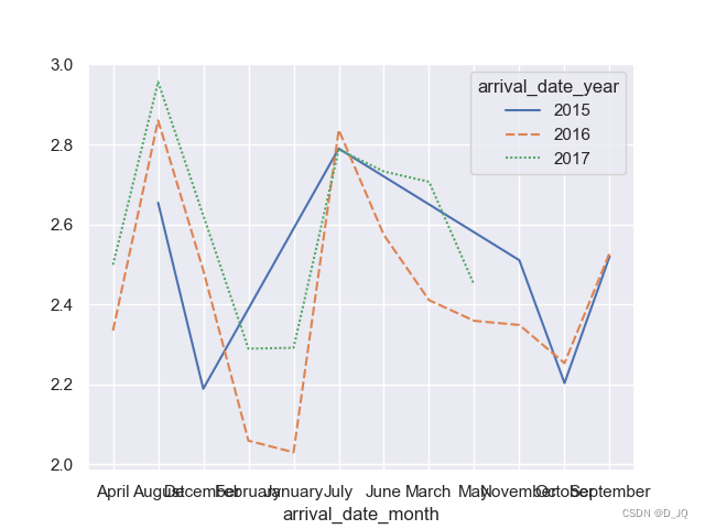
[119390 rows x 3 columns]
arrival_date_year       2015      2016      2017
arrival_date_month
April                    NaN  2.334009  2.498852
August              2.654153  2.859964  2.956142
December            2.188699  2.485233       NaN
February                 NaN  2.058854  2.288963
January                  NaN  2.029804  2.291225
July                2.789625  2.836177  2.787502
June                     NaN  2.573507  2.732247
March                    NaN  2.410448  2.706439
May                      NaN  2.358708  2.448757
November            2.510256  2.348226       NaN
October             2.202945  2.252942       NaN
September           2.519945  2.528550       NaN
我们也可以按照在原始的csv文件中,arrival_date_month的顺序来画图,也就是上面我们设定的order=df['arrival_date_month']的作用。
arrival_date_year       2015      2016      2017
arrival_date_month
July                2.789625  2.836177  2.787502
July                2.789625  2.836177  2.787502
July                2.789625  2.836177  2.787502
July                2.789625  2.836177  2.787502
July                2.789625  2.836177  2.787502
...                      ...       ...       ...
August              2.654153  2.859964  2.956142
August              2.654153  2.859964  2.956142
August              2.654153  2.859964  2.956142
August              2.654153  2.859964  2.956142
August              2.654153  2.859964  2.956142

[119390 rows x 3 columns]


 666
666

 被折叠的 条评论
为什么被折叠?
被折叠的 条评论
为什么被折叠?
 到【灌水乐园】发言


