


import QtQuick 2.0
import QtQuick.Controls 2.14
Popup {
id: popup
x: 100
y: 100
width: 300
height: 300
visible: true
// 默认的关闭方式为 点击外部 或者 点击esc按键
closePolicy: Popup.NoAutoClose // 取消上面的关闭方法
modal: false // 模态,底下的屏幕颜色变为深灰色
// 规定了当前页面除popup以外的背景颜色;默认为深灰色;
// 当下面参数设置为 true 的时候,再modal为false的时候,底部的颜色也会变为深灰色
dim: true
// 当创建的时候,会由一个 透明度 从 0 到 1.0 渐变的效果
enter: Transition {
NumberAnimation {
property: "opacity";
from: 0.0;
to: 1.0
duration: 1000
}
}
// 渐变的退出效果
// 退出的时候,动画效果
exit: Transition {
NumberAnimation {
property: "opacity";
from: 1.0;
to: 0.0
duration: 1000
}
}
// 绘制样式: 内容样式
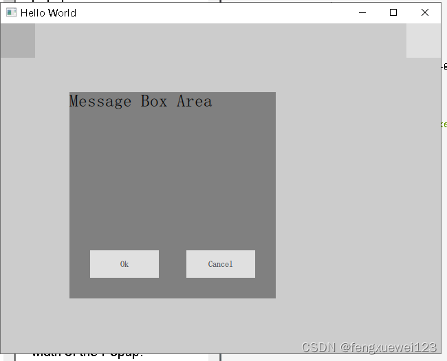
contentItem: Rectangle{
anchors.fill: parent
color: "gray"
Text {
id: name
anchors.fill: parent
text: qsTr("Message Box Area")
font.pixelSize: 25
wrapMode: Text.WordWrap
}
Button {
anchors.bottom: parent.bottom
anchors.bottomMargin: 30
anchors.right: parent.right
anchors.rightMargin: 30
text: "Cancel"
}
Button {
anchors.bottom: parent.bottom
anchors.bottomMargin: 30
anchors.left: parent.left
anchors.leftMargin: 30
text: "Ok"
}
}
// //
// background: Rectangle{
// }
// 如果要控制 popup 之外的 控件 颜色的变化
Overlay.modal: Rectangle { // 模态的时候,外侧的颜色
anchors.fill: parent
color: "blue"
}
// modal为false,dim为true的时候,才会生效
Overlay.modeless: Rectangle { // 非模态的时候,外侧的颜色
anchors.fill: parent
// color: "transparent"
// color: "transparent"
color: "#33000000" // ARGB
Button {
width: 50
height: 50
anchors.right: parent.right
onClicked: {
console.log("onClicked.")
}
}
}
}


 3631
3631


 被折叠的 条评论
为什么被折叠?
被折叠的 条评论
为什么被折叠?
 到【灌水乐园】发言


