| 1 2 3 4 5 6 7 8 9 10 11 12 13 14 15 16 17 18 19 20 21 22 23 24 25 26 27 28 29 30 31 32 33 34 35 36 37 38 39 40 41 42 43 44 45 46 47 48 49 50 51 52 53 54 55 56 57 58 59 60 61 62 63 64 65 66 67 68 69 70 71 72 73 74 75 76 77 78 79 80 81 82 83 84 85 86 87 88 89 90 91 92 93 94 95 96 97 98 99 100 101 102 103 104 105 106 107 108 109 110 111 112 | var windWidth = wx.getSystemInfoSync().windowWidth;
Component({
options: {
multipleSlots: true // 在组件定义时的选项中启用多slot支持
},
/**
* 组件的属性列表
*/
properties: {
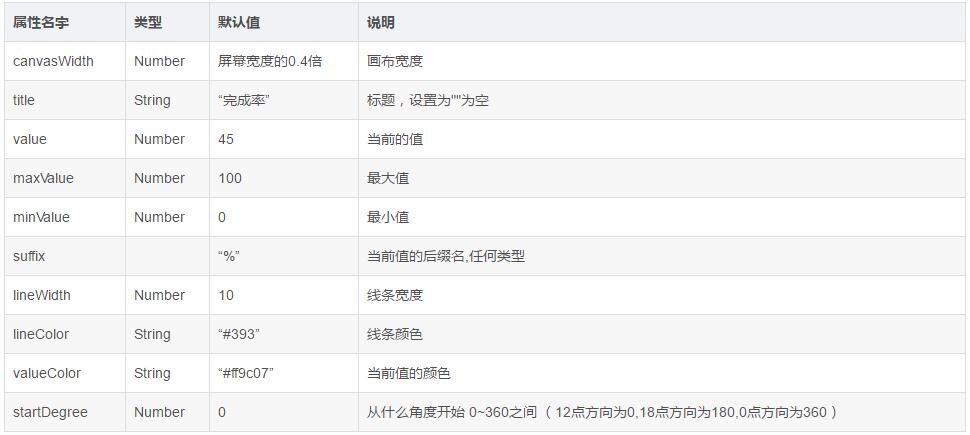
//画布的宽度 默认占屏幕宽度的0.4倍
canvasWidth: {
type: Number,
value: windWidth * 0.4
},
//线条宽度 默认10
lineWidth: {
type: Number,
value: 10
},
//线条颜色 默认"#393"
lineColor: {
type: String,
value: "#393"
},
//标题 默认“完成率”
title: {
type: String,
value: "完成率"
},
//当前的值 默认45
value: {
type: Number,
value: 45
},
//值的颜色 默认"#ff9c07"
valueColor:{
type: String,
value: "#ff9c07"
},
//最大值 默认100
maxValue: {
type: Number,
value: 100
},
//最小值 默认0
minValue: {
type: Number,
value: 0
},
//当前值的后缀名
suffix: {
type: null,
value: "%"
},
//从什么角度开始 0~360之间 (12点方向为0,18点方向为180,0点方向为360)
startDegree: {
type: Number,
value: 0
}
},
/**
* 组件的初始数据
*/
data: {
canvasWidth: windWidth * 0.4,
isMarginTop: true
},
/**
* 组件的方法列表
*/
methods: {
showCanvasRing() {
//去掉首位空格后如果标题为空,那么当前值的区域就没有margin-top值
if (this.data.title.replace(/(^\s*)|(\s*$)/g, "").length == 0) {
this.setData({
isMarginTop: false
})
}
//作画
var ctx = wx.createCanvasContext("circleBar", this); //canvas组建封装,需要后加个this
var circle_r = this.data.canvasWidth / 2; //画布的一半,用来找中心点和半径
var startDegree = this.data.startDegree; //从什么角度开始
var maxValue = this.data.maxValue; //最大值
var minValue = this.data.minValue; //最小值
var value = this.data.value; //当前的值
var lineColor = this.data.lineColor; //线条颜色
var lineWidth = this.data.lineWidth; //线条宽度
var percent = 360 * ((value - minValue) / (maxValue - minValue)); //计算结果
//定义起始点
ctx.translate(circle_r, circle_r);
//灰色圆弧
ctx.beginPath();
ctx.setStrokeStyle("#ebebeb");
ctx.setLineWidth(lineWidth);
ctx.arc(0, 0, circle_r - 10, 0, 2 * Math.PI, true);
ctx.stroke();
ctx.closePath();
//有色彩的圆弧
ctx.beginPath();
ctx.setStrokeStyle(lineColor);
ctx.setLineWidth(lineWidth);
ctx.arc(0, 0, circle_r - 10, startDegree * Math.PI / 180 - 0.5 * Math.PI, percent * Math.PI / 180 + startDegree * Math.PI / 180 - 0.5 * Math.PI, false);
ctx.stroke();
ctx.closePath();
ctx.draw();
}
}
})
|


 1006
1006

 被折叠的 条评论
为什么被折叠?
被折叠的 条评论
为什么被折叠?
 到【灌水乐园】发言


