


透明
使元素的Opacity属性
- 设置元素的Opacity属性
- 设置划算的Opacity属性
- 使用具有透明Alpha值的颜色
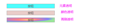
        <Button Content="按钮" Background="Aqua" Width="200"  Opacity="0.7" Margin="5"/>
        <Button Content="按钮" Background="#60AA4030" Width="200"  Opacity="0.7" Margin="5"/>
        <Button Content="按钮" Width="200"  Opacity="0.7" Margin="5">
            <Button.Background>
                <RadialGradientBrush RadiusX="0.8" RadiusY="0.8" Center="0.2,0.2" Opacity="0.7">
                    <GradientStop Color="Yellow" Offset="0"/>
                    <GradientStop Color="Red" Offset="0.25"/>
                    <GradientStop Color="Blue" Offset="0.75"/>
                    <GradientStop Color="LimeGreen" Offset="1"/>
                </RadialGradientBrush>
            </Button.Background>
        </Button>
透明掩码OpacityMask
获取或设置一个作为 Brush 实现的不透明蒙板,该蒙板可应用到此元素所呈现内容的任何 Alpha 通道蒙板。 这是依赖项属性。
此属性仅使用 alpha 通道值为提供的 Brush 。 Brush呈现的内容 (红色、绿色或蓝色) 的其他通道将被忽略。
此目的最常见的 Brush 是 ImageBrush ,可用于各种照片屏蔽技术(例如 vignette)。 但 Brush 可以使用任何定义的 (如 LinearGradientBrush) 。
在 Extensible Application Markup Language (XAML) 中,此属性值可以使用特定于抽象类的每个实现的内联语法 Brush 。 有关详细信息,请参阅 采用纯色和渐变进行绘制概述。

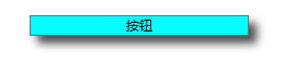
        <Button Content="按钮" Background="Aqua" Width="400"  Height="400"  Margin="5" FontSize="50">
            <Button.OpacityMask>
                <LinearGradientBrush  StartPoint="0,0" EndPoint="1,1">
                    <GradientStop Offset="0.2" Color="GreenYellow"/>
                    <GradientStop Offset="0.8" Color="Transparent" />
                </LinearGradientBrush>
            </Button.OpacityMask>
        </Button>
BitmapEffect
注意
BitmapEffects 已弃用且不再起作用。考虑在适当的地方使用效果。
BitmapEffect 是抽象类型,因此 XAML 使用需要的实现的派生类 BitmapEffect ,如 OuterGlowBitmapEffect 。 请注意,一个实现的派生类是一种集合类型,它允许你 BitmapEffect 使用嵌套标记语法指定多个顺序。
没有支持类型转换器的现有派生类 BitmapEffect ,因此,用于此属性的 XAML 语法通常是属性元素语法。
        <Button Content="按钮" Background="Aqua" Width="200">
            <Button.BitmapEffect>
                <DropShadowBitmapEffect ShadowDepth="10" Direction="-45" Opacity="0.7"/>
            </Button.BitmapEffect>
        </Button>
Effect 类
提供自定义位图效果。
使目标纹理变模糊的位图效果。

        <Button Content="按钮" Background="Aqua" Width="200">
            <Button.Effect>
                <BlurEffect Radius="10" KernelType="Gaussian"  RenderingBias="Performance"/>
            </Button.Effect>
</Button>在目标纹理周围绘画投影的位图效果。

        <Button Content="按钮" Background="Aqua" Width="200">
            <Button.Effect>
                <DropShadowEffect   Color="SlateBlue" ShadowDepth="10" BlurRadius="5" Direction="-60" Opacity="0.8"/>
            </Button.Effect>
</Button>通过使用 PixelShader 提供自定义位图效果。
自定义的像素着色器已经编译到名为Grayscale_Compiled.ps
 public class GrayscaleEffect : ShaderEffect
    {

        public GrayscaleEffect()
        {
            Uri pixelShaderUri = new Uri("Grayscale_Compiled.ps", UriKind.RelativeOrAbsolute);

            // Load the information from the .ps file.
            PixelShader = new PixelShader() { UriSource = pixelShaderUri };

            UpdateShaderValue(InputProperty);
        }

        public static readonly DependencyProperty InputProperty =
            ShaderEffect.RegisterPixelShaderSamplerProperty("Input", typeof(GrayscaleEffect), 0 /* assigned to sampler register S0 */);

        public Brush Input
        {
            get { return (Brush)GetValue(InputProperty); }
            set { SetValue(InputProperty, value); }
        }
    }
https://docs.microsoft.com/zh-cn/dotnet/api/system.windows.media.effects.shadereffect?view=net-5.0


 958
958


 被折叠的 条评论
为什么被折叠?
被折叠的 条评论
为什么被折叠?
 到【灌水乐园】发言


