


 本文详细介绍了如何使用R语言中的ggplot2库绘制和定制截断堆积柱状图,包括数据导入、图形基础结构、主题调整和不同位置的截断设置。
本教程原文链接:截断堆积柱状图绘制教程
欢迎大家转载!!!!
本期教程
写在前面
堆积柱状图是柱状图的常见类型之一,也是平时使用概率较高的图形之一。我们前期发布了很多个柱状图的绘制教程,若你刚兴趣可以自行查看。堆积柱状图,最近也发布了一个相对详细的教程,基于R语言 | 绘制个性化堆积柱状图。
对于截断图的绘制,也是相对比较简单,因为我们柱状图和堆积柱状图都是基于ggplot2绘制。因此,基本全部的代码都是可以通用。我们次教程,也是基于前期的教程进行修改即可。
截断堆积柱状图绘制
导入所需的R包和数据
library(ggplot2)
library(cowplot)
library(dplyr)
library(tidyr)
library(ggbreak)
library(ggsignif)
library(ggpubr)
library(EnvStats)
library(stats)
导入数据
请结合自己的数据进行导入!!!
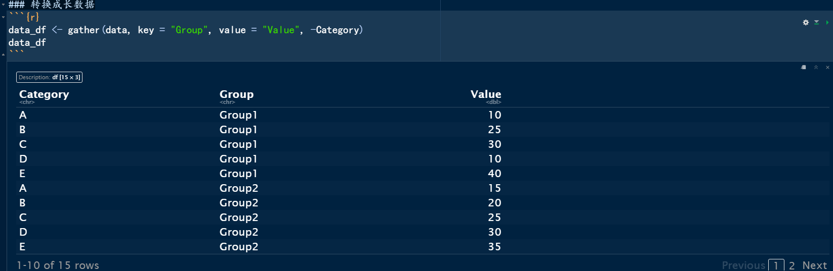
我们这里需要长数据,需要将宽数据转换成长数据。
data_df <- gather(data, key = "Group", value = "Value", -Category)
data_df
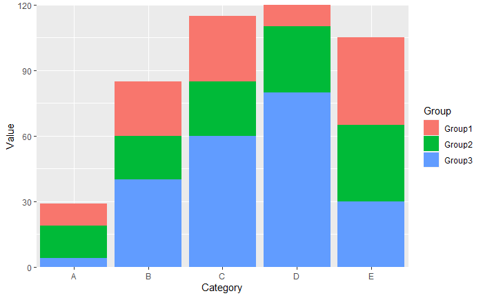
绘制基础图形
# 绘制柱状堆积图
ggplot(data_df, aes(Category, y = Value , fill = Group))+
  #geom_bar(stat = "identity", position = "fill")+
  geom_bar(stat = "identity", position = "stack")+
  scale_y_continuous(expand = c(0, 0),
                     labels = scales::number_format(accuracy = 1)  ## 设置Y轴保留一位小数点
                     )+
  scale_x_discrete(expand = c(0,0.5))
我们可以自行先设置主题,以便于后期的图形绘制。
mytheme01 <- theme_classic()+
  theme(axis.line = element_line(size = 1),  ## 粗细
        text=element_text(family = "sans",colour ="black",size = 12),
        axis.text.x = element_text(color = "black", size = 12),
        axis.text.y = element_text(color = "black",size = 12),
        axis.ticks = element_line(size = 0.6,colour = "black"),
        axis.ticks.length = unit(1.5,units = "mm"),
        #legend.position = "none",
        strip.background = element_blank()
       )
mytheme02 <- theme_classic() +
  theme(
    text = element_text(family = "sans", colour = "gray30", size = 12),
    axis.line = element_line(size = 0.6, colour = "gray30"),
    axis.ticks = element_line(size = 0.6, colour = "gray30"),
    axis.ticks.length = unit(1.5, units = "mm"),
    plot.margin = unit(c(1, 1, 1, 1), units = "inches")
  )
图形修改和截断设置
ggplot(data_df, aes(Category, y = Value , fill = Group))+
  #geom_bar(stat = "identity", position = "fill")+
  geom_bar(stat = "identity", position = "stack")+
  scale_y_continuous(expand = c(0, 0),
                     labels = scales::number_format(accuracy = 1)  ## 设置Y轴保留一位小数点
                     )+
  scale_x_discrete(expand = c(0,0.5))+
  scale_y_break(c(33,70),
                  scales = "free", #'fixed', 'free'
                  )+

  ## 设置颜色
  scale_fill_manual(values = c("#386cb0", "#fdc086", "#1b9e77","#a6cee3","#bebada","#e5c494"))+
  labs(x = "Season", y = "Percentage", fill = NULL) +
  theme_classic()
堆积柱状图柱子参数修改
p1 <- ggplot(data_df, aes(Category, y = Value , fill = Group))+
  #geom_bar(stat = "identity", position = "fill")+
  geom_bar(stat = "identity",
           position = "stack",
           color = "black", ## 柱边颜色
           width = 0.5,    ## 柱子宽度
           size = 1.0     ## 粗细
           )+
  scale_y_continuous(expand = c(0, 0),
                     labels = scales::number_format(accuracy = 1)  ## 设置Y轴保留一位小数点
                     )+
  scale_x_discrete(expand = c(0,0.5))+
  scale_y_break(c(33,70),
    scales = "free", #'fixed', 'free'
    expand = c(0, 0),
    ## 修改坐标轴
    ticklabels = c(70,90,110,120),
    space = 0.25
                  )+

  ## 设置颜色
  scale_fill_manual(values = c("#386cb0", "#fdc086", "#1b9e77","#a6cee3","#bebada","#e5c494"))+
  labs(x = NULL, y = "Number of DEGs", fill = NULL) +
  theme_classic()
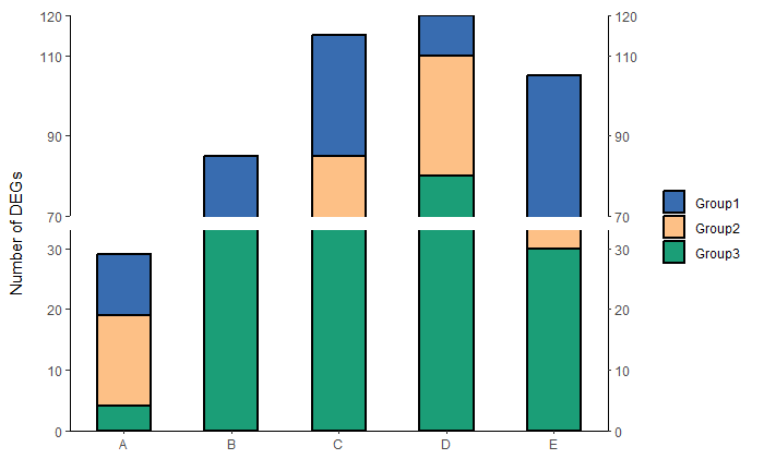
设置主题参数
p1 +

  ## 设置颜色
  scale_fill_manual(values = c("#386cb0", "#fdc086", "#1b9e77","#a6cee3","#bebada","#e5c494"))+
  labs(x = NULL, y = "Number of DEGs", fill = NULL) +
  # 设置主题
  theme_classic()+
  theme(axis.line = element_line(size = 1),  ## 粗细
        text=element_text(family = "sans",colour ="black",size = 12),
        axis.text.x = element_text(color = "black", size = 12),
        axis.text.y = element_text(color = "black",size = 12),
        axis.ticks = element_line(size = 1,colour = "black"),
        axis.ticks.length = unit(1.5,units = "mm"),
        legend.position = "none",
        strip.background = element_blank()
       )

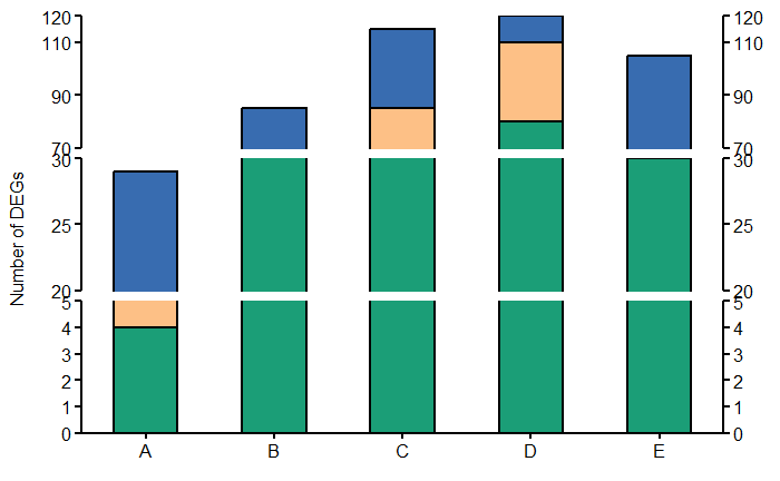
添加不同的截断位置
ggplot(data_df, aes(Category, y = Value , fill = Group))+
  #geom_bar(stat = "identity", position = "fill")+
  geom_bar(stat = "identity",
           position = "stack",
           color = "black", ## 柱边颜色
           width = 0.5,    ## 柱子宽度
           size = 1.0     ## 粗细
           )+
  scale_y_continuous(expand = c(0, 0),
                     labels = scales::number_format(accuracy = 1)  ## 设置Y轴保留一位小数点
                     )+
  scale_x_discrete(expand = c(0,0.5))+
  ##'@第一个截断位置
  scale_y_break(c(5,20),
                scales = "free",
                ticklabels = c(20,25,30))+
  ##'@第二个截断位置
  scale_y_break(c(30,70),
    scales = "free", #'fixed', 'free'
    # ## 修改坐标轴
    ticklabels = c(70,90,110,120),
    space = 0.25,
    expand = c(0, 0))+
  ##'@第三个截断位置
  # scale_y_break(c(90,105),
  #               scales = "free",
  #               expand = c(0, 0))+
  ## 设置颜色
  scale_fill_manual(values = c("#386cb0", "#fdc086", "#1b9e77","#a6cee3","#bebada","#e5c494"))+
  labs(x = NULL, y = "Number of DEGs", fill = NULL) +
  # 设置主题
  theme_classic()+
  theme(axis.line = element_line(size = 1),  ## 粗细
        text=element_text(family = "sans",colour ="black",size = 12),
        axis.text.x = element_text(color = "black", size = 12),
        axis.text.y = element_text(color = "black",size = 12),
        axis.ticks = element_line(size = 1,colour = "black"),
        axis.ticks.length = unit(1.5,units = "mm"),
        legend.position = "none",
        strip.background = element_blank()
       )
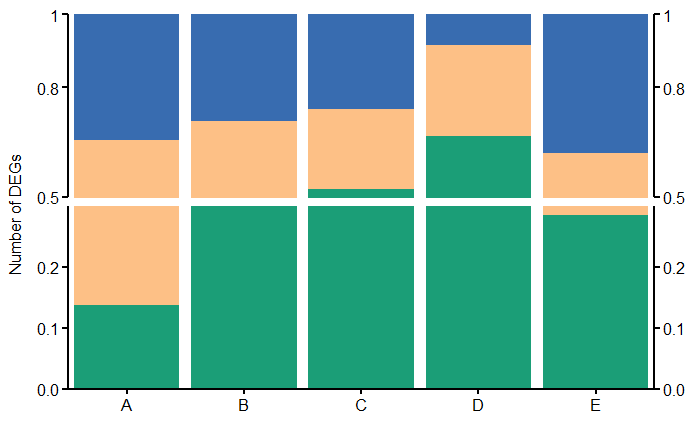
百分比堆积柱状图进行截断设置
ggplot(data_df, aes(Category, y = Value , fill = Group))+
  geom_bar(stat = "identity", position = "fill")+
  scale_y_continuous(expand = c(0, 0),
                     labels = scales::number_format(accuracy = 0.1)  ## 设置Y轴保留一位小数点
                     )+
  scale_x_discrete(expand = c(0,0.5))+
  ##'@第一个截断位置
  scale_y_break(c(0.3,0.5),
                scales = "free",
                ticklabels = c(0.5,0.8,1.0),
                expand = c(0,0))+
  scale_fill_manual(values = c("#386cb0", "#fdc086", "#1b9e77","#a6cee3","#bebada","#e5c494"))+
  labs(x = NULL, y = "Number of DEGs", fill = NULL) +
  # 设置主题
  theme_classic()+
  theme(axis.line = element_line(size = 1),  ## 粗细
        text=element_text(family = "sans",colour ="black",size = 12),
        axis.text.x = element_text(color = "black", size = 12),
        axis.text.y = element_text(color = "black",size = 12),
        axis.ticks = element_line(size = 1,colour = "black"),
        axis.ticks.length = unit(1.5,units = "mm"),
        legend.position = "none",
        strip.background = element_blank()
       )
本教程原文链接:截断堆积柱状图绘制教程
欢迎大家转载!!!!
小杜的生信笔记,自2021年11月开始做的知识分享,主要内容是R语言绘图教程、转录组上游分析、转录组下游分析等内容。凡事在社群同学,可免费获得自2021年11月份至今全部教程,教程配备事例数据和相关代码,我们会持续更新中。
往期教程部分内容


往期部分文章
1. 复现SCI文章系列专栏
2. 《生信知识库订阅须知》,同步更新,易于搜索与管理。
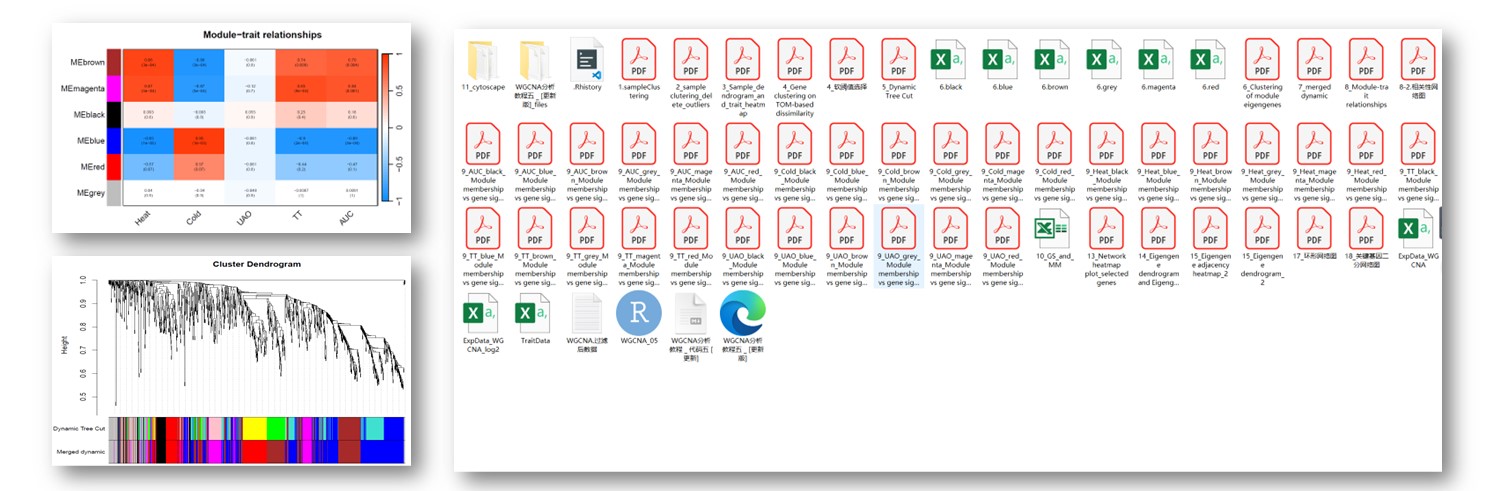
3. 最全WGCNA教程(替换数据即可出全部结果与图形)
4. 精美图形绘制教程
5. 转录组分析教程
6. 转录组下游分析
小杜的生信筆記 ,主要发表或收录生物信息学的教程,以及基于R的分析和可视化(包括数据分析,图形绘制等);分享感兴趣的文献和学习资料!!


 3427
3427


 被折叠的 条评论
为什么被折叠?
被折叠的 条评论
为什么被折叠?
 到【灌水乐园】发言


