


(1) Transition
平滑过渡的效果, 部分的解决Flash问题
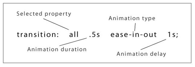
transition:属性 时间 函数 延迟时间
执行变换的属性:transition-property
变换延续的时间:transition-duration
动画函数:transition-timing-function
变换延迟时间:transition-delay
transition-timing-function:
ease 变慢
linear 恒速
ease-in 加速 渐显效果
ease-out 减速 渐隐效果
ease-in-out 先加速 后减速
Example:
<div>Click Me!</div>div{
position: relative;
width:100px;
height:100px;
border:2px solid orange;
color:green;
background:rgba(200,220,001,0.4);
-webkit-transition-property:background border color font-weight;
-webkit-transition-duration:2s;
-webkit-transition-timing-function:linear;
}
div:hover{
background:red;
color:black;
border:1px dotted green;
font-weight:bold;
-webkit-transform:translate(20px,0);
}


(2) 多个CSS3过渡效果
div{
  position: relative;
  width:100px;
  height:100px;

  color:green;
  background:rgba(200,220,001,0.4);
  /****************/
  /*transition:background 3s linear 1s*/
  /****************/
  -webkit-transition:background 3s linear 1s, color 1s ease-in 1s,-webkit-transform 2s linear 1s;
  /****************/
}
div:hover{
  background:red;
  color:black;
  -webkit-transform:translate(200px,0);
}


 390
390

 被折叠的 条评论
为什么被折叠?
被折叠的 条评论
为什么被折叠?
 到【灌水乐园】发言


