


Python可以画的图很多,比如气泡图、玫瑰图等等,很多我们用Excel实现起来很麻烦的图表,用Python都可以轻松实现。今天我们就以python内置的Iris(鸢尾花)数据集为例,绘制好看的图捏~
一、导入头文件
import matplotlib.pyplot as plt
# 使用ipython的魔法方法,将绘制出的图像直接嵌入在notebook单元格中
%matplotlib inline
# 设置绘图大小
plt.style.use({'figure.figsize':(6,4)})
import seaborn as sns
sns.set_style('whitegrid')
二、导入数据集
df = sns.load_dataset('iris')
三、绘图
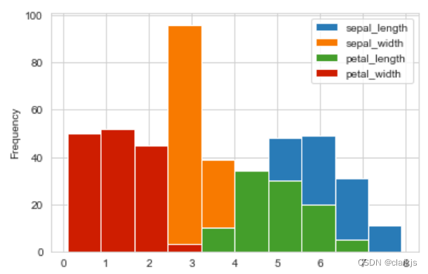
1. 柱形图
# 横坐标是cm
df.plot(kind = 'hist')
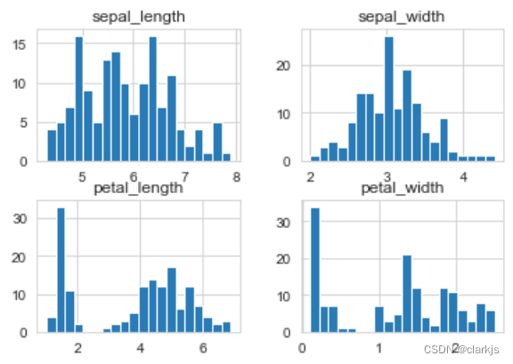
2. 直方图
df.hist(bins = 20)
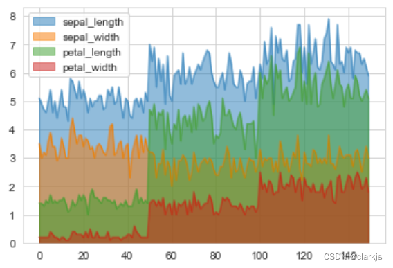
3. 区域图
df.plot.area(stacked = False)
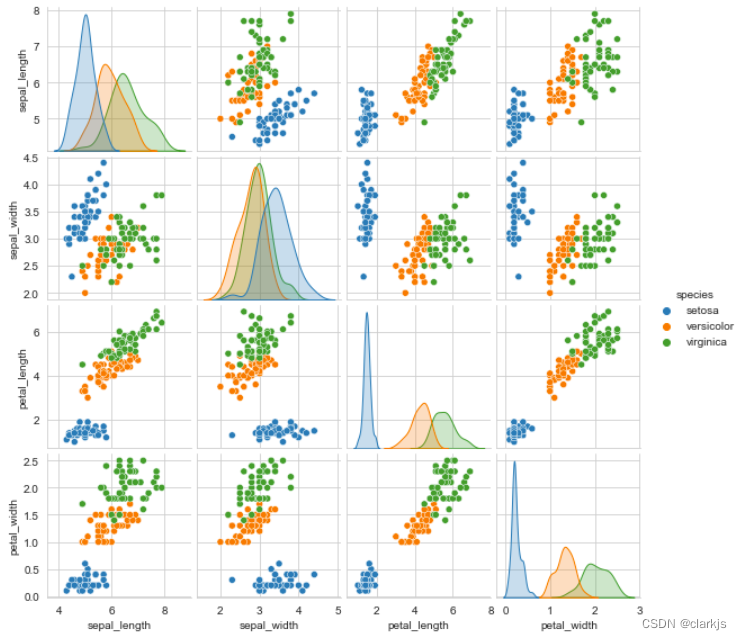
4. 属性关系图
# 可以绘制N个特征两两之间的关系
sns.pairplot(df,hue='species',height=2)
# 对角线自己对自己时,不能画出散点图,只能画概率密度曲线
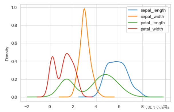
5. KDE(核密度估计图)
# KDE是核密度估计图(更加全面地反映数据的概率密度分布)
df.plot(kind = 'kde')
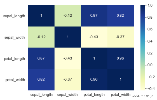
6. 相关性矩阵
# 将pearson相关系数矩阵绘制成热力图,可以清楚的看到变量之间的相关关系
# 运行一下,发现,花萼的长度、宽度没有相关关系,花瓣的长度、宽度相关性很强
sns.heatmap(df.corr(),annot=True,cmap='YlGnBu')   # 这是L,不是one
# 下图,颜色越深表示越相关
7. 盒图
df.plot(kind = 'box')
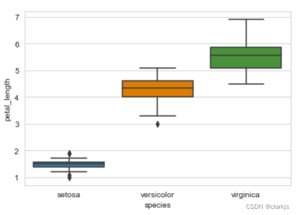
8. 箱形图
# 三类鸢尾花花瓣长度的箱形图
sns.boxplot(y = df['petal_length'], x = df['species'])
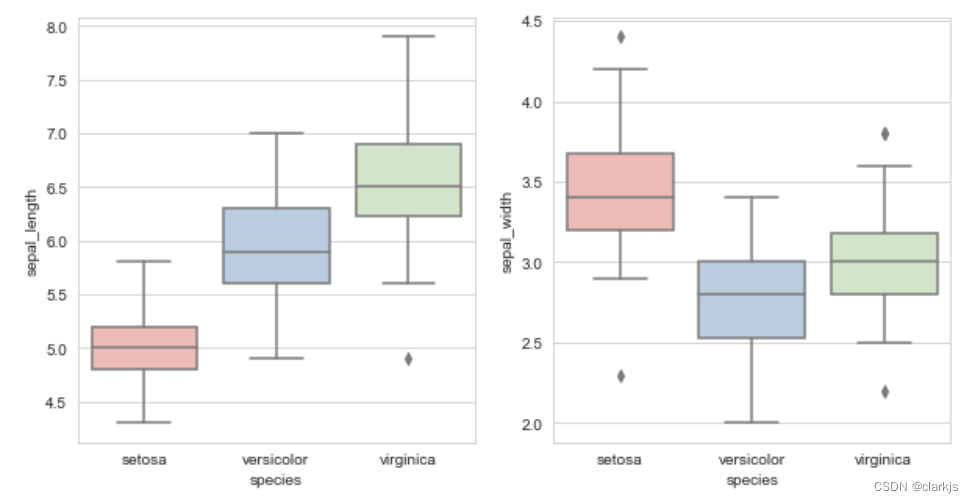
9. subplot子图(以boxplot为例)
fig, axes = plt.subplots(1, 2, figsize = (10,5))
sns.boxplot(x = "species", y = "sepal_length", data = df, palette = 'Pastel1', ax = axes[0])
sns.boxplot(x = "species", y = "sepal_width", data = df, palette = 'Pastel1', ax = axes[1])
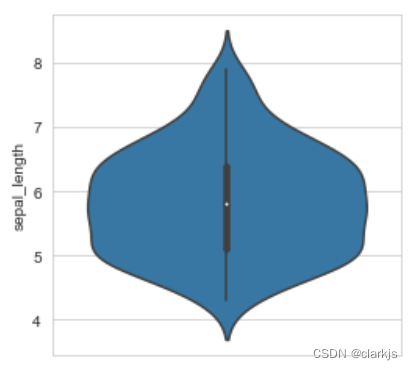
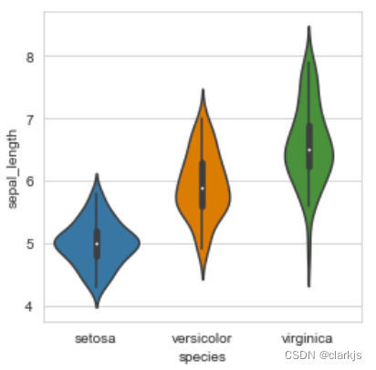
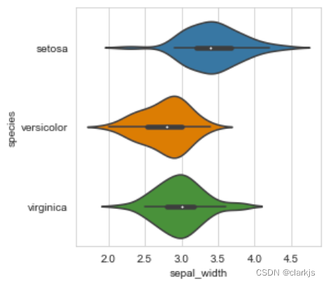
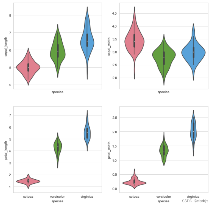
10. 小提琴图
# 小提琴图 —— iris数据集中“花萼长度”的数据分布(越胖的地方表示该数值的数据越多)
sns.violinplot(y = df['sepal_length'])
sns.violinplot(x = df["species"], y = df['sepal_length'])
# 把x,y反过来,绘制横的小提琴图
sns.violinplot(y = df["species"], x = df['sepal_width'])
f, axes = plt.subplots(2, 2, figsize = (10, 10), sharex = True)
sns.violinplot(x = 'species', y = 'sepal_length', data=df, palette='husl', ax = axes[0,0])
sns.violinplot(x = 'species', y = 'sepal_width', data=df, palette='husl', ax = axes[0,1])
sns.violinplot(x = 'species', y = 'petal_length', data=df, palette='husl', ax = axes[1,0])
sns.violinplot(x = 'species', y = 'petal_width', data=df, palette='husl', ax = axes[1,1])
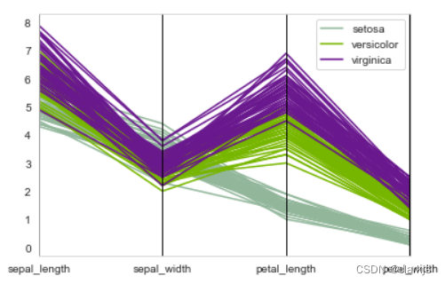
11. 平行坐标图
# 平行坐标图(作用:拿到一个新数据,把各个特征绘制成折线图,看看像哪个类别)
plt.style.use({'figure.figsize':(6,4)})
from pandas.plotting import parallel_coordinates
parallel_coordinates(df, 'species')
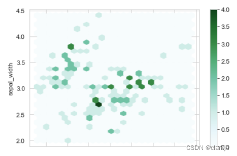
12. 六边形蜂窝图
# 六边形蜂窝图(蜂窝状的热力图),在城市大数据中常见
df.plot.hexbin(x = 'sepal_length', y = 'sepal_width', gridsize = 25)
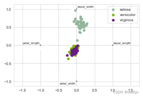
13. 雷达图
# 雷达图(径向坐标可视化)(将高维压缩到低维)
from pandas.plotting import radviz
radviz(df, 'species')
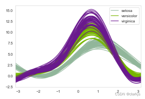
14. 安德鲁斯曲线
# 安德鲁斯曲线(傅里叶)
from pandas.plotting import andrews_curves
andrews_curves(df, 'species')


 925
925


 被折叠的 条评论
为什么被折叠?
被折叠的 条评论
为什么被折叠?
 到【灌水乐园】发言


