


🎩 欢迎来到技术探索的奇幻世界👨💻
📜 个人主页:@一伦明悦-CSDN博客
✍🏻 作者简介: C++软件开发、Python机器学习爱好者
🗣️ 互动与支持:💬评论 👍🏻点赞 📂收藏 👀关注+
如果文章有所帮助,欢迎留下您宝贵的评论,
点赞加收藏支持我,点击关注,一起进步!
目录
前言
高斯混合模型(Gaussian Mixture Model,简称GMM)是一种概率性的聚类算法,它假设数据是由若干个高斯分布混合而成的。每个高斯分布对应一个聚类,而GMM的目标就是找出这些高斯分布的参数以及每个样本属于这些聚类的概率。
正文
01-高斯混合模型的密度估计
高斯混合模型(Gaussian Mixture Model,简称GMM)是一种用于对数据集进行概率密度估计的方法。在 GMM 中,假设数据是由若干个高斯分布混合而成的,每个高斯分布代表一个聚类。通过对这些高斯分布的参数进行估计,可以得到对数据整体的概率密度估计。
GMM 的密度估计基于以下几个关键概念:
高斯分布(Gaussian Distribution):
高斯分布是一种连续概率分布,具有钟形曲线的形状。其概率密度函数可以用以下公式表示:
其中,𝜇μ 是均值,𝜎σ 是标准差。高斯分布的均值确定了曲线的中心位置,标准差决定了曲线的宽度。高斯混合模型:
GMM 由多个高斯分布叠加而成,其中每个高斯分布对应一个聚类。每个高斯分布的参数包括均值和协方差矩阵,以及该分布在整体混合中所占的权重。通过调整这些参数,可以拟合出最优的概率密度函数来描述数据。数据的概率密度估计:
在 GMM 中,对于给定的数据集,通过最大化似然函数或利用 EM 算法来估计每个高斯分布的参数,从而得到数据整体的概率密度估计。这个过程可以将数据集投影到特征空间中的多个高斯分布上,并根据数据的分布情况来确定每个样本属于这些高斯分布的概率。通过 GMM 的密度估计,可以实现对数据集的建模、聚类、异常检测等任务,对于复杂的数据集和分布情况具有较好的拟合效果。
具体代码实例如下:这段代码主要是使用 sklearn 中的 Gaussian Mixture 模型对合成的数据集进行训练,并绘制概率密度的轮廓图。具体步骤解释如下:
-
生成数据集:
- 使用
np.random.randn()生成了两组符合标准正态分布的数据点。 - 将第一组数据点进行平移,使其位于 (20, 20) 处。
- 使用矩阵乘法
np.dot()将第二组数据点进行线性变换,形成一个拉伸的高斯分布。 - 将两组数据点拼接成最终的训练集
X_train。
- 使用
-
使用 Gaussian Mixture 模型:
- 创建了一个 Gaussian Mixture 模型
clf,设定了两个高斯分布组件,并使用完整的协方差类型。 - 对训练集
X_train进行拟合训练,估计模型参数。
- 创建了一个 Gaussian Mixture 模型
-
绘制轮廓图:
- 生成用于绘制轮廓图的网格数据点
X和Y。 - 将网格点展开成一维数组
XX,通过clf.score_samples()方法计算每个点的负对数似然度作为Z值。 - 对Z值进行处理,然后使用
plt.contour()绘制轮廓线。 - 添加颜色条
CB,显示每个轮廓线的取值范围。 - 使用
plt.scatter()绘制训练集X_train的散点图。 - 设置图像标题为 ‘Negative log-likelihood predicted by a GMM’,调整图像显示范围并展示图像。
- 生成用于绘制轮廓图的网格数据点
import numpy as np
import matplotlib.pyplot as plt
from matplotlib.colors import LogNorm
from sklearn import mixture
n_samples = 300
# generate random sample, two components
np.random.seed(0)
# generate spherical data centered on (20, 20)
shifted_gaussian = np.random.randn(n_samples, 2) + np.array([20, 20])
# generate zero centered stretched Gaussian data
C = np.array([[0., -0.7], [3.5, .7]])
stretched_gaussian = np.dot(np.random.randn(n_samples, 2), C)
# concatenate the two datasets into the final training set
X_train = np.vstack([shifted_gaussian, stretched_gaussian])
# fit a Gaussian Mixture Model with two components
clf = mixture.GaussianMixture(n_components=2, covariance_type='full')
clf.fit(X_train)
# display predicted scores by the model as a contour plot
x = np.linspace(-20., 30.)
y = np.linspace(-20., 40.)
X, Y = np.meshgrid(x, y)
XX = np.array([X.ravel(), Y.ravel()]).T
Z = -clf.score_samples(XX)
Z = Z.reshape(X.shape)
CS = plt.contour(X, Y, Z, norm=LogNorm(vmin=1.0, vmax=1000.0),
levels=np.logspace(0, 3, 10))
CB = plt.colorbar(CS, shrink=0.8, extend='both')
plt.scatter(X_train[:, 0], X_train[:, 1], .8)
plt.title('Negative log-likelihood predicted by a GMM')
plt.axis('tight')
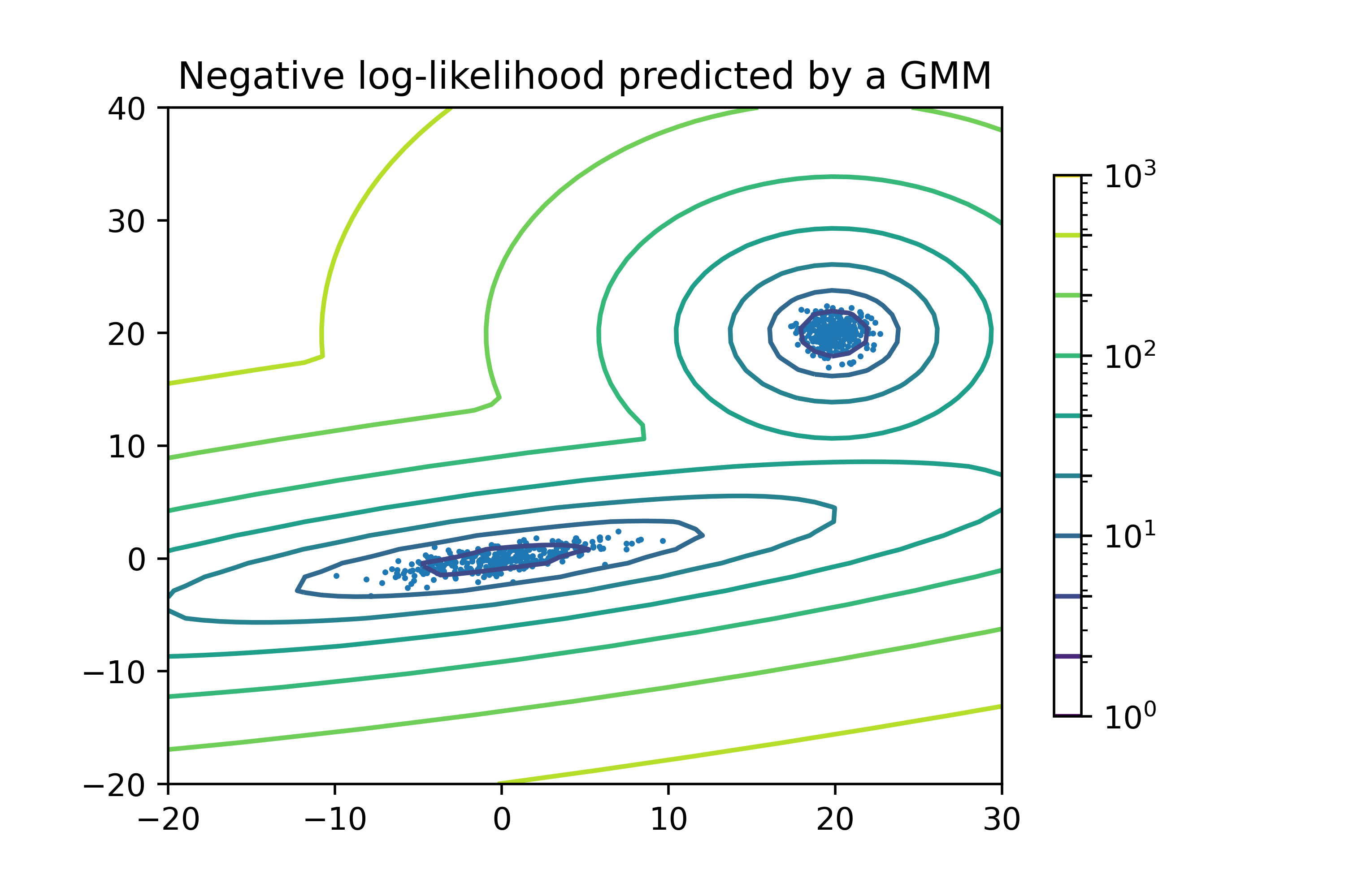
plt.show()运行结果如下图所示:
- 图像中的轮廓线代表了通过 GMM 模型对数据点分布进行建模后得到的概率密度轮廓。
- 每条轮廓线对应着一组概率密度相等的数据点。
- 图中的散点代表原始数据集的分布情况。
- 通过轮廓线的分布可以观察到两个不同的数据集群,对应着模型中设置的两个高斯分布组件。
- 颜色条显示了轮廓线颜色对应的取值范围,颜色越深代表概率密度越高。
02-高斯混合模型椭球
在高斯混合模型中,椭球被用来表示每个高斯分布的形状和方向,通过椭球的大小和方向,我们可以推断出这个高斯分布的置信区域。在 scikit-learn 中,通过 GaussianMixture 类和 BayesianGaussianMixture 类进行训练并绘制高斯混合模型的置信椭球。
最大期望算法(GaussianMixture类):
- 使用 GaussianMixture 类进行训练,可以得到每个高斯分布的参数,包括均值、协方差矩阵和权重。
- 通过获取协方差矩阵的特征向量和特征值,可以确定椭球的方向和大小。
- 通过椭球参数,可以绘制出每个高斯分布的置信椭球,表示数据点位于该椭球内的概率。
变分推理(BayesianGaussianMixture类):
- BayesianGaussianMixture 是一个具有 Dirichlet 过程先验的贝叶斯高斯混合模型,它可以自动确定高斯分布的个数,并且适用于具有不确定聚类数目的情况。
- 通过变分推理的方法,模型可以从数据中学习出每个高斯分布的均值、协方差矩阵以及置信概率。
- 使用 BayesianGaussianMixture 类进行训练时,可以得到每个高斯分布的椭球表示,这些椭球表示了聚类的置信区域。
在绘制置信椭球时,可以根据具体需求选择合适的绘图方法,在二维空间中可以直接绘制椭圆来表示置信椭球,而在更高维度的情况下可以通过绘制特征空间的投影或引入降维的方法来展示置信椭球的信息。
绘制高斯混合模型的置信椭球可以帮助我们更直观地理解数据的聚类情况和不确定性,并帮助我们进行模型的解释和评估。
具体代码实例如下:这段代码通过使用 Gaussian Mixture 模型和 Bayesian Gaussian Mixture 模型分别拟合合成的数据集,并绘制了两个高斯混合模型的置信椭圆,以展示数据的聚类情况和不确定性。代码步骤解释如下:
- 导入必要的库,设置颜色迭代器和绘图函数
plot_results。 - 生成数据集
X,包括两个部分的数据,每个部分包含500个样本。 - 使用 GaussianMixture 模型拟合数据,并调用
plot_results函数绘制高斯混合模型的结果。 - 使用 BayesianGaussianMixture 模型拟合数据,并调用
plot_results函数绘制具有 Dirichlet 过程先验的贝叶斯高斯混合模型的结果。 - 保存绘制的图像为 PNG 文件,并显示出来。
import itertools
import numpy as np
from scipy import linalg
import matplotlib.pyplot as plt
import matplotlib as mpl
from sklearn import mixture
color_iter = itertools.cycle(['navy', 'c', 'cornflowerblue', 'gold',
'darkorange'])
def plot_results(X, Y_, means, covariances, index, title):
splot = plt.subplot(2, 1, 1 + index)
for i, (mean, covar, color) in enumerate(zip(
means, covariances, color_iter)):
v, w = linalg.eigh(covar)
v = 2. * np.sqrt(2.) * np.sqrt(v)
u = w[0] / linalg.norm(w[0])
# as the DP will not use every component it has access to
# unless it needs it, we shouldn't plot the redundant
# components.
if not np.any(Y_ == i):
continue
plt.scatter(X[Y_ == i, 0], X[Y_ == i, 1], .8, color=color)
# Plot an ellipse to show the Gaussian component
angle = np.arctan(u[1] / u[0])
angle = 180. * angle / np.pi # convert to degrees
ell = mpl.patches.Ellipse(mean, v[0], v[1], 180. + angle, color=color)
ell.set_clip_box(splot.bbox)
ell.set_alpha(0.5)
splot.add_artist(ell)
plt.xlim(-9., 5.)
plt.ylim(-3., 6.)
plt.xticks(())
plt.yticks(())
plt.title(title)
# Number of samples per component
n_samples = 500
# Generate random sample, two components
np.random.seed(0)
C = np.array([[0., -0.1], [1.7, .4]])
X = np.r_[np.dot(np.random.randn(n_samples, 2), C),
.7 * np.random.randn(n_samples, 2) + np.array([-6, 3])]
# Fit a Gaussian mixture with EM using five components
gmm = mixture.GaussianMixture(n_components=5, covariance_type='full').fit(X)
plot_results(X, gmm.predict(X), gmm.means_, gmm.covariances_, 0,
'Gaussian Mixture')
# Fit a Dirichlet process Gaussian mixture using five components
dpgmm = mixture.BayesianGaussianMixture(n_components=5,
covariance_type='full').fit(X)
plot_results(X, dpgmm.predict(X), dpgmm.means_, dpgmm.covariances_, 1,
'Bayesian Gaussian Mixture with a Dirichlet process prior')
plt.savefig("../5.png", dpi=500)
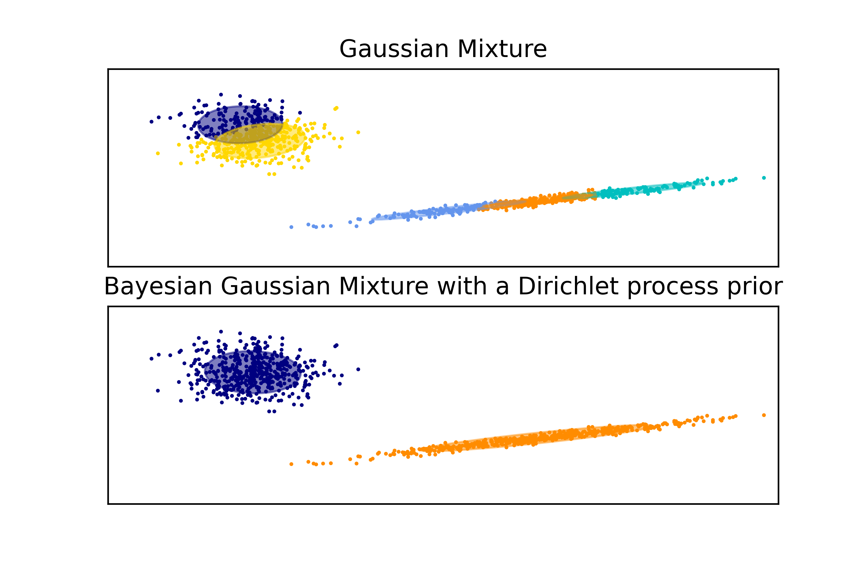
plt.show()运行结果如下图所示:
- 上半部分展示了 Gaussian Mixture 模型的结果,包括五个高斯分布的置信椭圆,每个椭圆代表一个聚类的形状和方向。
- 下半部分展示了 Bayesian Gaussian Mixture 模型的结果,同样展示了五个高斯分布的置信椭圆,但这里是采用了具有 Dirichlet 过程先验的贝叶斯模型。
- 椭圆的中心点是模型预测的均值参数,椭圆的大小和方向表示了对应高斯分布的协方差矩阵。
- 不同颜色的数据点代表不同的聚类,而对应的椭圆则表现了该聚类的置信区域,数据点落在对应椭圆内的概率较高。
- 经过高斯混合模型和贝叶斯高斯混合模型的拟合和可视化,可以更直观地观察数据的聚类情况、模型的表现以及置信区域的形状和大小。
03-高斯混合模型选择
在高斯混合模型中,模型选择是选择合适的协方差类型和成分数来更好地拟合数据的关键问题。为了进行模型选择,我们可以使用信息论准则中的贝叶斯信息准则(BIC)和赤池信息准则(AIC)。
贝叶斯信息准则(BIC):
BIC 是一种模型选择准则,旨在平衡模型的拟合优度和模型复杂度。BIC 考虑了模型的拟合优度以及数据的样本量和模型参数数量之间的权衡。
具体地,BIC =,其中 L 是模型的最大似然函数值,k 是模型参数数量,n 是样本量。BIC 的值越小,表示模型越好,更符合数据的拟合要求。
在高斯混合模型中,我们可以通过比较不同协方差类型和成分数下的 BIC 值来选择最优的模型结构。AIC(未详细展示):
赤池信息准则(AIC)是另一种常用的模型选择准则,与 BIC 相似,但考虑的惩罚项稍有不同。AIC 也可以用来评估不同模型的拟合优度和复杂度。模型选择:
- 在没有先验信息的情况下,对高斯混合模型进行模型选择,BIC 更合适。因为 BIC 在惩罚项中引入了对参数数量的更严格考虑,可以更好地防止过拟合。
- 通过计算不同协方差类型和成分数下的 BIC 值,我们可以选择具有最小 BIC 值的模型作为最佳拟合模型,以达到更好的泛化能力和数据拟合度。
- 选择合适的高斯混合模型结构对于数据分析和模式识别任务十分重要,BIC 提供了一种可靠的准则来帮助我们做出理性的模型选择。
综上所述,BIC 是一种无需先验信息即可进行模型选择的信息论准则,对于高斯混合模型的建模和选择具有重要意义,能够有效平衡模型的复杂度和数据的拟合度。
具体代码实例如下:这段代码演示了如何使用 sklearn 库中的 GaussianMixture 对象拟合高斯混合模型,并使用 BIC 准则选择最佳模型。我将逐步解释代码并解释生成的图像。
-
导入必要的库和模块:
- 导入了 NumPy、itertools、scipy、matplotlib 和 sklearn 中的 mixture 模块。
- 打印了文档字符串(docstring)。
-
生成数据集:
- 设置了每个组件的样本数量为 500。
- 生成了一个包含两个成分的随机样本集合 X,其中一个成分受到特定线性变换的影响,另一个成分受到另一种随机扰动的影响。
-
模型选择:
- 通过迭代不同的协方差类型和成分数,使用 GaussianMixture 拟合数据,并计算每个模型的 BIC 值。
- 选择具有最小 BIC 值的模型作为最佳模型。
-
绘制 BIC 分数图:
- 创建一个包含两个子图的图形。
- 在第一个子图中,绘制了不同模型及其对应 BIC 值的条形图,以及标记了最佳模型的星号。
- 在第二个子图中,绘制了选择的最佳 GMM 的散点图和椭圆,展示了每个成分的分布情况。
import numpy as np
import itertools
from scipy import linalg
import matplotlib.pyplot as plt
import matplotlib as mpl
from sklearn import mixture
print(__doc__)
# Number of samples per component
n_samples = 500
# Generate random sample, two components
np.random.seed(0)
C = np.array([[0., -0.1], [1.7, .4]])
X = np.r_[np.dot(np.random.randn(n_samples, 2), C),
.7 * np.random.randn(n_samples, 2) + np.array([-6, 3])]
lowest_bic = np.infty
bic = []
n_components_range = range(1, 7)
cv_types = ['spherical', 'tied', 'diag', 'full']
for cv_type in cv_types:
for n_components in n_components_range:
# Fit a Gaussian mixture with EM
gmm = mixture.GaussianMixture(n_components=n_components,
covariance_type=cv_type)
gmm.fit(X)
bic.append(gmm.bic(X))
if bic[-1] < lowest_bic:
lowest_bic = bic[-1]
best_gmm = gmm
bic = np.array(bic)
color_iter = itertools.cycle(['navy', 'turquoise', 'cornflowerblue',
'darkorange'])
clf = best_gmm
bars = []
# Plot the BIC scores
plt.figure(figsize=(8, 6))
spl = plt.subplot(2, 1, 1)
for i, (cv_type, color) in enumerate(zip(cv_types, color_iter)):
xpos = np.array(n_components_range) + .2 * (i - 2)
bars.append(plt.bar(xpos, bic[i * len(n_components_range):
(i + 1) * len(n_components_range)],
width=.2, color=color))
plt.xticks(n_components_range)
plt.ylim([bic.min() * 1.01 - .01 * bic.max(), bic.max()])
plt.title('BIC score per model')
xpos = np.mod(bic.argmin(), len(n_components_range)) + .65 +\
.2 * np.floor(bic.argmin() / len(n_components_range))
plt.text(xpos, bic.min() * 0.97 + .03 * bic.max(), '*', fontsize=14)
spl.set_xlabel('Number of components')
spl.legend([b[0] for b in bars], cv_types)
# Plot the winner
splot = plt.subplot(2, 1, 2)
Y_ = clf.predict(X)
for i, (mean, cov, color) in enumerate(zip(clf.means_, clf.covariances_,
color_iter)):
v, w = linalg.eigh(cov)
if not np.any(Y_ == i):
continue
plt.scatter(X[Y_ == i, 0], X[Y_ == i, 1], .8, color=color)
# Plot an ellipse to show the Gaussian component
angle = np.arctan2(w[0][1], w[0][0])
angle = 180. * angle / np.pi # convert to degrees
v = 2. * np.sqrt(2.) * np.sqrt(v)
ell = mpl.patches.Ellipse(mean, v[0], v[1], 180. + angle, color=color)
ell.set_clip_box(splot.bbox)
ell.set_alpha(.5)
splot.add_artist(ell)
plt.xticks(())
plt.yticks(())
plt.title('Selected GMM: full model, 2 components')
plt.subplots_adjust(hspace=.35, bottom=.02)
plt.savefig("../5.png", dpi=500)
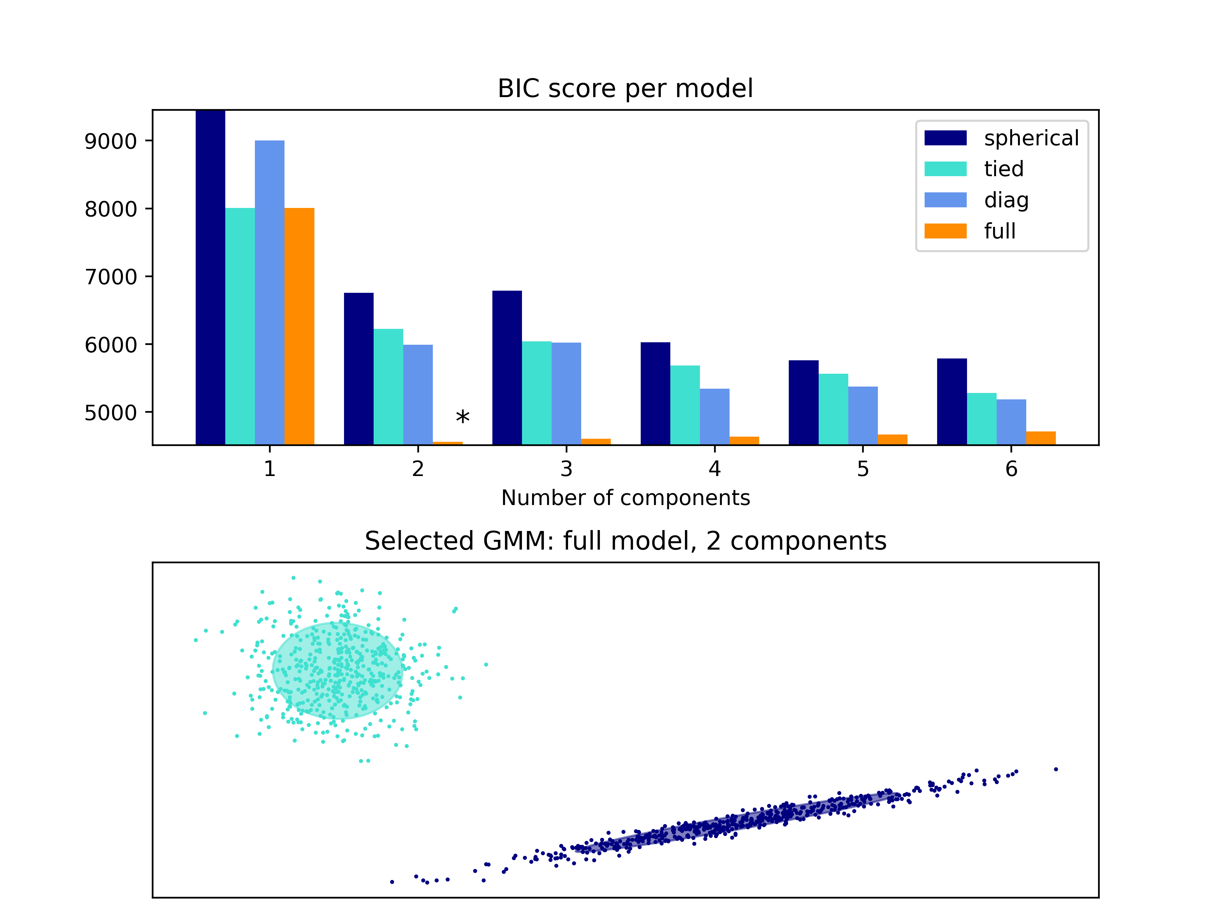
plt.show()实例运行结果如下图所示:
- 展示了生成的图像,其中第一个子图展示了不同模型的 BIC 分数,第二个子图展示了选择的最佳 GMM 模型的散点图和椭圆。
04-GMM协方差
在高斯混合模型(Gaussian Mixture Model, GMM)中,协方差矩阵描述了数据在每个高斯成分内部的分布形状,并反映了特征之间的相关性。GMM 的协方差矩阵可以根据不同的类型进行建模,包括以下几种常见类型:
Spherical(球形协方差):
- 在球形协方差模型下,每个高斯成分都具有相同的方差,但是各个特征之间可能存在不同的相关性。
- 球形协方差假设数据在每个方向上的方差都相等,各个方向相互独立。
- 这种模型适用于各个特征的方差相近,且数据在各个方向的分布情况相似的情况。
Tied(通用协方差):
- 在通用协方差模型下,所有高斯成分共享同一个协方差矩阵。
- 通用协方差假设所有高斯成分都具有相同的协方差结构,但是可以捕捉到不同成分之间特征之间的相关性。
- 这种模型比球形协方差更一般化,可以更灵活地拟合数据中不同成分之间的相关性。
Diag(对角协方差):
- 在对角协方差模型下,每个高斯成分具有一个对角协方差矩阵,其中非对角元素为零。
- 对角协方差假设数据在不同特征之间是独立分布的,但在同一特征上存在协方差。
- 这种模型适用于特征之间的协方差主要来源于同一特征的不同取值,而不是不同特征之间的相关性。
Full(完全协方差):
- 在完全协方差模型下,允许每个高斯成分具有各自独立的协方差矩阵。
- 完全协方差能够捕捉到任意两个特征之间的相关性,并更加灵活地拟合数据的复杂结构。
- 这种模型最为一般化,适用于数据特征之间存在复杂的相关性和协变化的情况。
在选择 GMM 模型的协方差类型时,需要考虑数据的特点和结构,以及对模型灵活性和复杂性的要求。不同的协方差类型对模型的拟合能力和泛化能力具有不同的影响,因此在实际应用中需要根据具体问题进行选择。
具体代码实例如下:这段代码主要实现了使用高斯混合模型(Gaussian Mixture Model, GMM)对鸢尾花数据集(iris dataset)进行分类,并可视化各个类别的分布情况。以下是对代码的详细解释:
-
首先导入必要的库和模块:
matplotlib:用于绘图。numpy:用于数值计算。datasets、GaussianMixture和StratifiedKFold:分别来自scikit-learn库,用于加载数据集、构建高斯混合模型以及数据的分层交叉验证。
-
加载鸢尾花数据集 iris,并定义颜色列表 colors。
-
自定义函数 make_ellipses 用于在图中绘制各个高斯混合成分的椭圆。
-
利用数据集进行训练集和测试集的划分。
-
构建不同协方差类型(‘spherical’, ‘diag’, ‘tied’, ‘full’)的高斯混合模型估计器。
-
循环遍历不同协方差类型的高斯混合模型估计器,并进行训练、绘制椭圆、绘制数据点等操作。
-
在每个子图中绘制了各个类别的数据点,以及测试集数据点的标记。
-
计算并展示了训练集和测试集的准确率。
-
最后展示了生成的图像并保存为 5.png 文件。
import matplotlib as mpl
import matplotlib.pyplot as plt
import numpy as np
from sklearn import datasets
from sklearn.mixture import GaussianMixture
from sklearn.model_selection import StratifiedKFold
print(__doc__)
colors = ['navy', 'turquoise', 'darkorange']
def make_ellipses(gmm, ax):
for n, color in enumerate(colors):
if gmm.covariance_type == 'full':
covariances = gmm.covariances_[n][:2, :2]
elif gmm.covariance_type == 'tied':
covariances = gmm.covariances_[:2, :2]
elif gmm.covariance_type == 'diag':
covariances = np.diag(gmm.covariances_[n][:2])
elif gmm.covariance_type == 'spherical':
covariances = np.eye(gmm.means_.shape[1]) * gmm.covariances_[n]
v, w = np.linalg.eigh(covariances)
u = w[0] / np.linalg.norm(w[0])
angle = np.arctan2(u[1], u[0])
angle = 180 * angle / np.pi # convert to degrees
v = 2. * np.sqrt(2.) * np.sqrt(v)
ell = mpl.patches.Ellipse(gmm.means_[n, :2], v[0], v[1],
180 + angle, color=color)
ell.set_clip_box(ax.bbox)
ell.set_alpha(0.5)
ax.add_artist(ell)
ax.set_aspect('equal', 'datalim')
iris = datasets.load_iris()
# Break up the dataset into non-overlapping training (75%) and testing
# (25%) sets.
skf = StratifiedKFold(n_splits=4)
# Only take the first fold.
train_index, test_index = next(iter(skf.split(iris.data, iris.target)))
X_train = iris.data[train_index]
y_train = iris.target[train_index]
X_test = iris.data[test_index]
y_test = iris.target[test_index]
n_classes = len(np.unique(y_train))
# Try GMMs using different types of covariances.
estimators = {cov_type: GaussianMixture(n_components=n_classes,
covariance_type=cov_type, max_iter=20, random_state=0)
for cov_type in ['spherical', 'diag', 'tied', 'full']}
n_estimators = len(estimators)
plt.figure(figsize=(3 * n_estimators // 2, 6))
plt.subplots_adjust(bottom=.01, top=0.95, hspace=.15, wspace=.05,
left=.01, right=.99)
for index, (name, estimator) in enumerate(estimators.items()):
# Since we have class labels for the training data, we can
# initialize the GMM parameters in a supervised manner.
estimator.means_init = np.array([X_train[y_train == i].mean(axis=0)
for i in range(n_classes)])
# Train the other parameters using the EM algorithm.
estimator.fit(X_train)
h = plt.subplot(2, n_estimators // 2, index + 1)
make_ellipses(estimator, h)
for n, color in enumerate(colors):
data = iris.data[iris.target == n]
plt.scatter(data[:, 0], data[:, 1], s=0.8, color=color,
label=iris.target_names[n])
# Plot the test data with crosses
for n, color in enumerate(colors):
data = X_test[y_test == n]
plt.scatter(data[:, 0], data[:, 1], marker='x', color=color)
y_train_pred = estimator.predict(X_train)
train_accuracy = np.mean(y_train_pred.ravel() == y_train.ravel()) * 100
plt.text(0.05, 0.9, 'Train accuracy: %.1f' % train_accuracy,
transform=h.transAxes)
y_test_pred = estimator.predict(X_test)
test_accuracy = np.mean(y_test_pred.ravel() == y_test.ravel()) * 100
plt.text(0.05, 0.8, 'Test accuracy: %.1f' % test_accuracy,
transform=h.transAxes)
plt.xticks(())
plt.yticks(())
plt.title(name)
plt.legend(scatterpoints=1, loc='lower right', prop=dict(size=12))
plt.savefig("../5.png", dpi=500)
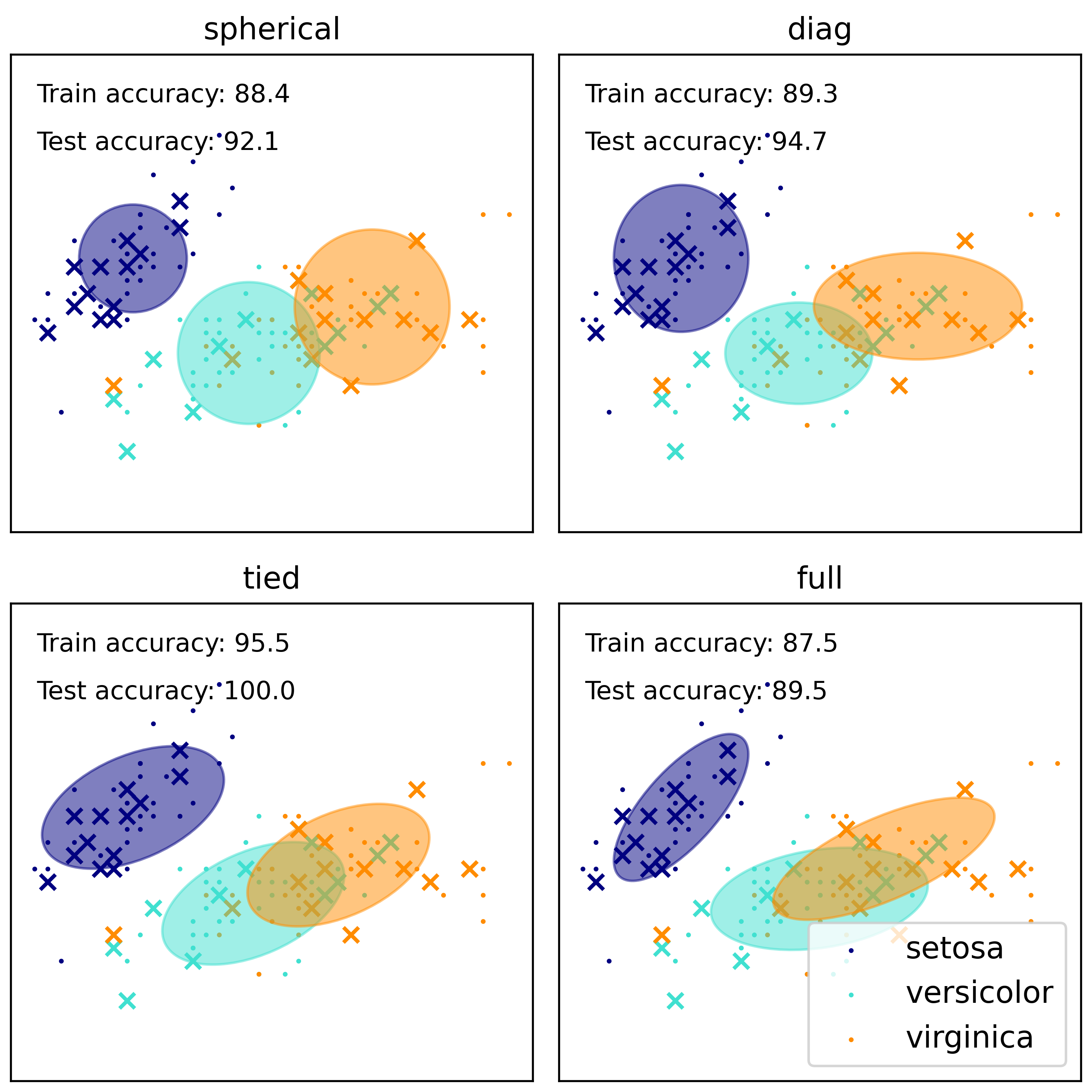
plt.show()实例运行结果如下图所示:
- 图中展示了不同协方差类型的高斯混合模型对鸢尾花数据集进行分类的结果。
- 每种颜色代表一个类别,展示了各个类别在特征空间中的分布情况。
- 椭圆表示了每个高斯成分的分布范围,可以看出不同成分在空间中的覆盖情况。
- 数据点根据类别进行了不同颜色的标记,可以直观地看出模型的分类效果。
- 每个子图中显示了训练集和测试集的准确率,评估了模型的性能表现。
05-高斯混合模型正弦曲线
高斯混合模型(Gaussian Mixture Model, GMM)是一种通过将多个高斯分布函数组合成混合模型来建模数据分布的统计模型。它通常用于聚类分析和密度估计,以及在概率模型中进行概率密度函数的拟合。正弦曲线在这里不是 GMM 的标准用法,但可以作为一种示例来说明 GMM 的概念。
假设我们有一个包含多个正弦曲线的数据集,每个正弦曲线对应数据集中的一个分布。使用 GMM,我们可以对这些正弦曲线进行建模,通过组合多个高斯分布来拟合数据的复杂分布。
具体来说,对于包含正弦曲线的数据集,我们可以假设每个正弦曲线对应一个高斯分布成分,且整个数据集由多个高斯分布成分的线性叠加组成。通过调整每个高斯分布成分的均值、方差和权重(表示每个成分在整个数据集中的占比),可以使用 GMM 来拟合数据并对其进行建模。
在拟合正弦曲线的数据时,GMM 可以帮助我们发现数据中存在的潜在分布,并为每个分布估计出均值和方差,进而得到对数据分布的更准确的描述。通过调整 GMM 的参数,比如成分数量和协方差类型,我们可以更好地适应不同形状的正弦曲线数据,从而实现对数据的有效建模和分析。
总的来说,GMM 在正弦曲线建模中的应用可以帮助我们解决复杂数据分布的拟合和分析问题,同时也展示了 GMM 作为一种灵活且功能强大的统计模型在多样化数据集分析中的潜力。
具体代码示例如下:这段代码是一个用于演示如何使用高斯混合模型(Gaussian Mixture Model, GMM)对包含正弦曲线的数据进行建模和可视化的 Python 代码。
首先,代码导入了所需的库,包括 numpy、scipy、matplotlib 和 sklearn 中的 mixture 模块。然后定义了一些辅助函数和变量,如 color_iter 用于循环生成颜色,plot_results 和 plot_samples 用于绘制数据点和拟合的高斯分布。
接着,代码生成包含正弦曲线数据的样本集合 X。数据集中的每个点都沿着正弦曲线生成,同时添加了一些噪声。然后通过 GaussianMixture 和 BayesianGaussianMixture 对象,分别使用 EM 算法和贝叶斯高斯混合模型对数据集进行拟合,并绘制出拟合结果。
import itertools
import numpy as np
from scipy import linalg
import matplotlib.pyplot as plt
import matplotlib as mpl
from sklearn import mixture
print(__doc__)
color_iter = itertools.cycle(['navy', 'c', 'cornflowerblue', 'gold',
'darkorange'])
def plot_results(X, Y, means, covariances, index, title):
splot = plt.subplot(5, 1, 1 + index)
for i, (mean, covar, color) in enumerate(zip(
means, covariances, color_iter)):
v, w = linalg.eigh(covar)
v = 2. * np.sqrt(2.) * np.sqrt(v)
u = w[0] / linalg.norm(w[0])
# as the DP will not use every component it has access to
# unless it needs it, we shouldn't plot the redundant
# components.
if not np.any(Y == i):
continue
plt.scatter(X[Y == i, 0], X[Y == i, 1], .8, color=color)
# Plot an ellipse to show the Gaussian component
angle = np.arctan(u[1] / u[0])
angle = 180. * angle / np.pi # convert to degrees
ell = mpl.patches.Ellipse(mean, v[0], v[1], 180. + angle, color=color)
ell.set_clip_box(splot.bbox)
ell.set_alpha(0.5)
splot.add_artist(ell)
plt.xlim(-6., 4. * np.pi - 6.)
plt.ylim(-5., 5.)
plt.title(title)
plt.xticks(())
plt.yticks(())
def plot_samples(X, Y, n_components, index, title):
plt.subplot(5, 1, 4 + index)
for i, color in zip(range(n_components), color_iter):
# as the DP will not use every component it has access to
# unless it needs it, we shouldn't plot the redundant
# components.
if not np.any(Y == i):
continue
plt.scatter(X[Y == i, 0], X[Y == i, 1], .8, color=color)
plt.xlim(-6., 4. * np.pi - 6.)
plt.ylim(-5., 5.)
plt.title(title)
plt.xticks(())
plt.yticks(())
# Parameters
n_samples = 100
# Generate random sample following a sine curve
np.random.seed(0)
X = np.zeros((n_samples, 2))
step = 4. * np.pi / n_samples
for i in range(X.shape[0]):
x = i * step - 6.
X[i, 0] = x + np.random.normal(0, 0.1)
X[i, 1] = 3. * (np.sin(x) + np.random.normal(0, .2))
plt.figure(figsize=(10, 10))
plt.subplots_adjust(bottom=.04, top=0.95, hspace=.2, wspace=.05,
left=.03, right=.97)
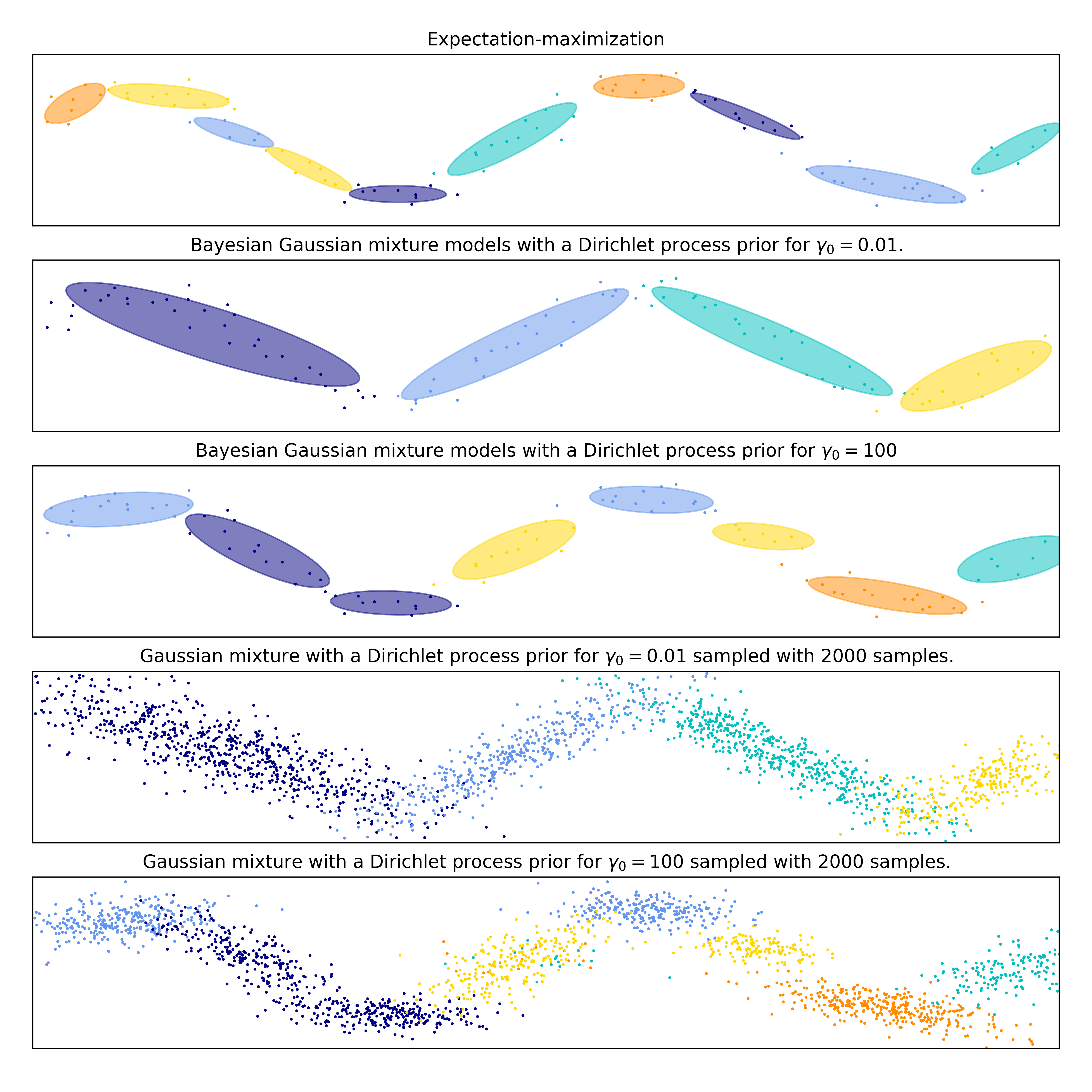
# Fit a Gaussian mixture with EM using ten components
gmm = mixture.GaussianMixture(n_components=10, covariance_type='full',
max_iter=100).fit(X)
plot_results(X, gmm.predict(X), gmm.means_, gmm.covariances_, 0,
'Expectation-maximization')
dpgmm = mixture.BayesianGaussianMixture(
n_components=10, covariance_type='full', weight_concentration_prior=1e-2,
weight_concentration_prior_type='dirichlet_process',
mean_precision_prior=1e-2, covariance_prior=1e0 * np.eye(2),
init_params="random", max_iter=100, random_state=2).fit(X)
plot_results(X, dpgmm.predict(X), dpgmm.means_, dpgmm.covariances_, 1,
"Bayesian Gaussian mixture models with a Dirichlet process prior "
r"for $\gamma_0=0.01$.")
X_s, y_s = dpgmm.sample(n_samples=2000)
plot_samples(X_s, y_s, dpgmm.n_components, 0,
"Gaussian mixture with a Dirichlet process prior "
r"for $\gamma_0=0.01$ sampled with $2000$ samples.")
dpgmm = mixture.BayesianGaussianMixture(
n_components=10, covariance_type='full', weight_concentration_prior=1e+2,
weight_concentration_prior_type='dirichlet_process',
mean_precision_prior=1e-2, covariance_prior=1e0 * np.eye(2),
init_params="kmeans", max_iter=100, random_state=2).fit(X)
plot_results(X, dpgmm.predict(X), dpgmm.means_, dpgmm.covariances_, 2,
"Bayesian Gaussian mixture models with a Dirichlet process prior "
r"for $\gamma_0=100$")
X_s, y_s = dpgmm.sample(n_samples=2000)
plot_samples(X_s, y_s, dpgmm.n_components, 1,
"Gaussian mixture with a Dirichlet process prior "
r"for $\gamma_0=100$ sampled with $2000$ samples.")
plt.savefig("../5.png", dpi=500)
plt.show()示例运行结果如下图所示:绘制了三幅图像:第一幅图显示了使用 EM 算法拟合的高斯混合模型的结果,第二幅图显示了使用贝叶斯高斯混合模型拟合的结果(参数 gamma_0=0.01),第三幅图显示了另一组参数下的贝叶斯高斯混合模型拟合结果(参数 gamma_0=100)。同时,每幅图还展示了数据点的分布和拟合的高斯分布。
06-变体贝叶斯高斯混合的聚集优先类型分析
变分贝叶斯方法是一种用于估计概率模型中参数和潜在变量后验分布的方法。在高斯混合模型(Gaussian Mixture Model, GMM)中,变分贝叶斯方法的一个常见变体是变分贝叶斯高斯混合模型(Variational Bayesian Gaussian Mixture Model, VB-GMM)。VB-GMM 在对 GMM 进行参数估计时引入了一种贝叶斯观点,并通过最大化变分下界来实现对参数和潜在变量的更准确估计。
在 VB-GMM 中,我们可以进一步引入聚集优先类型(Concentration priors)来调整模型复杂度和灵活性。聚集优先类型在贝叶斯统计中用于控制混合模型中成分的数量,从而实现自动确定模型的复杂度,避免过拟合和提高模型的泛化能力。聚集优先类型的一个常见参数是 Dirichlet 过程(Dirichlet Process, DP),它可以根据数据来确定模型中需要多少个组分。
具体来说,当我们在 VB-GMM 中引入聚集优先类型时,我们可以通过调整聚集优先类型的参数来影响模型对成分数量的估计。比如,增加聚集优先类型的参数值可以鼓励模型拟合出更多的成分,而减少参数值则可以促使模型更倾向于较少的成分,这样可以更好地适应数据集的复杂性。
总的来说,使用聚集优先类型的 VB-GMM 模型可以帮助我们在不完全事先确定成分数量的情况下,有效地估计数据分布的模型参数,并自动调整模型的复杂度,从而更好地处理数据集中的潜在结构。这种方法在机器学习和统计建模中具有重要的应用,并为我们提供了一种灵活而强大的工具,可以有效地应对多样化和复杂的数据分布。
具体代码示例如下,这段代码主要是使用 sklearn 中的贝叶斯高斯混合模型(BayesianGaussianMixture)来生成一个具有不同聚焦优先类型的高斯混合模型,并展示模型拟合后的结果。
首先,程序定义了一个名为plot_ellipses的函数,用来绘制每个高斯混合分量对应的椭圆,同时根据权重、均值和协方差来调整椭圆的大小、方向和位置。
接着定义了一个名为plot_results的函数,用来展示模型拟合后的数据点分布和每个成分的权重情况。函数还包括了两个子图,左边展示了数据点的分布和每个成分的椭圆,右边展示了每个成分的权重情况。
在生成数据集之后,代码通过两种不同的聚焦优先类型(有限混合和无限混合)来初始化两个不同的贝叶斯高斯混合模型,并对数据集进行拟合。随后,根据不同的聚焦优先类型参数,调用plot_results函数展示了两种模型拟合的结果。
import numpy as np
import matplotlib as mpl
import matplotlib.pyplot as plt
import matplotlib.gridspec as gridspec

from sklearn.mixture import BayesianGaussianMixture

print(__doc__)


def plot_ellipses(ax, weights, means, covars):
    for n in range(means.shape[0]):
        eig_vals, eig_vecs = np.linalg.eigh(covars[n])
        unit_eig_vec = eig_vecs[0] / np.linalg.norm(eig_vecs[0])
        angle = np.arctan2(unit_eig_vec[1], unit_eig_vec[0])
        # Ellipse needs degrees
        angle = 180 * angle / np.pi
        # eigenvector normalization
        eig_vals = 2 * np.sqrt(2) * np.sqrt(eig_vals)
        ell = mpl.patches.Ellipse(means[n], eig_vals[0], eig_vals[1],
                                  180 + angle, edgecolor='black')
        ell.set_clip_box(ax.bbox)
        ell.set_alpha(weights[n])
        ell.set_facecolor('#56B4E9')
        ax.add_artist(ell)


def plot_results(ax1, ax2, estimator, X, y, title, plot_title=False):
    ax1.set_title(title)
    ax1.scatter(X[:, 0], X[:, 1], s=5, marker='o', color=colors[y], alpha=0.8)
    ax1.set_xlim(-2., 2.)
    ax1.set_ylim(-3., 3.)
    ax1.set_xticks(())
    ax1.set_yticks(())
    plot_ellipses(ax1, estimator.weights_, estimator.means_,
                  estimator.covariances_)

    ax2.get_xaxis().set_tick_params(direction='out')
    ax2.yaxis.grid(True, alpha=0.7)
    for k, w in enumerate(estimator.weights_):
        ax2.bar(k, w, width=0.9, color='#56B4E9', zorder=3,
                align='center', edgecolor='black')
        ax2.text(k, w + 0.007, "%.1f%%" % (w * 100.),
                 horizontalalignment='center')
    ax2.set_xlim(-.6, 2 * n_components - .4)
    ax2.set_ylim(0., 1.1)
    ax2.tick_params(axis='y', which='both', left=False,
                    right=False, labelleft=False)
    ax2.tick_params(axis='x', which='both', top=False)

    if plot_title:
        ax1.set_ylabel('Estimated Mixtures')
        ax2.set_ylabel('Weight of each component')

# Parameters of the dataset
random_state, n_components, n_features = 2, 3, 2
colors = np.array(['#0072B2', '#F0E442', '#D55E00'])

covars = np.array([[[.7, .0], [.0, .1]],
                   [[.5, .0], [.0, .1]],
                   [[.5, .0], [.0, .1]]])
samples = np.array([200, 500, 200])
means = np.array([[.0, -.70],
                  [.0, .0],
                  [.0, .70]])

# mean_precision_prior= 0.8 to minimize the influence of the prior
estimators = [
    ("Finite mixture with a Dirichlet distribution\nprior and "
     r"$\gamma_0=$", BayesianGaussianMixture(
        weight_concentration_prior_type="dirichlet_distribution",
        n_components=2 * n_components, reg_covar=0, init_params='random',
        max_iter=1500, mean_precision_prior=.8,
        random_state=random_state), [0.001, 1, 1000]),
    ("Infinite mixture with a Dirichlet process\n prior and" r"$\gamma_0=$",
     BayesianGaussianMixture(
        weight_concentration_prior_type="dirichlet_process",
        n_components=2 * n_components, reg_covar=0, init_params='random',
        max_iter=1500, mean_precision_prior=.8,
        random_state=random_state), [1, 1000, 100000])]

# Generate data
rng = np.random.RandomState(random_state)
X = np.vstack([
    rng.multivariate_normal(means[j], covars[j], samples[j])
    for j in range(n_components)])
y = np.concatenate([np.full(samples[j], j, dtype=int)
                    for j in range(n_components)])

# Plot results in two different figures
for (title, estimator, concentrations_prior) in estimators:
    plt.figure(figsize=(4.7 * 3, 8))
    plt.subplots_adjust(bottom=.04, top=0.90, hspace=.05, wspace=.05,
                        left=.03, right=.99)

    gs = gridspec.GridSpec(3, len(concentrations_prior))
    for k, concentration in enumerate(concentrations_prior):
        estimator.weight_concentration_prior = concentration
        estimator.fit(X)
        plot_results(plt.subplot(gs[0:2, k]), plt.subplot(gs[2, k]), estimator,
                     X, y, r"%s$%.1e$" % (title, concentration),
                     plot_title=k == 0)
plt.savefig("../5.png", dpi=500)
plt.show()
示例运行结果如下图所示: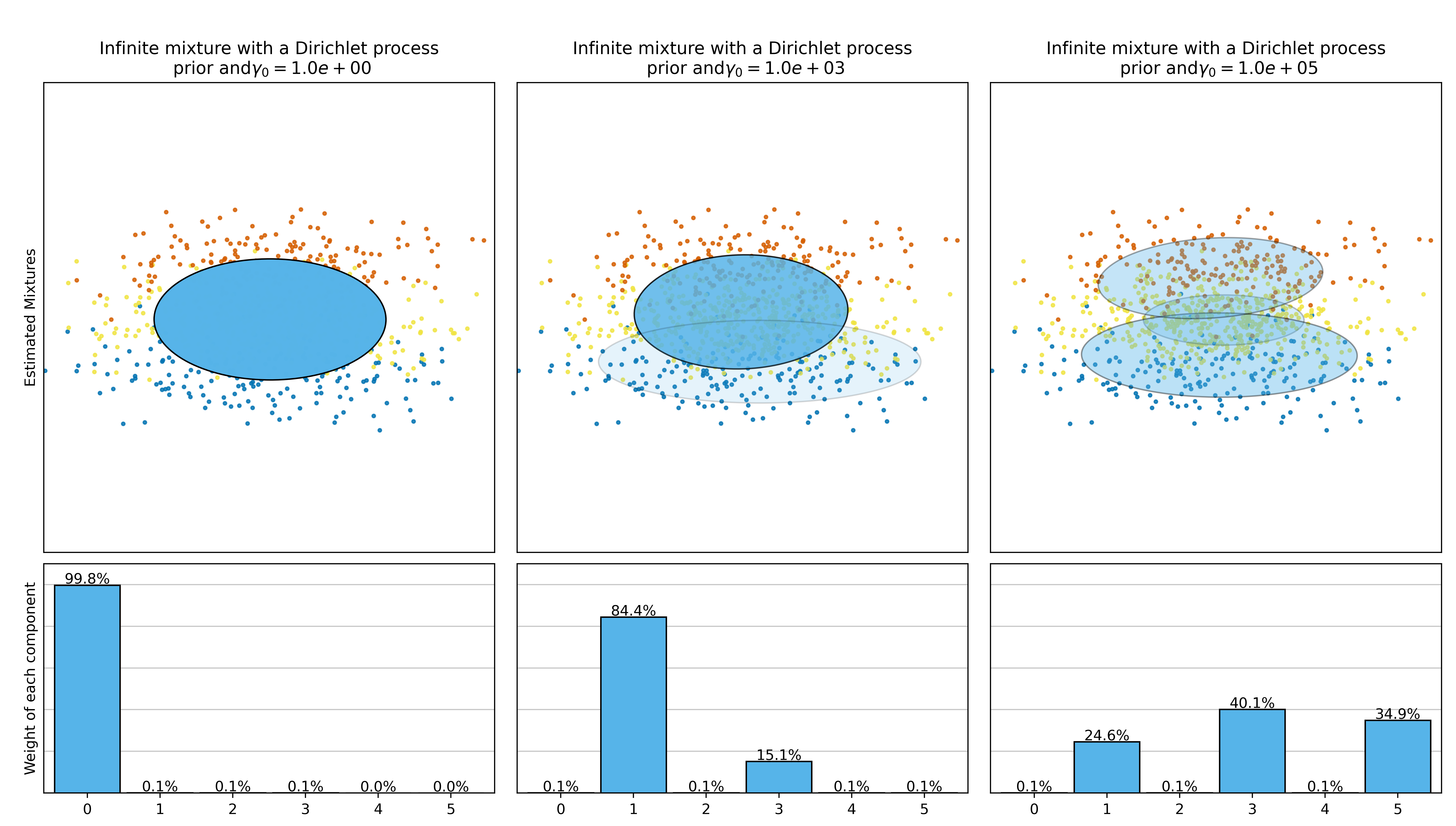
总结
Scikit-Learn 中的高斯混合模型 (Gaussian Mixture Models, GMM) 可以在 sklearn.mixture 模块中找到。以下是关于这个模块的一些重要总结:
GaussianMixture 类:
- GaussianMixture 类实现了高斯混合模型。
- 通过指定的参数,如成分数量、协方差类型(full、tied、diag、spherical)、初始化策略、收敛阈值等,可以创建一个 GMM 对象。
fit 方法:
- fit 方法用于拟合数据,即对数据进行聚类并学习模型参数。
- 可以使用样本数据作为输入,这些样本数据将被用于拟合。
predict 方法:
- predict 方法用于为新数据点分配簇标签。
- 可以根据拟合后的模型,预测新数据点属于哪个成分。
属性:
- weights_:每个混合成分的权重。
- means_:每个混合成分的均值。
- covariances_:每个混合成分的协方差矩阵。
参数:
- n_components:指定混合模型中的成分数量。
- covariance_type:协方差矩阵的类型,可以是 “full”(完全协方差矩阵)、“tied”(相同的协方差矩阵)、“diag”(对角协方差矩阵)、“spherical”(球形协方差矩阵)。
- init_params:指定初始化参数的策略,可以是 “kmeans”、“random” 或者指定初始均值和协方差。
- max_iter:最大迭代次数。
- tol:收敛阈值。
调优:
- 可以通过调整上述参数来优化模型的性能和拟合效果。
- 可以使用交叉验证等技术来选择最佳的超参数。
应用:
- GMM 可以用于聚类、密度估计、异常检测等任务中。
- 在数据中存在多个簇或者高斯分布时,GMM 是一个有效的建模工具。
综上所述,sklearn.mixture 模块提供了一个方便且强大的工具,用于实现高斯混合模型,并通过拟合数据来对数据进行聚类和模式识别。通过合理设置参数并结合适当的数据预处理和模型评估,可以有效利用 GMM 解决各种机器学习问题。


 621
621

 被折叠的 条评论
为什么被折叠?
被折叠的 条评论
为什么被折叠?
 到【灌水乐园】发言


