


声明:文章是从本人公众号中复制而来,因此,想最新最快了解各类算法的家人,可关注我的VX公众号:python算法小当家,不定期会有很多免费代码分享~
目录
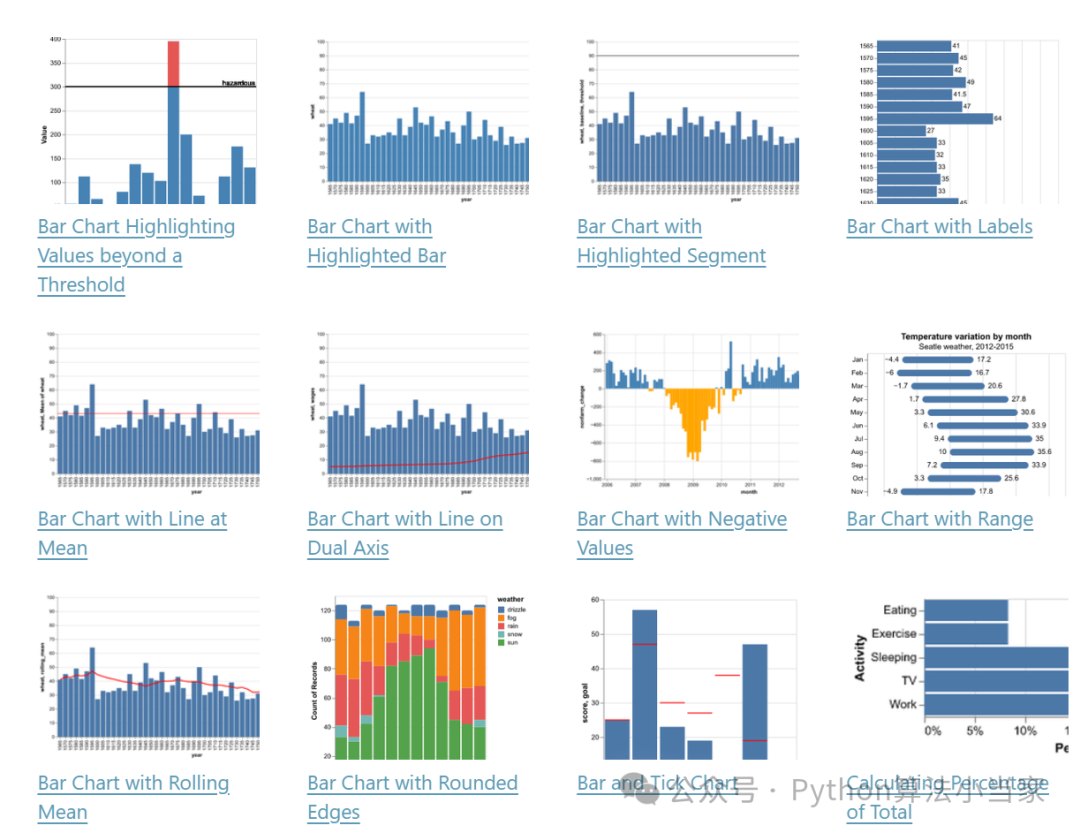
Python库Altair实现精美SCI论文插图制作代码分享!!!
Altair是一个基于Python的声明性统计可视化库,专注于简洁的语法和美观的默认设置。它是基于Vega和Vega-Lite构建的,能够快速生成复杂的图表。与Matplotlib 和Seaborn相比,Altair 更注重统计特征。Altair凭借其强大而简洁的可视化语法,可快速构建各种可视化效果。
下面以几种常见的图为例,进行可视化分享。
完整免费代码,关注VX公众号:Python算法小当家 | 后台回复关键词Altair
01 散点图
代码展示
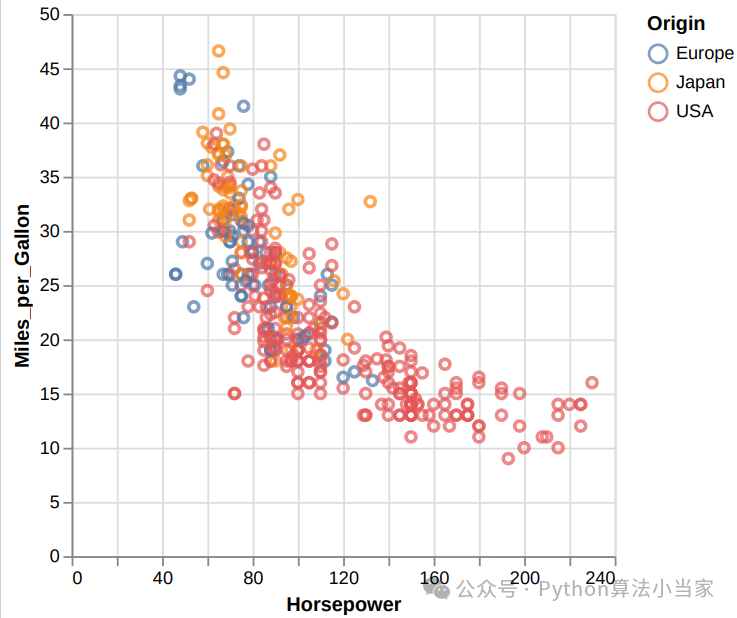
import altair as altfrom vega_datasets import data # 生成示例数据source = data.cars()# 绘制散点图chart = alt.Chart(source).mark_point().encode(x='Horsepower',y='Miles_per_Gallon',color='Origin',)# 保存为HTML文件chart.save('chart.html')# 打开HTML文件import webbrowserwebbrowser.open('chart.html')
代码说明
生成示例数据:使用Vega Datasets中的汽车数据集。
绘制散点图:使用Altair生成散点图,X轴为马力,Y轴为每加仑行驶里程,颜色根据产地进行编码,并添加工具提示显示详细信息。
保存为HTML文件:将生成的图表保存为HTML文件。
打开HTML文件:使用默认浏览器打开保存的HTML文件。
下图为一个包含不同产地汽车的马力与每加仑行驶里程关系的散点图,并将其保存为HTML文件,然后在默认浏览器中打开。这个图表使用不同颜色表示汽车的产地,并包含工具提示,显示具体的汽车名称、马力和每加仑行驶里程,使得图表更加直观和信息丰富。如果需要进一步调整,可以修改代码中的参数和配置。
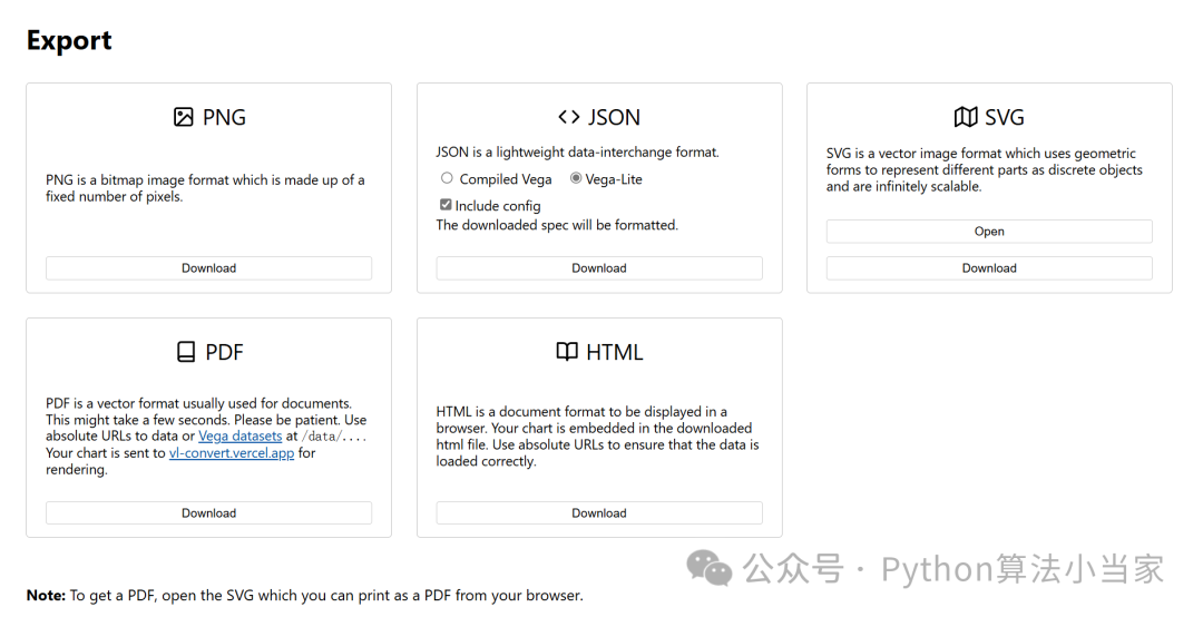
图片保存
运行上述代码会自动跳转浏览器显示所作图,这里我们可以点击右上角的选项,可以选择保存图为SVG、PNG等格式,非常方便。
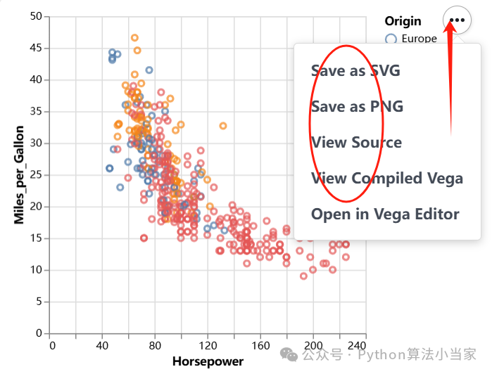
最能体现其交互性高的操作是,我们可以点击Open in Vega Editor选项进入后台编辑界面。如下图,左侧为可编辑的代码区,可以按个人需求调整图片细节,调整后的图会实时显示在左侧。
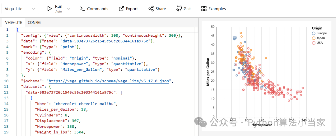
点击后台编辑界面Export,可以将图片保存更多种格式的文件。
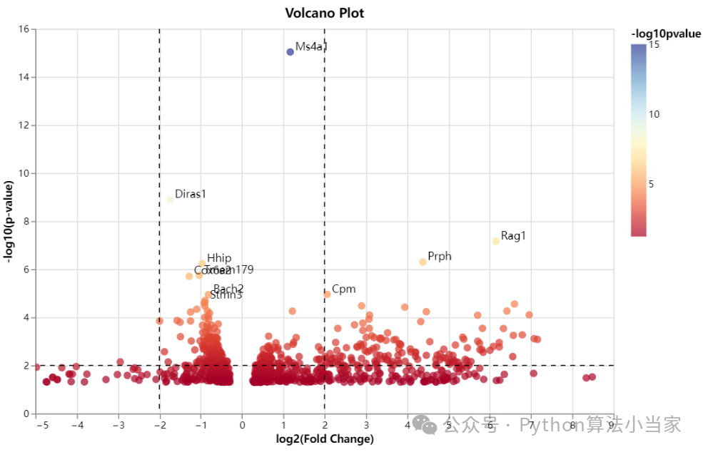
02 火山图
代码展示
import pandas as pdimport numpy as npimport altair as alt # 读取数据data = pd.read_csv('volcano.csv')# 转换P值为-log10data['-log10pvalue'] = -np.log10(data['padj'])# 标记前10个显著基因top_genes = data.nlargest(10, '-log10pvalue')# 基础火山图base = alt.Chart(data).mark_circle(size=60).encode(x=alt.X('log2FoldChange', axis=alt.Axis(title='log2(Fold Change)')),y=alt.Y('-log10pvalue', axis=alt.Axis(title='-log10(p-value)')),color=alt.Color('-log10pvalue', scale=alt.Scale(scheme='redyellowblue')),tooltip=['gene_name', 'log2FoldChange', '-log10pvalue']).properties(width=600,height=400,title='Volcano Plot').interactive()# 添加虚线lines = alt.Chart(pd.DataFrame({'log2FoldChange': [-2, 2], '-log10pvalue': [2, 2]})).mark_rule(strokeDash=[5,5]).encode(x='log2FoldChange:Q').interactive()hline = alt.Chart(pd.DataFrame({'y': [2]})).mark_rule(strokeDash=[5,5]).encode(y='y:Q')# 标注前10个显著基因text = alt.Chart(top_genes).mark_text(align='left', dx=5, dy=-5).encode(x='log2FoldChange',y='-log10pvalue',text='gene_name')# 组合图表volcano_plot = base + lines + hline + text# 保存为HTML文件并打开volcano_plot.save('volcano_plot.html')import webbrowserwebbrowser.open('volcano_plot.html')
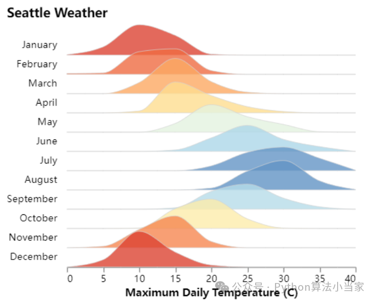
03 山脊图
代码展示
# 设置步长和重叠step = 20overlap = 1# 创建图表chart = alt.Chart(source, height=step).transform_timeunit(Month='month(date)').transform_joinaggregate(mean_temp='mean(temp_max)', groupby=['Month']).transform_bin(['bin_max', 'bin_min'], 'temp_max').transform_aggregate(value='count()', groupby=['Month', 'mean_temp', 'bin_min', 'bin_max']).transform_impute(impute='value', groupby=['Month', 'mean_temp'], key='bin_min', value=0).mark_area(interpolate='monotone',fillOpacity=0.8,stroke='lightgray',strokeWidth=0.5).encode(alt.X('bin_min:Q').bin('binned').title('Maximum Daily Temperature (C)'),alt.Y('value:Q').axis(None).scale(range=[step, -step * overlap]),alt.Fill('mean_temp:Q').legend(None).scale(domain=[5, 30], scheme='redyellowblue')).facet(row=alt.Row('Month:T').title(None).header(labelAngle=0, labelAlign='left', format='%B')).properties(title='Seattle Weather',bounds='flush').configure_facet(spacing=0).configure_view(stroke=None).configure_title(anchor='start')# 保存为HTML文件并打开chart.save('seattle_weather.html', embed_options={'actions': False})import webbrowserwebbrowser.open('seattle_weather.html')
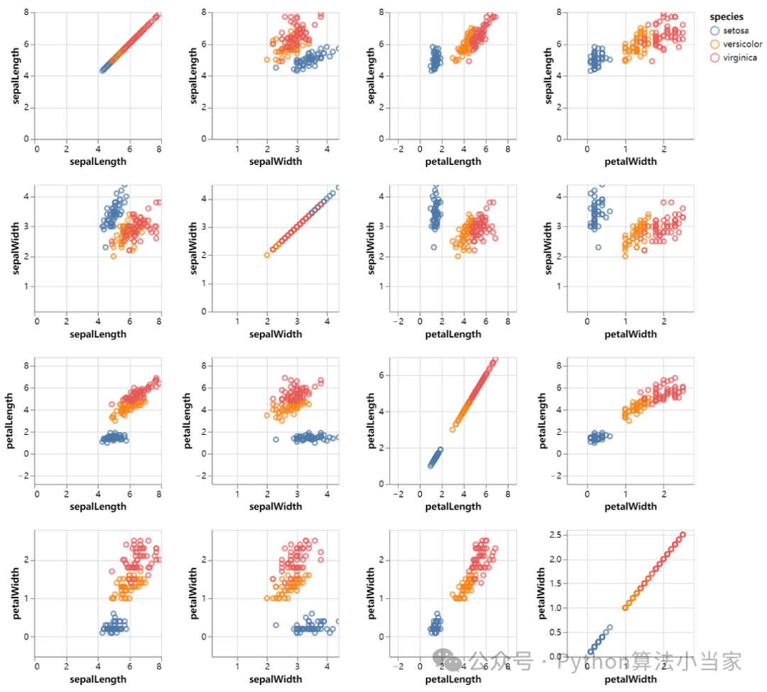
04 散点矩阵图
代码展示
# 创建散点图矩阵scatter_matrix = alt.Chart(iris).mark_point().encode(alt.X(alt.repeat("column"), type='quantitative'),alt.Y(alt.repeat("row"), type='quantitative'),color='species:N').properties(width=150,height=150).repeat(row=['sepalLength', 'sepalWidth', 'petalLength', 'petalWidth'],column=['sepalLength', 'sepalWidth', 'petalLength', 'petalWidth']).interactive()# 保存为HTML文件scatter_matrix.save('scatter_matrix.html', embed_options={'actions': False})# 打开生成的HTML文件import webbrowserwebbrowser.open('scatter_matrix.html')
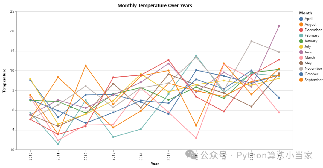
05 组合折线图
代码展示
# 创建折线图line_chart = alt.Chart(data).mark_line(point=True).encode(x=alt.X('Year:O', title='Year'),y=alt.Y('Temperature:Q', title='Temperature'),color='Month:N',tooltip=['Year', 'Month', 'Temperature']).properties(width=800,height=400,title='Monthly Temperature Over Years') # 保存为HTML文件并打开line_chart.save('line_chart.html')import webbrowserwebbrowser.open('line_chart.html')
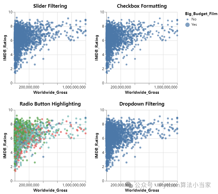
06 散点交互图
代码展示
# 加载数据并解析日期movies = alt.UrlData(data.movies.url,format=alt.DataFormat(parse={"Release_Date": "date"}))ratings = ['G', 'NC-17', 'PG', 'PG-13', 'R']genres = ['Action', 'Adventure', 'Black Comedy', 'Comedy','Concert/Performance', 'Documentary', 'Drama', 'Horror', 'Musical','Romantic Comedy', 'Thriller/Suspense', 'Western']# 基础图表base = alt.Chart(movies, width=200, height=200).mark_point(filled=True).transform_calculate(Rounded_IMDB_Rating="floor(datum.IMDB_Rating)",Big_Budget_Film="datum.Production_Budget > 100000000 ? 'Yes' : 'No'",Release_Year="year(datum.Release_Date)").transform_filter(alt.datum.IMDB_Rating > 0).transform_filter(alt.FieldOneOfPredicate(field='MPAA_Rating', oneOf=ratings)).encode(x=alt.X('Worldwide_Gross:Q').scale(domain=(100000, 10**9), clamp=True),y='IMDB_Rating:Q',tooltip="Title:N")# 滑块过滤器year_slider = alt.binding_range(min=1969, max=2018, step=1, name="Release Year")slider_selection = alt.selection_point(bind=year_slider, fields=['Release_Year'])filter_year = base.add_params(slider_selection).transform_filter(slider_selection).properties(title="Slider Filtering")# 下拉菜单过滤器genre_dropdown = alt.binding_select(options=genres, name="Genre")genre_select = alt.selection_point(fields=['Major_Genre'], bind=genre_dropdown)filter_genres = base.add_params(genre_select).transform_filter(genre_select).properties(title="Dropdown Filtering")# 单选按钮高亮rating_radio = alt.binding_radio(options=ratings, name="Rating")rating_select = alt.selection_point(fields=['MPAA_Rating'], bind=rating_radio)rating_color_condition = alt.condition(rating_select,alt.Color('MPAA_Rating:N').legend(None),alt.value('lightgray'))highlight_ratings = base.add_params(rating_select).encode(color=rating_color_condition).properties(title="Radio Button Highlighting")# 复选框格式更改input_checkbox = alt.binding_checkbox(name="Big Budget Films ")checkbox_selection = alt.param(bind=input_checkbox)size_checkbox_condition = alt.condition(checkbox_selection,alt.Size('Big_Budget_Film:N').scale(range=[25, 150]),alt.SizeValue(25))budget_sizing = base.add_params(checkbox_selection).encode(size=size_checkbox_condition).properties(title="Checkbox Formatting")# 组合图表final_chart = (filter_year | budget_sizing) & (highlight_ratings | filter_genres)# 显示图表final_chart.show()# 保存为HTML文件并打开final_chart.save('interactive_movie_chart.html', embed_options={'actions': False})import webbrowserwebbrowser.open('interactive_movie_chart.html')
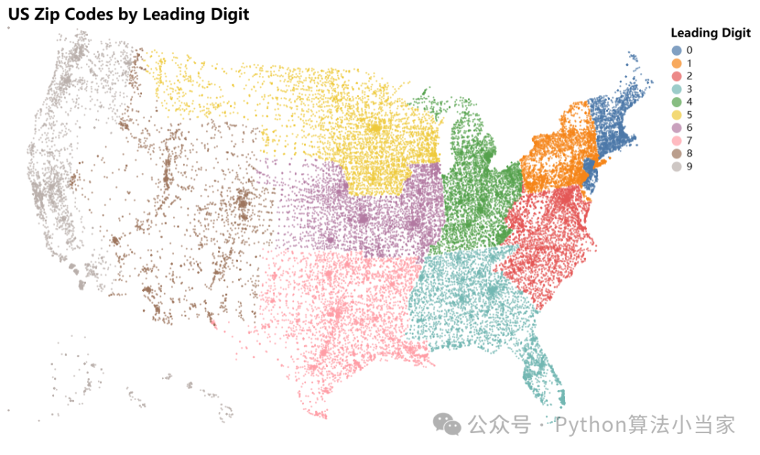
07 气泡地图
代码展示
# 创建地图图表map_chart = alt.Chart(source).transform_calculate("leading_digit", alt.expr.substring(alt.datum.zip_code, 0, 1)).mark_circle(size=3).encode(longitude='longitude:Q',latitude='latitude:Q',color=alt.Color('leading_digit:N', legend=alt.Legend(title='Leading Digit')),tooltip='zip_code:N').project(type='albersUsa').properties(width=650,height=400,title='US Zip Codes by Leading Digit').configure_legend(titleFontSize=12,labelFontSize=10).configure_title(fontSize=16,anchor='start')# 显示图表map_chart.show()# 保存为HTML文件并打开map_chart.save('us_zip_codes.html', embed_options={'actions': False})import webbrowserwebbrowser.open('us_zip_codes.html')
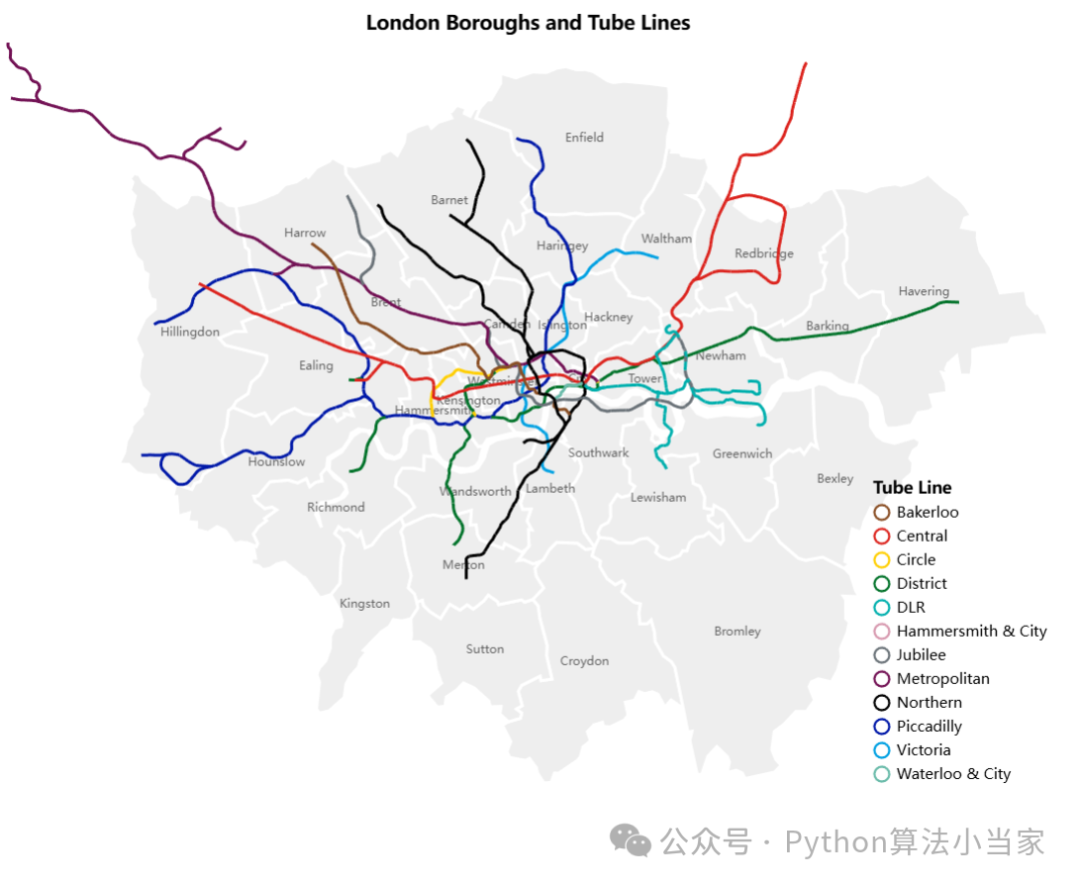
08 交通地图
代码展示
import altair as altfrom vega_datasets import data# 加载数据boroughs = alt.topo_feature(data.londonBoroughs.url, 'boroughs')tubelines = alt.topo_feature(data.londonTubeLines.url, 'line')centroids = data.londonCentroids.url# 创建背景图表background = alt.Chart(boroughs).mark_geoshape(stroke='white',strokeWidth=2).encode(color=alt.value('#eee'),).properties(width=700,height=500,title='London Boroughs and Tube Lines')# 创建标签图表labels = alt.Chart(centroids).mark_text().encode(longitude='cx:Q',latitude='cy:Q',text='bLabel:N',size=alt.value(8),opacity=alt.value(0.6)).transform_calculate(bLabel="indexof(datum.name, ' ') > 0 ? substring(datum.name, 0, indexof(datum.name, ' ')) : datum.name")# 创建颜色映射line_scale = alt.Scale(domain=["Bakerloo", "Central", "Circle", "District", "DLR","Hammersmith & City", "Jubilee", "Metropolitan", "Northern","Piccadilly", "Victoria", "Waterloo & City"],range=["rgb(137,78,36)", "rgb(220,36,30)", "rgb(255,206,0)","rgb(1,114,41)", "rgb(0,175,173)", "rgb(215,153,175)","rgb(106,114,120)", "rgb(114,17,84)", "rgb(0,0,0)","rgb(0,24,168)", "rgb(0,160,226)", "rgb(106,187,170)"])# 创建地铁线路图表lines = alt.Chart(tubelines).mark_geoshape(filled=False,strokeWidth=2).encode(alt.Color('id:N').title('Tube Line').legend(orient='bottom-right', offset=0).scale(line_scale))# 组合所有图表final_chart = background + labels + lines# 显示图表final_chart.show()# 保存为HTML文件并打开final_chart.save('london_boroughs_tube_lines.html', embed_options={'actions': False})import webbrowserwebbrowser.open('london_boroughs_tube_lines.html')
09 代码获取
关注VX公众号python算法小当家,后台回复关键字,即可获得完整代码
Altair
可后台回复需求定制模型,看到秒回


 347
347


 被折叠的 条评论
为什么被折叠?
被折叠的 条评论
为什么被折叠?
 到【灌水乐园】发言


