


XX.马尔可夫区制转换动态回归模型(Markov switching dynamic regression models).2.美国联邦基金的区制转换_具有转换截距(Federal funds rate with switching intercept)
文章目录
描述
将美国联邦利率在恒定截距附近随机变动(噪音),看作一个马尔可夫区制转换动态回归模型,恒定截距具有在不同区制下有一定规律变化的特点。模型如下:

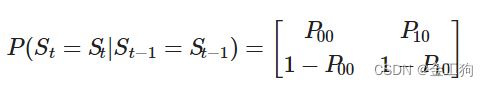
区制转换规则根据:
我们将用最大似然法估计该模型的参数:
此模型案例的数据来源:美国联邦基金的区制转换案例数据来源
用法
参数
代码①
#pip install pandas_datareader
%matplotlib inline

import numpy as np
import pandas as pd
import statsmodels.api as sm
import matplotlib.pyplot as plt

#Get the federal funds rate data
#载美国联邦基金数据
from statsmodels.tsa.regime_switching.tests.test_markov_regression import fedfunds

dta_fedfunds = pd.Series(
    fedfunds, index=pd.date_range("1954-07-01", "2010-12-31", freq="QS")
)
# Plot the data
dta_fedfunds.plot(title="Federal funds rate", figsize=(12, 3))
结果①
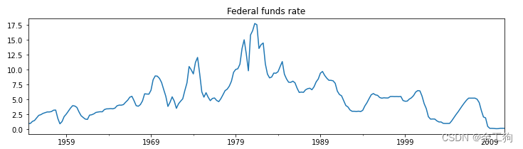
从《图:Federal funds rate》,我们可以看出美国联邦基金在不同时期的利率变化。我们假定美国联邦基金利率有两种状态:①高利率②低利率。高利率似乎是七十年代和八十年代的特征,低利率好像是其他几十年的特征。
代码②
#Fit the model
#拟合模型
# (a switching mean is the default of the MarkovRegession model)
# (区制转换均值是MarkovRegression模型的默认值)
mod_fedfunds = sm.tsa.MarkovRegression(dta_fedfunds, k_regimes=2)
res_fedfunds = mod_fedfunds.fit()
res_fedfunds.summary()
结果②
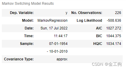
马尔可夫区制转换动态回归模型结果
观测值数量No.Observations:226
样本Sample:1954.7.1-2010.10.1
似然对数Log Likelihood:-508.636
AIC:1027.272
BIC:1044.375
HQIC:1034.174

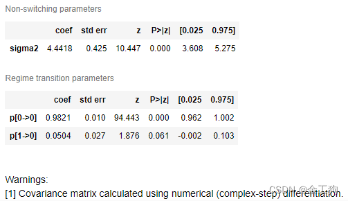
Regime0的coef为3.7088%,表示:为②低利率状态,并且利率平均值为3.7088%。
Regime1的coef为9.5568%,表示:为①高利率状态,并且利率平均值为9.5568%。
从结果可以看出①高利率②低利率两个状态都是持久性。
P[0>0]的概率为0.9821,即保持②低利率状态的概率为0.9821;
P[1>0]的概率为0.0504,即P[1>1]的概率为0.9496,即保持①高利率状态的概率为0.9496。
代码③
print(res_fedfunds.expected_durations)
结果③
[55.85400626 19.85506546]
保持②低利率状态55.8/4=14年左右,保持①高利率状态19.8/4=5年左右。
代码④
data1 = res_fedfunds.smoothed_marginal_probabilities.reset_index().rename(columns={"index":"时间",0:"zero-step probabilities",1:"one-step probabilities"})
data2 = dta_fedfunds.reset_index().rename(columns={"index":"时间",0:"Federal funds rate"})
data  = data1.merge(data2)
data.head()
结果④

代码⑤
import plotly as py
import plotly.graph_objects as go
import plotly.express as px
import plotly.offline
import plotly.figure_factory as ff  # 画有标注的热力图, go.Heatmap 无标注
from plotly import tools

figname = '20220716'
x2 ='one-step probabilities'
x1 ='Federal funds rate'
draw1 = go.Scatter(x=data['时间'], y=data[x1], name=x1, marker=dict(color='rgb(49,130,189)'),yaxis = 'y')
draw2 = go.Scatter(x=data['时间'], y=data[x2], name=x2, marker=dict(color='rgb(190,190,190)'),yaxis = 'y2')
# draw3 = go.Scatter(x=data['时间'], y=data[x33], name=x33, marker=dict(color='rgb(0,0,0)'))

figdata = [draw1,draw2]
fig = go.Figure(data=figdata)
# 尺寸、背景和全局设置:Paper、plot
fig.update_layout(template='simple_white'  # 'plotly',#'simple_white',
        #     ,font_size=16,
        #     ,paper_bgcolor='#E9E7EF'
        #     ,plot_bgcolor='black'
        #     ,width=1000
        #     ,margin=dict(t=100,pad=10)
    )

    # 标题
fig.update_layout(
        title=figname
        # ,title_font_size=22,
        # ,title_font_color='red',
        , title_x=0.5)

    # 图例
fig.update_layout(
        legend_title=''
        , legend_x=0.9
        , legend_y=1.1
        #     ,legend_title_font_color='red',
        #     ,legend_bordercolor='black',
        #     ,legend_valign='top',
        #     ,legend_borderwidth=1
    )

    # 图形系列非数据相关的设置
fig.layout.bargap = 0.5  # (如针对bar图)

    # x轴:轴、网格线、范围滚动条
fig.update_layout(
        xaxis=dict(
            title=''
            , title_font_color='red'
            # ,gridcolor='cyan'
            # ,rangeslider=dict(bgcolor='black',yaxis_rangemode='auto')
            # ,tickmode='array'#str型,设置坐标轴刻度的格式,’auto’表示自动根据输入的数据来决定,’linear’表示线性的数值型,
            # ’array’表示由自定义的数组来表示(用数组来自定义刻度标签时必须选择此项)
            # ,tickvals = np.arange(1,len(xoldticktext))
            # ,ticktext = np.arange(1,len(xoldticktext))
        ),
        yaxis=dict(
            title='',
            title_font_color='red',
            side='left'
        ),
            yaxis2=dict(
            title='',
            title_font_color='red',
            overlaying='y',
            side='right'
        )

    )
    # xaxis = dict(title=dict(text=""),),# "tickformat": '', "zeroline": True},
    # yaxis = dict(title=dict(text=""),zeroline = False),#"autorange": 'reversed'
    # "yaxis2": {"anchor": 'x', "overlaying": 'y', "side": 'right'},


plotly.offline.plot(fig, filename=figname + '.html')
fig.show()
结果⑤

该模型在每个时间点的状态几乎没有不确定性,可以看到三个时期的高利率状态和四个时期的低利率状态。
总结
数据更新
1.每月中国进出口
1.1.进出口数据 20220531 时间序列 ARMA ARIMA SARIMA
链接: link
2.宏观数据集
2.1.图01:剔除价格波动后工业增加值同比增速较为平滑_金工狗_数据包
链接: link


 474
474


 被折叠的 条评论
为什么被折叠?
被折叠的 条评论
为什么被折叠?
 到【灌水乐园】发言


