


这两个实例主要运用了前端JavaScript,css和html知识。
走马灯实例的代码及思路
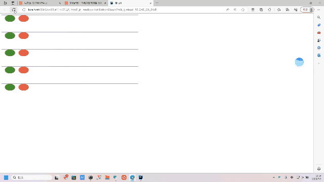
思路:
实现这个动画效果首先要在视图中显示出一条线和下面是十个圆,可以用css+html,用css写出基本样式,然后再用布局定位写出确定好线和圆之间的距离。先隐藏后面的圆,使用动画效果延时将后面的圆显示出来,再根据时间的变化显示出各种颜色,最后使用循环出五行一样的效果。
代码展示:
<!DOCTYPE html>
<html lang="en">
<head>
    <meta charset="UTF-8">
    <title>走马灯</title>
    <style>
        .f{
            width: 800px;
            height: 100px;
            border-top: 1px solid rebeccapurple;
        }
        .f>div{
            width: 60px;
            height: 40px;
            background-color: white;
            border-radius: 50%;
            float: left;
            margin-left: 20px;
        }
        @keyframes changeColor {
            0% {
                background-color: rgb(236, 65, 65);
            }
            20% {
                background-color: rgb(235, 176, 68);
            }
            40% {
                background-color: rgb(28, 148, 28);
            }
            60% {
                background-color: rgb(35, 35, 165);
            }
            80% {
                background-color: rebeccapurple;
            }
            100% {
                background-color: pink;
            }
        }
        .f>div:nth-child(1){
            animation: changeColor 3s ease 0s infinite ;
        }.f>div:nth-child(2){
             animation: changeColor 3s ease 1s infinite ;
        }.f>div:nth-child(3){
             animation: changeColor 3s ease 2s infinite ;
        }.f>div:nth-child(4){
             animation: changeColor 3s ease 3s infinite ;
        }.f>div:nth-child(5){
             animation: changeColor 3s ease 4s infinite ;
        }.f>div:nth-child(6){
             animation: changeColor 3s ease 5s infinite ;
        }.f>div:nth-child(7){
             animation: changeColor 3s ease 6s infinite ;
        }
        .f>div:nth-child(8){
            animation: changeColor 3s ease 7s infinite ;
        }.f>div:nth-child(9){
             animation: changeColor 3s ease 8s infinite ;
        }.f>div:nth-child(10){
             animation: changeColor 3s ease 9s infinite ;
        }
    </style>
</head>
<body id="body">
<div>
    <button  class="btn btn-primary"><a onclick="add()">获取值</a></button>
</div>
<div class="f">
    <div></div>
    <div></div>
    <div></div>
    <div></div>
    <div></div>
    <div></div>
    <div></div>
    <div></div>
    <div></div>
    <div></div>
</div>
</body>
<script>
    //1.获取
    let body=document.getElementById('body')
    let s=''
    for (let i=0;i<5;i++){
        s+=`<div class="f">
    <div></div>
    <div></div>
    <div></div>
    <div></div>
    <div></div>
    <div></div>
    <div></div>
    <div></div>
    <div></div>
    <div></div>
</div>`
    }
    body.innerHTML=s
</script>
</html>
小球的转动实例的代码及思路

思路:
使用布局定位显示出三个圆和里面的两个与圆环相切的球需要计算好各个圆的圆心位置,设置好上边距和左边距。再设置旋转动画,先设置好旋转的的圆心,设置好运动轨迹,旋转使用弧度的方法,设置好旋转速度,然后绑定点击事件,点击后才开始运动。
代码展示:
<!DOCTYPE html>
<html lang="en">
<head>
    <meta charset="UTF-8">
    <title>小球圆心运动2.0</title>
    <style>
        .r1{
            width: 500px;
            height: 500px;
            border: 1px solid red;
            border-radius: 50%;
            position: relative;
        }
        .r1>div{
            position: absolute;
        }
        .r2>div{
            position: absolute;
        }
        .r2{
            width: 300px;
            height: 300px;
            border: 1px solid green;
            border-radius: 50%;
            top: 100px;
            left: 100px;
            position: relative;
        }
        .b1{
            width: 100px;
            height: 100px;
            background-color: rgb(61,61,212);
            border-radius: 50%;
            top: 200px;
            left: 0px;
        }
        .b2{
            width: 100px;
            height: 100px;
            background-color: rebeccapurple;
            border-radius: 50%;
            top: 200px;
            left: 100px;
        }
        .r3{
            width: 100px;
            height: 100px;
            border:1px solid blue;
            border-radius: 50%;
            top: 200px;
            left: 200px;
        }

    </style>
</head>
<body>
<div class="r1">
    <div class="b1" id="b1"></div>
    <div class="b2" id="b2"></div>
    <div class="r2"></div>
    <div class="r3"></div>
</div>
<button onclick="start1()">开始</button>
</body>
<script>
    //r表示运动轨迹的半径,x0、y0表示圆心的坐标
    let r=200,x0=250,y0=250;
    let r1=100,x1=250,y1=250;
    //获取b1蓝色小球
    let b1=document.getElementById('b1')
    let b2=document.getElementById('b2')
    //定义x,y表示外面球的运动轨迹,x2,y2表示里面球的运动轨迹
    let x=50,y=50;
    let x2=50,y2=50;
    function start1(){
        let i=180
        setInterval(()=>{
            //i表示0-360度,角度,deg是0-2pi,弧度
            i++
            let deg=i*Math.PI/180
            x=x0+r*Math.cos(deg)
            y=y0+r*Math.sin(deg)
            x2=x1+r1*Math.cos(deg)
            y2=y1+r1*Math.sin(deg)
            b1.style.top=y-50+'px'
            b1.style.left=x-50+'px'
            b2.style.top=y2-50+'px'
            b2.style.left=x2-50+'px'
        },10)
    }
</script>
</html>
小结:
CSS动画和JavaScript是在网页开发中常用的技术,它们可以为网页增添生动的效果和交互性。通过不断地学习和实践,你将能够掌握CSS动画和JavaScript的技能,并运用它们创建出吸引人的网页效果和丰富的用户交互体验。动画的显示和布局的细节还要多多实践才可以掌握。


 3745
3745


 被折叠的 条评论
为什么被折叠?
被折叠的 条评论
为什么被折叠?
 到【灌水乐园】发言


