


伪类
结构伪类 :nth-child(),前几个元素
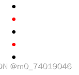
ul中第一个li
<style>
  ul li:nth-child(1){
    color: red;
  }
</style>
<body>

<ul>
    <li class="li1"></li>
    <li class="li2"></li>
    <li class="li3"></li>
    <li class="li4"></li>
    <li class="li5"></li>
</ul>

</body>
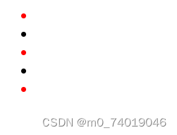
偶数个子元素
ul li:nth-child(2n){
    color: red;
  }
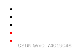
奇数个子元素
 ul li:nth-child(2n+1){
    color: red;
  }
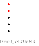
前几个元素
//前2个元素 -n+3,前三个元素生效
 ul li:nth-child(-n+2){
    color: red;
  }
结构伪类 :nth-last-child(),后几个元素
从最后一个元素可是计数,和:nth-child()的使用相同
 ul li:nth-last-child(-n+2){
    color: red;
  }
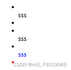
:nth-of-type()
只有对应类型的子元素才会生效
<style>
  ul li:nth-last-child(-n+2){
    color: red;
  }
  ul div:nth-of-type(2){
    color: blue;
  }
  ul div:nth-child(2){
    color: yellow;
  }
</style>
<body>

<ul>
    <li class="li1"></li>
    <div>sss</div>
    <li class="li2"></li>
    <li class="li3"></li>
    <div>sss</div>
    <li class="li4"></li>
    <li class="li5"></li>
</ul>

</body>
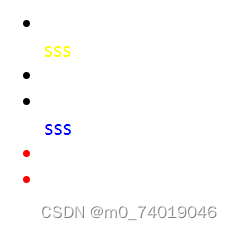
:nth-child()不会判断子元素的类型,只按子元素出现在父元素中的位置计算,比如给ul中第3个元素且子元素是div的设置样式,由于第三个子元素是li所以不会生效
 ul div:nth-child(3){
    color: yellow;
  }
<ul>
    <li class="li1"></li>
    <div>sss</div>
    <li class="li2"></li>
    <li class="li3"></li>
    <div>sss</div>
    <li class="li4"></li>
    <li class="li5"></li>
</ul>
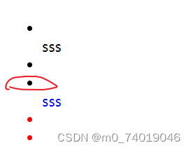
而:nth-of-type()会判断子元素的类型
改成3后会匹配第三个类型为div的子元素
style>
  ul li:nth-last-child(-n+2){
    color: red;
  }
  ul div:nth-of-type(3){
    color: blue;
  }
  ul div:nth-child(3){
    color: yellow;
  }
</style>
<body>

<ul>
    <li class="li1"></li>
    <div>sss</div>
    <li class="li2"></li>
    <li class="li3"></li>
    <div>sss</div>
    <li class="li4"></li>
    <div>sss</div>
    <li class="li5"></li>
</ul>

</body>
:root,:empty和:not
:root 根元素,就是html,可以用来设置全局的CSS变量
// :root {  和{之间有一个空格,没有空格也可以,但是在有些地方可能有问题
 :root {
    color: red;
  }
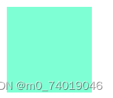
:empty 元素里面没有任何内容
 div:empty {
    width: 100px;
    height: 100px;
    background-color: aquamarine;
  }
     <div></div>
:not 选择不符合指定选择器的元素
//给div里子元素不是a的设置样式
div:not(a){
    color: brown;
  }
   <div>
        <span>sasa</span>
        <a href="s">sss</a>
    </div>

:nth-of-type()对应的还有一个:nth-last-of-type()
其他的结构伪类还有:

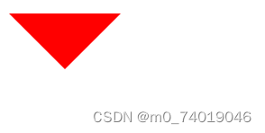
利用border的边框实现三角形
向下三角形
style>
 .triangle {
  width: 0;
  height: 0;
  border-left: 50px solid transparent;
  border-right: 50px solid transparent;
  border-top: 50px solid red; /* 可以修改颜色 */
}
</style>
 <div class="triangle">

    </div>
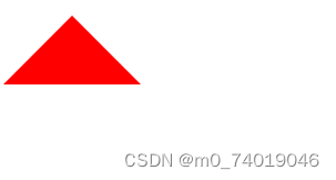
向上
<style>
 .triangle {
  width: 0;
  height: 0;
  border-left: 50px solid transparent;
  border-right: 50px solid transparent;
  border-bottom: 50px solid red; /* 可以修改颜色 */
}
</style>
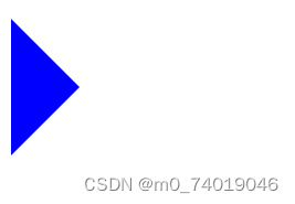
向右
.triangle {
  width: 0;
  height: 0;
  border-top: 50px solid transparent;
  border-bottom: 50px solid transparent;
  border-left: 50px solid blue; /* 可以修改颜色 */
}
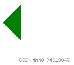
向左
.triangle {
  width: 0;
  height: 0;
  border-top: 50px solid transparent;
  border-bottom: 50px solid transparent;
  border-right: 50px solid green; /* 可以修改颜色 */
}
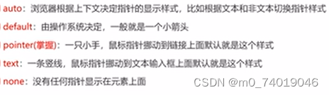
cursor 设置光标的类型
常见值
.triangle {
 cursor: crosshair;
}
标准流
默认情况下按照从左到右,从上到下的情况排列,不存在层叠的情况。
在标准流中可以通过margin,padding来为元素改变位置,但是会影响到其他元素,也不便于实现层叠效果,可以通过CSS的定位属性、浮动属性等可以改变元素在标准流中的位置。
定位
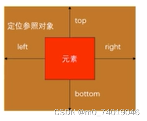
利用position可以对元素实现定位,常见的值有:
static:默认值,静态定位
relative:相对定位
absolute:绝对定位
fixed:固定定位
sticky:粘性定位
relative 相对定位
元素按照标准流布局,可以通过设置left,top,right,bottom来改变元素的位置。
相对定位是相对与自身的位置调整的,不会影响其他元素。
实现类似于 background-position: center使图片始终保持在页面中心位置
//
<style>
* {
margin: 0;
padding: 0;
}
.triangle{
  height: 500px;
  overflow: hidden;
  background-color: red;
}
img{
  width: 100%;
  position: relative;
  margin-left: 50%;
  transform: translate(-50%);
}
</style>
<body>
    <div class="triangle">
       <img src="https://www.keaitupian.cn/cjpic/frombd/2/253/2107631312/3178897554.jpg" alt="">
    </div>


</body>
先设置margin-legt:50%使图片的左半部分移除页面(相对于div的-半)
在设置 transform: translate(-50%);位移50%的距离(相对于图片的一半)

fixed 固定定位
会脱离标准流,是参照于视口的。
当画布滚动时,会固不动。
视口是文档的可视区域,画布用于渲染文档的区域,还包括文档超出视口的区域。画布的宽高大于视口的宽高
absolute 绝对定位
脱离标准流
是参照于最近的定位的祖先元素,如果找不到,参照对象就是窗口。
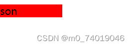
子绝父相:相对于最近的一个定位元素。大多数子元素的绝对定位都是相对于父元素的。如果希望子元素是相对于父元素定位,又不希望父元素脱标,可以将父元素的position设置为relative,子元素的position设置为absolute,简称为子绝父相。
.parent{
 position: relative;
}
.son{
  position: absolute;
  background-color: red;
  width: 100px;
}
</style>
<body>
   <div  class="parent">
      <span class="son">son</span>
   </div>
</body>
将position设为absolute/fixed的元素的特点
1.可以设置宽高
2.宽高默认有内容决定
3.脱离标准流,不在受标准流的约束。不在严格区分行内元素,块元素,行内块的特性。
4.父元素如果没有设置宽高,默认由内容或子元素撑起。子元素设置后脱离标准流,父元素就没有高度了。
5.脱离标准流的元素内部还是按标准流布局。
6.对于定位(absolute,fixed)的元素来说
- 定位参照对象的宽度 =left+right+margin-left+margin-right+绝对定位的元素实际占用的宽度
- 定位参照对象的高度 =top+bottom+margin-top+margin-bottom+绝对定位的元素实际占用的高度
如果希望绝对定位的元素和参照对象的宽高一致可以给绝对定位的元素设置以下属性:
left:0,top:0,right:0,bottom:0,margin:0
参考上面的公式,left+right+margin-left+margin-right都为0,而参照对象的宽高固定,那么绝对定位的元素实际占用的宽度就必须等于参照对象的宽高。
.parent{
 position: relative;
 width: 100px;
 height: 100px;
}
.son{
  position: absolute;
  background-color: red;
 left: 0;
 top: 0;
 bottom: 0;
 right: 0;
 margin: 0;
}
<div  class="parent">
      <span class="son">son</span>
   </div>

如果希望绝对定位的元素在参照对象中剧中可以设置:
left:0,top:0,right:0,bottom:0,margin:auto
另外,绝对定位的元素必须有宽高。
left:0,top:0,right:0,bottom:0,绝对定位的元素的宽高固定,,margin:auto具体的margin有浏览器自行分配,浏览器会给margin-left+margin-righ分配相同的距离,margin-top+margin-bottom也是,这样就会垂直和水平居中
.parent{
 position: relative;
 width: 100px;
 height: 100px;
 background-color: blue;
 margin: auto;
}
.son{
  width: 50px;
  height: 50px;
  position: absolute;
  background-color: red;
 left: 0;
 top: 0;
 bottom: 0;
 right: 0;
 margin: auto;
}
<div  class="parent">
      <span class="son">son</span>
   </div>
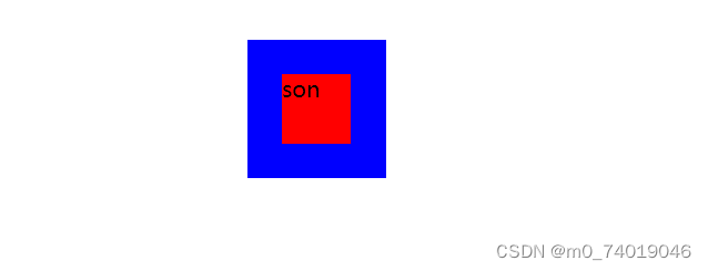
关于width,heigth等设为auto时的特点
以width为例
1.行内非替换元素:width会包裹内容
span{
  width: auto;
  background-color: blue;
}
a{
  display: inline-block;
  width: auto;
  background-color: aqua;
}
 <span>111</span>
   <a href="">222</a>
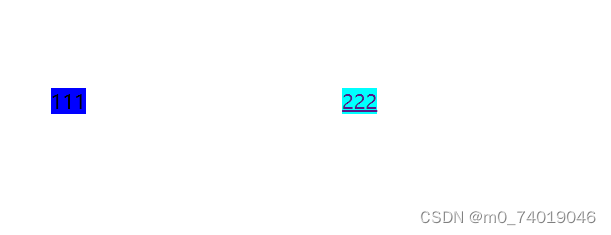
2.块元素: width为包含块的宽度
//块元素默认占一行,,这里的例子设置了margin:100,所以没有占满一行
.test{
  width: 100px;
  height: 100px;
  background-color: chartreuse;
  margin: 0;
}
.t{
  width: auto;
  background-color: blueviolet;
  margin: 0;
}

   <div>
    sss
   </div>
   <div class="test">
     <div class="t">
        sss
     </div>
   </div>
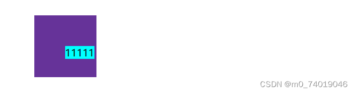
3.绝对定位元素:width:包裹内容
.p{
  width: 100px;
  height: 100px;
  position: relative;
  background-color: rebeccapurple;
}
.s{

  position: absolute;
  width: auto;
  background-color: aqua;
}
<div class="p">
      <div class="s">
         11111
      </div>
   </div>
sticky 粘性定位
当页面滚动到某个位置时就会变为固定定位
position: sticky;
top: 500px;


 被折叠的 条评论
为什么被折叠?
被折叠的 条评论
为什么被折叠?
 到【灌水乐园】发言


