 从零开始的Python热图绘制


 本文介绍如何使用Python的常见库如matplotlib、numpy和math,从头开始创建热图。通过Kernel Density Estimation (KDE)算法,详细解释了如何计算每个网格的密度值,并展示了完整的代码实现。
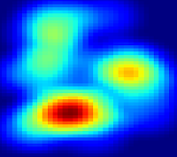
Heatmap sample热图样例:
Introduction
Heatmap is frequently used to visualize event occurrence or density. There are some Python libraries or GIS software/tool that can be used to create a heatmap like QGIS, ArcGIS, Google Table Fusion, etc. Unfortunately, this post won't discussed how to create a heatmap using those software/tool, but more than that, we will write our own code to create a heatmap in Python 3 from scratch using Python common library.
The algorithm which will be used to create a heatmap in Python is Kernel Density Estimation (KDE). Please refer to this post (QGIS Heatmap Using KDE Explained) to get more explanation about KDE and another post (Heatmap Calculation Tutorial) which give an example how to calculate intensity for a point from a reference point using KDE.
Importing Library
Actually, there are some libraries in Python that can be used to create heatmap like Scikit-learn or Seaborn. But we will use just some libraries such as matplotlib, numpy and math. So we are starting with importing those three libraries.
import matplotlib.pyplot as plt
import numpy as np
import math
Heatmap Dataset
To create a heatmap, we need a point dataset that consist of x,y coordinates. Here we create two list for x and y. The plot of dataset can be seen in figure 1.
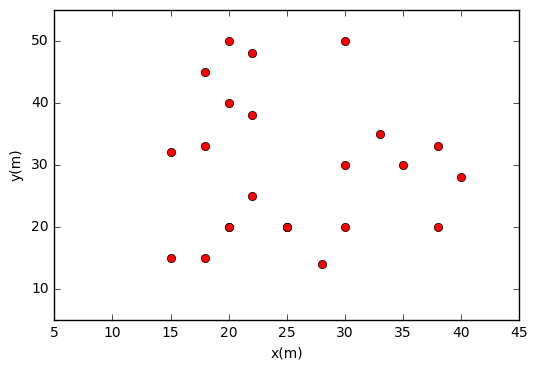 |
| Figure 1. Point Dataset |
Grid Size and Radius
In creating heatmap using KDE we need to specify the bandwidth or radius of the kernel shape and output grid size. For this case, I use radius 10 m and grid size 1 m. Later you can change these parameters to see how they affect the heatmap result.
#DEFINE GRID SIZE AND RADIUS(h)
grid_size=1
h=10
Getting X,Y Min/Max to Construct Grid
To construct grid we use mesh grid. Therefore we need to find x,y minimum and maximum to generate a sequence number of x and y. These sequence numbers then will be used to construct mesh grid. To include all the dataset coverage with a little bit more space, I subtract x,y minimum with radius and add it up for x,y maximum.
#GETTING X,Y MIN AND MAX
x_min=min(x)
x_max=max(x)
y_min=min(y)
y_max=max(y)

#CONSTRUCT GRID
x_grid=np.arange(x_min-h,x_max+h,grid_size)
y_grid=np.arange(y_min-h,y_max+h,grid_size)
x_mesh,y_mesh=np.meshgrid(x_grid,y_grid)
Calculate Grid Center Point
After constructing mesh grid. Next we calculate the center point for each grid. This can be done with adding x mesh and y mesh coordinate with half of grid size. The center point will be used later to calculate the distance of each grid to dataset points.
#GRID CENTER POINT
xc=x_mesh+(grid_size/2)
yc=y_mesh+(grid_size/2)
Kernel Density Estimation Function
To calculate a point density or intensity we use a function called kde_quartic. We are using Quartic kernel shape, that's why it has "quartic" term in the function name. This function has two arguments: point distance(d) and kernel radius (h).
#FUNCTION TO CALCULATE INTENSITY WITH QUARTIC KERNEL
def kde_quartic(d,h):
    dn=d/h
    P=(15/16)*(1-dn**2)**2
    return P
Compute Density Value for Each Grid
This is the hardest part of this post. Computing the density value for each grid. We are doing this in three looping. First loop is for mesh data list or grid. Second loop for each center point of those grids and third loop to calculate the distance of the center point to each dataset point. Using the distance, then we compute the density value of each grid with kde_quartic function which already defined before. It will return a density value for each distance to a data point. Here we only consider the point with a distance within the kernel radius. We do not consider the point outside the kernel radius and set the density value to 0. Then we sum up all density value for a grid to get the total density value for the respective grid The total density value then is stored in a list which is called intensity_list.
#PROCESSING
intensity_list=[]
for j in range(len(xc)):
    intensity_row=[]
    for k in range(len(xc[0])):
        kde_value_list=[]
        for i in range(len(x)):
            #CALCULATE DISTANCE
            d=math.sqrt((xc[j][k]-x[i])**2+(yc[j][k]-y[i])**2)
            if d<=h:
                p=kde_quartic(d,h)
            else:
                p=0
            kde_value_list.append(p)
        #SUM ALL INTENSITY VALUE
        p_total=sum(kde_value_list)
        intensity_row.append(p_total)
    intensity_list.append(intensity_row)
Visualize The Result
The last part we visualize the result using matplotlib color mesh. We also add a color bar to see the intensity value. The heatmap result can be seen in figure 2.
#HEATMAP OUTPUT
intensity=np.array(intensity_list)
plt.pcolormesh(x_mesh,y_mesh,intensity)
plt.plot(x,y,'ro')
plt.colorbar()
plt.show()
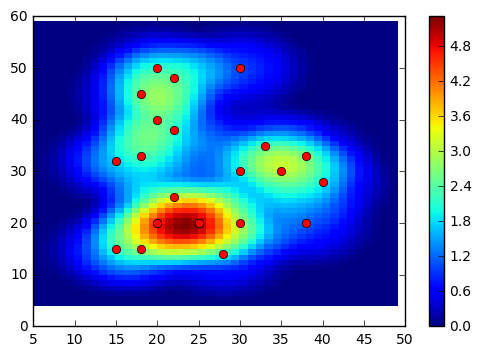 |
| Figure 2. Heatmap Output |
The complete code snippet can be found below:
import matplotlib.pyplot as plt
import numpy as np
import math

#POINT DATASET
x=[20,28,15,20,18,25,15,18,18,20,25,30,25,22,30,22,38,40,38,30,22,20,35,33,35]
y=[20,14,15,20,15,20,32,33,45,50,20,20,20,25,30,38,20,28,33,50,48,40,30,35,36]

#DEFINE GRID SIZE AND RADIUS(h)
grid_size=1
h=10

#GETTING X,Y MIN AND MAX
x_min=min(x)
x_max=max(x)
y_min=min(y)
y_max=max(y)

#CONSTRUCT GRID
x_grid=np.arange(x_min-h,x_max+h,grid_size)
y_grid=np.arange(y_min-h,y_max+h,grid_size)
x_mesh,y_mesh=np.meshgrid(x_grid,y_grid)

#GRID CENTER POINT
xc=x_mesh+(grid_size/2)
yc=y_mesh+(grid_size/2)

#FUNCTION TO CALCULATE INTENSITY WITH QUARTIC KERNEL
def kde_quartic(d,h):
    dn=d/h
    P=(15/16)*(1-dn**2)**2
    return P

#PROCESSING
intensity_list=[]
for j in range(len(xc)):
    intensity_row=[]
    for k in range(len(xc[0])):
        kde_value_list=[]
        for i in range(len(x)):
            #CALCULATE DISTANCE
            d=math.sqrt((xc[j][k]-x[i])**2+(yc[j][k]-y[i])**2)
            if d<=h:
                p=kde_quartic(d,h)
            else:
                p=0
            kde_value_list.append(p)
        #SUM ALL INTENSITY VALUE
        p_total=sum(kde_value_list)
        intensity_row.append(p_total)
    intensity_list.append(intensity_row)

#HEATMAP OUTPUT
intensity=np.array(intensity_list)
plt.pcolormesh(x_mesh,y_mesh,intensity)
plt.plot(x,y,'ro')
plt.colorbar()
plt.show()


 843
843

 被折叠的 条评论
为什么被折叠?
被折叠的 条评论
为什么被折叠?
 到【灌水乐园】发言


