水平垂直居中
说到css 我们在工作中经常用到的就是垂直居中: 但是水平垂直居中你知道几种呢? 下面罗列了七中欢迎大家参考
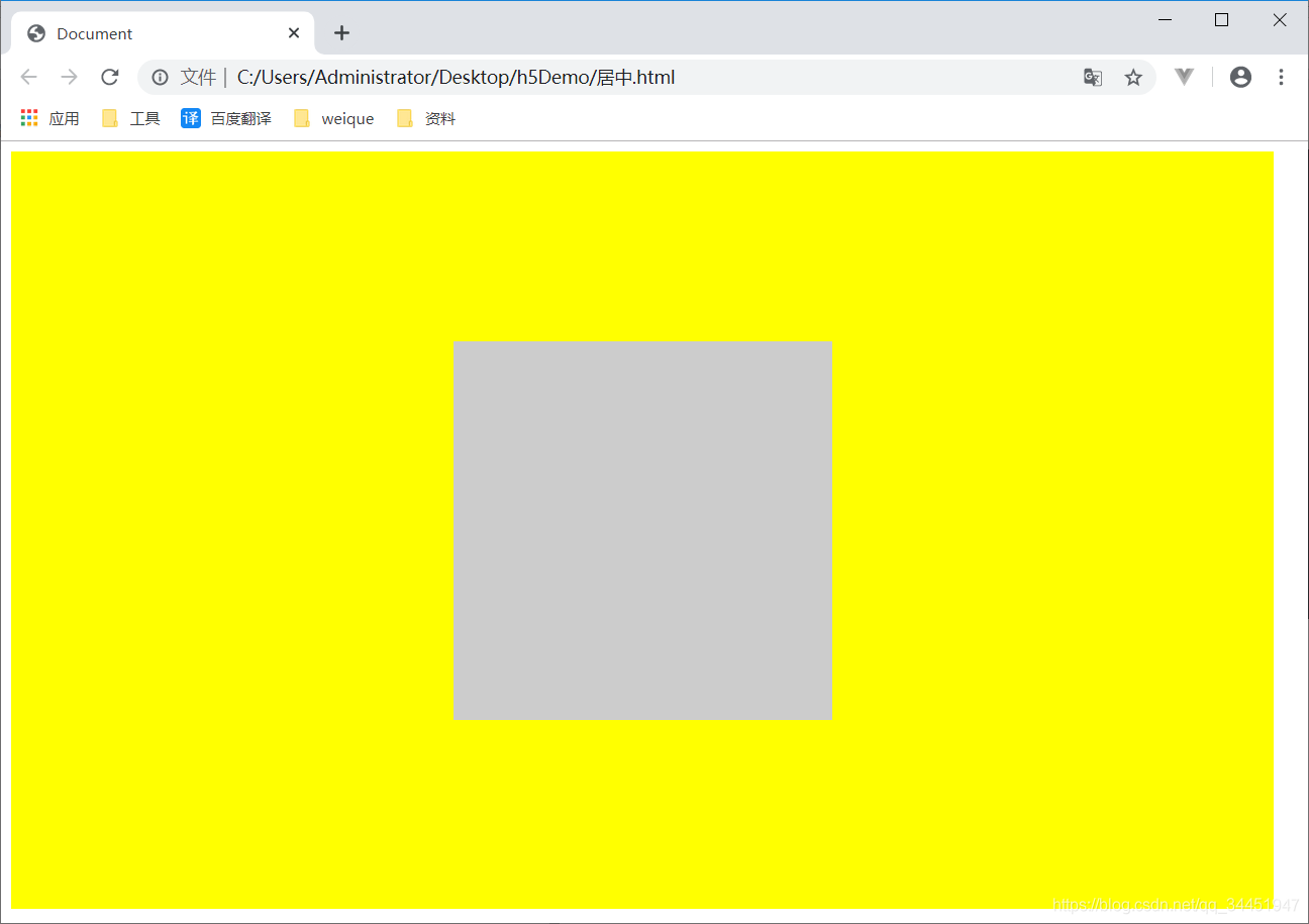
第一种方法 利用定位
//代码如下
<!DOCTYPE html>
<html lang="en">
<head>
    <meta charset="UTF-8">
    <meta name="viewport" content="width=device-width, initial-scale=1.0">
    <meta http-equiv="X-UA-Compatible" content="ie=edge">
    <title>Document</title>
    <style>
    .wrap{
        width: 1000px;
        height: 600px;
        background-color: yellow;
        position: relative;
    }
    .box{
        width: 300px;
        height: 300px;
        background-color: #ccc;
        position: absolute;
        top: 0;
        left: 0;
        bottom: 0;
        right: 0;
        margin: auto;
    }
    </style>
</head>
<body>
    <div class="wrap">
        <div class="box"></div>
    </div>
</body>
</html>
效果演示如下:
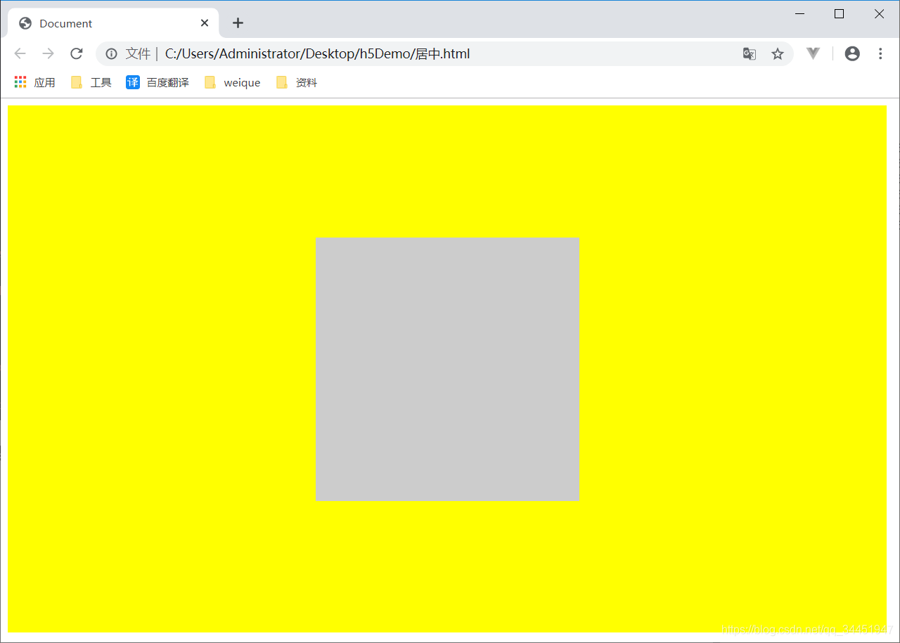
第二种方法也是利用定位
//该方法需要知道居中元素的宽和高
//代码如下
<!DOCTYPE html>
<html lang="en">

<head>
    <meta charset="UTF-8">
    <meta name="viewport" content="width=device-width, initial-scale=1.0">
    <meta http-equiv="X-UA-Compatible" content="ie=edge">
    <title>Document</title>
    <style>
        .wrap {
            width: 1000px;
            height: 600px;
            background-color: yellow;
            position: relative;
        }

        .box {
            width: 300px;
            height: 300px;
            background-color: #ccc;
            position: absolute;
            top: 50%;
            left: 50%;
            margin-top: -150px;
            margin-left: -150px;
        }
    </style>
</head>

<body>
    <div class="wrap">
        <div class="box"></div>
    </div>
</body>

</html>
效果演示如下:
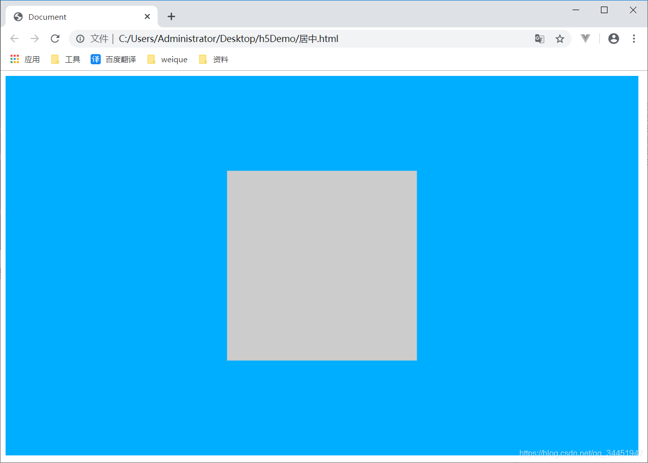
第三种利用 CSS3.0 transform属性+定位
<!DOCTYPE html>
<html lang="en">

<head>
    <meta charset="UTF-8">
    <meta name="viewport" content="width=device-width, initial-scale=1.0">
    <meta http-equiv="X-UA-Compatible" content="ie=edge">
    <title>Document</title>
    <style>
        .wrap {
            width: 1000px;
            height: 600px;
            background-color: rgb(0, 174, 255);
            position: relative;
        }

        .box {
            width: 300px;
            height: 300px;
            background-color: rgb(204, 204, 204);
            position: absolute;
            top: 50%;
            left: 50%;
            transform: translate(-50%,-50%);
        }
    </style>
</head>

<body>
    <div class="wrap">
        <div class="box"></div>
    </div>
</body>

</html>
效果演示如下:
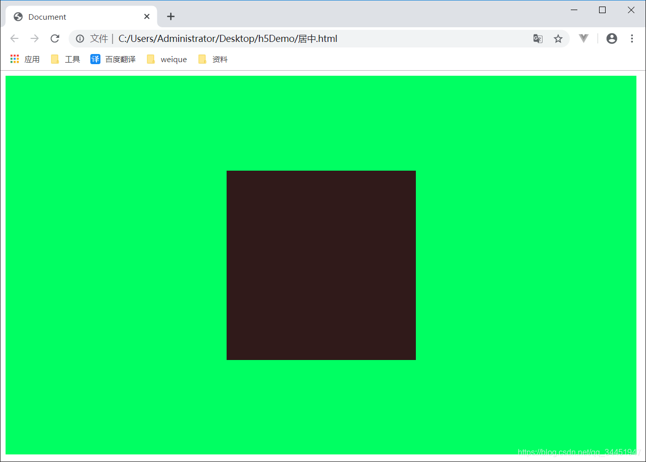
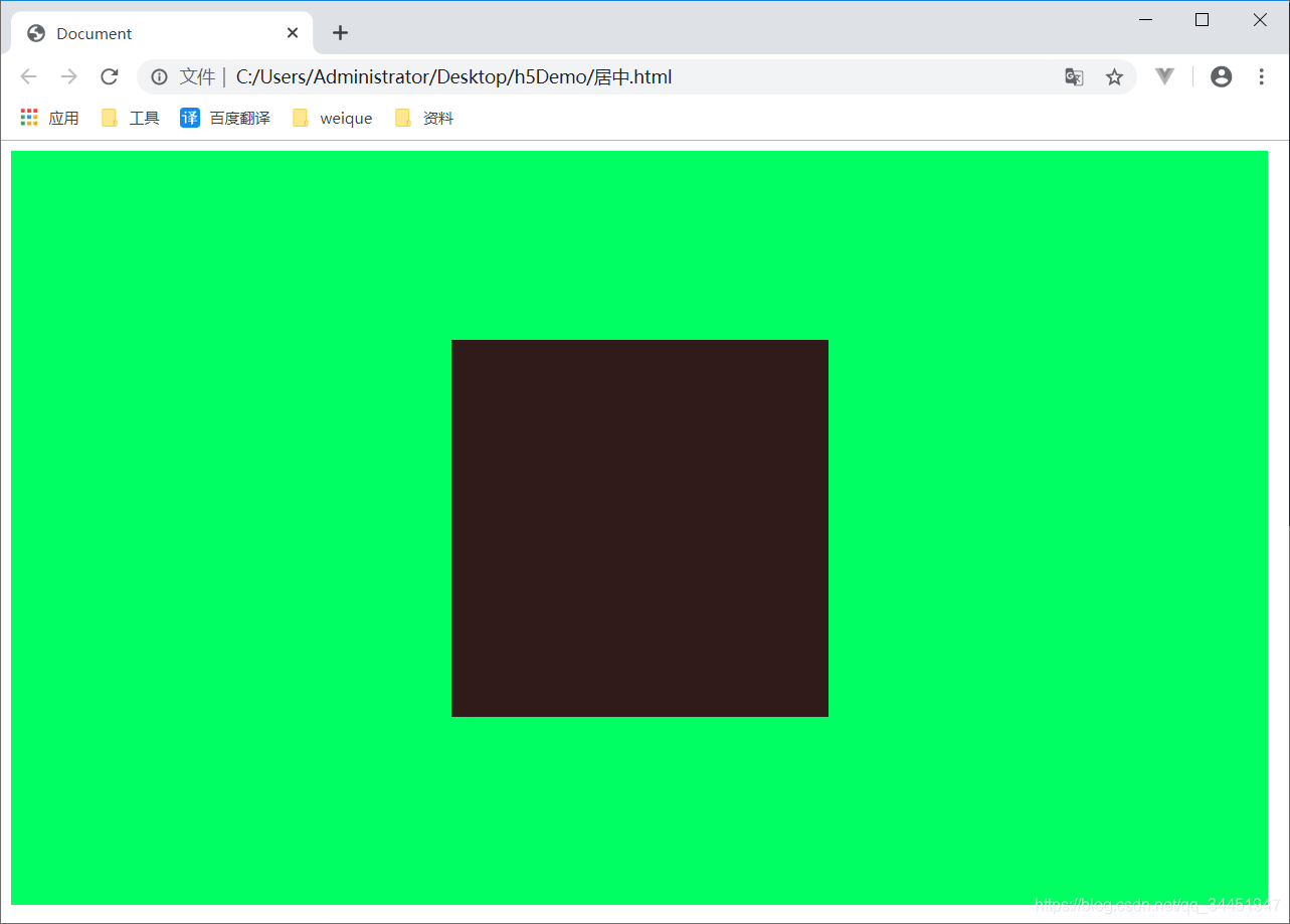
第四种方法 弹性盒模型
//如果不了解弹性盒子的可以去我的博客css里面看  讲的很详细  很适合新手快速学会弹性盒子
<!DOCTYPE html>
<html lang="en">

<head>
    <meta charset="UTF-8">
    <meta name="viewport" content="width=device-width, initial-scale=1.0">
    <meta http-equiv="X-UA-Compatible" content="ie=edge">
    <title>Document</title>
    <style>
        .wrap {
            width: 1000px;
            height: 600px;
            background-color: rgb(0, 255, 98);
            display: flex;
            justify-content: center;
            align-items: center;
        }

        .box {
            width: 300px;
            height: 300px;
            background-color: rgb(48, 26, 26);

        }
    </style>
</head>

<body>
    <div class="wrap">
        <div class="box"></div>
    </div>
</body>

</html>
效果演示如下:
第五种方法 利用absolute + calc
//这种方法兼容性依赖calc的兼容性,缺点是需要知道子元素的宽高
<!DOCTYPE html>
<html lang="en">

<head>
    <meta charset="UTF-8">
    <meta name="viewport" content="width=device-width, initial-scale=1.0">
    <meta http-equiv="X-UA-Compatible" content="ie=edge">
    <title>Document</title>
    <style>
        .wrap {
            width: 1000px;
            height: 600px;
            background-color: rgb(0, 255, 98);
            position: relative;
        }

        .box {
            width: 300px;
            height: 300px;
            background-color: rgb(48, 26, 26);
            position: absolute;
            top: calc(50%  - 150px);
            left: calc(50% - 150px);
        }
    </style>
</head>

<body>
    <div class="wrap">
        <div class="box"></div>
    </div>
</body>

</html>
效果演示如下:
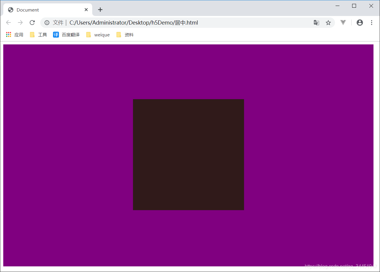
第六种 css新增的table属性,可以让我们把普通元素,变为table元素的现实效果,通过这个特性也可以实现水平垂直居中
//代码
<!DOCTYPE html>
<html lang="en">

<head>
    <meta charset="UTF-8">
    <meta name="viewport" content="width=device-width, initial-scale=1.0">
    <meta http-equiv="X-UA-Compatible" content="ie=edge">
    <title>Document</title>
    <style>
        .wrap {
            display: table-cell;
            text-align: center;
            vertical-align: middle;
            width: 1000px;
            height: 600px;
            background-color:purple;
        }

        .box {

            background-color: rgb(48, 26, 26);
            display: inline-block;
            width: 300px;
            height: 300px;
        }
    </style>
</head>

<body>
    <div class="wrap">
        <div class="box"></div>
    </div>
</body>

</html>
效果展示如下:
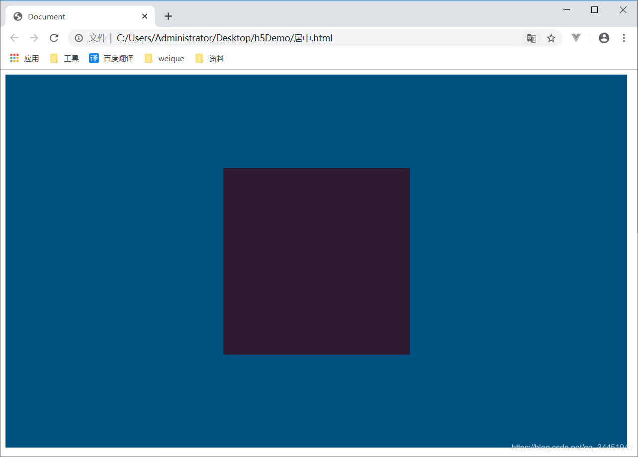
第七种 grid
//代码
<!DOCTYPE html>
<html lang="en">

<head>
    <meta charset="UTF-8">
    <meta name="viewport" content="width=device-width, initial-scale=1.0">
    <meta http-equiv="X-UA-Compatible" content="ie=edge">
    <title>Document</title>
    <style>
        .wrap {
            display: grid;
            width: 1000px;
            height: 600px;
            background-color: rgb(0, 81, 128);
        }

        .box {

            background-color: rgb(46, 26, 48);
            width: 300px;
            height: 300px;
            align-self: center;
            justify-self: center;
        }
    </style>
</head>

<body>
    <div class="wrap">
        <div class="box"></div>
    </div>
</body>

</html>
效果演示如下
顺带总结下:
1. PC端有兼容性要求,宽高固定,推荐absolute + 负margin
2. PC端有兼容要求,宽高不固定,推荐css-table
3. PC端无兼容性要求,推荐flex
4. 移动端推荐使用flex


 扫一扫
扫一扫
 1502
1502

 被折叠的 条评论
为什么被折叠?
被折叠的 条评论
为什么被折叠?
 到【灌水乐园】发言


