


1.什么是饼图/甜甜圈图?
在工作中如果遇到需要计算总费用或金额的各个部分构成比例的情况,一般都是通过各个部分与总额相除来计算,而且这种比例表示方法单看数字很抽象,我们可以使用一种饼形图表,能够直接以图形的方式直接显示各个组成部分所占比例,更加形象直观。
饼图,是指使用圆形及圆内扇形的面积来表示数值大小的图形,其一般用于表示总体中各部分所占的比例。
甜甜圈图(圆环图),其本质是将饼图的中间区域挖空。虽然如此,甜甜圈图还是有其优点的。饼图的整体性太强,会让我们将注意力集中在比较饼图内各个扇形之间占整体比重的关系。但如果我们将两个饼图放在一起,则很难同时对比两个图。甜甜圈图在解决上述问题时,采用了让我们更关注长度而不是面积的做法。这样我们就能相对简单地对比不同的甜甜圈图。
本文我们就来讨论一下饼图/甜甜圈图是如何绘制的以及如何对其进行解读。
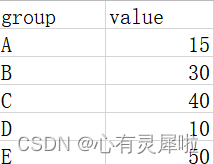
2.绘图前的数据准备
demo数据可以在https://www.bioladder.cn/shiny/zyp/bioladder2/demoData/Pie/data.csv下载。
包含2列数据,第一列是名称,第二列是数值。
3. R语言怎么画饼图/甜甜圈图
3.1 饼图
# 加载R包,没有安装请先安装  install.packages("包名")
library(graphics)

# 读取饼图/甜甜圈图数据文件
df= read.delim("https://www.bioladder.cn/shiny/zyp/bioladder2/demoData/Pie/data.csv",# 这里读取了网络上的demo数据,将此处换成你自己电脑里的文件
               sep = "," # 因为文件为csv格式,所以分隔符设置为","逗号
)

# 设置标签样式(名称+百分比+原数值)
labs <- paste0(df$group," \n(", round(df$value/sum(df$value)*100,2), "%)"," \n(",df$value, ")")

# 绘图
pie(df$value,
    labels=labs,
    init.angle=90,    # 设置初始角度
    col = rainbow(length(df$value)) , # 设置颜色
    border="white",   # 边框颜色
    cex = 1)          # 字体大小
3.2 甜甜圈图
# 并没有直接画甜甜圈图的R包,所以在饼图源代码的基础上改改
doughnut <- function (x, labels = names(x), edges = 200, outer.radius = 0.8,
                      inner.radius=0.6, clockwise = FALSE,
                      init.angle = if (clockwise) 90 else 0, density = NULL,
                      angle = 45, col = NULL, border = FALSE, lty = NULL,
                      main = NULL, ...)
{
  if (!is.numeric(x) || any(is.na(x) | x < 0))
    stop("'x' values must be positive.")
  if (is.null(labels))
    labels <- as.character(seq_along(x))
  else labels <- as.graphicsAnnot(labels)
  x <- c(0, cumsum(x)/sum(x))
  dx <- diff(x)
  nx <- length(dx)
  plot.new()
  pin <- par("pin")
  xlim <- ylim <- c(-1, 1)
  if (pin[1L] > pin[2L])
    xlim <- (pin[1L]/pin[2L]) * xlim
  else ylim <- (pin[2L]/pin[1L]) * ylim
  plot.window(xlim, ylim, "", asp = 1)
  if (is.null(col))
    col <- if (is.null(density))
      palette()
  else par("fg")
  col <- rep(col, length.out = nx)
  border <- rep(border, length.out = nx)
  lty <- rep(lty, length.out = nx)
  angle <- rep(angle, length.out = nx)
  density <- rep(density, length.out = nx)
  twopi <- if (clockwise)
    -2 * pi
  else 2 * pi
  t2xy <- function(t, radius) {
    t2p <- twopi * t + init.angle * pi/180
    list(x = radius * cos(t2p),
         y = radius * sin(t2p))
  }
  for (i in 1L:nx) {
    n <- max(2, floor(edges * dx[i]))
    P <- t2xy(seq.int(x[i], x[i + 1], length.out = n),
              outer.radius)
    polygon(c(P$x, 0), c(P$y, 0), density = density[i],
            angle = angle[i], border = border[i],
            col = col[i], lty = lty[i])
    Pout <- t2xy(mean(x[i + 0:1]), outer.radius)
    lab <- as.character(labels[i])
    if (!is.na(lab) && nzchar(lab)) {
      lines(c(1, 1.05) * Pout$x, c(1, 1.05) * Pout$y)
      text(1.1 * Pout$x, 1.1 * Pout$y, labels[i],
           xpd = TRUE, adj = ifelse(Pout$x < 0, 1, 0),
           ...)
    }
    Pin <- t2xy(seq.int(0, 1, length.out = n*nx),
                inner.radius)
    polygon(Pin$x, Pin$y, density = density[i],
            angle = angle[i], border = border[i],
            col = "white", lty = lty[i])
  }

  title(main = main, ...)
  invisible(NULL)
}

# 绘图
doughnut(
  df$value,
  labels=labs,
  init.angle=90,     # 设置初始角度
  col = rainbow(length(df$value)) , # 设置颜色
  border="white",    # 边框颜色
  inner.radius= 0.4, # 内环大小
  cex = 1)           # 字体大小
4. BioLadder生信云平台在线绘制饼图/甜甜圈图
不想写代码?可以用BioLadder生信云平台在线绘制饼图/甜甜圈图。
饼图网址:https://www.bioladder.cn/web/#/chart/38
甜甜圈图网址:https://www.bioladder.cn/web/#/chart/39
![[外链图片转存失败,源站可能有防盗链机制,建议将图片保存下来直接上传(img-evG7Xu6k-1652085241036)(D:\gitee\bioladder2\文档\知乎\饼图、甜甜圈图.assets\image-20220104140123160.png)]](https://i-blog.csdnimg.cn/blog_migrate/430b111f47d81588cf7869011efe7fef.png)
5. 饼图/甜甜圈图结果解读
![[外链图片转存失败,源站可能有防盗链机制,建议将图片保存下来直接上传(img-LOfS4hHs-1652085241037)(D:\gitee\bioladder2\文档\知乎\饼图、甜甜圈图.assets\image-20220104142127729.png)]](https://i-blog.csdnimg.cn/blog_migrate/d80d55508d482759b5921d47503c6932.png)
饼图/甜甜圈图都是用比例显示数值大小的图形。数值越高,该组别所占的比例。
甜甜圈图本质是将饼图的中间区域挖空


 622
622

 被折叠的 条评论
为什么被折叠?
被折叠的 条评论
为什么被折叠?
 到【灌水乐园】发言


