


学习总结
(1)本task其实较为简单。选用最熟悉(简单)的波士顿房价数据集,进行数据分析;另外主要是回顾sklearn的基本用法,复习xgboost模型及其参数的选择。
文章目录
一、题目

选用波士顿房价数据集是因为最为熟悉和简单,进行数据分析时可以发现数据集相关特点。
kaggle:https://www.kaggle.com/c/house-prices-advanced-regression-techniques/overview
二、数据集分析
首先来看下训练集的特点:
import pandas as pd
import warnings
warnings.filterwarnings("ignore")

train = pd.read_csv("boston_house/train.csv")
train
前80列的特征列的含义,举例:
- YearBuilt: 建筑年份
- GarageCars:车库的容量
- HouseStyle:房子的风格

可以看到一共有81个feature(但其实第一列是没啥用的,只是序号)。也可以通过train.head()和train.tail()查看训练集数据的前几行或者后几行。
2.1 占地面积和房价
数据集中的GrLivArea特征表示占地面积,可以直观观察占地面积和房价之间的关系:
import matplotlib.pyplot as plt
import seaborn as sns
%matplotlib inline
color = sns.color_palette()
sns.set_style('darkgrid')

# 注意的是这里占地面积的单位是平方英尺而不是平方米
fig, ax = plt.subplots()
# 绘制散点图
ax.scatter(x=train['GrLivArea'], y=train['SalePrice'])
plt.ylabel('SalePrice', fontsize=13)
plt.xlabel('GrLivArea', fontsize=13)
plt.show()
结果图如下,基本满足常识,即房子占地面积越大,房价越高。

但是发现右下方有2个点异常,即占地面积大但是价格反而不高,需要去除异常点。
# 删除异常值点
train_drop = train.drop(
    train[(train['GrLivArea'] > 4000) & (train['SalePrice'] < 300000)].index)

# 重新绘制图
fig, ax = plt.subplots()
ax.scatter(train_drop['GrLivArea'], train_drop['SalePrice'])
plt.ylabel('SalePrice', fontsize=13)
plt.xlabel('GrLivArea', fontsize=13)
plt.show()

2.2 类别型特征和房价
刚才的房子占地面积是连续性数值特征,而如果是类别型特征,如数据集中的房子的材料和成品的质量OverallQual,可以画出箱线图展示其和房价之间的关系:
var = 'OverallQual'
data = pd.concat([train_drop['SalePrice'], train_drop[var]], axis=1)
# 画出箱线图
f, ax = plt.subplots(figsize=(8, 6))
fig = sns.boxplot(x=var, y="SalePrice", data=data)
fig.axis(ymin=0, ymax=800000)
箱线图如下图所示,OverallQual等级越高,即房子的材料质量越好,房价也越高。

2.3 热力图分析特征相关性
刚才都是分析单个特征和房价之间的关系,如果要分析所有特征之间的相关性和放假之间的关系,可以使用热力图,为了化简和便于展示,我选取了前10个相关度最高的特征。
import numpy as np

k = 10
corrmat = train_drop.corr()  # 获得相关性矩阵
# 获得相关性最高的 K 个特征
cols = corrmat.nlargest(k, 'SalePrice')['SalePrice'].index
# 获得相关性最高的 K 个特征组成的子数据集
cm = np.corrcoef(train_drop[cols].values.T)
# 绘制热图
sns.set(font_scale=1.25)
hm = sns.heatmap(cm, cbar=True, annot=True, square=True, fmt='.2f', annot_kws={
                 'size': 10}, yticklabels=cols.values, xticklabels=cols.values)
plt.show()
由下面的箱线图,房价大致与占地面积和房子质量相关度最高,这也很符合事实。

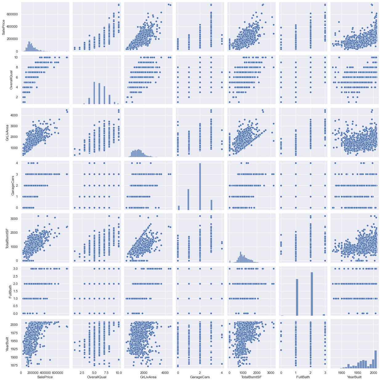
这些特征之间的关系:
# 绘制散点图
sns.set()
cols = ['SalePrice', 'OverallQual', 'GrLivArea',
        'GarageCars', 'TotalBsmtSF', 'FullBath', 'YearBuilt']
sns.pairplot(train_drop[cols], size=2.5)
plt.show()
三、数据预处理
3.1 房价的基本分布
按照刚才说得第一列为序号(无用),删除后可以使用describe查看房价数据的基本情况,然后通过 SciPy 提供的接口来进行相关的计算。
train_drop1 = train_drop.drop("Id", axis=1)
# train_drop1.head()

train_drop1['SalePrice'].describe()
"""
count      1458.000000
mean     180932.919067
std       79495.055285
min       34900.000000
25%      129925.000000
50%      163000.000000
75%      214000.000000
max      755000.000000
Name: SalePrice, dtype: float64
"""

from scipy.stats import norm, skew
sns.distplot(train_drop1['SalePrice'], fit=norm)

# 获得均值和方差
(mu, sigma) = norm.fit(train_drop1['SalePrice'])
print('\n mu = {:.2f} and sigma = {:.2f}\n'.format(mu, sigma))

# 画出数据分布图
plt.legend(['Normal dist. ($\mu=$ {:.2f} and $\sigma=$ {:.2f} )'.format(mu, sigma)],
           loc='best')
plt.ylabel('Frequency')
# 设置标题
plt.title('SalePrice distribution')

3.2 高斯分布
上图不是常见的正态分布,而是高斯分布,画出高斯分布的Q-Q图:
from scipy import stats

fig = plt.figure()
res = stats.probplot(train_drop1['SalePrice'], plot=plt)
plt.show()

一般预测模型都会选用机器学习算法,而许多机器学习算法都是基于数据是高斯分布的条件下推导出来的,因此,这里先把房价处理成为高斯分布的形式。这里直接使用 NumPy 提供的数据平滑接口来实现。处理后(平滑后),数据已经大致呈高斯分布的形状。
# 平滑数据
train_drop1["SalePrice"] = np.log1p(train_drop1["SalePrice"])

# 重新画出数据分布图
sns.distplot(train_drop1['SalePrice'], fit=norm)

# 重新计算平滑后的均值和方差
(mu, sigma) = norm.fit(train_drop1['SalePrice'])
print('\n mu = {:.2f} and sigma = {:.2f}\n'.format(mu, sigma))

plt.legend(['Normal dist. ($\mu=$ {:.2f} and $\sigma=$ {:.2f} )'.format(mu, sigma)],
           loc='best')
plt.ylabel('Frequency')
plt.title('SalePrice distribution')

# 画出 Q-Q 图

fig = plt.figure()
res = stats.probplot(train_drop1['SalePrice'], plot=plt)
plt.show()


四、特征工程
4.1 缺失的数据
# 查看数据集中的缺失值
train_drop1.isnull().sum().sort_values(ascending=False)[:20]  # 取前 20 个数据
"""
PoolQC          1452
MiscFeature     1404
Alley           1367
Fence           1177
FireplaceQu      690
LotFrontage      259
GarageYrBlt       81
GarageCond        81
GarageType        81
GarageFinish      81
GarageQual        81
BsmtExposure      38
BsmtFinType2      38
BsmtCond          37
BsmtQual          37
BsmtFinType1      37
MasVnrArea         8
MasVnrType         8
Electrical         1
MSSubClass         0
dtype: int64
"""

# 计算缺失率
train_na = (train_drop1.isnull().sum() / len(train)) * 100
train_na = train_na.drop(
    train_na[train_na == 0].index).sort_values(ascending=False)[:30]
missing_data = pd.DataFrame({'Missing Ratio': train_na})
missing_data.head(20)

在数据集中 PoolQC 列的数据缺失达到 99.45% ,MiscFeature 列的数据缺失达到 96.16%。为了更加直观的观察,对其进行可视化(画出直方图)。
f, ax = plt.subplots(figsize=(15, 6))
plt.xticks(rotation='90')
sns.barplot(x=train_na.index, y=train_na)
plt.xlabel('Features', fontsize=15)
plt.ylabel('Percent of missing values', fontsize=15)
plt.title('Percent missing data by feature', fontsize=15)

4.2 填充缺失值
从刚才上面的分析中,可以看到,大约有 20 列的数据都存在缺失值,在构建预测模型之前需要对其进行填充。
在数据描述中,PoolQC 表示游泳池的质量,缺失了则代表没有游泳池。从上面的分析结果,该列的缺失值最多,这也就意味着许多房子都是没有游泳池的,与事实也比较相符。
除了 PoolQC 列,还有很多情况类似的列,例如房子贴砖的类型等。因此,对这些类别特征的列都填充 None。
feature = ['PoolQC', 'MiscFeature', 'Alley', 'Fence',
           'FireplaceQu', 'GarageType', 'GarageFinish',
           'GarageQual', 'GarageCond', 'BsmtQual',
           'BsmtCond', 'BsmtExposure', 'BsmtFinType1',
           'BsmtFinType2', 'MasVnrType', 'MSSubClass']
for col in feature:
    train_drop1[col] = train_drop1[col].fillna('None')
(1)对类似于车库的面积和地下室面积相关数值型特征的列填充 0 ,表示没有车库和地下室。
(2)LotFrontage 表示与街道的距离,每个房子到街道的距离可能会很相似,因此这里采用附近房子到街道距离的中值来进行填充。
(3)MSZoning 表示分区分类,这里使用众数来填充。
(4)Utilities 列与所要预测的 SalePrice 列不怎么相关,这里直接删除该列。
train_drop1["LotFrontage"] = train_drop1.groupby("Neighborhood")["LotFrontage"].transform(
    lambda x: x.fillna(x.median()))

feature = []
train_drop1['MSZoning'] = train_drop1['MSZoning'].fillna(
    train_drop1['MSZoning'].mode()[0])

train_drop2 = train_drop1.drop(['Utilities'], axis=1)
4.3 提取所需特征
4.4 类别型特征编码
对那些用符号表示的类别型特征用 One-Hot 来进行编码:
data_y = train_drop2['SalePrice']
data_X = train_drop2.drop(['SalePrice'], axis=1)

data_X_oh = pd.get_dummies(data_X)
print(data_X_oh.shape)
五、模型
5.1 Lasso模型
进行完数据预处理和特征工程后,先将数据划分,选用 70% 的数据来训练,选用 30% 的数据来测试。然后先使用线性回归的改进版——Lasso模型进行预测:
data_y_v = data_y.values  # 转换为 NumPy 数组
data_X_v = data_X_oh.values
length = int(len(data_y)*0.7)

# 划分数据集
train_y = data_y_v[:length]
train_X = data_X_v[:length]
test_y = data_y_v[length:]
test_X = data_X_v[length:]

model = Lasso()
model.fit(train_X, train_y)

# 使用训练好的模型进行预测。并使用均方差来衡量预测结果的好坏。
import cmath

y_pred = model.predict(test_X)
a = mean_squared_error(test_y, y_pred)
print('rmse:', cmath.sqrt(a))
RMSE结果为:
rmse: (0.04343148097263102+0j)
5.2 xgboost模型
from xgboost import XGBRegressor
from sklearn.model_selection import GridSearchCV
from sklearn.model_selection import ShuffleSplit


xgb_model = XGBRegressor(nthread=7)
cv_split = ShuffleSplit(n_splits=6, train_size=0.7, test_size=0.2)
grid_params = dict(
    max_depth = [4, 5, 6, 7],
    learning_rate = np.linspace(0.03, 0.3, 10),
    n_estimators = [100, 200]
)
grid_model = GridSearchCV(xgb_model, grid_params, cv=cv_split, scoring='neg_mean_squared_error')
grid_model.fit(train_X, train_y)
通过网格搜索搜索最佳参数:
GridSearchCV(cv=ShuffleSplit(n_splits=6, random_state=None, test_size=0.2, train_size=0.7),
             estimator=XGBRegressor(base_score=None, booster=None,
                                    colsample_bylevel=None,
                                    colsample_bynode=None,
                                    colsample_bytree=None,
                                    enable_categorical=False, gamma=None,
                                    gpu_id=None, importance_type=None,
                                    interaction_constraints=None,
                                    learning_rate=None, max_delta_step=None,
                                    max_de...
                                    n_estimators=100, n_jobs=None, nthread=7,
                                    num_parallel_tree=None, predictor=None,
                                    random_state=None, reg_alpha=None,
                                    reg_lambda=None, scale_pos_weight=None,
                                    subsample=None, tree_method=None,
                                    validate_parameters=None, verbosity=None),
             param_grid={'learning_rate': array([0.03, 0.06, 0.09, 0.12, 0.15, 0.18, 0.21, 0.24, 0.27, 0.3 ]),
                         'max_depth': [4, 5, 6, 7],
                         'n_estimators': [100, 200]},
             scoring='neg_mean_squared_error')
最佳参数值:
print(grid_model.best_params_)
print('rmse:', (-grid_model.best_score_) ** 0.5)
"""
{'learning_rate': 0.12000000000000001, 'max_depth': 4, 'n_estimators': 200}
rmse: 0.014665279597622335
"""
5.3 模型结果比较
根据上面的模型结果进行比较:
Lasso模型的RMSE:0.043431;xgboost模型的RMSE:0.014665。
RMSE即开根号的均方误差,可见xgboost模型更胜一筹。
小结:首先对数据进行可视化,然后对数据进行分析,填充缺失值,然后手工提取特征,最后构建预测模型Lasso和xgboost,比较RMSE值。
Reference
(1)kaggle:https://www.kaggle.com/c/house-prices-advanced-regression-techniques/overview
(2)Scikit中使用Grid_Search来获取模型的最佳参数
(3)Typora_Markdown_图片排版(总)
(4)基于xgboost+GridSearchCV的波士顿房价预测
(5)竞赛大杀器xgboost,波士顿房价预测


 8334
8334

 被折叠的 条评论
为什么被折叠?
被折叠的 条评论
为什么被折叠?
 到【灌水乐园】发言


