


其实就是加一个html的节点
// 生成闪烁底部--圆圈扩散
  addHtmlNode(obj){
    const node = this.findNodeById(obj.id)
    this.graph.removeNode(obj.id)
    const html = '<div class="pr"><div class="zero" style="backgroundColor:'+ obj.mutualColor +
    '"></div><div class="one" style="backgroundColor:'+ obj.mutualColor +
    '"></div><div class="two" style="backgroundColor:'+ obj.mutualColor +
    '"></div></div>'
    this.graph.addNode({
      x: obj.x,
      y: obj.y,
      id: obj.id,
      width: 100,
      height: 30,
      shape: 'html',
      html() {
        const wrap = document.createElement('div')
        wrap.innerHTML = `
        <div class="pr">
            <div class="zero" style="background-color:${obj.mutualColor}"></div>
              <div class="one" style="background-color:${obj.mutualColor}"></div>
              <div class="two" style="background-color:${obj.mutualColor}"></div>
          </div>`
        return wrap
      }
    })
  }
然后加一个css
// 圆圈闪烁动画---------
.pr{
position: relative;
left: 42px;
top:10px;
transform: scale(1,0.3);
}
.zero
{
position: absolute;
width:10px;
height:10px;
border-radius:5px;
animation:myZero 2s ease-out;
background-color:rgba(255,0,0,0.5);
animation-iteration-count: infinite;
}
.one
{
position: absolute;
width:10px;
height:10px;
border-radius:50%;
animation:myOne 2s ease-out;
background-color:rgba(255,0,0,0.5);
animation-iteration-count: infinite;
}
.two{
position: absolute;
width:10px;
height:10px;
border-radius:50%;
animation:myTwo 2s ease-out;
background-color:rgba(255,0,0,0.5);
animation-iteration-count: infinite;
}
@keyframes myZero
{
0% {
transform: scale(1);
opacity: 1;
}
100% {
transform: scale(5);
opacity: 0;
}
}
@keyframes myOne
{
0% {
transform: scale(2);
opacity: 1;
}
100% {
transform: scale(8);
opacity: 0;
}
}
@keyframes myTwo
{
0% {
transform: scale(3);
opacity: 1;
}
100% {
transform: scale(11);
opacity: 0;
}
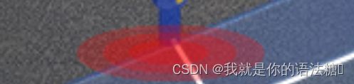
}闪烁效果(动态)


 2027
2027


 被折叠的 条评论
为什么被折叠?
被折叠的 条评论
为什么被折叠?
 到【灌水乐园】发言


