


最近画图比较多,对ggplot2做一个总结,以后会慢慢更新
![[外链图片转存失败,源站可能有防盗链机制,建议将图片保存下来直接上传(img-dWAjANKj-1658759491475)(attachment:%E5%9B%BE%E7%89%87.png)]](https://img-blog.csdnimg.cn/0846c67b20864189b5f9002a7130f6a2.png)
ggplot2颜色设置及使用
https://blog.csdn.net/qq_45759229/article/details/125422964
主题theme使用
https://zhuanlan.zhihu.com/p/115639331
library(ggplot2)
library(gcookbook)
hw_plot <- ggplot(heightweight, aes(x = ageYear, y = heightIn)) +
geom_point()
hw_plot
hw_plot + theme_bw()
hw_plot + theme_grey()
hw_plot + theme_minimal()
hw_plot + theme_classic()
hw_plot + theme_void()
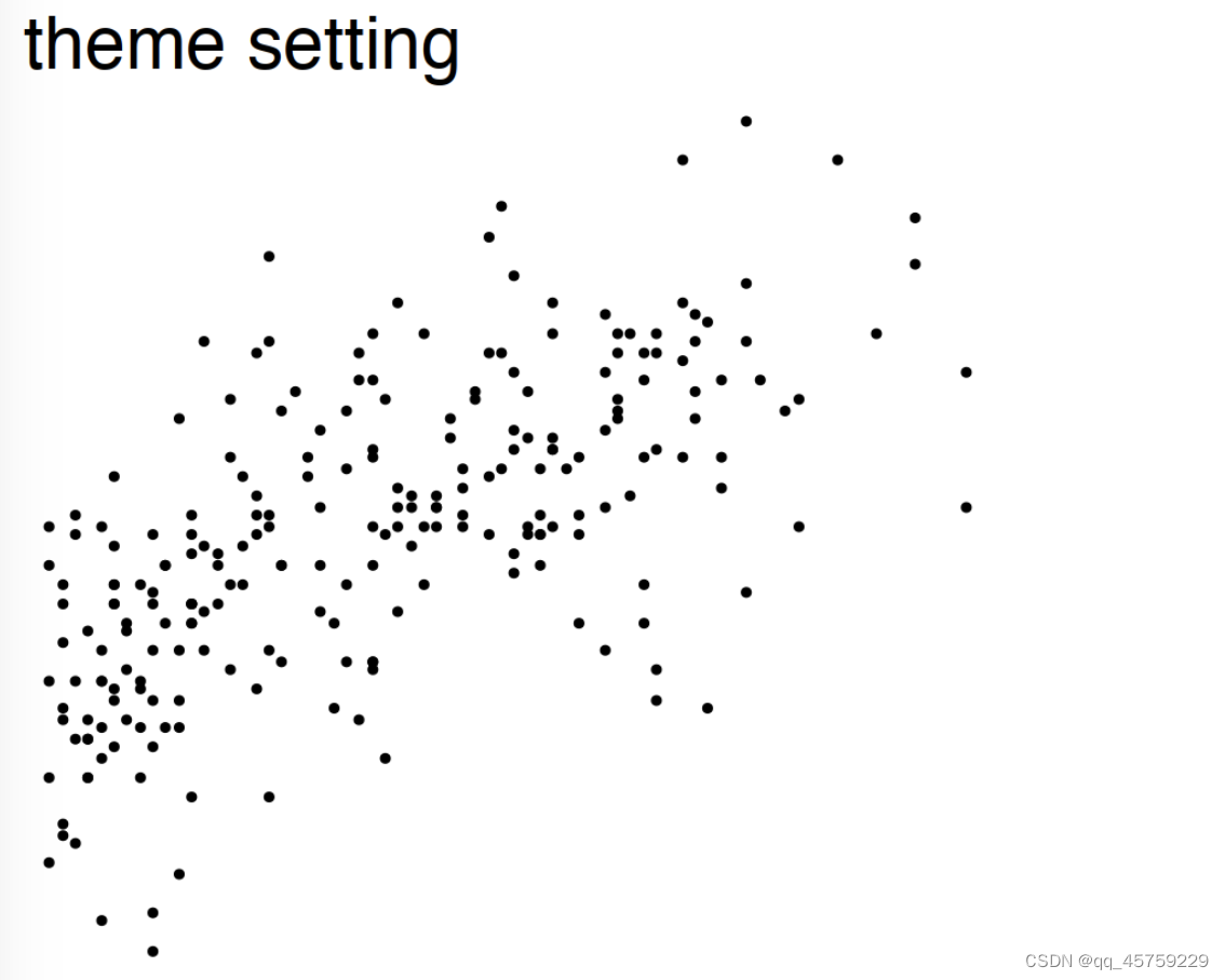
hw_plot + theme_void()+ggtitle(" theme setting") # 设置标题
hw_plot + theme_void(base_size = 20,base_family = "Times")+ggtitle(" theme setting") # 设置字体
library(extrafont)
hw_plot + theme_void(base_size = 30,base_family = "mono")+ggtitle(" theme setting") # 有问题,不知道怎么回事
Warning message:
“程辑包‘ggplot2’是用R版本4.1.2 来建造的”


![[外链图片转存失败,源站可能有防盗链机制,建议将图片保存下来直接上传(img-PysdAa4P-1658759491477)(output_5_3.png)]](https://img-blog.csdnimg.cn/e0cd8127eebc4be6baa806064d6d0422.png)


标题居中
## 注意标签
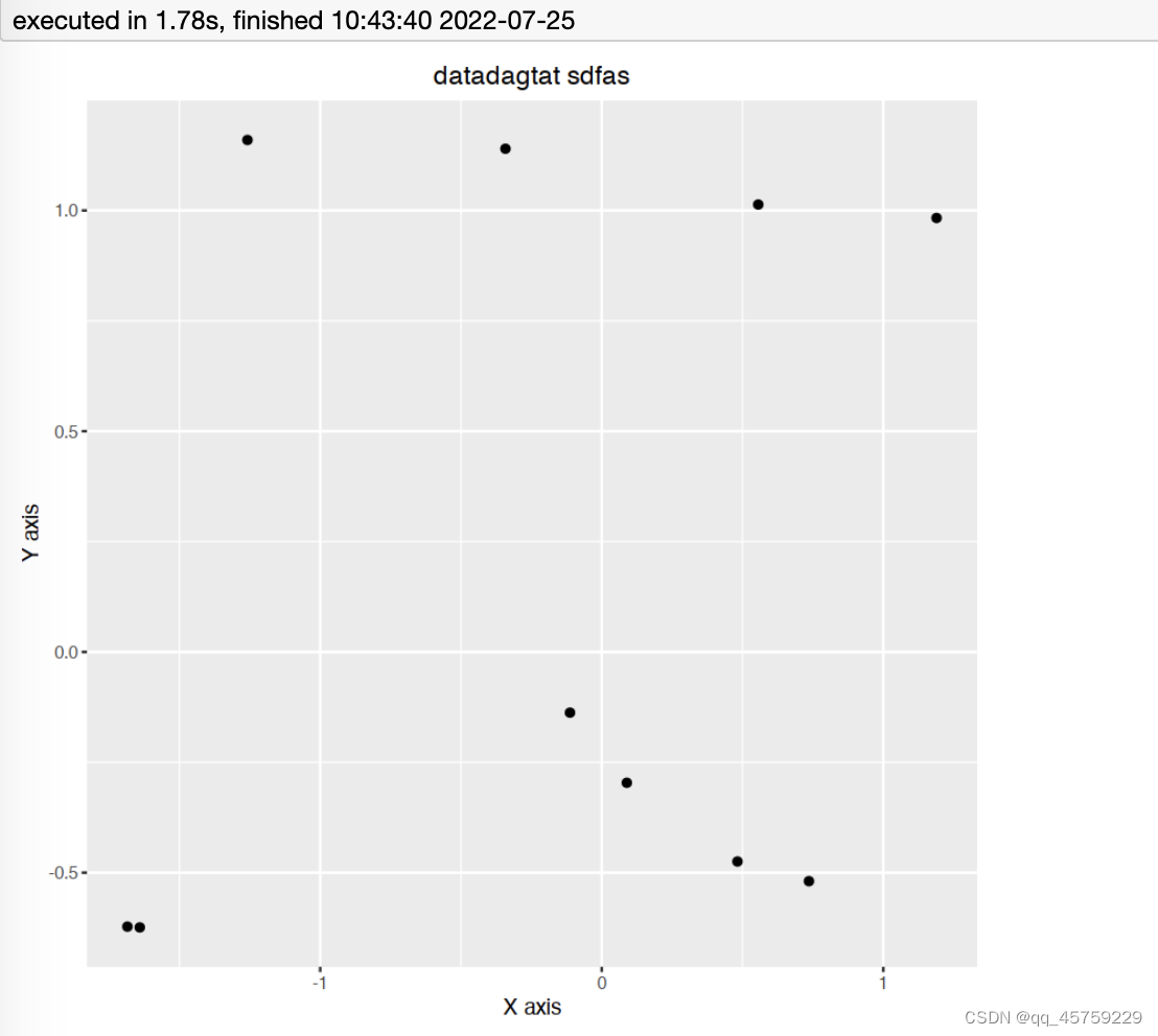
df <- data.frame(A = rnorm(10), B = rnorm(10))
p = ggplot(data = df, aes(x = A, y = B)) + geom_point()
p = p + xlab("A long x-string so we can see the effect of the font switch")
p = p + ylab("Likewise up the ordinate")
p+labs(title="datadagtat sdfas",x="X axis",y="Y axis")+theme(plot.title = element_text(hjust = 0.5))
# xlab和labs(x="?")是等价的
theme(strip.background)参数
https://zhuanlan.zhihu.com/p/225852640
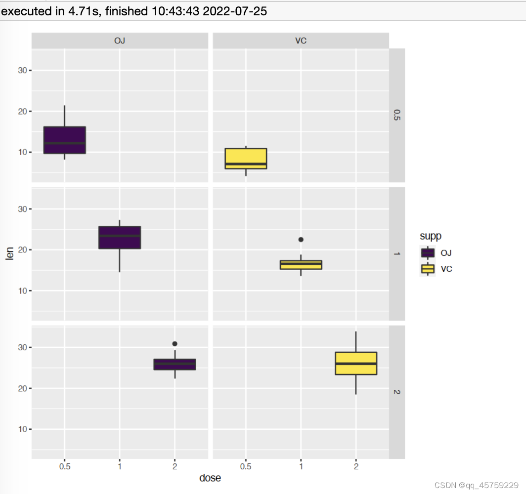
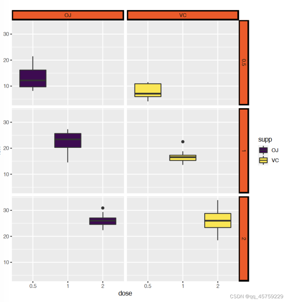
# Load data and convert dose to a factor variable
data("ToothGrowth")
ToothGrowth$dose <- as.factor(ToothGrowth$dose)
# Box plot, facet accordding to the variable dose and supp
p <- ggplot(ToothGrowth, aes(x = dose, y = len)) +
geom_boxplot(aes(fill = supp), position = position_dodge(0.9)) +
scale_fill_viridis_d() # 离散颜色
p + facet_grid(dose ~ supp)
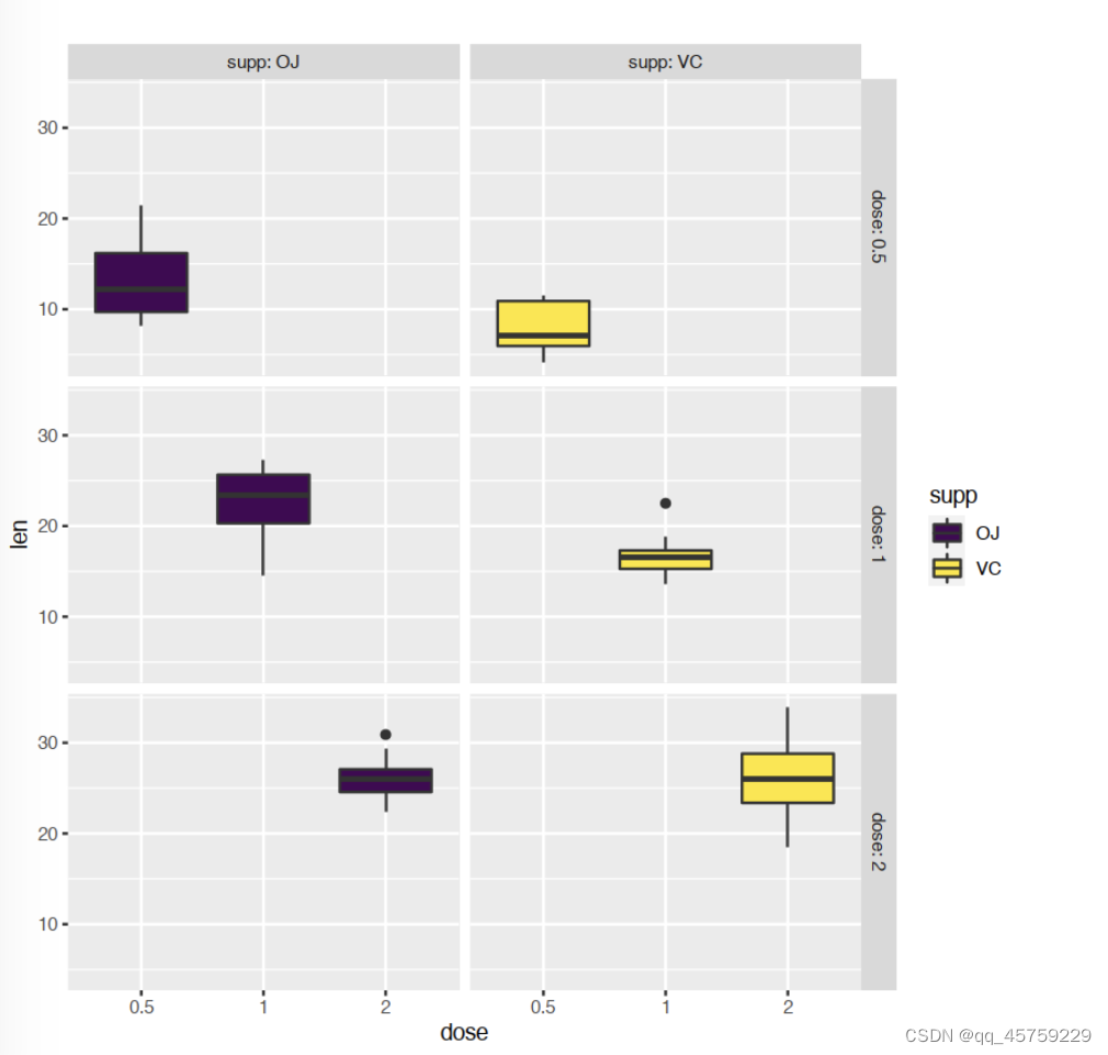
p + facet_grid(dose ~ supp, labeller = label_both)
# 给labeller传递一个lable_both就可以将分面的标签加上这个分面的label
p + facet_grid(dose ~ supp)+
theme(
strip.text.x = element_text(
size = 12, color = "red", face = "bold.italic"
), # 这里设置x轴方向的字体类型,
strip.text.y = element_text(
size = 12, color = "red", face = "bold.italic"
) # 这里设置y轴方向的字体类型,
) # 修改字体和颜色
p + facet_grid(dose ~ supp)+
theme(
strip.background = element_rect(
color="black", fill="#FC4E07", size=1.5, linetype="solid"
)
)
#分面label的背景设置是theme里面的strip.background调整
p + facet_grid(dose ~ supp)+
theme(
strip.background.x = element_rect(
color="black", fill="#FC4E07", size=1.5, linetype="solid"
),
strip.background.y = element_rect(
color="black", fill="green", size=1.5, linetype="solid"
)
)
# 设置x轴和y轴strip的颜色不同
p + facet_grid(dose ~ supp)+
theme(
strip.background.x = element_rect(
color="black", fill="#FC4E07", size=1.5, linetype="solid"
),
strip.background.y = element_rect(
color="black", fill="green", size=1.5, linetype="solid"
),
panel.border = element_rect(color = 'red')
)
# 设置各个分面的panel的边框的颜色还是panel.border,对应的输入格式是element_rect。
p + facet_grid(dose ~ supp)+
theme(
strip.background.x = element_rect(
color="black", fill="#FC4E07", size=1.5, linetype="solid"
),
strip.background.y = element_rect(
color="black", fill="green", size=1.5, linetype="solid"
),
strip.placement = "outside",
)
p + facet_grid(dose ~ supp)+
theme(
strip.background.x = element_rect(
color="black", fill="#FC4E07", size=1.5, linetype="solid"
),
strip.background.y = element_rect(
color="black", fill="green", size=1.5, linetype="solid"
),
strip.placement = "inside",
strip.switch.pad.grid = unit(2, "cm"),
strip.switch.pad.wrap = unit(2, "cm")
)


ggplot(ToothGrowth, aes(x = dose, y = len)) + geom_boxplot(aes(fill = supp),position = position_dodge(0.9))

position_dodge(柱形图柱宽度)
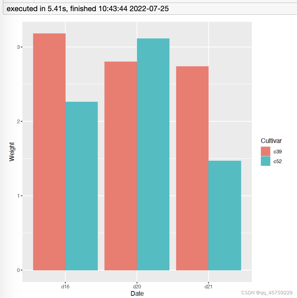
ggplot(cabbage_exp, aes(x=Date, y=Weight, fill=Cultivar)) +
geom_bar(stat="identity", width=0.9, position="dodge")
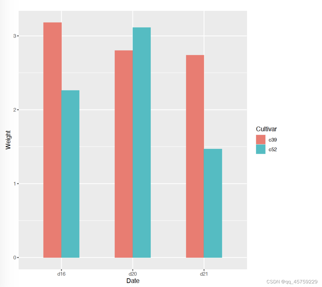
ggplot(cabbage_exp, aes(x=Date, y=Weight, fill=Cultivar)) +
geom_bar(stat="identity", width=0.5, position="dodge")
##
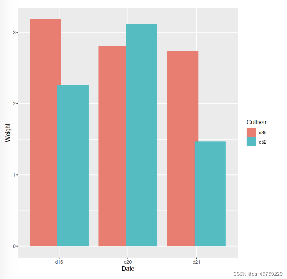
ggplot(cabbage_exp, aes(x=Date, y=Weight, fill=Cultivar)) +
geom_bar(stat="identity",position = position_dodge(0.8))
facet_grid()分面
#----------分面作图----------
library(ggplot2)
library(patchwork)
p1<-ggplot(mtcars,aes(mpg,wt))+geom_point()+facet_grid(vs~.)+
  labs(title = "by row")+
  theme(plot.title = element_text(hjust = 0.5))
p2<-ggplot(mtcars,aes(mpg,wt))+geom_point()+facet_grid(.~vs)+
  labs(title = "by column")+
  theme(plot.title = element_text(hjust = 0.5))
p1|p2

df=mtcars[mtcars$vs==0,]
p1<-ggplot(df,aes(mpg,wt))+geom_point()
p1 ## 放大

p1<-ggplot(mtcars,aes(mpg,wt))+geom_point()+facet_grid(vs~cyl)+
  labs(title = "by row and column")+
  theme(plot.title = element_text(hjust = 0.5))
p1


element_blank()
http://events.jianshu.io/p/528d5da54c2e
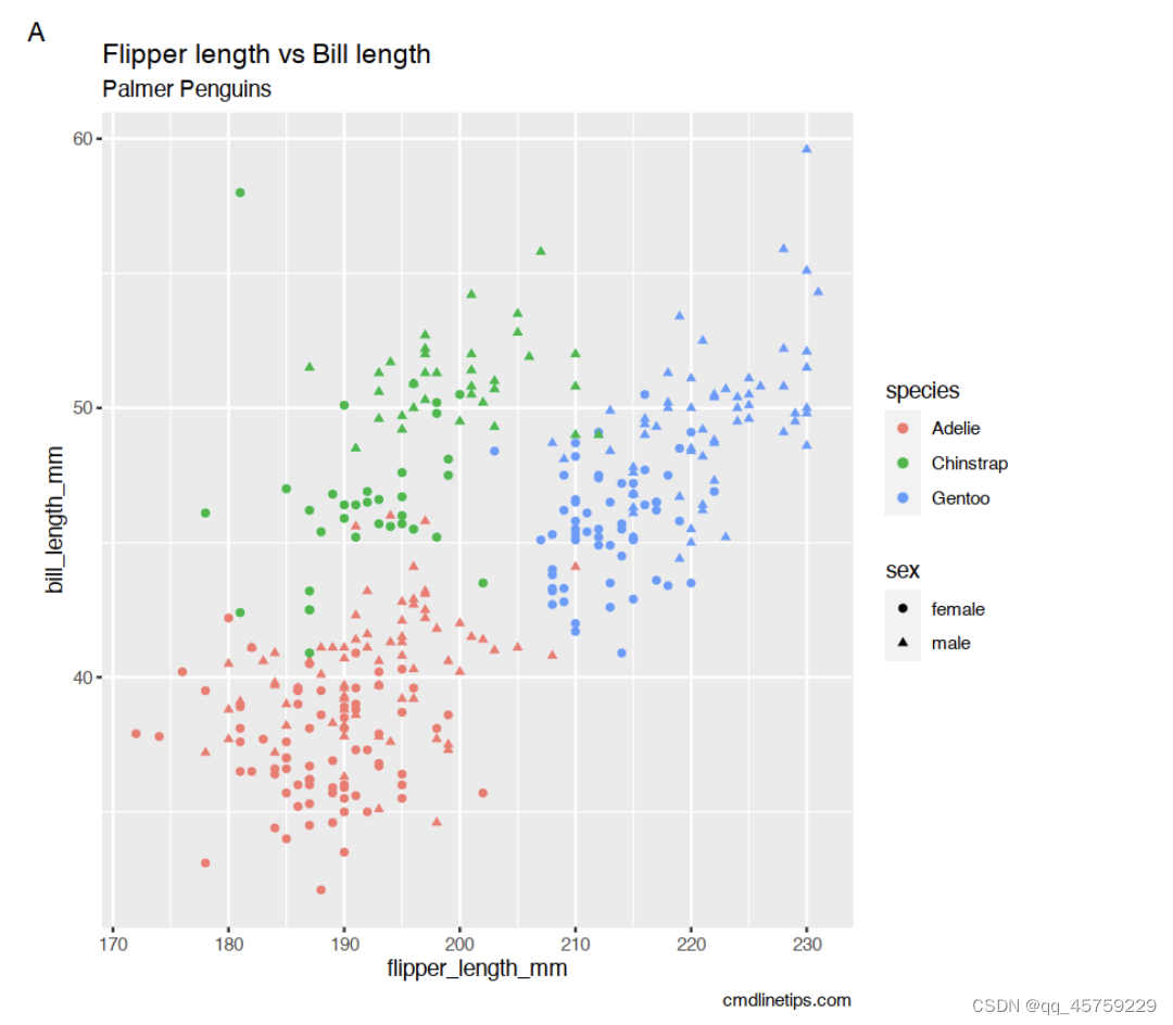
suppressPackageStartupMessages(library(tidyverse))
suppressPackageStartupMessages(library(palmerpenguins))
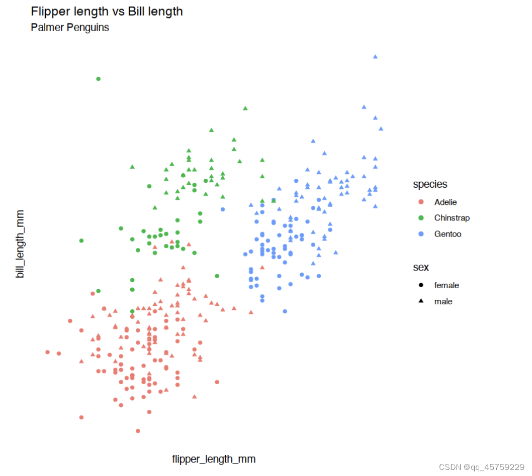
p <- penguins %>%
drop_na() %>%
ggplot(aes(x=flipper_length_mm,
y=bill_length_mm,
color=species,# 设置颜色
shape=sex))+ # 设置形状
geom_point()+
labs(title="Flipper length vs Bill length",
subtitle="Palmer Penguins", # 设置子title
caption="cmdlinetips.com", # 设置caption
tag="A")
p
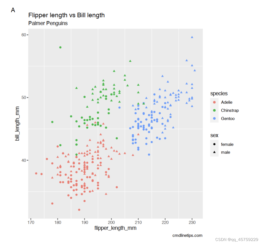
# 删除主要网格
p + theme(panel.grid.major=element_blank())
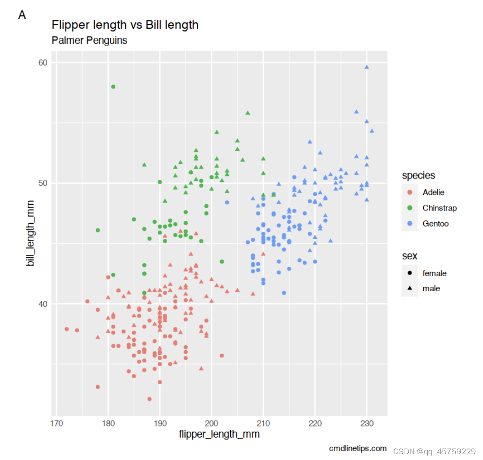
# 删除次要网格
p + theme(panel.grid.minor=element_blank())
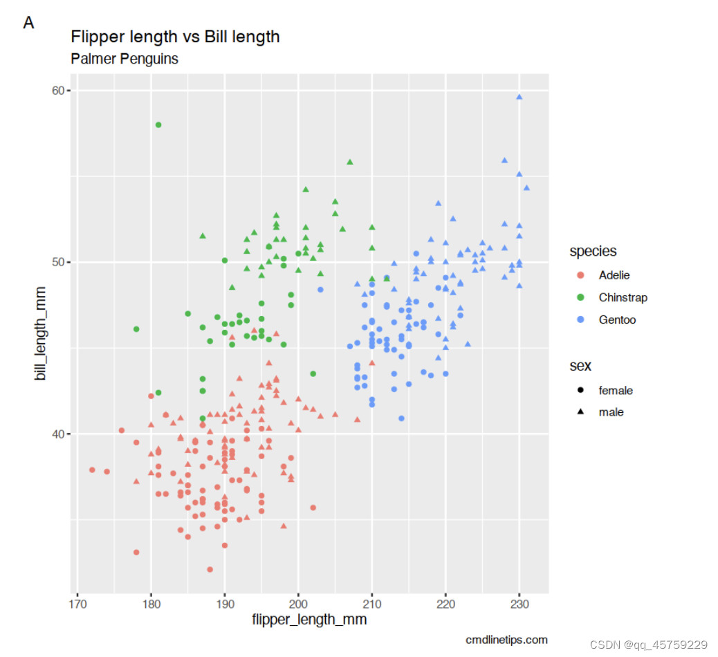
# 删除图像背景
p + theme(panel.background = element_blank())
# 删除轴刻度
p + theme(axis.ticks = element_blank())
# 删除轴文本
p + theme(axis.text = element_blank())
# 删除图例键
p + theme(legend.key=element_blank())
# 删除多个主题元素
p + theme(panel.background = element_blank(),
axis.ticks = element_blank(),
axis.text = element_blank(),
legend.key=element_blank(),
plot.tag=element_blank(),
plot.caption=element_blank())
Warning message:
“程辑包‘tibble’是用R版本4.1.2 来建造的”
Warning message:
“程辑包‘tidyr’是用R版本4.1.2 来建造的”
Warning message:
“程辑包‘readr’是用R版本4.1.2 来建造的”
Warning message:
“程辑包‘dplyr’是用R版本4.1.2 来建造的”


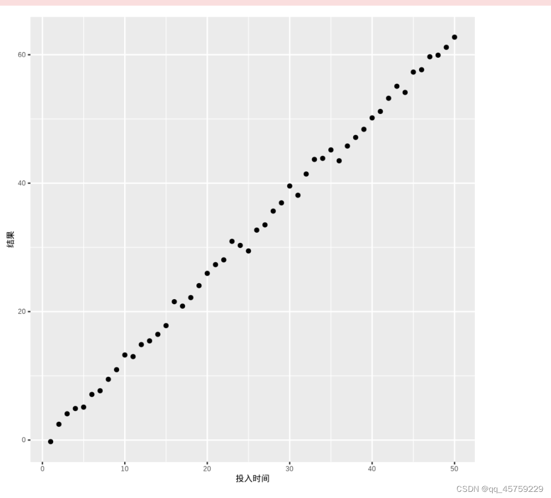
ggplot2显示中文
rm(list=ls())
library(ggplot2)
## 显示中文
library(showtext) # 安装这个包
showtext_auto()
data=data.frame(投入时间=c(1:50),结果=c(1:50)*1.25+rnorm(50))
#plot(data$投入时间,data$结果,family="STKaiti")#这句也可以

#plot(data$投入时间,data$结果,main="中文题目")
print(ggplot(data=data,aes(x=投入时间,y=结果))+geom_point())
Warning message:
“程辑包‘showtext’是用R版本4.1.2 来建造的”
载入需要的程辑包:sysfonts

Warning message:
“程辑包‘sysfonts’是用R版本4.1.2 来建造的”
载入需要的程辑包:showtextdb
载入程辑包:‘showtextdb’
The following object is masked from ‘package:extrafont’:

    font_install
ggplot2显示导入的png图像
library(ggplot2)
library(cowplot)
library(magick)
library(patchwork)
# Update 2020-04-15:
# As of version 1.0.0, cowplot does not change the default ggplot2 theme anymore.
# So, either we add theme_cowplot() when we build the graph
# (commented out in the example below),
# or we set theme_set(theme_cowplot()) at the beginning of our script:
theme_set(theme_cowplot())

# Example with PNG (for fun, the OP's avatar - I love the raccoon)
p1=ggdraw() +
  draw_image("./gg_test1.png")

p2=ggdraw() +
  draw_image("./gg_test1.png")

p1+p2
载入程辑包:‘cowplot’
The following object is masked from ‘package:patchwork’:

    align_plots
Linking to ImageMagick 6.9.12.3
Enabled features: cairo, fontconfig, freetype, heic, lcms, pango, raw, rsvg, webp
Disabled features: fftw, ghostscript, x11

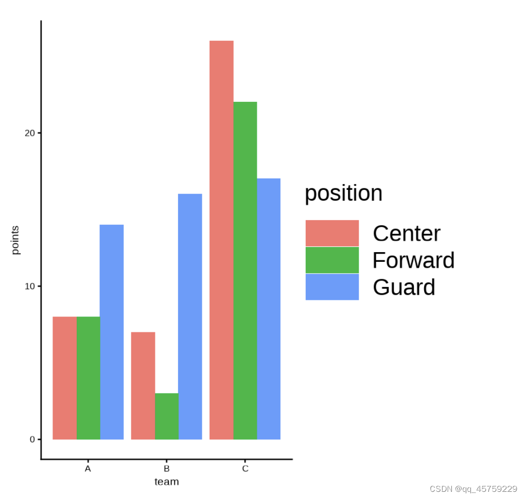
ggplot2调整图例大小
# 调整图例大小(不使用guides)
library(ggplot2)
# http://www.360doc.com/content/12/0121/07/77506210_1001626628.shtml
#create data frame
df <- data.frame(team=rep(c('A', 'B', 'C'), each=3),
                 position=rep(c('Guard', 'Forward', 'Center'), times=3),
                 points=c(14, 8, 8, 16, 3, 7, 17, 22, 26))

#create grouped barplot
ggplot(df, aes(fill=position, y=points, x=team)) +
  geom_bar(position='dodge', stat='identity')

ggplot(df, aes(fill=position, y=points, x=team)) +
  geom_bar(position='dodge', stat='identity') +
  theme(legend.title = element_text(size=30))+
  theme(legend.text = element_text(size=30))+
   theme(legend.key.height= unit(1, 'cm'),legend.key.width= unit(2, 'cm'))

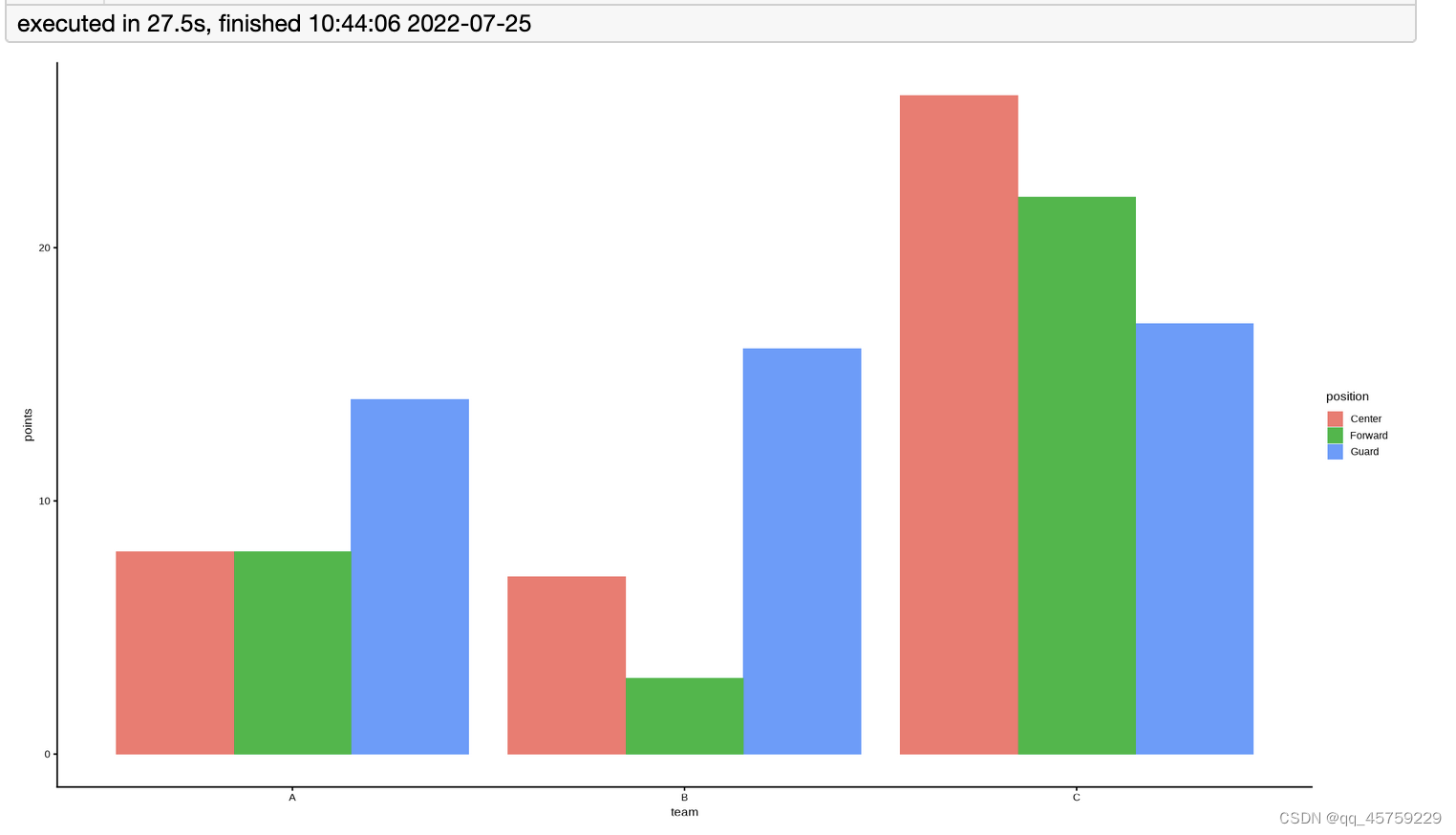
ggplot2设置图片大小(jupyter)
options(repr.plot.width = 18, repr.plot.height = 10)## 这个点其实有点大
# 调整图例大小(不使用guides)
library(ggplot2)
# http://www.360doc.com/content/12/0121/07/77506210_1001626628.shtml
#create data frame
df <- data.frame(team=rep(c('A', 'B', 'C'), each=3),
                 position=rep(c('Guard', 'Forward', 'Center'), times=3),
                 points=c(14, 8, 8, 16, 3, 7, 17, 22, 26))

#create grouped barplot
ggplot(df, aes(fill=position, y=points, x=team)) +
  geom_bar(position='dodge', stat='identity')

options(repr.plot.width = 5, repr.plot.height = 5)## 这个点其实有点大
library(ggplot2)
# http://www.360doc.com/content/12/0121/07/77506210_1001626628.shtml
#create data frame
df <- data.frame(team=rep(c('A', 'B', 'C'), each=3),
                 position=rep(c('Guard', 'Forward', 'Center'), times=3),
                 points=c(14, 8, 8, 16, 3, 7, 17, 22, 26))

#create grouped barplot
ggplot(df, aes(fill=position, y=points, x=team)) +
  geom_bar(position='dodge', stat='identity')

ggplot2保存图片
#Figure 4
library(ggplot2)
# http://www.360doc.com/content/12/0121/07/77506210_1001626628.shtml
#create data frame
df <- data.frame(team=rep(c('A', 'B', 'C'), each=3),
                 position=rep(c('Guard', 'Forward', 'Center'), times=3),
                 points=c(14, 8, 8, 16, 3, 7, 17, 22, 26))

#create grouped barplot
p=ggplot(df, aes(fill=position, y=points, x=team)) +
  geom_bar(position='dodge', stat='identity')
ggsave("./gg_test1.tiff",p,width=24,height = 26,dpi=300,compression="lzw")
ggsave("./gg_test1.pdf",p,width=24,height = 26,dpi=300)
ggsave("./gg_test1.png",p,width=24,height = 26,dpi=300)
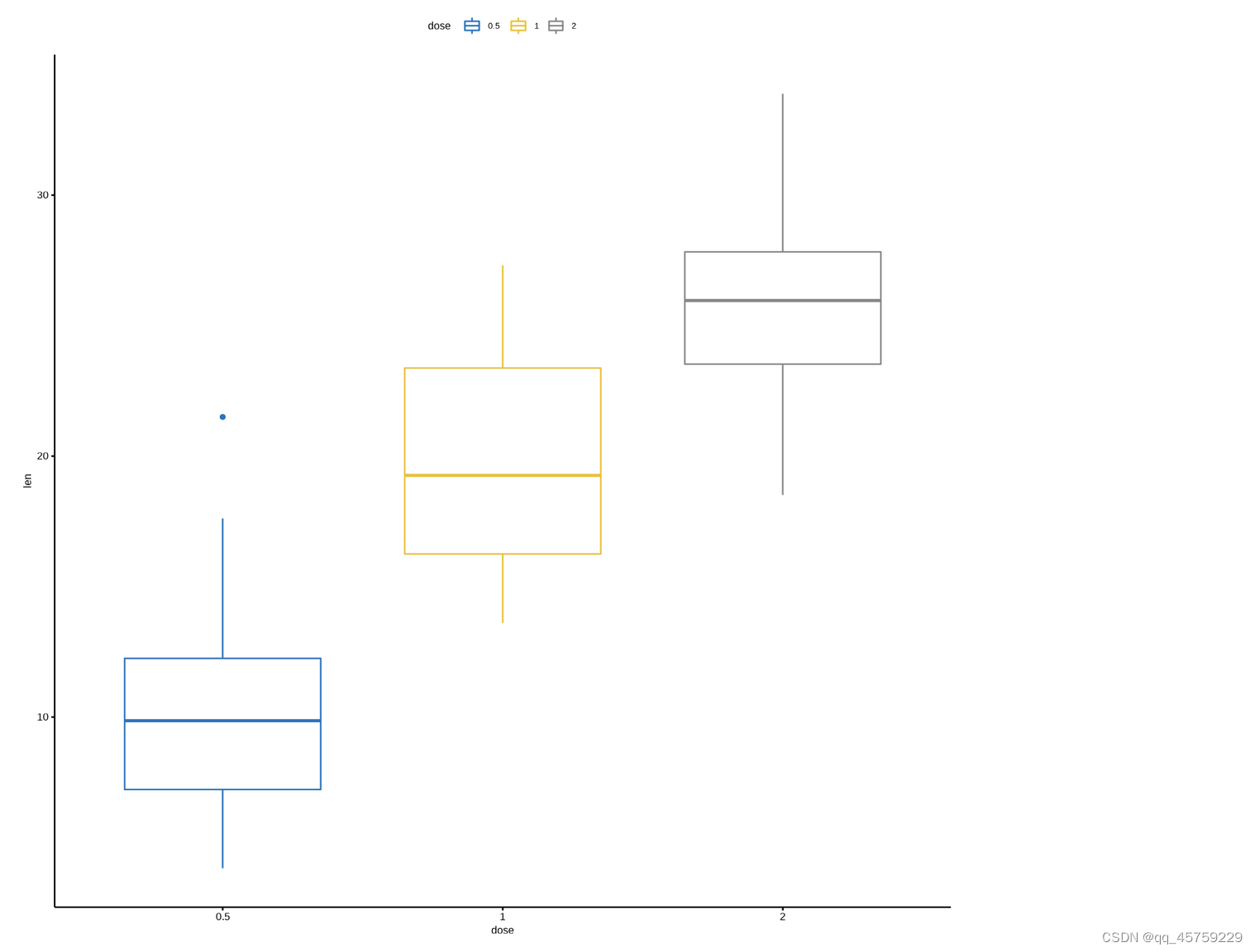
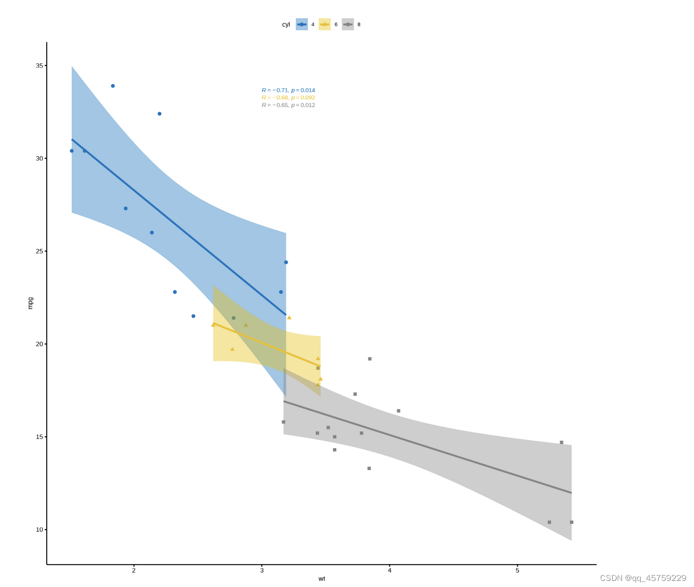
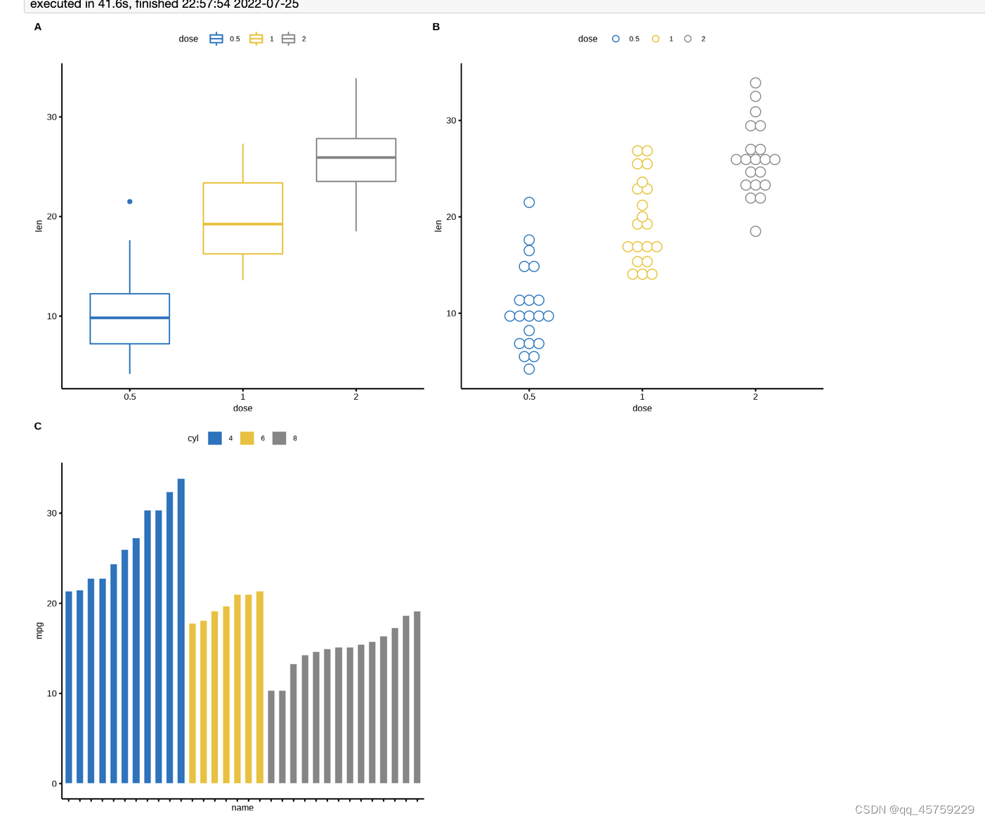
ggarange 排列子图
http://www.sthda.com/english/articles/24-ggpubr-publication-ready-plots/81-ggplot2-easy-way-to-mix-multiple-graphs-on-the-same-page/
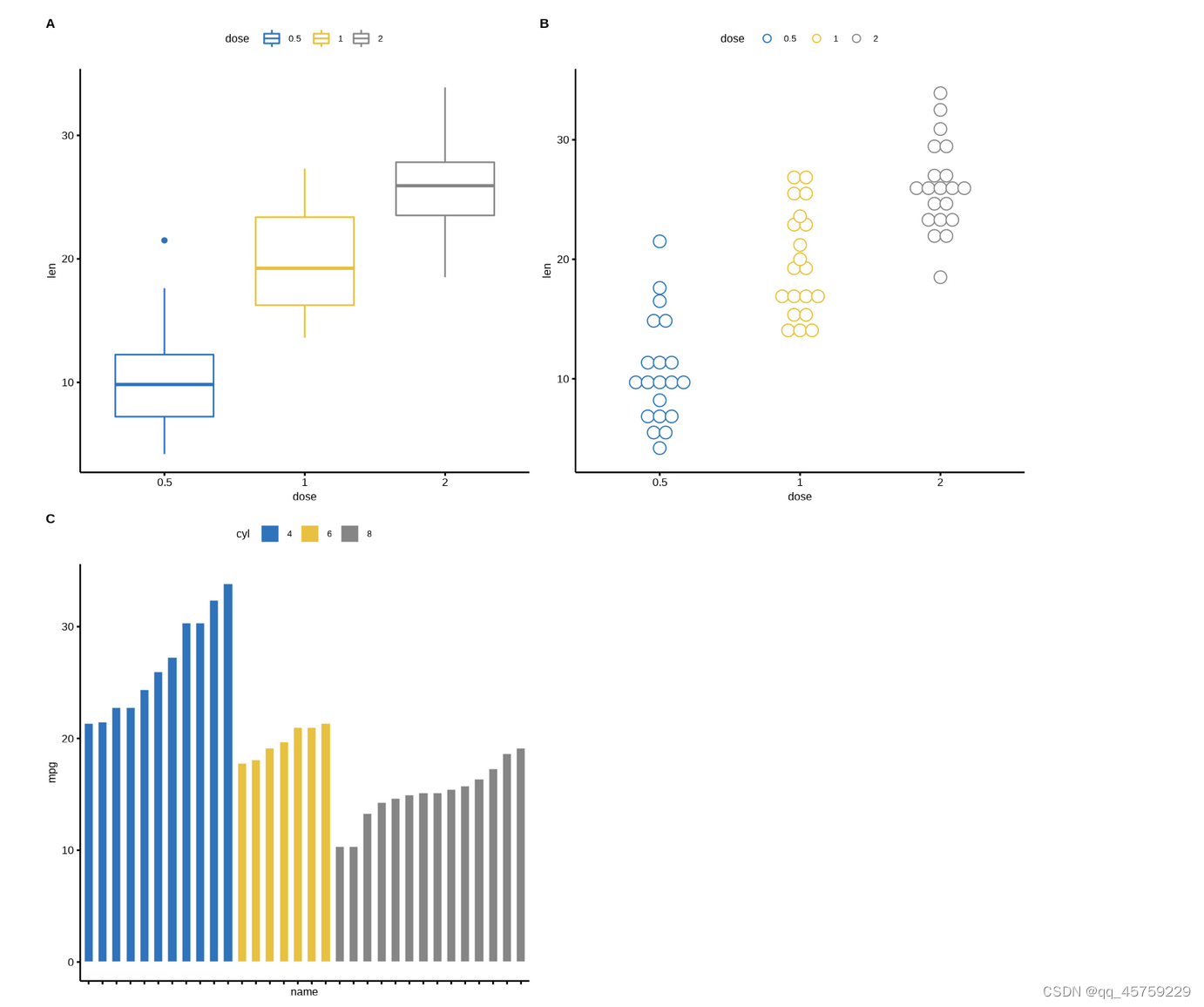
library(ggpubr)
# ToothGrowth
data("ToothGrowth")
#head(ToothGrowth)
# mtcars
data("mtcars")
mtcars$name <- rownames(mtcars)
mtcars$cyl <- as.factor(mtcars$cyl)
#head(mtcars[, c("name", "wt", "mpg", "cyl")])

# Box plot (bp)
bxp <- ggboxplot(ToothGrowth, x = "dose", y = "len",
                 color = "dose", palette = "jco")
bxp
# Dot plot (dp)
dp <- ggdotplot(ToothGrowth, x = "dose", y = "len",
                 color = "dose", palette = "jco", binwidth = 1)
dp

# Bar plot (bp)
bp <- ggbarplot(mtcars, x = "name", y = "mpg",
          fill = "cyl",               # change fill color by cyl
          color = "white",            # Set bar border colors to white
          palette = "jco",            # jco journal color palett. see ?ggpar
          sort.val = "asc",           # Sort the value in ascending order
          sort.by.groups = TRUE,      # Sort inside each group
          x.text.angle = 90           # Rotate vertically x axis texts
          )
bp + font("x.text", size = 8)
# Scatter plots (sp)
sp <- ggscatter(mtcars, x = "wt", y = "mpg",
                add = "reg.line",               # Add regression line
                conf.int = TRUE,                # Add confidence interval
                color = "cyl", palette = "jco", # Color by groups "cyl"
                shape = "cyl"                   # Change point shape by groups "cyl"
                )+
  stat_cor(aes(color = cyl), label.x = 3)       # Add correlation coefficient
sp

##################### 以下三种格式都是可以的
## type1
ggarrange(bxp, dp, bp + rremove("x.text"),
          labels = c("A", "B", "C"),
          ncol = 2, nrow = 2)

## type2
library("cowplot")
plot_grid(bxp, dp, bp + rremove("x.text"),
          labels = c("A", "B", "C"),
          ncol = 2, nrow = 2)
## type3
library("gridExtra")
grid.arrange(bxp, dp, bp + rremove("x.text"),
             ncol = 2, nrow = 2)


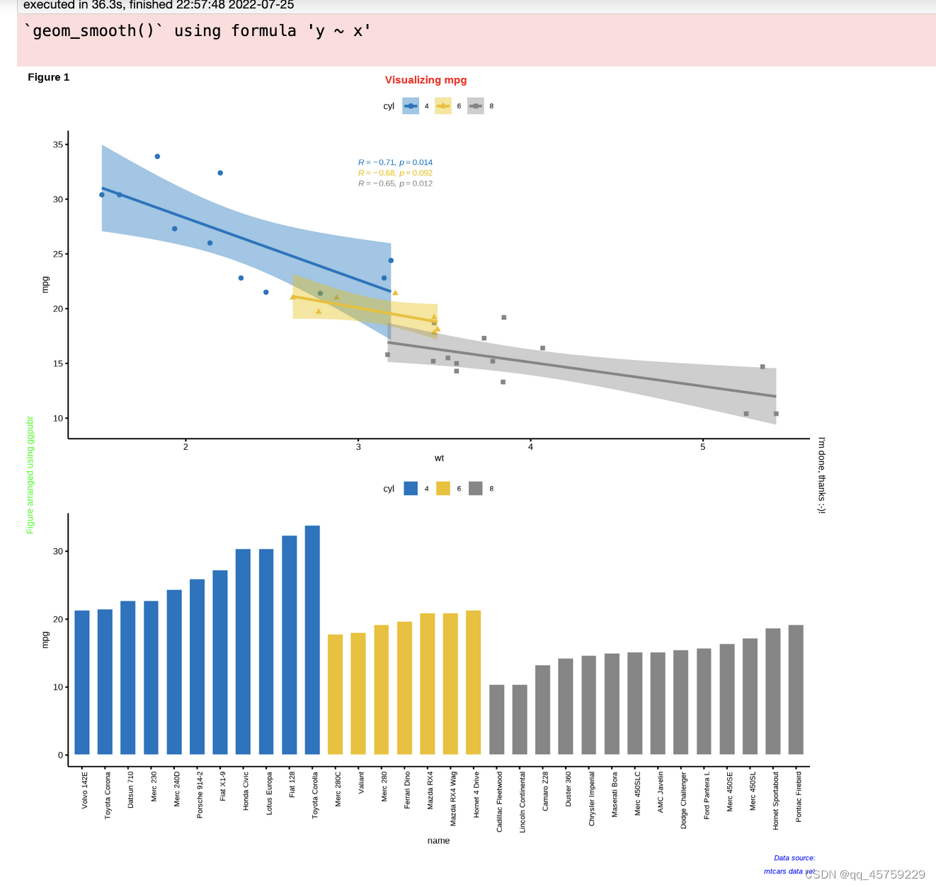
ggplot2标注图片
options(repr.plot.width=12,repr.plot.height=12)
library(ggpubr)
# ToothGrowth
data("ToothGrowth")
#head(ToothGrowth)
# mtcars
data("mtcars")
mtcars$name <- rownames(mtcars)
mtcars$cyl <- as.factor(mtcars$cyl)
#head(mtcars[, c("name", "wt", "mpg", "cyl")])

# Bar plot (bp)
bp <- ggbarplot(mtcars, x = "name", y = "mpg",
          fill = "cyl",               # change fill color by cyl
          color = "white",            # Set bar border colors to white
          palette = "jco",            # jco journal color palett. see ?ggpar
          sort.val = "asc",           # Sort the value in ascending order
          sort.by.groups = TRUE,      # Sort inside each group
          x.text.angle = 90           # Rotate vertically x axis texts
          )
# Scatter plots (sp)
sp <- ggscatter(mtcars, x = "wt", y = "mpg",
                add = "reg.line",               # Add regression line
                conf.int = TRUE,                # Add confidence interval
                color = "cyl", palette = "jco", # Color by groups "cyl"
                shape = "cyl"                   # Change point shape by groups "cyl"
                )+
  stat_cor(aes(color = cyl), label.x = 3)       # Add correlation coefficient


figure <- ggarrange(sp, bp + font("x.text", size = 10),
                    ncol = 1, nrow = 2)
annotate_figure(figure,
                top = text_grob("Visualizing mpg", color = "red", face = "bold", size = 14),
                bottom = text_grob("Data source: \n mtcars data set", color = "blue",
                                   hjust = 1, x = 1, face = "italic", size = 10),
                left = text_grob("Figure arranged using ggpubr", color = "green", rot = 90),
                right = "I'm done, thanks :-)!",
                fig.lab = "Figure 1", fig.lab.face = "bold"
                )
`geom_smooth()` using formula 'y ~ x'
ggplot画密度图并设置图例
rm(list=ls())
library(tidyverse)

set.seed(2)
dat = data.frame(dv = rnorm(100, 10, 3),
                 sim = rnorm(100, 11, 2))

print(ggplot(dat) +
  geom_density(aes(dv, colour="dv")) +
  geom_density(aes(sim, colour="sim")) +
  labs(colour="Type",
       x="Concerta Peak1 Cmax Distribution",
       y="Density") +
  scale_colour_manual(values=c("green", "red")) +
  theme(legend.position=c(0.9, 0.9)))

# ggplot2确实是挺好用的,但是问题是一定得注意colour的位置和拼写,首先colour的拼写是colour而不是color,而且colour的设置是在aes()的括号内,而不是在ggplot2()的括号内,如果写错了,很容易犯错误

散点图和拟合图叠加(设置x轴和y轴范围)
#load package and data
options(scipen=999)  # turn-off scientific notation like 1e+48,关闭科学记数法
library(ggplot2)
theme_set(theme_bw())  # pre-set the bw theme.
data("midwest", package = "ggplot2")
# midwest <- read.csv("http://goo.gl/G1K41K")  # bkup data source

# Scatterplot
gg <- ggplot(midwest, aes(x=area, y=poptotal)) +
  geom_point(aes(col=state, size=popdensity)) +
  geom_smooth(method="loess", se=F) +
  xlim(c(0, 0.05)) +
  ylim(c(0, 500000)) +
  labs(subtitle="Area Vs Population",
       y="Population",
       x="Area",
       title="Scatterplot",
       caption = "Source: midwest")

plot(gg)
#ggsave(filename = "test2.pdf", gg, width = 8, height = 5, dpi = 200)

options(scipen=999)  # turn-off scientific notation like 1e+48
library(ggplot2)
theme_set(theme_bw())  # pre-set the bw theme.
data("midwest", package = "ggplot2")


# Scatterplot
# 设置x轴和y轴范围
gg <- ggplot(midwest, aes(x=area, y=poptotal)) +
  geom_point(aes(col=state, size=popdensity)) +
  geom_smooth(method="loess", se=F) +
  xlim(c(0, 0.10)) +
  ylim(c(0, 500000)) +
  labs(subtitle="Area Vs Population",
       y="Population",
       x="Area",
       title="Scatterplot",
       caption = "Source: midwest")

plot(gg)
`geom_smooth()` using formula 'y ~ x'

Warning message:
“Removed 66 rows containing non-finite values (stat_smooth).”
Warning message:
“Removed 66 rows containing missing values (geom_point).”
`geom_smooth()` using formula 'y ~ x'

Warning message:
“Removed 15 rows containing non-finite values (stat_smooth).”
Warning message:
“Removed 15 rows containing missing values (geom_point).”


ggplot2自定义统计函数
# 我今天画直方图和拟合的密度图发现一个问题,就是使用ggplot2画图时,画的直方图时离散的点,例如样本数为20,
#但是我想画密度图,这个时候相当于x是连续的,画的点也不会再是20个,
# 也就是说这两个x的维度大小不一样,不可能放入一个dataframe,所以是使用ggplot2画图时,
# 需要使用stat_function()函数,这个函数就特别的好用,可以画出上述效果的图
# 首先给一个stat_function的用法案例
library(ggplot2)
#这个函数是可以自定义的
MyFun <- function(x, p) {
  res <- x^(1 / p)
  return(res)
}

my.df <-data.frame(x = c(0,1))
ggplot(my.df, aes(x=x)) +
  stat_function(fun = MyFun, n = 1000, args = list(p = 10), aes(colour = "line1")) +
  stat_function(fun = MyFun, n = 1000, args = list(p = 3), aes(colour = "line2")) +
  stat_function(fun = MyFun, n = 1000, args = list(p = 2), aes(colour = "line3")) +
  stat_function(fun = MyFun, n = 1000, args = list(p = 1), aes(colour = "line4")) +
  scale_colour_manual("Lgend title", values = c("red", "blue", "green", "orange"))

额外库1 easyGgplot2
library(easyGgplot2)
# data.frame
df <- ToothGrowth
# 自定义框图与中心点图
plot1<-ggplot2.boxplot(data=df, xName='dose',yName='len', groupName='dose', addDot=TRUE, dotSize=1, showLegend=FALSE)
# 带中心点图的自定义点图
plot2<-ggplot2.dotplot(data=df, xName='dose',yName='len', groupName='dose',showLegend=FALSE)
# 带有中心点图的自定义带状图
plot3<-ggplot2.stripchart(data=df, xName='dose',yName='len', groupName='dose', showLegend=FALSE)
# Notched box plot
plot4<-ggplot2.boxplot(data=df, xName='dose',yName='len', notch=TRUE)
#在同一页上的多个图表
ggplot2.multiplot(plot1,plot2,plot3,plot4, cols=2)
Bin width defaults to 1/30 of the range of the data. Pick better value with `binwidth`.

Bin width defaults to 1/30 of the range of the data. Pick better value with `binwidth`.

额外库2(patchwork)
额外库3(egg)
额外库(ggpubr)
http://www.sthda.com/english/articles/24-ggpubr-publication-ready-plots/81-ggplot2-easy-way-to-mix-multiple-graphs-on-the-same-page/
library(ggpubr)
# ToothGrowth
data("ToothGrowth")
#head(ToothGrowth)
# mtcars
data("mtcars")
mtcars$name <- rownames(mtcars)
mtcars$cyl <- as.factor(mtcars$cyl)
#head(mtcars[, c("name", "wt", "mpg", "cyl")])

# Box plot (bp)
bxp <- ggboxplot(ToothGrowth, x = "dose", y = "len",
                 color = "dose", palette = "jco")
bxp
# Dot plot (dp)
dp <- ggdotplot(ToothGrowth, x = "dose", y = "len",
                 color = "dose", palette = "jco", binwidth = 1)
dp

# Bar plot (bp)
bp <- ggbarplot(mtcars, x = "name", y = "mpg",
          fill = "cyl",               # change fill color by cyl
          color = "white",            # Set bar border colors to white
          palette = "jco",            # jco journal color palett. see ?ggpar
          sort.val = "asc",           # Sort the value in ascending order
          sort.by.groups = TRUE,      # Sort inside each group
          x.text.angle = 90           # Rotate vertically x axis texts
          )
bp + font("x.text", size = 8)
# Scatter plots (sp)
sp <- ggscatter(mtcars, x = "wt", y = "mpg",
                add = "reg.line",               # Add regression line
                conf.int = TRUE,                # Add confidence interval
                color = "cyl", palette = "jco", # Color by groups "cyl"
                shape = "cyl"                   # Change point shape by groups "cyl"
                )+
  stat_cor(aes(color = cyl), label.x = 3)       # Add correlation coefficient
sp

`geom_smooth()` using formula 'y ~ x'

## type1
ggarrange(bxp, dp, bp + rremove("x.text"),
          labels = c("A", "B", "C"),
          ncol = 2, nrow = 2)

## type2
library("cowplot")
plot_grid(bxp, dp, bp + rremove("x.text"),
          labels = c("A", "B", "C"),
          ncol = 2, nrow = 2)
## type3
library("gridExtra")
grid.arrange(bxp, dp, bp + rremove("x.text"),
             ncol = 2, nrow = 2)

options(repr.plot.width=12,repr.plot.height=12)
figure <- ggarrange(sp, bp + font("x.text", size = 10),
                    ncol = 1, nrow = 2)
annotate_figure(figure,
                top = text_grob("Visualizing mpg", color = "red", face = "bold", size = 14),
                bottom = text_grob("Data source: \n mtcars data set", color = "blue",
                                   hjust = 1, x = 1, face = "italic", size = 10),
                left = text_grob("Figure arranged using ggpubr", color = "green", rot = 90),
                right = "I'm done, thanks :-)!",
                fig.lab = "Figure 1", fig.lab.face = "bold"
                )
`geom_smooth()` using formula 'y ~ x'

ggplot2 设置点的填充和边框颜色(透明度)
rm(list=ls())
library(ggplot2)
data <- data.frame(x = 1:6,        # Create example data
                   y = c(3, 1, 5, 4, 2, 4),
                   group = factor(letters[1:3]))
data
ggp <- ggplot(data,                # Create ggplot2 scatterplot
              aes(x, y,
                  color = group,
                  fill = group)) +
  geom_point(size = 7,
             shape = 21,
             stroke = 3)
ggp +                              # Change fill & border color
  scale_fill_manual(values = c("a" = "black",
                               "b" = "blue",
                               "c" = "white")) +
  scale_color_manual(values = c("a" = "red",
                                "b" = "yellow",
                                "c" = "green"))+
  theme(legend.position = "none")
结果如下

# 设置透明度
ggp <- ggplot(data,                # Create ggplot2 scatterplot
              aes(x, y,
                  color = group,
                  fill = group)) +
  geom_point(size = 7,
             shape = 21,
             stroke = 3,
            alpha=0.15) #
ggp +                              # Change fill & border color
  scale_fill_manual(values = c("a" = "black",
                               "b" = "blue",
                               "c" = "white")) +
  scale_color_manual(values = c("a" = "red",
                                "b" = "yellow",
                                "c" = "green"))+
  theme(legend.position = "none")

data <- data.frame(x = 1:6,        # Create example data
                   y = c(3, 1, 5, 4, 2, 4),
                   group = factor(letters[1:3]))
data
ggp <- ggplot(data,                # Create ggplot2 scatterplot
              aes(x, y,
                  color = group,
                  fill = group)) +
  geom_point(size = 10,
             shape = 21,
             stroke = 1)
ggp +                              # Change fill & border color
  scale_fill_manual( values =alpha(c("a"="red","b"="yellow","c"="green"),0.15)) +
  scale_color_manual(values = c("a" = "red",
                                "b" = "yellow",
                                "c" = "green"))+
  theme(legend.position = "none")
边框和填充设置不同透明度
标签设置不同的字体
# library(ggplot2)
# library(ggtext)
#
# p=ggplot(iris, aes(Sepal.Length, Sepal.Width, color = Species)) +
# geom_point(size = 3) +
# scale_color_manual(
# name = NULL,
# values = c(setosa = "#0072B2", virginica = "#009E73", versicolor = "#D55E00"),
# labels = c(
# setosa = "<i style='color:#0072B2'>I. setosa</i>",
# virginica = "<i style='color:#009E73'>I. virginica</i>",
# versicolor = "<i style='color:#D55E00'>I. versicolor</i>")
# ) +
# labs(
# title = "**Fisher's *Iris* dataset**
# <span style='font-size:11pt;font-family: serif'>Sepal width vs. sepal length for three *Iris*
# species</span>",
# x = "Sepal length (cm)", y = "Sepal width (cm)"
# ) +
# theme_minimal() +
# theme(
# plot.title = element_markdown(lineheight = 1.1),
# legend.text = element_markdown(size = 11)
# )
#
# print(p)
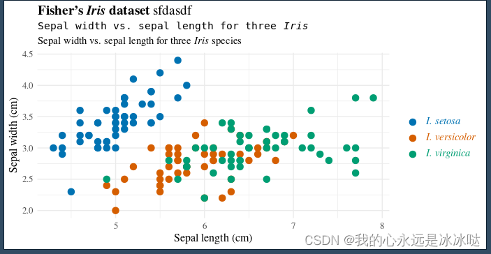
library(ggplot2)
library(ggtext)
p=ggplot(iris, aes(Sepal.Length, Sepal.Width, color = Species)) +
geom_point(size = 3) +
scale_color_manual(
name = NULL,
values = c(setosa = "#0072B2", virginica = "#009E73", versicolor = "#D55E00"),
labels = c(
setosa = "<i style='color:#0072B2'>I. setosa</i>",
virginica = "<i style='color:#009E73'>I. virginica</i>",
versicolor = "<i style='color:#D55E00'>I. versicolor</i>")
) +
labs(
title = "**Fisher's *Iris* dataset** sfdasdf
<span style='font-size:11pt;font-family: monospace'>Sepal width vs. sepal length for three *Iris*</span>
<span style='font-size:11pt;font-family: serif'>Sepal width vs. sepal length for three *Iris*
species</span>",
x = "Sepal length (cm)", y = "Sepal width (cm)"
) +
theme_minimal() +
theme(
plot.title = element_markdown(lineheight = 1.1),
legend.text = element_markdown(size = 11)
)
print(p)
## 不同的字体
结果如下

如果不确定是否是罗马字体,可以使用下面的代码
# library(ggplot2)
# library(ggtext)
#
# p=ggplot(iris, aes(Sepal.Length, Sepal.Width, color = Species)) +
#   geom_point(size = 3) +
#   scale_color_manual(
#     name = NULL,
#     values = c(setosa = "#0072B2", virginica = "#009E73", versicolor = "#D55E00"),
#     labels = c(
#       setosa = "<i style='color:#0072B2'>I. setosa</i>",
#       virginica = "<i style='color:#009E73'>I. virginica</i>",
#       versicolor = "<i style='color:#D55E00'>I. versicolor</i>")
#   ) +
#   labs(
#     title = "**Fisher's *Iris* dataset**
#     <span style='font-size:11pt;font-family: serif'>Sepal width vs. sepal length for three *Iris*
#     species</span>",
#     x = "Sepal length (cm)", y = "Sepal width (cm)"
#   ) +
#   theme_minimal() +
#   theme(
#     plot.title = element_markdown(lineheight = 1.1),
#     legend.text = element_markdown(size = 11)
#   )
#
# print(p)


library(ggplot2)
library(ggtext)

p=ggplot(iris, aes(Sepal.Length, Sepal.Width, color = Species)) +
  geom_point(size = 3) +
  scale_color_manual(
    name = NULL,
    values = c(setosa = "#0072B2", virginica = "#009E73", versicolor = "#D55E00"),
    labels = c(
      setosa = "<i style='color:#0072B2'>I. setosa</i>",
      virginica = "<i style='color:#009E73'>I. virginica</i>",
      versicolor = "<i style='color:#D55E00'>I. versicolor</i>")
  ) +
  labs(
    title = "**Fisher's *Iris* dataset**  sfdasdf
    <span style='font-size:11pt;font-family: monospace'>Sepal width vs. sepal length for three *Iris*</span>
    <span style='font-size:11pt;font-family: serif'>Sepal width vs. sepal length for three *Iris*
    species</span>",
    x = "Sepal length (cm)", y = "Sepal width (cm)"
  ) +
  theme_minimal() +
  theme(
    plot.title = element_markdown(lineheight = 1.1),
    legend.text = element_markdown(size = 11)
  )+
  theme(text=element_text(family="Times", size=12))

print(p)

## 不同的字体的组合
结果如下


 339
339


 被折叠的 条评论
为什么被折叠?
被折叠的 条评论
为什么被折叠?
 到【灌水乐园】发言


