


算法思想: 目的:使每一个簇尽可能聚拢,达到聚类的效果。
方法: 对于给定的训练样本集,根据聚类中心与训练样本之间的距离划分为K个簇(K由自己需求决定,簇是指一个数据团,包含n个相同类别样本),再将聚类中心算作所属簇中的一个样本,利用平均值求出新的簇聚类中心,直到让聚类中心与样本距离的误差小于理想值为止。根据上图可视化结果,易得K=3
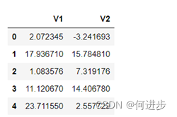
# 导入数据
import pandas as pd
import numpy as np

data = pd.read_csv('data_km.csv')
x = data.drop('labels',axis=1)
y = data.loc[:,'labels']
x.head()
# 模型训练
from sklearn.cluster import KMeans
KM = KMeans(n_clusters=3,random_state=0)
KM.fit(x)

#获取中心点
centers = KM.cluster_centers_
# 可视化数据
from matplotlib import pyplot as plt
fig1 = plt.figure()
label0 = plt.scatter(x.loc[:,'V1'][y==0],x.loc[:,'V2'][y==0])
label1 = plt.scatter(x.loc[:,'V1'][y==1],x.loc[:,'V2'][y==1])
label2 = plt.scatter(x.loc[:,'V1'][y==2],x.loc[:,'V2'][y==2]) #自动分为不同颜色
plt.legend((label0,label1,label2),('label0','label1','label2'))
# 可视化中心点
plt.scatter(centers[:,0],centers[:,1]) #两个维度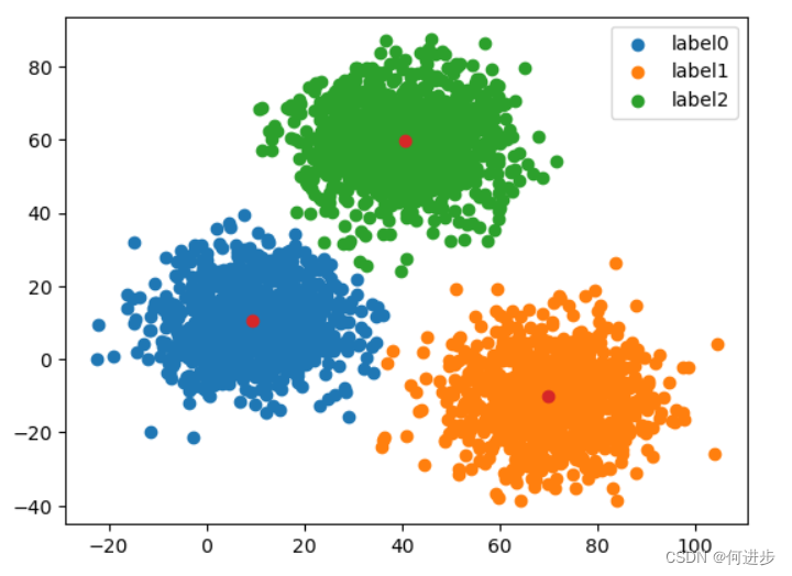
# 模型预测确定值
y_predict_test = KM.predict([[80,60]])#[80,60]属于label2
print(y_predict_test)
# 计算准确率
y_predict = KM.predict(x)
print(pd.value_counts(y_predict))
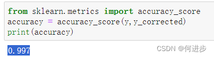
from sklearn.metrics import accuracy_score
accuracy = accuracy_score(y,y_predict)
print('\n accuracy=')
print(accuracy)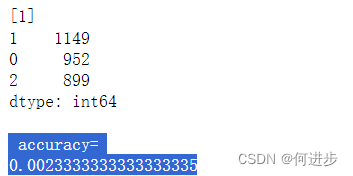
发现准确率很低,下面进行可视化进行对比寻找原因:
# 可视化对比

fig4 = plt.subplot(121)

label0 = plt.scatter(x.loc[:,'V1'][y_predict==0],x.loc[:,'V2'][y_predict==0])

label1 = plt.scatter(x.loc[:,'V1'][y_predict==1],x.loc[:,'V2'][y_predict==1])

label2 = plt.scatter(x.loc[:,'V1'][y_predict==2],x.loc[:,'V2'][y_predict==2]) #自动分为不同颜色

plt.legend((label0,label1,label2),('label0','label1','label2'))

plt.title('y_predict')

plt.scatter(centers[:,0],centers[:,1]) #两个维度

fig4 = plt.subplot(122)

label0 = plt.scatter(x.loc[:,'V1'][y==0],x.loc[:,'V2'][y==0])

label1 = plt.scatter(x.loc[:,'V1'][y==1],x.loc[:,'V2'][y==1])

label2 = plt.scatter(x.loc[:,'V1'][y==2],x.loc[:,'V2'][y==2]) #自动分为不同颜色

plt.legend((label0,label1,label2),('label0','label1','label2'))

plt.title('y')

plt.scatter(centers[:,0],centers[:,1]) #两个维度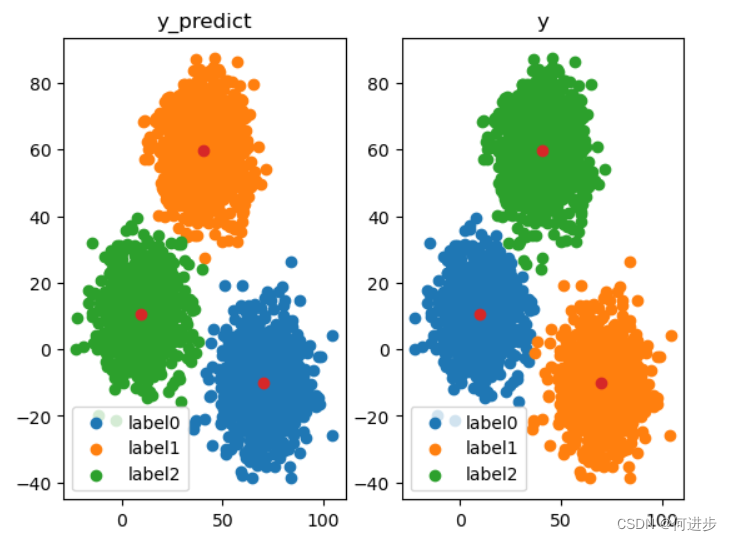
发现上述模型预测结果误差很大(颜色不对应)
# 矫正预测结果

y_corrected = []

for i in y_predict:
    if i==0:
        y_corrected.append(1)
    elif i==1:
        y_corrected.append(2)
    else:
        y_corrected.append(0)

#  转化为数组
y_corrected = np.array(y_corrected)

#预测的结果矫正后 可视化

fig5 = plt.subplot(121)

label0 = plt.scatter(x.loc[:,'V1'][y_corrected==0],x.loc[:,'V2'][y_corrected==0])

label1 = plt.scatter(x.loc[:,'V1'][y_corrected==1],x.loc[:,'V2'][y_corrected==1])

label2 = plt.scatter(x.loc[:,'V1'][y_corrected==2],x.loc[:,'V2'][y_corrected==2]) #自动分为不同颜色

plt.legend((label0,label1,label2),('label0','label1','label2'))

plt.title('y_corrected')

plt.scatter(centers[:,0],centers[:,1]) #两个维度

fig5 = plt.subplot(122)

label0 = plt.scatter(x.loc[:,'V1'][y==0],x.loc[:,'V2'][y==0])

label1 = plt.scatter(x.loc[:,'V1'][y==1],x.loc[:,'V2'][y==1])

label2 = plt.scatter(x.loc[:,'V1'][y==2],x.loc[:,'V2'][y==2]) #自动分为不同颜色

plt.legend((label0,label1,label2),('label0','label1','label2'))

plt.title('y')

plt.scatter(centers[:,0],centers[:,1]) #两个维度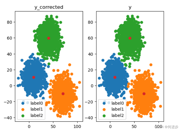
链接:https://pan.baidu.com/s/1TwC5q8yK95aAElq0IYZJIw
提取码:hhhh


 1744
1744


 被折叠的 条评论
为什么被折叠?
被折叠的 条评论
为什么被折叠?
 到【灌水乐园】发言


