


文章目录
CSS是什么
层叠样式表(Cascading Style Sheets)
CSS 能够对网页中元素位置的排版进行像素级精确控制, 实现美化页面的效果. 能够做到页面的样式和结构分离.
基本语法规范
选择器+{一条/n条说明}
- 选择器决定针对谁修改 (找谁)
- 声明决定修改啥. (干啥)
- 声明的属性是键值对. 使用 ; 区分键值对, 使用 : 区分键和值.
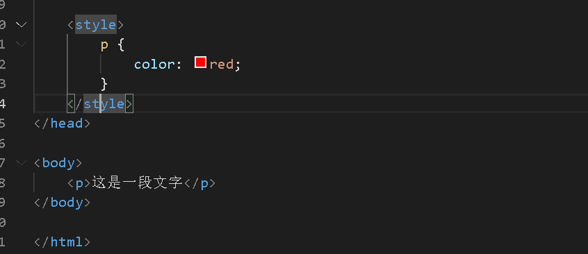
<style>
    p {
        /* 设置字体颜色 */
        color: red;
        /* 设置字体大小 */
        font-size: 30px;
   }
</style>
<p>hello</p>
注意:
CSS 要写到 style 标签中(后面还会介绍其他写法)
style 标签可以放到页面任意位置. 一般放到 head 标签内.
CSS 使用 /* */ 作为注释. (使用 ctrl + / 快速切换) .
引入方法
内部样式表
写在style标签中,嵌入到html内部,理论说html可以放到任意位置,但最好放在head标签中
优点: 这样做能够让样式和页面结构分离.
缺点: 分离的还不够彻底. 尤其是 css 内容多的时候
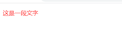
行内样式表
通过 style 属性, 来指定某个标签的样式.
只适合于写简单样式. 只针对某个标签生效.
<style>
    p {
        color: red;
    }
</style>
<p style="color: blue;">这是一段文字</p>
缺点: 不能写太复杂的样式.
这种写法优先级较高, 会覆盖其他的样式.
外部样式
实际开发中最常用的方式.
-
创建一个 css 文件.
-
使用 link 标签引入 css
<html lang="en">
<head>
    <title>Document</title>
    <link rel="stylesheet" href="css001.css">
</head>
<body>
    <p>这是一段使用外部样式文字</p>
</body>
</html>
css001.css
p {
    color: red;
}
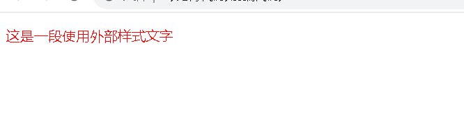
注意: 不要忘记 link 标签调用 CSS, 否则不生效.
优点: 样式和结构彻底分离了.
**缺点 **:受到浏览器缓存影响, 修改之后 不一定 立刻生效.
选择器
选中页面中指定的标签元素.
基础选择器
标签选择器
写的选择器其实就是html中使用的标签
特点:
- 能快速为同一类型的标签都选择出来
- 但是不能差异化选择
<style>
   p {
        color: red;
    }

    div {
        color: blue;
    }
</style>

<p>Java</p>
<p>C++</p>
<p>Python</p>
<div>Java</div>
<div>C++</div>
<div>Python</div>
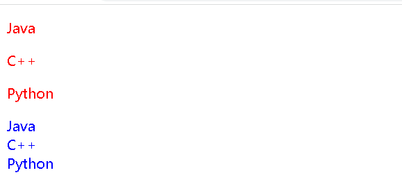
例子中:p标签的字体颜色变为红色,div标签的字体颜色变为蓝色
类选择器
使用类选择器,就可以随心所欲的选择任意想要的元素
首先,需要在CSS代码中创建一个类名,在对应的HTML元素中,通过class属性来引用这个类名,此时具有该类名的元素,都会应用上相关的CSS属性
<style>
    .red {
        color: red;
    }
</style>

<p class="red">hello Java</p>
<p>hello C++</p>
<p>hello Python</p>
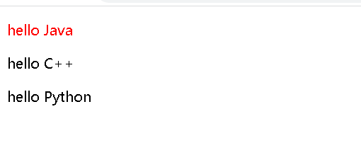
语法细节:
- 类名用 . 开头的
- 下方的标签使用 class 属性来调用.
- 一个类可以被多个标签使用, 一个标签也能使用多个类(多个类名要使用空格分割, 这种做法可以让代码更好复用)
- 如果是长的类名, 可以使用 - 分割.
- 不要使用纯数字, 或者中文, 以及标签名来命名类名
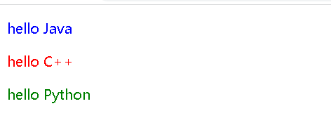
id选择器
和类选择器类似.
- CSS 中使用 # 开头表示 id 选择器
- id 选择器的值和 html 中某个元素的 id 值相同
- html 的元素 id 不必带 #
- id 是唯一的, 不能被多个标签使用 (是和 类选择器 最大的区别)
<style>
    #java {
        color: blue;
    }

    #cpp {
        color: red;
    }

    #py {
        color: green;
    }
</style>

<p id="java">hello Java</p>
<p id="cpp">hello C++</p>
<p id="py">hello Python</p>
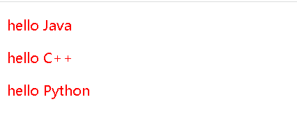
通配符选择器
使用 * 的定义, 选取所有的标签.
<style>
    * {
        color: red;
    }
</style>

<p>hello Java</p>
<p>hello C++</p>
<p>hello Python</p>
基础选择器小结
| 1 | 作用 | 特点 |
|---|---|---|
| 标签选择器 | 能选出所有相同标签 | 不能差异化选择 |
| 类选择器 | 能选出一个或者多个标签 | 根据需求选择, 最灵活, 最常用. |
| id 选择器 | 能选出一个标签 | 同一个 id 在一个 HTML 中只能出现一次 |
| 通配符选择器 | 选择所有标签 | 特殊情况下使用 |
复合选择器
后代选择器
又叫包含选择器. 选择某个父元素中的某个子元素.
选择器1 选择器2 {样式声明}
- 选择器1和选择器2要使用空格分割
- 选择器1 是父级, 选择器 2 是子级, 只选选择 2 , 不影响选择 1
- 选择器1和选择器2都可以是标签选择器/类选择器/id选择器
<style>
    ul li {
        color: red;
    }
</style>

<ul>
    <li>aaa</li>
    <li>bbb</li>
    <li>ccc</li>
</ul>
<ol>
    <li>ddd</li>
    <li>eee</li>
    <li>fff</li>
</ol>
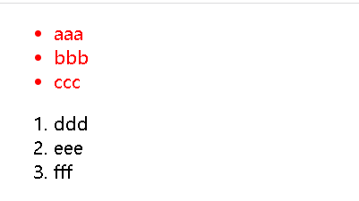
此时不仅可以是选择器1的儿子,也可以是选择器1的孙子
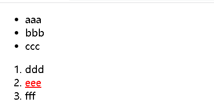
<style>
    ol a {
        color: red;
    }
</style>

<ul>
    <li>aaa</li>
    <li>bbb</li>
    <li>ccc</li>
</ul>
<ol>
    <li>ddd</li>
    <li> <a href="#">eee</a></li>
    <li>fff</li>
</ol>
子选择器
和后代选择器类似, 但是只能选择子标签.
选择器1>选择器2 { 样式声明 }
- 使用大于号分割
- 只选亲儿子, 不选孙子元素
<style>
    ol>li {
        color: red;
    }
</style>

<ul>
    <li>aaa</li>
    <li>bbb</li>
    <li>ccc</li>
</ul>
<ol>
    <li>ddd</li>
    <li> <a href="#">eee</a></li>
    <li>fff</li>
</ol>
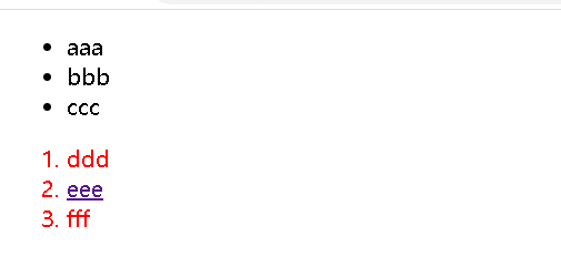
只有选择器1的子选择器才可以被选中,但是孙子选择器不会被选择
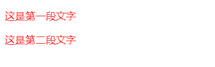
并集选择器
并列写的多个选择器用逗号隔开.用于选择多组标签. (集体声明)
选择器1,选择器2,选择器3{ 样式声明}
<style>
    p,div {
        color: red;
    }
</style>

<p>这是第一段文字</p>
<div>这是第二段文字</div>
伪类选择器
链接伪类选择器
a:link 选择未被访问过的链接
a:visited 选择已经被访问过的链接
a:hover 选择鼠标指针悬停上的链接
a:active 选择活动链接(鼠标按下了但是未弹起)
<style>
    a:link {
        color: black;
        /* 去掉 a 标签的下划线 */
        text-decoration: none;
    }

    a:visited {
        color: green;
    }

    a:hover {
        color: red;
    }

    a:active {
        color: blue;
    }
</style>

<a href="#">小猫</a>
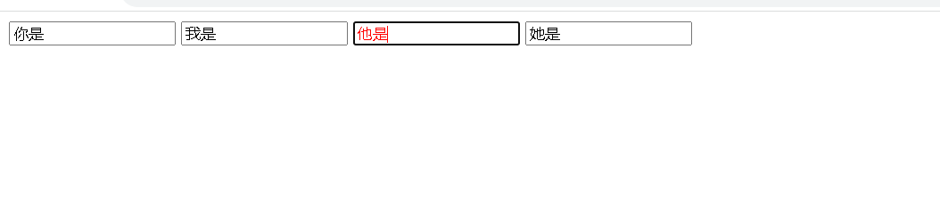
force 伪类选择器
选取获取焦点的 input 表单元素.
<style>
    .three>input:focus {
        color: red;
    }
</style>

<div class="three">
    <input type="text">
    <input type="text">
    <input type="text">
    <input type="text">
</div>
常用元素属性
CSS 属性有很多, 可以参考文档
https://www.w3school.com.cn/cssref/index.asp
字体属性
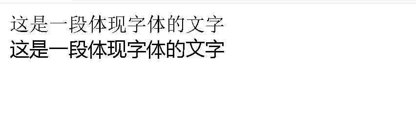
字体家族 font-family
<style>
    .ff1 {
         font-family: 宋体;
    }

    .ff2 {
        font-family: 微软雅黑;
    }
</style>

<div class="ff1">这是一段体现字体的文字</div>
<div class="ff2">这是一段体现字体的文字</div>
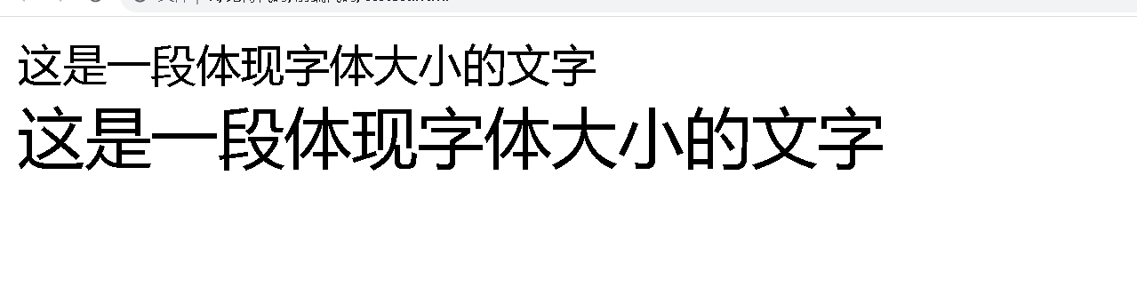
字体大小 font-size
<style>
    .fs1 {
         font-size: 20px;
    }

    .fs2 {
        font-size: 30px;
    }
</style>

<div class="fs1">这是一段体现字体大小的文字</div>
<div class="fs2">这是一段体现字体大小的文字</div>
字体粗细 font-weight
<style>
    .fw1 {
        font-weight: bold;
    }

    .fw2 {
        font-weight: lighter;
     }
</style>

<div class="fw1">这是一段体现字体粗细的文字</div>
<div class="fw2">这是一段体现字体粗细的文字</div>
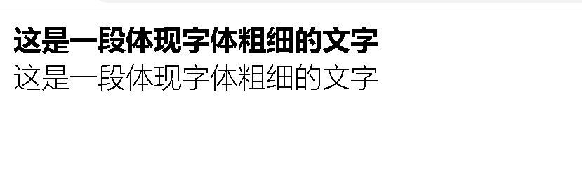
bold:粗体的
bolder:更粗的
lighter:细的
normal:普通的
字体样式 font-style
/* 设置倾斜 */
font-style: italic;
/* 取消倾斜 */
font-style: normal;
文本属性
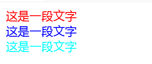
文本颜色
<style>
    .one {
        color: red;
    }

    .two {
        color: blue;
    }

    .three {
        color: aqua;
    }
</style>

<div class="one">这是一段文字</div>
<div class="two">这是一段文字</div>
<div class="three">这是一段文字</div>
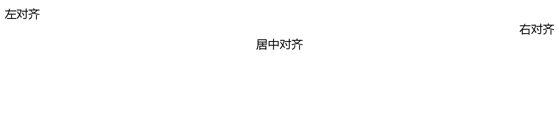
文本对齐
text-align: [值];
center: 居中对齐
left: 左对齐
right: 右对齐
<style>
    .one {
        text-align: left;
    }

    .two {
        text-align: right;
    }

    .three {
        text-align: center;
    }
</style>

<div class="one">左对齐</div>
<div class="two">右对齐</div>
<div class="three">居中对齐</div>
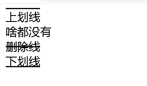
文本装饰
text-decoration: [值];
常用取值:
- underline 下划线. [常用]
- none 啥都没有. 可以给 a 标签去掉下划线.
- overline 上划线. [不常用]
- line-through 删除线 [不常用]
<style>
    .text-decorate .one {
        text-decoration: none;
    }

    .text-decorate .two {
        text-decoration: underline;
    }
    .text-decorate .three {
        text-decoration: overline;
     }

    .text-decorate .four {
        text-decoration: line-through;
    }
</style>
<div class="text-decorate">
    <div class="three">上划线</div>
    <div class="one">啥都没有</div>
    <div class="four">删除线</div>
    <div class="two">下划线</div>
</div>
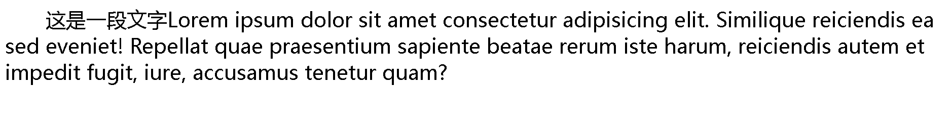
文本缩进
控制段落的 首行 缩进 (其他行不影响)
text-indent: [值];
- 单位可以使用 px 或者 em.
- 使用 em 作为单位更好. 1 个 em 就是当前元素的文字大小.
- 缩进可以是负的, 表示往左缩进. (会导致文字就冒出去了)
<style>
    p {
        text-indent: 2em;
    }
</style>

<p>这是一段文字Lorem ipsum dolor sit amet consectetur adipisicing elit. Similique reiciendis ea sed eveniet! Repellat quae praesentium sapiente beatae rerum iste harum, reiciendis autem et impedit fugit, iure, accusamus tenetur quam?</p>
行高
行高指的是上下文本行之间的基线距离
HTML 中展示文字涉及到这几个基准线:
- 顶线
- 中线
- 基线 (相当于英语四线格的倒数第二条线)
- 底线
内容区:底线和顶线包裹的区域,即下图深灰色背景区域
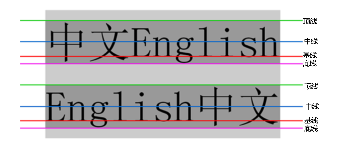
行高 = 上边距 + 下边距 + 字体大小
上下边距是相等的, 此处字体大小是 16px, 行高 50px, 上下边距就分别是 17px
<style>
    .two {
        line-height: 50px;
    }
</style>

<div class="one">第一行</div>
<div class="two">第二行</div>
<div class="three">第三行</div>
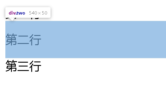
正因为行高是上下均等的,就都可以基于行高实现垂直方向的文本居中
如果元素高度为150px,只需要给里面的文字设置行高为150ox,就可以达到文本垂直居中的效果
<style>
    .two {
        background: blue;
        height: 100px;
        line-height: 100px;
    }
</style>

<div class="one">第一行</div>
<div class="two">第二行</div>
<div class="three">第三行</div>
背景属性
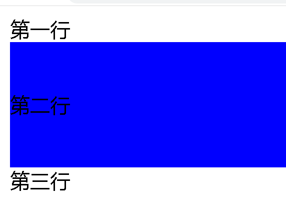
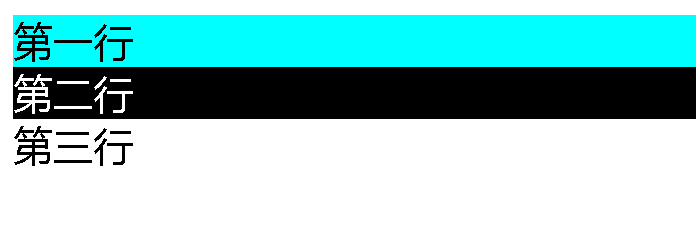
背景颜色
background-color: [指定颜色]
默认是 transparent (透明) 的. 可以通过设置颜色的方式修改
<style>
    .one {
        background-color: aqua;
    }

    .two {
        background: black;
        color: white;
    }
</style>

<div class="one">第一行</div>
<div class="two">第二行</div>
<div class="three">第三行</div>
背景图片
background-image: url(...);
<style>
    div {
        height: 400px;
        background-image: url(图片.jpg);
    }
</style>
<div>这是一段文字</div>

设置背景图片后,默认是一种平铺的效果(就像铺地板一样,把图片视为一个地砖,挨个进行平铺
背景平铺
background-repeat: [平铺方式]
重要取值:
- repeat: 平铺
- no-repeat: 不平铺
- repeat-x: 水平平铺
- repeat-y: 垂直平铺
默认是 repeat.
背景颜色和背景图片可以同时存在. 背景图片在背景颜色的上方
不平铺效果
<style>
    div {
        height: 400px;
        background-color: aqua;
        background-image: url(图片.jpg);
        background-repeat: no-repeat;
    }
</style>
<div>这是一段文字</div>
背景位置
background-position: x y;
修改图片的位置.
参数有三种风格:
-
方位名词: (top, left, right, bottom)
-
精确单位: 坐标或者百分比(以左上角为原点)
-
混合单位: 同时包含方位名词和精确单位
<style>
    div {
        height: 400px;
        background-color: aqua;
        background-image: url(图片.jpg);
        background-repeat: no-repeat;
        background-position: center center;
    }
</style>
<div>这是一段文字</div>
背景尺寸
background-size: length|percentage|cover|contain;
可以通过px的方式直接设置背景的宽度和高度,也可以使用contain和cover让背景自适应元素大小
contain 可能会露出一部分背景色把图片拉伸到元素大小就结束,保证背景图始终在元素之中
cover :不会让元素漏出背景色
contain
cover
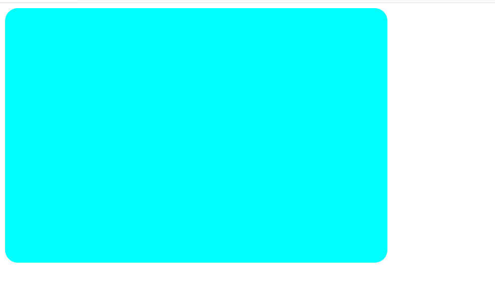
圆角矩形
通过 border-radius 使边框带圆角效果.
基本用法
border-radius: length;
length 是内切圆的半径. 数值越大, 弧线越强烈
<style>
    div {
        width: 600px;
        height: 400px;
        background-color: aqua;
        border-radius: 20px;
    }
</style>

<div></div>
Chrome 调试工具 – 查看 CSS 属性
打开浏览器
有两种方式可以打开 Chrome 调试工具
- 直接按 F12 键
- 鼠标右键页面 => 检查元素
标签页含义
- elements 查看标签结构
- console 查看控制台
- source 查看源码+断点调试
- network 查看前后端交互过程
- application 查看浏览器提供的一些扩展功能(本地存储等)
- Performance, Memory, Security, Lighthouse 暂时不使用, 先不深究
elements 标签页使用
-
ctrl + 滚轮进行缩放, ctrl + 0 恢复原始大小.
-
使用 左上角 箭头选中元素
-
右侧可以查看当前元素的属性, 包括引入的类.
-
右侧可以修改选中元素的 css 属性. 例如颜色, 可以点击颜色图标,弹出颜色选择器, 修改颜色. 例如字体大小, 可以使用方向键来微调数值.
-
此处的修改不会影响代码, 刷新就还原了~
-
如果 CSS 样式写错了, 也会在这里有提示. (黄色感叹号)
元素的显示模式
在 CSS 中, HTML 的标签的显示模式有很多.
此处只重点介绍两个:
- 块级元素
- 行内元素
块级元素:独占一行,可以设置宽度高度(div,h1-h6,p,ul,li,table)
行内元素:不独占一行,不能设置宽度高度(span,a,em,i…)
行内块元素:不独占一行,能够设置宽度高度(input,img)
改变显示模式
使用 display 属性可以修改元素的显示模式.
》可以把 div 等变成行内元素, 也可以把 a , span 等变成块级元素.
- display: block 改成块级元素 [常用]
- display: inline 改成行内元素 [很少用]
- display: inline-block 改成行内块元素
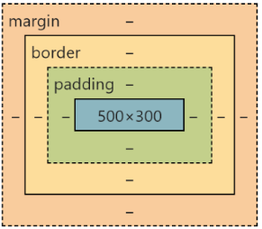
盒模型
每一个 HTML 元素就相当于是一个矩形的 “盒子”
这个盒子由这几个部分构成
- 边框 border
- 内容 content
- 内边距 padding
- 外边距 margin
边框
基础属性
- 粗细: border-width
- 样式: border-style, 默认没边框. solid 实线边框 dashed 虚线边dotted 点线边框
- 颜色: border-color
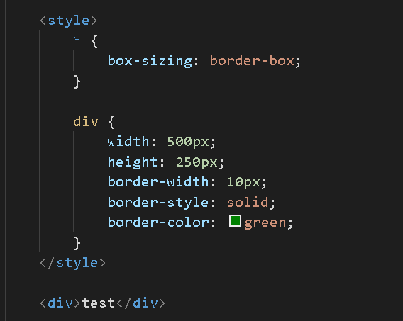
<style>
div {
width: 500px;
height: 250px;
border-width: 10px;
border-style: solid;
border-color: green;
}
</style>
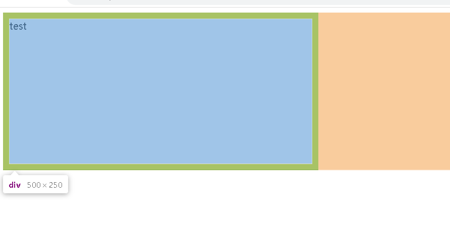
<div>test</div>
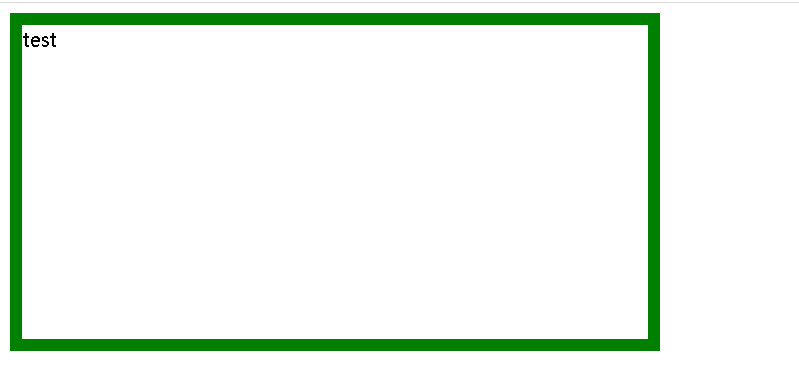
边框会撑大盒子
可以看到, width, height 是 500*250, 而最终整个盒子大小是 520 * 270. 边框10个像素相当于扩大了大小.
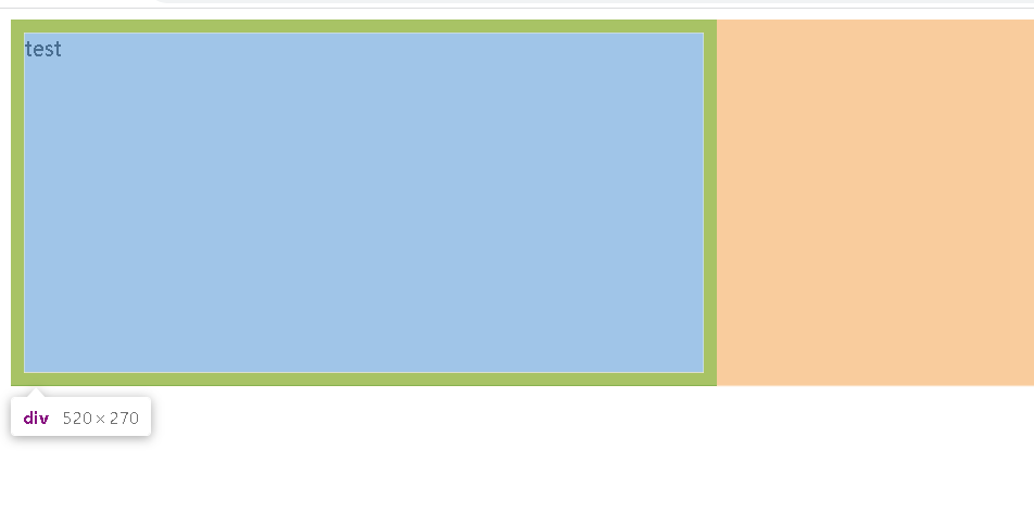
通过 box-sizing 属性可以修改浏览器的行为, 使边框不再撑大盒子.
内边距
padding 设置内容和边框之间的距离.
基础写法
默认内容是顶着边框来放置的. 用 padding 来控制这个距离
可以给四个方向都加上边距
- padding-top
- padding-bottom
- padding-left
- padding-right
<style>
    div {
        height: 200px;
        width: 300px;
        padding-top: 5px;
        padding-left: 10px;
    }
</style>
<div>test</div>
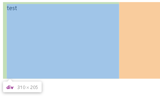
整个盒子的大小从原来的 300 * 200 => 310 * 205. 说明内边距也会影响到盒子大小(撑大盒子).
使用 box-sizing: border-box 属性也可以使内边距不再撑大盒子. (和上面 border 类似)
外边距
基础写法
控制盒子和盒子之间的距离.
可以给四个方向都加上边距
- margin-top
- margin-bottom
- margin-left
- margin-right
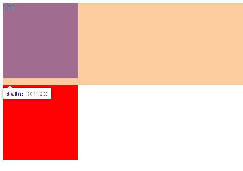
<style>
    div {
        background-color: red;
        width: 200px;
        height: 200px;
    }

    .first {
        margin-bottom: 20px;
    }
</style>

<div class="first">蛤蛤</div>
<div>呵呵</div>
文本的水平居中 test-align :center
文本的垂直居中:lineheight =height
元素的水平居中:margin
弹性布局
主要安排页面上的元素的位置(排列方式)
默认的网页布局是从上到下的
实际的网页不仅仅需要从上到下,也需要从左到右
    <style>
        .parent {
            width: 100%;
            height: 200px;
            background-color: grey
        }

        .one,
        .two,
        .three {
            width: 100px;
            height: 100px;
            background-color: red;
        }
    </style>

    <div class="parent">
        <div class="one">1</div>
        <div class="two">2</div>
        <div class="three">3</div>
    </div>
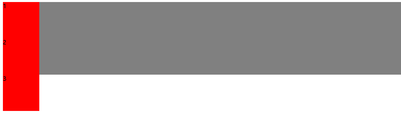
此时div默认作为块级元素,独占一行,为了让div能够再一行排列,就可以使用弹性布局
给父类设置一个属性 display:flex
加上之后
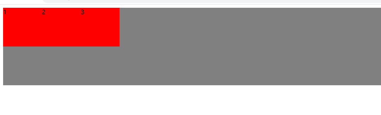
默认子类都在左上角,也可以添加一些属性
水平方向的排列方式:justify-content
start 靠左排列
end:靠右排列
center:居中排列
space-between:让元素中间有一些等分的间隔
space-around:让元素中间有一些等分的间隔,最左边和最右边也有间隙
垂直方向的排列方式:align-items
和水平方向差不多
flex布局中最常见的三种操作
- 设置为弹性布局 display:flex来实现
- 设置水平方向排列:justify-content 来实现
- 设置垂直方法排列 align-items来实现


 1013
1013


 被折叠的 条评论
为什么被折叠?
被折叠的 条评论
为什么被折叠?
 到【灌水乐园】发言


