


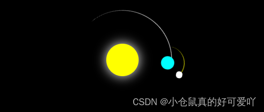
(实际运行是有动画效果的,下图是静态效果图)
<!DOCTYPE html>
<html lang="en">

<head>
  <meta charset="UTF-8">
  <meta http-equiv="X-UA-Compatible" content="IE=edge">
  <meta name="viewport" content="width=device-width, initial-scale=1.0">
  <title>太阳动画练习</title>
  <style>
    body {
      background-color: black;
    }

    .container {
      width: 400px;
      height: 400px;
      margin: 100px auto;
      position: relative;
    }

    .sun {
      width: 100px;
      height: 100px;
      background-color: yellow;
      border-radius: 50%;
      position: absolute;
      top: 0;
      right: 0;
      bottom: 0;
      left: 0;
      margin: auto;
      box-shadow: 0 0 35px white;
    }

    .circle1 {
      width: 300px;
      height: 300px;
      border-top: 1px solid white;
      border-right: 1px solid transparent;
      position: absolute;
      top: 0;
      right: 0;
      bottom: 0;
      left: 0;
      margin: auto;
      border-radius: 50%;
      animation: myani1 10s linear infinite;
    }

    @keyframes myani1 {
      from {
        transform: rotate(0deg);
      }

      to {
        transform: rotate(360deg);
      }

    }

    .circle2 {
      width: 100px;
      height: 100px;
      border-top: 1px solid yellow;
      border-right: 1px solid transparent;
      border-radius: 50%;
      position: absolute;
      right: 0;
      top: 0;
      animation: myani2 10s linear infinite;
    }

    @keyframes myani2 {
      from {
        transform: rotate(0deg);
      }

      to {
        transform: rotate(360deg);
      }
    }

    .earth {
      width: 40px;
      height: 40px;
      background-color: aqua;
      border-radius: 50%;
      position: absolute;
      top: 0;
      right: 0;
      bottom: 0;
      left: 0;
      margin: auto;
    }

    .moon {
      width: 20px;
      height: 20px;
      border-radius: 50%;
      background-color: white;
      position: absolute;
      left: 71px;
      top: 0;
    }
  </style>
</head>

<body>
  <div class="container">
    <div class="sun"></div>
    <div class="circle1">
      <div class="circle2">
        <div class="earth"></div>
        <div class="moon"></div>
      </div>
    </div>
  </div>
</body>

</html>
太阳动画


 3108
3108


 被折叠的 条评论
为什么被折叠?
被折叠的 条评论
为什么被折叠?
 到【灌水乐园】发言


