


让数据集改变你的思维
数据可视化是数据科学家传达洞见和讲述数据故事的关键工具。作为 Python 开发者,我们拥有丰富的可视化库和工具,能够创建各种引人入胜的图表。本文将探索一些鲜为人知但实用的可视化类型,如桑基图(Sankey Diagrams)、脊线图(Ridge Plots)、内嵌图(Insets)、雷达图(Radar Chart)和词云图(Word Cloud Plots)。我们将主要使用流行的 Matplotlib、Seaborn 和 Plotly 这些 Python 库来实现这些有趣的可视化效果,让你的数据讲述更加生动有趣。
我们将使用形状、大小、颜色、方向、面积和标记符号等属性,为十种不同的使用案例创建绘图。在每个使用案例中,我们的目标都是创建有效、高效和美观的可视化效果。描述这些词语在图表中的含义如下:
(a) 有效:图表中包含了所有需要传达的信息
(b) 高效:图表中没有多余的数据
© 美观:图表以清晰的方式展示数据,吸引注意力
所有图表都是二维图,因为从效率和效果的角度来看,二维图比三维图更清晰易懂,同时更容易描绘距离。文中还将介绍每个用例的代码,并讨论代码和图表中的要点。
需要更多项目源码,领取方式在:

用例 1
描述大学之间学生交流流动的桑基图。
这些图展示了资源流动的情况,下面的代码展示了用例的实现。字符 “A” 代表第一所大学,字符 “B” 代表第二所大学。数字 3、4、5 分别代表不同的系,即{Statistics, Math, Physics}。第 25 行创建了一个图表,其中 node 和 link是字典。node 使用的 label 对象由唯一的 Depts 院系组成,而 link 使用的两个列表分别由 sending"院系的索引和 acepting 院系的索引组成。
import pandas as pd
import plotly.graph_objects as gr
data = {
    'Sending_Dept':   ['5A', '4A', '5B', '5A', '4B', '4A', '3A', '3B', '3A', '3B', '3A', '3B'],
    'Accepting_Dept': ['4B', '5B', '5A', '5B', '4A', '4B', '5B', '5A', '4B', '4A', '3B', '3A'],
    'FlowValue': [1, 3, 4, 3, 4, 4, 1, 1, 3, 2, 5, 3]
}
df = pd.DataFrame(data)
unique_departments = set(df['Sending_Dept']).union(set(df['Accepting_Dept']))
Depts = list(unique_departments)
Dept_indices = {}
for i, dept in enumerate(Depts):
    Dept_indices[dept] = i
sending_indices = []
for dept in df['Sending_Dept']:
    dept_index = Dept_indices[dept]
    sending_indices.append(dept_index)
    print(f"Sending indices are: {sending_indices}")
accepting_indices = []
for dept in df['Accepting_Dept']:
    dept_index = Dept_indices[dept]
    accepting_indices.append(dept_index)
flowvalues = df['FlowValue'].tolist()
# Sankey diagram
fig = gr.Figure(data=[gr.Sankey(
    node=dict( pad=10,thickness=25,line=dict(color="red", width=0.8),label=Depts,),
    link=dict(source=sending_indices,target=accepting_indices,value=flowvalues
    ))])
fig.update_layout(title_text="Sankey Diagram of exchange students flow between University Depts", font_size=12)
fig.show()
生成的"桑基图"图(1)中,节点3A旁的橙色矩形显示了光标放置在节点上时的情况。当光标位于节点"3A"上时,我们可以看到A大学3系接受和派遣交换生的频率。它接受学生1次,派遣学生3次。我们还可以从上面代码片段中的 data 字典推断出这一点,因为"3A"在Sending_Dept列表中出现了3次,在Accepting_Dept列表中出现了1次。节点 “3A” 左边的数字9是它向B大学派出的交换生总数。我们还可以通过在Sending_Dept列表中添加与3A相对应的FlowValues来推断。
我们还注意到,当我们点击节点 “3A” 时,从它发出的箭头会变暗,并显示出与 “3A” 交换学生的其他节点。箭头的粗细与 FlowValues 相对应。总之,桑基图利用箭头的方向和粗细来传递流动信息,并以文字为基础为每个节点形成累积流动。
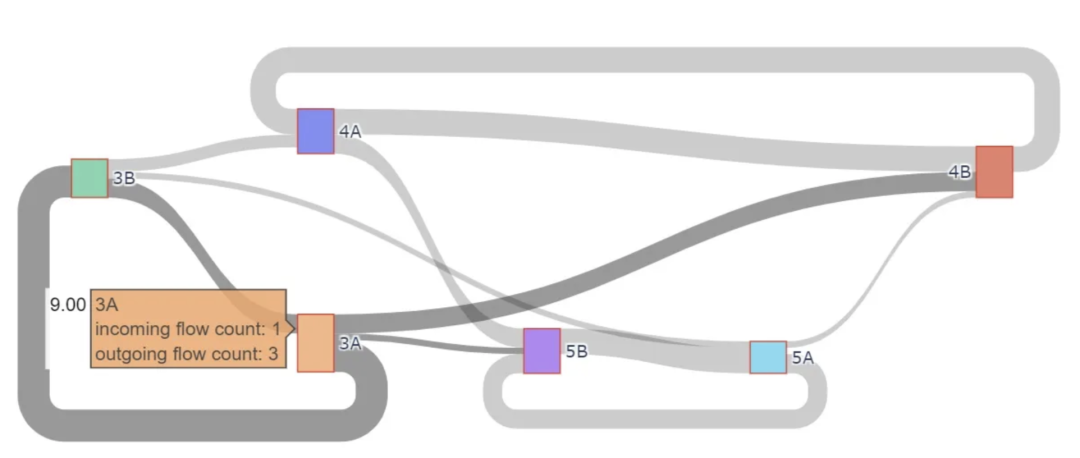
图 1. 桑基图显示了两所大学各系之间的学生交流流
用例 2
绘制一家房地产中介公司的房屋销售数据。
一位数据科学家在房地产中介公司工作,机构要求绘制上个月售出房屋信息的二维图。每栋售出的房屋需包含房价、距离市中心、方向、代理佣金和销售代理的公司级别(助理、副总裁、合伙人)的信息。二维图形信息量大,可使用复杂对象描述地块上的每栋房屋。具体来说,使用“笑脸表情符号”实现方法的代码片段如下。
import matplotlib.pyplot as plt
import numpy as np
np.random.seed(125)
num_houses = 10
distances = np.random.uniform(0, 30, num_houses)  # distance from city center
prices = np.random.uniform(400, 2000, num_houses) * 1000  # sale price in thousands
directions = np.random.choice(['N', 'S', 'E', 'W'], num_houses)  # direction from city center
agent_levels = np.random.choice([1, 2, 3], num_houses)  # agent's level
def get_emoji_size(level):
    size_map = {1: 250, 2: 380, 3: 700}
    return size_map.get(level, 120)  # Increased size for better visibility
def get_emoji_color_new(price):
    if price < 600000:
        return 'white'  # Light yellow for $400k-$600k
    elif price < 800000:
        return 'yellow'        # White for $600k-$800k
    elif price < 1000000:
        return 'pink'         # Pink for $800k-$1 million
    else:
        return 'lime'         # Lime for $1 million-$2 million
def rotate_smiley(direction):
    rotation_map = {'N': 0, 'E': 270, 'S': 180, 'W': 90}
    return rotation_map.get(direction, 0)  # default no rotation if direction not found
plt.figure(figsize=(12, 8))
for i in range(num_houses):
    plt.scatter(distances[i], prices[i], s=get_emoji_size(agent_levels[i]),\
    c=get_emoji_color_new(prices[i]),
                marker='o', edgecolors='black', alpha=0.8)
    plt.text(distances[i], prices[i], "😊", fontsize=agent_levels[i]*10,
             rotation=rotate_smiley(directions[i]), ha='center', va='center',\
             fontweight='bold')
plt.xlabel('Distance from City Center (km)')
plt.ylabel('Sale Price ($)')
plt.title('House Sales Data for 10 Houses: Price vs Distance with New Color Scheme')
plt.grid(True)
plt.show()
用例 3
在旭日图中显示某大学各学院和系的组成。还必须表达各学院和部门的规模信息。
这是一种不同组成部分具有层次结构的情况。在这种情况下,旭日图是理想的选择。下面的代码片段展示了实现过程。第一个数组 labels 包含旭日图的名称。第二个数组 parents 包含层次结构,而数组 values 包含段的大小。
import plotly.graph_objects as go
labels = ["PineForest University",
          "College of Engineering", "Natural Sciences", "Medical School",
          "Chemical Engineering", "Mechanical Engineering", "Computer Science", "Electrical Engineering",\
          "Biomedical Engineering",
          "Astronomy", "Biology", "Mathematics", "Physics","Chemistry","Statistics","EarthSciences",\
          "Emergency Medicine", "Neurology", "Cardiology", "Pediatrics", "Pathology","Family Medicine", \
          "Orthopedics", "Obstetrics", "Anesthesiology", "Anatomy", "Physiology",\
          "Microbiology","Immunology"]
parents = ["",
           "PineForest University", "PineForest University", "PineForest University",
           "College of Engineering", "College of Engineering", "College of Engineering",\
           "College of Engineering","College of Engineering",
           "Natural Sciences","Natural Sciences","Natural Sciences","Natural Sciences","Natural Sciences",\
           "Natural Sciences","Natural Sciences",
           "Medical School", "Medical School", "Medical School", "Medical School","Medical School", \
           "Medical School","Medical School", "Medical School", "Medical School",\
           "Medical School", "Medical School", "Medical School","Medical School"]
values = [0,
          50, 30, 200,
          85, 100, 180, 163,120,
          90,70 ,104,54,180,100,70,
          70,180,200, 85,170,89,75,120,76,150,67,56,239]
fig = go.Figure(go.Sunburst(
    labels=labels,
    parents=parents,
    values=values,
))
fig.update_layout(margin=dict(t=0, l=0, r=0, b=0))
fig.show()
图 3 显示了上述算法的输出结果。请注意,每个片段的大小与 "值 "数组中的相应数字成正比。下图显示,当我们点击一个片段时,它的大小就会显示出来(Immunology 239)。
旭日图使用大小、颜色和文本来描述大学不同实体的层次结构。
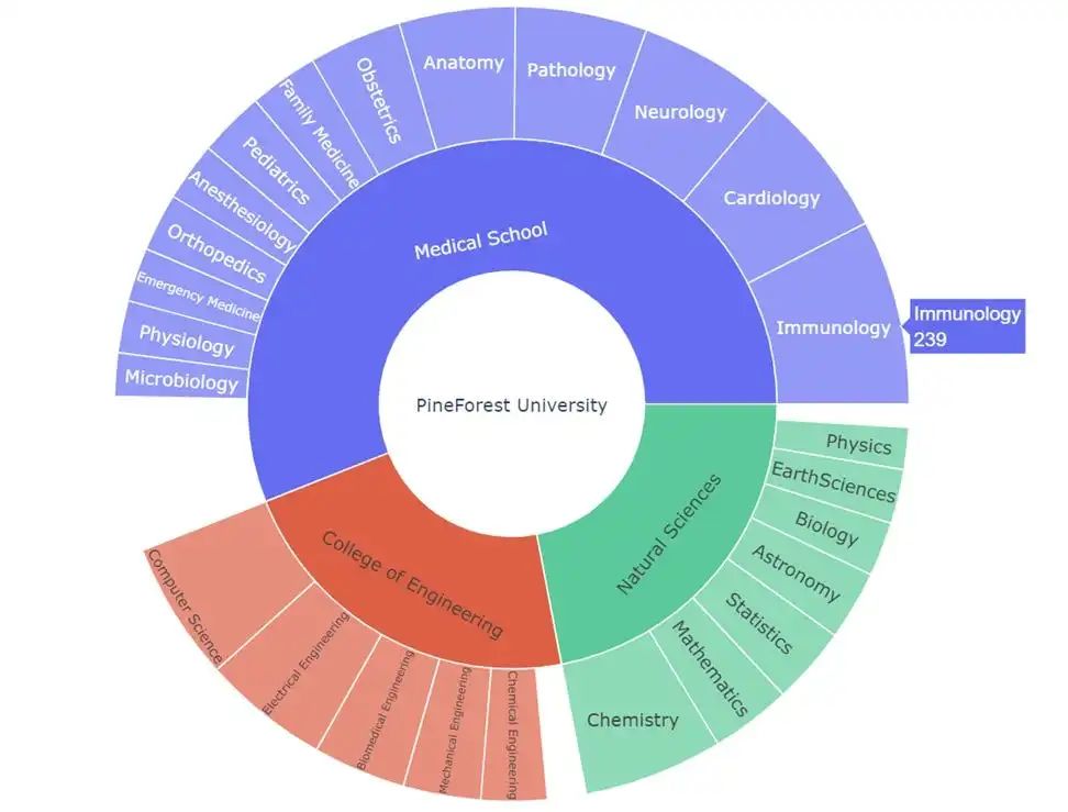
图 3. 旭日图显示了一所大学不同学院和系的结构
用例 4
我们的房地产客户需要一张二维图,显示上个月售出房屋的信息:(a) 售价,(b) 面积,© 海边距离,(d) 火车站距离。必须放大已售出最多房屋的图段。
本用例与用例 2 类似,但数据科学家有新任务:创建一个放大版的最繁忙图段。这就是插图。插图可以放大图表的重要部分,提高效果。下面的代码片段显示了插图的实现。
import seaborn as sns
import matplotlib.pyplot as plt
import numpy as np
import pandas as pd
np.random.seed(0)
size_of_house = np.random.uniform(1000, 4000, 100)  # Size in square feet
price = size_of_house * np.random.uniform(150, 350) + np.random.normal(0, 50000, 100)  # Price
distance_from_train = np.random.uniform(0.5, 5, 100)  # Distance from train in miles
distance_from_ocean = np.random.uniform(0.1, 10, 100)  # Distance from ocean in miles
df = pd.DataFrame({
    'Size of House': size_of_house,
    'Price': price,
    'Distance from Train': distance_from_train,
    'Distance from Ocean': distance_from_ocean
})
# Sample 10 points for a less cluttered plot
sampled_df = df.sample(10)
# Adding the inset
# Filtering sampled data for the inset plot
#inset_data = sampled_df[(sampled_df['Size of House'] >= 2000) & (sampled_df['Size of House'] <= 3000) & (sampled_df['Price'] >= 250000) & (sampled_df['Price'] <= 600000)]
inset_data=sampled_df
inset_ax = ax.inset_axes([0.7, 0.05, 0.25, 0.25])  # Inset axes
# Scatter plot in the inset with filtered sampled data
sns.scatterplot(data=inset_data, x='Size of House', y='Price', ax=inset_ax, size='Distance from Train', sizes=(40, 200), hue='Distance from Ocean', alpha=0.7, marker='D', legend=False)
# Capturing the part of the original regression line that falls within the bounds
sns.regplot(
    x='Size of House',
    y='Price',
    data=df,  # Using the entire dataset for the trend line
    scatter=False,
    color='red',
    ax=inset_ax,
    lowess=True,
    truncate=True  # Truncating the line within the limits of the inset axes
)
# Adjusting the limits of the inset axes
inset_ax.set_xlim(2000, 3500)
inset_ax.set_ylim(600000, 1000000)
# Display the plot
plt.show()

用例 5
以清晰而有说服力的方式介绍一种新零食产品的优势。
我们的数据科学家的任务是展示市场营销部门进行的一次民意调查的结果。在这次民意调查中,客户被要求对一种高蛋白棒的新旧配方的性价比、营养价值、外观和口味进行评分。
据科学家使用雷达图来显示投票结果。雷达图将不同的属性(口味、外观等)放在不同的坐标轴上,然后连接属于同一实体(本例中为蛋白棒)的属性值,形成一个多边形区域。不同的区域使用不同的颜色,便于查看者掌握产品之间的差异。
雷达图(Radar Chart),又可称为戴布拉图、蜘蛛网图(Spider Chart),每个分类都拥有自己的数值坐标轴,这些坐标轴由中心向外辐射, 并用折线将同一系列的值连接,用以显示独立的数据系列之间,以及某个特定的系列与其他系列的整体之间的关系。
图 5 显示了生成的图形,下面的代码片段显示了生成图形的 Python 代码。下面代码的第 7-9 行有一个有趣的地方。enpoint被设置为False,第一个值被添加到 old_values 和 new_values 数组的末尾,以关闭循环。
import matplotlib.pyplot as plt
import numpy as np
categories = ['Taste', 'Nutritional value', 'Appearance', 'Money Value']
old_values = [3, 4, 4, 3]
new_values = [5, 5, 4, 5]
N = len(categories)
angles = np.linspace(0, 2 * np.pi, N, endpoint=False).tolist()
old_values = np.append(old_values, old_values[0])
new_values = np.append(new_values, new_values[0])
angles = np.append(angles, angles[0])
fig, ax = plt.subplots(figsize=(6, 6), subplot_kw=dict(polar=True))
ax.fill(angles, old_values, color='blue', alpha=0.4)
ax.fill(angles, product_values, color='lime', alpha=0.4)
ax.set_yticklabels([])
ax.set_xticks(angles[:-1])
ax.set_xticklabels(categories)
plt.title('Benchmarking: Standard vs New Product', size=20)
plt.legend(['Old Product', 'New Product'], loc='lower right', bbox_to_anchor=(1.1, 1.1))
plt.show()
如下图所示,人们认为新的蛋白质棒在三个关键方面优于旧产品:营养价值、口味和性价比。
在这个案例中,展示了如何利用颜色和形状在雷达图上区分两种产品。
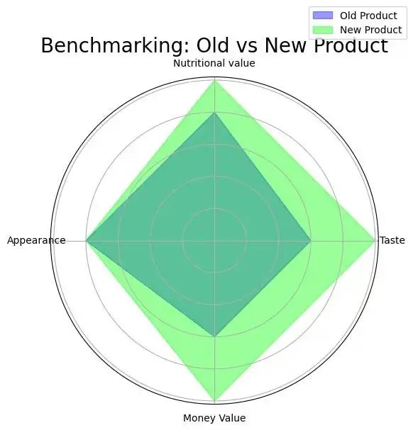
图 5. 展示两种产品属性差异的雷达图
用例 6
在同一幅图上,显示不同类型图书在这些类型的图书节前后的销售情况。
在这个案例中,我们需用同一图绘制不同类别的时间数据。Python的ridge plot适合这种情况。桥形图以不同类别分布的垂直堆叠图呈现,便于比较它们的异同。图7显示了不同图书类型的销售差异以相应图书节为中心。将分布图放在同一图上,使用不同颜色,可创建一个视觉效果良好的图表,有效比较。
相应代码如下:
(a) ridge plot使用joyplot Python软件包创建
(b) 第6-13行模拟了各种图书流派的分布情况,书籍类型后面的数字是相应分布的中心和标准偏差。
© 在第20行,我们将数据放入一个DataFrame中,因为joyplot希望输入一个DataFrame。
(d) 在第30行、第33-36行,我们指定了轴[-1]上x轴的参数,即底图的参数。
import matplotlib.pyplot as plt
import pandas as pd
from joypy import joyplot
import numpy as np
import scipy.stats as stats
book_festivals = {
    'Mystery': [1,1],
    'Adventure fiction':[6,2],
    'Fantasy': [11,3],
    'Self-help':[10,2],
    'Sci-Fi': [7,2],
    'Historical fiction': [12,1]
}
genre_data = {}
for genre, params in book_festivals.items():
    mu,sigma=params
    data = np.random.normal(mu, sigma, 300)
    genre_data[genre] = data
genre_data_dict = {genre: data.tolist() for genre, data in genre_data.items()}
data=pd.DataFrame(genre_data_dict)
# Now we can plot it using joyplot
fig, axes = joyplot(
    data,
    figsize=(30, 18),
    colormap=plt.cm.plasma,
    alpha=1.0
)
colors = plt.cm.plasma(np.linspace(0, 1, len(data.columns)))
# Set x-axis labels and limits
axes[-1].set_xlim(1, 12)
month_order = ['January', 'February', 'March', 'April', 'May', 'June',
               'July', 'August', 'September', 'October', 'November', 'December']
axes[-1].set_xticks(range(1, 13))
axes[-1].set_xticklabels(month_order)
axes[-1].tick_params(axis='x', labelsize='30')
axes[-1].set_xticklabels(month_order)
for ax in axes:
    ax.set_yticks([])

legend_handles = [plt.Line2D([0], [0], color=color, lw=6, label=genre) for genre, \
                  color in zip(book_festivals.keys(), colors)]
ax.legend(handles=legend_handles, title='Book Genres', loc='upper right', fontsize='26')
plt.show()
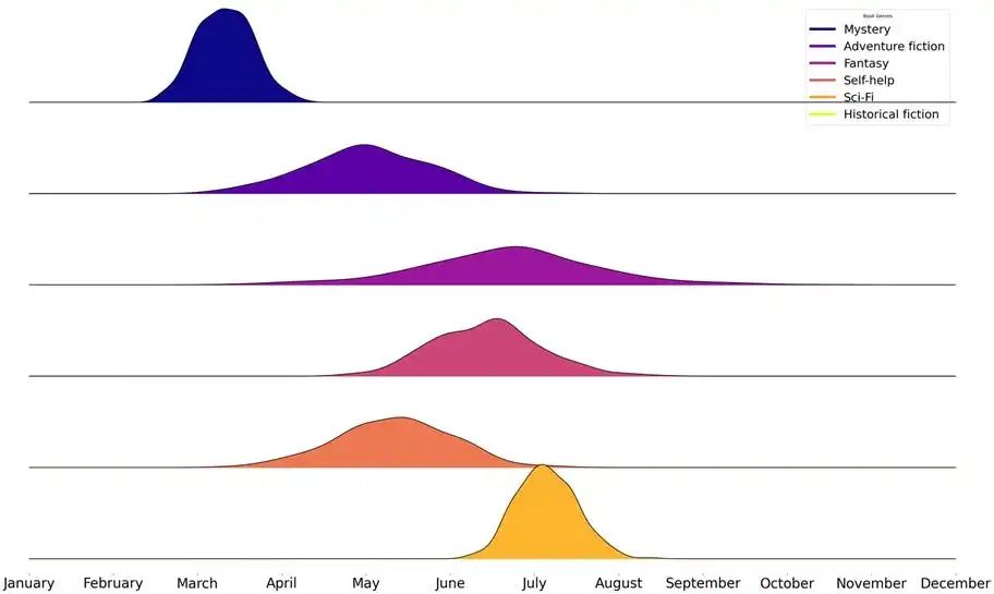
图 6. 图书类型的脊状分布图
用例 7
给定信用卡公司提供的有关年龄和购买金额的数据,在图中突出显示购买金额最高的组别。
二维直方图似乎适合这类数据,与标准直方图不同,标准直方图按一维分类,而二维直方图同时按两个维度分类。
import numpy as np
import matplotlib.pyplot as plt
np.random.seed(0)
ages = np.random.randint(18, 61, 20)  # Random ages between 18 and 60 for 20 customers
purchase_amounts = np.random.randint(200, 1001, 20)  # Random purchase amounts between 200 and 1000 for 20 customers
plt.figure(figsize=(10, 6))
plt.hist2d(ages, purchase_amounts, bins=[5, 5], range=[[18, 60], [200, 1000]], cmap='plasma')
plt.colorbar(label='Number of Customers')
plt.xlabel('Age')
plt.ylabel('Purchase Amount ($)')
plt.title('2D Histogram of Customer Age and Purchase Amount')
用例 8
在一幅图中,显示 1990-2010 年生物、天文、物理和数学系的学生人数。
在这种情况下,我们可以使用堆叠面积图。这种类型的图表用于显示不同类别的时间数据,可以使用堆叠区域图来展示不同类别的时间数据,用户可以看到:
(a) 每个类别随时间的变化;
(b) 它们的相对规模;
© 它们随时间的总规模。每个类别用不同的颜色标识。
代码如下,图 8 显示了不同院系学生人数的堆叠面积图。
堆叠面积图与面积图类似,都是在折线图的基础上,将折线与自变量坐标轴之间区域填充起来的统计图表,主要用于表示数值随时间的变化趋势。而堆叠面积图的特点在于,有多个数据系列,它们一层层的堆叠起来,每个数据系列的起始点是上一个数据系列的结束点。
import matplotlib.pyplot as plt
import numpy as np
years = np.arange(1990, 2011)
biology_students = np.linspace(100, 1000, len(years))
astronomy_students = np.linspace(50, 150, len(years))
math_students = np.linspace(80, 500, len(years))
physics_students = np.linspace(70, 480, len(years))

plt.figure(figsize=(10, 6))
plt.stackplot(years, biology_students, astronomy_students, math_students,\
              physics_students, labels=['Biology', 'Astronomy', 'Math', 'Physics'],\
              colors=['#76b947', '#fcb001', '#00a2e8', '#ff7f27'])
plt.legend(loc='upper left')
plt.title('University Department Student Numbers (1990-2010)')
plt.xlabel('Year')
plt.ylabel('Number of Students')
plt.tight_layout()

plt.show()
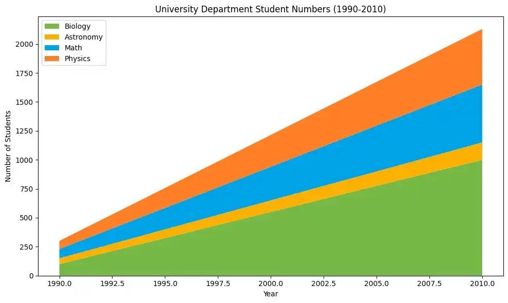
图 8. 不同院系学生人数的堆叠面积图
用例 9
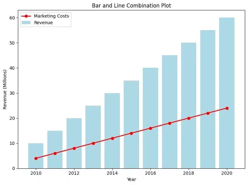
显示一家公司 2010 年至 2020 年的营销成本与收入对比。
与上一个用例一样,我们也可以在这个用例中使用堆叠面积图。然而,堆叠面积图并不是万能的,也不是绘制随时间变化的分类差异的一站式解决方案。对于当前用例,比较营销成本与收入的更有效方法是r收入柱状图,并将营销成本作为趋势线。代码如下所示。将营销成本作为趋势线绘制在收入条形图前,可以更有效地传达营销成本增加的信息。
import matplotlib.pyplot as plt
import numpy as np
years = np.arange(2010, 2021)
revenue = np.linspace(10, 60, len(years))
marketing_costs = revenue * 0.4

plt.figure(figsize=(8, 6))
plt.bar(years, revenue, color='lightblue', label='Revenue')
plt.plot(years, marketing_costs, color='red', marker='o', \
linestyle='-', linewidth=2, markersize=6, label='Marketing Costs')
plt.xlabel('Year')
plt.ylabel('Revenue (Millions)')
plt.title('Bar and Line Combination Plot')
plt.legend()
plt.tight_layout()
plt.show()

plt.figure(figsize=(8, 6))
plt.stackplot(years, marketing_costs, revenue, labels=['Marketing Costs', 'Revenue'], colors=['lightcoral', 'palegreen'])
plt.xlabel('Year')
plt.ylabel('Total Amount (Millions)')
plt.title('Area Plot')
plt.legend()
plt.tight_layout()
plt.show()
结论
在这篇文章中,我们讨论了各种用例和相应的 Python 图,强调了 Python 语言在可视化方面的丰富性。从 Sankey 图的流程到蜘蛛图的轮廓再到山脊图的多峰,展示了 Python 将原始数据转化为引人注目的数据故事的能力。讨论的图只是 Python 广泛工具箱中的一个缩影。
由于文章篇幅有限,文档资料内容较多,需要这些文档的朋友,可以加小助手微信免费获取,【保证100%免费】,中国人不骗中国人。

**(扫码立即免费领取)**
全套Python学习资料分享:
一、Python所有方向的学习路线
Python所有方向路线就是把Python常用的技术点做整理,形成各个领域的知识点汇总,它的用处就在于,你可以按照上面的知识点去找对应的学习资源,保证自己学得较为全面。


二、学习软件
工欲善其事必先利其器。学习Python常用的开发软件都在这里了,还有环境配置的教程,给大家节省了很多时间。

三、全套PDF电子书
书籍的好处就在于权威和体系健全,刚开始学习的时候你可以只看视频或者听某个人讲课,但等你学完之后,你觉得你掌握了,这时候建议还是得去看一下书籍,看权威技术书籍也是每个程序员必经之路。

四、入门学习视频全套
我们在看视频学习的时候,不能光动眼动脑不动手,比较科学的学习方法是在理解之后运用它们,这时候练手项目就很适合了。


五、实战案例
光学理论是没用的,要学会跟着一起敲,要动手实操,才能将自己的所学运用到实际当中去,这时候可以搞点实战案例来学习。


 1464
1464

 被折叠的 条评论
为什么被折叠?
被折叠的 条评论
为什么被折叠?
 到【灌水乐园】发言


