


文本组件
Text 是显示文本的基础组件之一,它可以包含子组件 Span ,当包含 Span 时不生效,只显示 Span 的内容。
Text定义介绍
interface TextInterface {
  (content?: string | Resource): TextAttribute;
}content:要显示的文本内容,一个简单的例子如下:
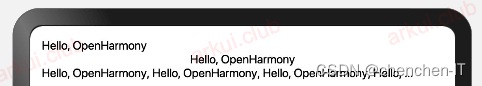
Text("Hello, OpenHarmony")

Text('Hello, OpenHarmony')
  .width('100%')
  .textAlign(TextAlign.Center)

Text('Hello, OpenHarmony, Hello, OpenHarmony, Hello, OpenHarmony, Hello, OpenHarmony')
  .maxLines(1)
  .textOverflow({overflow: TextOverflow.Ellipsis})
样例运行结果如下图所示:
Text属性介绍
textAlign:设置文本的对其方式,对齐参考系是 Text 组件本身,只有 Text 组件本身的宽度大于文本内容长度, textAlign 属性才起作用, TextAlign 定义了以下 3 种类型:
-
Start(默认值):根据文字书写相同的方向对齐,比如中文从左往右排版,那么文本则靠左对齐。
-
Center:文本居中对齐。
-
End:根据文字书写相反的方向对齐,比如中文从左往右排版,那么文本则靠右对齐。
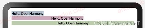
简单样例如下所示:
Text("Hello, OpenHarmony")
  .backgroundColor('#aabbcc')
  .textAlign(TextAlign.Center) // 宽度等于文本内容长度,textAlign不起作用

Text('Hello, OpenHarmony')
  .backgroundColor('#ccaabb')
  .margin({top: 2})
  .width(200)                  // 宽度大于文本内容长度,textAlign起作用
  .textAlign(TextAlign.End)

Text('Hello, OpenHarmony')
  .backgroundColor('#bbccaa')
  .margin({top: 2})
  .width('100%')               // 宽度大于文本内容长度,textAlign起作用
  .textAlign(TextAlign.Center)
样例运行结果如下图所示:
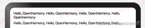
maxLines、textOverflow:设置文本显示的最大行数和截取方式,默认折行显示不截取,如果设置了此参数,则文本最多显示到指定的行,如果有多余的文本,可以通过 textOverflow 来指定截取方式,本样例的截断方式是 Ellipsis ,它将截断后的文本用 "..." 表示。
Text('Hello, OpenHarmony, Hello, OpenHarmony, Hello, OpenHarmony, Hello, OpenHarmony')
Text('Hello, OpenHarmony, Hello, OpenHarmony, Hello, OpenHarmony, Hello, OpenHarmony')
  .margin({top: 5})
  .maxLines(1)
  .textOverflow({overflow: TextOverflow.Ellipsis})
样例运行结果如下图所示:
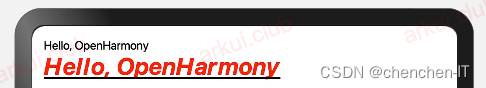
fontSize、fontColor、fontStyle、 fontWeight:分别表示设置文字的大小,颜色,样式以及粗细,我们可以组合起来设置文本的富样式,先看一个样例:
Text('Hello, OpenHarmony')
Text('Hello, OpenHarmony')
.fontSize(20)
.fontColor('#ff0000')
.fontWeight(FontWeight.Bold)
.fontStyle(FontStyle.Italic)
.decoration({type: TextDecorationType.Underline, color: Color.Black})
样例运行结果如下图所示:
官方更多全面的案例如下:
案例1
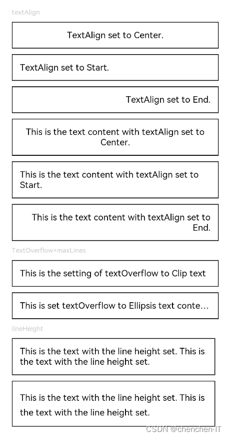
textAlign,textOverflow,maxLines,lineHeight使用示例。
// xxx.ets
@Entry
@Component
struct TextExample1 {
  build() {
    Flex({ direction: FlexDirection.Column, alignItems: ItemAlign.Start, justifyContent: FlexAlign.SpaceBetween }) {
      // 文本水平方向对齐方式设置
      // 单行文本
      Text('textAlign').fontSize(9).fontColor(0xCCCCCC)
      Text('TextAlign set to Center.')
        .textAlign(TextAlign.Center)
        .fontSize(12)
        .border({ width: 1 })
        .padding(10)
        .width('100%')
      Text('TextAlign set to Start.')
        .textAlign(TextAlign.Start)
        .fontSize(12)
        .border({ width: 1 })
        .padding(10)
        .width('100%')
      Text('TextAlign set to End.')
        .textAlign(TextAlign.End)
        .fontSize(12)
        .border({ width: 1 })
        .padding(10)
        .width('100%')

      // 多行文本
      Text('This is the text content with textAlign set to Center.')
        .textAlign(TextAlign.Center)
        .fontSize(12)
        .border({ width: 1 })
        .padding(10)
        .width('100%')
      Text('This is the text content with textAlign set to Start.')
        .textAlign(TextAlign.Start)
        .fontSize(12)
        .border({ width: 1 })
        .padding(10)
        .width('100%')
      Text('This is the text content with textAlign set to End.')
        .textAlign(TextAlign.End)
        .fontSize(12)
        .border({ width: 1 })
        .padding(10)
        .width('100%')


      // 文本超长时显示方式
      Text('TextOverflow+maxLines').fontSize(9).fontColor(0xCCCCCC)
      // 超出maxLines截断内容展示
      Text('This is the setting of textOverflow to Clip text content This is the setting of textOverflow to None text content. This is the setting of textOverflow to Clip text content This is the setting of textOverflow to None text content.')
        .textOverflow({ overflow: TextOverflow.Clip })
        .maxLines(1)
        .fontSize(12)
        .border({ width: 1 })
        .padding(10)

      // 超出maxLines展示省略号
      Text('This is set textOverflow to Ellipsis text content This is set textOverflow to Ellipsis text content.'.split('')
        .join('\u200B'))
        .textOverflow({ overflow: TextOverflow.Ellipsis })
        .maxLines(1)
        .fontSize(12)
        .border({ width: 1 })
        .padding(10)

      Text('lineHeight').fontSize(9).fontColor(0xCCCCCC)
      Text('This is the text with the line height set. This is the text with the line height set.')
        .fontSize(12).border({ width: 1 }).padding(10)
      Text('This is the text with the line height set. This is the text with the line height set.')
        .fontSize(12).border({ width: 1 }).padding(10)
        .lineHeight(20)
    }.height(600).width(350).padding({ left: 35, right: 35, top: 35 })
  }
}
样例运行结果如下图所示:
案例2
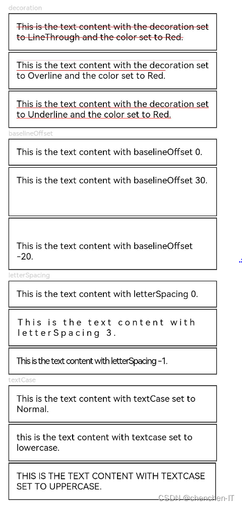
decoration,baselineOffset,letterSpacing,textCase使用示例:
@Entry
@Component
struct TextExample2 {
  build() {
    Flex({ direction: FlexDirection.Column, alignItems: ItemAlign.Start, justifyContent: FlexAlign.SpaceBetween }) {
      Text('decoration').fontSize(9).fontColor(0xCCCCCC)
      Text('This is the text content with the decoration set to LineThrough and the color set to Red.')
        .decoration({
          type: TextDecorationType.LineThrough,
          color: Color.Red
        })
        .fontSize(12)
        .border({ width: 1 })
        .padding(10)
        .width('100%')


      Text('This is the text content with the decoration set to Overline and the color set to Red.')
        .decoration({
          type: TextDecorationType.Overline,
          color: Color.Red
        })
        .fontSize(12)
        .border({ width: 1 })
        .padding(10)
        .width('100%')


      Text('This is the text content with the decoration set to Underline and the color set to Red.')
        .decoration({
          type: TextDecorationType.Underline,
          color: Color.Red
        })
        .fontSize(12)
        .border({ width: 1 })
        .padding(10)
        .width('100%')

      // 文本基线偏移
      Text('baselineOffset').fontSize(9).fontColor(0xCCCCCC)
      Text('This is the text content with baselineOffset 0.')
        .baselineOffset(0)
        .fontSize(12)
        .border({ width: 1 })
        .padding(10)
        .width('100%')
      Text('This is the text content with baselineOffset 30.')
        .baselineOffset(30)
        .fontSize(12)
        .border({ width: 1 })
        .padding(10)
        .width('100%')
      Text('This is the text content with baselineOffset -20.')
        .baselineOffset(-20)
        .fontSize(12)
        .border({ width: 1 })
        .padding(10)
        .width('100%')

      // 文本字符间距
      Text('letterSpacing').fontSize(9).fontColor(0xCCCCCC)
      Text('This is the text content with letterSpacing 0.')
        .letterSpacing(0)
        .fontSize(12)
        .border({ width: 1 })
        .padding(10)
        .width('100%')
      Text('This is the text content with letterSpacing 3.')
        .letterSpacing(3)
        .fontSize(12)
        .border({ width: 1 })
        .padding(10)
        .width('100%')
      Text('This is the text content with letterSpacing -1.')
        .letterSpacing(-1)
        .fontSize(12)
        .border({ width: 1 })
        .padding(10)
        .width('100%')

      Text('textCase').fontSize(9).fontColor(0xCCCCCC)
      Text('This is the text content with textCase set to Normal.')
        .textCase(TextCase.Normal)
        .fontSize(12)
        .border({ width: 1 })
        .padding(10)
        .width('100%')
      // 文本全小写展示
      Text('This is the text content with textCase set to LowerCase.')
        .textCase(TextCase.LowerCase)
        .fontSize(12)
        .border({ width: 1 })
        .padding(10)
        .width('100%')
      // 文本全大写展示
      Text('This is the text content with textCase set to UpperCase.')
        .textCase(TextCase.UpperCase)
        .fontSize(12).border({ width: 1 }).padding(10)

    }.height(700).width(350).padding({ left: 35, right: 35, top: 35 })
  }
}
样例运行结果如下图所示:
按钮组件
Button 组件也是基础组件之一,和其它基础组件不同的是 Button 组件允许添加一个子组件来实现不同的展示样式。
Button定义介绍
interface ButtonInterface {
  (): ButtonAttribute;
  (options: ButtonOptions): ButtonAttribute;
  (label: ResourceStr, options?: ButtonOptions): ButtonAttribute;
}-
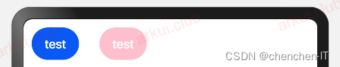
label:设置按钮文字,简单样例如下所示:
Button('test')

Button('test')
  .backgroundColor(Color.Pink)
样例运行结果如下图所示:
-
type:设置
Button按钮的显示样式,ButtonType定义了以下3种样式:-
Capsule(默认值):胶囊类型,圆角值为
Button高度的一半并且不允许修改,此时通过设置 borderRadius() 的方式设置圆角则无效。简单样例如下所示:Button('test') .height(40) .width(90) .backgroundColor('#aabbcc') Button('test', {type: ButtonType.Capsule}) .height(40) .width(90) .borderRadius(20) // 设置圆角,但是没有效果 .borderWidth(3) // 设置边框宽度 .borderColor(Color.Red) // 设置边框颜色 .backgroundColor('#bbaacc')// 设置背景色样例运行结果如下图所示:
-
Normal:矩形按钮,无圆角,可以通过 borderRadius() 设置圆角大小,不支持通过 border() 的方式设置圆角,简单样例如下所示:
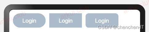
Button('Login')                            // 默认胶囊类型
  .height(40)
  .width(90)
  .backgroundColor('#aabbcc')

Button('Login', {type: ButtonType.Normal}) // 没有圆角
  .height(40)
  .width(90)
  .backgroundColor('#aabbcc')

Button('Login', {type: ButtonType.Normal}) // 设置圆角
  .height(40)
  .width(90)
  .backgroundColor('#aabbcc')
  .borderRadius(8)
样例运行结果如下图所示:
-
Circle:圆形按钮,设置该样式时,简单样例如下所示:
Button('Login')
  .height(40)
  .width(90)
  .backgroundColor('#aabbcc')

Button('Harmony', {type: ButtonType.Circle})
  .backgroundColor('#aabbcc')

Button('OpenHarmony', {type: ButtonType.Circle})
  .height(40)
  .width(90)
  .backgroundColor('#aabbcc')
样例运行结果如下图所示:
-
-
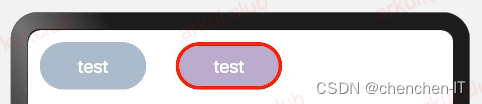
stateEffect:设置是否开启点击效果,默认开启,简单样例如下所示:
Button('effect: on')
  .fontSize(20)

Button('effect: off', {stateEffect: false})
  .fontSize(20)
Button自定义样式
-
包含
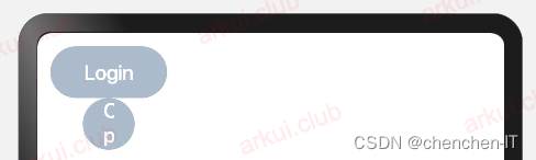
Text组件Button({type: ButtonType.Normal}) { Text('Login') .fontSize(20) .fontColor(Color.Red) .padding({left: 20, right: 20}) } .borderRadius(8) .backgroundColor("#aabbcc") Button({type: ButtonType.Circle}) { Text('Login') .fontSize(20) .fontColor(Color.Red) } .width(80) .height(80) .backgroundColor("#aabbcc")样例运行结果如下图所示:
样例给
Button添加了一个Text子组件,通过设置Text的文本样式达到修改Button文字的效果。 -
包含
Image组件Button({type: ButtonType.Circle}) { Image($r("app.media.more")) .width(30) .height(30) } .width(70) .height(70) Button({type: ButtonType.Circle}) { Image($r("app.media.delete")) .width(40) .height(40) } .width(70) .height(70) .backgroundColor('#ff0000')样例运行结果如下图所示:
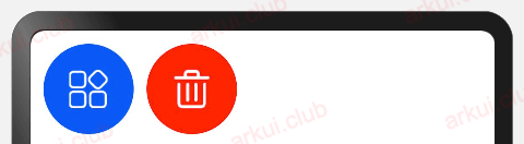
样例中使用了
Image组件,该组件是后续章节要讲解的基础组件,读者们先了解一下。 -
包含复杂组件
Button({type: ButtonType.Normal}) {
  Row() {
    Image($r("app.media.loading"))
      .width(30)
      .height(30)
      .margin({left: 12})
    Text('loading')
      .fontSize(20)
      .fontColor('#ffffff')
      .margin({left: 5, right: 12})
  }
}
.borderRadius(8)
.backgroundColor(0x317aff)
样例运行结果如下图所示:
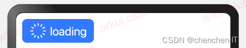
样例中使用
Row作为子组件,Row组件属于线性容器组件,它可以添加多个子组件
官方更多全面的案例如下:
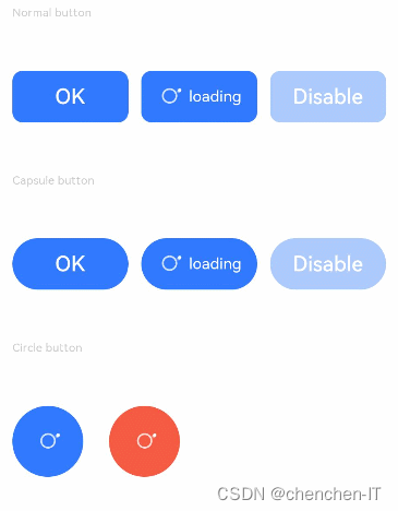
案例1
// xxx.ets
@Entry
@Component
struct ButtonExample {
  build() {
    Flex({ direction: FlexDirection.Column, alignItems: ItemAlign.Start, justifyContent: FlexAlign.SpaceBetween }) {
      Text('Normal button').fontSize(9).fontColor(0xCCCCCC)
      Flex({ alignItems: ItemAlign.Center, justifyContent: FlexAlign.SpaceBetween }) {
        Button('OK', { type: ButtonType.Normal, stateEffect: true })
          .borderRadius(8)
          .backgroundColor(0x317aff)
          .width(90)
          .onClick(() => {
            console.log('ButtonType.Normal')
          })
        Button({ type: ButtonType.Normal, stateEffect: true }) {
          Row() {
            LoadingProgress().width(20).height(20).margin({ left: 12 }).color(0xFFFFFF)
            Text('loading').fontSize(12).fontColor(0xffffff).margin({ left: 5, right: 12 })
          }.alignItems(VerticalAlign.Center)
        }.borderRadius(8).backgroundColor(0x317aff).width(90).height(40)

        Button('Disable', { type: ButtonType.Normal, stateEffect: false }).opacity(0.4)
          .borderRadius(8).backgroundColor(0x317aff).width(90)
      }

      Text('Capsule button').fontSize(9).fontColor(0xCCCCCC)
      Flex({ alignItems: ItemAlign.Center, justifyContent: FlexAlign.SpaceBetween }) {
        Button('OK', { type: ButtonType.Capsule, stateEffect: true }).backgroundColor(0x317aff).width(90)
        Button({ type: ButtonType.Capsule, stateEffect: true }) {
          Row() {
            LoadingProgress().width(20).height(20).margin({ left: 12 }).color(0xFFFFFF)
            Text('loading').fontSize(12).fontColor(0xffffff).margin({ left: 5, right: 12 })
          }.alignItems(VerticalAlign.Center).width(90).height(40)
        }.backgroundColor(0x317aff)

        Button('Disable', { type: ButtonType.Capsule, stateEffect: false }).opacity(0.4)
          .backgroundColor(0x317aff).width(90)
      }

      Text('Circle button').fontSize(9).fontColor(0xCCCCCC)
      Flex({ alignItems: ItemAlign.Center, wrap: FlexWrap.Wrap }) {
        Button({ type: ButtonType.Circle, stateEffect: true }) {
          LoadingProgress().width(20).height(20).color(0xFFFFFF)
        }.width(55).height(55).backgroundColor(0x317aff)

        Button({ type: ButtonType.Circle, stateEffect: true }) {
          LoadingProgress().width(20).height(20).color(0xFFFFFF)
        }.width(55).height(55).margin({ left: 20 }).backgroundColor(0xF55A42)
      }
    }.height(400).padding({ left: 35, right: 35, top: 35 })
  }
}
样例运行结果如下图所示:
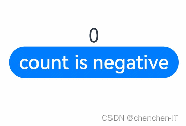
案例2
// xxx.ets
@Entry
@Component
struct SwipeGestureExample {
  @State count: number = 0

  build() {
    Column() {
      Text(`${this.count}`)
        .fontSize(30)
        .onClick(() => {
          this.count++
        })
      if (this.count <= 0) {
        Button('count is negative').fontSize(30).height(50)
      } else if (this.count % 2 === 0) {
        Button('count is even').fontSize(30).height(50)
      } else {
        Button('count is odd').fontSize(30).height(50)
      }
    }.height('100%').width('100%').justifyContent(FlexAlign.Center)
  }
}
有动态的按钮会变化:


 扫一扫
扫一扫


 14万+
14万+

 被折叠的 条评论
为什么被折叠?
被折叠的 条评论
为什么被折叠?
 到【灌水乐园】发言


