


HTML+CSS系列学习:重生之我要精通编程语言修仙 第四篇
四十、Position定位
position:
    static(默认)
    relative
    absolute
    fixed
    sticky
1.relative(相对定位)
relative(相对定位):
    如果没有定位偏移量,对元素本身没有任何影响
    不使元素脱离文档流
    不影响其他元素布局
left、top、right、bottom是相对于当前元素自身进行偏移的
<style>
        #box1{width: 100px; height: 100px; background-color: red;} */
        #box2{width: 100px; height: 100px; background-color: blue;position: relative;left:100px;}
        #box3{width: 100px; height: 100px; background-color: yellow;}
</style>

<body>
    <div id="box1"></div>
    <div id="box2"></div>
    <div id="box3"></div>
</body>
效果如下:

2.absolute(绝对定位)
absolute:
    使元素脱离文档流;
    使内联元素支持宽高(让内联具备块特性)
    使块元素默认宽根据内容决定(让块具备内联的特性)
    如果有定位祖先元素相对于定位祖先元素发生偏移,没有定位祖先元素相对于整个文档发生					偏移(绝对、相对、固定)
<style>
  #box1{width: 300px;height: 300px; border: 1px black solid;margin: 200px;position: absolute;}
  #box2{width: 100px;height: 100px;background-color: red;position: absolute;left: 0;bottom: 0;}
</style>

<body>
<div id="box1">
        <div id="box2"></div>
    </div>
</body>
效果如下:

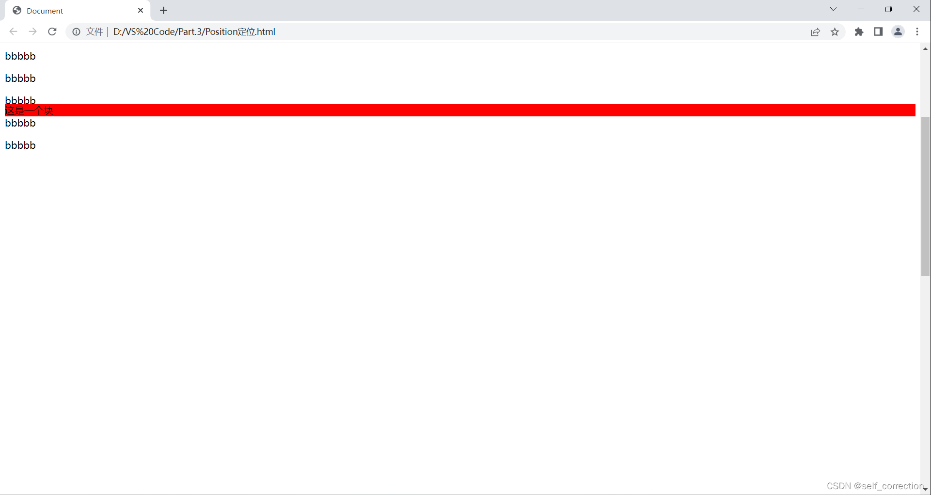
3.fixed(固定定位)
	使元素脱离文档流;
    使内联元素支持宽高(让内联具备块特性)
    使块元素默认宽根据内容决定(让块具备内联的特性)
    相对于整个浏览器窗口进行偏移,不受浏览器滚动条的影响
<style>
 body{height: 2000px;}
 div{position: fixed;}
</style>

<body>
<div>这是一个块</div>
</body>
效果展示:

4.sticky(粘性定位)
第一个特性:
在指定的位置,进行粘性操作
<style>
body{height: 2000px;}
div{background-color: red;position: sticky;top: 100px;}
</style>

<body>
	<p>aaaaa</p>
    <p>aaaaa</p>
    <p>aaaaa</p>
    <p>aaaaa</p>
    <p>aaaaa</p>
    <p>aaaaa</p>
    <div>这是一个块</div>
    <p>bbbbb</p>
    <p>bbbbb</p>
    <p>bbbbb</p>
    <p>bbbbb</p>
    <p>bbbbb</p>
    <p>bbbbb</p>
</body>
效果如下:
第二个特性:
    默认层级为0
    嵌套时候的层级问题
<style>
 #box1{width: 100px; height: 100px; background-color: red; position: absolute; z-index: 2;}
#box2{width: 100px; height: 100px; background-color: blue; position: absolute; left:50px; top:50px; z-index: 1;}
</style>

<body>
    <div id="box1"></div>
    <div id="box2"></div>
</body>
效果如下:

四十一、CSS添加省略号
width
必须有一个固定的宽
white-space:nowrap
不让内容折行
overflow:hidden
阴藏溢出的内容
text-overflow:ellipsis
添加省略号
<!DOCTYPE html>
<html lang="en">
<head>
    <meta charset="UTF-8">
    <meta http-equiv="X-UA-Compatible" content="IE=edge">
    <meta name="viewport" content="width=device-width, initial-scale=1.0">
    <title>Document</title>
    <style>
        #content
        {
            width: 200px; border: 1px black solid; white-space: nowrap;
            overflow: hidden;text-overflow: ellipsis;
        }
    </style>
</head>
<body>
    <div id="content">测试文字测试文字测试文字测试文字测试文字测试文字</div>
</body>
</html>
效果如下:

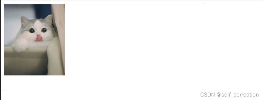
四十二、CSS Sprite(精灵)
特性:
    CSS雪碧也叫做CSS精灵,是一种网页图片应用处理方式。它允许你将一个页面涉及到的所有零星图片都包括到一张大图中去加载。
    好处:
    可以减少图片的质量,网页的图片加载速度快;
    减少图片的请求的次数,加快网页的打开
<style>
 #box1{width: 516px; height: 235px; border:1px black solid; line-height: 50px;
 padding-left: 30px;background: url(./猫咪.jpg) no-repeat left -57px;}
</style>

<body>
<div id="box1"></div>
</body>
效果展示:
四十三、CSS圆角
给标签添加圆角
PS:
设置一个值:四个角
设置两个值:左上右下、右上左下
设置四个值:左上、右上、右下、左下
<!DOCTYPE html>
<html lang="en">
<head>
    <meta charset="UTF-8">
    <meta http-equiv="X-UA-Compatible" content="IE=edge">
    <meta name="viewport" content="width=device-width, initial-scale=1.0">
    <title>Document</title>
    <style>
        #box1{width: 100px; height: 100px; background-color: red; border-radius: 10px;}
    </style>
</head>
<body>
    <div id="box1"></div>
</body>
</html>
效果如下:

四十四、博文尚美
<!DOCTYPE html>
<html lang="en">
<head>
    <meta charset="UTF-8">
    <meta http-equiv="X-UA-Compatible" content="IE=edge">
    <meta name="viewport" content="width=device-width, initial-scale=1.0">
    <title>Document</title>
    <link rel="stylesheet" href="./CSS/common.css">
    <style>
        #banner .banner_list{width: 100%;height: 469px;position: relative;}
        #banner .banner_list li{width: 100%;height: 100%;background: center 0 no-repeat;position: absolute;left: 0;top: 0;opacity: 0;z-index: 1;}
        #banner .banner_list li.active{opacity: 1;z-index: 10;}
        #banner .banner_list li.a{display: block;width: 100%;height: 100%;}
        #banner .banner_btn{width:100%; position: absolute;bottom: 19px;z-index: 20;font-size: 0;text-align: center;}
        #banner .banner_btn li{display: inline-block; width: 12px;height: 12px;border: 2px solid white;border-radius: 50%;box-sizing: border-box;margin: 0 6px;cursor: pointer;}
        #banner .banner_btn li.active{background:white}

        #service{overflow: hidden;min-height: 407px;}
        #service .service_list{text-align: center;margin-top: 34px;}
        #service .service_list li{float: left;width: 250px;margin:0 10px;}
        #service .service_list div{width: 102px;height: 102px;margin: 0 auto;}
        #service .service_list li:nth-of-type(1) div{background-image: url(./images/web1.png);}
        #service .service_list li:nth-of-type(2) div{background-image: url(./images/mail1.png);}
        #service .service_list li:nth-of-type(3) div{background-image: url(./images/graphic1.png);}
        #service .service_list li:nth-of-type(4) div{background-image: url(./images/e-bussiness1.png);}
        #service .service_list h3{font-size: 18px;color: #434343;line-height: 36px;margin-top: 25px;}
        #service .service_list p{font-size: 14px;color: #6d6d6d;line-height: 22px;}

        #case{background: #f8f8f8;}
        #case .container{min-height: 460px;overflow: hidden;}
        #case .area_title{margin-top: 55px;}
        #case .area_title h2{color: #66c5b4;}
        #case .case_list{margin-top: 28px;}
        #case .case_list li{float:left;width: 340px;margin: 0 10px;}
        #case .case_btn{width: 176px;height: 37px;background: #66c5b4;margin: 0 auto;border-radius: 25px;line-height: 37px;text-align: center;font-size: 14px;margin-top: 36px;}
        #case .case_btn a{display: block;width: 100%;height: 100%;color: white;}

        #news{min-height: 450px;overflow: hidden;}
        #news .area_title{margin-top: 65px;}
        #news dt{width: 234px;}
        #news dl{margin-top: 48px;}
        #news dd{width: 846px;}
        #news .news_list{width: 100%;}
        #news .news_list li{width: 40%;float: left;margin-bottom: 48px;}
        #news .news_date{width: 71px;height:70px;border-right: 1px solid #dcdcdc;text-align: center;}
        #news .news_date i{color: #66c584;font-size: 39px;display: block;font-weight: bold;}
        #news .news_date span{color: #999999;font-size: 20px;line-height: 36px;}
        #news .news_text{width: 310px;margin-left: 20px;}
        #news .news_text h3{font-size: 14px;}
        #news .news_text h3 a{color: #3f3f3f;}
        #news .news_text p{color: #a4a4a4;font-size: 12px;line-height: 21px;margin-top: 17px;}

        #foot{height: 77px;background: rgb(102, 197, 180);color: white;font-size: 20px;}
        #foot div{line-height: 77px;}
        #foot a{color: white;}
        #foot span{margin:0 20px;}

    </style>
</head>
<body>
    <div id="head" class="container">
        <div class="head_logo l">
            <a href="#">
                <img src="./images/logo.png" alt="" title="博文尚美">
            </a>
        </div>
        <ul class="head_menu r">
            <li>
                <a href="#">HOME</a>
            </li>
            <li>
                <a href="#">ABOUT</a>
            </li>
            <li>
                <a href="#">PROTFOLIO</a>
            </li>
            <li>
                <a href="#">SERVICE</a>
            </li>
            <li>
                <a href="#">NEWS</a>
            </li>
            <li>
                <a href="#">CONTACT</a>
            </li>
        </ul>
    </div>
    <div id="banner" class="container-fluid">
        <ul class="banner_list">
            <li class="active" style="background-image:url(./images/banner.png);">
                <a href="#"></a>
            </li>
            <li style="background-image:url(./images/banner.png);">
                <a href="#"></a>
            </li>
            <li style="background-image:url(./images/banner.png);">
                <a href="#"></a>
            </li>
            <li style="background-image:url(./images/banner.png);">
                <a href="#"></a>
            </li>
        </ul>
        <ol class="banner_btn">
            <li class="active"></li>
            <li></li>
            <li></li>
            <li></li>
        </ol>
    </div>
    <div id="service" class="container">
        <div class="area_title">
            <h2>服务范围</h2>
            <p>OUR SERVICES</p>
        </div>
        <ul class="service_list">
            <li>
                <div></div>
                <h3>1.WEB DESIGN</h3>
                <p>企业品牌网站设计/手机网站制作
                <br> 动画网站创意设计
                </p>
            </li>
            <li>
                <div></div>
                <h3>2.GRAPHIC DESIGN</h3>
                <p>标志LOGO设计/铲平宣传册设计
                <br>企业广告/海报设计
                </p>
            </li>
            <li>
                <div></div>
                <h3>3.E-BUSINESS PLAN</h3>
                <p>淘宝/天猫装修设计及运营推广
                <br>企业微博、微信营销
                </p>
            </li>
            <li>
                <div></div>
                <h3>4.MAILBOXAGENTS</h3>
                <p>腾讯/网易企业邮箱品牌代理
                <br>个性化邮箱定制开发
                </p>
            </li>
        </ul>
    </div>
    <div id="case" class="container-fluid">
        <div class="container">
            <div class="area_title">
                <h2>{客户案例}</h2>
                <p>with the best professional technology,to design the best innovative web site</p>
            </div>
            <ul class="case_list clear">
                <li>
                    <a href="#"><img src="./images/20141121095216750.png" alt=""></a>
                </li>
                <li>
                    <a href="#"><img src="./images/20141121095528549.png" alt=""></a>
                </li>
                <li>
                    <a href="#"><img src="./images/20141121105856226.png" alt=""></a>
                </li>
            </ul>
            <div class="case_btn">
                <a href="#">view more</a>
            </div>
        </div>
    </div>
    <div id="news" class="container">
        <div class="area_title">
            <h2>最新资讯</h2>
            <p>THE LATEST NEWS</p>
        </div>
        <dl>
            <dt class="l">
                <img src="./images/xs1.png" alt="">
            </dt>
            <dd class="l">
                <ul class="news_list">
                    <li>
                        <div class="news_date l">
                            <i>09</i>
                            <span>Jan</span>
                            </span>
                        </div>
                        <div class="news_list l">
                            <h3><a href="#">网站排名进入前三的技巧说明</a></h3>
                            <p>很多客户都会纳闷为什么自己的网站老是优化不到搜索引擎首页,更不用说明进入首页前三了,那么网站优...</p>
                        </div>
                    </li>
                </ul>
            </dd>
        </dl>
    </div>
    <div id="foot" class="container-fluid">
        <div class="container">
            <p class="l">copyright 2006-2014 bowenshangmei culture all right reserved</p>
            <div class="r">
                <a href="#">home</a><a href="#"about></a><a href="#">portfolio</a><a href="#">CONTACT</a>
            </div>
        </div>
    </div>
</body>
</html>
*{margin: 0; padding: 0;}
ul,ol{list-style: none;}
img{display: block;}
a{text-decoration: none;color:#646464 ;}
h1,h2,h3{font-size: 16px;}
body{font-family: Arial;}

.l{float: left;}
.r{float: right;}
.clear::after{content: ""; display: block; clear: both;}
.container{width: 1080px;margin: 0 auto;position: relative;}
.container-fluid{width: 100%;}


#head{height: 81px; }
#head .head_logo{width: 162px; height: 44px; margin-top: 19px;}
#head .head_menu{font-size: 14px; line-height: 81px;}
#head .head_menu li{float: left; margin-left: 58px;}

.area_title{margin-top: 60px; text-align: center;}
.area_title h2
{height: 20px; line-height: 20px; font-size: 20px; color: #363636;
    background: url(../images/title_bg.png) no-repeat center 7px;font-weight: normal;}
.area_title p{color: #9F9F9F; font-size: 14px; line-height: 34px;}
效果如下:


 634
634


 被折叠的 条评论
为什么被折叠?
被折叠的 条评论
为什么被折叠?
 到【灌水乐园】发言


