


最近学习了一下怎么画地图,各类填色地图的教程都比较好用,但是合并饼图的教程我用不好,所以自己尝试改了些内容,但也不是最优的解决办法,还是有点费力。
一、前期准备
首先网上下载好两个文件: “九段线GS(2019)1719号.geojson”与“中国省级地图GS(2019)1719号.geojson”,其次安装并加载以下R包,最后模拟一份数据,各省吃豆腐脑人数等于喜欢吃甜味、咸味与原味人数之和。
library(sf)
library(ggplot2)
library(ggspatial)
library(cowplot)
library(scatterpie)

#数据模拟
set.seed(456)
data <- data.frame('省份' = 1:34,'吃豆腐脑人数'= sample(1:100, 34, replace = T))
data$甜味 <- mapply(function(tot) sample(0:tot, 1), data$吃豆腐脑人数)
data$咸味 <- mapply(function(tot,T) sample(0:(tot - T), 1), data$吃豆腐脑人数,data$甜味)
data$原味 <- data$吃豆腐脑人数 - data$甜味 - data$咸味
二、读取地图文件
读取地图文件并将数据与地图合并。
#地图读取
china_shp <- "中国省级地图GS(2019)1719号.geojson"
nine <- "九段线GS(2019)1719号.geojson"
china_sf <- read_sf(china_shp)
nine_line <- read_sf(nine)

#合并
data$省份 <- china_sf$CNAME
china <- merge(china_sf,data,by.x="CNAME",by.y='省份')
三、制作填色地图
制作大地图
#绘制填色地图
##绘制大地图
map <- ggplot() +
  geom_sf(data = china,aes(fill=吃豆腐脑人数),size=.5,color="black") +
  geom_sf(data = nine_line) +
  coord_sf(ylim = c(1869414.769862395,7187874.74616931),crs = 3857)+
  theme(axis.text = element_text(size = 8))+
  annotation_north_arrow(location = "tl", which_north = "true") +
  scale_fill_gradient(name = "吃豆腐脑人数",
                      low = "#fae3d9",
                      high = "#ff2e63",
                      n.breaks = 10,
                      guide = guide_legend(keywidth=1.5,keyheight=1.5))
map
制作小地图
##绘制小地图
nine_map <- ggplot() +
  geom_sf(data = china,aes(fill=吃豆腐脑人数))+
  geom_sf(data = nine_line)+
  scale_fill_gradient(low = "#fae3d9",
                      high = "#ff2e63",
                      n.breaks = 10)+
  coord_sf(ylim = c(278392.10080518876,2991845.069153875),
           xlim = c(11631734.185889415,13868701.579770062),crs = 3857)+
  theme(axis.text = element_text(size = 8))+
  theme(legend.position = "none", plot.margin = unit(c(0, 0, 0, 0), "mm"),
        panel.border = element_rect(fill = NA,color = "grey10",linetype = 1,linewidth = 0.5))

nine_map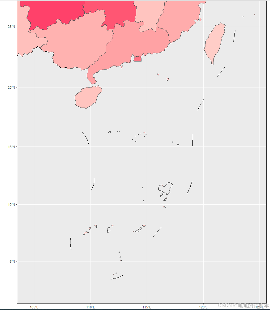
合并大小地图
##拼图
figure <-
  ggdraw(map) +
  draw_plot(nine_map,
            x = 0.666,y = 0.05,
            width = 0.15,height = 0.25)

figure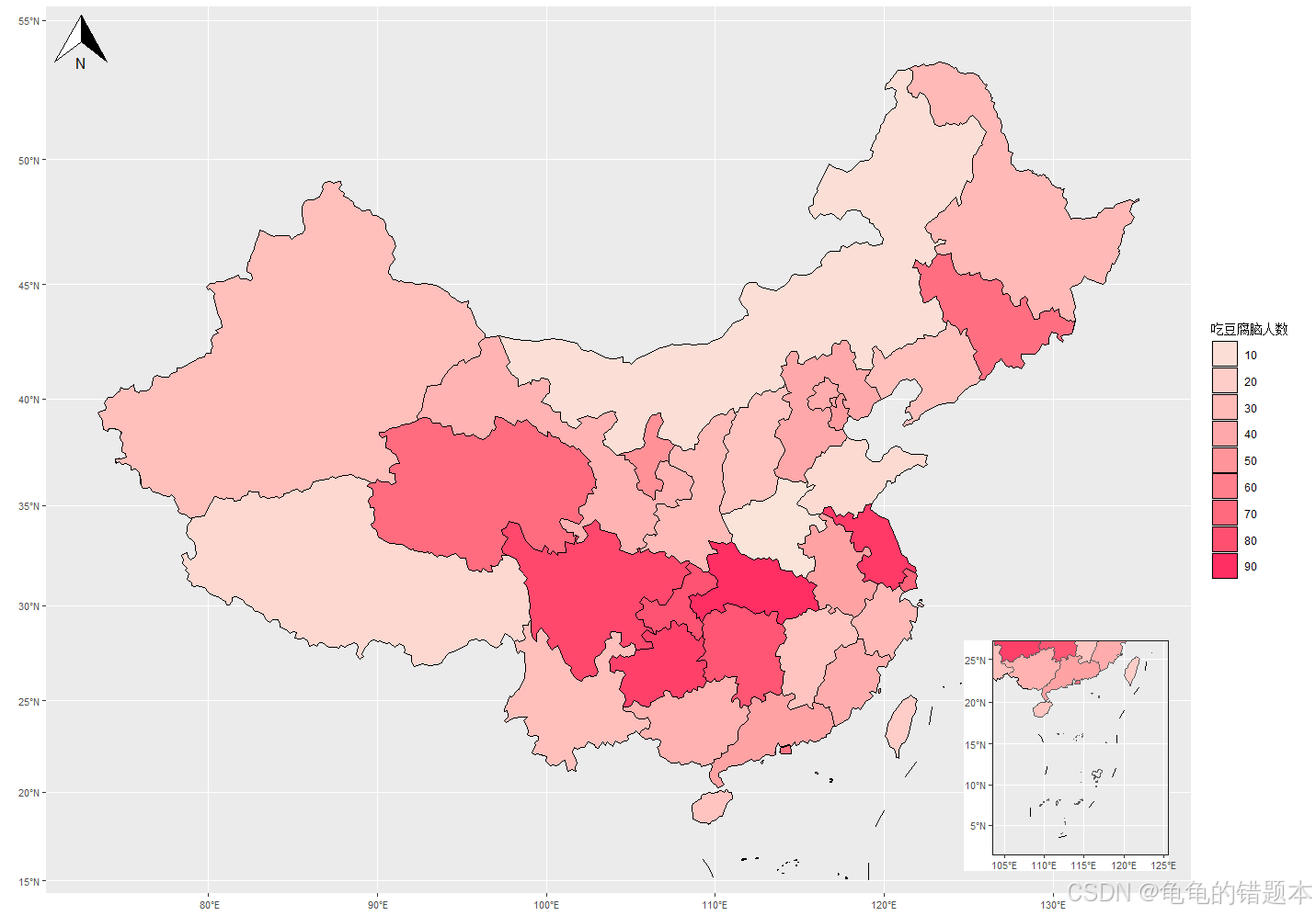
四、添加饼图
制作饼图散点图
给数据框里省份加上经纬度,不要散点图的图例并额外做个图例。
## 饼图
data$lng = as.numeric(china$lng)
data$lat = as.numeric(china$lat)

pin <- ggplot() +
  geom_scatterpie(aes(x=lng, y=lat),
                  data = data,
                  cols = c('甜味','咸味','原味'),
                  pie_scale = 1) +
  scale_fill_manual(values = c('#fcbad3','#71c9ce','#cadefc')) +
  theme(axis.text = element_text(size = 8),
        legend.position = "none" ,
        plot.background = element_rect(fill = "transparent", color = NA),
        panel.background = element_blank(),
        panel.grid.major = element_blank(),
        panel.grid.minor = element_blank(),
        axis.title.x = element_blank(),
        axis.title.y = element_blank(),
        axis.text.x = element_blank(),
        axis.text.y = element_blank(),
        axis.ticks.x = element_blank(),
        axis.ticks.y = element_blank()
  )
pin

#单独做一个饼图图例
pin_legend <- get_legend(
  ggplot() +
    geom_scatterpie(aes(x=lng, y=lat),
                    data = data,
                    cols = c('甜味','咸味','原味'),
                    pie_scale = 1) +
    scale_fill_manual(values = c('#fcbad3','#71c9ce','#cadefc')) +
    theme(legend.position = "right",
          legend.title = element_blank())
  )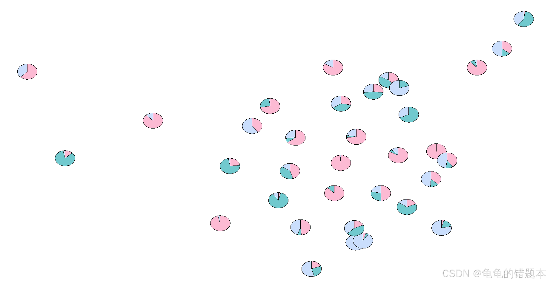
合并地图与饼图
对于饼图的比例与坐标需要反复修改数字,直到与饼图与各省份对齐。
#再拼图(这里比较头秃,比例与坐标需要反复调整)
figure2 = ggdraw(figure) +
    draw_plot(pin,x = 0.26,y = 0.06, width = 0.5, height = 0.7) +
    draw_plot(pin_legend, x = 0.735, y = 0.17, width = 0.2, height = 0.3)

figure2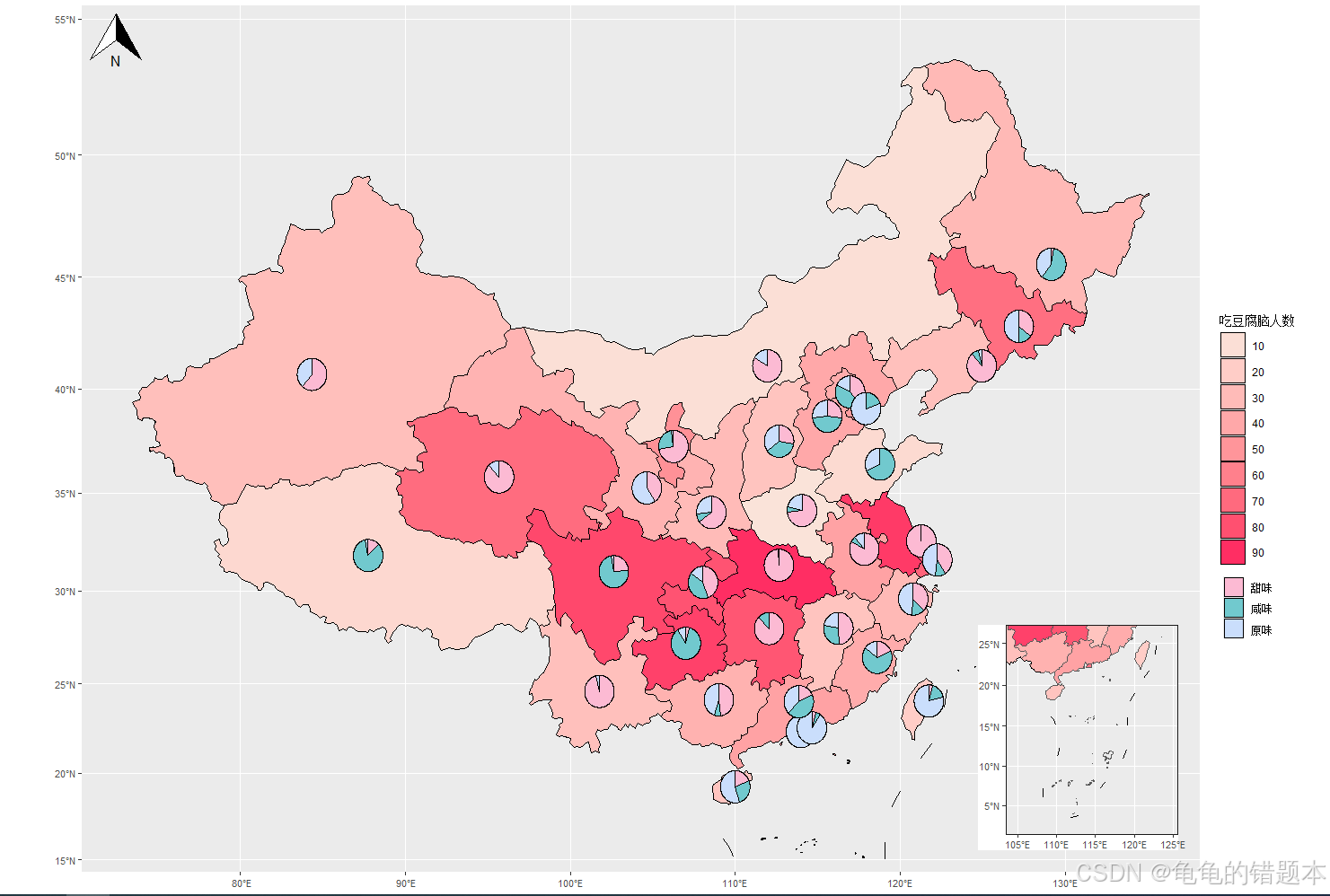


 1403
1403

 被折叠的 条评论
为什么被折叠?
被折叠的 条评论
为什么被折叠?
 到【灌水乐园】发言


