


博主介绍:✌全网粉丝10W+,前互联网大厂软件研发、集结硕博英豪成立工作室。专注于计算机相关专业项目实战6年之久,选择我们就是选择放心、选择安心毕业✌
> 🍅想要获取完整文章或者源码,或者代做,拉到文章底部即可与我联系了。🍅🍅感兴趣的可以先收藏起来,点赞、关注不迷路,大家在毕设选题,项目以及论文编写等相关问题都可以给我留言咨询,希望帮助同学们顺利毕业 。🍅
1、毕业设计:2025年计算机专业毕业设计选题汇总(建议收藏)✅
2、大数据毕业设计:2025年选题大全 深度学习 python语言 JAVA语言 hadoop和spark(建议收藏)✅
🍅感兴趣的可以先收藏起来,点赞、关注不迷路,大家在毕设选题,项目以及论文编写等相关问题都可以给我留言咨询,希望帮助同学们顺利毕业 。🍅
1、项目介绍
技术栈:
python语言、Flask框架、Echarts可视化、销量预测、MySQL数据库、机器学习
2、项目界面
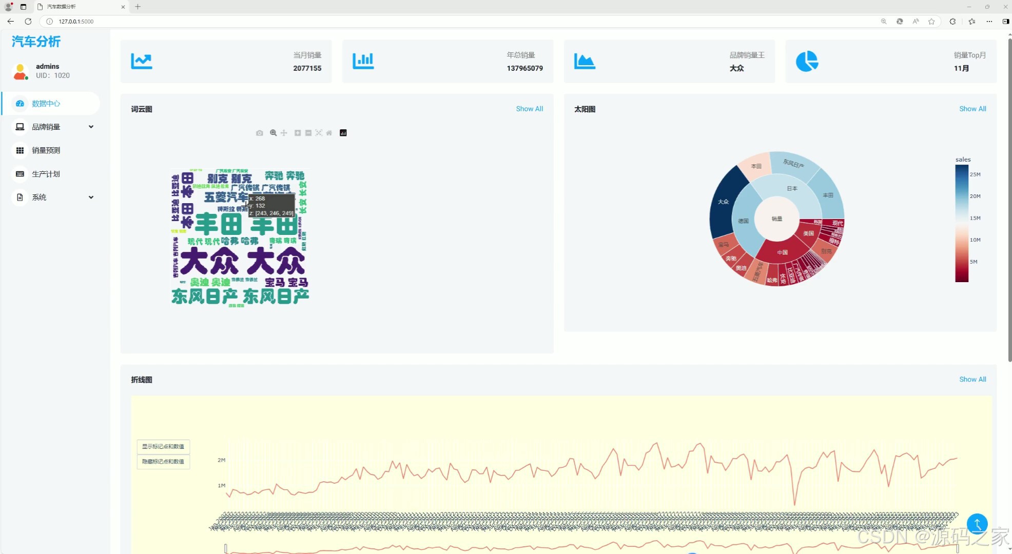
(1)首页–数据概况
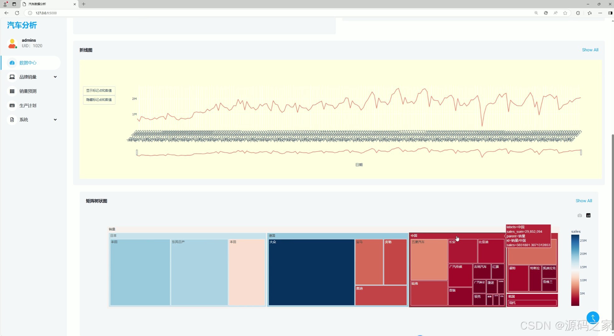
(2)折线图、矩阵树状图
(3)汽车销量数据分析可视化
(4)销量预测
(5)销量预测2
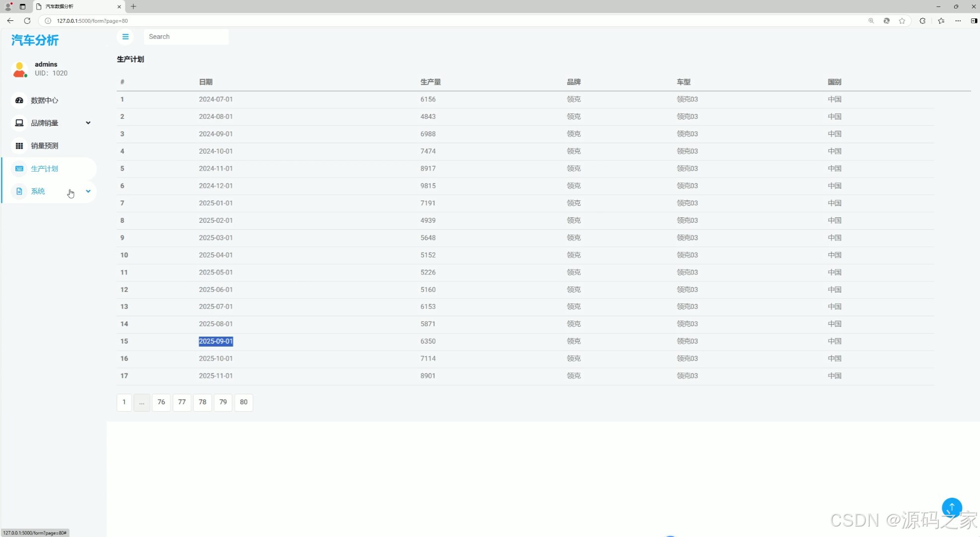
(6)生产计划
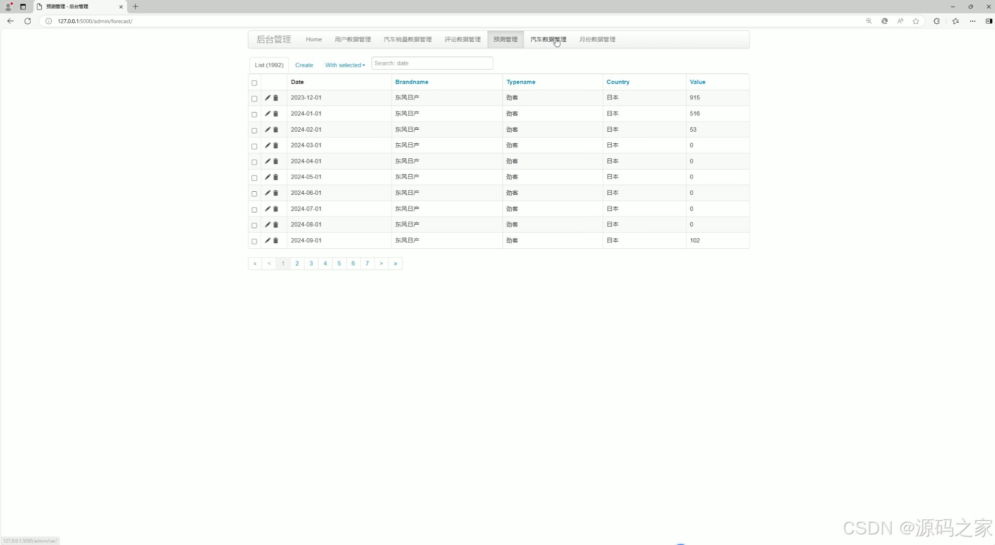
(7)后台数据管理
(8)注册登录

3、项目说明
摘要
本文介绍了一个基于Python的汽车销量可视化系统。该系统旨在通过数据可视化技术,帮助用户直观、快速地理解汽车市场的销售情况。系统利用Python的数据处理和分析能力,结合图表库进行可视化展示,为用户提供了丰富的销售数据分析和决策支持工具。在系统中,用户可以通过上传或导入汽车销量数据,进行数据的清洗、整理和分析。系统支持多种数据类型和格式的输入,包括Excel表格、CSV文件等。用户可以自定义分析维度和指标,如品牌、车型、地区、时间等,以获取个性化的销售数据报告。可视化方面,系统提供了多种图表类型,如柱状图、折线图、饼图等,用于展示销售数据的分布、趋势和比例。用户可以根据需要选择不同的图表类型,并通过交互操作进行细节查看和数据筛选。此外,系统还支持数据的动态更新和实时展示,使用户能够及时获取最新的销售数据。该汽车销量可视化系统不仅简化了销售数据的处理和分析过程,还提高了决策效率和准确性。通过直观的可视化展示,用户可以更快速地发现市场趋势、识别潜在机会,并制定相应的销售策略。该系统的开发和应用为汽车行业的市场分析、产品开发和市场推广提供了有力的支持。
关键词:可视化;Python;Flask框架;软件开发
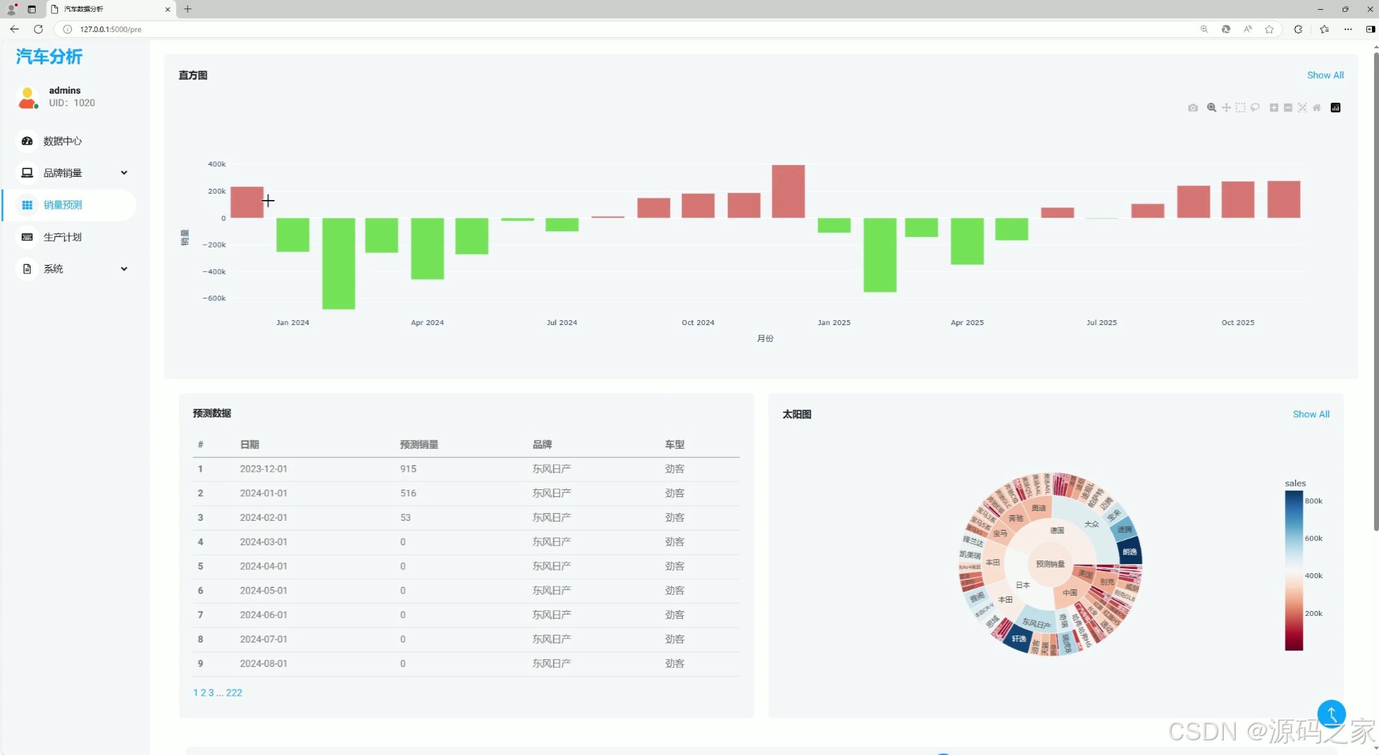
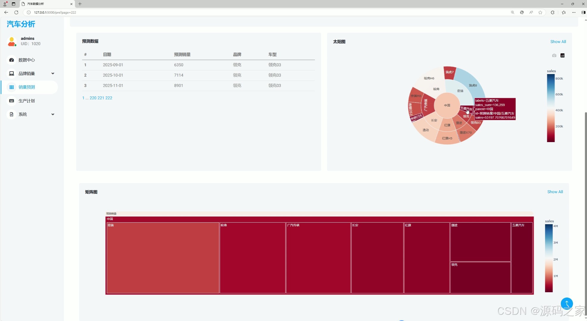
销量预测页面是一个专为已登录用户设计的独特功能区域,旨在通过一系列可视化图表,为用户提供全面、深入的汽车销量预测数据。为确保数据安全与用户隐私,用户需完成登录流程后方可访问该页面。一旦成功登录,用户将被引导至销量预测页面。首先映入眼帘的是一幅直方图,它直观地展示了不同时间段或不同车型类别的预测销量分布。通过直方图的高低起伏,用户可以迅速把握预测销量的整体趋势和差异。
页面中央呈现了一个预测数据表。这个表格详细列出了各车型、各月份或各地区的预测销量数据,以及与实际销量数据的对比。通过数据表,用户可以清晰地看到预测数值与实际数值的差距,从而更准确地评估预测结果的可靠性。此外,页面还采用了太阳图来展示销量预测的多维度信息。太阳图以圆心为起点,向外延伸出多条射线,每条射线代表一个维度(如车型、地区、销售渠道等),射线的长度则代表该维度下的预测销量。通过太阳图,用户可以一目了然地了解各维度对销量的影响程度,以及它们之间的相互关系。最后,页面还引入了矩阵树状图来展示销量预测数据的层级关系。这种图表形式以树状结构展示不同车型、不同时间段或不同地区的销量预测数据,通过节点和连线的组合,用户可以清晰地看到数据之间的层级关系和依赖性。
4、核心代码
# 首页路由,展示预测列表
@app.route('/form',methods=['GET'])
def form():
# 使用cursor对象执行SQL语句
cursor.execute("SELECT * FROM forecast")
# 获取数据
data = cursor.fetchall()
#data=tuple(data_back)
print(len(data))
page = int(request.args.get('page', 1)) # 获取页码,默认为第一页
items_per_page = 25 # 每页显示的条目数量
start_index = (page - 1) * items_per_page
end_index = start_index + items_per_page
paginated_data = data[start_index:end_index]
total_pages = (len(data) + items_per_page - 1) // items_per_page # 计算总页数
# data=tuple(data_back)
enumerated_data = list(enumerate(paginated_data, start=1))
i=0
# content={}
# for item in data:
# content[i] = textwrap.shorten(item[3].replace('#', '').replace('\n', ' '), width=100, placeholder='...')
# #item[3]=content[i]
# i=i+1
for item in data:
print(item[3])
# 将数据传递给模板进行渲染
#return "1"
username=session.get('username')
uid=session.get('uid')
if username is None:
return render_template('login.html')
return render_template('form.html', total_pages=total_pages, current_page=page, data=enumerated_data, i=i,username=username,uid=uid)
@app.route('/others/<int:uid>')
def goothers(uid):
if session['uid']==uid :
return redirect('/information')
else :
cursor.execute('SELECT uid, title, content, hit, likes,count,time,blogid FROM blog WHERE uid = '+str(uid))
data = cursor.fetchall()
print(data)
cursor.execute('SELECT username FROM user WHERE uid = '+str(uid))
user = cursor.fetchone()
username=user[0]
uid=uid
#return "1"
return render_template('other_index.html', data=data, username=username,uid=uid)
@app.route('/upgrade_back',methods=['POST'])
def upgrade_back():
return redirect('/upgrade')
@app.route('/upgrade')
def upgrade():
#flag=-1
uid=session['uid']
username = request.form.get("username")
#passwd = request.form.get("passwd")
#cursor.execute("select passwd from user where username=\""
#+str(username)+"\"")
#data = cursor.fetchone()
#if passwd == data[0]:
#flag=1
#new_passwd = request.form.get("new_passwd")
cursor.execute("update user set username=\""
+str(username)+"\" where uid= " +str(uid))
db.commit()
session['username']=username
return redirect('/information')
# 销量数据
@app.route('/button',methods=['GET'])
def button():
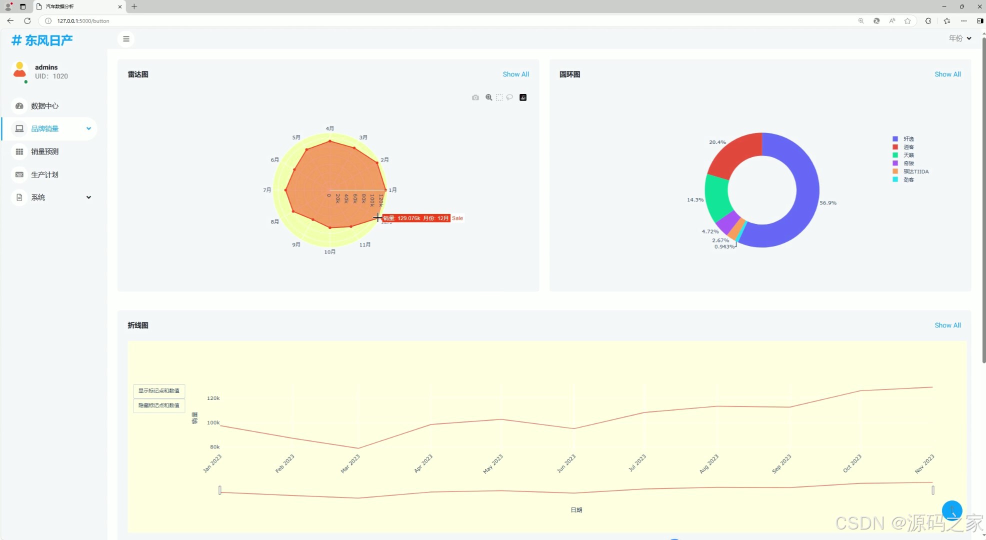
# 雷达图
# 时间、车型、车型总销量、销量占比
cursor.execute(
"SELECT date,typename,SUM(salenum) AS monthly_sales,SUM(salenum) / (SELECT SUM(salenum) FROM carsale WHERE brandname = '东风日产') AS sales_percentage FROM carsale WHERE brandname = '东风日产' AND YEAR(date)=2023 GROUP BY date, typename ")
data = cursor.fetchall()
print(data)
# 时间、品牌总销量
cursor.execute("SELECT date, SUM(salenum) FROM carsale WHERE brandname = '东风日产' AND YEAR(date)=2023 GROUP BY brandname, date ")
data1 = cursor.fetchall()
print(data1)
months = ['1月','2月','3月','4月','5月','6月','7月','8月','9月','10月','11月','12月']
sales = []
for item in data1:
# months.append(str(item[0]))
sales.append(int(item[1]))
print(months)
print(sales)
# 创建雷达图
fig = go.Figure()
# 添加雷达图的数据
fig.add_trace(go.Scatterpolar(
r=sales + [sales[0]], # 将最后一个数据点复制一份,确保闭合
theta=months + [months[0]], # 将最后一个类别复制一份,确保闭合
mode='lines+markers',
fill='toself', # 使用 'toself' 参数填充区域
name='Sale',
line=dict(color='#FF4517'), # 更改连接线的颜色为红色
hovertemplate='销量: %{r} 月份: %{theta}',
))
# 更改坐标轴标签
fig.update_layout(
polar=dict(radialaxis=dict(title=''), angularaxis=dict(categoryorder='array', categoryarray=months)))
# 更改背景颜色
fig.update_layout(polar=dict(bgcolor='#F0FBA9'))
# 改变背景色
fig.update_layout(
paper_bgcolor='#f3f6f9' # 绘图纸背景色
)
# 将图表的 HTML 表示嵌入到模板中
graph_html = fig.to_html(full_html=False)
# 折线图
x_data = []
y_data = []
for item in data1:
x_data.append(item[0])
y_data.append(int(item[1]))
# 示例数据
# 创建折线图
fig1 = make_subplots()
# 添加折线
scatter1 = go.Scatter(x=x_data, y=y_data, mode='lines', line=dict(color='#F78D73'), name='折线图',
text=[str(i) for i in y_data], textposition='top right', hoverinfo='x+y')
fig1.add_trace(scatter1)
# 添加标题和轴标签
fig1.update_layout( xaxis_title='日期', yaxis_title='销量', xaxis_dtick='M1',
xaxis_tickangle=-45)
# 设置悬停模式
fig1.update_layout(hovermode='x')
# 添加滑动条
fig1.update_layout(
xaxis=dict(
rangeslider=dict(
visible=True
),
type='date' # 如果 x 轴是日期类型,需要设置 type='date'
)
)
# 添加按钮
fig1.update_layout(
updatemenus=[
dict(
type='buttons',
showactive=False,
buttons=[
dict(label='显示标记点和数值',
method='update',
args=[{'mode': 'lines+markers+text'}]),
dict(label='隐藏标记点和数值',
method='update',
args=[{'mode': 'lines'}])
]
)
]
)
# 改变背景色
fig1.update_layout(
plot_bgcolor='lightyellow', # 绘图区域背景色
paper_bgcolor='lightyellow' # 绘图纸背景色
)
# 将图表的 HTML 表示嵌入到模板中
graph_html1 = fig1.to_html(full_html=False)
# 环形图
labels = []
values = []
for item in data:
labels.append(item[1])
values.append(float(item[3]))
# labels = ['Category A', 'Category B', 'Category C', 'Category D']
# values = [10, 15, 7, 20]
# 创建环形图
fig2 = make_subplots(1, 1, specs=[[{'type': 'pie'}]])
# 添加环形图
trace_pie = go.Pie(labels=labels, values=values, hole=0.6, hoverinfo='label+percent+value+percent+name',
textposition='outside')
fig2.add_trace(trace_pie)
# 设置布局
fig2.update_layout(
plot_bgcolor='white', # 绘图区域背景色
paper_bgcolor='#f3f6f9') # 绘图纸背景色
# 将图表的 HTML 表示嵌入到模板中
graph_html2 = fig2.to_html(full_html=False)
# 假设 brand_name 是你想要查询的车品牌
brand_name = '东风日产'
# 使用cursor对象执行SQL语句
cursor.execute("SELECT DISTINCT YEAR(date) FROM carsale WHERE brandname = %s", (brand_name,))
# 获取不同年份
distinct_years = cursor.fetchall()
# 打印结果
for year in distinct_years:
print(year[0])
username=session.get('username')
uid=session.get('uid')
# 渲染包含 Sunburst 图的页面
return render_template('button1.html',year=distinct_years, username=username,uid=uid, graph_html=graph_html, graph_html1=graph_html1, graph_html2=graph_html2)
5、源码获取方式
🍅由于篇幅限制,获取完整文章或源码、代做项目的,查看【用户名】、【专栏名称】就可以找到我啦🍅
感兴趣的可以先收藏起来,点赞、关注不迷路,下方查看👇🏻获取联系方式👇🏻


 785
785

 被折叠的 条评论
为什么被折叠?
被折叠的 条评论
为什么被折叠?
 到【灌水乐园】发言


