


Chakra UI is a modern component library for React created by Segun Adebayo. It provides a set of accessible, reusable, and composable React components that you need to build front-end applications. Its simplicity, modularity, and accessibility make it powerful. You can use it to build accessible React apps and to speed up the building process.
Chakra UI是由Segun Adebayo创建的React的现代组件库。 它提供了构建前端应用程序所需的一组可访问,可重用和可组合的React组件。 它的简单性,模块化和可访问性使其功能强大。 您可以使用它来构建可访问的React应用程序并加快构建过程。
Chakra UI uses Emotion and Styled System. Style systems are great kinds of infrastructure that can be used to build a UI component library. They make so many things much easier.
Chakra UI使用情感和样式系统。 样式系统是多种基础结构,可用于构建UI组件库。 它们使许多事情变得容易得多。
Furthermore, Chakra UI is built with TypeScript, and it comes with 49 components and three utility hooks. Despite being an open-source tool, Chakra UI has great documentation. It has 10.3K GitHub stars and 678 GitHub forks.
此外,Chakra UI是使用TypeScript构建的,它带有49个组件和三个实用程序挂钩。 尽管Chakra UI是开源工具,但它具有出色的文档。 它拥有10.3K GitHub star和678 GitHub fork。
You can find Chakra UI’s open-source GitHub repository here.
您可以在此处找到Chakra UI的开源GitHub存储库。
Tip: Share your reusable components between projects using Bit (Github). Bit makes it simple to share, document, and organize independent components from any project.
提示:使用Bit ( Github )在项目之间共享可重用组件 。 Bit使共享,记录和组织来自任何项目的独立组件变得简单。
Use it to maximize code reuse, collaborate on independent components, and build apps that scale.
使用它可以最大程度地重复使用代码,在独立组件上进行协作以及构建可扩展的应用程序。
Bit supports Node, TypeScript, React, Vue, Angular, and more.
Bit支持Node,TypeScript,React,Vue,Angular等。
Chakra UI的功能 (Features of Chakra UI)
Chakra UI keeps its components fairly consistent based on the following principles.
Chakra UI根据以下原则保持其组件相当一致。
风格道具 (Style Props)
Because Chakra UI is based on styled systems, it is possible to override or extend all component styles using props. So, you rarely have to use stylesheets or inline styles.
由于Chakra UI基于样式化系统,因此可以使用prop覆盖或扩展所有组件样式。 因此,您几乎不必使用样式表或嵌入式样式。
You can find many shorthand variants of the style props in the Chakra UI component library. You can find the complete reference to style props in the official documentation.
您可以在Chakra UI组件库中找到样式道具的许多速记变体。 您可以在官方文档中找到有关样式道具的完整参考。
Here are some of the commonly used style props. These style prop shorthands are used to space CSS properties.
以下是一些常用的风格道具。 这些样式道具速记用于间隔CSS属性。
m is used for margin.
m用于保证金。
mr is used for marginRight.
mr用于marginRight。
mt is used for marginTop.
mt用于marginTop。
p is used for padding.
p用于填充。
pr is used for paddingRight.
pr用于paddingRight。
pt is used for paddingTop.
pt用于paddingTop。
py is used for padding-top and padding-bottom.
py用于填充顶部和填充底部。
组成 (Composition)
Chakra UI breaks down components into smaller parts with minimal props to keep the complexity low and compose them together to ensure that the styles and functionality are flexible and extensible.
Chakra UI用最少的道具将组件分解成较小的部分,以保持较低的复杂性并将它们组合在一起,以确保样式和功能灵活且可扩展。
无障碍 (Accessible)
Accessibility is vital when creating components. Chakra UI components follow the WAI-ARIA guidelines specifications and support accessibility by providing keyboard navigation, focus management, correct aria-* attributes, and focus trapping and restoration for modal dialogs. You can check the accessibility report of each authored component in a file called accessibility.md.
在创建组件时,可访问性至关重要。 Chakra UI组件遵循WAI-ARIA准则规范,并通过提供键盘导航,焦点管理,正确的aria- *属性以及模式对话框的焦点捕获和还原来支持可访问性。 您可以在名为accessibility.md的文件中检查每个创作组件的可访问性报告。
主题化的 (Themeable)
Style systems have their own theme specifications. By following these specific theme specifications, you can theme your app into different themes, or you can download different themes.
样式系统具有自己的主题规范。 通过遵循这些特定的主题规范,您可以将应用程序主题化为不同的主题,也可以下载不同的主题。
You have to create a theme.js file and pass it as a JSON object. The theme object is where you can define the application’s color palette, font stacks, type scale, breakpoints, and so on with custom values.
您必须创建一个theme.js文件,并将其作为JSON对象传递。 在主题对象中,可以使用自定义值定义应用程序的调色板,字体堆栈,类型比例,断点等。
import { theme } from "@chakra-ui/core";


// Adding custom colors
const customTheme = {
  ...theme,
  colors: {
    ...theme.colors,
    brand: {
      900: "#1d4044",
      800: "#234e52",
      700: "#285e61",
    },
  },
};
The theme object also supports fonts and font sizes.
主题对象还支持字体和字体大小。
export default {
    fonts: {
      heading: '"Georgia", sans-serif',
      body: "system-ui, sans-serif",
      mono: "Menlo, monospace",
    },
    fontSizes: {
      xs: "0.75rem",
      sm: "0.875rem",
      md: "1rem",
      lg: "1.125rem",
      xl: "1.25rem",
      "2xl": "1.5rem",
      "3xl": "1.875rem",
      "4xl": "2.25rem",
      "5xl": "3rem",
      "6xl": "4rem",
    },
  };
You can add a breakpoint array to your theme and configure the default breakpoints used in responsive array values. You can then use those values to apply responsive styles.
您可以在主题中添加一个断点数组,并配置响应数组值中使用的默认断点。 然后,您可以使用这些值来应用自适应样式。
export default {
    breakpoints: ["30em", "48em", "62em", "80em"],
  };
暗模式 (Dark Mode)
Because Chakra UI supports dark mode out of the box, implementing dark mode using it is extremely simple. Most of the components provided in this library are dark mode compatible.
由于Chakra UI开箱即用地支持暗模式,因此使用它实现暗模式非常简单。 该库中提供的大多数组件都兼容暗模式。
Chakra UI provides a hook called useColorMode, which you can use to change the application’s color mode.
Chakra UI提供了一个名为useColorMode的钩子,您可以使用它来更改应用程序的颜色模式。
You have to use ColorModeProvider to enable color mode within your app and wrap your application in a ColorModeProvider.
您必须使用ColorModeProvider在应用程序中启用颜色模式,并将应用程序包装在ColorModeProvider 。
import React from "react";
import { ThemeProvider, ColorModeProvider } from "@chakra-ui/core";
import customTheme from "./theme";


function TurnOnColorMode({ children }) {
  return (
    <ThemeProvider theme={customTheme}>
      <ColorModeProvider>{children}</ColorModeProvider>
    </ThemeProvider>
  );
}
响应式设计 (Responsive Design)
Chakra UI supports mobile-first responsive styles out of the box. It stays performant on mobile devices. So you don’t have to manually add media queries and nested styles throughout your code.
Chakra UI开箱即用地支持移动优先响应样式。 它在移动设备上保持高性能。 因此,您不必在整个代码中手动添加媒体查询和嵌套样式。
The responsive design supports every style prop in the theme specification. You can also change the style of properties at given breakpoints.
响应式设计支持主题规范中的每个样式道具。 您还可以在给定的断点处更改属性的样式。
<>
  <Box
    height="40px"
    bg="teal.400"
    width={[
      "100%", // base
      "50%", // 480px upwards
      "25%", // 768px upwards
      "15%", // 992px upwards
    ]}
  />
  {/* responsive font size */}
  <Box fontSize={["sm", "md", "lg", "xl"]}>Font Size</Box>
  {/* responsive margin */}
  <Box mt={[2, 4, 6, 8]} width="full" height="24px" bg="tomato" />
  {/* responsive padding */}
  <Box bg="papayawhip" p={[2, 4, 6, 8]}>
    Padding
  </Box>
</>
入门 (Getting Started)
You can install Chakra UI and its peer dependencies with npm or yarn. Because Chakra UI uses Emotion for handling component styles, you have to install Emotion, the CSS-in-JS library, as a peer dependency.
您可以使用npm或yarn安装Chakra UI及其对等依赖项。 由于Chakra UI使用Emotion处理组件样式,因此您必须安装Emotion(CSS-in-JS库)作为对等依赖项。
npm install @chakra-ui/core @emotion/core @emotion/styled emotion-theming
npm install @chakra-ui/core @emotion/core @emotion/styled emotion-theming
or
要么
yarn add @chakra-ui/core @emotion/core @emotion/styled emotion-theming
yarn add @chakra-ui/core @emotion/core @emotion/styled emotion-theming
You will need the ThemeProvider and optionally a custom theme. ThemeProvider is the component that includes all the appropriate styling for your components.
您将需要ThemeProvider和可选的自定义主题。 ThemeProvider是包含所有适合您的组件样式的组件。
You can set up your custom theme to customize the UI. You can include custom colors, typography, and layout values. However, this step is optional. Chakra UI provides a default theme that is extendable.
您可以设置自定义主题以自定义UI。 您可以包括自定义颜色,版式和布局值。 但是,此步骤是可选的。 Chakra UI提供了可扩展的默认主题。
import { theme } from "@chakra-ui/core"


const customTheme = {
  ...theme,
  colors: {
    ...theme.colors,
    primary: {
      100: "#CFD1FD",
      200: "#A7ABFB",
      300: "#8388F9",
      400: "#6268F8",
      500: "#444BF7",
      600: "#262EF6",
      700: "#0B14F5",
      800: "#0911DD",
      900: "#080FC7",
    },
  },
}


export default customTheme;
You can easily handle the styles of components switching between dark and light theme modes using ColorModeProvider and useColorMode hook.
您可以使用ColorModeProvider和useColorMode挂钩轻松处理在深色和浅色主题模式之间切换的组件样式。
If you need, you can also apply CSS reset styles to your application. Chakra UI provides a CSSReset component that will remove browser default styles.
如果需要,还可以将CSS重置样式应用于应用程序。 Chakra UI提供了CSSReset组件,该组件将删除浏览器的默认样式。
It is recommended to add the CSSReset component at the root of your application to ensure all components work correctly.
建议在应用程序的根目录中添加CSSReset组件,以确保所有组件都能正常工作。
Then you have to wrap your entire application with theThemeProviderpassing in the theme object as a prop. It establishes all of the styles for our components.
然后,您必须使用ThemeProvider包装整个应用程序,并传入主题对象作为道具。 它为我们的组件建立了所有样式。
import React from 'react';
import {
  ThemeProvider,
  ColorModeProvider,
  CSSReset
} from '@chakra-ui/core';
import customTheme from "./customTheme";


const App = () => {
  return (
    <ThemeProvider theme={customTheme}>
      <ColorModeProvider>
        <CSSReset />
            {children}
      </ColorModeProvider>
    </ThemeProvider>
  );
}


export default App;
After the basic setup is completed, you can use Chakra UI components in your application. Chakra UI provides 49 components including inputs, accordions, icons, tooltips, and so on.
基本设置完成后,您可以在应用程序中使用Chakra UI组件。 Chakra UI提供了49个组件,包括输入,手风琴,图标,工具提示等。
For example, the following code adds two typography components Text and Heading, and a Button wrapped by a Stack component.
例如,以下代码添加了两个印刷组件Text和Heading ,以及一个由Stack组件包装的Button 。
import { Button, Heading, Stack, Text } from "@chakra-ui/core"


return (
  <Stack spacing={4} bg="white" p={8} borderRadius="lg">
    <Heading as="h1" size="md" color="primary.900">
      Learning Chakra UI
    </Heading>
    <Text as="p" fontSize="md" color="primary.500">
      Your first Chakra components:
    </Text>
    <Button variantColor="primary" isFullWidth>
      Click me
    </Button>
  </Stack>
)
In the above example, you can see that Stack is the layout utility component that makes it easy to stack elements together and apply a space between them. The Spacing prop is used to define the spacing between components. It can accept all the valid Styled System props too.
在上面的示例中,您可以看到Stack是布局实用程序组件,可以轻松地将元素堆叠在一起并在元素之间应用空格。 Spacing属性用于定义组件之间的间距。 它也可以接受所有有效的样式系统道具。
Chakra UI组件 (Chakra UI Components)
Chakra UI provides a large number of high-quality React components. Here are a few of them.
Chakra UI提供了大量高质量的React组件。 这里有几个。
输入组件 (Input Components)
Chakra UI’s input components consist of text inputs, number inputs, select inputs, checkboxes, radio buttons, and switch inputs.
Chakra UI的输入组件包括文本输入,数字输入,选择输入,复选框,单选按钮和开关输入。
布局组件 (Layout Components)
With Chakra UI, you can easily add responsive layouts to multiple components. It consists of a set of layout components like Box and Stack that make it easy to style your components by passing props. So you can pass-in the properties like bg or justifyContent in CSS as props.
使用Chakra UI,您可以轻松地将响应式布局添加到多个组件。 它由一组布局组件(如Box和Stack组成,可轻松通过传递道具来对组件进行样式设置。 因此,您可以将CSS中的bg或justifyContent类的属性作为props justifyContent 。
Stack can be used to group a set of components with equal spacing. Although it is vertical by default, you can override it with isInline.
Stack可用于以相等的间距对一组组件进行分组。 尽管默认情况下它是垂直的,但是可以使用isInline覆盖它。
You can use Box as a div element for receiving style props.
您可以将Box用作接收样式道具的div元素。
Grid can be used to wrap everything in a CSS Grid container.
Grid可用于将所有内容包装在CSS网格容器中。
Flex can be used to wrap everything in a Flexbox container. So you can use all the flex properties such as flexDirection, alignItems, justifyContent, and so on, on the wrapper as props.
Flex可用于将所有内容包装在Flexbox容器中。 因此,您可以在包装器flexDirection所有flex属性(例如flexDirection , alignItems , justifyContent等)用作道具。
This is an example of how you can use layout components.
这是如何使用布局组件的示例。
import { Stack, Flex, Box, Grid } from "@chakra-ui/core";


const App = () => {
  const flexSettings = {
    flex: "1",
    minW: "300px",
    textAlign: "center",
    color: "white",
    mx: "6",
    mb: "6"
  };


  const gridSettings = {
    w: "100%",
    textAlign: "center",
    color: "white",
  };


  return (
    <div>
      <Flex w="100%" justify="space-between" flexWrap="wrap">
        <Box {...flexSettings} bg={"red.500"}>This is a box</Box>
        <Box {...flexSettings} bg={"blue.500"}>This is a box</Box>
        <Box {...flexSettings} bg={"green.500"}>This is a box</Box>
        <Box {...flexSettings} bg={"purple.500"}>This is a box</Box>
      </Flex>


      <Grid w="100%" templateColumns="repeat(auto-fit, minmax(300px, 1fr))" gap={6}>
        <Box {...gridSettings} bg={"red.500"}>This is a box</Box>
        <Box {...gridSettings} bg={"blue.500"}>This is a box</Box>
        <Box {...gridSettings} bg={"green.500"}>This is a box</Box>
        <Box {...gridSettings} bg={"purple.500"}>This is a box</Box>
      </Grid>
    </div>
  );
};
面包屑 (Breadcrumb)
You can use the Breadcrumb component to make routing between different pages easier. It enhances how users navigate to previous page levels of a website, especially if that website has many pages or products. Chakra UI provides 4 breadcrumb related components including Breadcrumb, BreadcrumbItem, BreadcrumbLink, and BreadcrumbSeparator.
您可以使用“面包屑”组件来简化不同页面之间的路由。 它增强了用户导航到网站的先前页面级别的方式,尤其是在该网站包含许多页面或产品的情况下。 Chakra UI提供了4个与面包屑相关的组件,包括Breadcrumb , BreadcrumbItem , BreadcrumbLink和BreadcrumbSeparator 。
标签 (Tabs)
You can use the Tabs component to separate your views into multiple screens. The order is important with the Tab and TabPanel elements. None of these components should be empty wrappers. Each one should be associated with a real DOM element in the document. This gives you maximum control over styling and composition.
您可以使用“选项卡”组件将视图分为多个屏幕。 该顺序对于Tab和TabPanel元素很重要。 这些组件都不应该是空包装。 每个文档都应与文档中的真实DOM元素相关联。 这使您可以最大程度地控制样式和组成。
抽屉 (Drawer)
Drawer is a component that is unique to Chakra UI. It is a mechanism that would be perfect for any side navbar. Drawer component uses Chakra UI’s custom useDisclosure hook that provides isOpen, onOpen, and onClose for controlling the state of the drawer.
抽屉是Chakra UI特有的组件。 对于任何侧面导航条来说,这都是一种完美的机制。 抽屉组件使用Chakra UI的自定义useDisclosure钩子,该钩子提供isOpen , onOpen和onClose来控制抽屉的状态。
如何使用Chakra UI创建表单 (How to create forms with Chakra UI)
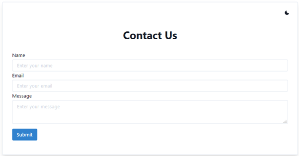
Chakra UI is a great library for creating forms. You can use it to build any kind of form. Here is how you can use it to build a simple “Contact Us” form. The final result from this demo will look like:
Chakra UI是用于创建表单的出色库。 您可以使用它来构建任何形式的表单。 您可以使用它来构建简单的“联系我们”表单。 该演示的最终结果将如下所示:
Dark Mode :
暗模式
Light Mode :
灯光模式:
The code for the “Contact Us” form is as follows:
“联系我们”表格的代码如下:
import React from 'react';
import {
  ThemeProvider,
  ColorModeProvider,
  CSSReset,
  theme,
  Button,
  Input,
  Textarea,
  FormLabel,
  FormControl,
  Heading,
  IconButton,
  Flex,
  Box,
  useColorMode
} from '@chakra-ui/core';

const App = () => {
  return (
    <ThemeProvider theme={theme}>
      <ColorModeProvider>
        <CSSReset />
        <Contact />
      </ColorModeProvider>
    </ThemeProvider>
  )
}

const Contact = () => {
  return (
    <Flex minHeight='100vh' width='full' align='center' justifyContent='center'>
      <Box
        borderWidth={1}
        px={4}
        width='full'
        maxWidth='1000px'
        borderRadius={4}
        textAlign='center'
        boxShadow='lg'
      >
        <ThemeSelector />
        <Box p={4}>
          <ContactHeader />
          <ContactForm />
        </Box>
      </Box>
    </Flex>
  )
}

const ThemeSelector = () => {
  const { colorMode, toggleColorMode } = useColorMode()

  return (
    <Box textAlign='right' py={4}>
      <IconButton
        icon={colorMode === 'light' ? 'moon' : 'sun'}
        onClick={toggleColorMode}
        variant='ghost'
      />
    </Box>
  )
}

const ContactHeader = () => {
  return (
    <Box textAlign='center'>
      <Heading>Contact Us</Heading>
    </Box>
  )
}

const ContactForm = () => {
  return (
    <Box my={8} textAlign='left'>
      <form>

        <FormControl>
          <FormLabel>Name</FormLabel>
          <Input type='text' placeholder='Enter your name' />
        </FormControl>

        <FormControl>
          <FormLabel>Email</FormLabel>
          <Input type='email' placeholder='Enter your email' />
        </FormControl>

        <FormControl>
          <FormLabel>Message</FormLabel>
          <Textarea type='textarea' placeholder='Enter your message' />
        </FormControl>

        <Button variantColor="blue" type="submit" mt={4}>Submit</Button>

      </form>
    </Box>
  )
}

export default App;
In the code above, the ColorModeProvider allows the user to toggle between dark and light theme mode. Chakra UI handles the value of the current theme, which is stored in the localStorage of the browser by the key to darkMode.
在上面的代码中, ColorModeProvider允许用户在暗和亮主题模式之间切换。 Chakra UI处理当前主题的值,该主题值通过darkMode键存储在浏览器的localStorage中。
脉轮UI的局限性 (Limitations of Chakra UI)
Chakra UI is a powerful component library, but it has some limitations. One notable limitation is the lack of a Date Picker. So you have to use another React library for that. Also, there is no component for the search bar.
Chakra UI是功能强大的组件库,但有一些限制。 一个值得注意的限制是缺少日期选择器。 因此,您必须为此使用另一个React库。 另外,搜索栏没有任何组件。
It is impossible to style some components with Chakra UI. For example, even though you can add styles to Switch, Checkbox, and a couple more components, you don’t have access to some of their underlying elements.
使用Chakra UI设置某些组件的样式是不可能的。 例如,即使您可以将样式添加到Switch , Checkbox以及更多其他组件,您也无权访问其某些基础元素。
There is no way to theme some components. Chakra UI provides a few button styles and even the variant colors also have limits.
无法将某些组件作为主题。 Chakra UI提供了一些按钮样式,甚至各种颜色也有限制。
You have to pass hover/active styling using Pseudobox or a component deriving from it. So you need additional wrappers for the configuration of some components.
您必须使用Pseudobox或派生自其的组件传递悬停/活动样式。 因此,您需要其他包装器来配置某些组件。
结论 (Conclusion)
All in all, what makes Chakra UI unique is its highly customizable design system. It comes with the ability to switch between themes. It also provides style utilities to create your own design systems and Flexbox.
总而言之,Chakra UI的独特之处在于其高度可定制的设计系统。 它具有在主题之间切换的能力。 它还提供了样式实用程序来创建您自己的设计系统和Flexbox。
Chakra UI has recently gained a lot of traction. As a promising new library, it is constantly improving and the hype is building around the library. More components will probably be added soon. So you can consider using it for your next React project.
Chakra UI最近获得了很大的吸引力。 作为一个有前途的新图书馆,它正在不断完善,并且围绕图书馆的宣传也在不断增加。 可能很快会添加更多组件。 因此,您可以考虑将其用于下一个React项目。
学到更多 (Learn More)
翻译自: https://blog.bitsrc.io/review-of-chakra-ui-651157bdf43a


 2901
2901

 被折叠的 条评论
为什么被折叠?
被折叠的 条评论
为什么被折叠?
 到【灌水乐园】发言


